 by Tom Gurney
Tom Gurney BSc (Hons) is an art history expert with over 20 years experience
Published on June 19, 2020 / Updated on October 30, 2026
Email: tomgurney1@gmail.com / Phone: +44 7429 011000
Convergence: Number 10, 1952: Introduction
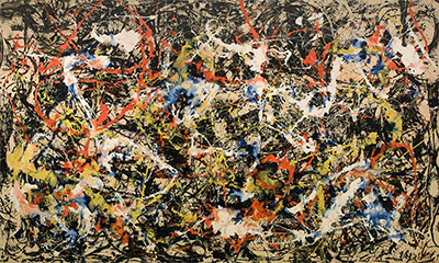
Jackson Pollock’s Convergence: Number 10, 1952 began in black and white. Colour came later, when he decided to change a result that had disappointed him. This large painting, now in the Buffalo AKG Art Museum, shows how far he could rethink a canvas. The museum records it as oil on canvas, measuring 237.49 × 393.7 centimetres across the support. [1]
The museum’s written description identifies black, white, red, yellow and blue spread across a horizontal field. It emphasises that the colours overlap while remaining distinct, with no single colour dominating. That offers a useful starting point for looking: follow one colour briefly, then let the others interrupt it. A line can join the larger movement while retaining its own direction. The painting’s energy arises through these changing relationships, and a first impression of abundance can gradually become an awareness of differences. [2]
At a Glance
This work across Jackson Pollock’s career
The Flame
c.1934–38The She-Wolf
1943Mural
1943Alchemy
1947Number 1A, 1948
1948Blue Poles
1952The Deep
1953White Light
1954Contents
- A new painting at a turning point
- What lies beneath the colour
- Did the colour work?
- Another way to organise a large canvas
- The painting becomes a puzzle
A new painting at a turning point
The year matters. In May 1952 Pollock left Betty Parsons’s gallery for Sidney Janis, whose premises were across the hall. His first solo exhibition there ran from 10 to 29 November and included twelve paintings from that year, among them Convergence and Blue Poles. Elizabeth Levine and Anna Indych’s chronology also records the selection of Convergence for the Museum of Modern Art’s circulating exhibition 12 Contemporary American Painters and Sculptors, which opened in Paris in 1953. These appearances place the work within an active public testing of Pollock’s recent painting. The coloured canvases were being presented together as new work, while the previous year’s black paintings remained part of the immediate artistic context. The two approaches were close enough in time to speak to one another. [3]
Echo: Number 25, 1951 makes that context easier to understand. MoMA describes its economical black composition as a departure from the multidirectional activity of One: Number 31, 1950, and draws attention to its suggestions of figures. Echo is enamel on canvas and nearly square, measuring 233.4 × 218.4 centimetres. Its almost equal height and width give a useful comparison with the extended horizontal format of Convergence. When considering the pair, attend to the relationship between a mark and the space around it. In the black painting, an economical vocabulary makes each turn of the line consequential. In Convergence, added colours offer further relationships to follow. MoMA’s account of Echo helps make sense of the black paintings as a distinct exploration of drawing and possible figuration, an exploration with which a later canvas could remain in conversation. [4]
What lies beneath the colour
Buffalo AKG explains that Pollock added colour to rescue the black-and-white beginning. It also identifies a small match embedded near the centre. That modest object draws attention to the painting’s physical surface. The match has a definite location and a recognisable everyday identity; the surrounding paint belongs to a more elusive visual order. The museum’s account brings both scales of attention into the same encounter. [1]
Bernice Rose offered a more specific reading of the underlying image in her 1980 study Jackson Pollock: Drawing into Painting. She described an abstract, all-over poured configuration laid over a figurative black-and-white ground. For Rose, Convergence brought different conceptions of drawing and painting into dialogue. Her reading invites us to think about the canvas as a meeting of structures, with an earlier organisation persisting beneath another. The word figurative here belongs to her interpretation: it is an invitation to consider the relationship between recognisable forms and abstraction, rather than an inventory of securely identified characters. A reader can use that possibility without having to decode a hidden scene. Rose’s account gives the lower layer a continuing role in how the completed work is understood, making the relation between what is covered and what remains available to sight especially consequential. [5]
Carol C. Mancusi-Ungaro likewise treats the added colour as a renewed engagement with an existing black painting, merging two approaches. James Coddington draws attention to fluid, marbled mixing and heavy flows of paint. He considered synthetic paint a possible explanation, citing Leonard Bocour’s account of supplying Magna and circumstantial studio evidence. Crucially, Coddington explicitly states that Convergence had not undergone the technical analysis needed to establish that proposal. His conclusion was deductive and visual. He did not establish acrylic or Magna as an ingredient. Together, the two essays suggest a productive distinction: the transformation through added colour can be discussed with confidence, while the precise formulation responsible for particular effects remains a question. Material experiment and revision are connected here without requiring a laboratory certainty that the study did not claim. [6]
Pollock’s own account allows room for such revision. In “My Painting,” published in 1947–48, he welcomed changing and even destroying an image. In his interview with William Wright, he connected direct painting with experience in controlling paint flow. Directness could include reconsideration. [7]
Did the colour work?
William Rubin thought the reds tended to “pop” out of the fabric, disrupting the tonal integration he admired in earlier poured paintings. This is his critical judgment in the 1999 revision of his 1967 Artforum essay, and it gives colour a contentious role. [7]
The museum’s description of distinct but overlapping colours offers another emphasis. Its attention falls on their coexistence across the field. A viewer can try both approaches: notice when a colour seems to advance, then follow how it reconnects with surrounding marks. The question becomes whether a local interruption weakens the whole or adds a useful tension. That is a way of engaging with the painting’s organisation while leaving room for different responses. [2]
Buffalo AKG calls Convergence one of Pollock’s masterworks. The collection record credits Seymour H. Knox, Jr.’s gift in 1956 and records the Albright Art Gallery’s purchase through Sidney Janis on 13 March that year. Its accession number is K1956:7. [1]
The numbered title need not prescribe an interpretation. In Berton Roueche’s 1950 conversation with the couple, it was Lee Krasner who explained, “Numbers are neutral.” Her point was to encourage attention to painting itself. [7]
Another way to organise a large canvas
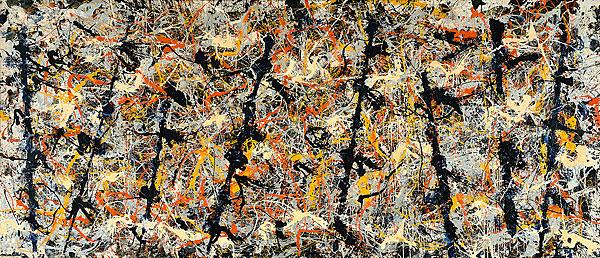
Blue Poles, also painted in 1952, offers a particularly useful comparison. Sarina Noordhuis-Fairfax’s National Gallery of Australia account explains that its eight dark poles were added towards the end, using the wet painted edge of a length of wood pressed onto the surface. Further cream, orange and black lines then crossed them. Those tilted, repeated uprights provide a rhythm across the long canvas, even as subsequent marks complicate it. Comparing the paintings, look for the different kinds of connection available to the eye. The poles provide conspicuous intervals to move between; colour offers another means of travelling across a field. The comparison opens a more precise question than whether Pollock had returned to pouring: how could a large painting hold together while allowing individual passages their own force? The late addition of the poles also provides a parallel example of major structural decisions entering a composition after much of its surface already existed. [8]
The painting becomes a puzzle
Springbok’s own history dates its original Convergence jigsaw to 1964 and gives its piece count as 340. A 1,000-piece version followed in 2003 for the publisher’s fortieth anniversary. The company’s claim that the original was the world’s hardest jigsaw belongs to its marketing. The reproduction nevertheless creates an intriguing change in attention. Assembling it asks a person to match small incidents: a crossing, a colour boundary, a line that continues onto another piece. Completion supplies a definite endpoint. Looking at a painting allows a different freedom, since the eye can abandon one connection and pursue another. A tabletop reproduction also changes the bodily scale of the encounter. It can make the organisation accessible to prolonged, intimate scrutiny, while the expansive painted surface remains a different experience. The puzzle is a later use of the image, with its own pleasures and demands; those demands need not define what Pollock intended his painting to do. [9]
Pollock artworks directory
Explore the distinct works discussed in these guides. This selection is not a complete catalogue. Green Silver and Untitled, 1949 are two guides to the same painting.
Discussion
Look again at the images and ideas explored in Convergence: Number 10, 1952. These editorial prompts invite your observations.
Reader Insights
Which detail in “A new painting at a turning point” changes how you understand this work?
What comparison comes to mind after “What lies beneath the colour”?
What would you like to discuss about “Did the colour work?”?
Join the Conversation
Share a detail, comparison or question about Convergence: Number 10, 1952 below.
References
- Buffalo AKG Art Museum, “Convergence: Number 10, 1952”, K1956:7, collection record and interpretation. View source.
- Buffalo AKG Art Museum, Albright-Knox Art Gallery: Highlights of the Collection, webpage’s textual description of Convergence. View source.
- Elizabeth Levine and Anna Indych, chronology in Kirk Varnedoe with Pepe Karmel, Jackson Pollock (MoMA, 1998), p. 327. View source.
- The Museum of Modern Art, “Echo: Number 25, 1951”, 241.1969, object record and gallery label. View source.
- Bernice Rose, Jackson Pollock: Drawing into Painting (MoMA, 1980), p. 17. View source.
- James Coddington, “No Chaos Damn It,” p. 112; Carol C. Mancusi-Ungaro, “Jackson Pollock: Response as Dialogue,” p. 120, in Jackson Pollock: New Approaches, ed. Kirk Varnedoe and Pepe Karmel (MoMA, 1999). View source.
- Jackson Pollock, “My Painting” (1947–48), p. 18, and William Wright interview, p. 22; Berton Roueche, “Unframed Space” (1950), p. 19; William Rubin, “Jackson Pollock and the Modern Tradition” (Artforum, February–May 1967, revised 1999), p. 143, in Jackson Pollock: Interviews, Articles, and Reviews, ed. Pepe Karmel (MoMA, 1999). View source.
- Sarina Noordhuis-Fairfax, National Gallery of Australia, “Blue Poles: The Work of Art”. View source.
- Springbok Editions, “Jackson Pollock’s Convergence”, publisher’s history of its puzzle editions. View source.