 by Tom Gurney
Tom Gurney BSc (Hons) is an art history expert with over 20 years experience
Published on June 19, 2020 / Updated on October 30, 2026
Email: tomgurney1@gmail.com / Phone: +44 7429 011000
Blue Poles by Jackson Pollock: Introduction
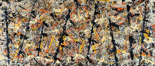
Eight dark uprights give Blue Poles its name, but its materials extend well beyond blue paint. Jackson Pollock made the canvas in 1952 with oil, enamel, aluminium paint and glass. It entered Australia's national collection in 1973, beginning a public life far removed from its earlier passage through American collections. [1]
The title arrived after the painting. It was shown at New York's Sidney Janis Gallery in November 1952 as Number 11, 1952. According to National Gallery of Australia curator Sarina Noordhuis-Fairfax, Pollock gave it the descriptive name Blue Poles two years later. [2]
At a Glance
This work across Jackson Pollock’s career
The Flame
c.1934–38The She-Wolf
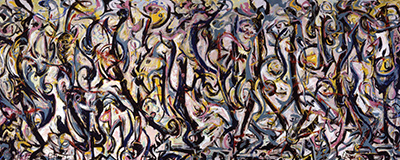
1943Mural
1943Alchemy
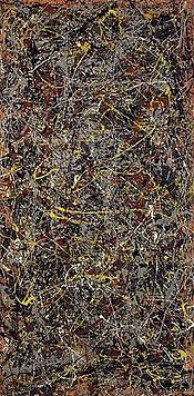
1947Number 1A, 1948
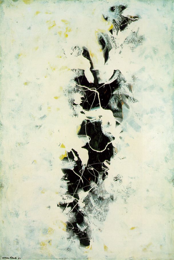
1948The Deep
1953White Light
1954Contents
- A wide canvas and eight uprights
- How the layers work
- Colour after the black paintings
- From private collections to a national argument
- Caring for different paints
A wide canvas and eight uprights
The National Gallery's record, supplied through Google Arts & Culture, gives the canvas dimensions as 212.1 × 488.9 centimetres. The framed measurements are 213.1 × 489.5 centimetres, with a depth of 6 centimetres and a framed weight of 99 kilograms. Those distinctions matter when imagining the object: its almost five-metre width belongs to a substantial canvas and frame, while the weight describes the framed assembly. [1]
Noordhuis-Fairfax identifies ultramarine, yellow, orange, white, cream, black and metallic silver. Wet paint sometimes mingled into marbling; other applications followed after drying. The silver's aluminium particles and the differing paint textures make the surface more various than a single tangled web. Pollock worked largely on the floor; a thin white layer ran when the canvas was temporarily upright. Drying left ripples in yellow and silver. [2]
The eight blue-black poles arrived late. A painted wooden edge was pressed against the canvas, and further cream, orange and black lines crossed the resulting marks. Their relatively regular spacing and alternating tilts give the swirling field a repeated beat. Trees or masts are possible associations, as Noordhuis-Fairfax suggests; the name leaves room for looking without identifying a literal forest. [2]
How the layers work
Conservator James Coddington's 1999 analysis helps explain how this busy painting was assembled. He describes a grey ground followed by early marks made in direct contact with the canvas. The initial paint appears to have been blue and yellow mixed before application. He also distinguishes campaigns devoted to separate colours, including orange and yellow, from the repeated returns to colours in earlier poured works. [3]
Coddington offers a particularly revealing example of the eye completing a form. The second pole from the right seems to pass beneath a substantial white pour, but the intervening blue section was never painted. Upper and lower marks are read as continuous. A perceived depth relationship can therefore arise through an unpainted interval, as well as through one actual layer covering another. [3]
Together, the early contact marks and the later wooden impressions show how much variety sits inside the familiar phrase “drip painting.” Touching, transferring and pouring offered different kinds of line; they could operate within the same canvas. [3]
Colour after the black paintings
Blue Poles belongs to a period when Pollock was reconsidering relationships between line, colour and recognisable imagery. MoMA describes Echo: Number 25, 1951 as a departure from his earlier poured paintings, with an economy of means and suggestions of figuration. Its museum label contrasts that economy with the multidirectional force of One: Number 31, 1950. The black paintings thus supplied another way to organise a canvas and let images emerge. [4]
The comparison is useful because it loosens a familiar sequence of expectations: dense coloured pouring, then black painting, then a supposed return to a previous manner. Each work makes different demands on attention. In Echo, MoMA draws attention to how much can be achieved through relatively economical black drawing; that provides a useful companion to the crowded colour and pronounced uprights of Blue Poles. [4]
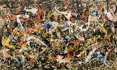
Convergence, also made in 1952, offers another route through this change. Buffalo AKG Art Museum explains that it began in black and white; Pollock added colour when dissatisfied with that beginning. Colour could become a means of revising a work already underway. The museum also records contemporary critical disagreement about whether he had succeeded. [5] Seen beside Blue Poles, that history makes 1952 a moment of active rethinking. Similar dates and an abundance of paint need not imply an identical sequence of decisions.
The exhibition history reinforces that sense of simultaneous exploration. Elizabeth Levine and Anna Indych's chronology records Pollock's move from Betty Parsons to Sidney Janis in 1952, with Blue Poles and Convergence exhibited that November. Their account places the black paintings in the preceding year and the markedly varied late works in 1953–54. These overlapping experiments are more illuminating than a division into sealed stylistic periods. [6]
The change of dealer had a practical background: Pollock was dissatisfied with slow sales. His first Janis solo exhibition ran from 10 to 29 November and contained twelve paintings from 1952. In February 1954, another Janis exhibition brought together works from 1953, including The Deep, Ocean Greyness and Portrait and a Dream. The crowded surface of Blue Poles was therefore one possibility within a changing body of work. Its particular combination of colour and uprights deserves attention on its own terms. [6]
From private collections to a national argument
The National Gallery's published provenance takes the painting from Pollock to Sidney Janis Gallery in 1952, then to Dr and Mrs Fred Olsen in 1955 and Mr and Mrs Ben Heller in 1957. The Australian National Gallery's Acquisitions Committee bought it from the Hellers through Max Hutchinson Gallery in July 1973. [1]
In his 2023 essay The Shock of the Old, critic Sebastian Smee describes Robert Hughes helping James Mollison facilitate the purchase from Ben Heller. The A$1.3 million price, then a record for an American artwork, became entangled with arguments about public spending under Gough Whitlam's government. Smee places the acquisition within a much wider collecting project: extensive purchases of Australian art accompanied the formation of an international collection. A foreign painting's conspicuous price could dominate discussion of what the national gallery was trying to become. [7]
An unusually personal trace of the dispute survives in the papers of Frances English of Manuka, Canberra. Angry about the purchase, English wrote to artists, writers and academics seeking support and signatures for a petition to the prime minister. The National Gallery acquired her papers at auction in 2012. Its introduction describes opinion among artists as divided, and the archive preserves responses associated with figures including Patrick White, Peter Sculthorpe and John Perceval. [8]
The presence of a correspondent's name in that archive does not by itself tell us whether they endorsed the petition. English's campaign and the varied responses belong to a larger public conversation, in which artistic judgement, cultural priorities and government expenditure met. The archive gives that conversation individual participants and a tangible survival beyond newspaper headlines. [8]
The painting's Australian journey also has several distinct dates. It was acquired in 1973, toured nationally in 1974 and preceded the National Gallery's opening in 1982. Conservator David Wise later recalled visitors sharing memories of that early encounter and of the acquisition itself. [9]
Caring for different paints
Wise's interview concerns work begun during the March 2020 lockdown and the following twelve months. He explained that cleaning proceeded by areas of colour because the paints responded differently. Earlier treatments, undertaken before the painting reached Australia, also affected decisions. Infrared and ultraviolet examination, paint cross-sections and pigment analysis informed the work. His account described good condition at that time; it is a historical treatment account. [9]
Wise also reported a thumbprint and handprints, while saying he could not confirm a footprint. Those traces add to the material history without establishing a forensic identification of the person who made them. His slow, colour-specific work shows why looking after this canvas requires attention to differences within its surface. [9]
Smee's broader argument returns us to the experience of painting. He questions the habit of treating monetary value as proof of artistic merit and advocates encountering Blue Poles among other works in a public gallery. The collecting debate remains part of its history, but the poles, intervals, colours and changing paint surfaces give the viewer something more particular to consider. [7]
Pollock artworks directory
Explore the distinct works discussed in these guides. This selection is not a complete catalogue. Green Silver and Untitled, 1949 are two guides to the same painting.
Discussion
Look again at the images and ideas explored in Blue Poles by Jackson Pollock. These editorial prompts invite your observations.
Reader Insights
Which detail in “A wide canvas and eight uprights” changes how you understand this work?
What comparison comes to mind after “How the layers work”?
What would you like to discuss about “Colour after the black paintings”?
Join the Conversation
Share a detail, comparison or question about Blue Poles by Jackson Pollock below.
References
- National Gallery of Australia, Blue poles, provider record on Google Arts & Culture, object details and provenance. View source.
- Sarina Noordhuis-Fairfax, “Blue Poles: How Pollock Created a Masterpiece”, National Gallery of Australia, materials, making and title history. View source.
- James Coddington, “No Chaos Damn It,” in Jackson Pollock: New Approaches, edited by Kirk Varnedoe and Pepe Karmel (MoMA, 1999), pp. 111–112. View source.
- The Museum of Modern Art, Echo: Number 25, 1951, object 241.1969, gallery label. View source.
- Buffalo AKG Art Museum, Convergence: Number 10, 1952, object K1956:7, collection interpretation. View source.
- Elizabeth Levine and Anna Indych, chronology in Jackson Pollock, Kirk Varnedoe with Pepe Karmel (MoMA, 1998), pp. 326–328. View source.
- Sebastian Smee, “The Shock of the Old”, National Gallery of Australia; first published in The Annual, 2023. View source.
- National Gallery of Australia, “Letters in Response: The Petition of Mrs Frances English, 1973”, introduction and catalogue captions. View source.
- David Wise, interviewed by the National Gallery of Australia, “Blue poles: a new perspective”, treatment following the March 2020 lockdown. View source.