


 by Tom Gurney
Tom Gurney BSc (Hons) is an art history expert with over 20 years experience
Published on June 19, 2020 / Updated on November 6, 2026
Email: tomgurney1@gmail.com / Phone: +44 7429 011000
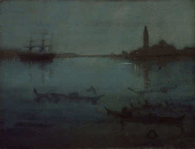
The Museum of Fine Arts' Nocturne in Blue and Silver: The Lagoon, Venice appears dark, making looking feel gradual. A large sailing vessel stands on the left, San Giorgio Maggiore rises on the right, and several gondolas lie across the foreground water. At first these elements appear as interruptions within blue-green dusk. Then masts, lamps, figures, reflections and the church's campanile begin to separate. The painting does not withhold Venice completely; it makes recognition take time.
Whistler painted the work during his only extended stay in Venice, from September 1879 to October 1880. The Museum of Fine Arts, Boston, records it as an oil on canvas measuring 50.16 by 65.4 centimetres, accession 42.302. Its current title joins musical form, colour and place. `Nocturne` proposes an arrangement for evening; `Blue and Silver` names a tonal relation; `The Lagoon, Venice` fixes a real body of water.[1][2]
The canvas is materially more complex than its quiet surface first suggests. Museum examination found thin washes on coarse cloth, a started painting on the reverse and the possibility that Whistler chose the rougher, unprimed face for the finished scene. Successive veils sank differently into the warp and weft, creating faint colour variations that can disappear in a small reproduction. Rubbing softened the boats, figures and buildings without removing their geographical structure.[3][5]
The painting also has a close companion in another medium. Whistler's etching and drypoint Nocturne, catalogue number 222 / K.184, presents the same prospect in reverse. Its nine states and varied plate tone reveal a different route towards atmosphere. The oil uses absorbent colour; the print uses line, burr and residual ink. Comparing them makes clear that softness was not vagueness imposed upon an unknown site. It was a set of choices remade for each material.[2][8]
At a Glance
- CatalogueYMSM 212 / MFA Boston 42.302
- Date1879–80
- SubjectSouth-east across the Bacino towards San Giorgio Maggiore
- MediumOil on coarse-weave canvas
- Dimensions50.16 × 65.4 cm (19 3/4 × 25 3/4 in.)
- SignatureButterfly cartouche lower right; title and artist on reverse
- Related printNocturne 222 / K.184, same prospect reversed
- Current frameAmerican Whistler-style slope, circa 1904; original unknown
- CollectionMuseum of Fine Arts, Boston; Emily L. Ainsley Fund
- DisplayHenderson Gallery 228 on 26 August 2026; verify current status
Contents
- Object record at a glance
- A scene that emerges slowly
- Scale, distance and reproduction
- The Venetian site
- Venice after bankruptcy
- What the title does
- A coarse canvas used deliberately
- Thin veils and hidden colour
- Atmosphere is not an absence of work
- The same prospect in reverse
Object record at a glance
The work is YMSM 212 in the University of Glasgow catalogue raisonné and 42.302 at the Museum of Fine Arts, Boston. Both records give the date as 1879–80, the medium as oil on canvas and the dimensions as 50.16 by 65.4 centimetres, or 19 3/4 by 25 3/4 inches. The MFA credit line is Emily L. Ainsley Fund.[1][2]
A butterfly cartouche appears at lower right. The MFA also records a title and artist inscription on the reverse: `Nocturne Blue & Silver/The Lagoon Venice—/by J. McNeill Whistler—`. YMSM's compact header says `Inscription: none`, meaning no separate recto inscription beyond the signature. The two records can be reconciled without pretending that the verso wording is absent.[1][2]
The current surround is an American-made Whistler-style slope frame dated to about 1904, with a recorded moulding width of 10.8 centimetres. It should not be treated as a design executed by Whistler for the canvas. The original frame's style and location were already unknown in 1903. This is quite different from The Gold Scab, whose repurposed historical frame is integral to its documented meaning.[3]
On 26 August 2026, the MFA marked the painting on view in the Robert P. and Carol T. Henderson Gallery, Gallery 228. That is a current display fact, not a permanent property. The museum's object identity, accession and measurements remain stable even when the painting moves.[1]
A scene that emerges slowly
The horizontal canvas is divided by a low, broken strip of shore and architecture. Sky occupies slightly less than the upper half; water opens beneath it and darkens towards the viewer. Because the tonal range is compressed, the usual landscape separation between atmosphere, distance and foreground is weakened. The eye must assemble depth from interruptions rather than from bright recession or sharp perspective.[2][5]
At the left, a three-masted vessel creates the densest mass on the horizon. Its hull is almost black against the water. The spars and rigging are scarcely more than vertical and diagonal threads. A handful of warm lights gather nearby, each producing a short, narrow descent. The ship is readable because those sparse marks cooperate, not because Whistler describes deck, sail and tackle.[2]
San Giorgio Maggiore answers the vessel from the right. Its campanile rises as the painting's strongest architectural vertical; the church's dome and adjoining buildings settle into a lower dark shape. A broken reflection falls below them. Whistler suppresses masonry, windows and ornament but preserves enough proportion to make the island unmistakable.[2][7]
The centre between ship and church is comparatively open. Low land, perhaps the distant Lido and intervening shore, stretches through the blue-green interval. Small lights puncture this band without forming a continuous illuminated frontage. The space feels wider because neither major silhouette occupies it. Ship and tower act like unequal posts holding the scene apart.
Several gondolas drift across the nearer water. One at lower left almost disappears into the darkened surface. A longer central craft contains tiny upright or seated forms. A broad right-hand gondola merges with foreground shadow, its bow and figure only intermittently distinct. Human presence is registered through boat, posture and scale rather than portrait detail.[1][2]
There is no moon and no central flare. Illumination is distributed through close tonal changes, minute lamps and the greater openness of the distant water. This matters because `silver` is not simply a patch of white pigment. It names the cool intervals that allow blue-green darkness to carry light without becoming a daytime scene.
Scale, distance and reproduction
At 50.16 by 65.4 centimetres, the canvas is neither a pocket-sized oil sketch nor an engulfing panorama. Its width permits the ship, open basin and church to remain separate, while its moderate height keeps the horizon, gondolas and reflections within one field of vision. The dimensions also approximate a standard French `toile de 15`. Whistler worked inside a recognisable commercial support format even as he used that support in an unusual way.[1][3]
Scale affects what the painting asks from a viewer. Seen from across a gallery, the vessel and campanile provide the first usable co-ordinates. The smaller boats and lamps register later because their values lie close to the surrounding water. Moving nearer does not simply reveal more represented detail. It makes the canvas threads, broken colour and rubbed transitions increasingly prominent, so that the material used to picture the lagoon begins to compete with the lagoon itself.[3][5]
This shift distinguishes the work from a view built around a single climax. No one highlight explains the whole canvas. The left-hand lights are too small, the church too dark and the gondolas too dispersed to function as an isolated centre. Attention instead passes among separated signs: a mast, a tower, a warm fleck, a short reflection, a boat's edge. The painting's moderate dimensions keep those signs close enough to be related without compressing them into one emblem.
Digital reproduction alters that balance. A small screen image tends to merge adjacent dark tones, regularise the blue-green field and reduce the weave to noise. Enlarging the file can disclose the grid of the cloth, but it cannot reproduce the way raised and recessed threads receive light in front of the actual object. Nor can a photograph make a viewer change position between the distant image and the near surface. The 800-by-623 catalogue study file is therefore useful for checking composition and exposed edges, but it is not a substitute for the painting's physical alternation between scene and textile.[2][3]
The local 400-by-307 image adds a second distortion by cropping portions of the canvas edges. That loss matters because the thinly painted field reaches the perimeter and because the full rectangle helps establish the proportions of the French-format support. The crop still identifies the correct work, yet it weakens any account of how the image meets its boundary. A better reproduction would improve study only if its full-object fidelity and reuse rights were both documented.[1][2]
Darkness also makes condition especially easy to misread in reproduction. A low-contrast file can be mistaken for faded paint, discoloured varnish or photographic underexposure. The locked technical record supplies no treatment chronology and does not authorise any of those diagnoses. What it does establish is intentional thinness, a coarse and possibly ungrounded painted face, superimposed veils and rubbing. Those findings explain much of the muted appearance without turning every difficult passage into damage.[3][5]
The most responsible way to look is therefore double. From a distance, follow the topographical structure that holds ship, water and San Giorgio together. At closer range, notice how colour inhabits the cloth rather than sitting uniformly above it. Neither view cancels the other. The painting remains a Venetian site when the weave becomes visible, and the weave remains an active construction when the site coheres.
The Venetian site
The view looks south-east across the Bacino, the basin beside the entrance to the Grand Canal. Alastair Grieve's site identification, adopted by YMSM, places the observer on the north side of that entrance. The Public Gardens lie towards the left, the Lido appears in the distance and San Giorgio Maggiore anchors the right.[2][7]
The MFA describes the scene more generally as painted from the Piazzetta near the Royal Gardens. These formulations identify the same waterside zone without proving one exact place where Whistler set down the canvas. The orientation is secure because the church, campanile, ship and island line form a recognisable prospect. The precise paving stone is not.[1][7]
Whistler's reduction does not detach the painting from topography. The vessel and tower retain different vertical rhythms; San Giorgio stands across the basin rather than beside the viewer; gondolas occupy the open water; and the low Lido lights preserve the distance beyond. Atmosphere changes the visibility of the site but does not replace it with an invented lagoon.
The current MFA text invokes Lord Byron's description of Venice as a “fairy city of the heart”, from canto 4 of Childe Harold's Pilgrimage. The phrase suits the city's hovering appearance here, but it remains a museum's literary comparison. No locked document shows Whistler selecting that stanza as the painting's programme.[1][12]
This distinction helps resist a familiar habit of treating Venice as automatically poetic. The painting does not derive its force from the city's name alone. It reorders a specific view through darkness, scale and surface. San Giorgio's recognisability makes the surrounding loss of detail more consequential than it would be in a wholly imaginary harbour.
Venice after bankruptcy
Whistler arrived in Venice in September 1879 following bankruptcy and the aftermath of his libel action against John Ruskin. The Fine Art Society had commissioned a set of etchings, offering a professional assignment at a moment when the artist's London property and finances had collapsed. He remained until October 1880, far longer than the brief working visit initially envisaged.[1][14]
The commission concerned prints, not this oil. MFA's overview notes that Whistler produced more than fifty Venetian etchings, around ninety pastels and only a few oil paintings during the stay. The Lagoon therefore belongs to the same campaign of looking but was not one of the twelve contractual plates. It occupied a more private and uncertain position in his output.[1][2]
In April 1880 Whistler told Matthew Robinson Elden that he hoped to bring back a large painting. YMSM refuses to attach that statement securely to this canvas. It could concern Nocturne: Blue and Gold—St Mark's, Venice, YMSM 213, or the missing portrait A Gondolier, YMSM 216. Describing YMSM 212 as the promised `large painting` would turn a possibility into a false identification.[2][14]
YMSM also raises the possibility that Whistler left the nocturne in Venice with William Graham. A later letter thanks Graham for caring for paintings left there and calls them beginnings. The catalogue's wording is deliberately cautious: it is `just possible` that this was among them. The letter does not provide a title or an unbroken custody record.[2][14]
Nor does `beginnings` settle the painting's status. Whistler may have been describing canvases at an earlier moment or speaking collectively. YMSM 212 bears his butterfly, entered the market as an autonomous work and was exhibited after his death. Its thinness and soft forms must be understood through material examination rather than treated as proof that he simply stopped too soon.
The wider Venice history—including Whistler's lodgings, expatriate companions, pastels and disputes with the Fine Art Society—belongs to the dedicated WHIS012 article. Here those events matter only where they explain the date, the parallel print project and the oil's uncertain early custody.
What the title does
The title known today did not appear in exactly this form during Whistler's life. At the Hôtel Drouot sale in 1903, the canvas was called Nocturne à Venise: l'église de Saint-George-Majeur. That name foregrounded the identifiable church. At the Copley Society memorial exhibition in 1904 it appeared as Nocturne in Blue and Silver “The Lagoon”—Venice. YMSM's accepted title descends from the Boston wording.[2][4]
The variants do not describe different works. They change the order in which a viewer approaches this one. The Drouot title begins with Venice and San Giorgio. The current title begins with musical and chromatic categories before arriving at lagoon and city. Both are defensible because Whistler kept enough site structure to support the former while organising colour and interval strongly enough to support the latter.
`Nocturne` had musical associations before Whistler adopted it for painting. In his titles it directs attention away from story and towards an evening arrangement of line, form and colour. It does not mean that every night picture is calm, or that the viewer should imagine one specific composition by Chopin playing behind the canvas. The word establishes analogy rather than a soundtrack.
`Blue and Silver` likewise resists symbolism. The inherited webpage claimed that blue represents calm and, in mythology, the gods. Nothing in the object record supports those meanings. The words describe a controlled field in which greenish blue, grey, near-black, warm specks and exposed texture are brought into relation. The title asks how these notes work together, not what one colour means in isolation.
The final phrase, `The Lagoon, Venice`, prevents aesthetic vocabulary from dissolving geography. It identifies water and city without imposing an anecdote. Musical form and named site coexist, which is why a close reading needs both surface and map.
A coarse canvas used deliberately
The support approximates a French `toile de 15`, about 50 by 65 centimetres. It has a coarse weave, visible even in the catalogue photograph. Rather than burying that texture beneath a smooth preparatory structure and thick paint, Whistler allowed it to participate in the image.[3]
Sandra Kelberlau, an MFA paintings conservator, examined the object in 2007. The reddish-brown colour visible at the tacking margins is not a normal ground layer. She considered it possible that the painted face has no separate ground at all. On the other side of the cloth there is a ground and the beginning of another painting.[3][6]
This physical sequence suggests, without proving, a studio decision. Whistler may have rejected or set aside the first beginning, turned the canvas and chosen the rougher face for the nocturne. He may then have coated that unprimed side with dilute oil paint. The distinction between finding and reconstruction is crucial: the reverse painting and layer relationships are observed, while the exact moment and motive of flipping the support are inferred.[3][6]
Why prefer the rough face? Kelberlau's account proposes that the primed side may have been too smooth for the effect Whistler wanted. Raised threads and recessed interstices offered a structure that dilute colour could occupy unevenly. The canvas was not a passive carrier. Its resistance and absorbency helped produce the image.[3][6]
This object-specific evidence corrects the inherited recipe, which asserted that Whistler thinned oil with copal and turpentine. The locked examination identifies thin oil applications and their behaviour but does not establish that formula for YMSM 212. A generic studio anecdote cannot override what the canvas itself permits researchers to say.
Thin veils and hidden colour
The paint is arranged in thin layers. Kelberlau observed that a second application is thinner than the lower one, so it settles into the weave's hollows while exposing underlying colour across the raised nubs. This alternating visibility contributes to shimmer. The effect depends upon physical depth measured in threads and films rather than a broad painted highlight.[3][6]
Marc Simpson describes varying blue-grey veils across a rough, absorbent support. According to the technical evidence he reports, these mixtures draw upon the three primary colours with black and white. Green, red and warmer particles therefore remain active inside a surface that a reproduction may compress into dark blue. The painting is muted without being monochrome.[5]
At normal viewing speed, the eye can miss this dispersed colour. Darkness seems to come first; only afterwards do small differences in the warp and weft register. Simpson uses that latency to explain how space, object and void can remain present without firm contours. The material invites a form of attention that resembles the scene's own gradual emergence.[5]
Whistler also smoothed and rubbed down passages. Gondolas, people, shipping and church consequently lose hard edges and appear to rise from enveloping darkness. Softness is thus not only a representation of mist. It is produced by working paint against the cloth until signs of the object and signs of the gesture are both subdued.[3]
This process leaves little virtuoso display. There are no conspicuous knife ridges and few emphatic strokes calling attention to their speed. Simpson contrasts the picture with advanced painting that made touch itself a spectacle. Here, handling becomes difficult to reconstruct from a distance, even though the unusual support and layered preparation reveal careful decisions.[5]
The scarcity of bright focal points adds to that reticence. Tiny lamps do not command the composition; they reward proximity and patience. The church, ship and boats are dark presences rather than illuminated subjects. Whistler makes the act of finding them part of the painting's temporal structure.
Atmosphere is not an absence of work
Soft edges can encourage a false opposition between exact labour and effortless mood. The canvas resists it. Choosing a coarse surface, perhaps rejecting the primed face, adjusting dilute layers and rubbing forms down are material actions. Their success depends upon not looking laborious.[3][5]
The phrase `like breath on glass`, associated with Whistler's ideal of thin paint and used for the Clark Art Institute's 2008 exhibition, captures the appearance of transience. Yet breath seems instantaneous, while this object records sequence. One side contains an abandoned beginning; the other carries nested layers and later smoothing. Apparent arrival without touch was constructed.[5][13]
Nor is darkness merely a lack of information. It distributes information differently. The campanile is precise enough to orient the view, but not detailed enough to dominate it as an architectural portrait. A gondola can establish scale while remaining close to water in value. A lamp can locate a shore through a speck and a short reflection. Each sign does more because it is surrounded by near-equivalent tones.
Conservation history is recorded as unknown. The present appearance cannot be linked confidently to a named cleaning, lining or varnish campaign. The exposed outer edges visible in the catalogue image should not be diagnosed from a digital file. Object description can acknowledge them without inventing damage or treatment.[3]
The current circa-1904 frame also belongs to the painting's later presentation rather than its Venetian making. Its Whistler-like slope may have helped the 1904 memorial exhibition place the nocturne within an established visual identity. Because the original surround is unknown, no stronger reconstruction is warranted.
The same prospect in reverse
Whistler's Nocturne, etching 222 / K.184, shows essentially the same Bacino view. A large anchored ship opposes San Giorgio Maggiore; gondolas and reflections occupy the water. Printed from a copper plate, the composition appears reversed relative to the site and the oil. That reversal is a normal consequence of printmaking, not evidence that one image has been misidentified.[2][8][9]
The plate dates from 1879–80 and measures approximately 202 by 294 millimetres. Whistler published it in the First Venice Set in 1880. Nine states survive before cancellation. The long development gives the print a visible history of revision unlike the oil's hidden layers.[8]
Whistler began with etched lines, then added and removed drypoint details. Gondolas entered in the fifth state, strengthening spatial scale. Fine horizontal and diagonal marks changed the sky, water and reflections around the vessel and campanile. Drypoint wore as impressions were taken, so the plate itself altered across printing.[8]
Atmosphere also came from ink left on the copper surface. Horizontal wiping could suggest water and darkening sky; heavier or differently directed tone could make another impression seem nocturnal or sunset-like. The University of Michigan, Metropolitan Museum and Frick records each emphasise how line and surface ink share responsibility for the damp, indistinct scene.[9][10][11]
The comparison clarifies the oil. On canvas, darkness is built through absorbent veils sinking around the weave. In print, it is built through the relation of fixed lines, fragile burr and variable plate tone. Both keep ship and tower in counterpoise, but neither is a mechanical translation of the other.[3][8]
Their public histories diverged as well. The etching was displayed with the First Venice Set in 1880 and provoked debate about `artistic printing`. The oil remained outside lifetime exhibition. Audiences encountered the printed version of the view decades before the painting entered a documented public show.[4][8]
That distinction is why the print remains a focused comparator rather than a substitute illustration. WHIS013 explains the Venice Sets, states and printing in full. For YMSM 212, K.184 matters because it exposes Whistler solving the same spatial problem through another material and because its reversal confirms the site's organisation.
A painting withheld from lifetime exhibition
YMSM states that the oil was not exhibited during Whistler's lifetime. That fact separates it from many famous nocturnes shaped by hostile reviews, the Ruskin trial or Whistler's own exhibition design. For more than twenty years after Venice, its history is instead tied to uncertain custody and the artist's Paris studio.[4]
Carmen Rossi had the painting by about 1898–1902. Rosalind Birnie Philip, Whistler's sister-in-law and executrix, later alleged that Rossi had `extracted` it from the studio. The MFA uses the more neutral phrase `taken from the artist's studio` and directs readers to the catalogue raisonné. Neither wording constitutes proof of theft.[1][4]
Rossi had modelled for Whistler over many years. She was suspected of removing drawings and paintings, but the allegation was not proved. Whistler did not successfully recover this canvas or secure action against the dealers handling works associated with her. The article must therefore separate documented possession and sale from the family's accusation.[4]
This is not a marginal issue. If the painting was a finished work deliberately entrusted to Rossi, its early history has one character; if it remained studio property removed without consent, it has another. The evidence fixes neither version completely. Responsible provenance retains the uncertainty rather than choosing the more dramatic story.
From Hôtel Drouot to Boston
After Whistler's death, Rossi consigned the painting to Hôtel Drouot in Paris. It was lot 1 on 25 November 1903 under the title naming the church of San Giorgio Maggiore. William Stephen Marchant bought it for the American collector Richard Albert Canfield. YMSM records the price as 18,500 francs.[1][4]
The following year it appeared in the Copley Society's Boston memorial exhibition as catalogue number 67. This was its first documented public exhibition, and the title used there supplied the basis for the one now accepted. A Venetian oil that had remained outside Whistler's lifetime displays entered public history in an American commemoration.[2][4]
Canfield sold the work to M. Knoedler & Co. in February 1914. The dealer recorded it as stock number 13431 and sold it the next month to Anna Blaksley Barnes Bliss. In 1935 it descended to her daughter, Mildred Barnes Bliss of Dumbarton Oaks.[1][4]
Mildred Bliss sold the painting to the Museum of Fine Arts in 1942 for $9,000. The museum accessioned it on 9 June using the Emily L. Ainsley Fund. This post-1903 sequence is considerably firmer than the Rossi episode, supported by sale, dealer and museum records.[1][4]
The painting later appeared in exhibitions at Buffalo in 1911, Knoedler in 1914, New London in 1949 and major Whistler surveys. A list of every loan adds less than the decisive sequence: no lifetime exhibition, memorial emergence in 1904, American private collections and entry into the MFA in 1942.
The present image and the inherited page
The existing website reproduces the correct painting, but its JPEG is only 400 by 307 pixels and crops portions of the canvas edges. An 800-by-623 YMSM study image preserves the full rectangle and makes the rough support easier to see. The catalogue limits its digital reproduction to personal use, while the MFA page separates download from licensing. A future image replacement requires explicit reuse terms rather than an assumption that a visible file is freely publishable.[1][2]
The inherited 393-word article cannot be repaired sentence by sentence. It begins with an irrelevant Van Gogh quotation, misspells Whistler's name, assigns unsupported divine and psychological symbolism to blue, claims certainty about direct on-site painting and gives an unverified copal-and-turpentine recipe. It also treats all nocturnes as exercises in tranquillity and ends with a meaningless statement about works being randomly distributed among museums.
Some factual fragments point in the right direction: San Giorgio is visible, the palette is reduced, Byron supplies the phrase used by the MFA, the title is musical and Japanese art informed Whistler's broader spatial thinking. Those points return here only through independent museum and catalogue sources. None of the inherited prose is retained.
The route itself is sound. It is a live standalone page with a correct canonical URL, sitemap membership and an identity-valid local image. Later implementation should preserve those structural elements while replacing the prose, improving title punctuation and using a better reproduction only if its rights are documented.
Why the nocturne matters
Nocturne in Blue and Silver: The Lagoon, Venice makes disappearance an active method. Whistler does not erase San Giorgio, ship, Lido, lamps or gondolas. He gives each the minimum contrast needed to participate in a broad relation of sky and water. Recognition arrives through accumulated small differences.
Material evidence explains how. The rough weave may have prompted Whistler to reverse a previously started canvas. Dilute paint settled into recesses and caught on raised fibres. Another veil altered that relation. Rubbing softened the named things until the brushwork ceased to advertise itself. The resulting surface is quiet because its labour has been redirected into texture and interval.[3][5][6]
The related etching shows that this was not one accidental effect. In copper and ink, Whistler reversed the view, revised it through nine states and varied its atmosphere through plate tone. Ship and campanile still balance one another; boats still establish scale; water and air still approach equality. Different processes arrive at related forms of uncertainty.[8][9]
Its provenance adds another kind of incomplete visibility. The oil was not exhibited while Whistler lived. Carmen Rossi's possession is secure, while the accusation about how she obtained it is not. From the 1903 sale onward, the record becomes clearer, carrying the work through Canfield, Knoedler and the Bliss family to Boston.[1][4]
The painting's darkness therefore contains no simple mystery. It is a precisely located view, a physically investigated surface, a private Venetian oil beside a public print, and an object whose early ownership resists final resolution. Its blue and silver do not make Venice timeless. They make the viewer experience how slowly a place, a process and a history can come into focus.
Discussion
How does a nearly dark image remain geographically exact?
Locate the ship, San Giorgio, gondolas and small lights, then follow how coarse weave, thin veils and rubbed contours turn site-specific observation into a slow optical experience.
Reader Insights
How do the ship and campanile balance the open centre of the Bacino?
What appears only after the eye adjusts to the layered blue-grey darkness?
How does the related reversed etching construct atmosphere differently?
Join the Conversation
Share a close observation or an object-history question.
References
- Museum of Fine Arts, Boston, “Nocturne in Blue and Silver: The Lagoon, Venice”, accession 42.302, current object record, checked 26 August 2026, https://collections.mfa.org/objects/32837.
- Margaret F. MacDonald and Grischka Petri, “YMSM 212: Nocturne in Blue and Silver: The Lagoon, Venice”, The Paintings of James McNeill Whistler: A Catalogue Raisonné, University of Glasgow, 2020, main, date and subject records, https://whistlerpaintings.gla.ac.uk/catalogue/display/?mid=y212.
- Margaret F. MacDonald and Grischka Petri, “YMSM 212: Technical Description”, The Paintings of James McNeill Whistler: A Catalogue Raisonné, University of Glasgow, 2020, https://whistlerpaintings.gla.ac.uk/catalogue/names/display/?mid=y212&xml=tec.
- Margaret F. MacDonald and Grischka Petri, “YMSM 212: History and Bibliography”, The Paintings of James McNeill Whistler: A Catalogue Raisonné, University of Glasgow, 2020, https://whistlerpaintings.gla.ac.uk/catalogue/printdisplay/?mid=y212.
- Marc Simpson, “Whistler, Modernism, and the Creative Afflatus”, in Marc Simpson, ed., Like Breath on Glass: Whistler, Inness, and the Art of Painting Softly (Williamstown: Sterling and Francine Clark Art Institute; New Haven: Yale University Press, 2008), pp. 24–51.
- Sandra Kelberlau, Museum of Fine Arts, Boston, examination of YMSM 212, 2007, findings published by Simpson and transcribed in the YMSM 212 technical record.
- Alastair Grieve, Whistler's Venice (New Haven and London: Yale University Press, 2000), p. 170, pl. 220.
- Margaret F. MacDonald, Grischka Petri, Meg Hausberg and Joanna Meacock, “Nocturne”, catalogue 222 / K.184, James McNeill Whistler: The Etchings, a Catalogue Raisonné, University of Glasgow, 2012, https://etchings.arts.gla.ac.uk/catalogue/etchings/etchlist/?catno=K184.
- Metropolitan Museum of Art, “Nocturne”, 1879–80, accession 17.3.77, https://www.metmuseum.org/art/collection/search/337065.
- University of Michigan Museum of Art, “Nocturne, from the ‘Twelve Etchings’ or the ‘First Venice Set’”, 1954/1.372, https://umma.umich.edu/objects/nocturne-from-the-twelve-etchings-or-the-first-venice-set-1954-1-372/.
- The Frick Collection, “Nocturne”, Gertrude Kosovsky Collection, https://www.frick.org/exhibitions/whistler_printmaker/208.
- Lord Byron, Childe Harold's Pilgrimage, canto 4, stanza 18, digital text, Project Gutenberg, https://www.gutenberg.org/ebooks/5131.
- Sterling and Francine Clark Art Institute, Like Breath on Glass: Whistler, Inness, and the Art of Painting Softly, exhibition and catalogue, 2008, https://www.clarkart.edu/.
- University of Glasgow, The Correspondence of James McNeill Whistler, letters GUW 12816 and GUW 11612, https://whistler.arts.gla.ac.uk/correspondence/.


