



 by Tom Gurney
Tom Gurney BSc (Hons) is an art history expert with over 20 years experience
Published on June 19, 2020 / Updated on November 6, 2026
Email: tomgurney1@gmail.com / Phone: +44 7429 011000
Overview
James McNeill Whistler's paintings are best understood as a changing body of experiments rather than a procession towards one mature style. He could use thick, strongly separated colour in an early portrait, build a crowded Thames interior, set a white dress against a pale curtain, reduce a bridge to a shadow across evening water, or suspend a full-length sitter within a narrow field of grey. The restricted harmonies for which he became famous emerged from those earlier material and spatial problems. They did not replace them with a single formula. [1][4]
The University of Glasgow's online catalogue raisonné includes about 550 oil paintings and connects them to more than 1,700 works on paper. Its structure is unusually valuable because it does not stop at a title, date and thumbnail. Entries examine how a title arose, why a date is accepted or disputed, who or what is represented, how the paint and support were handled, what conservation changed, which frame belongs to the object, and how provenance, exhibitions and publications developed. [1][2]
That evidence matters particularly for Whistler. He repeatedly altered paintings, retitled them, reused supports and adjusted frames or signatures long after a first campaign of work. Several nocturnes carried similar names at different exhibitions. A Valparaiso canvas that began as a daylight subject was later changed into a night scene. A portrait might remain in the studio for years and be scraped, rubbed down or repainted. The picture visible now may also bear the consequences of lining, cleaning, abrasion and later framing.
This page follows the development of the paintings and offers a way through their major groups. It does not rank a fixed list of masterpieces or compress forty-four separate object histories into captions. Each painting page will address its own identity, image, provenance, condition and reception. Here the aim is to show how Realist observation, Japanese compositional ideas, musical naming, portraiture, the nocturne and an exacting concern with display interact across the career.
At a Glance
- CatalogueAbout 550 oil paintings [1]
- Catalogue prefixYMSM
- Early focusDomestic interiors and the working Thames
- White symphoniesDeveloped across the 1860s [1][8]
- NocturnesThames, Cremorne, Valparaiso and Venice
- PortraitsSitters translated into tonal arrangements
- SupportsCanvas, panel and other prepared surfaces [15]
- DisplayFrames, wall colour and spacing formed part of the work
- Key centresLondon, Paris, Venice and coastal Europe
- Primary catalogueUniversity of Glasgow [1]
Contents
- What the Catalogue Establishes
- Early Paintings: Learning Through Difference
- The Working Thames and Realist Observation
- The White Paintings
- Japanese Art, Chinese Porcelain and Staged Interiors
- Decorative Projects and the Ambition of a Total Setting
- Portraiture as Negotiation
- Anna Whistler and the Two Grey-and-Black Arrangements
- The Nocturnes: Memory, Paint and the Modern River
- Valparaiso: A Picture Can Change Its Time of Day
What the Catalogue Establishes
The initials YMSM identify the numbering inherited from Andrew McLaren Young, Margaret F. MacDonald, Robin Spencer and Hamish Miles's 1980 catalogue of Whistler's paintings. The Glasgow digital catalogue retains that continuity while revising entries when evidence changes. A YMSM number is therefore more dependable than a shortened popular title. It distinguishes objects that exhibition catalogues, dealers or websites may call by nearly identical names. [1][2][3]
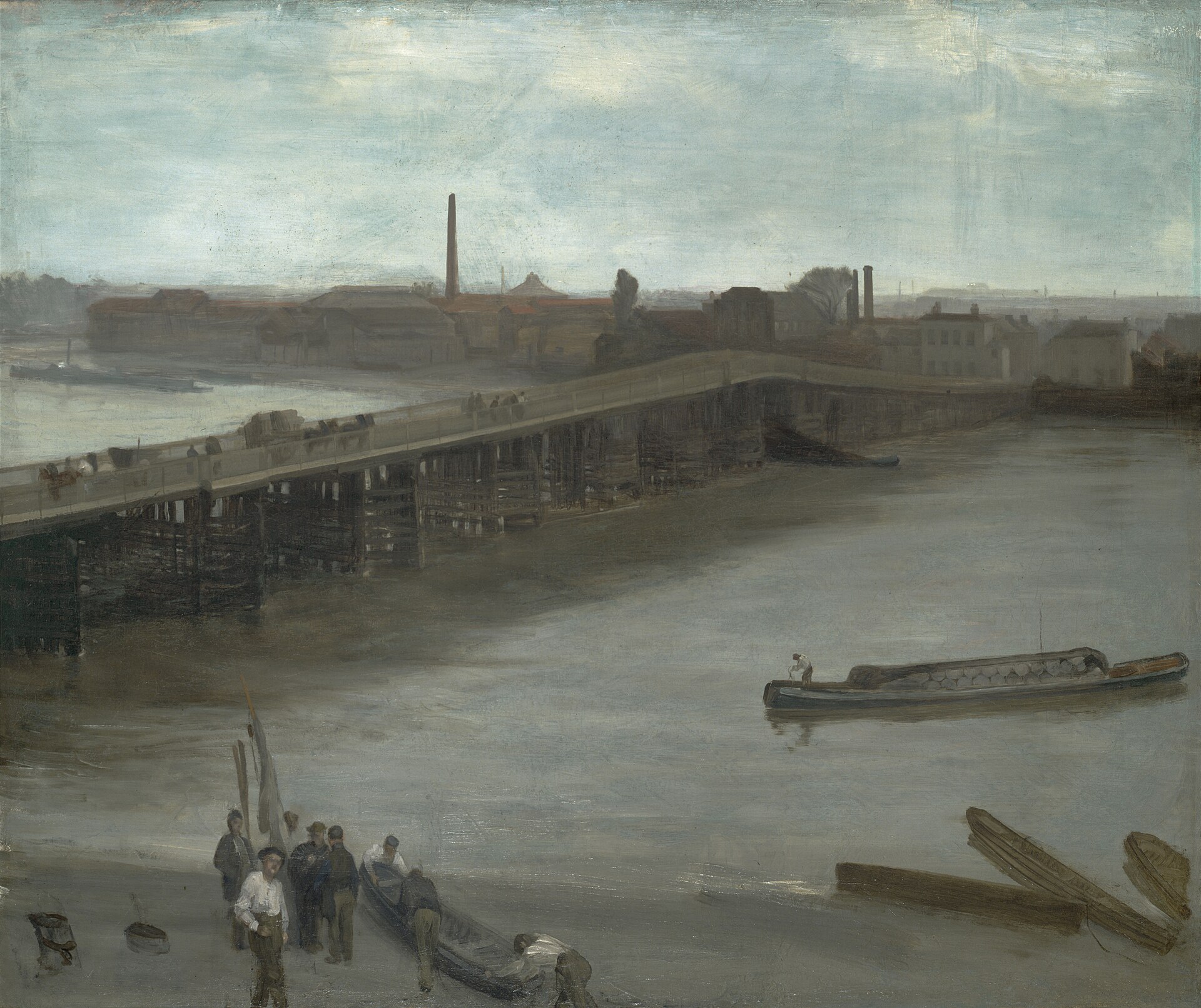
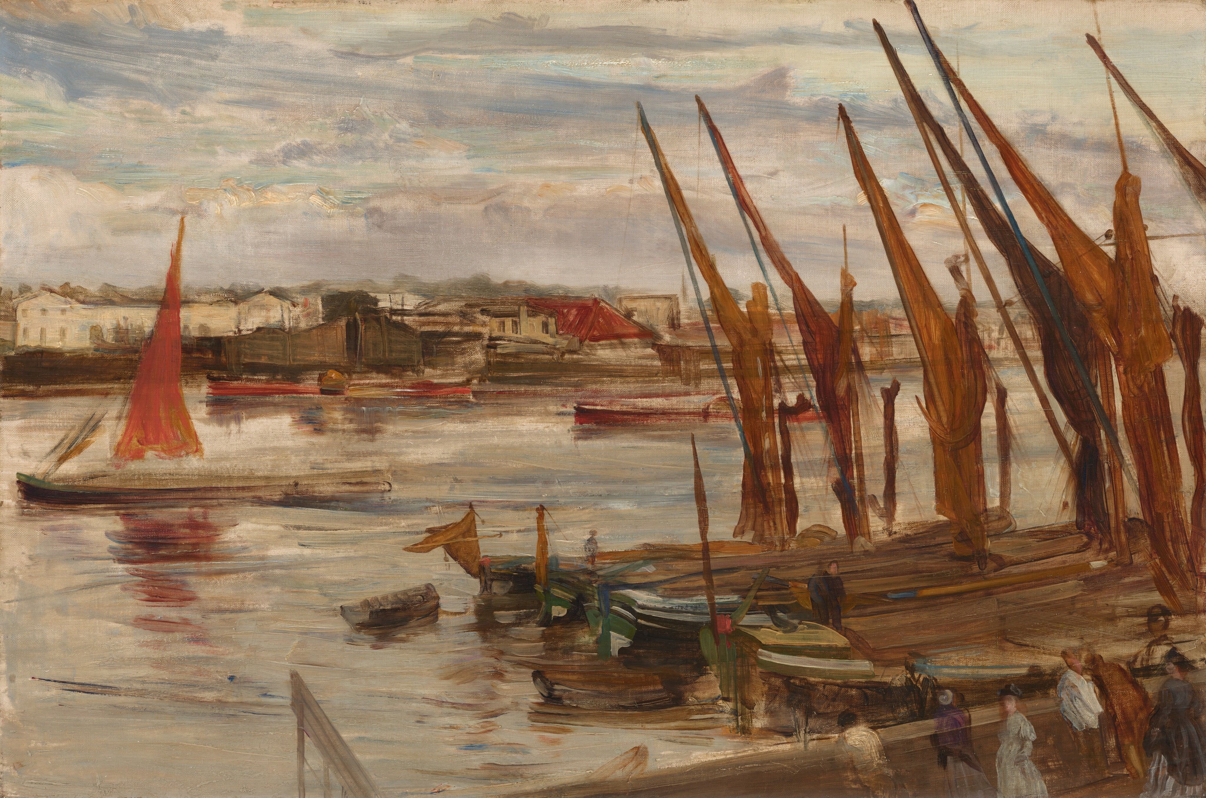
This is not a minor cataloguing problem. Brown and Silver: Old Battersea Bridge is YMSM 033, an early river painting now at the Addison Gallery of American Art. Nocturne: Blue and Gold—Old Battersea Bridge is YMSM 140, a later, much more reduced canvas at Tate. A generic “Old Battersea Bridge” label can collapse different dates, formats, holders and pictorial purposes into one famous image. The catalogue number prevents that error before interpretation begins. [1][10]
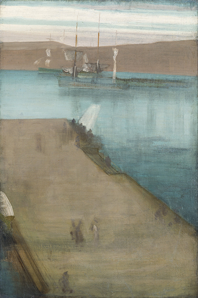
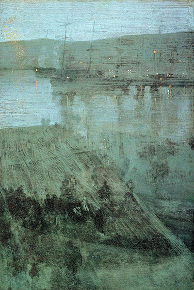
The same control is needed at Valparaiso. YMSM 074 is an upright 1866 study now in the Smithsonian American Art Museum, preferred as Sketch for “Nocturne in Blue and Gold: Valparaiso Bay”. YMSM 076 is the larger related canvas at the Freer Gallery of Art, begun in 1866 and reworked into a nocturne during the 1870s. The familiar local title “Valparaiso Harbor” applies to the study as a historical variant; it does not turn the two objects into duplicate reproductions. [1][7]
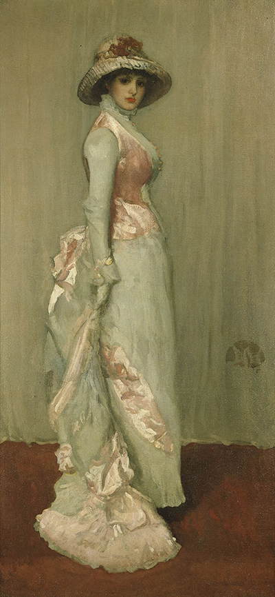
Catalogue entries also record works that are lost, destroyed, rejected or duplicated. That prevents a list of titles from implying that every named painting survives in an accessible collection. It can also correct identities built from old photographs. Whistler painted three portraits of Lady Meux: YMSM 228 in black, YMSM 229 in pink and grey, and the lost or destroyed fur portrait YMSM 230. The local page image corresponds to YMSM 229 at the Frick, not simply to any work called Portrait of Lady Meux. [1][13]
A digital catalogue remains open to correction. New provenance can emerge, a work can change ownership, conservation can reveal an earlier image and a title can be clarified through correspondence. The practical rule is simple: start with the current catalogue and current holder, then read older books and exhibition records as historical evidence rather than automatically superior authority.
All 50 Whistler Paintings in This Guide
Browse every Whistler painting covered in this artist guide.
Early Paintings: Learning Through Difference
Whistler's earliest surviving oils do not announce the subdued palette of the nocturnes. They show an artist testing copies, portraits, genre subjects, landscape and different degrees of finish. The catalogue begins before his permanent move to Europe and traces work made around the military and artistic training described in his biography. These early objects matter because they prevent hindsight from turning every brushstroke into a prediction. [1][3]
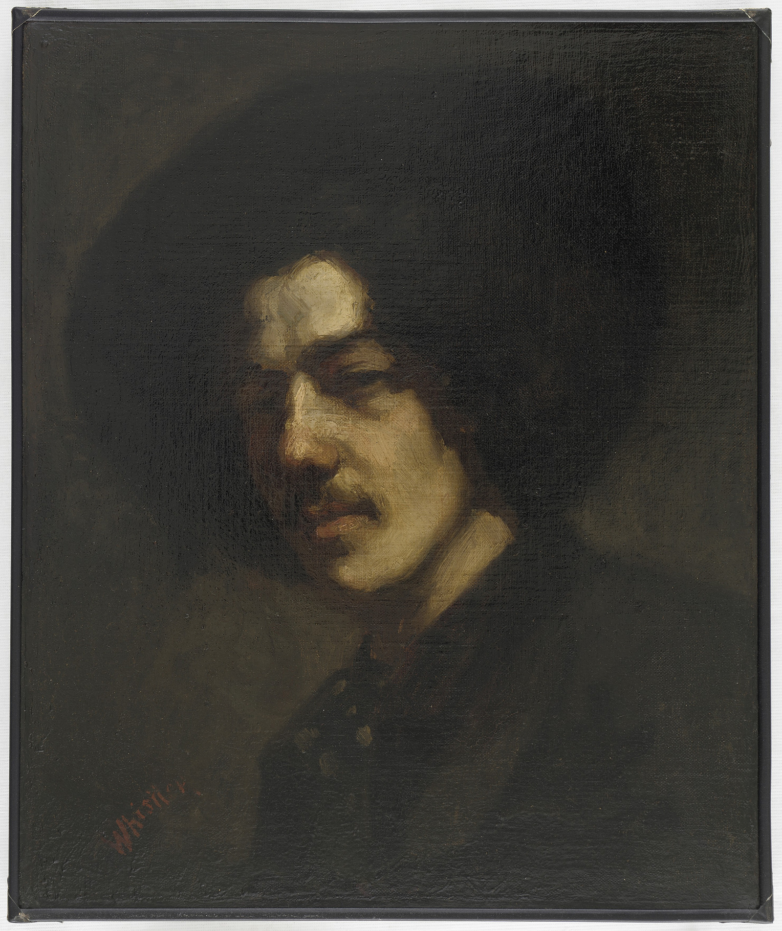
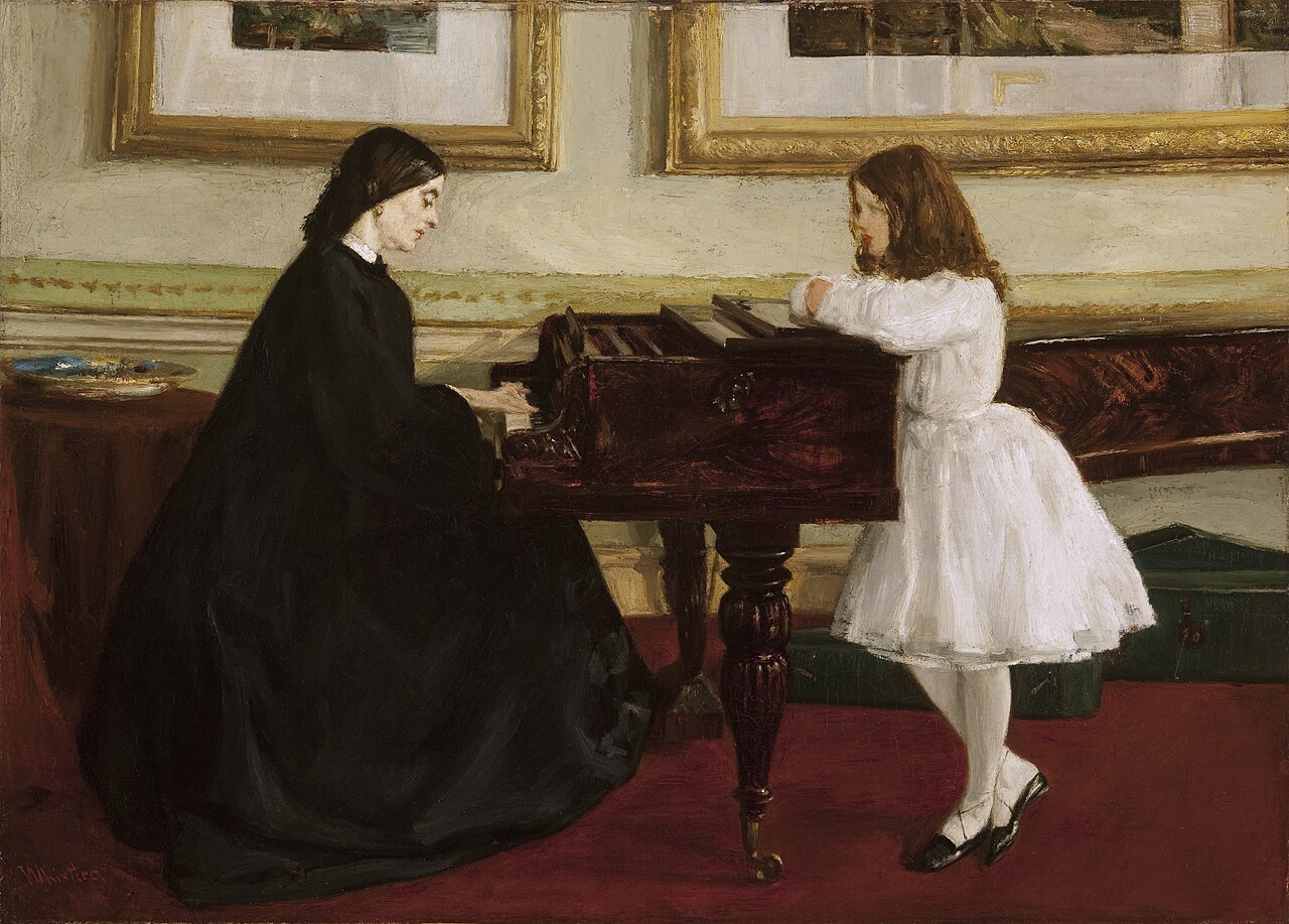
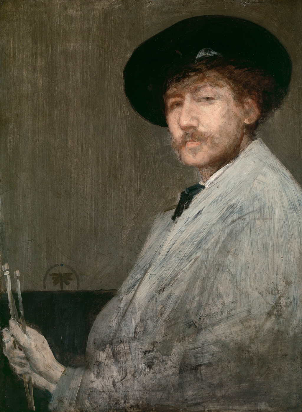
Paris in the later 1850s brought Whistler into contact with Courbet and a Realist network, but his education was wider. Dutch interiors and marine paintings, Velázquez, museum study and the practices of fellow artists contributed to pictures whose colour, texture and space could vary sharply. Portrait of Whistler with Hat uses a direct, dark presentation unlike the pale orchestration of the white paintings. At the Piano constructs an enclosed family interior from angled furniture, curtain, figures and reflected or framed surfaces. [1][4]
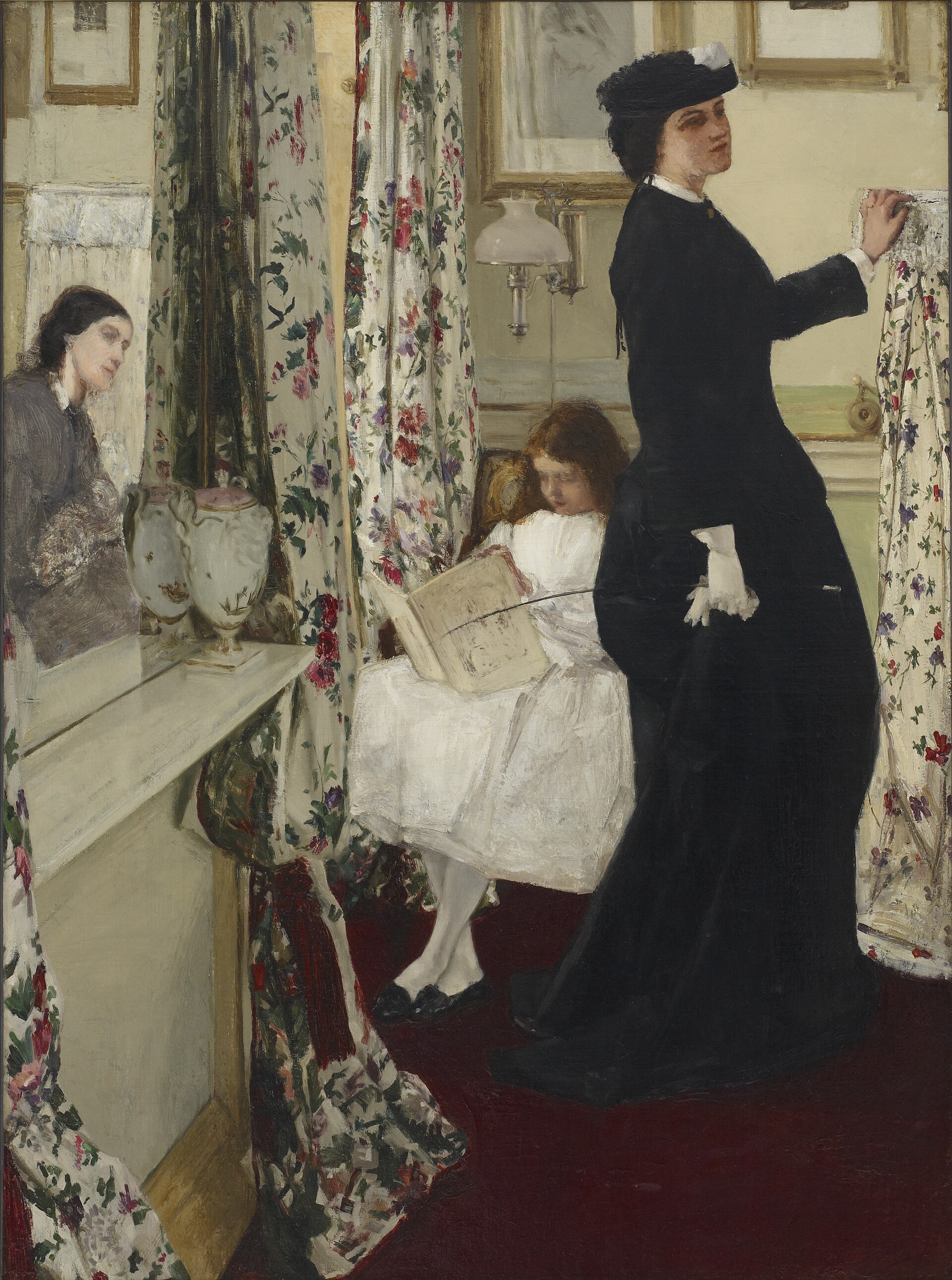
Technical entries demonstrate that “early” does not mean one handling. Some passages are dense and impasted; others are scrubbed thinly. Palette knife, brush, exposed ground and reworking can coexist. In The Music Room, for example, areas of careful detail meet broad, creamy strokes and softer, blurred passages. The composition changed during painting, and its complex surface is part of the domestic scene's unsettled construction. [1][15]
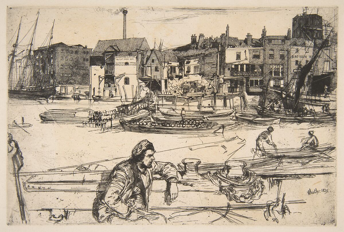
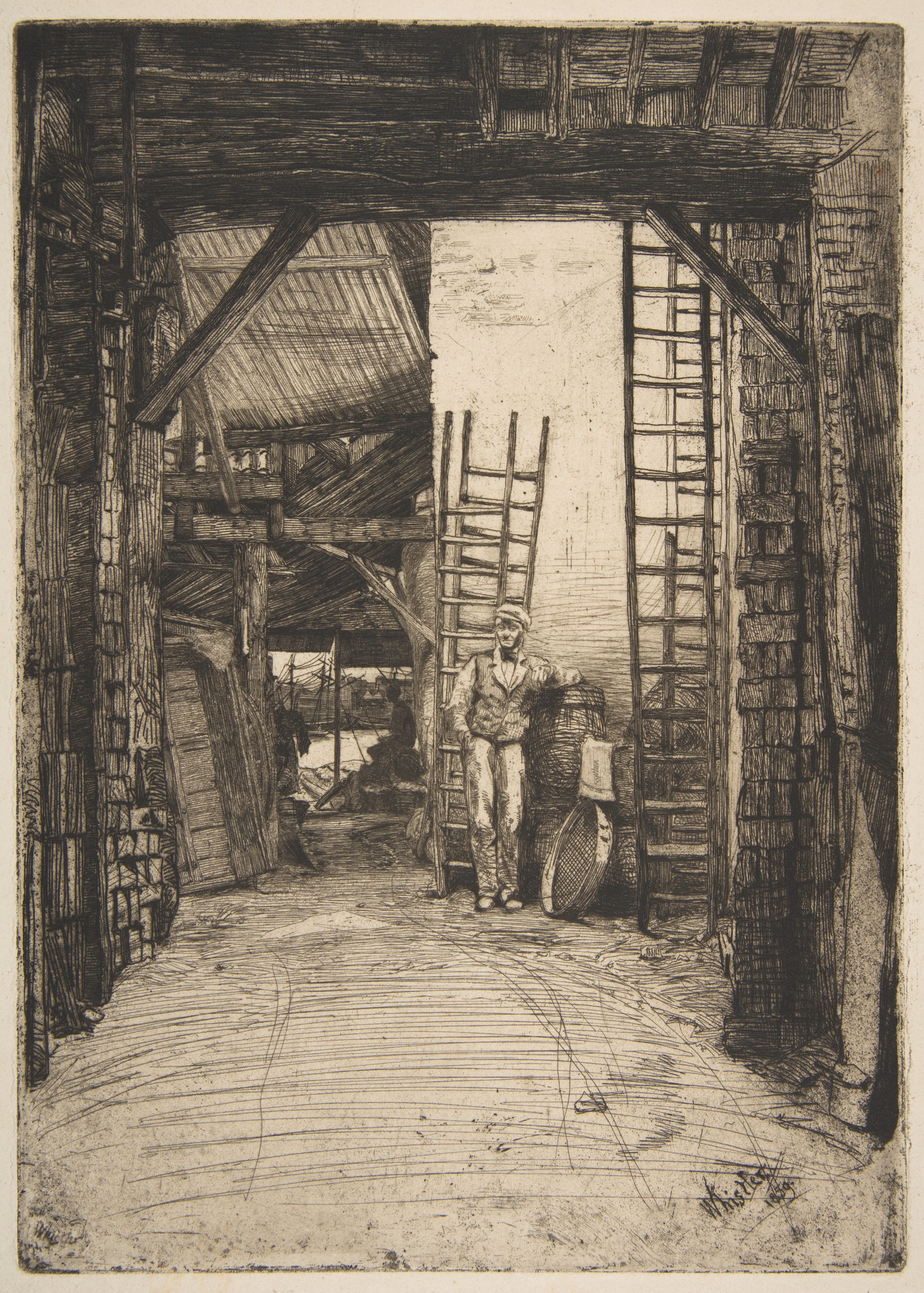
Whistler learned by moving between media. Etching trained him to select line and organise irregular architecture. Painting allowed colour, material thickness and scale to carry the arrangement. A subject tried in one medium did not become a simple design to be copied into another. Instead, each material imposed different decisions about what to describe, omit or revise.
This makes chronological viewing more useful than searching immediately for “typical Whistler”. The early paintings establish a range from which later restraint was chosen. They also show why his mature economy could be so deliberate: he had already practised dense description, figure grouping and tonal modelling before deciding where those conventions could be withheld.
The Working Thames and Realist Observation
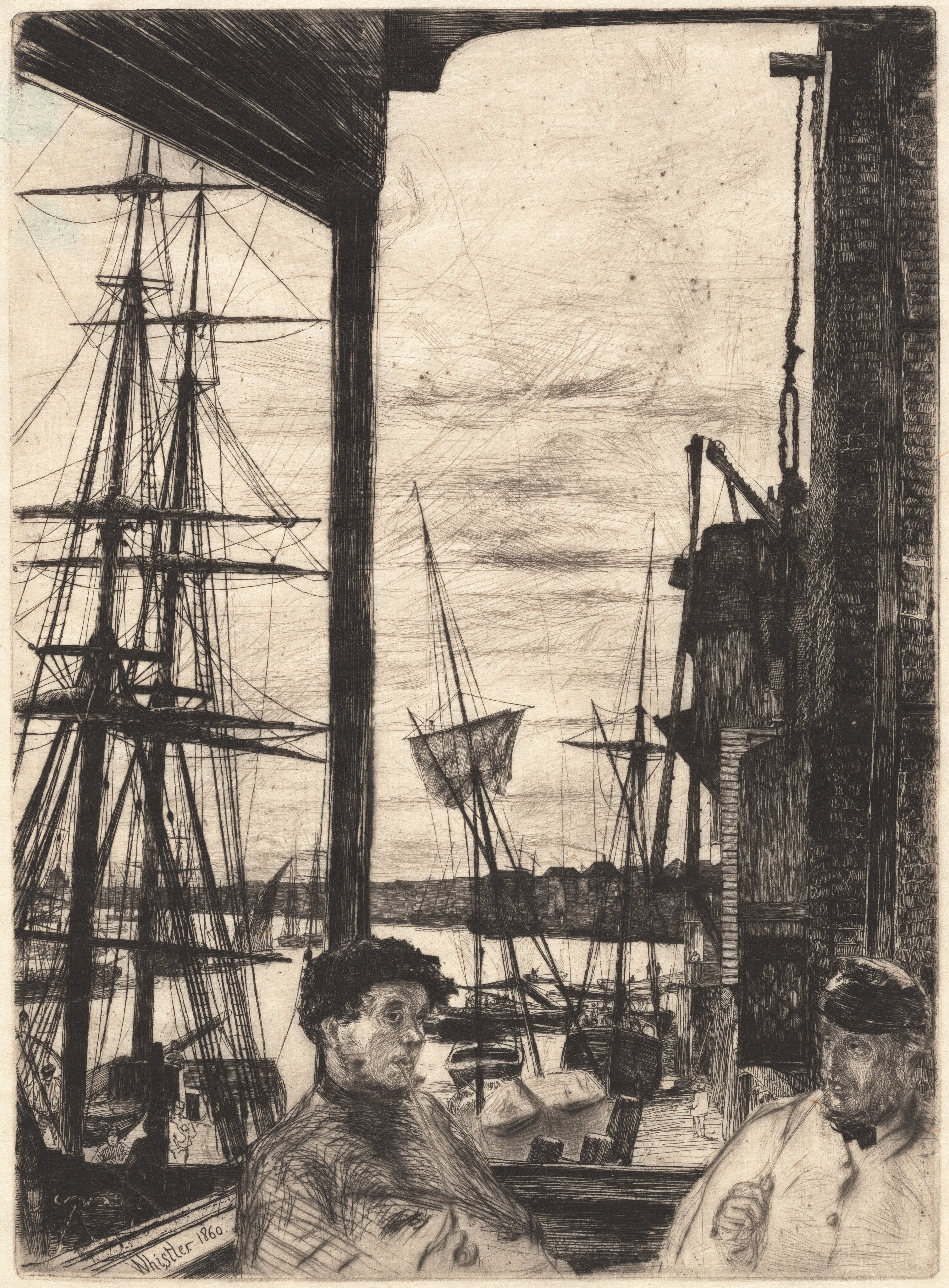
When Whistler settled in London in 1859, the Thames became both place and continuing laboratory. His lodgings near the docklands placed him beside warehouses, rigging, barges and international shipping. The early river paintings share ground with the Thames etchings but do not merely colour them in. Oil made weather, reflections, figures and the weight of the built environment behave differently. [1][4]
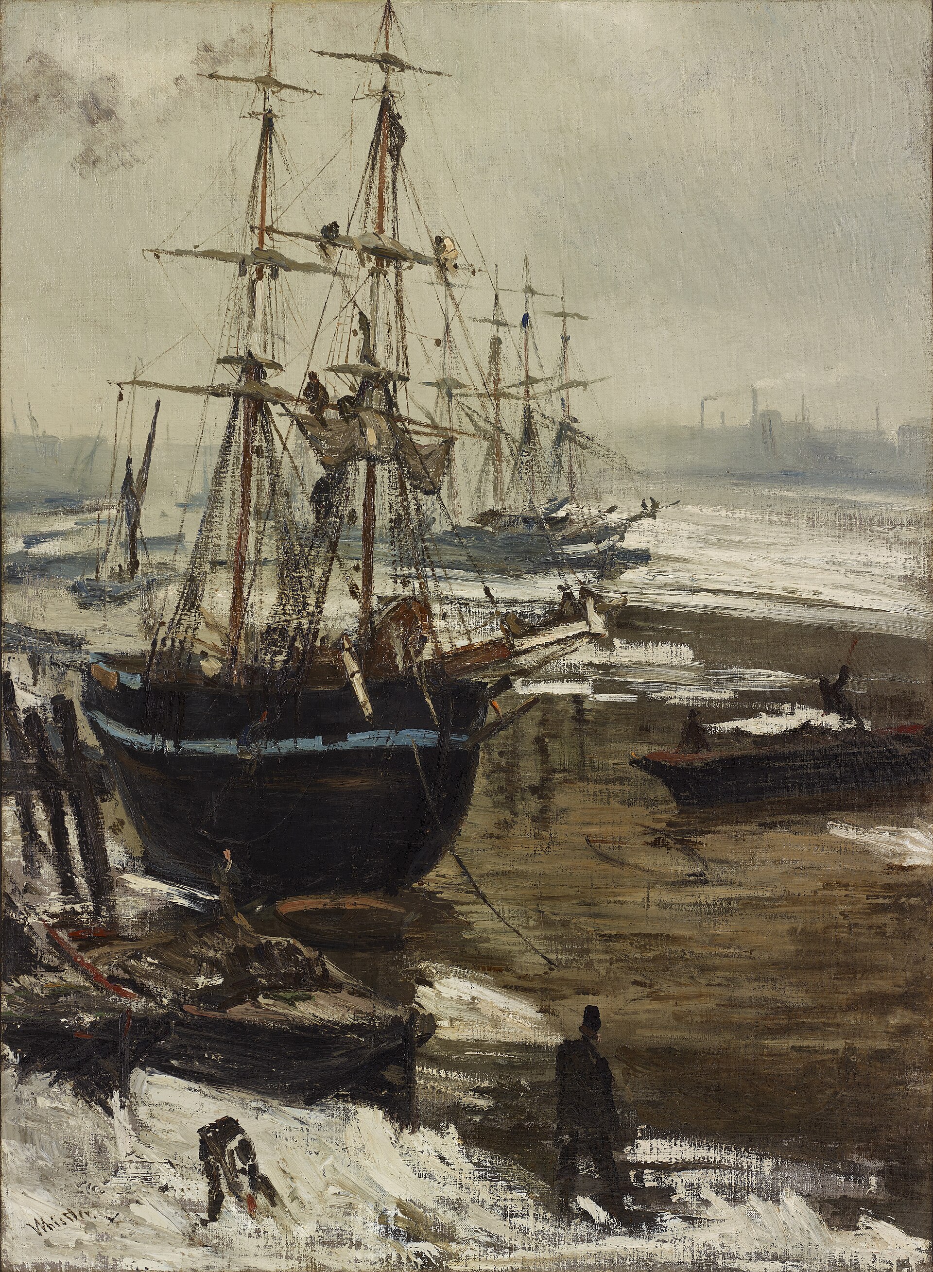
The Thames in Ice belongs to a river made difficult by winter. Boats, masts, shore and broken water occupy a cool, materially resistant scene. The subject is recognisable and contemporary, but Whistler already organises it through bands and intervals rather than treating every vessel as an isolated fact. The painting's present Freer context adds a later collection history that should be kept separate from the circumstances of making. [1][7]
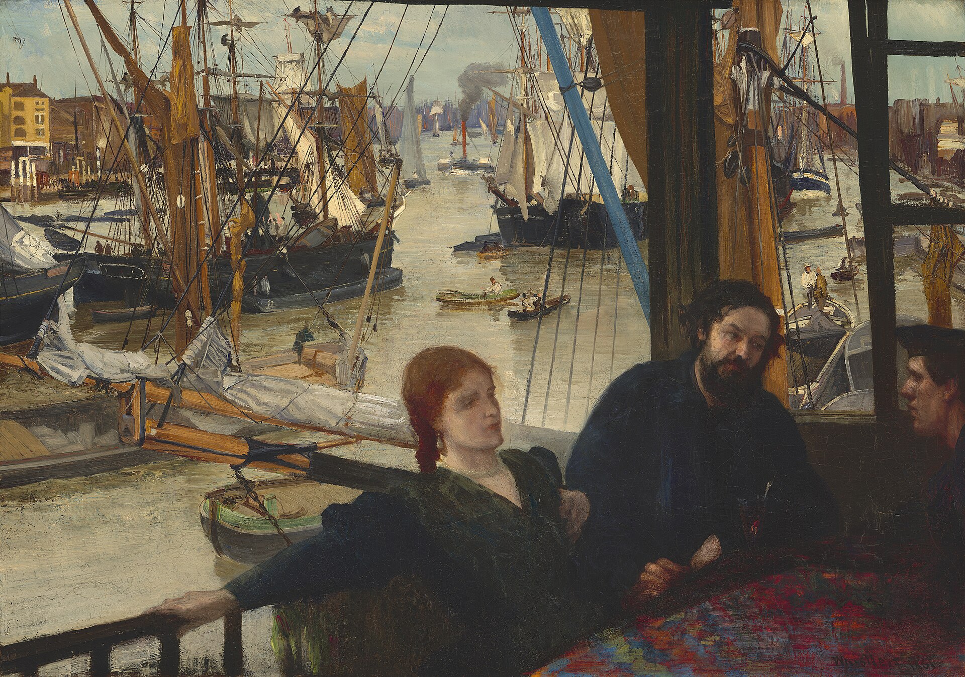
Wapping is more complicated. Three figures occupy an interior beside a window or balcony overlooking the river. Joanna Hiffernan appears within a setting where sailors, vessels and riverside commerce remain close. The picture took several years to reach the form exhibited at the Royal Academy in 1864. It is neither a neutral record of dockland life nor a fully detached colour harmony. Social implication, sexual tension, portrait presence and formal construction remain in productive discomfort. [1][6][17]
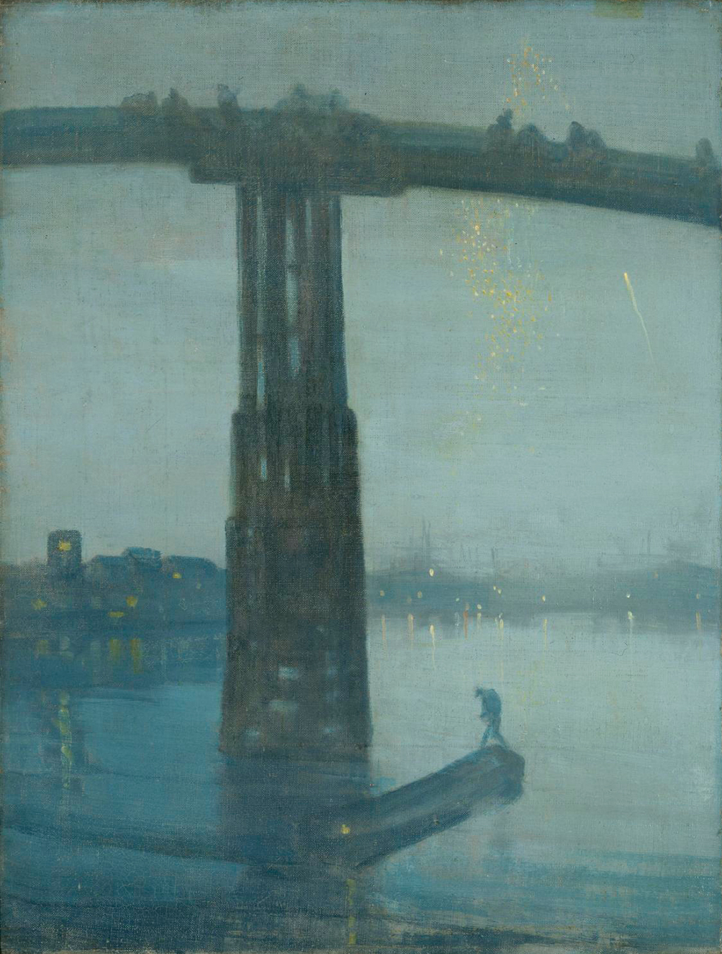
The difference between the two Battersea Bridge paintings shows how Whistler's river changed. YMSM 033 retains a daylight or early-evening sense of structure and place. YMSM 140 stretches the old wooden bridge into a dark vertical and horizontal framework against blue distance, reducing topography while intensifying placement. Both transform observation, but the later work makes that transformation visible as its subject.
The Thames should not be divided too neatly into “Realist early” and “Aesthetic late”. Industry persists in the nocturnes as chimneys, bridge works, lamps and barges. Likewise, early paintings already select and compress. The real development is a changing balance among description, memory, colour and the time at which the river is seen.
The White Paintings
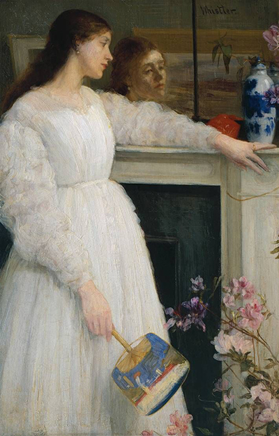
The three works now known as Whistler's white symphonies were made between the early and later 1860s and brought together through evolving titles rather than a single unaltered plan. Joanna Hiffernan appears in all three. Their sequence belongs as much to changing exhibition and reception as to the studio. The National Gallery of Art's recent exhibition treated Hiffernan's agency as central, countering older presentations in which the woman became an anonymous vehicle for white pigment. [9][17]
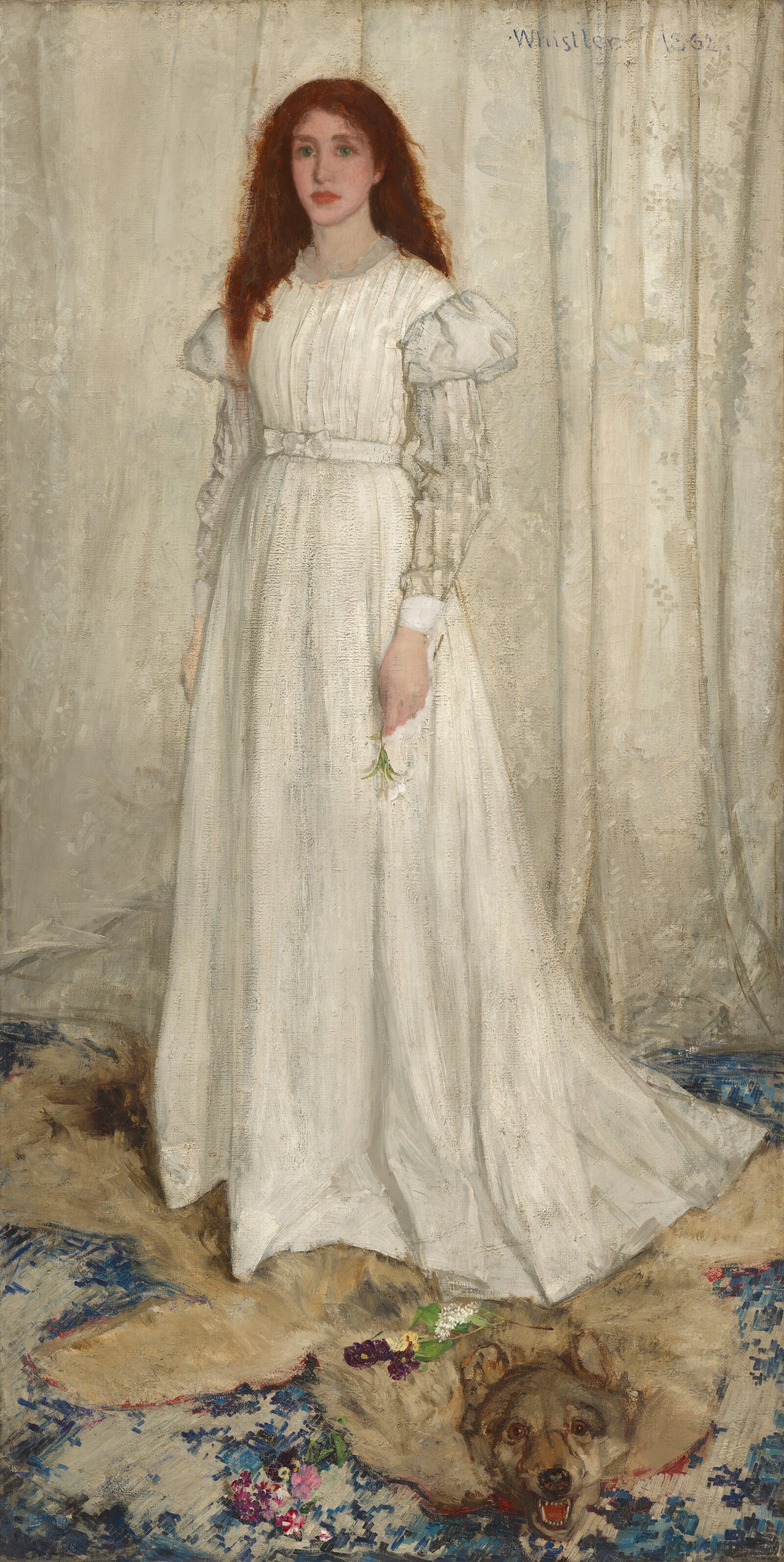
Symphony in White, No. 1: The White Girl began before “symphony” was attached publicly to it. Rejected by the Royal Academy in 1862, shown privately in London and then exhibited at the Salon des Refusés in 1863, it acquired notoriety alongside arguments over subject and finish. Whistler denied that it illustrated Wilkie Collins's The Woman in White. A critic's description of the canvas as a symphony in white helped supply the musical language Whistler later adopted. [4][9]
White is not absence in the painting. Dress, curtain, fur, flowers, hair and flesh require small distinctions of warmth, opacity and texture. Technical examination records thick application in many areas, later scraping or sanding around the head and hand, and changes to the skirt and floor. The apparently simple opposition of white figure and white ground was materially constructed and revised. [9][14]
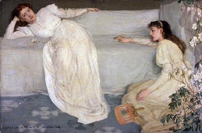
Symphony in White, No. 2: The Little White Girl changes the relation between model and room. Hiffernan turns away, leaning beside a mantel with her reflection present in a mirror. A fan, Japanese-associated objects and the flattening of space move the work beyond the first canvas without dissolving the sitter into decoration. Symphony in White, No. 3 brings two figures into a shallower, more overtly orchestrated setting. [10][17]
The numbers should not be treated as proof that every decision followed in sequence. Whistler regularised titles and re-exhibited works, shaping a retrospective group. The paintings remain distinct in date, composition, support history and institutional life: the first is in Washington, the second at Tate and the third at the Barber Institute. A useful series page follows their connections; an object page must preserve their differences.
Japanese Art, Chinese Porcelain and Staged Interiors
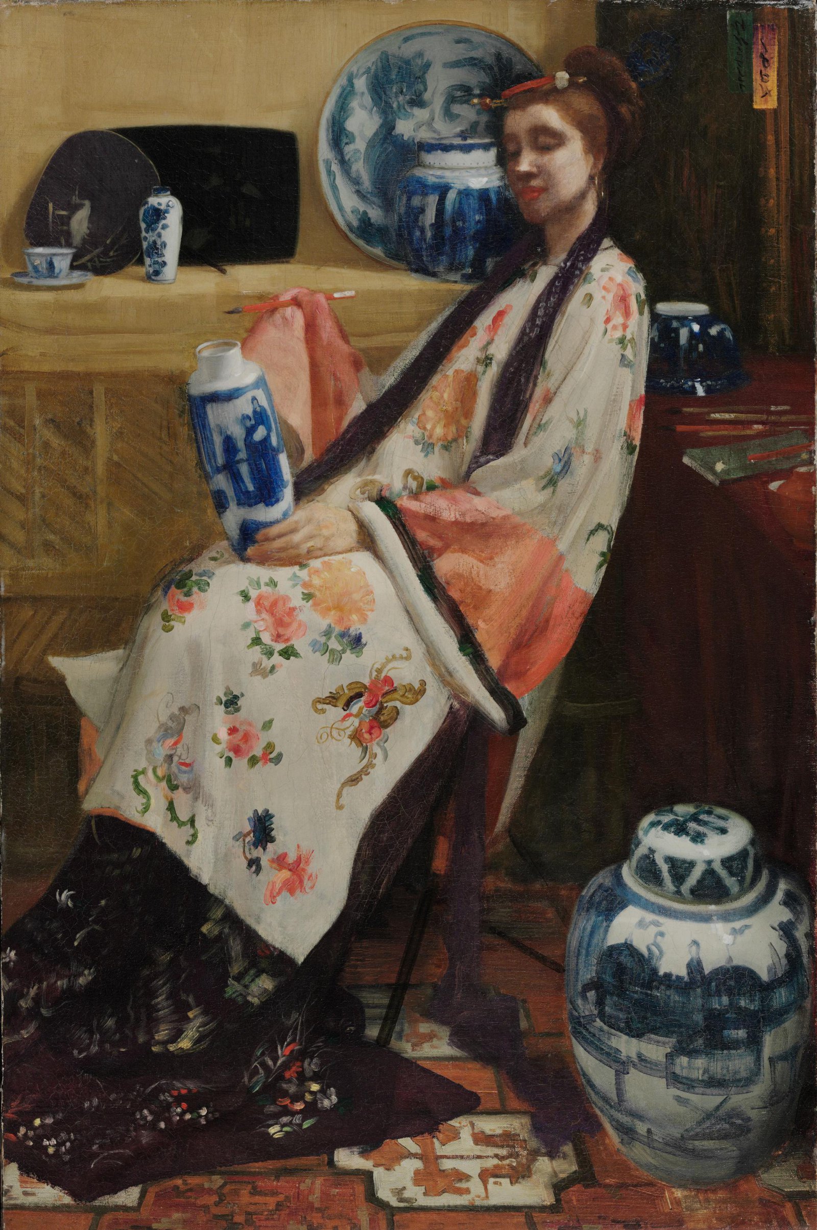
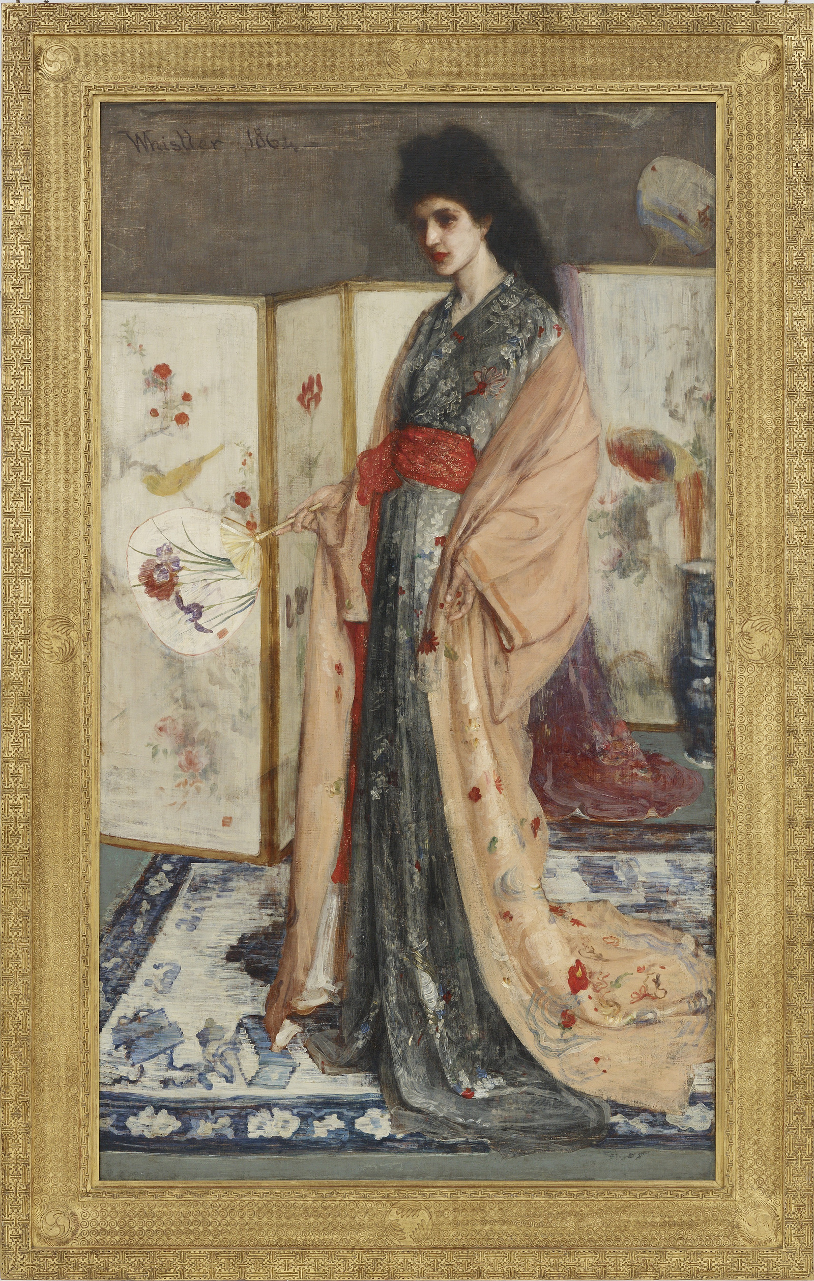
Whistler's paintings of the 1860s frequently include fans, screens, robes and blue-and-white ceramics. Period criticism grouped these objects under broad terms that obscured their different origins. Current interpretation needs sharper language. Japanese prints offered compositional strategies including asymmetry, cropping, elevated viewpoints and strong relations between occupied and relatively empty areas. Much of the porcelain Whistler collected and displayed was Chinese. European models wore or handled imported things within interiors constructed for Western patrons and exhibitions. [4][7][16]
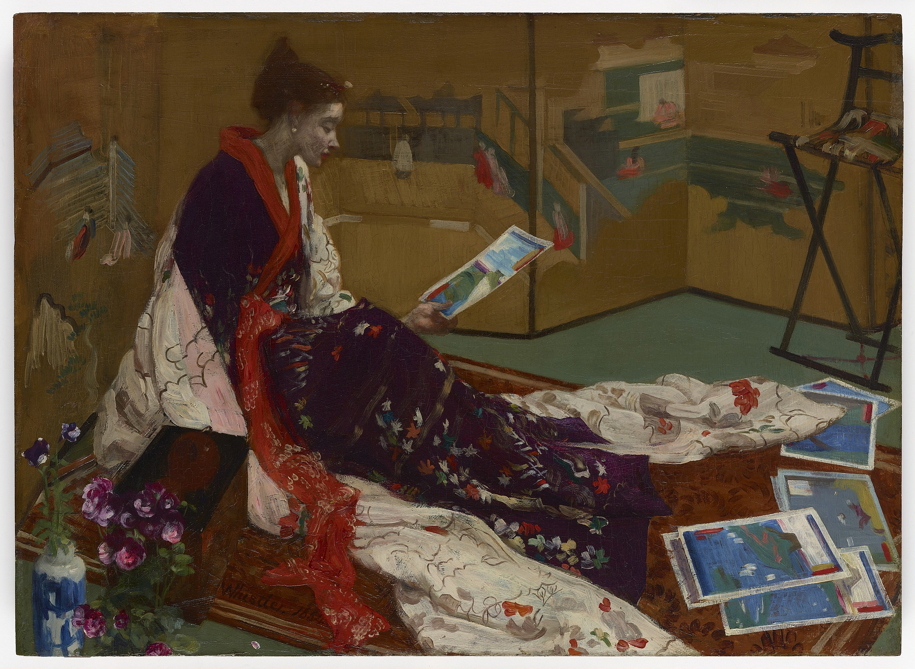
Caprice in Purple and Gold: The Golden Screen presents a woman looking at Japanese prints beside a gilded screen. The picture is an image of looking as well as an arrangement of colour. Its setting makes collecting visible, and the viewer is asked to see a European fantasy of access to Japanese art rather than an unmediated Japanese interior. [1][7]
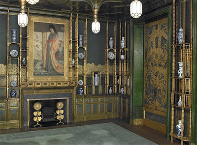
Purple and Rose: The Lange Leizen of the Six Marks and The Princess from the Land of Porcelain use porcelain-associated titles and tall female figures, but they are different paintings. “Lange Lijzen” was a collecting term connected to Chinese porcelain figures. The Princess later occupied the centre of Frederick Leyland's dining room and now remains installed in the Peacock Room at the Smithsonian. Its museum setting makes the historical relationship among painting, ceramics and room unusually vivid. [1][7][12]
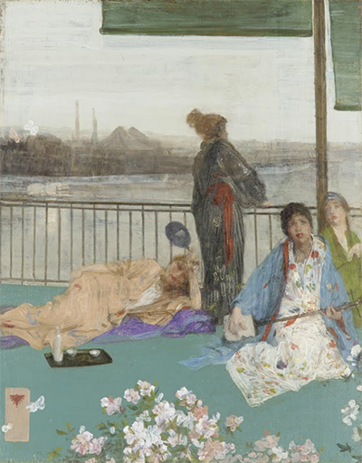
Variations in Flesh Colour and Green: The Balcony opens a shallow balcony scene through poses and rails informed by Japanese print design. The work was revised over years. Its apparent decorative ease should not conceal its long making or the Western construction of the women and setting. The title's “variations” draw attention to relation while the objects and costumes preserve the history of collecting and performance.
The strongest interpretation holds these levels together. Formal innovation is real, but so are trade, fashion and unequal systems through which Asian objects reached European collections. “Japonisme” describes a Western reception and transformation; it does not make Whistler a Japanese artist or every imported prop an example of the same culture.
Decorative Projects and the Ambition of a Total Setting
Whistler's easel paintings repeatedly approached decoration without becoming minor ornament. During the later 1860s he developed a group of large figure compositions associated with Frederick Leyland and sometimes called the Six Projects. Classical drapery, flowers, music and repeated figures offered a field in which colour relation could carry ambition normally attached to narrative history painting. [1][4][7]
The projects remained incomplete as a unified scheme, but related studies and canvases show Whistler testing multi-figure arrangement. He looked closely at Albert Moore, whose draped women and formal repetition provided a productive dialogue. The comparison matters because it prevents the development from being explained only through Japanese art. Classical, Aesthetic, musical and East Asian-associated sources overlapped.
Whistler increasingly treated the frame as part of the painting. Flat profiles, gilding, incised or painted patterns and butterfly cartouches extended colour and rhythm beyond the canvas edge. A frame could be designed or adjusted for a particular exhibition. Later replacements may resemble Whistler's preferences without being the frame through which a work first appeared. Catalogue and conservation records are therefore needed before assigning intention to what surrounds a painting now. [1][15]
The Peacock Room pushed decorative ambition into architecture. Yet it should not be counted simply as another oil painting. Thomas Jeckyll had designed the dining room at 49 Prince's Gate for Leyland's Chinese porcelain. Whistler expanded a colour consultation into an extensive intervention in paint and gold leaf across wood, leather, canvas, glass and tile. The room and The Princess from the Land of Porcelain remain related but materially distinct objects. [12]
This boundary clarifies Whistler's paintings rather than diminishing the room. Easel works could travel, be reframed and enter collections independently. The room depended on architecture, shelving and an ensemble of objects; later relocation to Detroit and Washington changed its function. The painting hub points to that history but leaves a full account to the dedicated Peacock Room page.
Portraiture as Negotiation
Whistler's portraits are often described as if the musical title replaced likeness. The studio evidence suggests a harder negotiation. A sitter brought face, body, clothes, schedule, payment and social identity. Whistler sought to subordinate those particulars to a unified arrangement, but they could resist. Long sittings, altered poses, unfinished commissions and disputes over delivery show that formal unity was achieved through human and contractual conditions. [1][4][13]
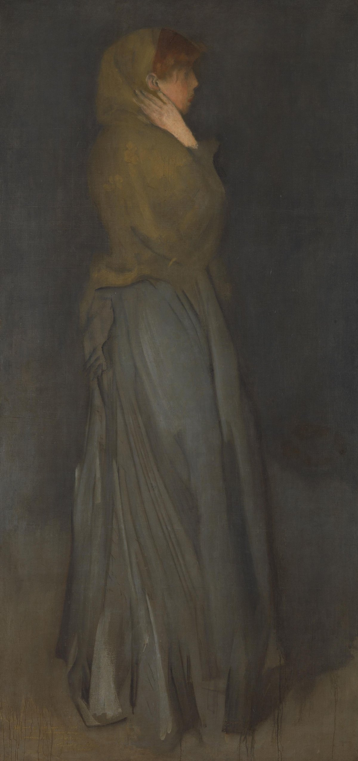
Full-length portraits became especially important. Whistler frequently placed a standing figure against a restricted ground within a tall, narrow canvas. The pose could recall Velázquez while costume remained distinctly modern. Large intervals around the body made small changes in contour or colour consequential. Hands and faces might be described selectively because excessive modelling could break the tonal field.
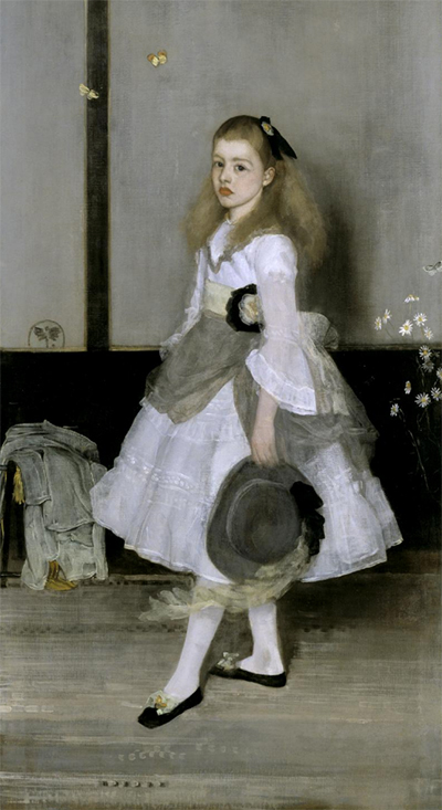
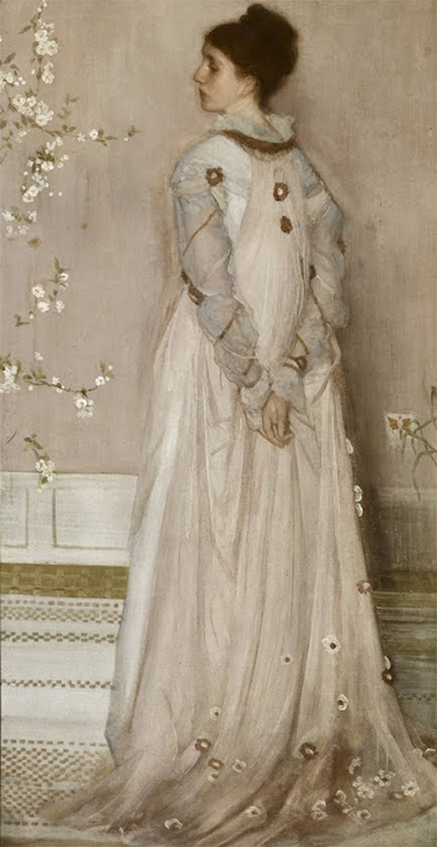
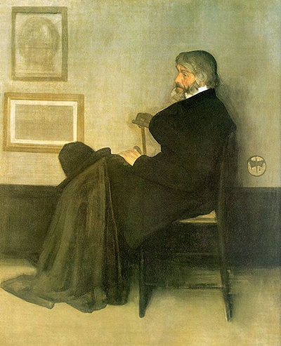
Symphony in Flesh Colour and Pink: Portrait of Mrs Frances Leyland connects portraiture to patronage and interior design. Harmony in Grey and Green: Miss Cicely Alexander depended on the patience of a young sitter and careful control of dress, floor and flowers. Arrangement in Grey and Black, No. 2: Portrait of Thomas Carlyle adapted the seated profile established in Anna Whistler's portrait while making age, gender and intellectual public identity behave differently. [1][10][13]
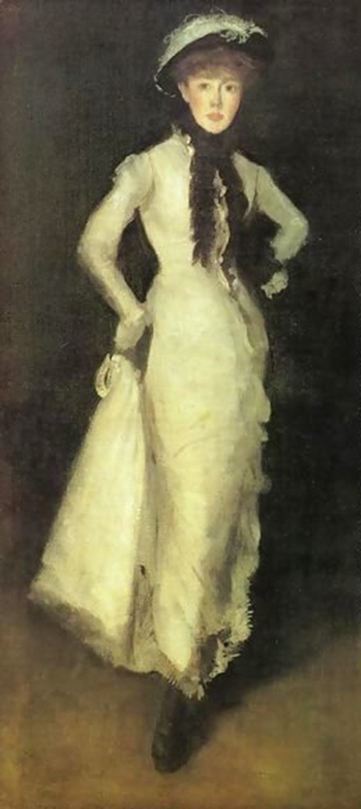
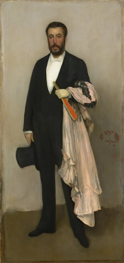
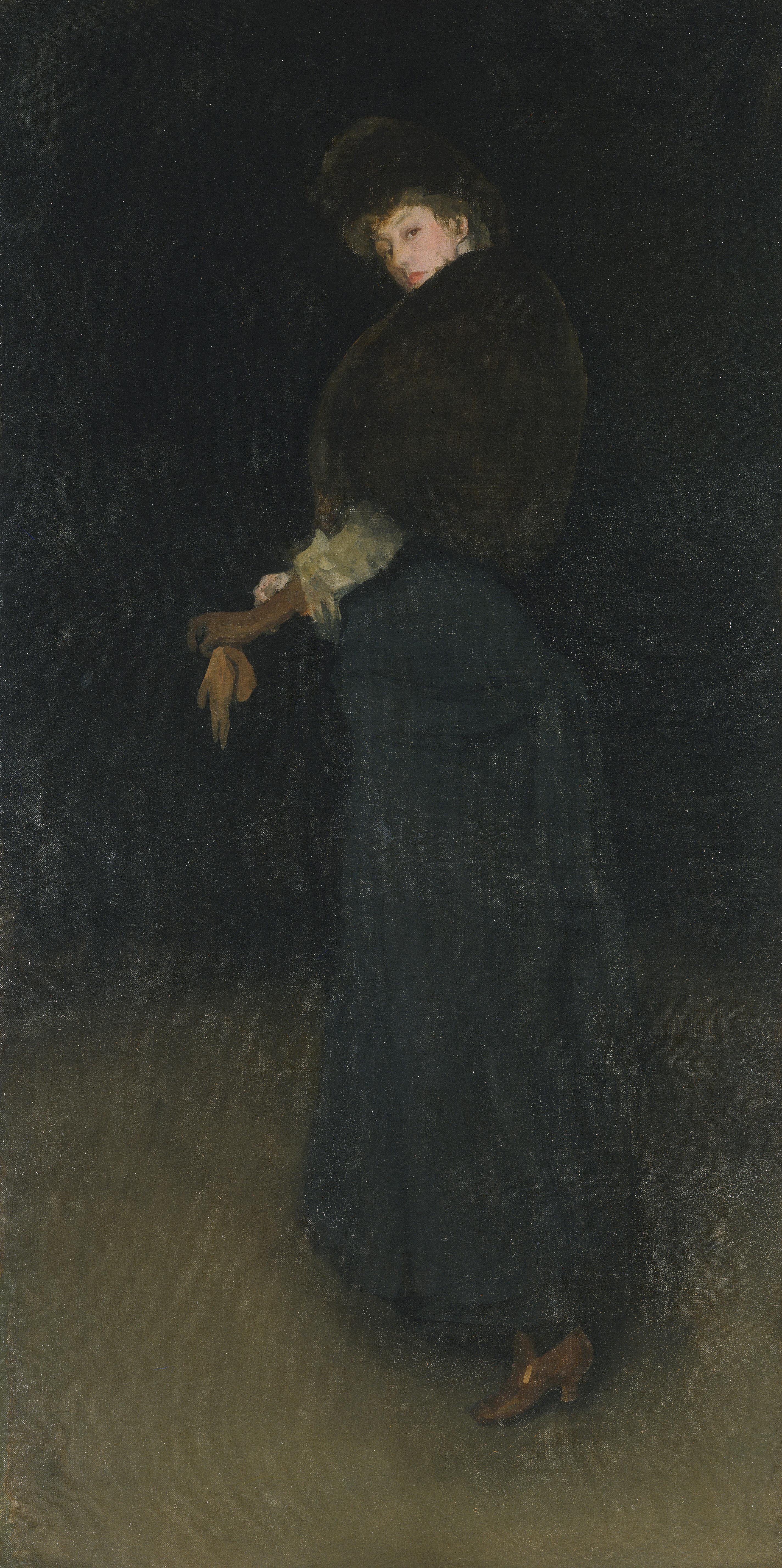
The portraits of the 1880s widen the social and theatrical range. Théodore Duret posed in modern evening dress carrying a pink cloak. Lady Archibald Campbell's Arrangement in Black used a long silhouette and yellow shoe within a presentation connected to performance and fashion. Pablo de Sarasate appears like a dark note held against a stage-like field. Lady Meux commissioned three portraits, but only two finished canvases survive; the pink-and-grey portrait at the Frick should not be confused with the black portrait or lost fur version. [1][13]
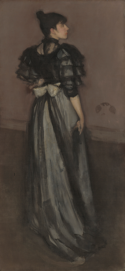
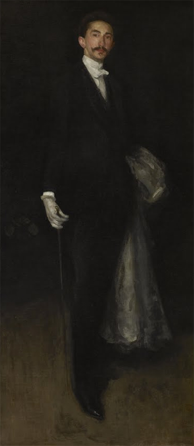
Robert de Montesquiou brought aristocratic self-fashioning and Symbolist culture to a later portrait in black and gold. Ethel Whibley posed for Mother of Pearl and Silver: The Andalusian, worked on from the early 1890s until 1900. Its thin layers, rubbing and scraping reveal how a seemingly fresh silhouette could result from prolonged adjustment. [1][15]
Whistler's portraiture should therefore be read across three agencies: the sitter's historical presence, the artist's formal control and the later institution's framing of the object. None cancels the others. A label that names only the colour harmony is incomplete; a biography of the sitter that ignores the arrangement is equally so.
Anna Whistler and the Two Grey-and-Black Arrangements
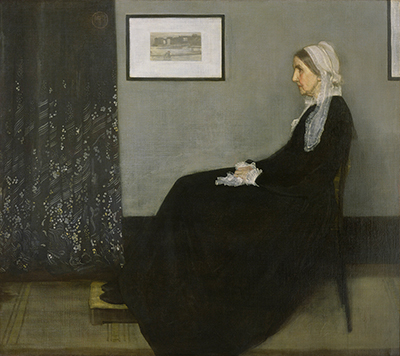
The painting popularly known as Whistler's Mother has become so familiar that reproductions can flatten its measured strangeness. Anna Matilda Whistler sits in strict profile against a pale wall, with dark dress, curtain, floor and framed print held in a limited structure. The full catalogue title begins Arrangement in Grey and Black, No. 1 and identifies her as the painter's mother. The popular and formal names direct attention differently, and both belong to its reception. [1][8]
Painted in 1871 and barely accepted for the Royal Academy exhibition of 1872, it was the final work Whistler showed there. The painting later entered the French national collection and is now at the Musée d'Orsay. That institutional journey changed an initially precarious exhibition object into an international emblem of motherhood and American art, even though Whistler made it in London and framed it through musical abstraction. [8]
Thomas Carlyle agreed to sit after seeing Anna's portrait. Arrangement in Grey and Black, No. 2 retains the seated profile but is not a pendant that merely changes the sitter. Carlyle's male public identity, coat, age and the picture's tonal emphasis produce another kind of presence. Glasgow's acquisition made it the first Whistler painting to enter a public collection. [1]
The pair demonstrates how repetition can generate difference. Whistler reused an organising proposition, not a template into which any sitter could be inserted. The space around each figure, the position of the feet, furnishings, clothes and wall elements change the balance. The numbering encouraged viewers to compare without implying equivalence.
These paintings also show why biography and form must remain in conversation. Anna and Carlyle were real people with lives beyond the canvases. Whistler deliberately reduced anecdotal cues and emphasised relation. The critic's task is not to choose between person and arrangement but to explain what the arrangement does to the encounter with a person.
The Nocturnes: Memory, Paint and the Modern River
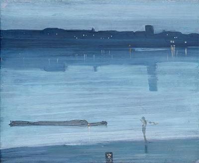
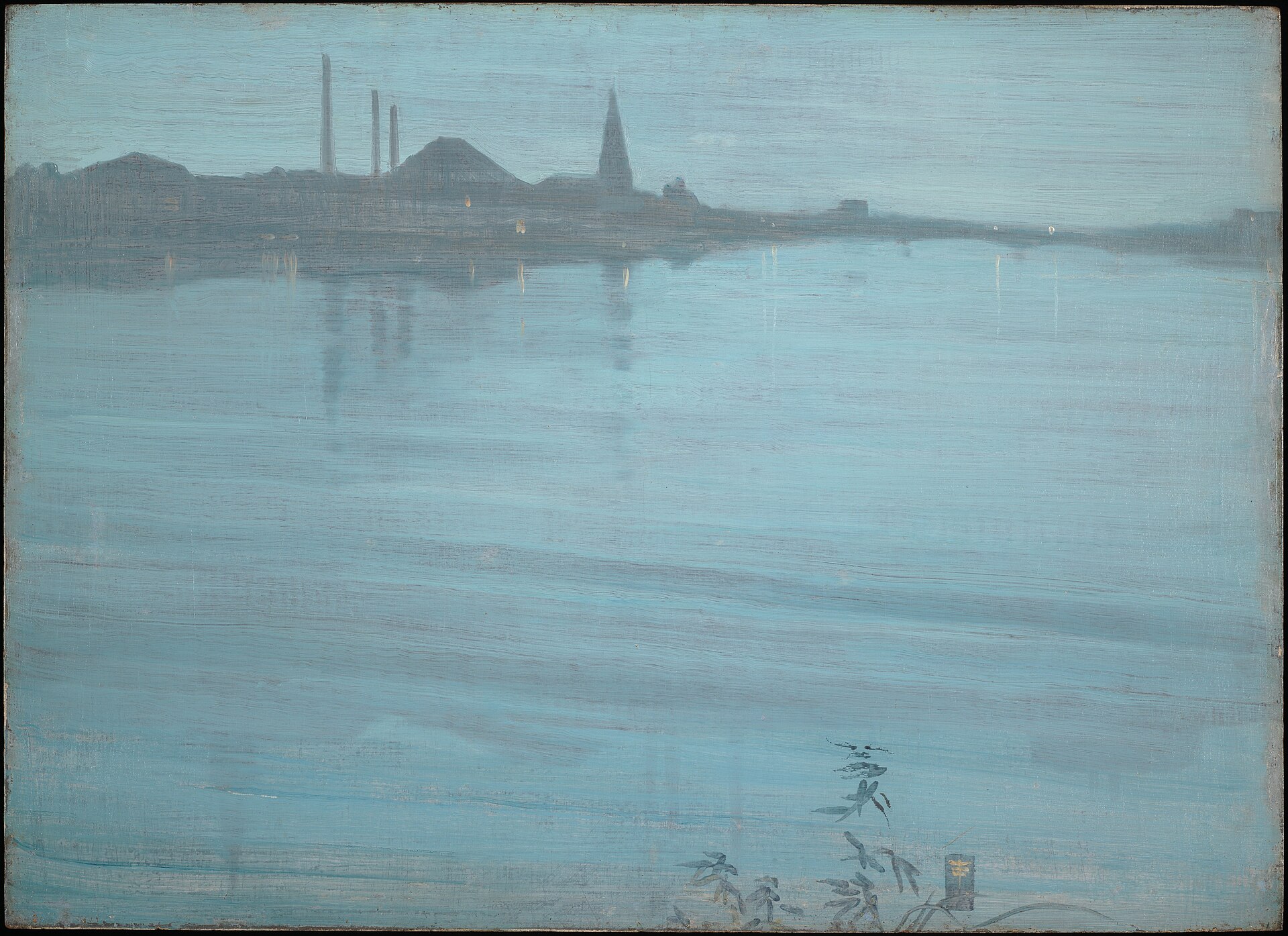
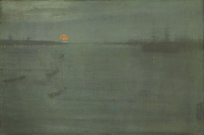
Whistler first described some evening scenes as moonlights. The title “nocturne”, associated with music and encouraged by Leyland, gave the pictures a category that emphasised mood, interval and tonal relation. It did not make them imaginary. Chelsea, Battersea, Cremorne, Southampton Water and Valparaiso remain identifiable or historically documented sites, though Whistler altered what observation supplied. [1][4][10]
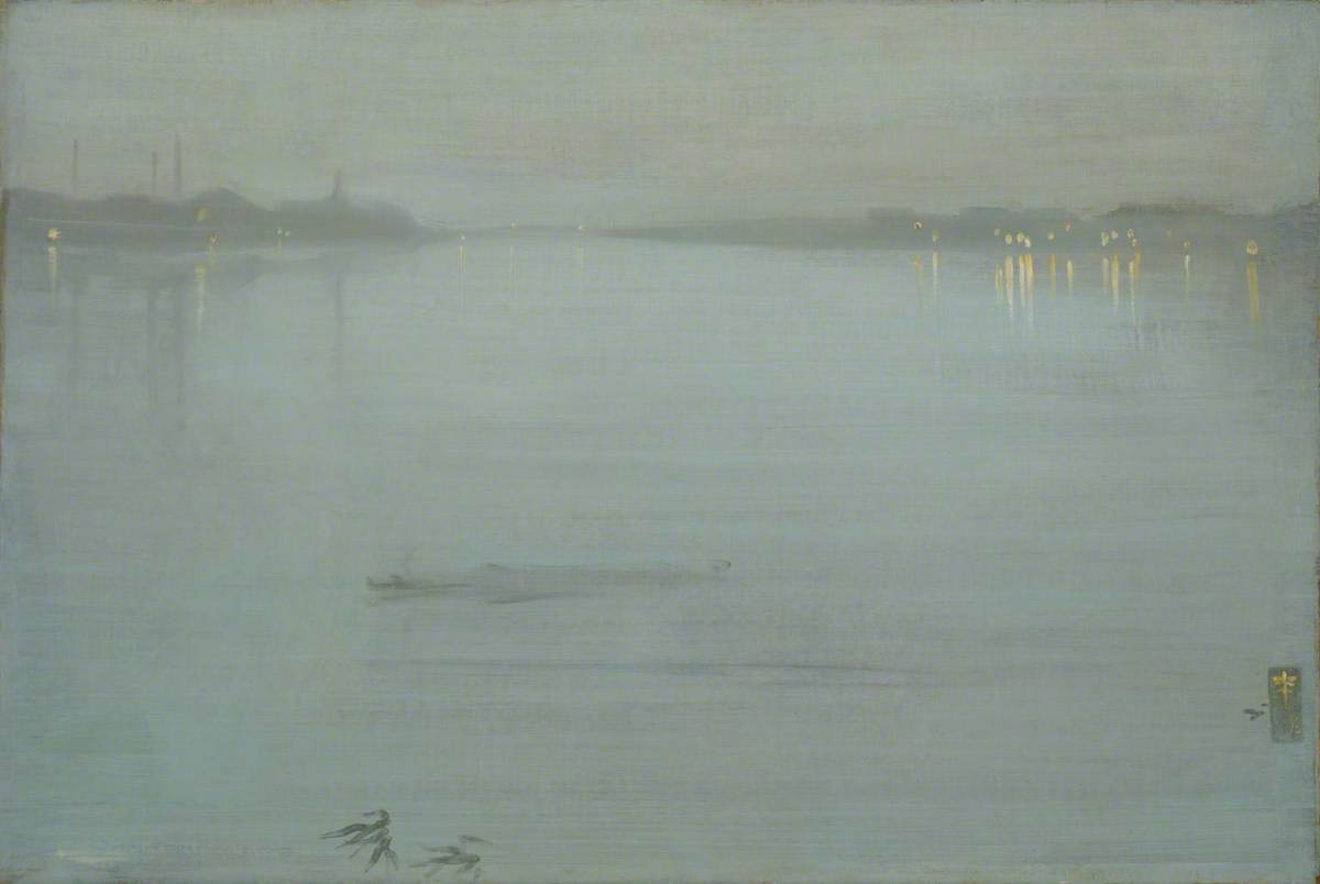
The technical means vary. Nocturne: Blue and Silver—Chelsea is on a thin wooden panel whose smooth grain contributes to the long horizontal paint strokes. A barge and figure are reduced but strategically placed. Its frame decoration and butterfly participate in the designed whole. Nocturne: Blue and Silver—Cremorne Lights uses a canvas with a complicated earlier history and a surface structured by repeated horizontal movements, vertical reflections and small touches of light. [1][15]
Nocturne: Blue and Gold—Old Battersea Bridge contains evidence of earlier images beneath the final scene. The bridge's great dark pier and span do not reproduce engineering dimensions neutrally. They organise a tall format in which a small figure, distant lights and fireworks depend on scale and interval. To describe the painting as quickly dashed off is to confuse visible economy with the object's layered history. [10][15]
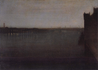
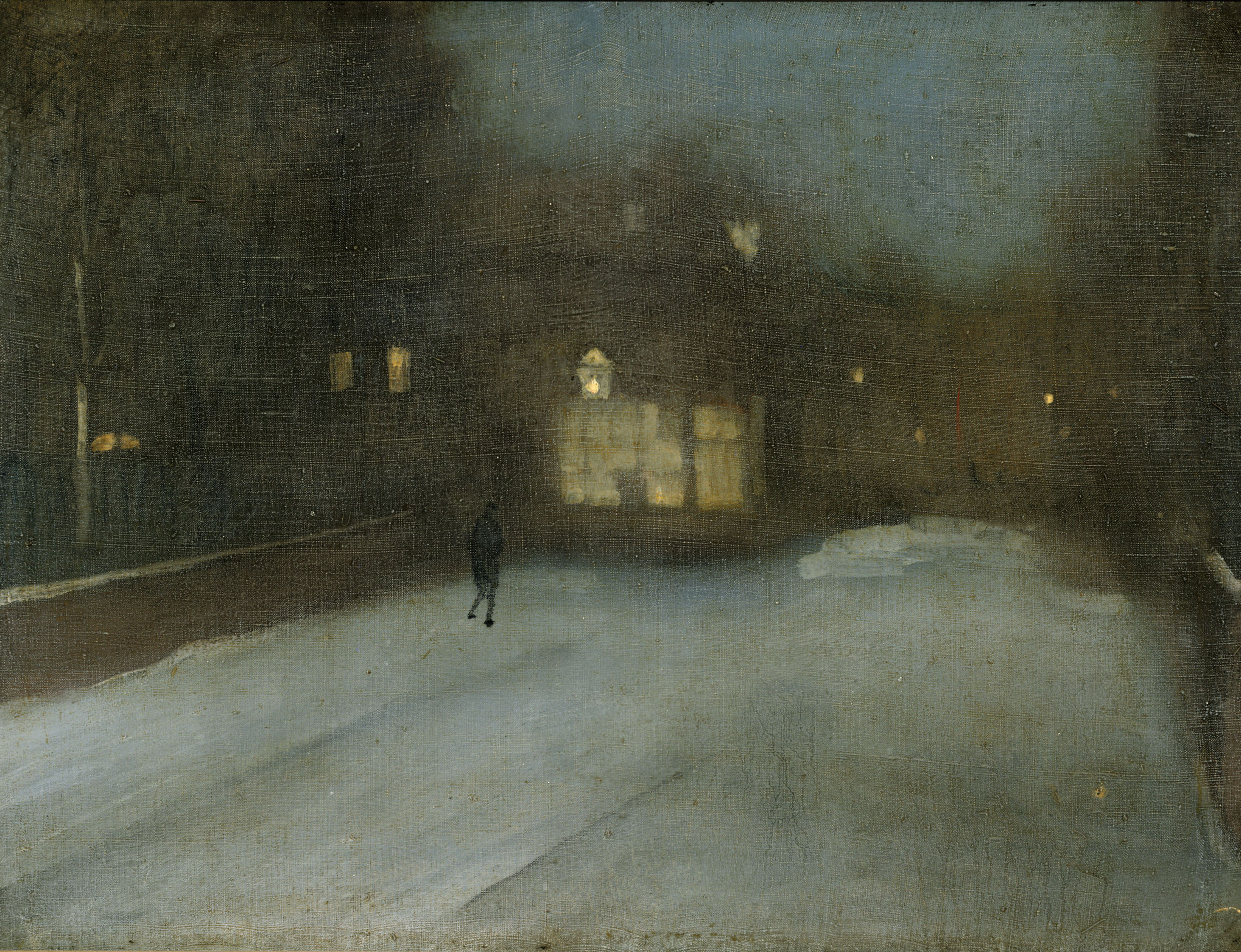
The local page titled simply “Nocturne, Grey and Gold” requires correction. Its image is YMSM 145, Nocturne: Grey and Gold—Westminster Bridge, now in the Burrell Collection. It is distinct from Nocturne: Grey and Gold—Chelsea Snow at Harvard and from lost or uncertain works that carried related names. [1]
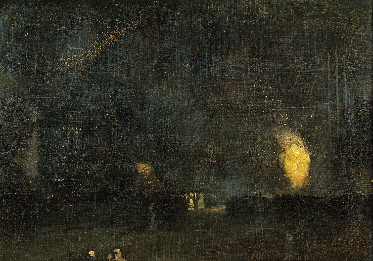
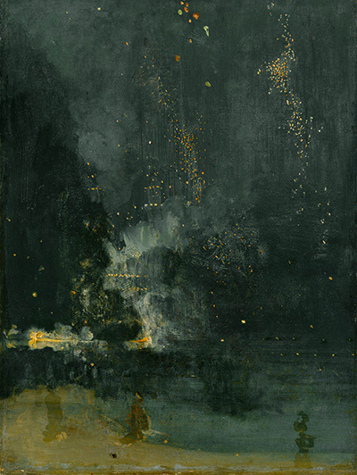
Nocturne in Black and Gold, the Falling Rocket depicts fireworks at Cremorne Gardens through sparks, smoke, darkness and a few grounded forms. John Ruskin's attack and Whistler's libel action made it the most notorious nocturne. The trial is part of its reception, but the painting should not be reduced to courtroom evidence. Its present display at the Detroit Institute of Arts allows the material object to stand apart from the endlessly repeated insult. [11]
Nocturnes ask viewers to tolerate uncertainty. A building may be barely visible, a boat may be a mark and the horizon may merge with air. This is not an invitation to project any story onto the surface. Current titles, sites, technical evidence and related studies constrain interpretation. Within those limits, obscurity becomes a designed experience of modern vision.
Valparaiso: A Picture Can Change Its Time of Day
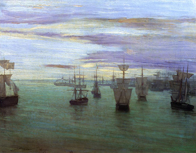
Whistler travelled to Valparaiso in 1866 and produced several harbour paintings. Their titles and later states illustrate why catalogue chronology must be more exact than a thematic label. Crepuscule in Flesh Colour and Green: Valparaiso belongs to the journey but was named through a later aesthetic vocabulary. The upright YMSM 074 is a study related to another canvas rather than the finished nocturne itself. [1][7]
YMSM 076, now Nocturne in Blue and Gold: Valparaiso Bay, began during the 1866 stay but was reworked substantially in the following decade. Catalogue research indicates that it was probably not conceived as a night painting. Whistler transformed the light and title, making the canvas a record of revision across years rather than one evening encounter. [1]
That history complicates the idea that a nocturne captures a fleeting instant. Whistler could begin from a site, retain a composition, change its colour and make a later aesthetic category govern its public appearance. Memory and studio judgement were not substitutes forced on him after observation failed. They were active tools.
The two related Valparaiso routes deserve independent pages because they let viewers study scale, format and transformation. Calling both “Valparaiso Harbor” would remove the very distinction that makes them informative. One preserves the structure of a study associated with the 1866 visit; the other embodies the conversion of that material into a mature nocturne.
Venice and the Painted City
Whistler's 1879–80 Venice stay is best known through etchings and pastels, but oil paintings also belong to it. The media should be connected without being collapsed. Etched plates made line, state and wiping central; pastel used coloured paper and selected marks; oil allowed translucent layers, broader fields and later studio revision. [1][5]
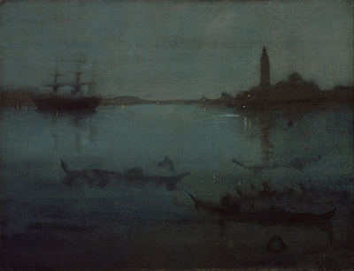
Nocturne in Blue and Silver: The Lagoon, Venice gives the city through water, distant architecture and limited tonal difference. It does not depend on a crowded inventory of monuments. Like the Thames nocturnes, it asks how much place can be retained after detail is subordinated. The answer differs because Venice offered another architecture, history and light.
Other Venetian oils focus on St Mark's, the lagoon or canals. Their dates can encompass the stay and later work. Whistler might carry a canvas back, reconsider it or connect it to exhibition projects after leaving Italy. A painted Venice is therefore not automatically a record completed outdoors during one session.
The city also altered the scale at which Whistler's paintings should be considered. Large nocturnes coexist with small panels, watercolours and pastels whose portability suited travel. Later coastal and town subjects continue that economy. The significance of Venice lies partly in a system of looking that could move among surfaces and sizes.
A dedicated Venice support page can reconstruct commission, residence, associates, sets and exhibitions. Individual painting pages can address objects and current holders. The painting overview uses Venice to show media crossing: one city tested different technologies of suggestion.
Small Panels, Coastal Views and Late Work
During the 1880s and 1890s Whistler painted many small works on wood. Panels were portable, offered a smooth surface and could support thin, rapid-looking applications. Shops, streets, beaches, sea and figures became compact arrangements. Their size does not make them preliminary; many were signed, framed, exhibited and sold as independent works. [1][4]
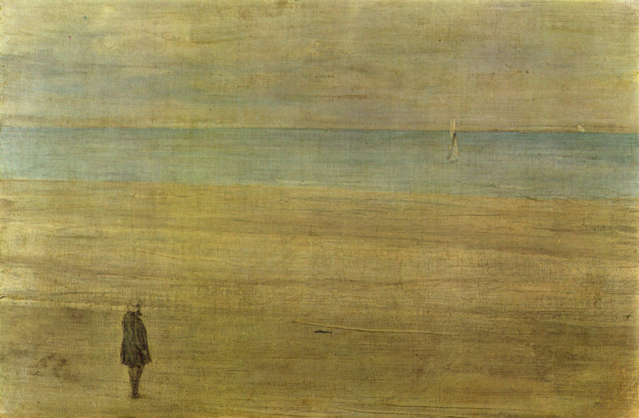
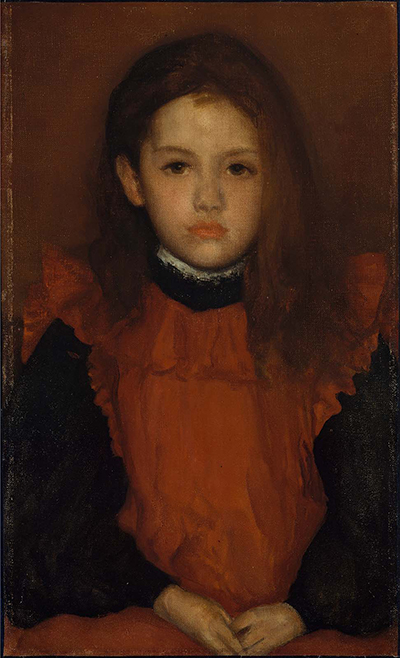
Little Rose of Lyme Regis brings a child's figure into a narrow tonal setting on a small support. Shopfront paintings use doorways, windows, walls and passages as geometric intervals. Coastal panels can reduce land, sea and sky to a few horizontal relations, then activate them with a boat or figure. The economy resembles the nocturnes without depending on darkness.
Technical evidence again prevents a single “late style”. Some panels are very thinly painted and leave the support visually active. Portraits could remain large and demanding. Whistler continued to revise ambitious likenesses of collectors and public figures while producing small landscapes. Scale and finish were choices connected to subject, mobility, market and satisfaction rather than stages on one linear path.
The late full-length Mother of Pearl and Silver: The Andalusian occupied Whistler for years. Its sitter, Ethel Whibley, turns partly away in a dark gauze costume over a silvery dress. Thin washes, scraping, rubbing and pentimenti coexist with final accents that appear direct. The date extends to 1900 because completion belongs to a late campaign, not solely to the first sittings. [1][15]
Late self-portraits and portraits of Charles Lang Freer, George Vanderbilt and Richard Canfield continue Whistler's concern with silhouette and selective characterisation. They should not be made into illustrations of decline. Illness and bereavement belong to the biography; the objects require their own technical and chronological evidence.
Paint, Supports and Revision
There is no universal Whistler recipe. The comparative technical entries show a practice that changed across decades and sometimes within one painting. Early works can use substantial impasto and palette knife. Mature portraits may combine thin backgrounds, scraped passages and selectively built faces or costumes. Nocturnes can be laid over older images or use supports prepared in ways that alter absorption and surface. [1][14][15]
Ground colour matters. A grey or dark preparation can provide middle tone, allowing light and dark accents to establish the image with relatively little coverage. On smooth wood, broad horizontal strokes can remain legible. On coarse or lined canvas, weave can break thin paint into texture. Whistler sometimes added medium to make colour more fluid, but “thin” is not a precise material diagnosis unless an examination identifies layers and components.
Scraping and rubbing down recur. They could remove an unsatisfactory passage, soften contours or prepare for another campaign. X-radiographs and infrared images reveal earlier heads, figures and orientations beneath some works. The evidence turns apparent spontaneity into a time structure: fast final marks may rest on years of alteration.
Whistler's paint boxes, palettes and tools in the Hunterian help reconstruct practice, while cross-sections and pigment analysis provide object-specific results. Lead white, earth pigments, vermilion, cobalt or ultramarine blue, bone black and other materials appear in different combinations. A list of pigments does not by itself explain the colour effect. Particle size, ground, medium, layer thickness, wiping and later conservation all matter. [5][15]
Condition must remain part of interpretation. Thin surfaces are vulnerable to abrasion, and lining may change the visibility of canvas texture. Varnish can deepen or yellow a tonal scheme. Whistler himself sometimes requested relining or reworked a picture after photographs were made. A digital reproduction may offer excellent access while still representing one moment in a long material life.
Frames, Butterflies and Exhibition Control
Whistler designed frames as continuations of paintings. Flat profiles, gold, coloured patterns and small cartouches could carry a harmony beyond the canvas. He argued that a discordant conventional frame would interrupt the relation he had made. Technical and archival records sometimes identify a Whistler-designed frame; in other cases the current surround was made later by American framemakers or reconstructed from known types. [1][15]
The butterfly signature belongs to the same field. Its form changed over time and can assist dating, though it is not an infallible clock. Whistler placed it deliberately and sometimes integrated it into a cartouche or frame pattern. A signature added after reworking may establish a late point in an object's history rather than the date every layer was painted.
Exhibition rooms extended control again. Wall colour, spacing, catalogue and invitations shaped the encounter among works. A nocturne surrounded by crowded, brightly coloured pictures would operate differently from one given air within a coordinated room. Whistler's exhibition design made that interpretive condition visible. [4][16]
This concern can look like modern branding, and it was partly that. The butterfly, persona and display made Whistler recognisable. It was also a material conviction: picture, frame and room affect one another. Separating promotion from aesthetics too cleanly would miss how deliberately he joined them.
Titles, Dates and How Not to Confuse the Paintings
Whistler's titles developed through letters, catalogues, critics, patrons, dealers and later scholarship. A work might be described by subject in one context and exhibited as a harmony in another. Spelling and punctuation vary. Colour terms can change, and numbers may be assigned or regularised later. The preferred catalogue title records a scholarly decision, not an eternal label present from the first brushstroke. [1][2][3]
Familiar titles remain useful. Whistler's Mother is how most viewers find the Orsay portrait. The Princess from the Land of Porcelain is more recognisable than the full porcelain-associated catalogue wording. A strong page gives the preferred title and explains the familiar alternative rather than forcing readers to choose between accessibility and accuracy.
Dates require similar care. A single year may describe the main campaign, first exhibition or completion. A range can indicate uncertainty or prolonged work. The two-stage date of a reworked canvas is not bureaucratic fuss: it changes what the painting means. Valparaiso YMSM 076 belongs both to the 1866 encounter and the 1870s nocturne practice.
Current collection is the third identity anchor. A local page once placed Whistler's Mother at Louvre Abu Dhabi, but the painting is held by the Musée d'Orsay. Lady Meux YMSM 229 is at the Frick. Falling Rocket is at Detroit. YMSM 145 belongs to Glasgow Museums' Burrell Collection. Current holders provide accessions, dimensions, display status and conservation records that a general list cannot safely infer. [8][11][13]
The crosswalk used for this project resolves all forty-four inherited artwork subjects. It treats a missing image as a reason for verification, not licence to guess. That is especially important for the redirected generic Nocturne in Blue and Silver, provisionally identified as YMSM 113 but requiring final Harvard image confirmation before publication recommendations are implemented.
How to Look at a Whistler Painting
Begin with the object label rather than the reputation. Confirm title, YMSM number, date, medium, support, dimensions and holder. Those facts establish whether the image is an oil, study, reworked canvas, interior or work on paper. They also prevent a nearby title from silently substituting another object.
Then look at the largest relations. Where are the main verticals and horizontals? How much space separates a figure from the edge? Does the ground act as a colour, or has paint covered it completely? Which accent is smallest but carries disproportionate weight? Whistler's musical language becomes useful at this level because it directs attention to interval without demanding that the subject be forgotten.
Next restore the historical particulars. Identify the sitter and what the session required. Locate the river, harbour, room or entertainment site. Ask who commissioned or owned the painting and which exhibition first shaped its reception. A tonal arrangement is not freed from labour, class, gender or commerce merely because its title avoids anecdote.
Study the surface at more than one distance. From afar, a nocturne may cohere as atmosphere. Close viewing can reveal horizontal tracks, drips, exposed weave, scratches or small lights placed over a broad field. In a portrait, face and costume may carry different thicknesses. A photograph can help, but conservation reports explain effects that the image alone cannot diagnose.
Finally, treat uncertainty as information. A disputed date, altered title or visible pentimento records the work's history. It is often more revealing to explain what remains unresolved than to produce a false certainty. Whistler's paintings are not weakened by evidence of change; revision is one of their defining conditions.
A Route Through the Paintings
For early development, begin with Portrait of Whistler with Hat, At the Piano, The Music Room, The Thames in Ice and Wapping. Together they show portrait, interior and working-river problems before musical naming became dominant. Brown and Silver: Old Battersea Bridge then provides a useful comparison with the later nocturne of the same structure.
The white and Japoniste group includes all three white symphonies, The Golden Screen, The Lange Leizen of the Six Marks, The Princess from the Land of Porcelain and The Balcony. These pages should be read with the dedicated discussions of Joanna Hiffernan and Whistler's engagement with Asian art, because formal and biographical evidence correct one another.
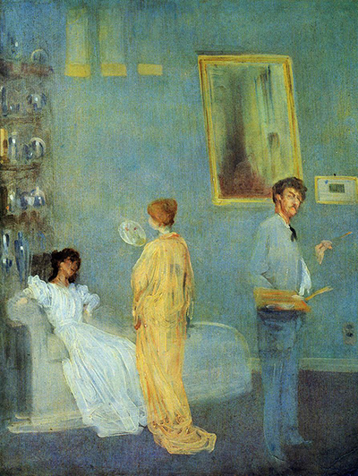
The portrait sequence can move from Anna Whistler and Thomas Carlyle to Frances Leyland, Cicely Alexander, Lady Meux, Duret, Lady Archibald Campbell, Ethel Whibley and Montesquiou. Portrait of the Painter and The Artist in his Studio add self-presentation. The route is not strictly chronological; it allows comparison among seated and standing arrangements, commissions and identities.
For nocturnes, separate Chelsea, Southampton Water, Westminster Bridge, Old Battersea Bridge, Cremorne and the fireworks pictures before moving to Valparaiso and Venice. The Fire Wheel and Falling Rocket should be compared without letting the Ruskin case consume both. The Valparaiso study and reworked nocturne make revision visible, while The Lagoon, Venice tests the category in another city.
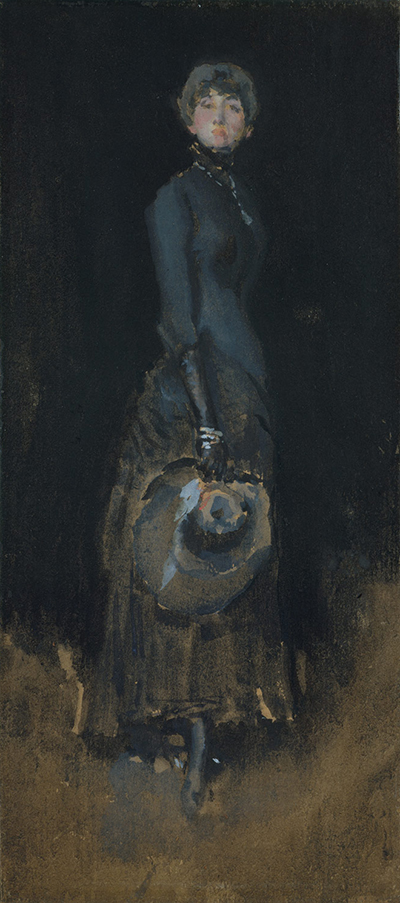
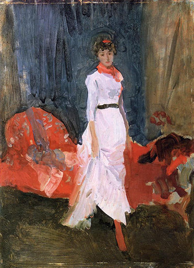
Late and small-scale work is represented by Arrangement in Pink, Red and Purple, Lady in Gray—which is a work on paper rather than a painting—and Little Rose of Lyme Regis, alongside the later full-length portraits. The drawings and prints hubs extend this route beyond oil. Whistler's career becomes clearer when media remain connected but objects remain correctly classified.
Frequently Asked Questions
Terms such as symphony, harmony, arrangement and nocturne direct attention to relationships among colour, shape and interval. They challenge the idea that subject or story is the only measure of a painting, but they do not remove the sitter, place or history represented.
He observed places and people closely, but many paintings were revised in the studio and some changed over years. The Valparaiso nocturne began from a 1866 harbour subject and was transformed later. Observation, memory and selection worked together. [1]
The painting is in the Musée d'Orsay in Paris, accession RF 699. Its formal title begins Arrangement in Grey and Black, No. 1; the familiar name identifies Anna Matilda Whistler. [8]
It is a painted interior made across architectural surfaces and materials, now installed at the Smithsonian's National Museum of Asian Art. The Princess from the Land of Porcelain is the separate oil displayed within it. [12]
He shared interests in modern subjects, changing light and unconventional finish with French contemporaries, but his tonal method, musical titles, exhibition history and ideas developed differently. Comparisons are useful when tied to particular works; the group label is too broad for the whole career. [4]
Discussion
Which painting most clearly changes when you attend to material, title and setting together?
Consider how Whistler’s apparent economy depends on revision, framing and display.
Reader Insights
Where does a narrow tonal interval carry the composition?
How do support and paint handling shape the work’s atmosphere?
Which title, catalogue number or sitter prevents two similar works being confused?
Join the Conversation
Share a close observation or a question for other readers.
References
- Margaret F. MacDonald and Grischka Petri, The Paintings of James McNeill Whistler: A Catalogue Raisonné, University of Glasgow. https://www.whistlerpaintings.gla.ac.uk/catalogue/
- University of Glasgow, “The Paintings of James McNeill Whistler: Project”. https://www.whistlerpaintings.gla.ac.uk/project/
- Andrew McLaren Young, Margaret F. MacDonald, Robin Spencer and Hamish Miles, The Paintings of James McNeill Whistler, Yale University Press, 1980.
- H. Barbara Weinberg, “James McNeill Whistler (1834–1903)”, Heilbrunn Timeline of Art History, The Metropolitan Museum of Art. https://www.metmuseum.org/essays/james-mcneill-whistler-1834-1903
- The Hunterian, University of Glasgow, “Whistler Collection”. https://www.gla.ac.uk/whistler/hunterian/
- National Gallery of Art, Washington, “James McNeill Whistler”. https://www.nga.gov/artists/1974-james-mcneill-whistler
- Smithsonian National Museum of Asian Art, “James McNeill Whistler”. https://asia-archive.si.edu/learn/james-mcneill-whistler/
- Musée d'Orsay, “Arrangement en gris et noir no 1”, RF 699. https://www.musee-orsay.fr/en/artworks/arrangement-en-gris-et-noir-ndeg1-974
- National Gallery of Art, Washington, “Symphony in White, No. 1: The White Girl”, 1943.6.2. https://www.nga.gov/artworks/12198-symphony-white-no-1-white-girl
- Tate, “James Abbott McNeill Whistler”, artist and collection records. https://www.tate.org.uk/art/artists/james-abbott-mcneill-whistler-596
- Detroit Institute of Arts, “Nocturne in Black and Gold, the Falling Rocket”, 46.309. https://dia.org/collection/nocturne-black-and-gold-falling-rocket/64931
- Smithsonian National Museum of Asian Art, “Harmony in Blue and Gold: The Peacock Room”, F1904.61. https://asia.si.edu/explore-art-culture/collections/search/edanmdm:fsg_F1904.61/
- The Frick Collection, “James McNeill Whistler”. https://www.frick.org/artists/james_mcneill_whistler
- National Gallery of Art, Washington, American Paintings of the Nineteenth Century, Part II. https://www.nga.gov/content/dam/ngaweb/research/publications/pdfs/american-paintings-of-the-nineteenth-century-part-II.pdf
- MacDonald and Petri, technical entries for YMSM 034, 038, 063, 103, 115, 140, 183 and 378, The Paintings of James McNeill Whistler: A Catalogue Raisonné. https://www.whistlerpaintings.gla.ac.uk/catalogue/
- Victoria and Albert Museum, “The Wonderful World of Whistler”. https://www.vam.ac.uk/articles/the-wonderful-world-of-whistler
- National Gallery of Art, Washington, “The Woman in White: Joanna Hiffernan and James McNeill Whistler”. https://www.nga.gov/exhibitions/woman-white-joanna-hiffernan-and-james-mcneill-whistler


