 by Tom Gurney
Tom Gurney BSc (Hons) is an art history expert with over 20 years experience
Published on June 19, 2020 / Updated on November 6, 2026
Email: tomgurney1@gmail.com / Phone: +44 7429 011000
Overview
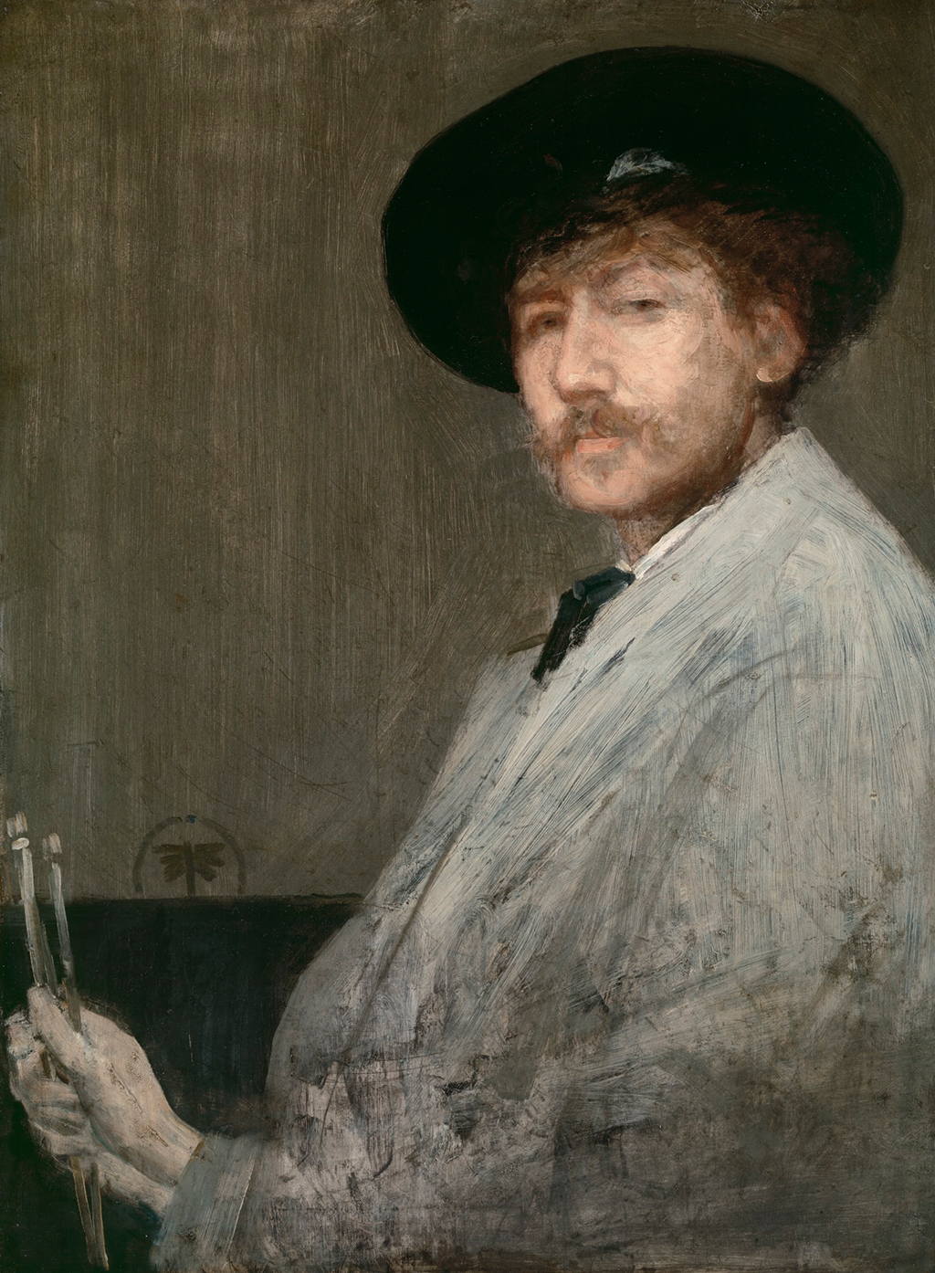
James Abbott McNeill Whistler was an American-born artist who made his career between Paris and London and changed how late nineteenth-century viewers thought about painting, printmaking and artistic display. Born in Lowell, Massachusetts, in 1834 and dead in London in 1903, he crossed national traditions as readily as he crossed media. He painted portraits, river views, seascapes and nocturnes; drew and worked in watercolour and pastel; became one of the century's most searching etchers and lithographers; designed frames, catalogues and exhibitions; and transformed a London dining room into the work now known as the Peacock Room. His art is often introduced through Whistler's Mother, yet that single picture gives only a narrow idea of a career built around tonal relation, material experiment and the control of every element surrounding an image. [1][4][11]
Whistler was also a gifted manufacturer of his own public identity. The white lock of hair, monocle, long cane, butterfly signature, elegant insults and highly public quarrels made him unusually recognisable. His writings can be brilliant, funny and vindictive, but they should not be mistaken for an impartial account of his work. The Gentle Art of Making Enemies gathered reviews, letters and disputes into a retrospective performance in which Whistler usually arranged the last word for himself. The Ten O'Clock lecture offered a more sustained aesthetic statement, arguing that the artist selects and orders nature rather than merely copying it. Both are essential evidence for his ambitions; neither releases a reader from examining the objects, documents and relationships that complicate his claims. [10][17]
The distinction matters because Whistler's most familiar slogans can make his pictures sound detached from history. He called works “symphonies”, “arrangements”, “harmonies” and “nocturnes”, directing attention towards colour and relation rather than narrative. Yet the subjects did not disappear. The Thames remained a working river lined with wharves, factories, bridges and boats. Joanna Hiffernan remained a model, partner and manager, not simply a patch of white paint. Anna Whistler's portrait belonged to a particular family history. Frederick Leyland's dining room was a patron's property, filled with Chinese porcelain and initially designed by Thomas Jeckyll. Whistler's formal language reframed those histories; it did not abolish them.
This page is an entrance to that larger field. It follows the broad movement of Whistler's career, explains how his media and ideas connect, and identifies the distinctions that make individual works worth studying. Close readings, full biographies, technical reports and detailed print histories belong to their own pages. The purpose here is orientation: to see how an artist associated with a handful of icons built a practice that now fills catalogues devoted separately to paintings, works on paper, etchings, lithographs and correspondence.
At a Glance
- Full nameJames Abbott McNeill Whistler
- Life1834–1903 [16]
- BornLowell, Massachusetts [16]
- Working centresParis and London
- PracticePainting, drawing, watercolour, pastel and printmaking [1][2]
- Associated ideasAestheticism, musical titles and Japonisme [11][14][15]
- SignatureButterfly monogram
Contents
- A Transnational Formation
- From Realist Surfaces to Tonal Relations
- Portraits, Models and Musical Titles
- The Thames and the Invention of the Nocturne
- Painting Beyond the Canvas
- Etching, Drypoint and the Art of the Impression
- Lithography, Drawing and Works on Paper
- Venice, Bankruptcy and Renewal
- Collections, Catalogues and the Work We See Now
- How to Look at Whistler
A Transnational Formation
Whistler's childhood did not provide a simple route from New England to American art. His father, George Washington Whistler, was a railway engineer whose work took the family to Saint Petersburg in the 1840s. The young Whistler received drawing instruction there and encountered a European artistic world before returning to the United States after his father's death. He entered the United States Military Academy at West Point in 1851, studied drawing with Robert W. Weir and was dismissed in 1854 after failing to meet the academy's wider requirements. A short period in the drawing division of the United States Coast Survey introduced him to the practical handling of etched plates. In 1855 he left for Paris and did not settle permanently in the United States again. [11][16]
Paris offered formal training but also a larger education in museums, studios, cafés, prints and friendships. Whistler enrolled at the École Impériale et Spéciale de Dessin and entered Charles Gleyre's studio. More decisive were the artists and works he sought out: Dutch and Spanish painting, especially Velázquez; the example of Courbet and French Realism; and relationships with Henri Fantin-Latour and Alphonse Legros. The three artists formed the Société des Trois in 1858. Whistler's early paintings and prints show an artist attentive to physical setting, social type and dense material fact rather than the weightless harmonies of his later reputation. [11]
The move to London in 1859 did not break the Paris connection. It gave Whistler a different base from which to work between artistic cultures. He lodged in the docklands and began the river subjects that would become the Thames Set. He also moved through circles that included British collectors and artists, French colleagues, Pre-Raphaelites and figures interested in Japanese prints and imported ceramics. London supplied the river, patrons, exhibition institutions and controversies that shaped much of his public career; Paris continued to supply friendships, artistic comparison and later a renewed centre of work. Calling Whistler American, British or French can each reveal something, but none of those labels contains him on its own.
His transnational position became a resource. In France he could appear as an artist connected with London and the American expatriate world; in Britain he brought Parisian training and unsettling continental associations; in the United States his birthplace and later collectors supported a retrospective claim. He cultivated these positions without settling comfortably inside a national school. The result was not placelessness. Lowell, Saint Petersburg, Paris, London, the Thames, Valparaiso, Venice and Dieppe entered his career in different ways. What changed was his refusal to let a national biography dictate a single artistic identity.
From Realist Surfaces to Tonal Relations
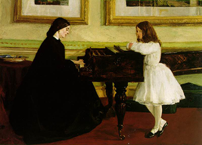
Whistler's development was neither a clean rejection of Realism nor an uninterrupted advance towards abstraction. His early art relied on close observation and a strong sense of physical environment. At the Piano places figures within a carefully built domestic interior. The Thames in Ice and Wapping attend to the working river, its vessels and its human traffic. The etchings of the Thames Set describe façades, rigging, balconies and river labour with a precision that makes the docklands tangible. These works share neither one finish nor one social argument, but they establish how much material structure underlies his later reductions. [1][12]
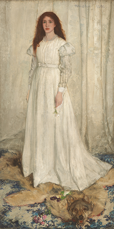
During the 1860s, Whistler increasingly reorganised that visible world. The three paintings now called the white symphonies use related titles and models but do not form a simple decorative sequence. Symphony in White, No. 1: The White Girl, showing Joanna Hiffernan standing on a white bearskin before a pale curtain, was rejected by the Royal Academy and shown at the Salon des Refusés in 1863. Its white dress is not a single white: fabric, fur, flowers, curtain and flesh depend on distinctions of temperature, texture and tone. Later works in the group shift pose, setting and relation, making “white” a problem to be constructed rather than an empty background. [7]
Japanese art and East Asian objects helped Whistler rethink composition, but their roles must be named accurately. He collected Japanese prints and absorbed asymmetry, cropping, high viewpoints, flattened intervals and the expressive placement of relatively empty space. He also collected Chinese blue-and-white ceramics and placed porcelain, screens, fans, robes and other imported objects within pictures. Victorian writers often collapsed these materials into a broad “Oriental” fashion. A modern account should instead distinguish Japanese visual strategies, Chinese objects, European trade and collecting, and the staged fantasy of works in which a European model wears an imported costume. [14][15]
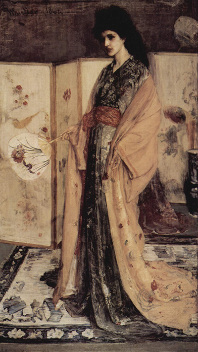
Paintings such as Caprice in Purple and Gold: The Golden Screen, The Princess from the Land of Porcelain and Variations in Flesh Colour and Green: The Balcony show different stages of this encounter. Their fans, screens, porcelain and costume are conspicuous, but composition matters as much as inventory. Figures can be pushed away from the centre; balconies and screens divide shallow space; decorative shapes carry as much force as conventional depth. Whistler did not copy a single Japanese model. He selected, misunderstood, combined and transformed what reached him through nineteenth-century Paris and London.
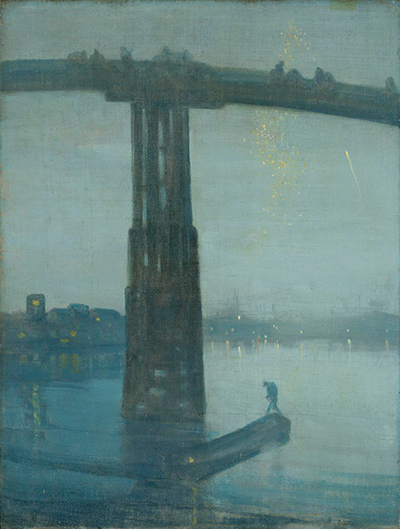
By the early 1870s, tonal relation became an increasingly explicit principle. This did not mean that Whistler abandoned drawing or subject. It meant that he controlled the picture so that no described element could claim independence from the whole. A face might be less finished than academic viewers expected because a sharply modelled head would rupture the arrangement. A bridge could be stretched, obscured or simplified to serve the vertical and horizontal forces of a nocturne. Colour names in titles prepared viewers to encounter this system before they searched for story.
Portraits, Models and Musical Titles
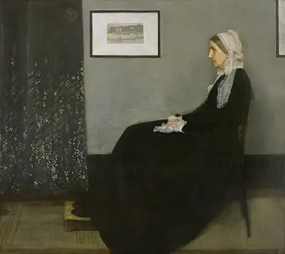
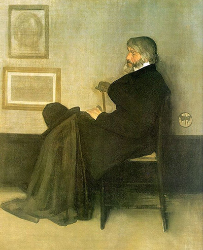
Whistler's musical titles are among his most influential inventions, but they were developed through conversation, revision and exhibition rather than imposed as one complete system. “Symphony”, “harmony”, “arrangement”, “variation” and “nocturne” propose analogies with music: a painting can organise intervals and relations without becoming an illustration of a literary event. A title such as Arrangement in Grey and Black, No. 1 asks a viewer to attend to the measured balance of dark dress, pale wall, curtain, floor, frame and profile. The familiar name Whistler's Mother identifies the sitter but can make that pictorial structure sound secondary. Both kinds of title convey information; neither is sufficient alone. [6][11][17]
The portraits make this tension especially clear. Whistler often used tall, narrow canvases, subdued backgrounds and full-length silhouettes. The apparent restraint required extensive negotiation with pose, costume, fee, schedule and finish. Sitters and patrons did not enter a purely autonomous world. Frances Leyland, Thomas Carlyle, Cicely Alexander, Théodore Duret, Lady Meux, Lady Archibald Campbell, Ethel Whibley and Robert de Montesquiou brought different ages, social positions and relationships to the studio. The paintings translate those circumstances into colour and contour, but good interpretation moves in both directions: from the sitter to the arrangement and from the arrangement back to the social conditions of the portrait.
The people closest to Whistler also require more than the role of “muse”. Joanna Hiffernan modelled for major paintings, managed practical affairs and shared his life during a formative period. Anna Matilda Whistler had her own transatlantic history and substantial correspondence. Maud Franklin was Whistler's partner, model and the mother of two of his children; she also exhibited work under the name Clifton Lin. Beatrix Whistler was an artist and designer before and during their marriage. The correspondence catalogue helps restore these lives, though Whistler's letters remain interested and sometimes evasive evidence. [3][16]
Musical naming can conceal such agency if it is treated as a command to ignore identity. That would turn Whistler's rhetoric into an editorial rule. A stronger reading asks what the title changes. In a portrait, the colour term may resist the assumption that likeness is the only measure of success. In a river scene, “nocturne” may direct attention towards interval, obscurity and memory. In a decorative interior, “harmony” may claim that architecture, shelving, painted surface and objects form one work. The titles alter the hierarchy of attention; they do not make history disappear.
The butterfly signature works in a similar way. Based on Whistler's initials, it developed from a relatively simple mark into a more elaborate emblem that could look delicate or barbed. He positioned it as part of the composition, sometimes within a cartouche, and extended it to frames, letters, catalogues and public design. It was a maker's mark, pictorial accent and brand. Its apparent playfulness fitted the persona; its exact placement reveals the organiser.
The Thames and the Invention of the Nocturne
The Thames gave Whistler one of the richest continuities of his career. When he arrived in London, he worked around the lower river, where warehouses, wharves, sailors, lodging houses and international shipping offered subjects for painting and etching. The Thames Set was not a decorative prelude to the nocturnes. Its plates examine the commercial river through sharply differentiated lines, complex architecture and viewpoints that sometimes place the spectator within a room, balcony or working edge. Published in 1871 after many plates had been made in the late 1850s and early 1860s, the set demonstrates how long Whistler could revise, print and reposition earlier work. [2][12]
The river changed as Whistler moved west to Chelsea. Industry remained, but distance, fog and evening light could reduce its structures to bands, silhouettes and points. Whistler first called some night subjects “moonlights”; the term “nocturne”, associated with music and encouraged by his patron Frederick Leyland, gave them a more suggestive public category. Works such as Nocturne: Blue and Silver—Chelsea, Nocturne: Blue and Gold—Old Battersea Bridge and the Cremorne pictures do not record one stable appearance. They compress repeated looking, memory and studio judgement into carefully limited fields.
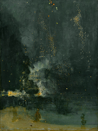
Their economy was radical. A few lamps may become vertical reflections. A bridge may loom as a dark structure while distant buildings almost vanish. Fireworks may register as touches and falling sparks rather than fully described events. Thin paint, broad sweeps and muted grounds can make the support active. The result is not formlessness. Whistler organised silhouettes, margins, tonal steps and small accents with precision. The difficulty for contemporary viewers was that labour did not always present itself as dense detail. A rapidly read surface could embody extended preparation.
That difference became central in Whistler's case against John Ruskin. Reviewing the Grosvenor Gallery in 1877, Ruskin attacked Whistler's work and price in language that included the famous image of paint flung in the public's face. Whistler sued for libel. The trial in November 1878 turned aesthetic disagreement into questions about labour, finish, value and the critic's limits. Whistler won but received only one farthing in damages and had to bear his own costs. The action did not single-handedly create his financial problems, but it intensified a crisis that ended in bankruptcy in 1879. [8][10]
The trial has often been compressed into a victory of modern art over conservative criticism. That story is too neat. Whistler defended professional value and the accumulated knowledge behind apparent speed, but his own pamphlet and later book shaped the episode to his advantage. Ruskin's attack was damaging and intemperate, yet the court did not deliver a general verdict on modern painting. The one-farthing award was legally a win and materially hollow. Its importance lies in the issues it exposed: whether price measures hours or judgement, whether finish must look laborious, and how far criticism can move from evaluation into personal injury.
Painting Beyond the Canvas
Whistler wanted control over the conditions in which art appeared. He designed or altered frames, placed his butterfly as a compositional element, prepared catalogues and invitations, and treated gallery colour and spacing as part of an exhibition. This enlarged field of practice connects the pictures to the Aesthetic Movement, which challenged boundaries between fine art, decoration and the domestic interior. The movement's emphasis on beauty, relation and the “house beautiful” gave Whistler an audience, while his severity and appetite for public conflict made him an awkward member of any collective identity. [14]
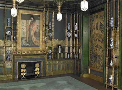
The Peacock Room is the most complete and contested example. It began as a dining room at 49 Prince's Gate in London, designed by architect Thomas Jeckyll for the shipowner Frederick Richards Leyland. Shelves displayed Leyland's Chinese blue-and-white porcelain, and Whistler's Princess from the Land of Porcelain occupied a place of honour. Asked initially about colour, Whistler expanded his intervention while Leyland was away. He painted and gilded architectural surfaces, doors, shutters and ceiling, turning the room into a blue, green and gold environment. Their dispute over authority and payment culminated in the mural of fighting peacocks. [5]
It is essential to keep the room distinct from the painting installed within it. The Princess from the Land of Porcelain is a portable oil with its own date, model, provenance and exhibition history. Harmony in Blue and Gold: The Peacock Room is an interior made from wood, canvas, leather, glass, tile, paint and gold leaf. Charles Lang Freer later acquired the room, moved it to Detroit and eventually gave it with his collection to the Smithsonian. It is now preserved by the National Museum of Asian Art. The room's relocation altered its contents and meaning: a British patron's dining room became an American collector's installation and then a museum environment. [5]
This history also complicates easy celebration. Whistler's intervention is a landmark of Aesthetic design, but it involved an assertion of artistic authority over another designer's work and a patron's property. Leyland's porcelain was not neutral scenery, and the room's “Asian” effect combined Chinese objects, Japanese-inflected motifs and Whistler's Western invention. Formal unity, ownership, global trade and conflict occupy the same space.
Whistler extended this wish for control to temporary exhibitions. Wall colour, spacing and visual rhythm mattered because a crowded or discordant gallery could destroy the relations he had built within a picture and frame. His exhibition designs anticipated the modern idea that display is interpretation. They were also acts of self-fashioning. Visitors entered an environment in which the artist had shaped not only what they saw but how their bodies moved from one work to another.
Etching, Drypoint and the Art of the Impression
Whistler's printmaking is not a secondary version of his painting. He began etching early, developed an exacting knowledge of the copper plate and became one of the nineteenth century's most influential painter-printmakers. The University of Glasgow catalogue covers his etchings, drypoints and mezzotints across the working career, recording states and located impressions rather than treating each composition as one fixed image. That structure reflects the art itself. A plate can be reworked; a burr can wear; ink can be left or wiped; paper can change; two impressions from one state can look markedly different. [2]
The French Set and Thames Set established different environments and graphic problems. Fine etched line could describe stone, timber, rigging, faces and cramped architecture. Drypoint, made by scratching the plate directly, raised a burr that printed a softer, darker line but wore quickly. Whistler learned to make that fragility expressive. The value of a print might lie in the relation between bitten line, drypoint accent, paper tone and the film of ink left during wiping.
Venice pushed this practice further. The Fine Art Society sent Whistler there in 1879 expecting a relatively brief trip and a publishable group of plates. He stayed for roughly fourteen months, from September 1879 to October 1880, and produced etchings, pastels and paintings. The Venice plates avoid a simple catalogue of celebrated monuments. Doorways, small canals, shadowed passages, distant façades and lagoon light become structures of line and tone. In printing them, selective wiping could make architecture emerge from or recede into a veil of ink. [12]
The distinction between plate and impression is therefore fundamental. A museum record for one sheet describes a particular state, ink, paper and printing. The catalogue raisonné follows the plate's development across examples. A general page can explain the process, but an individual print page must identify which impression is actually shown. Commercial reproductions erase these differences; Whistler's practice depends on them.
His papers mattered too. Old European sheets and Japanese papers offered different colour, texture, absorbency and historical associations. Irregularity or age could contribute to an impression's effect. The print was not just black line on a neutral carrier. Paper, ink and wiping were active decisions within the arrangement.
Lithography, Drawing and Works on Paper
Whistler's work on paper further unsettles the hierarchy that places oil paintings above everything else. The Glasgow paintings catalogue links oils to more than 1,700 works on paper, while the Hunterian preserves a vast collection of artworks, tools and estate material. Drawings could record, test or redesign; pastels could become independent works; watercolour and gouache allowed fluid, economical figure and landscape studies; lithography turned drawing into a collaborative, reproducible medium. [1][4]
The small scale of a sheet does not imply slight ambition. Lady in Gray, for example, is a watercolour and gouache on dark brown paper barely more than twenty-eight centimetres high, yet its full-length figure and dark emergence carry the authority of Whistler's painted portraits. The medium changes how that authority is built. Opaque gouache, transparent wash and the paper's own tone can replace the layered structure of oil.
Pastels made in Venice often use coloured paper and remarkably few marks. A façade, figure or canal can be suggested through selected strokes and untouched ground. Such economy should not be confused with incompletion. Whistler repeatedly tested how little description a relation needed to remain vivid. Works on paper made that question immediate because the support could participate openly in the image.
Lithography offered another kind of experiment. Whistler worked with stone, lithographic chalk, wash and transfer paper, often in collaboration with specialist printers including Thomas Way. Lithotint allowed broad tonal washes and scraping, producing effects closer to ink wash or watercolour than to a conventional linear print. Transfer paper let Whistler draw away from the stone and have the image transferred for printing. The Art Institute of Chicago's digital catalogue follows these technical histories, printers, states, impressions and papers in detail. [13]
Because lithography had a less secure fine-art status than etching, it offered room for risk. Whistler could approach it as multiplied drawing, explore atmospheric tone and develop publication projects such as “Songs on Stone”. Printer collaboration was not mechanical service added after invention. The qualities of transfer, stone, ink and proofing shaped what the image became. As with etching, a lithograph should be studied as a material impression rather than a generic picture available in any reproduced form.
Venice, Bankruptcy and Renewal
Whistler's Venice period is often presented as an aesthetic escape, but it began in financial and professional crisis. The Ruskin litigation had brought publicity without financial relief. The White House he had commissioned in Chelsea contributed to his debts, and bankruptcy proceedings in 1879 dispersed possessions and works. The Fine Art Society's Venice commission offered money, distance and a defined project. Whistler exceeded its timetable and scope, turning the stay into one of the most productive periods of his career. [12][16]
Venice changed his imagery without simply replacing the Thames. Both cities offered water, reflection, mist, boats and architecture, but the social and pictorial conditions differed. On the Thames, industry and modern bridges pressed against old waterfront structures. In Venice, famous monuments coexisted with working courtyards, doorways, narrow canals and inhabitants whom tourist views often ignored. Whistler selected peripheral and intimate sites as readily as the lagoon.
The etchings and pastels also moved in different temporal rhythms. A plate could be revised and then transformed through printing; a pastel could register a figure or façade with swift economy; an oil might return to the studio for extended reworking. “Venice” is therefore not one style. It is a connected body of experiments across line, plate tone, coloured paper and thin paint.
The later exhibition of the Venice material mattered almost as much as its making. Whistler arranged works and display to assert artistic coherence, even as disputes about delivery, selection and publication continued. The First Venice Set and Second Venice Set acquired distinct publishing histories. Their influence on the etching revival grew through the very qualities that frustrated viewers expecting topographical completeness: selective line, suggestive tone and the visible individuality of impressions.
Venice also helped Whistler rebuild after bankruptcy. It supplied saleable works, renewed critical attention and a body of evidence for his claims about selection. Yet “renewal” should not become another triumphal legend. Financial anxiety, strained relationships and the labour of printing remained. The achievement lies partly in how he turned those conditions into a practice whose spareness was materially complex.
Public Battles and Private Networks
Whistler's quarrels are inseparable from his reputation but should not be allowed to consume the art. He disputed with critics, patrons, artists, institutions and publishers. He could defend legitimate artistic autonomy and behave cruelly within the same conflict. His wit made disputes memorable; his publications edited them into a mythology of the artist against dull authority. That mythology influenced later ideas of the modern artist, but it also concealed dependence on networks of labour, money and care.
Patrons made ambitious projects possible. Frederick Leyland bought paintings and helped name the nocturnes before the Peacock Room dispute destroyed the relationship. Théodore Duret supported Whistler and sat for an important portrait. Charles Lang Freer collected his work at extraordinary scale and worked with the artist's encouragement, helping create the Smithsonian concentration that now includes paintings, prints and the Peacock Room. Dealers, printers, framemakers, exhibition organisers and lenders shaped what could be made and seen.
Women within Whistler's life did more than pose. Hiffernan managed affairs and sustained relationships during the early career. Maud Franklin's labour and family history sit behind works that Whistler's public narrative often kept indistinct. Beatrix Whistler participated as an artist and designer, and her death in 1896 was a profound personal rupture. Rosalind Birnie Philip later became executrix and a decisive figure in the estate that reached Glasgow. Anna Whistler's correspondence supplies a voice beyond the famous seated profile. [3][4][16]
Institutions also changed the career. The Royal Academy's rejection of The White Girl contributed to its alternative exhibition history. The Grosvenor Gallery provided a setting for Aesthetic painting and the Ruskin controversy. Whistler became president of the Society of British Artists in 1886, attempted to reform its display and standards, and was pushed out after conflict. Museums and universities later converted private collections and estate holdings into public research systems.
This networked view does not diminish Whistler's originality. It makes originality more exact. The artist controlled, selected and revised with unusual intensity, but he did so through materials supplied by others, images made with models, prints realised with printers, rooms owned by patrons and reputations built in exhibitions and print. Autonomy was an aspiration enacted within dependence.
Collections, Catalogues and the Work We See Now
Whistler's present visibility is the result of several different collection histories. The Musée d'Orsay holds Arrangement in Grey and Black, No. 1, commonly called Whistler's Mother. The National Gallery of Art in Washington holds Symphony in White, No. 1 and indexes hundreds of works by the artist across media. Tate holds major paintings including Thames nocturnes and white symphonies. The Detroit Institute of Arts holds Nocturne in Black and Gold, the Falling Rocket. The National Museum of Asian Art preserves the Peacock Room and the Freer collection. [5][6][7][8][9]
The University of Glasgow and the Hunterian provide a different kind of centre. The online paintings catalogue covers about 550 oils and more than 1,700 works on paper, joining object identity to title history, sitters, sites, technique, conservation, frames, provenance, exhibitions and bibliography. The Hunterian holds more than 800 artworks as well as tools, materials and the Beatrix Whistler collection. Glasgow also hosts the etchings catalogue and correspondence edition. These resources make it possible to test a familiar anecdote against a letter, an image against a catalogue number and a general claim about technique against an examined object. [1][2][3][4]
Catalogues do not freeze every answer. Attributions change, lost works reappear, titles are reconciled and current holder information develops. Different numbering systems reflect different media: YMSM for paintings; M. numbers for drawings, pastels and watercolours; G. numbers for the online etchings catalogue; and established lithograph catalogue references maintained by the Chicago edition. Learning those systems prevents pictures with similar titles from collapsing into one another.
That problem is acute with Whistler. Multiple works can be called Nocturne in Blue and Silver in exhibition records; titles may change from blue to grey or silver to gold; a familiar subtitle may displace a preferred catalogue title; and sketches may later acquire the name of a related finished painting. The first task of an artwork page is therefore identity: object, catalogue number, date range, medium, support, size, current collection and title history. Interpretation becomes stronger after those facts are stable.
Present condition also shapes what viewers see. Thin paint can be vulnerable to abrasion. Varnish can alter tonal balance. Lining can change canvas texture. A support may contain an earlier image, and Whistler himself scraped, rubbed down, enlarged or reworked paintings. Frames may be original, later approximations or reconstructions. A current digital image is invaluable, but it is not a transparent window onto the first exhibition state.
How to Look at Whistler
Begin with relation. Whistler's titles encourage that habit, but it can be practised without accepting all his rhetoric. Notice how the largest dark and light areas balance before concentrating on the face or narrative detail. Follow the intervals between figure and edge, bridge and horizon, lamp and reflection. Ask where the support remains visible and where paint becomes thick. In a print, look at the paper and plate tone as well as the line.
Then restore the subject. Identify the sitter, site, room or event. A nocturne may reduce Battersea to silhouette, but it still belongs to a changing Thames. A full-length portrait may suppress furniture, but costume, commission and social performance remain active. The Peacock Room may feel total, but it retains Jeckyll's structure, Leyland's porcelain and the marks of dispute. Formal attention and historical attention should correct one another.
Next, ask what kind of object is present. An oil on canvas, an oil on panel, a watercolour on dark paper, an etched plate and a selectively wiped impression do not produce atmosphere in the same way. “Thin” paint may mean a transparent wash, a rubbed layer, diluted oil or an altered surface. “Print” may mean a particular impression with unique inking, not an invariant design. Medium is part of meaning.
Titles require a similar pause. The musical title may be Whistler's preferred wording, a later catalogue form or an exhibition variant. A familiar name may help readers locate a work while obscuring the artist's formal emphasis. Use both when useful, but do not pretend they are interchangeable. Whistler's Mother and Arrangement in Grey and Black, No. 1 produce different expectations before the same picture.
Finally, resist the demand that Whistler resolve into one label. He worked near Realism, Aestheticism, Japonisme, Tonalism and the beginnings of modernist formalism, but no single category owns the career. His art can be socially specific and formally selective, decorative and contentious, technically economical and laboriously revised. The friction among those terms is often where the work becomes most interesting.
Legacy
Whistler helped enlarge the modern idea of artistic practice. His importance lies not only in atmospheric painting or the anticipation later viewers have found in it. He treated title, signature, frame, wall, catalogue, lecture and public dispute as connected to the artwork's address. He insisted that apparent simplicity could embody judgement rather than lack of labour. He made individual impressions of a print into aesthetic events and used limited colour to intensify rather than diminish attention.
His influence travelled through several channels. Painters responded to the nocturnes, tonal portraits and sparse coastal subjects. Printmakers studied the Thames and Venice plates, their states and their expressive wiping. Designers and collectors encountered the Peacock Room and his exhibition environments. Writers absorbed the persona, epigrams and doctrine of artistic autonomy. American collectors, especially Freer, helped turn the expatriate into a central figure in United States museum collections.
Later labels can both illuminate and distort this legacy. Whistler contributed to Aestheticism and to the international movement of ideas around Japanese art. His tonal economies mattered for artists often called Tonalists, and his insistence on pictorial relation contributed to modern formalist narratives. But he was not simply an Impressionist, an abstract painter before abstraction or a prophet detached from nineteenth-century conditions. Those retrospective claims become useful only when tied to specific works, viewers and transmissions.
The most durable legacy may be a way of paying attention. Whistler asks viewers to notice small differences: one grey against another, an edge that nearly vanishes, a line strengthened by plate tone, a figure held slightly off-centre, a frame carrying colour beyond the canvas. That attention can coexist with a critical awareness of the people, commerce and cross-cultural collecting behind the harmony. Beauty in Whistler is rarely innocent of arrangement.
Frequently Asked Questions
James Abbott McNeill Whistler was an American-born painter, printmaker and designer who lived mainly in London and Paris. Born in Lowell in 1834, he spent formative childhood years in Saint Petersburg, studied at West Point and worked briefly for the United States Coast Survey before moving to Paris in 1855. He died in London in 1903. [11][16]
The familiar name identifies the sitter, Anna Matilda Whistler. The preferred title, Arrangement in Grey and Black, No. 1: Portrait of the Artist's Mother, also directs attention to the designed relation of tones, shapes and intervals. The painting is in the Musée d'Orsay. The two titles reveal different aspects of the same object rather than two different pictures. [6]
He used the musical term for night and evening subjects in which limited colour, obscurity and interval mattered more than detailed topographical description. The term encouraged viewers to approach a painting as an arranged tonal experience. The scenes still refer to real places such as Chelsea, Battersea, Cremorne or Valparaiso.
Whistler shared some interests with artists associated with Impressionism, including modern life, changing light and unconventional finish, and he knew artists in the French avant-garde. His development, exhibition history, tonal method and aesthetic theory were distinct. It is more accurate to discuss particular relationships than to place him simply inside the Impressionist group.
Japanese prints contributed to his use of asymmetry, cropping, unusual viewpoints, flattened space and decorative interval. Imported costume and screens also appeared in paintings. Chinese blue-and-white porcelain belonged to a related but distinct culture of collecting. “Japanese influence” should not be used as a catch-all for every Asian object or compositional choice. [14][15]
The 1878 trial made questions of artistic labour, finish, price and critical freedom unusually public. Whistler won the libel action but received damages of only one farthing and paid his own costs. The dispute contributed to his financial crisis and became a central part of his later public mythology. [8][10]
No. He was a major etcher and drypoint artist, worked extensively in drawing, pastel, watercolour, lithography and lithotint, and designed frames, interiors and exhibitions. Separate catalogues are needed to document these practices because a single list of paintings cannot represent them. [1][2][13]
The Freer Gallery of Art and National Museum of Asian Art in Washington and the Hunterian and University of Glasgow hold exceptionally important concentrations. Major works are also held by the Musée d'Orsay, National Gallery of Art, Tate, Metropolitan Museum of Art, Detroit Institute of Arts, Frick Collection and many other institutions. Glasgow's connected catalogues of paintings, etchings and correspondence are central research tools. [1][2][3][4][9]
Discussion
Which part of Whistler’s practice most changes how you understand the familiar public persona?
Consider a portrait, nocturne, print or designed interior and describe the relation that holds your attention.
Reader Insights
Where does a small tonal interval do more work than a sharply described detail?
How does knowing the sitter, place or patron alter the idea of a self-contained arrangement?
Does Whistler’s control of titles and display guide attention, restrict it, or do both at once?
Join the Conversation
Share a close observation or a question for other readers.
References
- Margaret F. MacDonald and Grischka Petri, The Paintings of James McNeill Whistler: A Catalogue Raisonné, University of Glasgow. https://www.whistlerpaintings.gla.ac.uk/catalogue/
- Margaret F. MacDonald, Grischka Petri, Meg Hausberg and Joanna Meacock, James McNeill Whistler: The Etchings, a Catalogue Raisonné, University of Glasgow. https://www.etchings.arts.gla.ac.uk/catalogue/
- Margaret F. MacDonald, Patricia de Montfort, Nigel Thorp and Georgia Toutziari, eds, The Correspondence of James McNeill Whistler, 1855–1903 and Anna Whistler correspondence, University of Glasgow. https://www.whistler.arts.gla.ac.uk/correspondence/
- The Hunterian, University of Glasgow, “Whistler Collection”. https://www.gla.ac.uk/whistler/hunterian/
- Smithsonian National Museum of Asian Art, “Harmony in Blue and Gold: The Peacock Room”, F1904.61. https://asia.si.edu/explore-art-culture/collections/search/edanmdm:fsg_F1904.61/
- Musée d'Orsay, “Arrangement en gris et noir no 1”, RF 699. https://www.musee-orsay.fr/en/artworks/arrangement-en-gris-et-noir-ndeg1-974
- National Gallery of Art, Washington, “Symphony in White, No. 1: The White Girl”, 1943.6.2. https://www.nga.gov/artworks/12198-symphony-white-no-1-white-girl
- Detroit Institute of Arts, “Nocturne in Black and Gold, the Falling Rocket”, 46.309. https://dia.org/collection/nocturne-black-and-gold-falling-rocket/64931
- National Gallery of Art, Washington, “James McNeill Whistler”. https://www.nga.gov/artists/1974-james-mcneill-whistler
- James McNeill Whistler, The Gentle Art of Making Enemies, London, 1890; revised edition, 1892.
- H. Barbara Weinberg, “James McNeill Whistler (1834–1903)”, Heilbrunn Timeline of Art History, The Metropolitan Museum of Art. https://www.metmuseum.org/essays/james-mcneill-whistler-1834-1903
- Allison Rudnick, “James McNeill Whistler (1834–1903) as Etcher”, Heilbrunn Timeline of Art History, The Metropolitan Museum of Art. https://www.metmuseum.org/essays/james-mcneill-whistler-18341903-as-etcher
- Harriet K. Stratis and Martha Tedeschi, eds, The Lithographs of James McNeill Whistler: The Digital Edition, Art Institute of Chicago. https://publications.artic.edu/digitalwhistler/reader/lithographs
- Victoria and Albert Museum, “An Introduction to the Aesthetic Movement”. https://www.vam.ac.uk/articles/an-introduction-to-the-aesthetic-movement
- Colta Feller Ives, “Japonisme”, Heilbrunn Timeline of Art History, The Metropolitan Museum of Art. https://www.metmuseum.org/essays/japonisme
- University of Glasgow, “James McNeill Whistler, 1834–1903”, correspondence biography. https://www.whistler.arts.gla.ac.uk/correspondence/biog/display/?bid=Whis_JM
- James McNeill Whistler, Mr. Whistler's “Ten O'Clock”, Chatto and Windus, 1888, Smithsonian Libraries and Archives. https://library.si.edu/digital-library/book/mrwhistlersteno00whisa