


 Buy Art Prints Now
from Amazon
* As an Amazon Associate, and partner with Google Adsense and Ezoic, I earn from qualifying purchases.
 by Tom Gurney
Tom Gurney BSc (Hons) is an art history expert with over 20 years experience
Page Created on June 19, 2020 / Page Updated on November 1, 2026
Email: tomgurney1@gmail.com / Phone: +44 7429 011000
The Crucifixion and the Last Judgment
Two narrow paintings bring a death and a final reckoning into one field of view. On the left, Christ hangs above a crowded, imagined Jerusalem. On the right, he appears again above the division of the saved and the damned, with his wounds still visible. The Metropolitan Museum of Art preserves the pair with their original inscribed frames. Each painted image is only 56.5 centimetres high and 19.7 centimetres wide, yet the scenes extend from mountain and sky to packed human crowds and the depths of hell. Looking at them together means moving from an event in the Passion to its imagined consequence at the end of time.[1]
The Met currently titles the object The Crucifixion; The Last Judgment, attributes it to Jan van Eyck and dates it to about 1436–38. Earlier Met research and exhibition texts used about 1440–41 and named a workshop assistant as well. The change now has a published explanation: Maryan Ainsworth’s 2023 catalogue entry summarises the research behind the earlier dating and attribution to Jan, while Sophie Scully’s 2025 technical notes find no clear material or procedural difference that requires an assistant in the upper Judgment. The older labels remain part of the scholarly history; the current position is more than an unexplained change in the heading.[1][2][10][11]
At a Glance
Annotated Details from The Crucifixion and the Last Judgment
Compare the crowd and landscape of the Crucifixion with the ordered heaven and crowded hell of the Last Judgment. Match the numbered points to the details below.
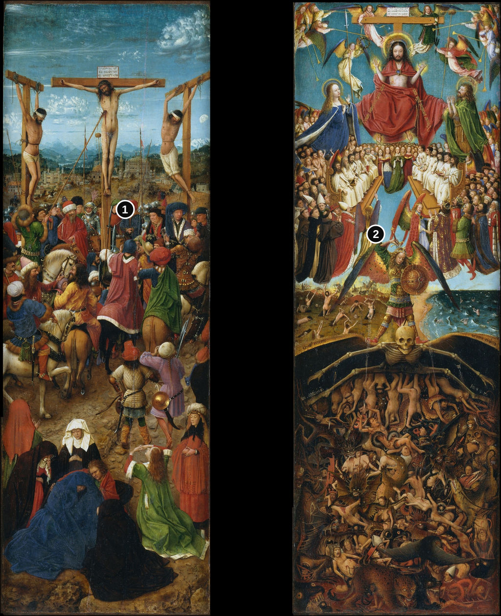
Details from THE CRUCIFIXION AND THE LAST JUDGMENT
Select a detail to enlarge it. Return to the numbered overview to find its position.
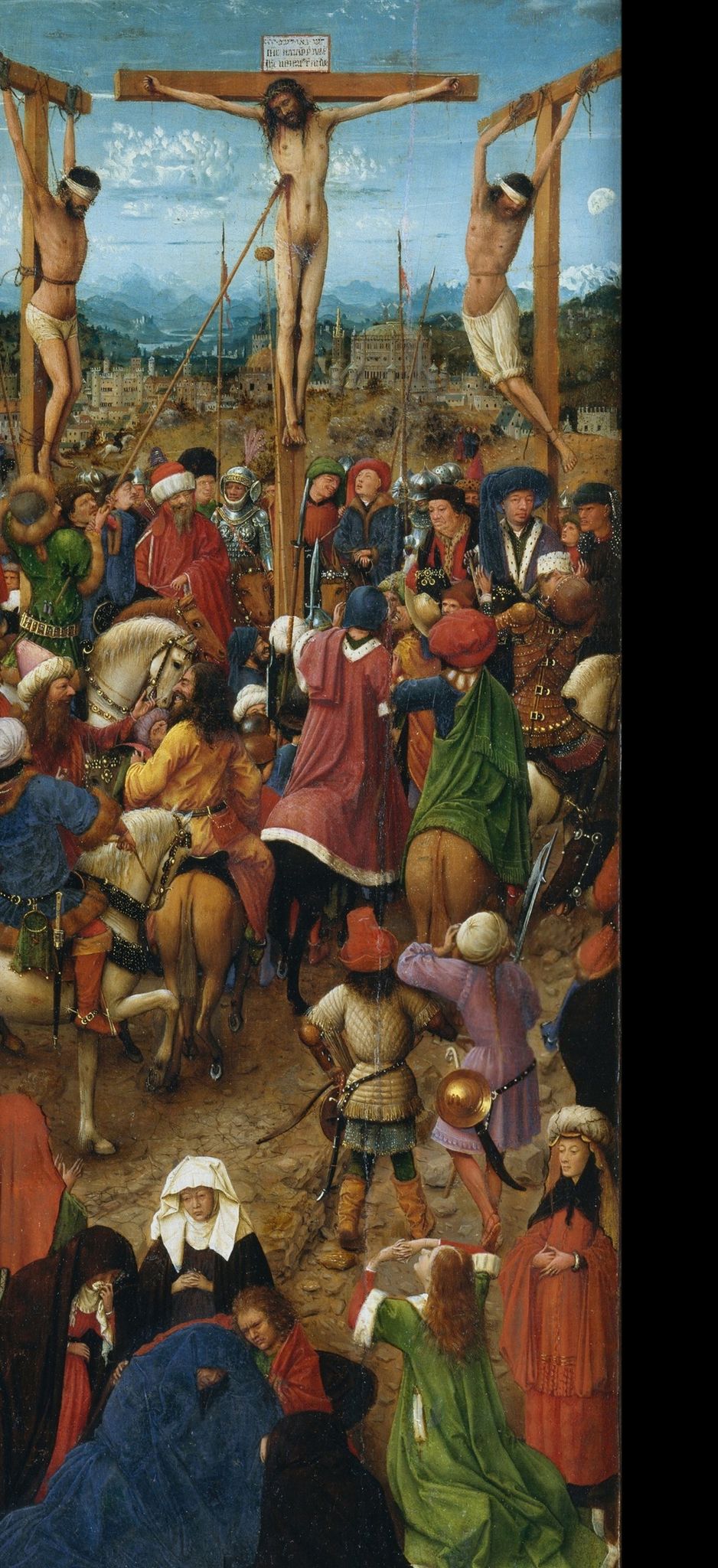
Crucifixion
The left panel gathers grief, soldiers and onlookers around the crosses. The crowded scene differs sharply from the vertical judgment beside it.
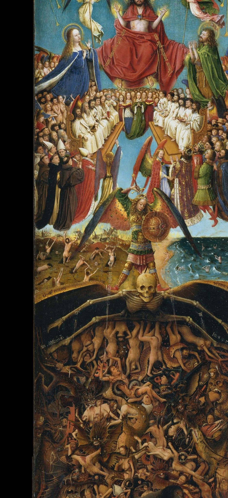
Last Judgment
The right panel moves from the heavenly court above to the condemned below. Both panels must be read within the pair's uncertain original format.
The two are often called a diptych because they now stand as a pair. Their original use is less secure. Study of the frames has changed the question from “what do these two panels mean when placed side by side?” to “what larger object, if any, did they first form?” They may have been wings of a triptych or doors of a tabernacle or reliquary shrine before being arranged as a diptych. No known lost centre can simply be inserted between them. Their relationship is clear enough to read; their first physical setting remains a subject of research.[1][2]
Two scales of Christian time
The Crucifixion shows a specific moment in the Gospel story: the execution of Jesus among the two thieves. The Last Judgment imagines Christ's future return to judge the dead. Placed together, the subjects form a theological sequence rather than an ordinary chronological narrative. Christian belief links the death of Christ to the possibility of salvation, while the judgment asks what becomes of humanity in its wake. The images put that connection before the eyes without making the two moments look alike. One is staged among people and soldiers on a hill; the other sorts an entire world into heaven, earth and hell.[1][3]
The left panel draws a viewer through a vast seeming landscape. At the top, the three crosses rise into blue sky, with a distant city, hills and pale mountains behind them. Christ's body occupies the middle cross but does not fill the whole painted space. Below, a dense gathering of riders, mourners and onlookers creates shifting pockets of movement. In the foreground, grieving figures are close enough for their posture to be read; above them, many faces shrink toward the crowded middle distance. A height of barely more than half a metre contains several ways of seeing an event, from intimate sorrow to public spectacle.[1]
The right panel compresses space differently. Its upper region centres the judging Christ, robed in red, surrounded by angels and assembled figures. Below this heavenly assembly, the archangel Michael stands over the region of torment, while the dead rise from land and sea to be judged. Beneath him spreads a skeletal figure of Death over a dark hell, where bodies twist among threatening creatures. The composition is hierarchical: scale, colour and vertical position separate authority, intercession, resurrection and punishment. The eye falls down the panel even as the subject asks it to consider ascent toward salvation.[1]
In the Crucifixion crowd
The crosses provide an unmistakable centre, but the people below are not treated as a single mass. Mounted figures gather under Christ; some turn toward the execution, others toward one another. Their clothes, horses and weapons make the biblical event feel witnessed by a complicated society rather than enacted before an empty backdrop. The distant city has the same effect. It gives the story a place one might imagine travelling through, even though the Jerusalem shown here is a painter's invention rather than a measured view of the historical city.[1]
At the lower edge, mourners turn away from the noise above. The Virgin, wrapped in blue, bends into grief while companions attend her. The descent from the crosses to this group is also a descent in emotional register. The central body is exposed high in the air; near the ground, sorrow makes people fold inward. The figures' clothing creates broad shapes amid the many small faces higher up. Those shapes hold the panel's bottom in place and give the viewer somewhere to rest after scanning the compressed crowd.[1]
One part of that construction is harmful. The Met's current audio discussion points out that some mounted men near the crosses have facial features and dress associated with long traditions of anti-Jewish caricature. Such imagery helped direct blame for Jesus's death toward Jews and has been part of a broader history of hostility and violence. It is necessary to name the stereotype rather than present it as neutral “character.” The Christian Passion scene is being told through a fifteenth-century visual convention that can carry prejudice, and recognizing it does not diminish the mourners' grief or the painting's material achievement.[1]
The Last Judgment's three regions
On the companion painting, Christ is no longer the exposed figure on a cross. He sits in judgment, larger than those around him and placed at the top of the visual order. The contrast is the pair's central pivot. The body that seemed vulnerable on the left is presented as sovereign on the right. Angels, saints and other figures form ranks around him. Colour and repeated faces turn the upper zone into a gathering that is both populous and ordered, very different from the jostling crowd under the crosses.[1]
The space beneath this assembly is less stable. Michael occupies the centre, armed and winged, between the fate of the saved and the terror of the damned. He is larger than many human figures near him, and his armour makes him stand out. On one side, the dead appear to rise from earth; on the other, figures emerge from water. The land and sea together suggest the reach of judgment beyond a single city or burial ground. The vast event is held in a thin strip of painted earth between heavenly order and the dark region below.[1]
Under Michael stretches a startling skeletal form, its wings or arms spread across the width of the picture. This is Death made into a bodily threshold. Below it, people tumble among monstrous mouths and claws. The crowded lower field resists an easy count of individual punishments. Instead, it produces a visual pressure, a sense that human bodies are becoming entangled in a place without stable footing. Darkness is used differently from the cool blue of the Crucifixion sky: it conceals and reveals at once, leaving the eye to discover more violence as it adjusts.[1]
One striking difference from the left panel is the treatment of horizon. In the Crucifixion, mountains and city recede under a wide sky, so even a sacred event seems to unfold in a navigable landscape. The Judgment leaves only a compressed band of land and sea between celestial court and hell. Space is defined by destiny rather than by a route a person might travel. The white clothing of many figures around Christ catches the eye in a disciplined array; lower down, bodies and creatures become harder to separate. Colour and spatial order thus do much of the theological work before any frame inscription is read.[1]
Words built into the frames
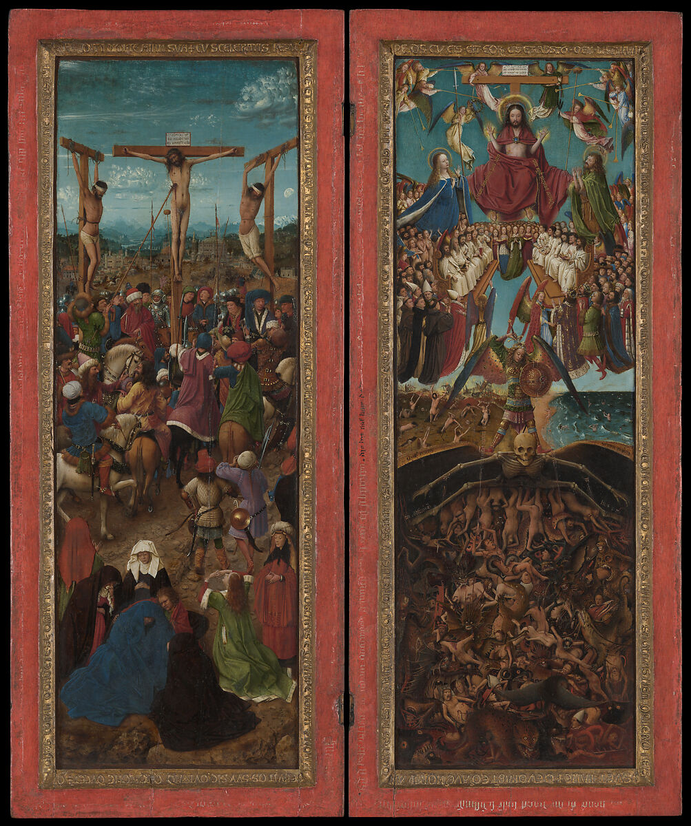
The paintings' frames are original, and their inscriptions are part of the work's meaning. Around the inner slopes are Latin biblical texts made as raised letters from chalk-based preparation, a technique called pastiglia, and then gilded. These Latin inscriptions are accepted as original; the exact date of the Middle Dutch writing on the outer flats is debated. The Crucifixion frame draws on Isaiah's account of a suffering figure who bears the sins of others. The Last Judgment frame draws on Revelation and Deuteronomy: divine dwelling with people, the end of death and sorrow, the sea surrendering its dead, and the threat of punishment. These are not interchangeable decorative borders. They direct a reader from painted events toward scriptural interpretation.[5][6][4]
The raised Latin lettering changes how one might have viewed the object. The eye can follow a painted figure inward and then move to words around it; the image and its frame become one field of attention. The Met's frame research emphasizes that some biblical passages were adapted to suit the painted subjects and the available space. The inscriptions therefore need to be understood as selected and arranged for these pictures, not as a mechanical copy of a whole biblical chapter. Their material form—golden letters casting tiny shadows—also lets language act visually before it is fully read.[7][4]
For many years another set of words was hidden. X-radiographs of the flat outer borders showed fragments beneath later gold-coloured covering. Further examination used macro X-ray fluorescence, which maps chemical elements, including lead in the lettering. Microscopic samples showed white painted letters over bright red paint as early layers, covered by several phases of repaint and regilding. The outer border’s later metallic coating was brass leaf, rather than its early red surface. The evidence altered the object in the eyes of its conservators: what had looked like a plain golden outer frame had once been a red field carrying a second script.[6][7]
That second text is in Middle Dutch, written in Gothic minuscule. Marc Smith, the paleographer who studied the surviving marks, found it to be a close translation of the Latin biblical material. In the portions he could reconstruct, the Crucifixion passage is better preserved than the Judgment passage. His assessment recovers nearly three quarters overall, not a complete transcript. Some letters are only minute traces; other sections were scraped away. A reader should not mistake a scholarly reconstruction printed today for words visible and intact on every side of the frames. The exact timing remains debated. Scully’s 2025 account finds different preparations beneath the inner and outer decorations, suggesting separate working stages, but no physical evidence proving that the outer border was decorated at a substantially later date. The museum considers workshop execution possible.[4][11]
The red-and-gold scheme helps explain why the added language matters. Latin could serve a priest or educated reader, while the vernacular made the same biblical argument accessible to other viewers. This division of readers is a plausible explanation offered by the Met; no surviving commission specifies precisely who read at the object's first location. Since the Dutch lettering's date remains uncertain, its first readers cannot be assigned confidently to the original presentation. A household patron, a religious community or visitors at an altar would each have approached the words differently. The surviving frames show a two-language encounter during an early phase of the object's history, but do not by themselves identify its first audience.[4][5][3]
Smith notes that the Judgment text begins with Ecce tabernaculum Dei, “Behold the tabernacle of God.” That opening gives extra weight to the idea that the panels may once have been tabernacle doors. Yet the phrase comes from Revelation and also belongs to the picture's theology, so it cannot independently prove a furniture type. The same frame could have been read after an alteration in the object's format. The wording is a clue about possible function, joined to technical evidence and the panels' shape, not a label left by a maker saying where every piece was mounted.[4]
Watch: Jan van Eyck in context
Choose a Smarthistory close reading of the Arnolfini Portrait or the closed and opened Ghent Altarpiece.
Jan van Eyck, The Arnolfini Portrait
Look closely at the room, mirror and gestures in the London double portrait.
Watch on YouTubeWhat was this object first?
The pair's present description as a diptych tells a visitor how the two paintings are arranged now. The Met says technical research shows they were not always so configured. Its investigators have considered two wings of a triptych and doors of a tabernacle or reliquary shrine. Each possibility gives the surviving narrow format a different practical role. Wings might open beside a central image; doors might cover something precious; a diptych could open into a paired devotional view. The paintings alone do not identify a lost centre, a shrine's contents or a first room.[1][2]
The frames offer clues because they are actual pieces of the early object, not modern surrounds chosen for gallery display. Investigators looked for hinge evidence and examined the layering of their decoration. The relationship between frames, inscriptions and images suggests that the pair's form evolved. Ainsworth later described a likely sequence from tabernacle doors to a devotional diptych and then to triptych wings, while noting that patronage and phases of use were still being studied. This should remain a working reconstruction. A complete object history would require more than a suggestive inscription and the present physical pair.[6][3]
The original frames also show why the picture's later appearance could mislead. At some point their red flat borders and white writing were scraped or covered; later bright brass leaf made them look uniformly metallic. Sophie Scully's conservation account attributes much scraping, cautiously, to reframing in Naples in the seventeenth century. That may explain the damage, but it is not a complete provenance for the panels or an exact date of each alteration. A later frame arrangement could physically change how viewers encountered the paintings while leaving the two painted scenes recognizable.[8]
The hardware supplies evidence distinct from an interpretation of words. Recesses on the inner sides of the frames accommodated hinges. Three square holes on the outer sides belong to a fastening system that would have worked when the pictures closed face to face as a diptych. Radiographs also reveal nails associated with fittings that could secure them side by side when used as triptych wings. These are traces of more than one arrangement, rather than three equally imaginary reconstructions. They establish a changing object; they do not independently identify the first arrangement or its patron.[11]
The Brussels proposal and its limits
Ainsworth’s 2023 catalogue entry develops the hypothesis that the pictures were doors to a reliquary shrine in the collegiate church of Saints Michael and Gudula in Brussels. A chapel for the venerated host was built there in 1436–38; the entry connects the paintings with that campaign, the relic’s public accessibility and the attached indulgences. Their narrow format could suit doors, and the Middle Dutch text would make sense for a local lay audience. In this reconstruction, Philip the Good and Isabella of Portugal were likely patrons, and the unusual imagery answers the requirements of a particular commission.[10]
Several visual details form part of the argument. Christ’s displayed wounds and pose are compared with images associated with miraculous hosts. The white habits of the apostles and Mary’s protecting mantle are read in relation to Carthusian devotion. Michael carries sword and shield, rather than weighing souls with a balance, which gives him a conspicuously defending role. Ainsworth also proposes portraits of Philip, Isabella and Cardinal Albergati among the Crucifixion witnesses. These identifications are argued from costume, physiognomy, revisions and historical relationships; no inscription names the figures. They should be presented as proposals, rather than as three securely labelled portraits.[10]
The distinction between Brussels and Dijon matters. Philip also supported a different host relic at the Sainte-Chapelle of his Dijon palace. Ainsworth distinguishes that French-speaking context from the Dutch text on the Met frames and argues for Brussels. The existence of two related cults cannot itself locate a painting. Language, architecture, iconography and ducal patronage have to be combined into an inference; there is still no recovered contract naming these exact surviving pictures as the Brussels doors.[10]
Susan Frances Jones, reviewing the 2022 study, questions how securely the proposed shrine follows from the surviving evidence. She notes the shortage of Netherlandish comparanda and the difference between the Met’s elaborate narrative and more conventional shrine imagery. She also suggests that the paired Latin and Dutch passages could have supported lay devotional reading. Her criticism does not overturn the hardware evidence for changing configurations. It challenges the further step from that evidence to a specific shrine and ducal commission. The distinction lets the reader understand what is observed and what remains an explanatory model.[5]
The proposed relic history also needs careful language. The Brussels cult grew around allegations of host desecration directed against Jews in 1370, followed by persecution and execution. Those accusations are not historical proof that Jews committed such acts. In a French-language statement of 22 April 2026, the cathedral’s dean, Benoît Lobet, says the claimed miracle cannot be historically established and rejects further public promotion of the devotion, specifically noting the anti-Jewish caricatures embedded in its retelling. This statement concerns the cathedral’s own historical memory; it neither proves nor disproves Ainsworth’s painting attribution. It does clarify why explaining a possible medieval cult setting requires naming the prejudice within its founding narrative.[12]
Recovery without invented text
Once the hidden letters had been identified, the Met faced a practical choice: leave the later brass-covered state in place or remove covering to reveal the damaged earlier layers. Conservators documented the later work and removed it under magnification. Beneath it they found fragments of fine white and black calligraphy and damaged red paint. The intervention made historical evidence visible again while exposing how much had been lost. It was not the discovery of two perfectly legible frame texts waiting untouched under a thin layer of metal.[7][8]
The 2015–16 treatment, described in the Met’s 2019 essays and later technical account, restored a red appearance to the outer border but did not recreate missing letters. Later brass leaf on the inner gilded coves was retained, according to Scully’s technical notes. Reconstructing the inscription in paint would have required too many guesses. This choice is visible in the work's current presentation: from a distance, the frames again have a strong red-and-gold contrast; close up, damaged original passages and modern compensation can be distinguished. The result does not erase the centuries of change, but it lets the earliest surviving evidence govern the overall look more strongly than the conspicuous later brass leaf did.[8][3]
The research is a reminder that a frame can be an archive. Its wood, pigment, raised lettering, metal layers and abrasions record actions not described in a single text. Radiography located obscured letters; elemental mapping helped chart them; cross sections gave their order; paleography tested possible words against the surviving strokes. Each method answered a different question. None alone settled where the object was first installed. The inquiry is strongest because it holds physical findings and interpretive hypotheses apart.[6][7][8][4]
The paintings and their frames began as unusually closely joined objects. Each picture and its integral surround were carved from a single piece of oak with vertical grain. During transfer from wood to canvas in 1867, the surrounds were cut away and preserved, while the paint and original preparation were attached to coarse canvas. Scully records a signature on the canvas reverses naming A. Sidorov and the year of transfer. This is why the frames can remain original even though the paintings’ present supports are later. The transfer also destroyed the original reverses, reportedly carrying a grisaille Annunciation described by Passavant in 1841.[11]
The oak still offers a limited chronological clue. Analysis of the frames places the possible felling of the trees between about 1410 and 1440 and relates the wood to an eastern Baltic source. That range cannot choose a precise painting date. It is useful precisely because the frames preserve material evidence that the transferred images have lost. Frame construction, inscriptions and surviving fastening marks now carry a disproportionate share of the evidence for the object’s early physical history.[11]
Drawing and painting beneath the minute detail
The Met’s current technical account describes elaborate brush underdrawing in both pictures. Fine contours and parallel hatching first organised forms and shadows; a second, bolder application strengthened outlines and clarified expressions. Cross-hatching marked the deepest folds. The handling is consistent across the pair, although its detail changes with the scale of the represented figures. This is a coordinated working process, not merely a collection of miniature incidents added wherever space remained.[11]
The painter then adjusted the design. Horses’ legs shifted in the Crucifixion, and trumpets changed position in the Judgment. Mary’s elaborate underdrawn crown in the upper Judgment was omitted in paint. That alteration is especially consequential for interpretation because the proposed crown of lilies and gems has been connected with Carthusian imagery. It survives as evidence of an idea considered during making, not as an accessory visible in the finished painting. The distinction prevents technical discoveries from being described as though all viewers had always seen them.[10][11]
Tiny faces were built through a repeatable but flexible procedure: a light warm base, intermediate modelling, dark accents for features and selective white highlights. Red strokes enliven the mourners’ eyes. Some costume and landscape details were worked wet into wet, including reflections on armour. The effect of exhaustive observation therefore need not mean that every passage was painted slowly with an equally tiny point. Deft marks and sharp tonal contrast could make a face legible at a scale where fully articulated anatomy would be impossible.[11]
The restricted dimensions also affect attribution. Earlier scholars assigned parts of the upper Judgment to an assistant or illuminator because they appeared less accomplished. Scully’s 2025 study finds consistent materials, handling and revisions, while noting abrasion and the exceptionally small figures in that area. Worn upper paint can expose broader underlayers and flatten subtle modelling; a difference in present appearance need not represent a different original hand. The Met’s conclusion is that both pictures appear entirely by Van Eyck. That is a reasoned technical assessment, rather than proof that no workshop member could have contributed any task.[11]
Colour has changed unevenly. The technical notes record lead white, blacks, earth colours, vermilion, blue pigments and copper-containing greens. Pale opaque patches interrupt Mary’s blue robe and may result from ultramarine degradation; grey or silvery passages in reds are associated with altered vermilion. The notes describe an apparently oil-bound paint system but explicitly say the binding medium was not analysed. Oil is the museum’s current medium designation; a precisely identified oil recipe would exceed the published evidence. Such qualifications matter in a work where differences of condition once influenced arguments about quality and authorship.[11]
Lettering participates in the same creative process. Lower inscriptions were prepared in drawing and subsequently repositioned or changed; some wording was omitted and other text added beside arrows. In the heavenly region, lettering was executed with mordant gilding, now much worn. Gold above and painted words below establish different material registers within the Judgment. A frame transcript alone cannot capture this distinction: the viewer encounters the script through its colour, placement, relief or reflective material as well as through its verbal meaning.[11]
A related drawing, not a missing panel
A drawing in Museum Boijmans Van Beuningen, Rotterdam, has helped renew study of the Met's Crucifixion. The Boijmans work, Crucifixion of Christ, is on prepared paper and combines goldpoint, silverpoint, pen and black ink. It was rediscovered in 2011 and shown beside the New York pair during the Met's 2016 exhibition. The museum's present record dates it around 1440–50 and lists Jan van Eyck and an anonymous maker. It is a separate work with its own uncertain production history, not a painted wing that once sat between the Met panels.[2][9]
The drawing is useful because it shares a complex Crucifixion design with the painted left side. Comparing it with the Met's infrared evidence can illuminate how a crowded scene was planned, adapted or transmitted. But the direction of that relationship cannot simply be assumed from resemblance. A drawing might precede a painting, follow it, preserve an idea through a workshop or combine more than one moment of design. The Met used their comparison as a research question. The Rotterdam sheet's full analysis belongs on its own Crucifixion drawing page; here it shows how another object can sharpen the study of the paired paintings without becoming identical to them.[2][9]
Dating, authorship and later history
Neither painting supplies an inscribed year equivalent to the date in the Arnolfini Portrait. The current circa 1436–38 range follows Ainsworth’s reconstruction of the Brussels chapel campaign and her comparisons with Jan’s other paintings. It is therefore an argued estimate, partly linked to a disputed commission hypothesis. The consistent technical execution supplies an additional case for the attribution to Jan; it does not turn the chapel’s construction dates into a date written on the paint surface.[10][11]
A likely seventeenth-century trace is a 1641 inventory of the Spanish viceroy of Naples and his wife. As discussed by Ainsworth, it describes paired Crucifixion and Judgment paintings with surrounding antique lettering so closely that identification with the Met works is highly plausible. They were reportedly acquired during the viceroy’s 1637–41 tenure and taken to Madrid in 1643. The Italian-style architectural surround described in that history offers a context for later alterations to the early frames. The route from any proposed Brussels shrine to Naples is still undocumented.[10]
The current provenance securely places the pictures with Dmitry Pavlovich Tatishchev by 1841. He reportedly bought them in Spain from a convent near Madrid or perhaps Burgos; that uncertain locality should remain uncertain. His bequest took them to the Imperial Hermitage after his death in 1845. They subsequently passed through Knoedler to the Met in 1933, acquired with the Fletcher Fund as 33.92ab. This ownership chain explains the Russian transfer to canvas and the American museum’s acquisition, while leaving the earliest journey unresolved. A plausible inventory match and a well-recorded later collection history are different kinds of evidence.[1][10][11]
The paired subjects have had a longer interpretive life than their exact format. Whatever they first opened or closed, a viewer can still move from Christ's death to the world judged by Christ. The red frames now make that movement more complex, asking the eye to read a border as well as a painted scene. The original Latin text and the Dutch version of uncertain exact date joined image to scripture; damage and recovery reveal how that joining was nearly lost. The paintings reward close looking because they hold the immediate sorrow of a few figures and the imagined destiny of multitudes at once. Their unknown first setting remains part of the story, and the surviving material gives clear grounds for saying exactly where knowledge ends.[1][4][5][3]
Related reading


Discussion
What do you notice in The Crucifixion and the Last Judgment by Jan van Eyck? Share a close observation or a source that adds useful context.
Join the Conversation
Keep observations specific and evidence clear.
References
- The Metropolitan Museum of Art, “The Crucifixion; The Last Judgment,” collection record 33.92ab, current object information, overview and audio transcript. View Source.
- The Metropolitan Museum of Art, “A New Look at a Van Eyck Masterpiece,” 2016 exhibition overview. View Source.
- Maryan Ainsworth, “Unlocking the Mysteries of Two Jan van Eyck Frames, Part Five: Mysteries Unlocked,” The Met, 19 March 2019. View Source.
- Marc Smith, “Unlocking the Mysteries of Two Jan van Eyck Frames, Part Four: What Does the Text Mean?,” The Met, 12 March 2019. View Source.
- Susan Frances Jones, review of Jan van Eyck’s Crucifixion and Last Judgment: Solving a Conundrum, Historians of Netherlandish Art Reviews, February 2024. View Source.
- Maryan Ainsworth, “Unlocking the Mysteries of Two Jan van Eyck Frames,” The Met, 19 February 2019. View Source.
- Silvia A. Centeno and Sophie Scully, “Unlocking the Mysteries of Two Jan van Eyck Frames, Part Two: Imaging the Hidden Details,” The Met, 26 February 2019. View Source.
- Sophie Scully, “Unlocking the Mysteries of Two Jan van Eyck Frames, Part Three: Addressing Questions of Display,” The Met, 5 March 2019. View Source.
-
Museum Boijmans Van Beuningen, “Crucifixion of Christ,” drawing MB 2014/T 1 (PK), collection record and Albert Elen contextual note (2021). View Source.
-
Maryan W. Ainsworth, catalogue entry for The Crucifixion; The Last Judgment, 2023, Metropolitan Museum of Art, including the summary of the 2022 research, Brussels commission hypothesis, attribution, dating and seventeenth-century inventory. Select “Catalogue Entry.” View Source.
- Sophie Scully, technical notes for The Crucifixion; The Last Judgment, 2025, Metropolitan Museum of Art, painting construction, transfer, underdrawing, paint, attribution, frames and treatment, with notes. Select “Technical Notes.” View Source.
- Benoît Lobet, “Le Saint Sacrement de Miracle — Intervention pastorale 22 avril 2026,” Cathédrale Saints-Michel-et-Gudule, Brussels; French statement on the unproven miracle narrative and anti-Jewish imagery. View Source.
 Jan van Eyck.jpg)
 Jan van Eyck.jpg)


