 Buy Art Prints Now
from Amazon
* As an Amazon Associate, and partner with Google Adsense and Ezoic, I earn from qualifying purchases.
 by Tom Gurney
Tom Gurney BSc (Hons) is an art history expert with over 20 years experience
Page Created on June 19, 2020 / Page Updated on November 1, 2026
Email: tomgurney1@gmail.com / Phone: +44 7429 011000
The Crucifixion Drawing Associated with Jan van Eyck
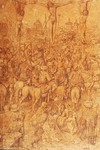
Three crosses stand over a dense assembly of horses, spectators and mourners. Beyond them, Jerusalem recedes into a finely drawn landscape. The image occupies a sheet only 25.4 centimetres high, yet moves from intimate grief to a distant city. Museum Boijmans Van Beuningen in Rotterdam calls it Crucifixion of Christ. Its relationship to Jan van Eyck's Crucifixion and Last Judgment in New York is unmistakable; whether Jan himself drew it remains disputed.[1][2][3]
The museum records goldpoint, silverpoint, pen and black ink on prepared paper, measuring 254 × 187 mm, under accession MB 2014/T 1 (PK). Its circa 1440–50 date accompanies qualified attribution to Van Eyck and/or his studio, with an anonymous maker also listed. That range extends beyond Jan's death in 1441. The object is therefore best approached as an Eyckian drawing whose materials, authorship and working history have to be considered separately.[1]
At a Glance
Reading the crowd
The drawing brings together several kinds of attention. Mounted spectators gather beneath the crosses; figures on foot turn, gesture and look upwards; the grieving group occupies the foreground. These people share the same event without sharing the same response. The horses give weight to the centre, while the crosses pull the eye above the crowd. Small differences in posture matter because they separate individuals within an unusually compressed narrative.[2]
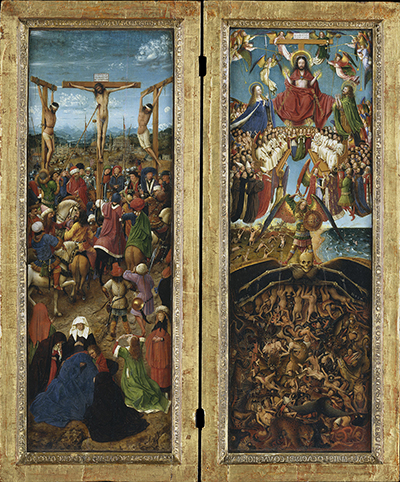
Mary Magdalene provides one of its strongest connections. Loose-haired and dramatically turned towards Christ, she carries the viewer's attention from the mourning women towards the execution above. Wallert notes that her placement differs between drawing and painting: the sheet positions her further forward and to the left of the grieving group, whereas the New York panel places her on its other side. The relationship survives a change in arrangement. This is an adapted composition, rather than the same image rendered in another medium.[2]
The distinction is especially clear in the ground between the mourners and the horsemen. In the painting an interval separates those groups, crossed by two figures. On the sheet the interactions between bodies connect the zones more continuously. Neither arrangement is simply more detailed than the other. Each makes a different use of space: the drawing's relatively broad rectangle accommodates a spreading crowd, while the tall, narrow panel requires a more pronounced progression from foreground to distance.[2]
A further comparison concerns the figure Wallert identifies as a sibyl. In his reading, she turns towards the mourning women in the painting but towards Christ in the drawing. The identification is interpretative; the changed orientation is the useful compositional observation. Similarly, the assisted piercing of Christ's side links the two images through a particular narrative motif. Such correspondences make a relationship compelling, but do not decide which surviving object came first.[2]
The background asks for close inspection of a different kind. Buildings and terrain extend the scene beyond its protagonists, allowing a small page to suggest an extensive world. They should be considered alongside the figures rather than treated as a secondary decoration. Their delicate marks also matter technically: imaging does not reproduce every part of this cityscape with the same clarity as the stronger foreground figures.[2]
A drawing surface made before the image
This was not a pencil sketch on untreated paper. Metalpoint deposits minute particles from a metal stylus onto a receptive ground. Preparing that ground was part of making the drawing, before the first face or horse appeared. Microscopy, elemental analysis and X-ray diffraction identified the Rotterdam preparation as bone white, a material based on hydroxyapatite. A fine coating covers the fibres, giving the stylus a surface on which it can leave precise marks.[2]
Wallert compares this preparation with historical recipes for finely burned animal bone mixed with dilute glue. Those recipes explain the craft behind the surface; they are not records of the actual preparation of this particular sheet. The significant agreement is between a historically documented technique and a material identified on the object. It places the drawing within a working practice without supplying the missing name of its maker.[2]
Metalpoint is fundamentally linear. Tonal modelling comes from the spacing, direction and accumulation of strokes, not from brushing a wash across an area. In the horses, contours define the bodies while fine hatching gives them volume. Around drapery, the direction of the hatchings distinguishes folds from adjacent ground. The density of this work helps explain how the image can remain legible despite containing so many small figures.[2][4]
An Van Camp's study of fifteenth-century metalpoint also explains why “finished” and “preparatory” are not interchangeable descriptions. The technique rewards control, but takes time and resists casual correction. An unwanted line cannot simply be rubbed away like graphite; small corrections may require disturbing the preparation itself. A meticulous sheet could preserve an existing image, offer a model for reuse or serve another practical purpose. Its finish alone does not establish that it preceded a painting.[4]
Silver and gold without a golden picture
Scientific examination identified two different metal alloys. The silverpoint contains copper, and the goldpoint includes copper and zinc with some silver. These are names for drawing materials, not evidence that the draughtsman intended a visibly silver-and-gold decorative effect. Initially both could leave relatively similar grey lines. Their differing chemical behaviour, together with the sheet's subsequent history, affects how they look and how they register under examination.[2]
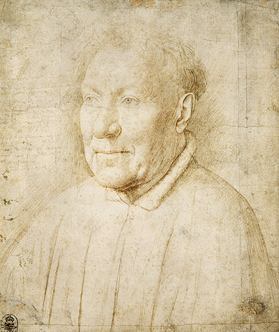
The extremely small amount of metal makes analysis demanding. Wallert cautions that alloy proportions inferred from such thin, uneven deposits are approximate. Similarities with metal traces in another drawing do not identify the same physical stylus, much less the same hand. The securely accepted Albergati portrait study is an important comparison, but matching ingredients cannot substitute for an argument about draughtsmanship and function.[2][4]
Nor can the whole image be divided neatly into a gold first stage and a silver second stage. Wallert's investigation found both materials across the composition without establishing a universal sequence. There is no secure basis for assigning all figures in one metal to Jan and all figures in the other to an assistant. The act of changing tools need not represent a change of author, date or purpose.[2]
Van Camp draws a more specific distinction between the two Eyckian sheets. Goldpoint has a comparatively restricted role in the portrait study, including its colour notes, whereas the Crucifixion uses it for hatching throughout the composition. This difference is relevant to what the drawings were doing. A close study of one sitter and an elaborate narrative demanded different decisions, even if the available materials overlapped.[4]
What infrared makes visible
An infrared reflectogram can make the drawing appear surprisingly different from an ordinary photograph. Goldpoint remains conspicuous, while many altered silverpoint marks become much less visible. Wallert connects this behaviour to the corrosion of silver: the resulting material no longer responds to infrared radiation in the same way as the original metallic deposit. The image is therefore selective, revealing a material difference as well as a design.[2]
St John's face and Magdalene's figure become especially forceful in the infrared view. The suffering thief on the viewer's right is also more legible there. His contorted body contributes a dramatic emphasis less prominent in the painted version. These passages offer a valuable comparison between the works, but the reflectogram is not a second, more authentic picture concealed beneath the visible sheet. It records different visibility among its surviving marks.[2]
The same caution applies to comparisons with underdrawings beneath paint. A painting's preparatory lines and a finished drawing on paper have different physical settings. In the New York Crucifixion the underdrawing was made with a fine brush and liquid medium; the Rotterdam image was principally drawn with metalpoints. Wallert nevertheless finds significant affinities in their continuous contours and closely placed modelling strokes, particularly in the horses and elaborate clothing.[2]
His argument depends on the character of those marks, not merely on the shared subject. The modelling of a horse's flank, the transition from a contour into hatching and the way a fold is set off against its surroundings are potentially more revealing than the presence of three crosses. They are also open to different interpretations: a workshop could teach linear habits, while a close copy could preserve some features of its model.[2][4]
Watch: Jan van Eyck in context
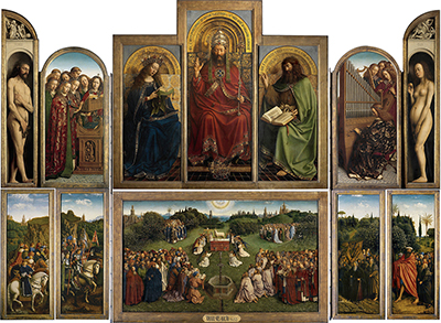
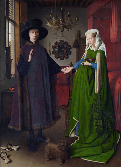
Choose a Smarthistory close reading of the Arnolfini Portrait or the closed and opened Ghent Altarpiece.
Jan van Eyck, The Arnolfini Portrait
Look closely at the room, mirror and gestures in the London double portrait.
Watch on YouTubeTracing marks and a blue reverse
The sheet's reverse provides evidence that an image might be used as well as viewed. Dark blue pigment identified as indigo survives on exposed original paper beneath its backing. Indentations on the front follow outlines. Together, pigment behind the drawing and pressure along its contours are consistent with a transfer process: place the sheet above another support and trace the front, pressing colour from the back onto the surface below.[2][4]
This procedure could reproduce outlines at the same scale. It did not require cutting the sheet into separate motifs, and the original drawing could remain available for further use. The impressed contours can now look heavier and more rigid than the surrounding delicate work. That distinction matters when judging quality. A line altered through handling should not automatically be treated as a direct record of the first draughtsman's touch.[2]
The evidence does not identify the receiving support. It might have been another sheet or a prepared surface, but the related Met painting cannot simply be declared the resulting impression. Its proportions and arrangement differ. Wallert did not find an exact surviving reproduction that closes this chain. Transfer marks establish a material history of use more securely than they establish the destination of the transferred design.[2]
Van Camp places the Rotterdam sheet beside other drawings that could both record existing imagery and become models for further work. Those functions need not exclude each other. A copy may subsequently be traced; an artist's own record of a composition may later be adapted by another hand. For this object, the blue reverse and indentations give the discussion a physical basis while leaving the identity and timing of its users unresolved.[4]
Ink, coating and two different papers
The 2016 technical study refined several earlier findings. Wallert, Birgit Reissland and Luc Megens securely identified later iron-gall ink in a heavy outline around a foreground rock; the lettering above Christ remained uncertain. They also detected iron in transfer incisions, so an iron-bearing mark need not be a pen stroke. Their analysis distinguished the original linen-rag drawing paper from a later lining paper with a Gothic P watermark. That watermark belongs to the backing, not the original support.[5]
The same study identified a discoloured transparent coating as thin starch and protein-glue layers. Its possible protective role during tracing remained a hypothesis. The sheet's brown appearance should consequently not be explained simply as the proven result of an original oil treatment, an earlier suggestion. These findings help separate original drawing, transfer, reinforcement and later intervention; they do not date every stage or settle authorship.[5]
Did drawing come before painting?
Wallert's 2013 article argues that the drawing preceded the New York painting. He sees a lively arrangement subsequently adjusted into the panel's more clearly separated groups, supported by close affinities with its underdrawing. His proposed function includes a possible vidimus: a developed design that could be presented for approval. On that account, the detail would serve communication as well as a workshop's later production.[2]
This remains a proposal, rather than a documented commission. No surviving approval attached to the sheet establishes a patron or a contractual role. Nor does “preparatory” have to mean an outline mechanically enlarged onto the surviving panel. Wallert explicitly allows intervening steps in the development of the image. The drawing could participate in a design process without providing a complete, fixed template for every painted figure.[2]
Van Camp's account instead allows a workshop variant made through copying and rearrangement. The drawing may relate to a different painted version rather than copy the Met panel itself. Her discussion gives copying a productive role: motifs could be preserved accurately and then reorganised into another image. That possibility fits the combination of strong resemblance and compositional divergence without requiring a simple sequence from this paper to that painting.[4]
The Met's focus exhibition in 2016 brought the objects together with infrared evidence. Its value lay in making direct comparison possible, rather than certifying a single answer. The museum currently dates its painted pair to circa 1436–38; that is the painting's catalogue date, not an independently established date for the Rotterdam paper. The relationship must still be argued from the objects and their evidence.[3][8]
A Belgian counterargument
Till-Holger Borchert's Dutch discussion for the Flemish Art Collection challenged autograph attribution. He argued that discovering metalpoint weakened an earlier late-sixteenth-century classification without proving Jan's authorship. Shared materials with the Albergati study were insufficient, and comparison with Saint Barbara raised stylistic differences. His preferred possibility was a later-fifteenth-century copy preserving an older Eyckian painted composition, potentially lost. This separates the age of a design from the age of the paper carrying it.[6]
That disagreement is consequential. Under Wallert's account the sheet belongs near the invention of the painted scene; under the alternative it helps transmit an already established image. Either role would make it valuable evidence. The present museum attribution remains qualified, and the surviving transfer marks cannot choose between those accounts. A drawing could have been a workshop tool at more than one point in its history.[1][2][4]
Rediscovery, Bruges, Paris and New York
The modern story begins with a small purchase rather than an early provenance. The museum's publication account identifies the buyer as Wim Hofman, a psychiatrist and collector from Groningen. In 1971 he bought what was offered as a reproduction for ten guilders. His conviction that it was an original work of art should be distinguished from proof that it was an original by Van Eyck. The documented transaction does not supply a chain back to the fifteenth century.[7]
The sheet was not entirely unknown to specialists before its Rotterdam rediscovery. Borchert reports that its owner brought it to Bruges for examination in 2002. Its difficult appearance initially encouraged a much later classification. Boijmans's account identifies 2011, during preparations for The Road to Van Eyck, as the point when the work came into renewed attention. Public exhibition in 2012–13 and museum acquisition in 2014 followed.[1][6]
France forms part of this history of scrutiny. Fondation Custodia's French account of De Bosch à Bloemaert, held in Paris from 22 March to 22 June 2014, specifically announces the drawing's presence and a film about its rediscovery. It describes the maker as Jan van Eyck or a follower. The wording documents an institution presenting the object and its uncertainty together, rather than adopting an unqualified attribution simply because it was on display.[9]
In New York, the 2016 exhibition placed it beside the painted pair from 25 January to 24 April. The accompanying Rotterdam publication assembled ten essays on separate problems: materials, paper, attribution, function, colour and relation to the painting. These were not interchangeable questions. A better understanding of the support could alter a technical argument without resolving style; evidence of copying could illuminate use without identifying the first draughtsman.[3][7]
The design beyond the two surviving works
Wallert also identifies related Crucifixion imagery in later illuminated books. His examples include Lieven van Lathem's 1471 prayer book for Charles the Bold, a Crucifixion by Gerard Horenbout and the scene in the Grimani Breviary. These comparisons concern the survival and adaptation of an Eyckian model. They are not exact impressions from the blue-backed Rotterdam sheet, and should not be used to claim that one of those illuminators handled this particular piece of paper.[2]
The distinction changes how similarities are read. A recurring figure or grouping can establish that an image was available within a tradition without specifying which object supplied it. Several drawings, a painted version or an intermediate copy could have carried the design. What survives is a set of related images, whereas the complete sequence of exchanges and workshop holdings has been lost. The Rotterdam sheet contributes to reconstructing that history because it combines a substantial composition with material signs of transfer.[2]
A comparison with other metalpoint copies makes the same point on a smaller scale. Van Camp discusses drawings after the Magdalene in Rogier van der Weyden's Braque Triptych, now in the Louvre. Differences from the painting's underdrawing help identify them as records after the painted image. Such cases show why an attractive resemblance must be tested against the stages of making, rather than accepted as proof of preparation. For the Rotterdam Crucifixion, the contested relationship with the New York underdrawing remains precisely the issue.[4]
Why a copy could still matter
The term “copy” can obscure the historical value of a drawing. Van Camp's survey shows how metalpoint could preserve a completed composition, train a pupil, record useful figures or transmit a lost painting. Some sheets were made by a master after his own work; others by assistants or later followers. The level of finish alone cannot distinguish all these situations. Nor does a convincing resemblance to a painting prove that a sheet was drawn from life or invented before it.[4]
That broader evidence is useful here because the Rotterdam Crucifixion is both highly developed and visibly related to another work. Its precise detail might be part of invention, but it might also be the precision of preservation. Its variations might indicate a revised design or another version within a shared tradition. The resulting question concerns the movement of imagery as much as the identification of a prestigious hand.[2][4]
For comparison, begin with Magdalene and follow her attention towards Christ. Then inspect the interval between mourners and horsemen, the orientation of individual figures and the remote city. Finally distinguish fine metalpoint work from heavier transferred or reinforced outlines. The drawings guide places the sheet within the wider graphic evidence associated with Van Eyck; this particular object rewards attention because its crowded image and handled surface preserve different parts of that history.[1][2][4]
Related reading
Discussion
What do you notice in The Crucifixion Drawing Associated with Jan van Eyck? Share a close observation or a source that adds useful context.
Join the Conversation
Keep observations specific and evidence clear.
References
- Museum Boijmans Van Beuningen, “Crucifixion of Christ”, MB 2014/T 1 (PK), collection data and Albert Elen's acquisition account. View Source.
- Arie Wallert, “Function and Meaning of a Metalpoint Drawing by Jan van Eyck”, ArtMatters 5 (2013), pp. 62–78, full technical article. View Source.
- Metropolitan Museum of Art, “A New Look at a Van Eyck Masterpiece”, 2016 exhibition account. View Source.
- An Van Camp, “The Use of Goldpoint and Silverpoint in the Fifteenth Century”, in An Eyckian Crucifixion Explored (2016), pp. 44–57; full accepted manuscript in Oxford University Research Archive. View Source.
- Arie Wallert, Birgit Reissland and Luc Megens, “Notes on the Material Aspects”, in An Eyckian Crucifixion Explored (2016), pp. 24–35; author-uploaded full text. View Source.
- Till-Holger Borchert, “Een Eyckiaanse tekening op de expo De weg naar van Eyck”, Flemish Art Collection, Dutch scholarly response. View Source.
- Museum Boijmans Van Beuningen, An Eyckian Crucifixion Explored: Ten Essays on a Drawing, publication description and contributors. View Source.
- Metropolitan Museum of Art, “The Crucifixion; The Last Judgment”, current collection record, 33.92ab. View Source.
- Fondation Custodia, “De Bosch à Bloemaert”, 2014 exhibition account, “Biographie d'un dessin”. View Source.
 Jan van Eyck.jpg)
 Jan van Eyck.jpg)