by Tom Gurney
Tom Gurney BSc (Hons) is an art history expert with over 20 years experience
Published on June 19, 2020 / Updated on September 28, 2026
Email: tomgurney1@gmail.com / Phone: +44 7429 011000
About the painting
Piet Mondrian's Composition in White, Black, and Red is almost all white, yet it hardly feels empty. Heavy black lines make large unequal rectangles, a short group of horizontal bars gathers on the right, and a narrow strip of red touches the lower edge. A small black area at the upper left answers that red across the canvas. Mondrian painted the work in Paris in 1936. It belongs to the Museum of Modern Art, New York, as object 2.1937; RKD catalogues the same painting as B269. The picture on this page matches the museum's reproduction.[1][2]
At a glance
The 1936 MoMA painting among Mondrian's mature abstractions
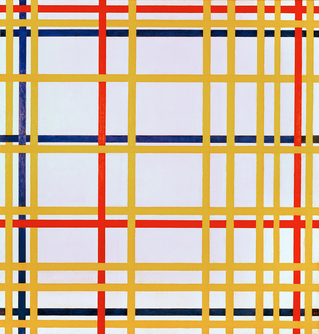
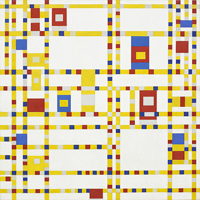
Broadway Boogie Woogie
1942–43Contents
- What can you see in the painting?
- How do the black lines and red strip create balance?
- Why is this a 1936 Mondrian rather than a generic grid?
- How did the painting enter MoMA?
What can you see in the painting?
Two major verticals organize the canvas. One stands near the left edge and the other farther right, leaving a wide white passage between them. A strong horizontal runs across roughly the upper half of the image, meeting the verticals and continuing to the right edge. Together these lines make large rectangular fields, but they do not divide the painting into an even grid. The upper middle white area is broad; the tall area below it reaches almost to the bottom of the canvas. On the far right, several shorter horizontal lines make a stack of much shallower spaces.
The red plane is a horizontal strip beneath that right-hand stack. It sits at the very bottom, so its lower boundary is the edge of the picture itself. The red is striking because there is no blue or yellow field to share the colour emphasis. At the opposite corner, a black patch appears at the upper left. It is easy to overlook in a quick glance at the red, but it gives the upper edge a visual weight of its own. These are observations from the image; a reproduction cannot establish the exact condition or colour of the original painted surface.
White performs several jobs. The open white block at the upper centre feels very different from the narrow white bands beside it, although they share the same broad colour family. Black lines turn white into a set of differently proportioned planes. The far-right bars create a quick rhythm of thin divisions; the central white field lets the eye slow down. Mondrian balances those unequal intervals without repeating a motif in mirror image.
The canvas is nearly square, measuring 102.2 × 104.1 cm according to MoMA. That near equality makes the asymmetry of its internal lines more noticeable. A line slightly left or right of centre can change how large an adjacent white area feels. The painting's structure comes from the particular placement and length of each black mark, not simply from the idea of drawing a grid over a square.[1]
How do the black lines and red strip create balance?
One way to look is to begin with the red and move upward. Immediately above it are horizontal black divisions and narrow white strips. The colour seems to hold the bottom of this busy area together. Moving left, the eye enters a much larger white rectangle with fewer interruptions. The broad middle horizontal then returns the gaze to the top right. The work gives the viewer several possible routes rather than a single central subject.
The upper-left black accent works differently from the red. It has no bright hue, but its dark fill and position against the canvas edge make it forceful. The painting's other black marks are mostly lines; this one reads as a small plane. Red below and black above occupy opposite edges without becoming exact equivalents. Their different size, colour and surroundings keep the painting in motion visually. If either were removed, the right-hand stack or the upper-left corner would feel less connected to the whole.
MoMA's publication Modern Art in Your Life used this painting in a discussion of geometric form and asymmetrical balance. That historical museum context fits what the viewer can test on the canvas: its parts differ in size and position, yet they form a controlled overall relation. The publication also places such designs among a wider range of twentieth-century objects, showing that MoMA presented Mondrian's severe geometry as visually relevant beyond painting alone. It does not mean this work was a plan for a building or product.[3]
Watch: Piet Mondrian
See his studio, the move toward geometric abstraction and the rhythms of his New York paintings.
Piet Mondrian: Abstract Painting as We Know It
Curator Michael White explores the paintings and Mondrian’s studio as an abstract space.
Watch on YouTubeWhy is this a 1936 Mondrian rather than a generic grid?
RKD's catalogue calls the work Composition en blanc, noir et rouge and dates it 1936, matching MoMA's date and its Paris location. The French title means a composition in white, black and red. The catalogue number B269 and museum number 2.1937 identify this particular canvas among many Mondrian works with similar colour names. Its near-square scale, upper-left black accent and red strip at the lower right are especially useful visual identifiers.[1][2]
The painting belongs to Mondrian's mature abstract work in Paris. By this point he had long used horizontal and vertical divisions and a restricted palette, but the actual relationships changed from canvas to canvas. The Composition in White and Blue of 1936, B244, is an instructive comparison: it is much taller and narrower, and its single coloured field is blue near the top rather than red at the bottom. Similar titles therefore do not describe interchangeable designs. Each painting sets its own balance among line, colour, white space and the canvas edge.[2]
MoMA has sometimes used different title wording in its own publications. A 1945 museum checklist listed a 1936 composition with this painting's 40¼ × 41 in. measurements and 2.37 inventory shorthand as Composition in White and Red. The current collection title includes Black. The matching date, measurements and museum number indicate a historical title variation rather than a second canvas. Museum records and older exhibition catalogues can describe the same object with slightly different names.[1][4]
How did the painting enter MoMA?
MoMA's provenance begins with Mondrian in Paris in 1936. It says George L. K. Morris purchased the painting from the artist in Paris for the museum that year. The work's credit line is “Gift of the Advisory Committee,” and its accession number, 2.1937, records it in MoMA's collection. These details distinguish the date of the painting and its 1936 purchase from the later accession numbering. The museum's online provenance is described as research in progress, so it should be used for the recorded sequence rather than expanded into undocumented transactions.[1]
MoMA's collection record includes installation photographs from later displays. Its present on-view label can change with the museum's gallery arrangements; readers planning a visit should use the live MoMA record. The enduring facts are the painting's identity, material, measurements and collection. Its visual effect remains immediate even in a small reproduction: one red strip, a small black accent and a carefully unequal set of white spaces animate a nearly square canvas.[1]
Mondrian artworks directory
Frequently asked questions
When did Mondrian paint Composition in White, Black, and Red?
Where is the original painting?
It belongs to the Museum of Modern Art, New York, as object 2.1937. MoMA's current collection page gives the latest gallery status.[1]
What is its size and medium?
It is oil on canvas, 102.2 × 104.1 cm (40¼ × 41 in.), according to MoMA.[1]
What does B269 mean?
Why do some older sources use Composition in White and Red?
Discussion
Does the red strip or the broad central white field first hold your attention?
Reader Insights
Follow the black horizontal across the canvas and into the short bars at right. Where does your eye stop?
How does the black accent at the upper left answer the red strip below?
How does this nearly square MoMA canvas differ from the narrow Düsseldorf Composition in White and Blue?
Join the Conversation
Share what you notice in this painting below.
References
- Museum of Modern Art, Composition in White, Black, and Red, collection record 2.1937, object facts, provenance and installation history. View source.
- RKD – Netherlands Institute for Art History, digital Mondrian catalogue raisonné, Paris 1935–37, B269 Composition en blanc, noir et rouge. View source.
- Museum of Modern Art, Modern Art in Your Life, section “Abstract Geometric Form,” including Composition in White, Black and Red. View source.
- Museum of Modern Art, 1945 Mondrian memorial exhibition checklist, entry 38, Composition in White and Red, MoMA 2.37. View source.
- Lead image credit. Piet Mondrian, Composition in White, Black, and Red, Paris 1936, oil on canvas, 102.2 × 104.1 cm, RKD B269; MoMA 2.1937.
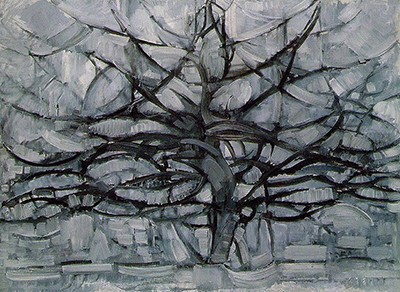
 The Red Tree Piet Mondrian.jpg)