 by Tom Gurney
Tom Gurney BSc (Hons) is an art history expert with over 20 years experience
Published on June 19, 2020 / Updated on September 28, 2026
Email: tomgurney1@gmail.com / Phone: +44 7429 011000
About the painting
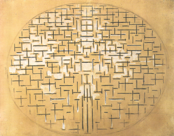
An oval filled with short dark verticals and horizontals spreads across the warm paper of Piet Mondrian's Ocean 5. Small areas of pale gouache interrupt and illuminate the marks. The work is nearly abstract, yet its title points back to the sea that Mondrian studied on the Dutch coast. The Peggy Guggenheim Collection in Venice dates it 1915 and records charcoal and gouache on paper, measuring 87.6 × 120.3 cm. RKD identifies this exact work as B76. It is a different sheet from MoMA's Pier and Ocean 5 (B78) and a different medium from the Kröller-Müller Museum's oil painting Composition 10 in Black and White (B79).[1][2][3][4]
At a glance
- ArtistPiet Mondrian (Piet Mondriaan, 1872–1944)
- TitleOcean 5
- Date1915 in the Venice collection and RKD catalogues
- Catalogue numberRKD / Joosten B76
- MediumCharcoal and gouache on paper
- Paper dimensions87.6 × 120.3 cm
- CollectionPeggy Guggenheim Collection, Venice, part of the Solomon R. Guggenheim Foundation
- Accession76.2553 PG 38
- Current displayListed as not on view by the Peggy Guggenheim Collection when its object page was checked[1][2]
The 1915 sea and pier sequence
Contents
- What does Ocean 5 show?
- How was the work made?
- Why did Mondrian turn the sea into short lines?
- How is it different from Pier and Ocean 5?
- How does it relate to Composition 10 in Black and White?
- Where is Ocean 5 now?
What does Ocean 5 show?
The composition is broad and horizontal. An oval boundary encloses hundreds of short charcoal strokes. Some meet to form crosses; others remain separate. They are not arranged as a uniform ruled grid. Their lengths, intervals and densities vary across the paper, making the eye move between small local patterns and the larger oval that contains them. Near the centre, several strokes surround paler, roughly rectangular spaces. Toward the lower part, longer upright marks give a different emphasis to the mostly short signs elsewhere.
 The Red Tree Piet Mondrian.jpg)
The paper itself supplies a warm tone rather than a stark white ground. Pale gouache passes among the charcoal strokes, catching light in irregular patches. The museum describes this highlighting as atmospheric, suggesting reflections on water and defining planes without creating ordinary perspective. A digital reproduction can show the tonal pattern, although it cannot fully convey the scale or texture of an 87.6 × 120.3 cm sheet.[1]
The oval is clear enough to set a boundary but not so heavy that it dominates every sign within it. Marks near the edge approach the contour; the rectangular corners of the sheet remain comparatively quiet. This makes the oval feel like a field of activity inside the paper. The eyes may enter through a concentration of strokes, move to an open interval, and then return through a crossing of vertical and horizontal marks. The image's rhythm comes from repeated differences, not from identical units stamped across a surface.
One can read the lower verticals as a possible reminder of a pier, particularly when comparing other works from the same series. Yet the Venice museum's title is Ocean 5, and its account stresses how far Mondrian reduced the signs of a natural source. No drawn shoreline or exact map of a specific Dutch beach is visible. The work invites the viewer to think about sea, light and movement without treating each stroke as a descriptive wave.[1]
How was the work made?
The Peggy Guggenheim Collection classifies Ocean 5 as a work on paper, made in charcoal and gouache. This is important because the large reproduction can look like a painting on canvas at first glance. Charcoal produces the dark, direct lines; gouache supplies the opaque pale accents. The warm paper remains visible throughout. Mondrian combined drawing and painting materials to build a carefully considered field rather than a simple black-and-white sketch.[1]
The Italian national heritage catalogue records that the sheet was attached to a panel by the artist. Its object record describes charcoal and gouache on paper and notes an inscription near the lower right reading “14/PM”. The inscription is a useful detail, but the Peggy Guggenheim Collection and RKD both give 1915 as the work's date. Without a documented explanation for the apparent difference, the date should follow the current object records while the inscription is reported separately. It would be misleading to silently relabel the finished work as 1914 from the inscription alone.[1][2][5]
The paper measurement, 87.6 × 120.3 cm, belongs to this Venice work. It should not be replaced by the slightly different dimensions of the distinct MoMA sheet. The Guggenheim accession 76.2553 PG 38 is an especially reliable identifier when image databases use shortened titles. The museum's online page places the original in Venice but presently labels it not on view; ownership and access are different questions.[1]
Why did Mondrian turn the sea into short lines?
The Peggy Guggenheim Collection traces Mondrian's sea subject back to naturalistic works made during visits to the Zeeland coast in 1909–11. He later encountered the Cubism of Picasso and Braque in Paris, where he lived from 1911–12 onward. The museum describes the oval and the underlying grid in Ocean 5 as devices related to Cubism, but it also stresses how Mondrian gave horizontal and vertical relations a purpose beyond organising a picture: for him, their opposition and interaction could suggest a wider harmony.[1]
Mondrian was back in the Netherlands in the summer of 1914 and remained there during the war years. The Venice museum cautiously says he probably worked on these sea studies in the following period. That qualification matters. The record links the theme to Zeeland and the development of the series, but it does not prove the precise location where B76 was made or give a daily sequence of drawings.[1]
The dark marks can recall the changeable pattern of water without describing every wave. Many horizontals seem to stretch across the oval; upright marks interrupt them. Mondrian reduces the seascape to a relation between directions, repeated at different sizes. The museum connects the pale gouache with reflected light on water while noting that the work avoids a conventional illusion of depth. Its source is natural, but its structure is built to hold the viewer's attention as an arrangement of signs in its own right.[1]
It is tempting to tell a simple story in which the sea disappears and the later red-yellow-blue grid appears fully formed. Ocean 5 is more interesting than that. The oval still encloses a field, the irregular marks still imply movement, and the paper still carries atmospheric touches of light. The painting of the 1920s would use other proportions, colours and boundaries. Here Mondrian was testing how far a recognisable subject could be compressed into rhythm while still feeling alive.
Watch: Piet Mondrian
See his studio, the move toward geometric abstraction and the rhythms of his New York paintings.
Piet Mondrian: Abstract Painting as We Know It
Curator Michael White explores the paintings and Mondrian’s studio as an abstract space.
Watch on YouTubeHow is it different from Pier and Ocean 5?
The similar names are a trap. RKD lists B76 Ocean 5 in Venice. Two entries later, it lists B78 Pier and Ocean 5 at The Museum of Modern Art, New York. MoMA titles its work Pier and Ocean 5 (Sea and Starry Sky) and dates it 1915, dated 1914. It is a different charcoal and watercolour on paper sheet, 87.9 × 111.7 cm, accession 34.1942. Its title contains the word “Pier”; B76's catalogue title does not.[2][3]
MoMA's interpretation identifies a pier through vertical marks at the base of its oval and reads the pale accents as starry reflection. That explanation belongs to B78. The Venice image has a related vocabulary of short crossed lines and an oval, so comparison is instructive. It does not turn the two sheets into the same object or make MoMA's measurements applicable to Venice. On this page, the image and accession belong to B76.[1][3]
RKD also places B77 Ocean 6 between them, listing its whereabouts as unknown. This sequence shows several related works rather than a single design repeatedly renamed. The numbers help a reader locate each object within Mondrian's 1914–15 investigation. They do not establish that every sheet was completed in that exact numerical order.[2]
How does it relate to Composition 10 in Black and White?
The site's Composition 10 in Black and White article concerns B79, an oil painting on canvas in the Kröller-Müller Museum. That museum dates it 1915, measures it 85.8 × 108.4 cm, and calls it an abstract elliptical composition of black horizontals and verticals. It relates its source to the sea and breakwaters. Although the paintings and drawings share the oval and the opposition of directions, B79 is not the Venice work on paper.[2][4]
The comparison reveals a useful shift of material and emphasis. Venice B76 keeps the warm paper tone and pale gouache highlights. Otterlo B79 is an oil canvas that the Kröller-Müller describes as Mondrian's first painting to use only black and white. Both organise a multitude of short signs inside an ellipse, yet the museum's distinction between a drawing and a painting should remain intact. B76 offers evidence of Mondrian exploring this structure with portable graphic materials at a substantial scale; B79 shows a related idea in oil.[1][4]
Neither comparison requires a claim that the Venice sheet was a direct preparatory study for the Otterlo canvas. The publicly cited records establish their subjects, dates and forms, but they do not specify a one-way transfer from this exact paper to that exact canvas. They are best seen as connected works in a short, intensive phase of exploration.
Where is Ocean 5 now?
The work belongs to the Peggy Guggenheim Collection in Venice, within the Solomon R. Guggenheim Foundation. Its museum accession is 76.2553 PG 38. The current object page marks it not on view, so anyone planning a visit should check the collection's latest display information before assuming it can be seen in the galleries. The online record and reproduction still allow the sheet to be studied while the original is in storage or otherwise unavailable.[1]
The collection identity also resolves a common geographic confusion. The Solomon R. Guggenheim Foundation has more than one museum, but B76's object page specifically says Peggy Guggenheim Collection, Venice. It should not be described as hanging in New York merely because the foundation's institutional name includes Solomon R. Guggenheim. MoMA's B78 is in New York; the original of B76 is the separate Venice work.[1][3]
Mondrian artworks directory
Frequently asked questions
Is Ocean 5 a painting or a drawing?
When did Mondrian make it?
How large is the work?
The Peggy Guggenheim Collection gives the paper dimensions as 87.6 × 120.3 cm.[1]
Is it the same as MoMA's Pier and Ocean 5 ?
Can I see it in Venice now?
The Peggy Guggenheim Collection's object page currently labels it not on view. Display status can change, so consult the museum before visiting specifically for this work.[1]
Discussion
Which part of the oval first holds your attention?
Reader Insights
Follow a cluster of charcoal crosses toward a pale opening. Where does your eye stop?
How do the pale gouache accents change the darker signs?
How does Venice B76 differ from the separate Otterlo B79 oil painting?
Join the Conversation
Share what you notice in this painting below.
References
- Peggy Guggenheim Collection, Venice, official object record for Ocean 5, 1915, charcoal and gouache on paper, 87.6 × 120.3 cm, accession 76.2553 PG 38, with collection interpretation and display status. View source.
- RKD – Netherlands Institute for Art History, digital Mondrian catalogue, Holland 1914–19, distinguishing B76 Ocean 5, B77 Ocean 6, B78 Pier and Ocean 5 and B79 Composition 10 in Black and White. View source.
- The Museum of Modern Art, official object record for the separate B78 Pier and Ocean 5 (Sea and Starry Sky), 1915, dated 1914, charcoal and watercolour on paper, 87.9 × 111.7 cm, accession 34.1942. View source.
- Kröller-Müller Museum, official object record for the separate B79 Composition 10 in Black and White, 1915, oil on canvas, 85.8 × 108.4 cm, KM 104.241. View source.
- Italian national cultural heritage catalogue, record 0500190403 for Oceano 5, documenting paper, charcoal and gouache, mounting to a panel and the “14/PM” inscription. View source.
- Lead image credit. Piet Mondrian, Ocean 5, 1915, charcoal and gouache on paper, 87.6 × 120.3 cm, Peggy Guggenheim Collection, Venice, 76.2553 PG 38, RKD B76.