



 by Tom Gurney
Tom Gurney BSc (Hons) is an art history expert with over 20 years experience
Published on June 19, 2020 / Updated on October 30, 2026
Email: tomgurney1@gmail.com / Phone: +44 7429 011000
Édouard Manet Prints: Introduction
Manet's prints bring a different kind of attention to subjects familiar from his paintings. A dancer's costume can emerge from etched lines, then acquire new weight as the plate is reworked. A comic figure can be assembled through successive colour impressions. In an illustrated book, broad black marks can carry a scene across a largely empty page.
The word print also describes modern reproductions of paintings such as A Bar at the Folies-Bergère. Manet's own graphic work involves another set of decisions: how to make an image on a printing surface, how to alter it and how to present the resulting impressions. His Spanish Singer entered a portfolio published by Alfred Cadart in 1862, with printing by Auguste Delâtre, establishing one early setting for this activity.[1]
At a Glance
- ArtistÉdouard Manet
- Processes explored hereEtching, aquatint, drypoint, lithography and wood-engraved book illustration
- Key distinctionsDesign, individual impression, state and edition
- Selected examplesLola de Valence, Polichinelle, Le Corbeau and Dead Toreador
- Early publishing collaborationManet, publisher Alfred Cadart and printer Auguste Delâtre, 1862.[1]
Contents
- Paintings Transformed for Print
- Etching, Aquatint and Drypoint
- Impressions, States and Editions
- Lola de Valence: Following a Reworked Plate
- Lithography and Colour in Polichinelle
- Prints within Illustrated Books
- Designs Printed after Manet's Death
- Reading a Manet Print Label
- Annotated details
Paintings Transformed for Print
The relationship between a painting and a print begins with a practical change of materials. An oil painting's coloured surfaces must become something that a printing plate or stone can carry. Contour, the spacing of marks and the distribution of dark areas take on new responsibilities. Even when the figure and pose remain recognisable, their surroundings can be reconstructed through quite different means.
The High Museum of Art describes this process in its impression of The Spanish Singer, dated 1861–62. Etched marks establish the seated figure, while hatching and aquatint contribute to the surrounding space, clothing and jug. The print belonged to Cadart's portfolio of eight etchings issued in 1862.[1] Its publication brought an image associated with Manet's painting into the separate context of a group of printed works.
That portfolio also placed Manet within a collaboration. Delâtre's role as printer matters alongside the artist's work on the design. The printed sheet is the result through which those contributions become visible to a reader or viewer. Its appearance depends on the prepared surface and on the way ink and paper meet under pressure.
The resulting object can therefore be approached on its own scale. A painting's broad dark passage may become a network of lines; a garment's pattern may acquire a sharper rhythm; a surrounding wall may become more insistent or more open. Looking between the media is especially useful when it reveals such decisions, rather than treating recognition of the original subject as the end of the encounter.
Selected Original Prints
Etching, Aquatint and Drypoint
Etching belongs to the intaglio family of printing processes, in which recessed marks hold ink. The artist draws through an acid-resistant ground on a metal plate, exposing areas that can be bitten by acid. After inking and wiping, the plate transfers its image to paper under pressure. Lines can be narrow and separate, gathered into hatching or built into a dense field.[2]
Aquatint extends the range of tone. A resistant grain allows the plate to be bitten around many small particles, producing ink-holding areas that can print as a textured wash. Used beside etched lines, it can strengthen a shadow or give a background greater density. The name describes a printing technique; it does not mean that the impression has been painted with watercolour.[2]
Drypoint involves scratching directly into metal. The displaced metal forms a burr beside the incision, which can retain ink and give the printed line a soft, rich edge. That burr is vulnerable to wear during printing.[2] Several processes may occur together: the Metropolitan Museum of Art identifies Manet's The Water Drinker as etching and drypoint. Its design is dated 1870–74, while the museum's impression belongs to the Strölin edition of 1905.[3]
These terms help explain how marks were made, but close looking still begins with the particular image. A soft area in a photograph alone cannot establish drypoint, just as every dark passage need not have the same technical origin. The museum's medium description provides a firmer starting point for distinguishing the tools and processes used in an individual work.
Impressions, States and Editions
An impression is an individual print taken from an inked surface. A state records a stage of that surface's development: adding lines, removing marks or changing lettering can produce a new state. An edition concerns the impressions issued from the printing surface.[2] The terms answer different questions about the same work.
This makes repeated printing an especially revealing part of Manet's practice. An early impression may preserve a comparatively spare design. A later state can show that he strengthened the setting, altered a face or prepared the image for publication with names and text. The earlier sheet remains evidence of a real stage in the work, even when further changes followed.
Variation also calls for care. Two photographs can differ in colour or contrast, and paper and printing affect the appearance of individual impressions. A changed design provides a stronger basis for identifying a new state than a general impression that one image looks darker. The clearest comparisons combine visible differences with the catalogue information attached to the exact sheets.
Lola de Valence: Following a Reworked Plate
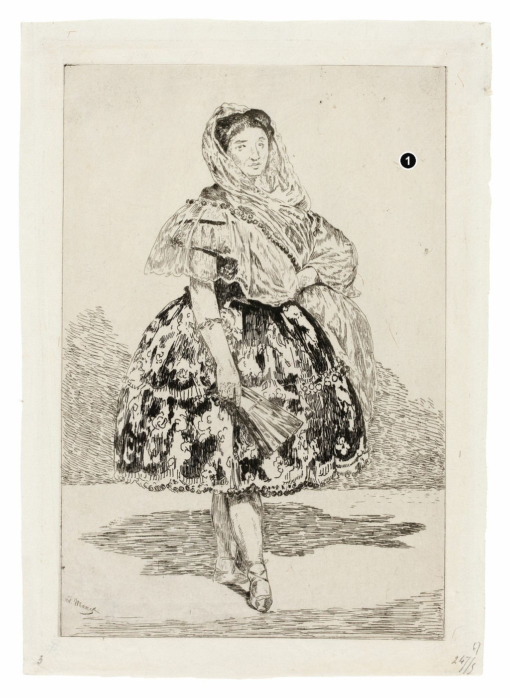
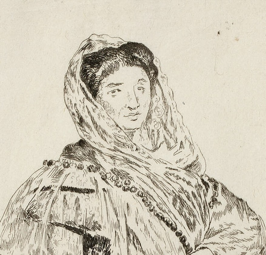
Two impressions of Lola de Valence make the development unusually clear. The Art Institute of Chicago holds a first-state etching of 1863, printed in black on ivory laid Japanese paper. Its plate measures 26 × 18.1 cm.[4] Most of the background remains pale, allowing the dancer's wide skirt and mantilla to occupy the centre with little surrounding detail.
The skirt is already elaborate. Dark marks describe its pattern, while broken strokes and open intervals articulate the fabric. The sleeve above it is much lighter, its folds traced with fine lines. Short parallel marks gather near the floor and behind the figure, but large areas remain available to the colour of the paper. The result has a lightness that is particularly apparent around the head and shoulders.
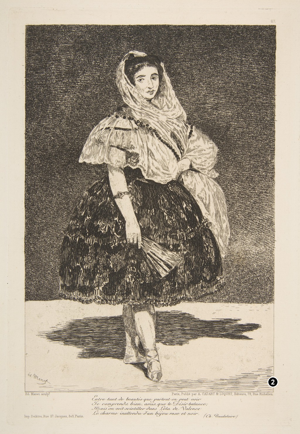
The Metropolitan Museum's impression presents a much more densely worked image. It is catalogued as etching and aquatint with roulette, in the sixth state of eight, also dated 1863. The plate measures 26.4 × 18.1 cm, and the sheet 39.5 × 29.5 cm.[5] A dark, textured field now surrounds the upper body, making the pale sleeve, mantilla and face stand out more strongly.
The setting has become an active part of the portrait. Its darkness presses towards the dancer's outline, while the floor remains comparatively open beneath her. Strengthened passages in the costume give the figure greater density. The bracelet is more distinct, and the fan lies across a skirt whose pattern is now embedded in a richer arrangement of dark marks.
Kathryn Kremnitzer traces the plate's successive reworking and the addition of stronger aquatint. She identifies the lettered impression with the Société des Aquafortistes publication of October 1863 and distinguishes the print's two lifetime editions from later publication.[6] This history gives the comparison a sequence, rather than leaving the two sheets as unexplained alternatives.
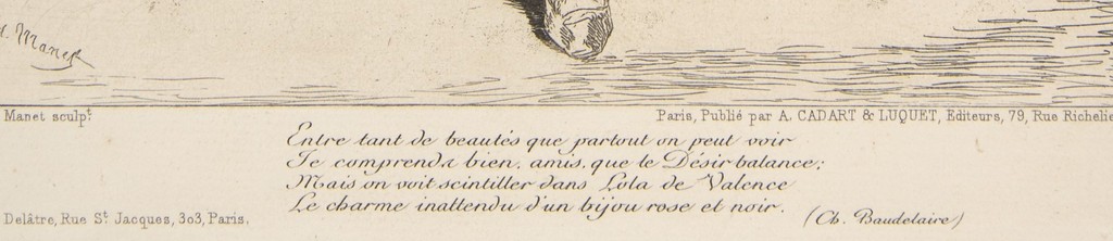
The lettering adds another dimension. Beneath the image are Charles Baudelaire's four lines about Lola, together with the publisher's and printer's details. Cadart & Luquet issued the print, and Delâtre printed it.[5] The space below the figure connects portraiture with poetry and publication. Looking only at the pictorial rectangle would miss part of the sheet's intended presentation.
State numbers need their accompanying catalogue. Chicago's record lists its impression as the first within systems counting three, eight and five states respectively.[4] Étienne Moreau-Nélaton's 1906 catalogue describes five stages, including changes to the image and its lettering.[7] The Metropolitan Museum uses an eight-state classification.[5] Keeping these systems attached to their sources prevents a historical description of a final state from becoming a mistaken label for a different impression.
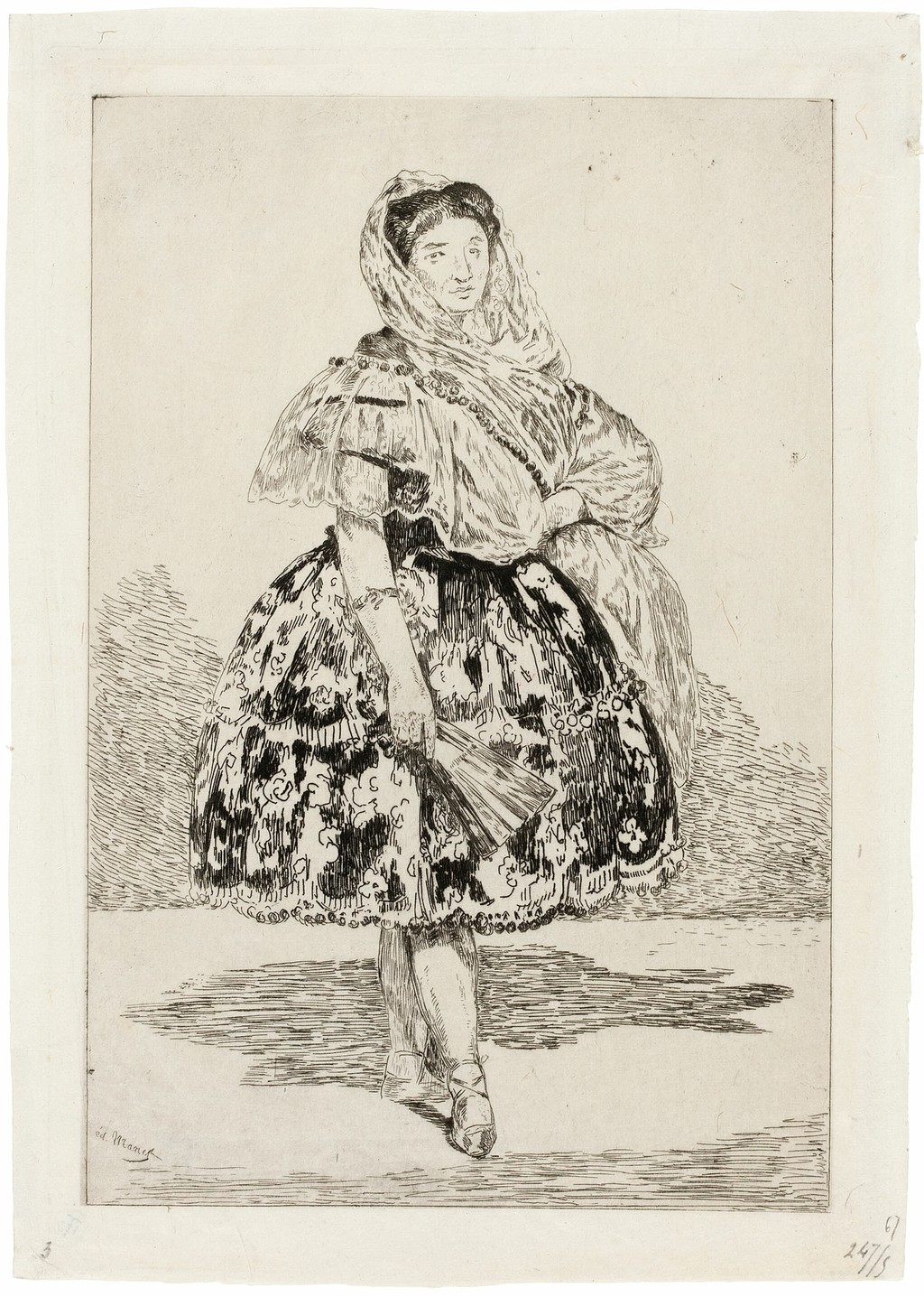
Édouard Manet, Lola de Valence, 1863, first state in the Art Institute’s cataloguing. Etching. Art Institute of Chicago, 1953.274. Art Institute of Chicago; faithful public-domain reproduction via Wikimedia Commons. Image source. Public domain. Trim outer white photographic background, retaining the supplied sheet’s edges, annotations and complete printed image.
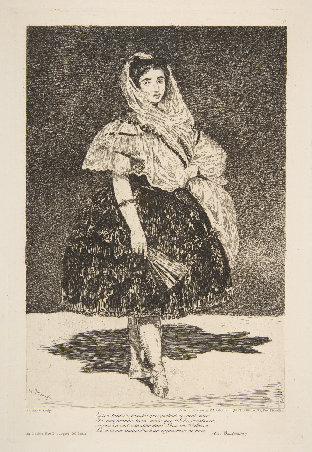
Édouard Manet, Lola de Valence, 1863, sixth state of eight. Etching, aquatint and roulette. The Metropolitan Museum of Art, New York, 18.88.28. Baudelaire’s poem and publisher/printer lettering are retained. Image source. CC0 / Public domain. Whole supplied reproduction resized within native dimensions; no enlargement, retouching or colour alteration.
Lithography and Colour in Polichinelle
Lithography offers a different relationship between drawing and printing. A greasy drawing is fixed on a flat stone or prepared plate. During printing, damp areas resist the oily ink, while the image accepts it. The process can carry marks made with crayon or brush. For a multicolour lithograph, successive matrices supply the colours, requiring careful alignment on the same sheet.[8]
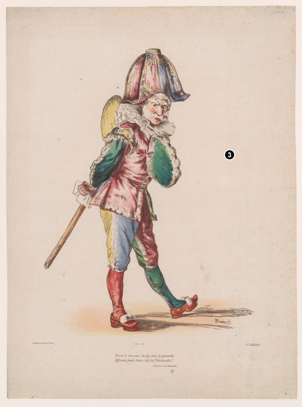
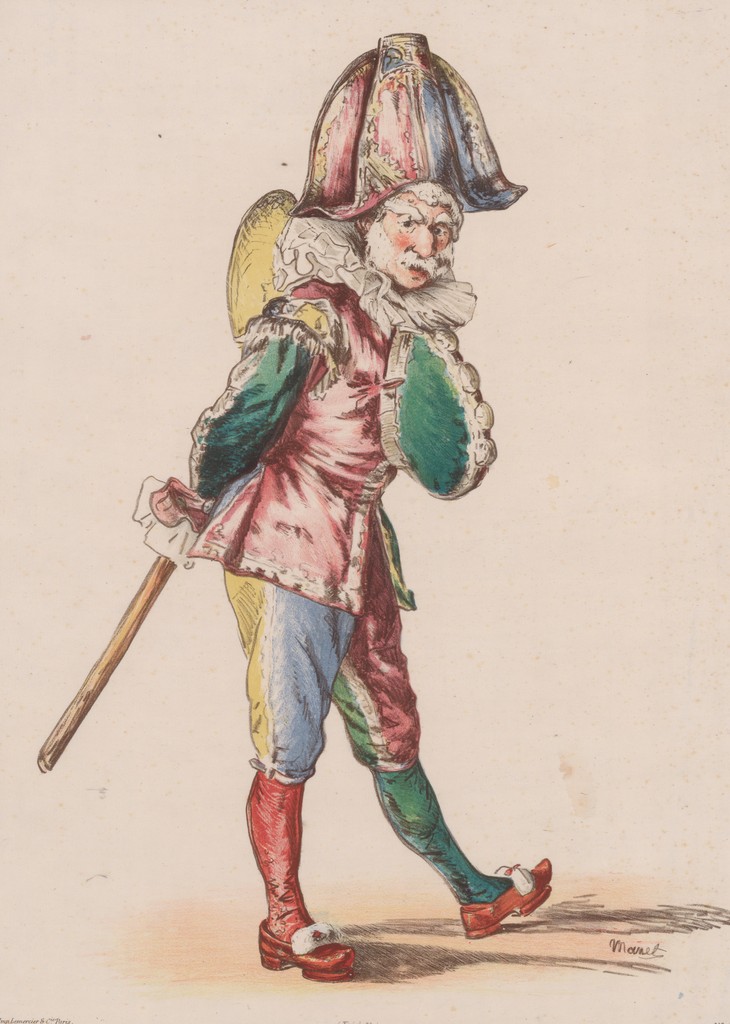
Manet's Polichinelle of 1874 is a vivid example. The Metropolitan Museum's impression has an image measuring 52 × 37 cm within a larger sheet.[9] The figure's red and pink clothing, green sleeve, blue trouser leg and yellow hump create an extravagant patchwork. Dark outlines and internal marks keep the different coloured areas connected to the body beneath them.
The costume gives the pose much of its energy. The tall hat widens above the head, the ruff spreads around the neck and the legs step in different directions. A long stick extends down towards the left, while a cast shadow draws the raised shoe back into relation with the ground. The surrounding paper leaves the figure conspicuous, without the busy setting that might accompany a theatrical scene.
Moreau-Nélaton describes the colour lithograph as made with seven stones: a dark-bistre key, two reds, yellow, blue, green and a light-bistre tint. He also distinguishes early proofs before lettering from subsequent printings.[7] His account helps explain the organisation behind the coloured image. The finished sheet brings separately prepared components into a single figure whose costume appears at first glance freely and loosely described.
The Metropolitan Museum's sheet includes lettering below, with verses by Théodore de Banville.[9] These belong to Polichinelle, while Baudelaire's quatrain accompanies the etched Lola de Valence. In both cases the lower margin carries a literary contribution, but the poets and publications have their own identities.
The 1874 lithograph also has to be distinguished from Manet's painted Polichinelle. Following the subject across media can reveal different scales and presentations. Dates, dimensions and printing information should remain attached to the particular work being viewed, even when the same familiar character links them.
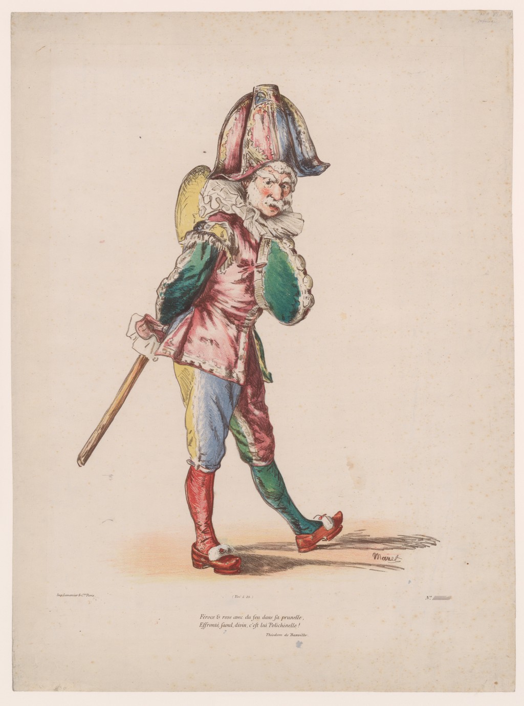
Édouard Manet, Polichinelle, 1874. Colour lithograph with Théodore de Banville’s verses. The Metropolitan Museum of Art, New York, 22.104.1. Rogers Fund, 1922. Image source. CC0 / Public domain. Whole supplied reproduction resized within native dimensions; no enlargement, retouching or colour alteration.
Prints within Illustrated Books
Book illustration gave Manet another kind of space in which to work. An image could face a passage of writing, interrupt a page or help establish the book's opening and ending. Its scale and placement became part of the reader's movement through a publication.
Different projects called for different processes. For Charles Cros's Le Fleuve, published in 1874, Manet supplied eight etchings. Juliet Wilson-Bareau's account describes their integration with the poem, while the catalogue checklist records the edition of one hundred.[10] The small printed images belonged to the unfolding text, giving the etched mark a role beyond an independent sheet displayed by itself.
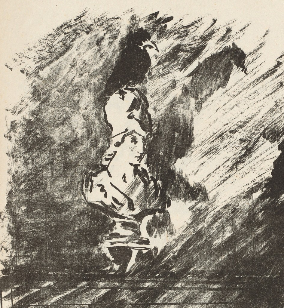
The following year, Le Corbeau brought together Edgar Allan Poe's poem, Stéphane Mallarmé's French prose translation and Manet's illustrations. Published by Richard Lesclide in 1875, it paired the English with the French and included four large transfer-lithograph compositions. An ex-libris and a raven-profile wrapper extended the design beyond those interior scenes.[10]
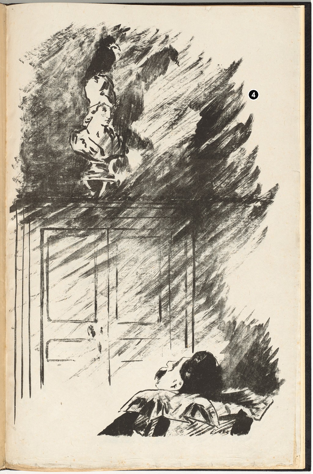
Transfer lithography allowed the drawn image to be transferred to the printing stone. In On the Bust, the marks retain a strong sense of brushwork. A raven perches on a pale bust above a door, while dark strokes sweep diagonally across the space. Below, a reclining head and arm occupy a separate area of the page. A few straight lines establish the door against the much freer movement of the black marks.
The white of the sheet has an unusually active role here. It gives the bust its pale presence, separates the door's structure from the surrounding darkness and opens channels through the broad strokes. These passages allow the image to suggest a charged interior without describing every object in an evenly finished room. The scene belongs to the poem's fictional world; the figure should not automatically be read as a portrait of its author or translator.
Individual copies of the book can have additional features. The National Gallery of Art's volume contains an original drawing and a double suite of the four full-page transfer lithographs.[11] Its catalogue describes that particular object. The extra drawing and duplicate impressions should therefore remain part of the copy's identity, rather than being assumed for every surviving volume.
Mallarmé and Manet worked together again on L'Après-midi d'un faune, published by Alphonse Derenne in 1876. Here the four designs were wood engravings. Wilson-Bareau explains that Manet drew on woodblocks and passed them to a professional engraver to cut; the catalogue tentatively associates the cutting with Alfred Prunaire.[10] The distinction preserves the separate contributions involved in turning a design into a printable block.
Watercolour washes also contributed to the publication's delicacy, according to Wilson-Bareau's account.[10] Colour applied by hand involves another operation from the successive colour stones described for Polichinelle. Across these three book projects, etching, transfer lithography and wood engraving served different relationships between image, page and text.
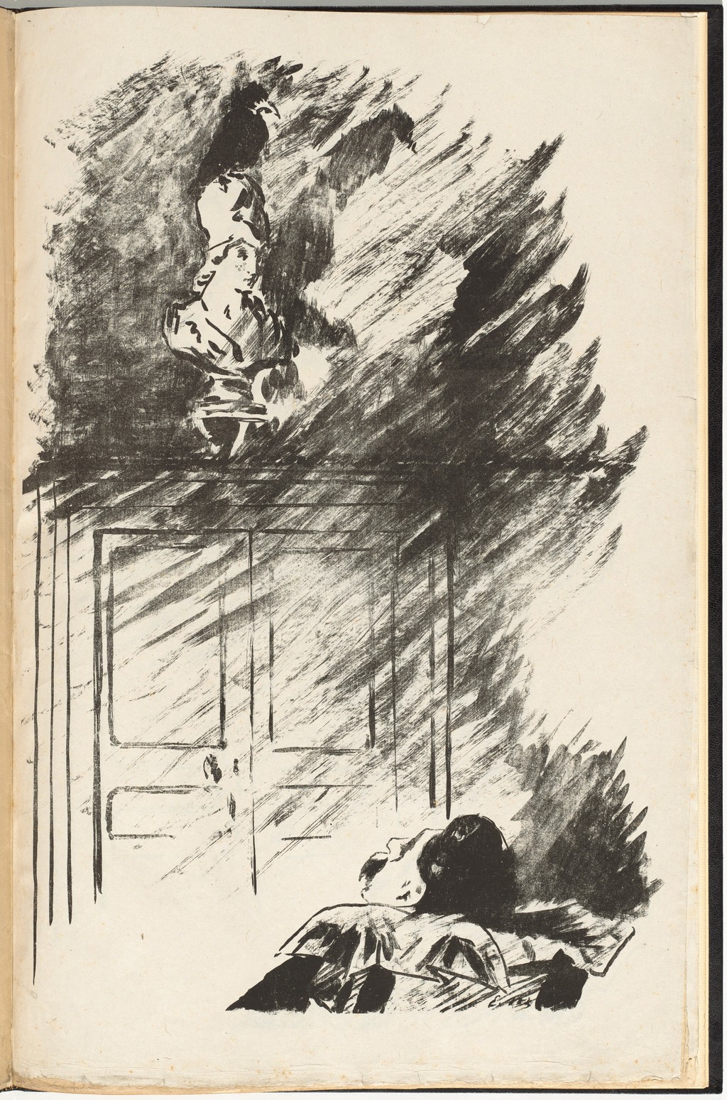
Édouard Manet, On the Bust, transfer-lithograph illustration in Le Corbeau, 1875. Edgar Allan Poe’s poem, translated by Stéphane Mallarmé. National Gallery of Art, Washington, 2014.112.27. Collection of Mr. and Mrs. Paul Mellon. Image source. Public domain. Whole supplied reproduction resized within native dimensions; no enlargement, retouching or colour alteration.
Designs Printed after Manet's Death
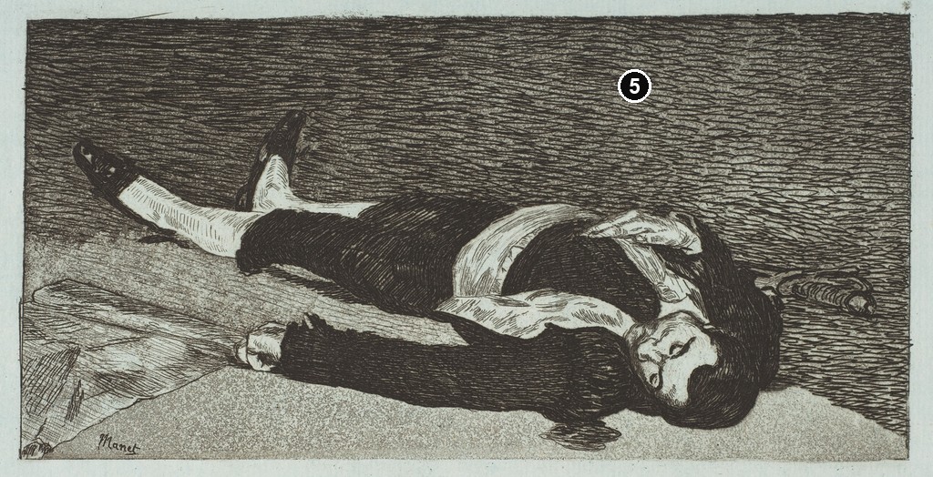
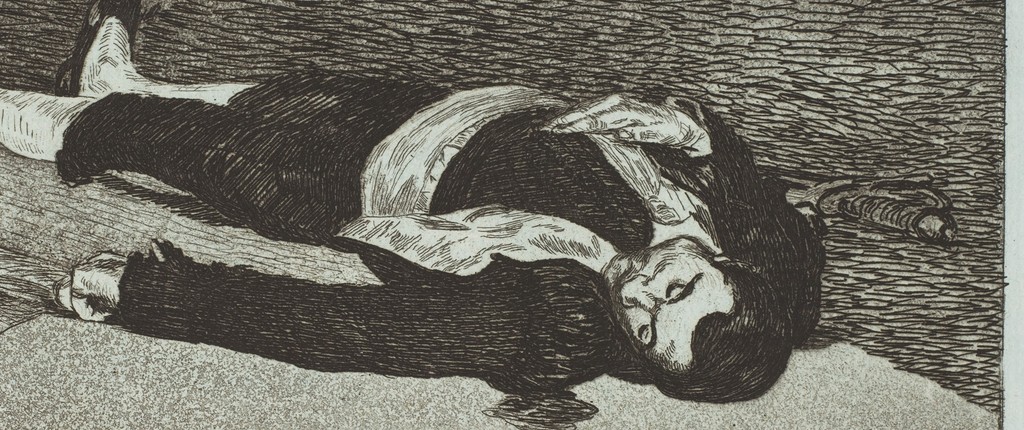
A print's date can refer to its design, while a separate edition date identifies a later printing. The Metropolitan Museum's Dead Toreador makes the distinction explicit: the design is dated 1867–68, but the impression belongs to the Strölin edition of 1905. The museum identifies it as etching and aquatint on blue laid paper, in the final state, numbered VI.[12]
The figure lies across a long, narrow pictorial field. Dense marks surround the dark costume, while the face, arm, stocking and shirt retain lighter passages. The blue paper gives those openings a different character from white paper. It becomes part of the image's tonal relationships wherever the printed marks leave it visible.
The catalogue also separates three measurements: an image of 9.8 × 19.4 cm, a plate of 15.2 × 22.4 cm and a sheet of 23.8 × 36.7 cm.[12] These describe different boundaries. A reproduction concentrating on the figure and its immediate frame may show much less paper than the full sheet measurement suggests.
The 1905 edition places this particular impression after Manet's death. Its date belongs beside the earlier design date in any account of the object. The same distinction applies to the Met's Water Drinker, whose 1870–74 design appears in a 1905 edition.[3] Recognising both dates makes the history of the printed sheet easier to follow and avoids compressing invention and later publication into a single event.
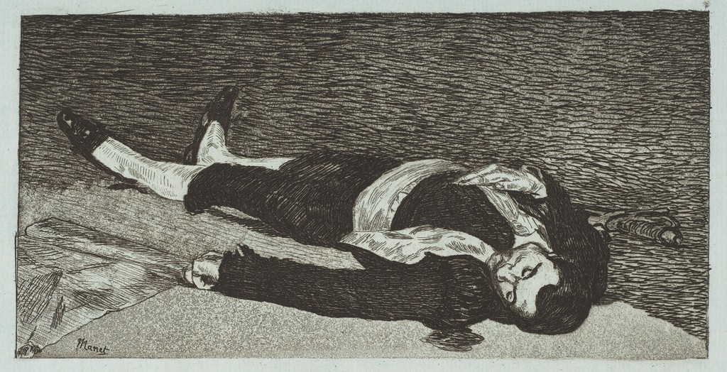
Édouard Manet, Dead Toreador, design 1867–68; impression from the posthumous 1905 Strölin edition, final state. Etching and aquatint on blue laid paper. The Metropolitan Museum of Art, New York, 21.76.10. Supplied image view, not a complete physical-sheet reproduction. Image source. CC0 / Public domain. Whole supplied reproduction resized within native dimensions; no enlargement, retouching or colour alteration.
Reading a Manet Print Label
A useful label begins with the exact object. The title identifies a design, but a museum's accession number identifies the particular impression in its collection. This becomes especially helpful for Lola de Valence, where different institutions hold different states and use several catalogue systems. The material, dimensions and edition attached to one sheet should travel with that sheet.[4][5]
Next consider what the recorded medium explains. Etching and aquatint can combine line with a textured field of tone; drypoint adds another kind of ink-holding mark; lithography permits a drawing to be carried by a flat printing surface.[2][8] The description provides a vocabulary for looking, while the image reveals how those possibilities were organised in a particular composition.
Lettering deserves the same attention as the figure. A poem, publisher's address or printer's name can reveal the presentation for which an impression was prepared. The margins of the lettered Lola and Polichinelle are part of their encounter with a reader.[5][9] Retaining them makes the sheets more intelligible as published objects.
Annotated Details from Manet’s Prints
The numbered points identify visible features discussed in this article. Return from each detail to the whole composition. Each caption identifies the work shown.
Lola de Valence — First State
Édouard Manet, Lola de Valence, 1863, first state in the Art Institute’s cataloguing. Etching. Art Institute of Chicago, 1953.274. Art Institute of Chicago; faithful public-domain reproduction via Wikimedia Commons. Image source. Public domain. Numbers added to a separate resized whole supplied overview. Detail crops from the unchanged original; no enlargement, retouching or colour alteration.
Lola de Valence — Lettered Print
Édouard Manet, Lola de Valence, 1863, sixth state of eight. Etching, aquatint and roulette. The Metropolitan Museum of Art, New York, 18.88.28. Baudelaire’s poem and publisher/printer lettering are retained. Image source. CC0 / Public domain. Numbers added to a separate resized whole supplied overview. Detail crops from the unchanged original; no enlargement, retouching or colour alteration.
Polichinelle — Colour Lithograph
Édouard Manet, Polichinelle, 1874. Colour lithograph with Théodore de Banville’s verses. The Metropolitan Museum of Art, New York, 22.104.1. Rogers Fund, 1922. Image source. CC0 / Public domain. Numbers added to a separate resized whole overview retaining the supplied edges and margins. Detail crops from the immutable original; no enlargement or retouching.
On the Bust — Le Corbeau Illustration
Édouard Manet, On the Bust, transfer-lithograph illustration in Le Corbeau, 1875. Edgar Allan Poe’s poem, translated by Stéphane Mallarmé. National Gallery of Art, Washington, 2014.112.27. Collection of Mr. and Mrs. Paul Mellon. Image source. Public domain. Numbers added to a separate resized whole supplied overview. Detail crops from the unchanged original; no enlargement, retouching or colour alteration.
Dead Toreador — Final-State Impression, 1905 Edition
Édouard Manet, Dead Toreador, design 1867–68; impression from the posthumous 1905 Strölin edition, final state. Etching and aquatint on blue laid paper. The Metropolitan Museum of Art, New York, 21.76.10. Supplied image view, not a complete physical-sheet reproduction. Image source. CC0 / Public domain. Numbers added to a separate resized whole supplied image view; this is not a complete physical-sheet reproduction. Detail crop from the unchanged original; no enlargement, retouching or colour alteration.
Details from MANET’S PRINTS
Follow the numbered details back to the complete images above. Each caption identifies the work shown.
Lola de Valence — First State
Face and Patterned Mantilla
Fine lines outline the face and patterned fabric around the head in the first-state impression.
Lola de Valence — Lettered Print
Lettering Beneath the Figure
Publisher lettering and the four lines of Baudelaire’s poem sit below the figure in this separate lettered impression.
Polichinelle — Colour Lithograph
Polichinelle’s Separate Full Figure
The colour print gives the hat, ruff, stick and contrasting boots room to form one clear silhouette.
On the Bust — Le Corbeau Illustration
The Raven above the Sculpted Bust
The raven sits above the light bust, surrounded by diagonal black marks in this separate book illustration.
Dead Toreador — Final-State Impression, 1905 Edition
Head, Hands and Hat in the Etching
Dark lines reshape the head, two hands and hat in this separate final-state impression.
Artworks directory
Explore selected paintings, drawings and prints by Édouard Manet. Search by title or another recorded name.
Frequently Asked Questions
Yes. His graphic work includes etchings, lithographs and illustrated-book designs. The Spanish Singer appeared in Cadart's eight-etching portfolio in 1862.[1]
An impression is an individual print. A state identifies a stage of the printing surface, changing when that surface is altered.[2]
No. The Met's Dead Toreador has a design dated 1867–68 but belongs to the posthumous Strölin edition of 1905.[12]
Discussion
Look again at the images and ideas explored in Édouard Manet Prints. These editorial prompts invite your observations.
Reader Insights
Compare the two Lola de Valence states. Which alteration most changes your sense of the dancer's presence?
In Polichinelle, follow one colour through the costume. How does it connect different parts of the figure?
Consider the open paper in On the Bust. Where does it give the scene its clearest form?
Join the Conversation
Share a detail, comparison or question about Édouard Manet Prints below.
References
- High Museum of Art, The Spanish Singer (Le chanteur espagnol), accession 56.24 (in English). View source.
- University of Delaware Library, Museums and Press, What is Etching?, explanatory text and glossary (in English). View source.
- The Metropolitan Museum of Art, The Water Drinker, accession 21.76.15 (in English). View source.
- The Art Institute of Chicago, Lola de Valence, accession 1953.274, current object and catalogue data (in English). View source.
- The Metropolitan Museum of Art, Lola de Valence, accession 18.88.28 (in English). View source.
- Kathryn Kremnitzer, Manet Across Media: Looking at Lola de Valence, Materia, issue 2, 2022, “The Etching,” figure 7 and note 26 (in English). View source.
- Étienne Moreau-Nélaton, Manet, graveur et lithographe, 1906, selected entries for Lola de Valence and Polichinelle, PDF pp. 48–49 and 142 (in French). View source.
- The Metropolitan Museum of Art, Lithograph, Materials and Techniques, 21 December 2018 (in English). View source.
- The Metropolitan Museum of Art, Polichinelle, accession 22.104.1 (in English). View source.
- Juliet Wilson-Bareau, Manet, Monet, and the Gare Saint-Lazare, 1998, pp. 163–165 and 197, including figure 147 and checklist entries 30–33 (in English). View source.
- National Gallery of Art, Le Corbeau (The Raven), 1875, accession 2014.112.27 (in English). View source.
- The Metropolitan Museum of Art, Dead Toreador, accession 21.76.10, 1905 Strölin edition (in English). View source.
- Splash image, Édouard Manet, A Bar at the Folies-Bergère, 1882. Modern reproduction of the oil painting. Manet’s original graphic works are illustrated in the article. The Courtauld / Google Arts & Culture, faithful reproduction via Wikimedia Commons. Image source. Public domain. Whole supplied faithful public-domain reproduction resized within native dimensions. No enlargement, retouching or colour alteration.


