![]() by Tom Gurney
by Tom Gurney
Tom Gurney BSc (Hons) is an art history expert with over 20 years experience
Published on June 19, 2020 / Updated on October 14, 2023
Email: tomgurney1@gmail.com / Phone: +44 7429 011000
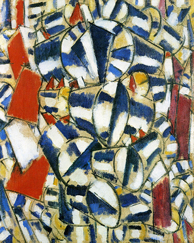
As part of a series showing some of Fernand Leger's most abstract work, Contrast of Forms was painted in 1912. Several different versions were given this same title.
As Leger moved from the expected style of the cubist movement into a style completely of his own, his art turned heads and created an unusual perception of his work. Contrast of Forms does not quietly follow even the strange rules of cubism. The focus is not on flat shapes but on cylinders, and these cylinders mix with other unusual shapes. The bright colours and uneven lines help create Leger's distinctive style. One interesting thing to note about Leger's work in this series is that he did not use the typical attention to correct placement of light. The highlights do not seem to match up with any particular direction or source, which creates a chaotic but visually appealing canvas. It is his defiance of typical rules which made Leger stand out, and means his art is still respected to this day. Another aspect to Leger's Contrast of Forms which set him apart from his peers is the use of colour in such a patchy, uneven fashion. His use of primary colours is not unusual, but his application stands out.
With the addition of the strong, firm black lines around the cylinders and shapes, the colours contrast intensely with one another and yet do not have the slick look of many other cubist pieces. Leger was not one to follow the rules, even in the cubist field which was already based on changing the artistic landscape. Somehow, Leger took these changes and created a style of his own. Over time, Leger would come to be known as one of the forefathers of Pop Art, largely due to his later works although the initial shift in his style can be seen in many early paintings such as this one. By defying the standards given to the movement, Fernand Leger created his own path in French contemporary art and left behind work that remains highly regarded all these years later.
Within Contrast of Forms, or Contraste de formes, to use its original French title, Leger filled a busy canvas with cubes and barrel shaped forms which are arranged seemingly at random. White and blue are the dominant colours, though tones of red are also used to the side. The shapes nearest us are larger in order to create a sense of perspective but very little else found here corresponds to the accepted principals of art. There would be several different versions of much the same content, each given this very same title. Two versions can be found within the collections of the Guggenheim Museum and also MoMA, both institutions of which host a number of other paintings and drawings from his career. They also address the work of several other related artists in detail as well, such as the likes of Braque, Gris and Picasso.
Much of early 20th century art was devoted to ignoring the real world and producing content that lived within entirely new realms that were created by each artist. Leger arrived at this point as his work became more and more abstract, and his use of Cubism continued to separate from how all others in the movement were working. Robert Delaunay would produce Simultaneous Windows also in 1913 and this attempted to similarly produce a new reality in which that artist’s content could exist. There were, therefore, several French artists who were working with similar intentions at this time, but their methods of delivery would vary markedly and that is how the Cubist movement would be seen as an umbrella of many different approaches to re-creating the use of perspective.