![]() by Tom Gurney
by Tom Gurney
Tom Gurney BSc (Hons) is an art history expert with over 20 years experience
Published on June 19, 2020 / Updated on October 14, 2023
Email: tomgurney1@gmail.com / Phone: +44 7429 011000
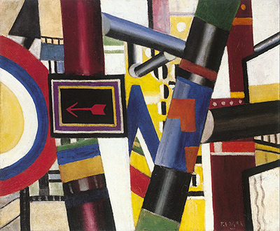
Fernand Léger's The Railway Crossing is an excellent example of his style, which is a modified form of cubism that became nicknamed by some as Tubism. The artist worked in other styles across his career, but it is this approach that became his signature look.
Léger was inspired by Pablo Picasso and George Braque, but his work is more colourful and less angular than that of his contemporaries. The simplified style of his work has led many to view it as a predecessor to pop art. Léger first explored the theme of the railway crossing in 1912, but it was not until 1919 that he began preparing for a more significant composition. At that time, he produced numerous smaller drawings and sketches on this theme. The finished painting is an oil study. Léger was heavily inspired by the industrial age, hence the beams and scaffolding which make up much of the painting. It is in many ways a tribute to modern civilisation, which Léger was fascinated by and viewed as a triumph. Rather than represent the scene realistically, Léger seeks to convey it conceptually. The network of jumbled objects and colours perfectly illustrates the energy, fragmentation and confusion inherent in modern life.
The tubular structures can be interpreted as pistons, conveying a sense of movement and activity. Meanwhile, the garish colours seem to be a visual representation of the noise and brashness of modern machinery. The Railway Crossing has been compared to Robert Delaunay's Champs de Mars: The Red Tower in its dynamism and modernity. However, The Railway Crossing differs in that the sign with the arrow is the only identifiable object in the painting. In Delaunay's work, on the other hand, structures and buildings are clearly visible. The aforementioned arrow appears to be a road sign, effectively directing the viewer's attention towards a certain area of the composition. In this way, it reflects the prominence of advertising in the modern world. This is reinforced by the bright colours which surround the sign. Interestingly, the painting was originally intended to be displayed the other way up. By turning it upside-down, Léger seems to further reject order and embrace the noise and chaos of industry.
Some have claimed this to be amongst the best periods in French art, which is quite a claim considering the number of prominent artists and movements that have come from this country over the previous centuries. For example, there was of course the French Impressionists, such as Monet, Renoir and Degas, as well as the more traditional approaches used by the likes of David as well as Romanticists such as Delacroix and Gericault. Cubism remains highly respected in a technical sense, but also its impact is seen as highly significant on what came afterwards and Leger himself has established a prominent role within that group. He is often seen as the fourth member, behind Picasso, Gris and Braque because his own approach was noticeably different from theirs, but that should not take away from the impact that his career oeuvre left behind via a huge selection of work across multiple mediums.