



 by Tom Gurney
Tom Gurney BSc (Hons) is an art history expert with over 20 years experience
Published on June 19, 2020 / Updated on November 2, 2026
Email: tomgurney1@gmail.com / Phone: +44 7429 011000
The Plain of Gennevilliers: Introduction
Yellow fills the foreground of Gustave Caillebotte’s The Plain of Gennevilliers, breaking into small, irregular marks against green and blue. Beyond it, bands of cultivated ground narrow towards a distant settlement. The houses are tiny; the plants seem close enough to brush against. Caillebotte makes a flat expanse feel both spacious and insistently present.
Painted in 1884, this canvas belongs to the National Gallery of Victoria in Melbourne. Its fuller title is The plain of Gennevilliers, yellow fields. [1] It is a particular painting within a sequence of related landscapes: Marie Berhaut’s catalogue identifies it as number 289. [2] Its distinctive pleasure lies in the exchange between a few broad divisions of space and an extraordinarily busy surface.
At a Glance
- ArtistGustave Caillebotte
- Date1884
- MediumOil on canvas
- Dimensions65.9 × 81.7 cm
- CollectionNational Gallery of Victoria, Melbourne
- Accession2011.289; Felton Bequest, 2011. [1]
This work across Gustave Caillebotte’s career
Contents
- A field without a central incident
- What yellow does to the landscape
- Cultivation beside Paris
- One view within a sequence
- Visible paint and the limits of technical comparison
- From a gift to a museum collection
- Annotated details
A field without a central incident
There is no dominant tree, conspicuous building or figure to settle the eye. Instead, the picture offers a broad surface across which looking can wander. The foreground enters the frame along its entire lower edge. Nothing marks the precise place where the spectator should stand, and there is no conveniently empty patch from which to survey the vegetation. We seem to encounter the field from within its immediate reach.
This closeness depends on the difference between the bottom of the painting and its distant edge. Low down, green strokes rise separately through the yellow. Some bend, some spread sideways, and others disappear beneath neighbouring marks. Farther away, comparable colours become thin, almost continuous ribbons. The changes in scale create distance without requiring a road or a succession of people to measure it. The field itself provides the measure.
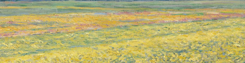
The ground is organised, although its boundaries are softened. A green interval crosses the middle distance; pinkish and yellow areas stretch beyond and beside it. Several bands slope gently towards the right, crossing the larger horizontal arrangement. Their edges are neither ruler-straight nor equally sharp. Sometimes a change of colour establishes a division; elsewhere one patch seems to leak into the next. The eye can read an agricultural layout while still feeling the irregularity of growing things.
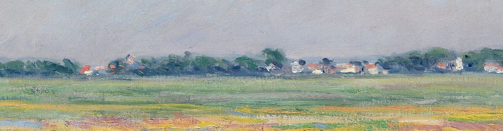
Along the horizon, dark green foliage and little white buildings create a much denser chain of forms. The red and orange roofs are particularly economical. A few warm touches can suggest a whole house when set against pale walls and a dark tree. These small structures briefly interrupt the spread of vegetation, but none is developed into a destination. The view carries on beyond them and beyond the two side edges.
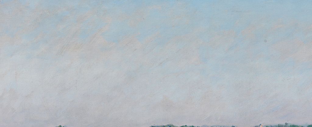
The sky gives this crowded ground room to breathe. Its pale blue is crossed by broad, soft grey-white passages, with none of the foreground’s sharp yellow flicker. The clouds have indistinct boundaries and an uneven distribution. There is no theatrical opening of sunlight or towering formation that would make the heavens the main event. Even so, the quiet sky is essential: its relative simplicity allows the field’s density to register.
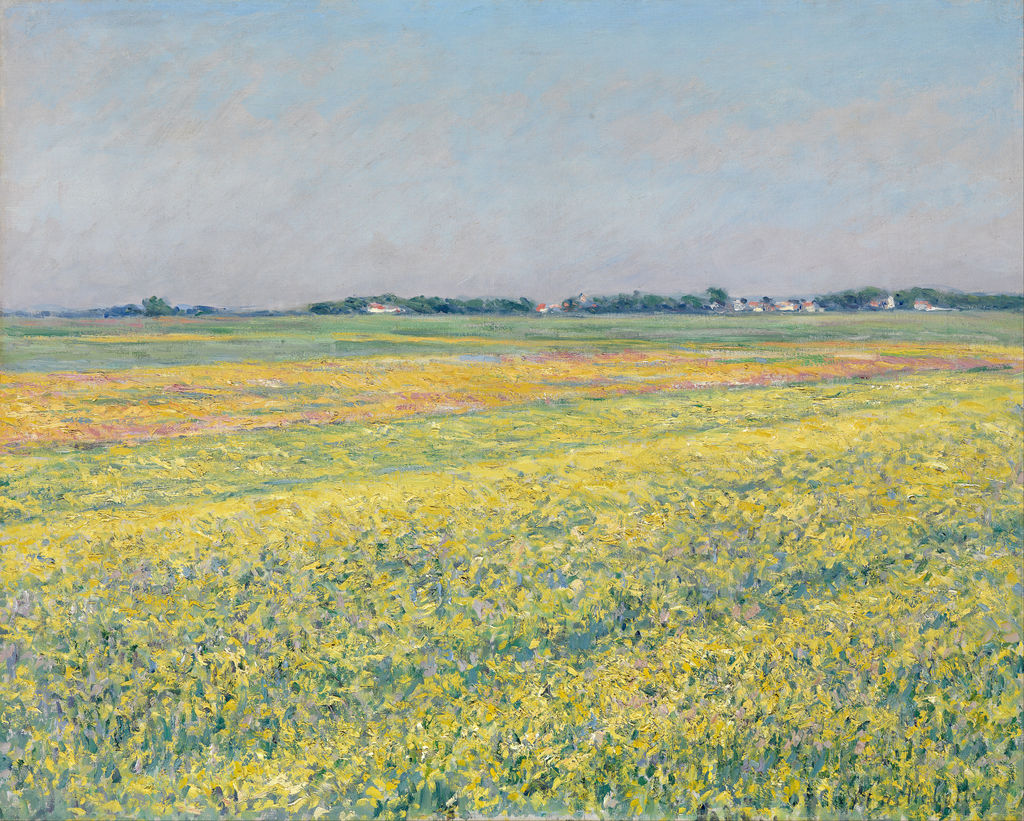
The Plain of Gennevilliers, Yellow Fields, 1884; National Gallery of Victoria, Melbourne, 2011.289. National Gallery of Victoria, Melbourne. Felton Bequest,2011. Source reproduction via Google Art Project and exact Commons file. Image source. Public domain. Resized only; source appearance preserved.
What yellow does to the landscape
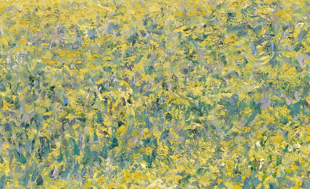
The yellow is not a uniform covering. Near the bottom it breaks into flecks, curls, short sweeps and thicker-looking little ridges. Between these marks are patches of cooler colour. At a glance, the eye gathers them into a radiant mass; looked at slowly, that mass divides into many competing directions. Individual strokes can be followed for a moment before they join the surrounding activity.
Blue-green gives the yellow much of its force. In the foreground, the cool passages are substantial enough to suggest leaves and spaces between plants. They also keep the yellow from becoming a solid wall. Small touches of pink and mauve complicate the contrast. Some lie within the nearer vegetation, while a more continuous pinkish band appears farther back. The painting’s brightness comes from these relations across the surface, as well as from the strength of any single colour.
Look particularly at the transition from foreground to middle distance. There is no abrupt border between a detailed lower zone and a simplified upper one. Small yellow incidents continue upward, but they become less individually legible. Their merging helps the eye accept the broad bands as more distant ground. At the same time, the bands can look almost like strips of paint laid across the canvas. The painting encourages both readings without fully resolving them.
Ted Gott, writing for the NGV, stresses the abundant, varied paint. His suggestion that some colour appears to have come straight from the tube is a visual impression, rather than a tested application method. He also relays Kirk Varnedoe’s interpretation that Caillebotte’s urban structural discipline survives in these landscapes. [4]
Those two observations meet in the visible painting. The broad arrangement is easy to grasp: sky, a distant settlement, cultivated bands and near vegetation. Within that arrangement, the marks refuse to settle into a regular pattern. At the lower right, repeated upward strokes can briefly resemble a row, then a sideways stroke or a broken patch disrupts it. Organisation operates at the scale of the whole canvas; local variety keeps its order from feeling mechanical.
The red roofs offer a useful test of this relationship. Seen from a distance, they help identify a populated place. Seen as paint, they are small warm accents answering the pinks and yellows below. The same touch can make a building intelligible and contribute to a colour rhythm. The landscape remains recognisable even where Caillebotte asks a great deal of very little descriptive information.
Annotated Details from The Plain of Gennevilliers
The numbered points identify visible features discussed in this article. Return from each detail to the whole composition. The Plain of Gennevilliers, Yellow Fields, 1884; National Gallery of Victoria, Melbourne, 2011.289. National Gallery of Victoria, Melbourne. Felton Bequest,2011. Source reproduction via Google Art Project and exact Commons file. Image source. Public domain. Resized only; source appearance preserved.
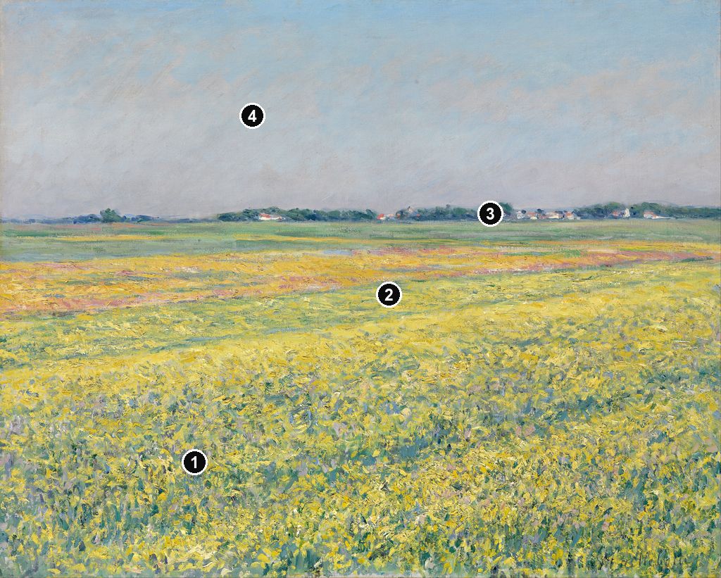
Details from THE PLAIN OF GENNEVILLIERS
Compare the cropped details with the complete images above. Notice how their colours, shapes and positions contribute to the larger compositions.
Flowers across the foreground
Small yellow touches gather among blue-green marks. Their uneven distribution keeps the field active without outlining every stem and flower.
Bands of colour through the field
Yellow and green bands stretch across the middle distance. Their changing widths carry the eye towards the much thinner line of the horizon.
Buildings on the distant horizon
Small pale buildings and dark trees interrupt the low horizon. Their reduced scale makes the breadth of the open field more apparent.
Clouds above the low horizon
Broad blue and pale cloud passages occupy the upper part of the picture. Their softer changes contrast with the smaller repeated marks in the field below.
Watch: Gustave Caillebotte
Explore a museum overview and two discussions of Paris Street; Rainy Day. This shared selection offers wider context for the artist’s work.
"Who Is Gustave Caillebotte?" - HD version
An introduction to Caillebotte from the Kimbell Art Museum.
Watch on YouTubeCultivation beside Paris
The NGV groups this work with five other 1884 landscapes near Caillebotte’s Petit Gennevilliers property. [1] He and his brother Martial had bought land there in 1881. The Musée des impressionnismes Giverny’s account describes the development of their house, boat shed, flower beds and vegetable garden. [5] The open fields belonged to a locality in which domestic life, cultivation and recreation were close neighbours.
Gott identifies the plain’s crops as vegetables and explains that sewage from Paris helped fertilise the riverside ground. He also notes the short railway journey from the capital. [4] These details complicate an easy impression of untouched countryside. Fertility here was connected to the nearby city’s infrastructure and consumption. The apparently separate worlds of urban life and agricultural land were materially joined.
There are no conspicuous workers in the picture, yet human activity structures what we see. Different plots have different colours and textures. Their long edges extend across the plain with a regularity unlike the loose outlines of the clouds. The distant roofs add another scale of occupation. Cultivation is present through the organisation of the land, even though the work that produced it is outside the depicted moment.
That distinction matters to the experience of the picture. A field can be full of labour’s results while appearing quiet. There is no action to read from a bent body, carried tool or cart; the viewer must attend to what has already been shaped and planted. The painting’s abundant surface makes that altered ground visually compelling. It does not supply an account of the growers’ conditions or identify individual crops closely enough to support a botanical inventory.
The settlement on the horizon also prevents the open land from feeling remote. Buildings and trees almost merge into a single low strip. Their small scale makes the plain seem extensive, but their persistence across the view keeps habitation in sight. The foreground’s apparent freedom from the city is therefore qualified by a continuously occupied distance. The field offers openness within a developed environment.
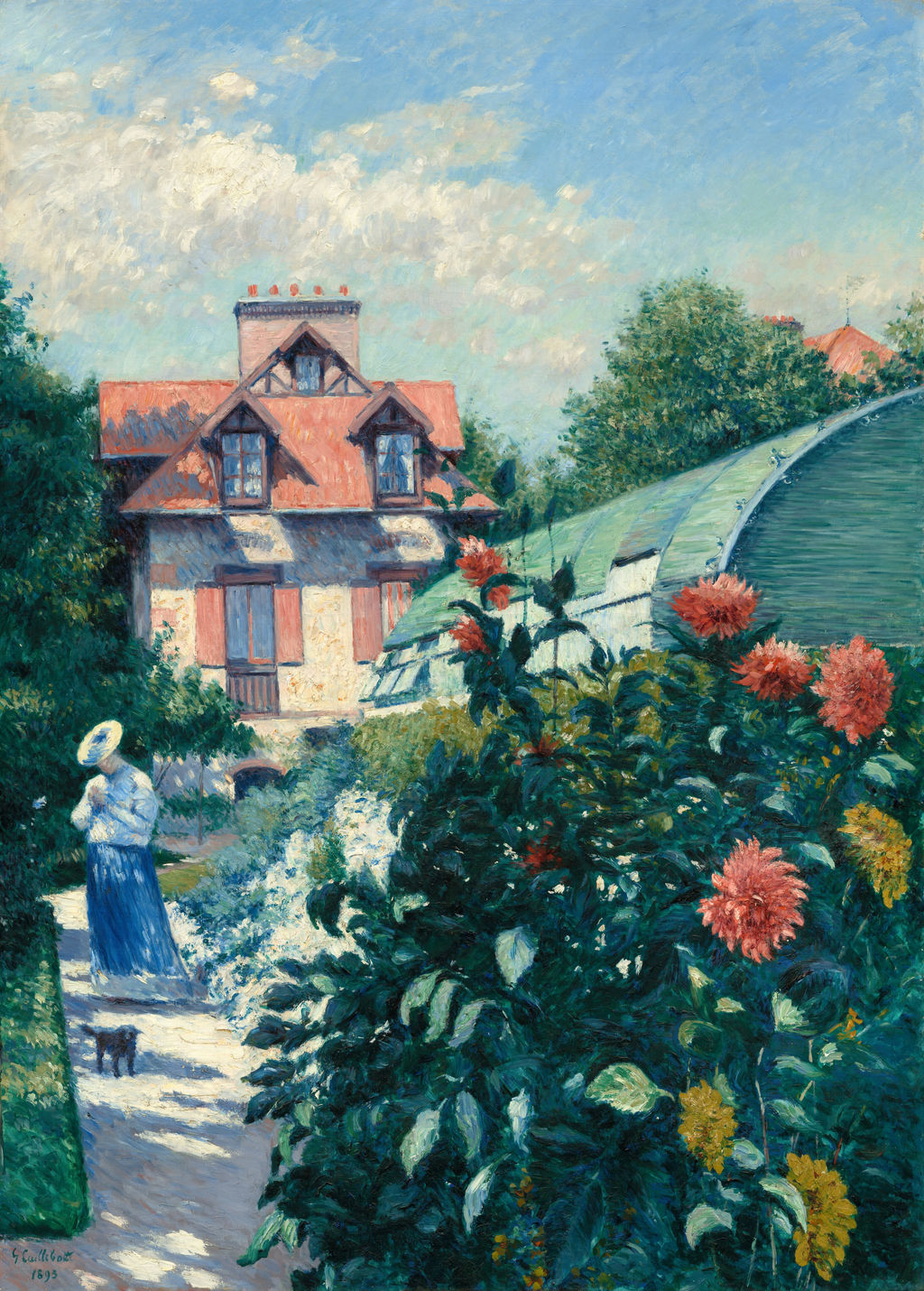
Dahlias at Petit Gennevilliers, 1893; a separate later view of cultivated flowers near the artist’s riverside home. Gift of the Scharffenberger Family. Image source. Public domain. Resized only; source appearance preserved.
One view within a sequence
Berhaut’s entry for number 289 connects it with coloured variations on the plain begun the preceding year. On the same catalogue spread, Study in Yellow and Pink, number 291, and the yellow-field paintings numbered 292 and 293 show different arrangements of related ground. Number 293 has a separate provenance through G. Minoret; number 289 was given to Émile Billard. [2] Similar titles therefore conceal distinct objects, sizes and histories.
The illustrated comparisons clarify what is unusual about the Melbourne painting. In numbers 291–293, the ground separates more decisively into lengthwise strips. Pale planted areas and darker divisions make channels that the eye can follow towards the horizon. In number 289, yellow growth spreads more fully across the front. The directional structure remains, but it is harder to detach from the mottled surface. This version gives less help to a viewer seeking a clear route into the distance.
The difference can be felt before any individual detail is identified. The neighbouring compositions make the plain legible as a succession of spaces. The Melbourne canvas makes its nearer part feel especially continuous and full. There is no broad foreground lane to create a pause between spectator and plants. Its open sky balances that density, while the pale roofs anchor the distant edge.
The SCHIRN’s 2012 exhibition texts discussed the related Study in Yellow and Pink in terms of simplified colour fields and expressive handling. That was a curatorial reading of another member of the sequence. [6] It helps frame a useful question here: how far can a landscape be simplified while its particular space remains convincing? In the Melbourne painting, the answer lies partly in those small buildings. Without requiring detailed description, they establish a distance against which the foreground’s enlarged marks can be read.
Visible paint and the limits of technical comparison
The foreground’s surface looks much more heavily worked than the sky. It catches the eye in broken, overlapping marks, whereas the upper area appears comparatively continuous. This is a visible difference in handling. It need not be translated into an exact sequence of painting sessions to explain its effect. The lower part seems active and resistant; the upper part allows the gaze to move with less interruption.
A technical study by Caroline von Saint-George and Katja Lewerentz concerns the separate Cologne Yellow Fields, Berhaut 293. For that canvas they discuss possible charcoal and brush planning, repeated paint applications and evidence interpreted as a field-easel mark. Their estimated sessions and findings concern the Cologne object. [7] They provide a useful comparison for Caillebotte’s practice without establishing those same procedures for Melbourne’s painting.
The NGV records a Dubus supplier’s stencil on its own canvas, identifying a commercial source for the support. [1]
This distinction leaves plenty to see. A short yellow mark may cross a green passage; nearby, a green stroke stands out between yellow touches. Such encounters produce depth within the vegetation at a much smaller scale than the receding plots. The spectator alternates between reading a broad landscape and looking into a densely interwoven patch of paint. The close view and the distant view ask for different kinds of attention.
Readers exploring Caillebotte’s style and technique can use this picture to notice how much depends on the scale of viewing. Step back mentally and the coloured divisions hold together. Look closely and the individual marks become assertive. Neither experience cancels the other. The painting’s space is sustained through a surface that continually announces its own activity.
From a gift to a museum collection
The NGV records an 1884 gift to Émile Billard. His descendants retained the picture until 2008; it subsequently entered another private collection before its acquisition through the Felton Bequest in 2011. [1] Berhaut’s earlier record of the Billard ownership connects that later museum history with this exact composition. [2]
The museum’s Degas-inspired, fluted frame, fitted in May 2011, was chosen to complement the picture’s abstract qualities without unduly stressing depth. [1]
That balance is already built into the canvas. The low buildings offer a recognisable horizon, and the diminishing marks establish distance. Yet the yellow foreground continually brings attention back to the painted surface. The view feels expansive because the plain extends away; it feels immediate because its nearest colour presses so vividly towards us. A modest agricultural subject becomes a sustained encounter between the organisation of land and the freedom of the painted mark.
Catalogue and documented works
This directory brings together 578 entries in the revised 1994 catalogue, 11 further documented records and three groups of study descriptions. It is a directory of records, not a total of authenticated individual works. Albums, print states and surviving decorative panels are grouped. English labels retain the French titles as searchable aliases; dates are supplied only where checked. Numbered entries link to the relevant article or the historical catalogue. Pastels appear under the Drawing filter; original prints remain searchable under All media.
Frequently Asked Questions
It belongs to the National Gallery of Victoria, Melbourne, accession 2011.289. [1]
No. Berhaut distinguishes several related compositions. This one is number 289; the smaller, separately documented number 293 is another painting. [2]
Gott describes vegetable cultivation on the plain. The title’s colour does not identify a wheat crop. [4]
Gott offers that as an impression of the surface, rather than a demonstrated technical finding. [4]
Discussion
Look again at the images and ideas explored in The Plain of Gennevilliers. These editorial prompts invite your observations.
Reader Insights
The yellow field has no single central incident.
Horizontal bands and small upright forms keep the open space from becoming empty.
Which small mark most changes your sense of distance?
Join the Conversation
Share a detail, comparison or question about The Plain of Gennevilliers below.
References
- National Gallery of Victoria, The plain of Gennevilliers, yellow fields, collection record, 2011.289; object details, provenance and frame account. View source.
- Marie Berhaut, with Sophie Pietri, Gustave Caillebotte: Catalogue raisonné des peintures et pastels (1994), pp. 182–183, entries 289–293 and illustrations; WPI public reader. View source. (in French).
- Marie Berhaut with Sophie Pietri; Wildenstein Plattner Institute, Gustave Caillebotte Catalogue raisonné des peintures et pastels, 1994. View source. (in French).
- Ted Gott, National Gallery of Victoria, “Gustave Caillebotte The plain of Gennevilliers, yellow fields” (2013), short acquisition essay; Varnedoe’s interpretation consulted through Gott. View source.
- Musée des impressionnismes Giverny, Caillebotte, peintre et jardinier: Dossier pédagogique (2016), pp. 5, 11, on the Petit Gennevilliers property. View source. (in French).
- SCHIRN Kunsthalle Frankfurt, Gustave Caillebotte: Ein Impressionist und die Fotografie, exhibition wall texts (2012), p. 4, discussion of Study in Yellow and Pink. View source. (in German).
- Caroline von Saint-George and Katja Lewerentz, Gustave Caillebotte – Gennevilliers Plain, Yellow Fields: Brief Report on Technology and Condition (2008), pp. 1–7; Cologne canvas, Berhaut 293, WRM Dep. 561. View source.
- Art Institute of Chicago, Caillebotte Paintings and Drawings at the Art Institute of Chicago, 2015. View source.
- Petit Palais / Paris Musées, Portrait de Paul Hugot, original print, PPG2319, current. View source. (in French).
- Paul Perrin, Musée d’Orsay, Transcription de l’entretien commissaire Caillebotte, 2024. View source. (in French).
- Cleveland Museum of Art, Caillebotte collection records: 2020.260, 2009.157 and 2020.105, current. View source.
- Splash image, The Plain of Gennevilliers, 1884.


