



 by Tom Gurney
Tom Gurney BSc (Hons) is an art history expert with over 20 years experience
Published on June 19, 2020 / Updated on November 3, 2026
Email: tomgurney1@gmail.com / Phone: +44 7429 011000
Aristide Bruant in His Cabaret: The Portrait Seen from Behind: Introduction
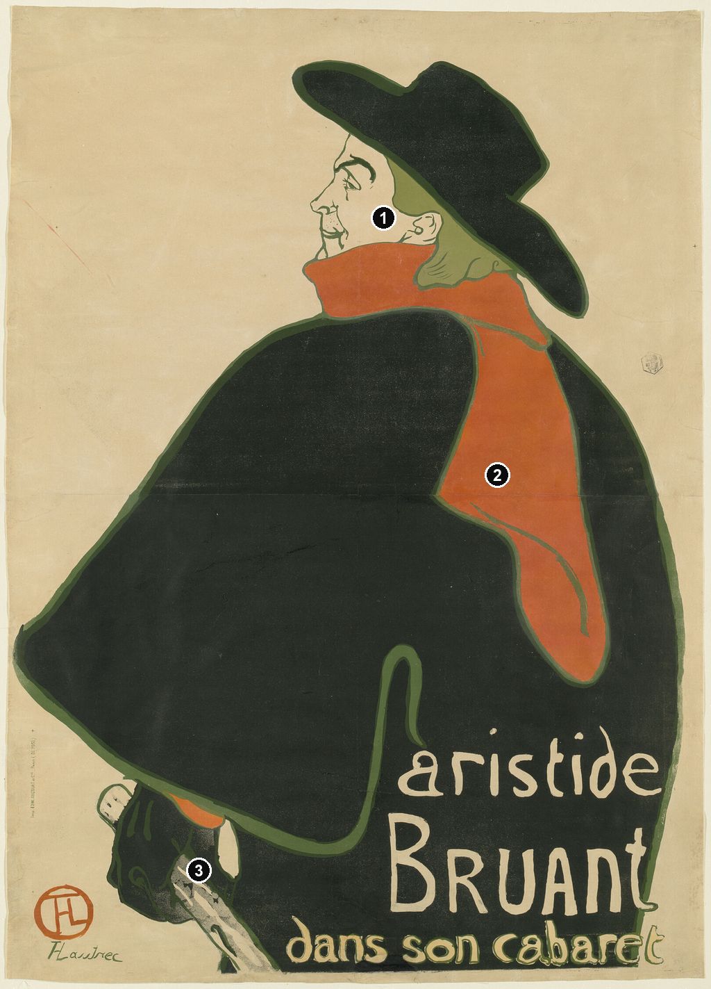
Aristide Bruant scarcely needs to face us. His black hat, red scarf and enormous cloak announce him before the eye reaches the small profile at the top of the sheet. In Henri de Toulouse-Lautrec’s Aristide Bruant in His Cabaret, made in 1893, a performer becomes recognisable through the very clothes that almost conceal him. The Art Institute of Chicago identifies the design as part of Lautrec’s repeated adaptation of Bruant’s distinctive appearance for advertising. Here, the turn of a shoulder gives that familiar appearance a new force. [1]
At a Glance
- ArtistHenri de Toulouse-Lautrec
- TitleAristide Bruant in His Cabaret; French: Aristide Bruant dans son cabaret
- Date1893. [1]
- MediumColour lithograph; Chicago’s impression is printed on buff wove paper. [1]
- PrinterCharles Verneau, Paris, credited in MoMA’s record and named on its unlettered impression. [2]
- Catalogue identityDelteil 348; Chicago’s lettered impression is Wittrock P9/C. [1]
- Chicago impressionImage: 127.3 × 94 cm; sheet, sight: 138 × 99.1 cm. Accession 1949.1005, Mr. and Mrs. Carter H. Harrison Collection. [1]
- Distinguishing featureBruant’s back dominates the composition, while his head turns into a left-facing profile.
This work across Henri de Toulouse-Lautrec’s career
Contents
- A Public Character at His Own Cabaret
- The Cloak Builds the Composition
- A Name Written Across a Back
- A New Design after Ambassadeurs and Eldorado
- Before and after the Lettering
- A Performer, a Silhouette and a Japanese Comparison
- Annotated details
A Public Character at His Own Cabaret
Bruant’s performance depended on a carefully cultivated relationship with his audience. At Le Mirliton he adopted the role of an outsider, criticising respectable society and mocking the prosperous customers who came to hear him. The Art Institute stresses that the cabaret attracted people from different social backgrounds, including members of the very upper classes he ridiculed. The antagonism was part of an entertainment that customers actively sought. It makes the poster’s refusal of an accommodating, face-to-face portrait particularly apt, although the pose alone cannot tell us Bruant’s private temperament. [1]
Lautrec’s involvement extended beyond a single advertisement. In her Metropolitan Museum catalogue, Colta Ives describes his illustrations for Bruant’s journal, also called Le Mirliton, and his work on song-sheet covers. She places the posters within an existing collaboration between an artist and a performer whose songs addressed poverty, imprisonment and marginal lives in Paris. That context gives the clothes their significance: the hat, scarf and cloak had become a public costume through which Bruant’s audience could recognise a particular voice and repertoire. [12]
The phrase dans son cabaret—“in his cabaret”—promotes that association without depicting an interior. There are no tables, musicians, lamps or paying customers here. The viewer encounters the proprietor as the attraction. His place of entertainment is represented through his presence rather than through a view of its rooms. The words offer an invitation while the image withholds the usual signs of hospitality: Bruant turns away, his cloak occupies much of the available space, and his gaze passes beyond us. This is a visual reading of the lettered design, whose function Ives identifies as advertising his performances at his own cabaret. [12]
The Cloak Builds the Composition
The figure is seen from behind and slightly to one side. His shoulder rises beneath his head, then the cloak swells towards the left edge before curving back towards his gloved hand. On the right, a more continuous sweep encloses his back. These two edges give the black mass an asymmetrical weight: one side spreads out almost like a wing, while the other presses towards the border. The red scarf descends over that dark expanse, making the turn of the body legible with remarkably little description. These relationships can be followed in the Metropolitan Museum’s lettered impression. [13]
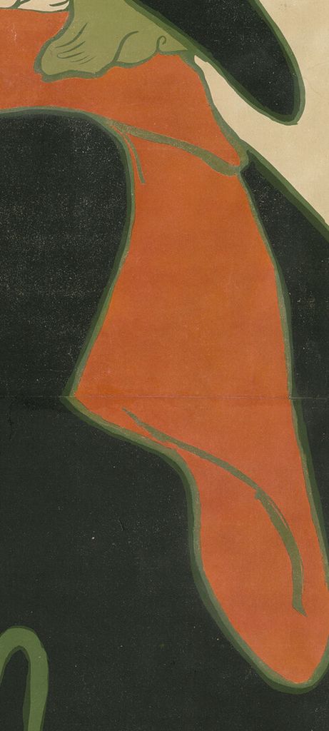
The scarf does more than supply an accent of colour. Its short horizontal section wraps high around the neck, separating the face from the cloak. The long end then drops down the back, bends inwards and finishes in a rounded point. A few dark lines suggest folds, but most of its effect comes from the uninterrupted red shape. The scarf pulls the eye from the profile into the body and then towards the inscription below. Its length also makes the black area seem larger: a substantial piece of cloth is reduced to a bright inset within an even greater field.
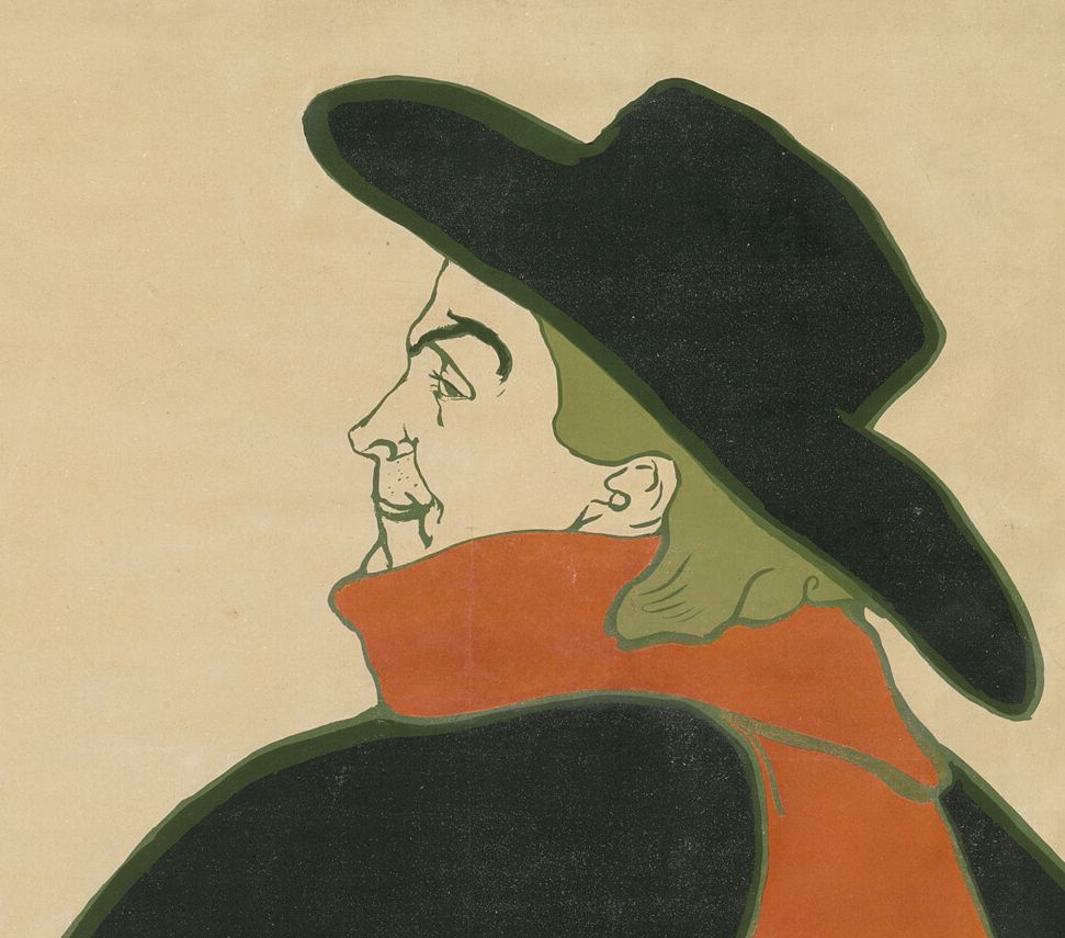
Bruant’s face is treated differently. The eyebrow, nose, eye, moustache and ear are picked out with economical lines against the light ground. Small adjustments distinguish one feature from the next, whereas the cloak receives almost no internal modelling. Looking closely reveals the balance behind the apparent simplicity. Lautrec gives the face enough information to sustain a likeness, then allows the clothing to operate at the broader scale of a sign. The eye alternates between a few fine marks and large areas of colour.
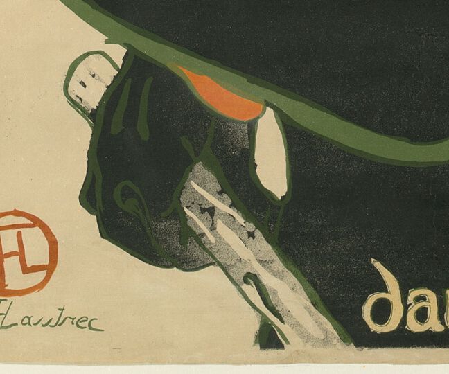
At the lower left, the glove and rough stick reintroduce details of touch and material. The stick angles down and out of the image; it does not establish a floor or tell us where Bruant stands. A narrow strip of light ground separates parts of the glove from the dark clothing. Nearby, a curved olive line defines the cloak’s lower edge before rising into a hook-like fold. It is easy to overlook this contour at a small scale, yet it prevents the silhouette from becoming shapeless. The shoulder, hem and hand together suggest a body concealed within the garment. [13]
The cropping adds to the effect. We see neither boots nor a complete standing figure. The hat has room around it, while the lower body and stick meet the bottom boundary. Bruant consequently feels both contained by the sheet and larger than its limits. That impression comes from the distribution of forms, rather than from any illustrated action: the poster conveys presence with very little movement.
Annotated Details from Aristide Bruant in His Cabaret: The Portrait Seen from Behind
The numbered points identify visible features discussed in this article. Return from each detail to the whole composition. Aristide Bruant in His Cabaret, 1893, Art Institute of Chicago, 1949.1005. Art Institute of Chicago, Mr. and Mrs. Carter H. Harrison Collection. Image source. CC0 / Public domain. Resized only; native appearance preserved.
Details from ARISTIDE BRUANT IN HIS CABARET: THE PORTRAIT SEEN FROM BEHIND
Compare the cropped details with the complete images above. Notice how their colours, shapes and positions contribute to the larger compositions.
The left-facing profile
Only a compact left-facing profile emerges from the great hat and cape.
The trailing scarf
The red scarf extends down the large dark back.
Glove and walking stick
The glove and stick give the reduced figure a recognisable gesture.
A Name Written Across a Back
The lettered version reads “aristide / Bruant / dans son cabaret,” with the surname given the greatest height. The first name runs above it in uneven, widely spaced characters; the smaller final line stretches along the foot of the composition. The light letters stand out against the dark cloak, while the warmer lower line relates to the scarf above. In the Met impression, these changes in size and colour make the text part of the picture’s rhythm. [13]
Lautrec does not reserve a rectangular panel for an orderly block of type. Instead, the words occupy the lower right of the figure, balancing the glove and projecting hem on the opposite side. The reader moves across an image that is simultaneously a body and a surface for writing. Ives draws attention to this use of calligraphy across Bruant’s cape, connecting it to the advertisement’s force. The words do not merely identify a portrait that would be complete without them; they change the distribution of light and dark within it. [12]
This produces a tension between imagined cloth and printed paper. The words appear to lie over Bruant’s back, but they do not follow folds like lettering sewn into a real garment. They remain legible across the flat surface of the sheet. The cloak provides a credible silhouette and an exceptionally clear background for a name. Read as advertising, the arrangement links the performer’s physical bulk to the scale of his public identity: the person and the name command attention together.
Watch: Toulouse-Lautrec
Choose an artist introduction, a film about graphic design or a closer look at At the Moulin Rouge.
A New Design after Ambassadeurs and Eldorado
The 1893 poster should be distinguished from Ambassadeurs: Aristide Bruant, made in 1892, and the related Eldorado: Aristide Bruant, also dated 1892 in the Art Institute’s exhibition checklist. The same checklist lists Aristide Bruant in His Cabaret separately as a work of 1893. Shared costume and similar wording can conceal the difference between these advertisements, particularly when reproductions omit their upper lettering. [14]
In the Ambassadeurs design, the performer’s chest and gloved hand are more directly exposed to view. Large venue lettering runs across the top, and another dark figure appears behind him. The Eldorado design retains a comparable arrangement, with the head facing in the opposite direction and the venue again announced above. The later cabaret poster removes that busy division between a performer and a background setting. A pale, largely empty field surrounds the head, while the enlarged back takes over the lower composition. The earlier figure confronts the passing viewer more directly; the later one makes recognition possible through a turn away. These differences are visible in the posters and in the Eldorado reproduction in MoMA’s 1985 catalogue. [14] [15]
The change demonstrates how an established public image could sustain variation. The scarf can move from the front of the body to the back without losing its identifying role. The hat can retain its broad outline while the profile beneath it changes direction. Instead of inventing a different costume for each commission, Lautrec rearranges the relationship between costume, face and lettering. Comparing the designs makes his decisions more apparent than treating every image of Bruant as the same famous poster.
Before and after the Lettering
An unlettered impression makes the writing’s contribution especially clear. MoMA’s example, accession 52.1961, was catalogued by Wolfgang Wittrock in 1985 as P9/A, while the lettered Met example was P9/C. The Chicago record likewise identifies its impression as P9/C. These references locate particular versions of the same design; they do not describe separate paintings or changes made to a single surviving sheet. [15] [1]
In MoMA’s unlettered version, the lower right is an uninterrupted dark field. The eye follows the cloak’s outline, the scarf and the profile without being asked to read a name. The printer’s imprint and Lautrec’s signature remain visible at the lower left, so “before lettering” does not mean that every written mark is absent. It refers here to the missing advertising inscription. The distinction is visible in the catalogue reproduction and avoids mistaking a proof for an unfinished drawing. [15]
Exhibition labels also distinguish these versions. SOMPO Museum of Art’s 2024 presentation of the Firos Collection identified a lithograph of the cabaret image specifically as an impression before lettering, dated 1893. Its Japanese title explicitly marks that status. This is a different physical sheet from Chicago’s lettered impression, despite the shared figure. [16]
Charles Verneau’s name appears along the edge of the unlettered MoMA impression, and the museum’s current record credits him as printer and Bruant as publisher. That separates the roles involved in making and circulating the image: Lautrec designed it, a printing workshop produced impressions, and Bruant had a direct stake in its publication. The current MoMA record describes the edition as unknown. The surviving image therefore supports a discussion of deliberate print production without requiring a confident total for how many sheets were issued. [2] [15]
A Performer, a Silhouette and a Japanese Comparison
Riva Castleman connected this poster with actor portraits by Katsukawa Shunshō in her introduction to MoMA’s 1985 Lautrec exhibition. Her comparison draws attention to a figure turned partly away, an expansive dark garment and conspicuous writing across its surface. Ives also places a Shunshō actor print beside her discussion of Bruant. The comparison is especially illuminating because it concerns the organisation of an image around a performer’s recognisable appearance, rather than a general resemblance between all flat-colour prints. [15] [12]
Looking between the images, one can see how a garment gives scale to a comparatively small head and how a powerful contour can carry attention across a sheet. Yet the differences matter as well. In the Japanese actor image reproduced by Ives, angular costume patterns and large characters create a much denser arrangement. Lautrec strips his field back, allows the red scarf to dominate the colour relationship and gives the advertising name its own uneven cadence. The comparison identifies a useful visual precedent without establishing that every detail was copied from one print.
Seen in this light, the poster’s economy is highly selective. It suppresses the room, the audience and most bodily detail while retaining the exact combination through which a performer can be known. The face supplies individuality, the costume supplies instant recognition, and the lettering turns recognition into an invitation to attend. For a broader account of how Lautrec developed images through printing, see his prints; here the unlettered and lettered versions let that process become visible within one composition.
Toulouse-Lautrec artworks directory
Browse 84 identified works and publications in this researched selection. Dates and titles follow the individual records; this is not a complete catalogue of the surviving oeuvre. Print impressions remain attached to their designs. Some listed works do not have a dedicated article. The Drawings guide also contains nine illustrated studies consolidated from former articles.
Frequently Asked Questions
No. Ambassadeurs is an 1892 design with the venue name across the top. The 1893 cabaret poster gives far more space to Bruant’s back and places the advertising inscription at the lower right. The Art Institute’s 2005 checklist lists them as separate works. [14]
The pose gives the cloak a dominant silhouette while preserving a recognisable profile, hat and red scarf. It also provides a large dark surface for the lettering. These visible effects explain how the design works; they do not establish Bruant’s private thoughts. [13]
Discussion
Look again at the images and ideas explored in Aristide Bruant in His Cabaret: The Portrait Seen from Behind. These editorial prompts invite your observations.
Reader Insights
Does the unlettered cloak seem more like a volume of cloth, or does its flatness become more apparent?
How does your route through the picture change when the pale name occupies the lower right?
Join the Conversation
Share a detail, comparison or question about Aristide Bruant in His Cabaret: The Portrait Seen from Behind below.
References
- Art Institute of Chicago, Aristide Bruant, in His Cabaret, 1893, accession 1949.1005. Object facts, catalogue references and curatorial description; full retained institutional API record consulted. View source.
- Museum of Modern Art, Aristide Bruant in His Cabaret, 1893, accession 52.1961. Current object record, printer, publisher, dimensions and unknown edition. View source.
- Autoportrait, 1880 (in French). View source.
- ALBERTINA: Der Schimmel Gazelle,GE123DL. View source. (in German).
- Franka Blok, Portrait of Vincent van Gogh, 2024. View source.
- Art Institute of Chicago: Moulin Rouge, La Goulue. View source.
- Art Institute of Chicago: At the Moulin Rouge. View source.
- Jane Avril, 1893. View source.
- Au Salon de la rue des Moulins (in French). View source.
- Colta Ives, Toulouse-Lautrec in The Metropolitan Museum of Art, 1996. View source.
- Maurice Joyant (in French). View source.
- Colta Ives, Toulouse-Lautrec in The Metropolitan Museum of Art (1996), printed pp. 36–37, figures 36–38, and checklist pp. 62–63. Relevant text and actual reproductions consulted. View source.
- Metropolitan Museum of Art, Aristide Bruant, at His Cabaret, 1893, accession 32.88.17. Current record and image of the lettered impression. View source.
- Art Institute of Chicago, Toulouse-Lautrec and Montmartre: exhibition checklist (2005), cats. 113, 115–117. Exact distinctions among Ambassadeurs, Eldorado, the cabaret poster and the separate smaller Bruant design. View source.
- Riva Castleman and Wolfgang Wittrock, in Henri de Toulouse-Lautrec: Images of the 1890s (MoMA, 1985), Castleman’s introduction, printed p. 13; Wittrock, cats. 251, 256–258, printed pp. 226–227 and 230–231. Bounded passages and corresponding reproductions consulted, including the unlettered MoMA poster. View source.
- SOMPO Museum of Art, Firos Collection Toulouse-Lautrec exhibition, 22 June–23 September 2024 (in Japanese). Exhibition dates and selected-work entry identifying the 1893 impression before lettering. View source.
- Splash image, Aristide Bruant in His Cabaret, 1893, Art Institute of Chicago, 1949.1005. Art Institute of Chicago, Mr. and Mrs. Carter H. Harrison Collection. Image source. CC0 / Public domain. Resized only; native appearance preserved.


 Henri de Toulouse-Lautrec.jpg)