



 by Tom Gurney
Tom Gurney BSc (Hons) is an art history expert with over 20 years experience
Published on June 19, 2020 / Updated on November 3, 2026
Email: tomgurney1@gmail.com / Phone: +44 7429 011000
Toulouse-Lautrec Prints and Posters: Introduction
A Toulouse-Lautrec print might once have announced a dancer across a Paris street, accompanied a song at home, or waited inside a portfolio for a collector to turn the next sheet. Those settings mattered. The image was made through a particular process, financed and distributed by particular people, and encountered in a particular form. Reading that history brings the familiar silhouettes back into contact with the workshops and publishing businesses that put them into circulation. [1]
The range extends well beyond posters. Before his celebrated Moulin Rouge advertisement of 1891, Lautrec supplied illustrations for journals using photomechanical reproduction and stencil colour. Afterwards, lithographic albums, theatre programmes, music covers and illustrated books developed alongside the large advertisements. His graphic art joins the apparent intimacy of a drawn mark to the possibility of reaching many viewers. [1]
At a Glance
- Before the postersjournal illustrations appeared in Le Courrier français and Le Mirliton in 1886, reproduced by photorelief. [1]
- First lithographic advertisementMoulin Rouge: La Goulue, 1891; the Met's example is printed in four colours on three sheets. [2]
- Principal formsposters, individual prints, portfolios, illustrated books, programmes, journal illustrations and song sheets. [1]
- A major portfolioElles, published by Gustave Pellet in 1896, contains ten image plates, a title page and a portfolio cover. [3]
- Three useful distinctionsan impression is an individual printed example; an edition is a defined issue; a state records a stage in the image's printing history. Particular objects require particular records. [3] [4]
Contents
- Printed images before the first poster
- From stone to proof to edition
- The people behind a printed sheet
- Impression, state and edition
- Posters made for streets and collections
- Albums and the time of turning pages
- Books, programmes and music covers
- What the letters and prices can establish
- How collections preserve the publication history
Printed images before the first poster
The starting point is a journal page. Phillip Dennis Cate identifies Gin Cocktail, published in Le Courrier français on 26 September 1886, and a double-page reproduction of The Quadrille of the Louis XIII Chair at the Élysée Montmartre in Le Mirliton on 29 December that year as early successful illustrations. Both used photorelief, a process in which photography helped produce a relief printing surface. Calling them lithographs would erase the method through which the drawings reached their readers. [1]
This distinction becomes more revealing in the colour covers Lautrec supplied to Le Mirliton in 1887. Black printed outlines and shapes were combined with colour applied through stencils. The limited palette encouraged decisive choices: in La dernière goutte, the red scarf becomes a concentrated accent. A small amount of added colour could organise attention across an otherwise black-and-white page. The procedure differs from printing the same passage from a separately inked lithographic stone. [1]
Cate treats these illustrations as a place where Lautrec learned to make the white paper, black image and limited colour work together. That argument gives the early journals an active role in the later development. They provided more than publicity for a painter. Their production constraints offered problems to solve, and those solutions could be carried into other media. The simplification associated with the famous posters had a history in the practical demands of publication. [1]
Other drawings tested the process differently. For three illustrations to Émile Michelet's account of summer in Paris, published in Paris illustré on 7 July 1888, Lautrec scratched light shapes out of a dark ground. The resulting contrast suited photorelief reproduction. Its roughly cut appearance might suggest a woodcut to someone looking only at the image, but Cate identifies the reproduction method separately from that visual resemblance. A print can look as though it belongs to one technique while having been produced by another. [1]
The relationship with journals continued after Lautrec became a lithographer. Kleinmann sold signed and numbered colour proofs of designs reproduced for Le Rire, treating photorelief images as collectible works on special paper. In 1893, Figaro illustré published seven colour illustrations for Gustave Geffroy's article on restaurants and café-concerts. The artist did not abandon reproductive printing when original lithography became available to him. He worked within several systems, with different costs, scales and routes to readers. [1]
Browse Toulouse-Lautrec prints


From stone to proof to edition
Lithography is a form of printing from a flat surface. In the traditional stone process, greasy drawing materials establish the image on prepared limestone. Chemical treatment, dampening and inking allow the image areas to receive printing ink while the surrounding surface resists it. Paper is then pressed against the stone. Albi's museum explains the process through pen, brush and crayon: the variety of drawing tools helps account for the variety of marks that can survive in a lithographic impression. [5]
The apparent directness of those marks can be deceptive. A line that resembles a brushstroke on the finished sheet may have been printed there. Cate describes Lautrec drawing on stones, usually one for each printing colour, while a printer pulled proofs for him to correct or approve. Only after the results were satisfactory would the printer undertake the edition. Artist and printer were performing related but distinct tasks. The material repeatability of the image depended upon that division of labour. [1]
A progressive proof makes the sequence partly visible. It may show an image before all the colour stones have been printed, allowing the contribution of one ink or combination of inks to be examined. A trial proof can also preserve a decision that was changed before publication. Neither term means simply an inferior version of the finished print. Proofs can document how the image was constructed and which possibilities the artist and printer tested. Wittrock's catalogue distinguishes a key-stone proof, intermediate colour trials and the published edition of The Englishman at the Moulin Rouge. [4]
Colour separation was not governed by one recipe. For the 1891 Moulin Rouge poster, Cate describes a sequence of yellow, red, blue and black. Overlap could create another hue: red and blue could yield purple. The next year's Englishman used six inks, including a purple that was mixed before printing. The physical difference matters even where a reproduction offers a similar-looking colour. One purple results from successive layers; the other arrives on the paper as its own ink. [1]
Cate's account of La Goulue and Her Sister, also from 1892, is more specific still. Progressive proofs in the Bibliothèque nationale allowed him to identify the printing order as olive-green, blue, light green, red, yellow and salmon-beige. The olive-green no longer functions simply as an overall outline; it becomes one of the colours placed beside others. This documented sequence belongs to that design. It cannot be transferred to every colour lithograph that Lautrec made. [1]
The paintings help explain how a composition could be prepared, but a lithograph required its own decisions. Colour had to be distributed among printing surfaces; the workshop had to coordinate the successive impressions. Even a seemingly economical image could demand careful proofing. The printed result brings together the artist's selection of forms and the printer's control of ink, pressure and alignment. Cate and Wittrock both make collaboration central to their accounts of the work. [1] [4]
The people behind a printed sheet
Lautrec pictured this shared labour in the 1893 cover for L'Estampe originale. Jane Avril examines a proof while Père Cotelle works at the press. Wittrock identifies Cotelle as the master printer at Ancourt's workshop. The subject connects a celebrated performer, a manual process and an act of attentive looking. A publication of original prints begins by showing the conditions in which such prints are made and judged. [4]
The cover also introduces André Marty, publisher of L'Estampe originale. A publisher organised an issue and brought it to an audience; a printer produced its physical impressions. The same firm could sometimes occupy more than one commercial role, but the credits should still be read individually. For Miss Loïe Fuller, the Met names Lautrec as artist, Edward Ancourt as printer and Marty as publisher. For MoMA's 1893 Jane Avril, the publisher is Jardin de Paris and the printer is Chaix. These are different production partnerships. [6] [7]
Dealers could also publish. Edouard Kleinmann showed Lautrec's work at 8 rue de la Victoire and issued or distributed lithographs of performers. Gustave Pellet published colour prints, including Elles. Edmond Sagot's catalogues offered posters for sale, while Maurice Joyant helped organise exhibitions and publication through the Boussod and Valadon gallery. These relationships form a network with overlapping responsibilities. The name on a dealer's catalogue does not automatically identify the person who operated the press. [1]
Nor was a commission simply an artist delivering an image to a passive recipient. The 1894 Yvette Guilbert project was refused by the performer whose public likeness it was intended to promote. Albi's account makes clear that subsequent album collaborations continued. Acceptance, revision, refusal and renewed work were all possible within a professional relationship. The rejected project survives as evidence of negotiation, while the albums document other agreements that reached publication. [5]
Impression, state and edition
An impression is a particular printed example, with its own paper, margins, inscriptions and ownership history. A state distinguishes a stage of the image as prepared for printing, which might include the addition of lettering. An edition describes an issue of impressions. These terms answer different questions: which physical sheet is this, which version of the image does it carry, and to which published issue does it belong? The catalogues use them together because no single term supplies the whole identity. [3] [4]
The Met's Elles image is a particularly clear test. Its heading calls the design a portfolio cover, but the medium description identifies the museum's actual sheet as the second state of three, from the frontispiece edition. It is printed in three colours on wove paper. The distinction tells us how to describe the object in front of us: this is a frontispiece impression of the cover design, rather than the large unfolded wrapper itself. Ives's checklist separately records the portfolio cover on Japan paper. [8] [3]
Miss Loïe Fuller demonstrates another limit of the vocabulary. The Met describes its five-colour impression as the only state, while also noting about sixty versions printed with varied coloured inks, including metallic colours. Variation in palette does not therefore automatically create a new state. Looking at the museum's sheet, one can see dense spattered colour surrounding a pale, twisting shape. Another impression may distribute colour differently while retaining the same basic printed image. The record's terminology and the sheet's visible appearance need to be considered together. [6]
Numbers require the same care. MoMA gives an edition of twenty for its Jane Avril, object 456.1954. Ives's checklist lists the Met's poster with its edition size unknown. The twenty cannot stand for every copy made to advertise Avril's performances. It is the edition information supplied for MoMA's object. Treating it as the complete street distribution would collapse different kinds of evidence into one attractive but unsupported statistic. [7] [3]
Measurements are equally specific. The 2026 Hiroshima exhibition checklist explicitly states that its print dimensions generally describe the sheet rather than the image. It lists first and second states of Moulin Rouge: La Goulue as separate exhibits, with different sheet sizes. Such conventions explain why dimensions found under a familiar title need not agree. Before comparing them, establish whether each institution measured the image, the paper, an assembled poster or a sheet with an additional strip. [9]
Watch: Toulouse-Lautrec
Choose an artist introduction, a film about graphic design or a closer look at At the Moulin Rouge.
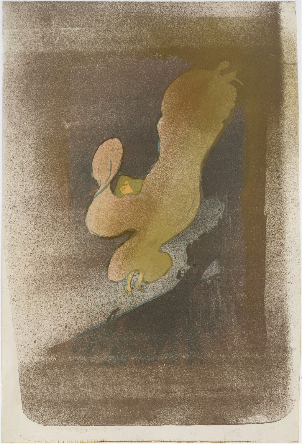
Miss Loïe Fuller, 1893, The Metropolitan Museum of Art, 1970.534. Rogers Fund, 1970. Image source. CC0 / Public domain. Resized only; native appearance preserved.
Posters made for streets and collections
The enormous scale of Moulin Rouge: La Goulue belonged to its advertising task. The Met's 1891 impression stands 190 centimetres high and credits Affiches Américaines, Charles Lévy, as printer. It consists of three sheets of wove paper. The physical construction reminds us that this was an assembled public object, quite different in handling and visibility from a portfolio leaf. A small reproduction compresses those material differences almost out of sight. [2]
The familiar Bruant silhouette also had more than one advertising life. Chicago distinguishes its 1893 Aristide Bruant, in His Cabaret from the 1892 commissions for the Ambassadeurs and Eldorado. The repeated hat, cloak and scarf made the singer recognisable, while adaptation and lettering served changing occasions. Reuse of an effective likeness should not make separate designs or issues disappear into one generic “Bruant poster”. The artist was supplying a working public identity across advertisements. [10]
Lettering could even change the function of an existing image. Albi's 2025 exhibition account describes The Passenger from Cabin 54 moving from a print for subscribers of La Plume into an advertisement for the Salon des Cent through added text. Wittrock's catalogue separates proof, first edition, second edition and poster state. The sequence shows how an image could acquire an advertising function through the addition of lettering. [5] [4]
Collectors could obtain advertisements almost as soon as they appeared. Cate found Jane Avril and Divan Japonais listed in Sagot's June–July 1893 catalogue. The shop provided a route from new commercial design to retained artwork. A surviving sheet might therefore have been bought directly, rather than detached from a Paris wall. Public exposure and private ownership were connected parts of the poster's early life. [1]
That connection also complicates the idea of ephemera. An advertisement had an immediate task, yet printers and dealers could supply impressions intended to last beyond it. Albi places this development within affichomanie, the enthusiasm for collecting posters that brought specialist dealers, exhibitions and publications into being. Preservation was already changing the experience of these images during Lautrec's lifetime. The advertisement became something one could revisit after the performance or publication it announced had passed. [5]
Albums and the time of turning pages
An album invites a different rhythm. Instead of competing with neighbouring advertisements on a wall, its images can accumulate through sequence. In 1893, Marty published Le Café Concert, bringing together twenty-two black-and-white lithographs by Lautrec and Henri-Gabriel Ibels. Cate situates this collaboration beside their journal and theatre work. Wittrock specifies eleven lithographs by each artist, accompanied by Georges Montorgueil's text. The reader moves between separate views brought together by a shared subject. [1] [4]
Marty's larger L'Estampe originale enterprise similarly gathered original prints by different artists into successive albums. Lautrec supplied the first cover in 1893, At the Ambassadeurs in 1894 and the cover for the final album in March 1895. These contributions placed him among a varied group of contemporary printmakers. The publisher created relationships between works through their issue together; the cover and individual print had distinct jobs within the same publication. [1]
The two Guilbert albums concentrated that serial attention on one performer. Ives's checklist describes the 1894 album as sixteen lithographs printed in olive-green with text by Gustave Geffroy, issued in an edition of one hundred. Wittrock counts seventeen lithographs for the book, identifying the cover separately as the first of the seventeen designs. The difference is therefore explained by the components: sixteen illustrations and a cover. Stating what is counted keeps the reader's experience of the book distinct from the number of designs catalogued. [3] [4]
The 1898 Guilbert publication belongs to a separate agreement with Bliss, Sands & Co. in London. Ives records eight principal lithographs, a frontispiece and a cover, with Arthur Byl's text translated by A. Teixeira de Mattos, in an edition of 350. The sequence follows named songs and stage actions, ending with Guilbert taking a bow. The book therefore gives performance a repeatable structure: the viewer can return to a gesture, move back to an earlier song or compare attitudes across the sequence. [3]
Elles, published by Pellet in 1896 in an edition of one hundred, offers another kind of serial experience. Ives separates its ten image plates from the title page and portfolio cover. Washing, waking, breakfast and other everyday activities supply connections between sheets, while differences of format, subject and printed colour prevent the suite from becoming a single repeated scene. The individual plate and the collected portfolio are related objects of attention. [3]
The cover design itself can be recognised by the woman raising her hands to her hair, the long blue garment and the large Elles lettering. On the Met's frontispiece impression, light drawing and spatter remain visible around those stronger shapes. Yet recognising this image does not establish that a loose sheet is the wrapper or that a collection contains the complete suite. The physical component, paper and state have to be checked. The distinction allows an album's original structure to remain intelligible even when its images circulate separately. [8]
A projected series could also remain incomplete. Ives identifies the 1899 Jockey as the only published image from a racing series commissioned by Pierrefort. Chicago's corresponding colour lithograph is catalogued as Wittrock 308, second state of two. The commission extended beyond the single image that reached publication. The surviving print should not be made into evidence that all the planned subjects were published, or confused with the separate Jockey Going to the Post. [3] [11]
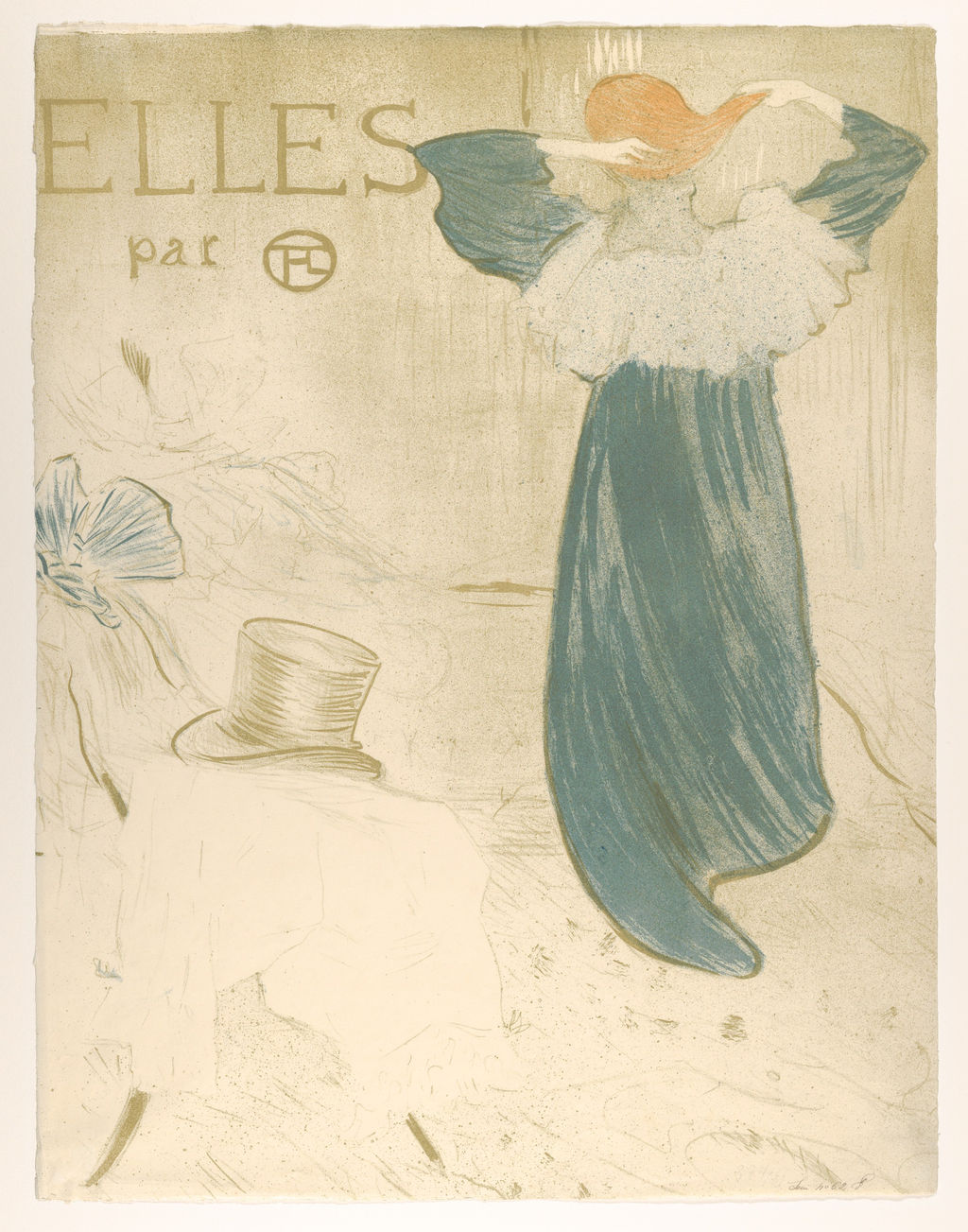
Elles frontispiece, 1896. Crayon, brush and spatter lithograph in three colours on wove paper, second state of three. Metropolitan Museum of Art, 1984.1203.166(2). This upright sheet introduces the portfolio; it is distinct from the unfolded wrapper and exhibition poster. Bequest of Scofield Thayer, 1982. Image source. CC0 / Public domain. Resized only; native appearance preserved.
Books, programmes and music covers
Printed images could travel with words that were sung, spoken or read. Cate identifies Georges Ondet as a publisher of song sheets and records Lautrec's 1893 designs for Carnot malade! and The Little Errand-Girl. For Les Vieilles Histoires, Lautrec provided the cover and illustrations to five poems, with Ibels and Henri Rachou contributing other illustrations. This is collaborative bookmaking as well as individual printmaking. The page belongs to a sequence of text, music and images assembled for a reader's use. [1]
Related commissions brought Lautrec into work for the composer Désiré Dihau. Cate records fourteen compositions illustrated by the artist and published by C. Joubert in 1895. Such covers extended graphic invention into the ordinary handling of printed music. An image on a song sheet might be encountered repeatedly at a piano or while rehearsing a song. Its commercial purpose and its place in musical practice are part of its history, alongside the identity of the represented performer. [1]
Theatre programmes attached an image to a particular production and institution. Lautrec worked for André Antoine's Théâtre Libre and Lugné-Poe's Théâtre de l'Oeuvre. Cate names designs associated with Le Chariot de terre cuite and the combined programme for Raphaël and Oscar Wilde's Salomé. The printed programme connected spectators with the performance through an object they could carry away. It also gave experimental theatres a visual identity shaped by contemporary artists. [1]
The surviving preparatory work can clarify what went into that apparently modest object. Ives reproduces the blue-chalk and white-gouache design for Le Chariot de terre cuite beside the lithographic playbill. The transition establishes a sequence of objects rather than a single image existing in interchangeable materials. Drawing, printed illustration and programme retain different functions, even when they share the same composition. Alongside the questions of colour and space, this sequence lets us follow the development of a publication. [3]
A book's execution and publication dates may also diverge. Wittrock records the lithographs for Jules Renard's Histoires naturelles as executed in 1897, while Henri Floury published the book in 1899. His entry specifies twenty-two illustrations plus a lithographic cover. The distinction places the artist's work on the images earlier than the reader's encounter with the issued volume. A date attached to an illustration is not necessarily the imprint date of the book containing it. [4]
Publication could also continue beyond the artist's lifetime. Ives records the Met's Madame Réjane as an 1898 design represented by a posthumous impression, possibly from an edition of seventy-five printed in 1936. The qualification belongs to that sheet. A catalogue date can therefore identify when Lautrec made the image without identifying when a particular impression was printed. Looking for a separate printing or publication date helps distinguish a lifetime issue from a later one. [3]
What the letters and prices can establish
The correspondence between Lautrec and W. H. B. Sands makes the work behind publication unusually tangible. Cate discusses forty-seven letters concerning the Guilbert album and the Portraits of Actors and Actresses. His account follows the exchange over images, process, fees and production. These are documents reported and analysed in Cate's essay; they provide a more concrete picture of the artist's working relationships than an assumption that every print was improvised in one sitting. [1]
One exchange concerns the Guilbert cover's process: Lautrec asked whether it should be lithographic or use the method of The Motograph Moving Picture Book, whose cover was produced in colour photorelief from his design. Lithography was chosen for the Guilbert album. The question shows a practical choice between available methods, rather than a rigid hierarchy in which the artist regarded every photomechanical process as unworthy of him. The book's final form emerged through discussion with its publisher. [1]
The financial evidence requires equal precision. Cate says the letters confirm payment of one hundred francs for each of the eight principal Guilbert images; payment for the frontispiece and cover is not confirmed in the same way. He also transcribes Henry Stern's bill of 64 francs 70 centimes for proofs, preparation of eight stones, the stones themselves and packing cases. A documented charge for preparing materials is different from the total cost of producing and selling the album. [1]
Cate goes on to estimate a possible French production cost, although the album was printed in London. That calculation should remain an estimate. The January 1899 advertisement he cites offers the edition at twenty-five francs and stresses its paper and binding. Those details establish how Sands presented the object to customers. They do not supply a complete set of paid invoices or prove the publisher's actual profit on every copy. Historical advertising, correspondence and economic reconstruction have different evidential strengths. [1]
Dealer prices reveal another aspect of the market. Sagot's July 1892 catalogue offered Ambassadeurs: Aristide Bruant for three francs and Reine de Joie for four. In 1894, Divan Japonais could be bought for two francs, or three francs fifty when mounted on linen. These figures belong to dated offers for particular objects and formats. They explain a market in which mounting, lettering and special proofs could affect price; they are not present-day valuations. [1]
The hierarchy could be quite fine. Cate reports La Revue blanche at two francs fifty with lettering, five francs before lettering, and ten francs for one of twenty-five signed and numbered proofs without lettering and with a remarque, a small additional image. The design's advertising purpose did not prevent the dealer from distinguishing collectible variants. The extra information belongs to the described issue, rather than to every surviving example carrying the familiar composition. [1]
Small editions were not automatically commercial triumphs. In the 1897 price evidence discussed by Cate, Lautrec's colour prints could be offered at fifty francs while their editions were much smaller than those of Alexandre Lunois. MoMA's The Clowness at the Moulin Rouge, published by Pellet in 1897 and printed by Ancourt, records an edition of twenty. Contemporary price, number issued and number actually sold answer separate questions. Reputation and demand did not move in a single uncomplicated direction. [1] [12]
How collections preserve the publication history
Museum collecting created further routes for the prints. Ives records the Met receiving the 1898 Guilbert portfolio in 1917, soon after its Department of Prints was established, and purchasing the 1894 album in 1918. Between 1922 and 1932 it bought twenty-nine portfolio prints and posters. The collection grew through gifts and bequests as well as purchases, allowing different kinds of printed object to be studied together. These dates describe institutional acquisition, rather than the date on which every sheet first entered a private collection. [3]
Specific credits preserve individual histories within that larger pattern. MoMA's Jane Avril came as a gift from A. Conger Goodyear; its standing Clowness was given by Abby Aldrich Rockefeller. The Met's Elles frontispiece belongs to the Scofield Thayer bequest. A shared design can survive through several collectors, and one museum may hold different states or components. Provenance follows those particular objects, rather than a disembodied image with a single ownership story. [7] [12] [8]
The range is visible in MoMA's 2014–15 exhibition, organised by Sarah Suzuki, which brought together posters, lithographs, printed ephemera and illustrated books. Programmes and song sheets were integral to its account of Lautrec's creative circle. Keeping those formats in view changes the route through the work: one can follow a publisher, compare successive appearances of a performer, or investigate how a drawing became an object that could be bought and handled. The famous poster becomes an entry into a much larger graphic practice. [13]
Read the museum publications
Two freely accessible publications offer routes into the prints and their history.
Toulouse-Lautrec in The Metropolitan Museum of Art. Colta Ives, 1996.
The museum’s publication includes object discussions and a print checklist. Visit the Met publication.
Henri de Toulouse-Lautrec: Images of the 1890s. Museum of Modern Art, 1985.
Essays and catalogue entries place the graphic work in its publishing context. Open the museum PDF.
Toulouse-Lautrec artworks directory
Browse 84 identified works and publications in this researched selection. Dates and titles follow the individual records; this is not a complete catalogue of the surviving oeuvre. Print impressions remain attached to their designs. Some listed works do not have a dedicated article. The Drawings guide also contains nine illustrated studies consolidated from former articles.
Frequently Asked Questions
His graphic work also includes photomechanical journal illustrations and stencil-coloured reproductions. Cate identifies the 1886 Courrier français and Mirliton illustrations as photorelief, preceding the 1891 lithographic poster. [1]
Not necessarily. The Met identifies its Miss Loïe Fuller as the only state while describing varied coloured versions. State, palette, paper and edition information need to be checked separately. [6]
Ives records ten image plates, with a title page and portfolio cover. Stating the components avoids confusion between the image sequence and the complete publication. [3]
Yes. Sagot offered Lautrec posters in 1892 and listed Jane Avril and Divan Japonais in 1893. Collectors could buy sheets directly, so surviving examples were not necessarily removed from walls. [1]
Discussion
Look again at the images and ideas explored in Toulouse-Lautrec Prints and Posters. These editorial prompts invite your observations.
Reader Insights
How does the large name and address in Divan Japonais change the way you read the image beside an album leaf from Elles? Consider the intended encounter as well as the visible lettering. [1] [3]
What would a progressive proof tell you that a finished reproduction cannot? Use the documented six-colour sequence of La Goulue and Her Sister as a starting point. [1]
Join the Conversation
Share a detail, comparison or question about Toulouse-Lautrec Prints and Posters below.
References
- Phillip Dennis Cate, “The Popularization of Lautrec,” in Henri de Toulouse-Lautrec: Images of the 1890s, Museum of Modern Art, 1985, pp. 77–92, complete essay and notes: journals and processes, pp. 77–82; publishers and programmes, pp. 83–86; Sands correspondence and historical economics, pp. 86–92. View source.
- Metropolitan Museum of Art, Moulin Rouge: La Goulue, 1891, accession 32.88.12, printer, four-colour medium, three-sheet construction and acquisition. View source.
- Colta Ives, Toulouse-Lautrec in The Metropolitan Museum of Art, 1996, p. 23, museum collecting; pp. 41, 44–45, printshop and programmes; pp. 55–56, Guilbert and Jockey; checklist pp. 62, 65 and 68–70, exact publication components, impressions and editions. View source.
- Wolfgang Wittrock, “Catalogue of the Exhibition,” in Henri de Toulouse-Lautrec: Images of the 1890s, Museum of Modern Art, 1985, pp. 94–95, conventions; pp. 98–102, key-stone and colour proofs and Cotelle; p. 118, Le Café Concert; p. 141, the 1894 Guilbert book and cover; p. 197, Histoires naturelles; pp. 226 and 242, poster and Passenger entries. Selected entries consulted. View source.
- Fanny Girard and Musée Toulouse-Lautrec, Toulouse-Lautrec et l'art de l'affiche, press dossier, 2025, pp. 5–6, advertising and affichomanie; p. 10, Passenger adaptation; p. 11, Guilbert project and continued collaboration; p. 14, lithographic process (in French). View source.
- Metropolitan Museum of Art, Miss Loïe Fuller, 1893, accession 1970.534, printer, publisher, medium, only-state designation and colour variants. View source.
- Museum of Modern Art, Jane Avril, 1893, object 456.1954, publisher, printer, recorded edition of twenty and Goodyear gift. Edition information is confined to this record. View source.
- Metropolitan Museum of Art, Elles (portfolio cover), 1896, accession 1984.1203.166(2), the frontispiece-edition impression, second state of three, medium and Thayer bequest. View source.
- Hiroshima Prefectural Art Museum, Toulouse-Lautrec and Mucha—Ten Years in Paris, exhibition checklist, 2026, introductory measurement conventions and entries 001–002, Moulin Rouge: La Goulue states (in Japanese and English). View source.
- Art Institute of Chicago, Aristide Bruant, in His Cabaret, 1893, accession 1949.1005, retained complete institutional API record: separate design and adaptation of the singer's likeness. View source.
- Art Institute of Chicago, The Jockey, 1899, accession 1931.46, retained complete institutional API record: colour lithograph, Wittrock 308, second state of two; compare The Jockey Going to the Post, accession 1930.135, the separate Wittrock 311 design. View source 1. View source 2.
- Museum of Modern Art, The Clowness at the Moulin Rouge, 1897, object 156.1946, publisher Pellet, printer Ancourt, edition of twenty and Rockefeller gift. View source.
- Museum of Modern Art, The Paris of Toulouse-Lautrec: Prints and Posters, 2014–15, organised by Sarah Suzuki, exhibition account, publication formats and creative-circle section. View source.
- Splash image, Divan Japonais, 1893. Colour lithograph, National Gallery of Victoria, 1846-4. The poster combines Avril’s silhouette, Guilbert’s gloves and a fragmentary orchestra. National Gallery of Victoria, Melbourne, 1846-4. Image source. Public domain. Resized only; native appearance preserved.


 Henri de Toulouse-Lautrec.jpg)