



 by Tom Gurney
Tom Gurney BSc (Hons) is an art history expert with over 20 years experience
Published on June 19, 2020 / Updated on November 3, 2026
Email: tomgurney1@gmail.com / Phone: +44 7429 011000
Moulin Rouge: La Goulue — Toulouse-Lautrec’s 1891 Poster: Introduction
La Goulue’s white petticoat flares across the dance floor, but another performer nearly blocks our view. Valentin le Désossé looms in the foreground, his tall hat, hooked profile and elongated hands reduced to a grey silhouette. Behind them, a black wall of spectators watches. Above them, the name Moulin Rouge repeats in red. Toulouse-Lautrec’s first commissioned poster makes a crowded entertainment venue legible through a handful of emphatic shapes. It advertises the dancers while making the act of looking part of the spectacle. [1]
Created in 1891 for the Moulin Rouge’s new season, the poster brought Lautrec’s work before a much wider public. Its force lies in more than an arresting likeness or a fashionable subject. Bodies, light, lettering and empty space work together to catch attention and direct it towards a particular business. Looking closely reveals how carefully this apparently immediate image has been constructed. [2]
At a Glance
- ArtistHenri de Toulouse-Lautrec
- TitleMoulin Rouge: La Goulue; also Moulin Rouge, La Goulue
- Date1891. [1]
- CommissionCharles Zidler, director of the Moulin Rouge, for the launch of the season. [2]
- Principal figuresLa Goulue dancing in the middle distance; Valentin le Désossé in the foreground. [1]
- Medium of the Chicago impressionColour lithograph on tan wove paper. [1]
- Chicago dimensionsImage: 189 × 115.7 cm; sheet, sight: 191 × 117 cm. [1]
- Chicago collectionArt Institute of Chicago, Mr. and Mrs. Carter H. Harrison Collection, accession 1954.1193. [1]
This work across Henri de Toulouse-Lautrec’s career
Contents
- A commission for a place already known
- La Goulue between a crowd and a partner
- The spectators, the lamps and the floor
- Lettering that moves through the picture
- Making a large colour lithograph
- Japanese prints, cropping and recognition
- From an advertisement to an object of collection
- Annotated details
A commission for a place already known
The Moulin Rouge opened on the boulevard de Clichy in 1889. Lautrec’s relationship with it therefore preceded the poster: his paintings were already part of its decoration. In 1891, its director Charles Zidler commissioned the advertisement for the season’s launch. The subject joined a recognisable venue to two of its performers, La Goulue and Valentin le Désossé. This was a commercial assignment with a particular occasion and audience, rather than a painting subsequently given an advertising slogan. [11] [2]
That distinction helps explain the composition. A person walking past a wall would need to grasp a name and an attraction quickly. The image does not offer a complete inventory of the hall or a patient description of every spectator. Instead, it selects the venue’s name, the dancer’s name, an unmistakable movement and a contrasting foreground figure. The repeated red words and the black crowd carry across the surface before the finer lines of faces and clothing become apparent. Its initial clarity leaves room for a more complicated encounter when the viewer stops.
The poster was a turning point, but Lautrec had already learned to make pictures for reproduction. Phillip Dennis Cate traces his published illustrations to Le Courrier français and Le Mirliton in 1886. Some subsequent Mirliton covers combined photorelief printing with stencil colour. Those illustrations encouraged a working vocabulary of black shapes, limited colour and active areas of bare paper. Cate connects that experience directly to the visual economy of the 1891 poster. Its status as his first lithographic poster marks a new stage within that developing practice. [12]
This preparation also changes how we understand its apparent boldness. Lautrec was already familiar with the need to coordinate a drawn image, a reproductive process and the practical purpose of a publication. The enormous scale of Moulin Rouge: La Goulue made those concerns newly public. The same artist who had adjusted a drawing to fit a journal now organised an image taller than most of the people who might encounter it. The change of scale amplified an existing interest in what a few sharply chosen forms could communicate. [12]
La Goulue between a crowd and a partner
The composition separates its people into three distinct zones. At the back, spectators form a nearly continuous band of black. In the middle, La Goulue turns across the light floor. In front, Valentin rises through much of the lower right. These zones create an immediate order of depth, yet their large flat shapes also press against one another on the paper. The image can be read as an interior and as an arrangement of interlocking coloured masses. Albi’s collection commentary particularly stresses Valentin’s cropped grey figure and the floor diagonals that establish La Goulue’s position within the space. [2]
La Goulue was the stage name of Louise Weber. MoMA’s commentary on her painted portrait stresses how gesture, hairstyle and accessories could identify her even when she was shown from the side or behind. The poster makes this economy of recognition especially clear: a turned head and a distinctive costume hold their own against much larger shapes. [13]
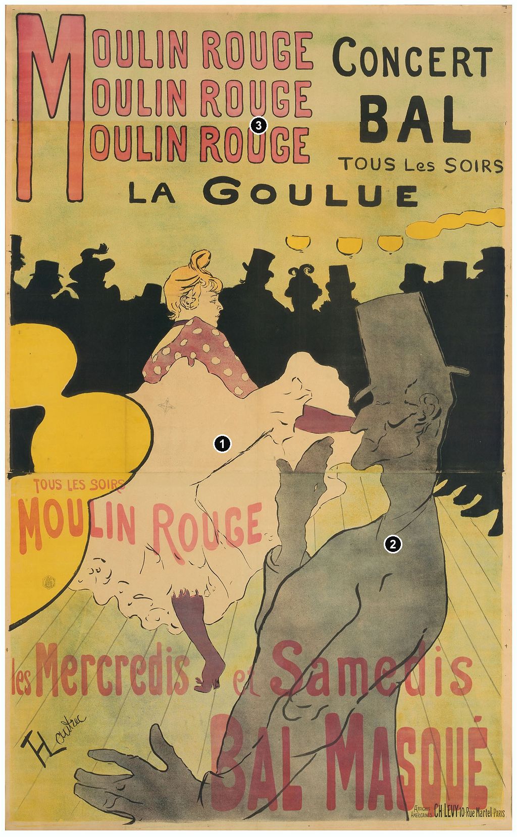
La Goulue is the central attraction without being the largest figure. Her pale skirt opens into a broad irregular shape, edged by economical black strokes. Above it, a reddish blouse dotted with pale circles leads towards her turned face and piled-up fair hair. Below it, a dark stocking and shoe break the light expanse. The eye can recognise her gesture at a distance, then discover the details that distinguish a person from a generic dancing emblem. The skirt’s size makes the movement readable while the smaller profile keeps the performance attached to an individual.
The Metropolitan Museum identifies the raised skirts with the finale of the chahut, the high-kicking dance associated with the performers. Its explanation grounds the gesture in an act presented to an audience. The picture’s exposure of petticoat and stocking belongs to that staged public identity; the gesture makes the performance itself immediately legible. The poster sells the anticipated experience of seeing her perform. [11]
Valentin’s role is equally deliberate. His nickname, le Désossé, means “the boneless,” and the image gives unusual prominence to the angular flexibility of his hands and body. One hand rises towards his face while the other spreads near the lower edge. His grey torso curves between them, and a few lines describe his coat, ear and facial profile. The cropping makes him feel close enough to obstruct us. We encounter the advertised dancer through the space left around another performer, as though our view already belongs to the room. [11]
The contrast between the two figures rewards attention. La Goulue’s pale skirt seems to expand; Valentin’s long form bends through the space beside it. Her costume supplies scattered details, while his body is largely a continuous tone. His much greater scale need not make him the advertisement’s principal attraction. Instead, it gives the smaller dancer something forceful to act against. The Art Institute interprets her position between Valentin, the lights and the anonymous crowd as a form of enclosure within the spectacle. That reading grows from the way the image places its brightest figure under observation on several sides. [1]
Annotated Details from Moulin Rouge: La Goulue — Toulouse-Lautrec’s 1891 Poster
The numbered points identify visible features discussed in this article. Return from each detail to the whole composition. Moulin Rouge: La Goulue, 1891. Colour lithograph on tan wove paper. Art Institute of Chicago, 1954.1193. Foreground Valentin and a band of spectators frame the dancer. Image source. Public domain. Resized only; native appearance preserved.
Details from MOULIN ROUGE: LA GOULUE — TOULOUSE-LAUTREC’S 1891 POSTER
Compare the cropped details with the complete images above. Notice how their colours, shapes and positions contribute to the larger compositions.
La Goulue’s lifted skirt
The pale lifted skirt stands out between surrounding dark silhouettes.
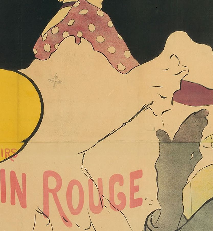
Valentin in the foreground
The enlarged foreground figure establishes a distance from the dancer.
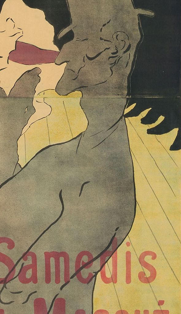
The venue’s name
Large lettering makes the venue part of the composition.
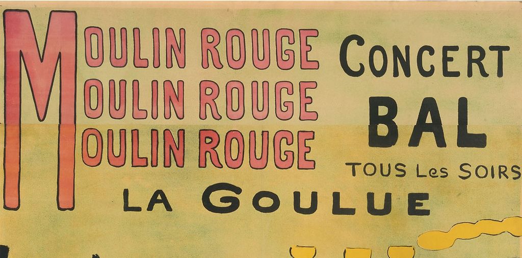
The spectators, the lamps and the floor
The audience looks anonymous at first, but its upper edge is varied. Top hats alternate with more elaborate headwear; profiles rise and fall; a small flourish or bent brim interrupts an otherwise solid mass. Lautrec supplies enough differences to make this a gathering of people while withholding the facial information that would turn it into a row of portraits. Black unifies the spectators as a group. La Goulue, by contrast, remains an exposed and differentiated figure before them.
The lamps create another sequence across the image. Small yellow bowls hover above the audience near the centre and right; much larger yellow curves intrude from the left. Their change of scale helps establish the viewer’s proximity to the foreground. Yet they are conspicuously flat. Rather than shading each lamp as a rounded object, Lautrec allows the yellow to act as a strong independent shape. Light becomes something the eye follows across the paper as well as something illuminating the represented room.
Follow the floorboards and a different spatial instruction emerges. Thin diagonals pass beneath the dancers and spread towards the lower corners. They provide recession where the colour masses tend to flatten it. The floor is therefore doing work that would otherwise require more extensive modelling, shadow or architectural detail. Albi identifies these diagonals as a key to the depth of the scene. Their sparseness is part of their effectiveness: they remain visible through areas that could easily have become crowded with furniture or secondary figures. [2]
These devices place the viewer in an unstable but compelling position. The large foreground figure suggests that we stand close to the action; the black spectators seem to face us across the dancer; the lamps partly interrupt the view. The composition offers the excitement of access while repeatedly placing something between us and the performance. Its room is built from a selection of things that attract, frame or obstruct attention. That is why the audience and lighting deserve as much consideration as the famous raised skirt.
Watch: Toulouse-Lautrec
Choose an artist introduction, a film about graphic design or a closer look at At the Moulin Rouge.
Lettering that moves through the picture
The text begins by behaving like a sign above an entrance. A single enormous red M serves three successive lines of “Moulin Rouge.” Its stretched upright shape anchors the left side, while the repeated words make a rhythm across the upper field. At the right, “Concert” and the heavier “BAL” supply a different pattern of black lettering. “Tous les soirs” promises activity every evening. La Goulue’s name occupies a broad line beneath these announcements, placing the named attraction between the venue’s publicity and the pictured dance.
Further down, the words enter the performance space. Another red “Moulin Rouge” crosses the pale skirt and neighbouring floor. The lower announcement, “les Mercredis et Samedis,” specifies Wednesdays and Saturdays; the large “Bal Masqué” advertises masked balls. Letters overlap Valentin’s body rather than politely waiting for an empty margin. Reading and looking become intertwined. A viewer following the advertisement meets the performers again; a viewer following the figures encounters the business’s name and programme.
There is considerable variety within this apparently simple scheme. Some letters are thin and outlined, some heavy and black, some tall and red. The smaller connecting words have a looser, handwritten appearance. These differences establish priorities without requiring every piece of information to have the same visual weight. At a distance the red repetitions and heavy “BAL” can dominate; closer inspection reveals the schedule and the firm responsible for printing. The lettering supports several speeds of attention within the same object.
At the bottom right, the Chicago impression carries the imprint of Affiches Américaines, Ch. Lévy, at 10 rue Martel, Paris. This small line brings the material production of the advertisement into view. The Met’s record also credits Affiches Américaines, Charles Lévy as printer. The inscription is useful evidence of the poster’s commercial manufacture, alongside the much more conspicuous artist’s signature at the lower left. The two names occupy very different scales within the sheet. [11]
Making a large colour lithograph
The Art Institute describes its impression as a colour lithograph on tan wove paper. At 189 centimetres high, the image has a physical presence that a small reproduction can conceal. It was designed to operate at the scale of a wall and a standing body. Its broad silhouettes and legible lettering belong to that scale; tiny descriptive marks could never have carried the advertisement’s entire burden. Even the blank-looking expanses are substantial pieces of the design. [1]
Lithography is a printing process based on the different behaviour of water and grease on a prepared stone. A greasy drawing accepts the printing ink while dampened non-image areas repel it; paper receives the ink under pressure. Colour printing adds the need to coordinate the separate printed components. Albi’s 2025 dossier explains the process and identifies this poster’s black drawing stone and yellow, red and blue colour stones. Its description also recognises brushwork and spattered marks, bringing together assertive outlines and more finely textured areas. [14]
Cate describes the sequence as yellow, red, blue and black. In this early poster, overlapping red and blue could produce purple. He distinguishes the result from an attempt to imitate continuous painterly modelling: the colours create broad, relatively flat areas that establish the composition’s rhythm. That helps explain the relationship between the dancer’s stocking, the grey foreground body, the black crowd and the bright lamps. The print’s complexity comes from their arrangement and contrast as much as from the number of printing colours. [12]
Lautrec’s colour procedures soon developed further. Cate shows that the 1892 prints La Goulue and Her Sister and The Englishman at the Moulin Rouge used six colours. In the latter, the purple was a premixed ink rather than a red-and-blue overlap. He also distinguishes the artist’s drawing and approval of proofs from the printer’s mechanical production of the edition. The apparent fluency of a finished image could depend on repeated testing and skilled collaboration. The 1891 poster belongs to an evolving practice, explored further in Lautrec’s style and technique. [12]
The individual surviving sheet matters too. The Met describes its impression, accession 32.88.12, as printed in four colours on three sheets of wove paper, measuring 190 × 116.5 centimetres. Those are its own object details. Chicago records a different set of image and sheet measurements and calls its support tan wove paper. Comparing these records teaches a useful distinction: a poster is a reproducible design, but each impression remains a physical object with its own dimensions and institutional description. [11] [1]
Japanese prints, cropping and recognition
Lautrec’s use of flat colour and emphatic contour belongs within his sustained interest in Japanese prints. Colta Ives discusses his collecting and compares his performer portraits with actor images by Sharaku. The useful connection is selective: both make individual recognition depend on forceful shape and expressive reduction. A distinctive profile or costume can carry more information than a smoothly modelled body. Such comparisons illuminate the design without establishing that the Moulin Rouge poster copied a particular Japanese sheet. [9]
Here the most productive connection with Japonisme lies in the relation between the edges and the centre. Valentin is dramatically cropped, lamps enter from outside the field, and spectators continue beyond the sides. The picture feels selected from a larger world, while its flat areas are tightly balanced within the rectangle. The boundary does not simply contain the action. It removes parts of things and thereby gives the remaining shapes their unusual prominence.
The comparison with Divan Japonais makes the device clearer. There, Jane Avril’s black dress dominates the foreground while the singer Yvette Guilbert’s head falls outside the upper edge. Ives relates the cropped orchestra and descriptive stage lighting of that poster to Degas, alongside the flattened masses and tilted space associated with Japanese prints. Moulin Rouge: La Goulue uses a different balance of people, but likewise makes restricted access to a performance a source of pictorial energy. [9]
In Jane Avril, the dancer is again seen across an intervening foreground shape, this time the curling double bass and the musician’s hand. The eye must travel around an obstruction to reach the advertised figure. In Ambassadeurs: Aristide Bruant, the hierarchy changes: the performer himself fills the foreground, identified through his broad hat, dark cloak and red scarf. Albi’s account stresses the recognisable costume and Lautrec’s reduction of the face to essential lines. These posters show several ways of organising publicity around a performer, rather than one repeated arrangement. [9] [14]
From an advertisement to an object of collection
The poster’s early success had practical consequences. The Art Institute describes thousands of copies circulating around Paris and connects the attention they attracted with further commissions from performers and venue owners. The crucial change was public visibility: an image made for the entertainment business also made its artist conspicuous. Its success built on his existing professional contacts while extending the audience for his work. [1]
Evidence of its reception extends beyond later recollections of sudden fame. Cate records the poster at the eighth Salon des Indépendants in Paris in spring 1892. In Antwerp, it appeared with Reine de joie and progressive proofs. The display of proofs is particularly revealing. An advertisement normally encountered as a finished message could also be examined through the successive stages of its manufacture. Exhibition audiences were invited to attend to the making of the printed image. [12]
Dealers also helped change its status. Edmond Sagot’s December 1892 catalogue specifically sought the Moulin Rouge poster among works he wanted to acquire. Cate records it selling for fifteen francs in 1894, distinguishing this historical market price from the much lower prices of some smaller posters. Demand, format and scarcity affected the life of an advertisement after its first promotional use. The collecting public did not have to wait for a later museum to declare the sheet worth keeping. [12]
Posters reached their eventual owners by several routes. Cate notes that some were sold directly to dealers and collectors. Albi’s 2025 exhibition places this affichomanie, or enthusiasm for collecting posters, within the growth of specialist dealing, publications and exhibitions. A design could attract a casual passer-by and reward sustained scrutiny by a collector. Its commercial function and its aesthetic interest were already being discussed together in the nineteenth century. [12] [14]
Museum collections preserve different parts of this history. Chicago’s impression belongs to the Carter H. Harrison Collection; the Met acquired its example through the Harris Brisbane Dick Fund in 1932. Albi’s example came through the Countess Adèle de Toulouse-Lautrec’s donation in 1922. These are separate acquisition histories attached to impressions of the same celebrated design. Together they preserve an image whose initial promise was immediate and local: a place to go, a dancer to see, an evening’s entertainment. [1] [11] [2]
The other works involving La Goulue offer a change of emphasis. The painted portrait of her entering the Moulin Rouge, dated 1891–92 by MoMA, belongs to a different pictorial encounter. [13] The panels for her fairground booth, commissioned in 1895, belong to another setting and purpose. Returning to the 1891 poster after those comparisons restores the specificity of its achievement: the dancer’s particular public identity, framed by partner, audience, lighting and words, has become an image readable across a street. [14]
Toulouse-Lautrec artworks directory
Browse 84 identified works and publications in this researched selection. Dates and titles follow the individual records; this is not a complete catalogue of the surviving oeuvre. Print impressions remain attached to their designs. Some listed works do not have a dedicated article. The Drawings guide also contains nine illustrated studies consolidated from former articles.
Frequently Asked Questions
La Goulue dances in the middle distance in the pale skirt and patterned blouse. Valentin le Désossé is the much larger grey figure in the foreground. Both were performers associated with the Moulin Rouge. [1]
In the Chicago impression it announces masked balls, “Bal Masqué,” on Wednesdays and Saturdays. The upper “Tous les soirs” means “every evening.” These announcements are integrated with the dancers rather than confined to a separate text panel. [1]
Discussion
Look again at the images and ideas explored in Moulin Rouge: La Goulue — Toulouse-Lautrec’s 1891 Poster. These editorial prompts invite your observations.
Reader Insights
La Goulue is smaller than Valentin but occupies the brightest opening in the composition. Which shapes do most to direct your attention towards her? [1]
Follow the repetitions of “Moulin Rouge” from the top into the dance floor. How does the lettering affect the sense that you are looking into a room? [1]
Join the Conversation
Share a detail, comparison or question about Moulin Rouge: La Goulue — Toulouse-Lautrec’s 1891 Poster below.
References
- Art Institute of Chicago, Moulin Rouge, La Goulue, 1891, accession 1954.1193. Collection record, curatorial description, medium, dimensions and credit; colour impression examined. View source.
- Musée Toulouse-Lautrec, Moulin-Rouge. La Goulue, 1891. Commission, composition and Albi acquisition (in French). View source.
- Autoportrait, 1880 (in French). View source.
- ALBERTINA: Der Schimmel Gazelle,GE123DL. View source. (in German).
- Franka Blok, Portrait of Vincent van Gogh, 2024. View source.
- Art Institute of Chicago: At the Moulin Rouge. View source.
- Jane Avril, 1893. View source.
- Au Salon de la rue des Moulins (in French). View source.
- Colta Ives, Toulouse-Lautrec in The Metropolitan Museum of Art, 1996, pp. 18–19, 34 and 38–41; Jane Avril poster illustration, p. 39. Japanese prints, performer recognition, Divan Japonais, line and printing collaboration. View source.
- Maurice Joyant (in French). View source.
- Metropolitan Museum of Art, Moulin Rouge: La Goulue, 1891, accession 32.88.12. Venue, performers, printer and this impression’s medium, dimensions and acquisition. View source.
- Phillip Dennis Cate, “The Popularization of Lautrec,” in Henri de Toulouse-Lautrec: Images of the 1890s, Museum of Modern Art, 1985, pp. 77–82 and 89. Earlier journal processes, four-colour printing, proofing, early exhibition and dealer evidence, and historical poster prices. View source.
- Museum of Modern Art, La Goulue at the Moulin Rouge, 1891–92, accession 161.1957. Current object facts and 2014–15 gallery-label discussion of Louise Weber’s distinctive public image. View source.
- Fanny Girard and Musée Toulouse-Lautrec, Toulouse-Lautrec et l’art de l’affiche, press dossier, 2025, pp. 3–8, 13–14, 17 and 20. Advertising context, Bruant, collecting, chronology, lithographic process and selected object captions (in French). View source.
- Splash image, Moulin Rouge: La Goulue, 1891. Colour lithograph on tan wove paper. Art Institute of Chicago, 1954.1193. Foreground Valentin and a band of spectators frame the dancer. Image source. Public domain. Resized only; native appearance preserved.


 Henri de Toulouse-Lautrec.jpg)