



 by Tom Gurney
Tom Gurney BSc (Hons) is an art history expert with over 20 years experience
Published on June 19, 2020 / Updated on November 3, 2026
Email: tomgurney1@gmail.com / Phone: +44 7429 011000
Jane Avril: Toulouse-Lautrec's 1893 Jardin de Paris Poster: Introduction
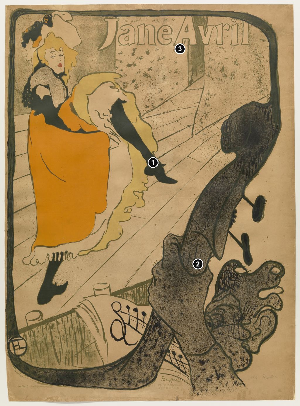
A black stocking cuts diagonally through a cloud of pale petticoats. Below it, an enormous hand grips a double bass whose curving outline becomes the poster's frame. In Jane Avril, Henri de Toulouse-Lautrec makes a dancer's movement and the musicians' work belong to one continuous design. The advertisement was made for Avril's appearance at the Jardin de Paris in 1893, at her own request. Her name fills the upper part of the sheet; her distinctive act supplies its centre. [1] [2]
At a Glance
- ArtistHenri de Toulouse-Lautrec.
- Title and dateJane Avril, 1893; the Jardin de Paris poster. [1]
- MediumColour lithograph. [2]
- PurposeAdvertising Avril's performance at the Jardin de Paris. [1]
- Featured impressionMuseum of Modern Art, New York, object 456.1954; gift of A. Conger Goodyear. MoMA identifies Jardin de Paris as publisher and Chaix, Paris, as printer. [2]
- Other impressionsThe Metropolitan Museum of Art, 32.88.15, and Art Institute of Chicago, 1949.1004. Their sheet measurements and collection histories belong to those individual objects. [1] [3]
- Recognisable detailsOrange skirt, lifted black leg, pale ruffles, tilted floorboards and the double bass forming a sinuous border.
This work across Henri de Toulouse-Lautrec’s career
At the Moulin Rouge
1892–1895 [8]Contents
- A performer commissions her public image
- Looking from the musicians' side
- How a still figure suggests a dance
- Lettering that belongs to the picture
- Building the printed performance
- Avril on stage, in the audience and in the printshop
- From advertisement to collected impression
- Annotated details
A performer commissions her public image
The name at the top matters as much as the kick. This is an advertisement centred on a particular professional, whose appearance and movement had to remain recognisable when translated into print. The Met records that Avril commissioned the design for her Jardin de Paris show. The Phillips Collection describes the arrangement more precisely as a commission from the café-concert at her request. Both accounts give her an active part in bringing the image into being. The poster belongs to the business of presenting an act to an audience, as well as to Lautrec's history of depicting a friend. [1] [12]
That distinction changes how we approach the woman on stage. Her lifted skirt, gloves and stockings form the equipment of a public performance. They also offer Lautrec conspicuous differences of shape and texture with which to construct a likeness of the act. Reading the poster only as an artist's fascination with a dancer leaves out the dancer's reason for wanting it. An image that could be remembered after a brief encounter helped carry her professional identity beyond the room in which she performed.
Albi's 2025 exhibition account places such commissions within competition between entertainment venues. Café-concert directors needed distinctive advertisements to attract customers; performers such as Avril and Aristide Bruant became recurring named subjects. Jane Avril answers that practical problem with unusually concentrated means. Almost the whole field is occupied by one figure, one instrumental motif and one large name. The image promises an individual performance. [13]
Avril's agency does not mean that the poster offers an unmediated self-portrait. Lautrec selected the pose, altered its surroundings and established our position in relation to it. The result is a negotiated kind of visibility: a performer commissions an image, and an artist makes her act intelligible through his own powerful formal decisions. The distinction between her work and his representation remains useful throughout the sheet.
Looking from the musicians' side
The bass is close enough to feel intrusive. Its dark neck rises across the right side, with the hand wrapped around it near the lower centre. The instrument's scale makes Avril seem further away even though her orange costume commands much of the left half. Our view passes through the space of accompaniment before reaching the dancer. The poster gives the music a visible foreground presence.
The Met connects the upward thrust of the instrument with Avril's signature cancan kick. Follow the two long dark shapes and the relationship becomes clear. Her leg descends towards the right from the pale raised ruffles; the bass rises across that movement from below. They come close without joining. Between them is a narrow interval of light stage, making the relationship feel active rather than locked into a symmetrical emblem. [1]
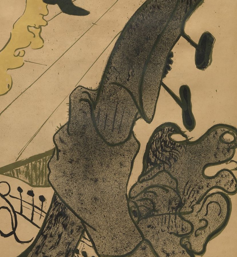
The hand complicates that elegance. Large fingers curl firmly around the instrument, with dark marks and outlines giving them a weight quite unlike the thin contour of the dancer's face. The hand shows sustained physical contact; the kick offers a momentary extension. One grips while the other reaches. That contrast can be read directly from their shapes, without turning the instrument into a fixed sexual symbol or pretending that we know the musician's thoughts.
At the bottom, a music sheet carries a broad looping sign and conspicuous black notes. Its pale surface sits between the dense foreground forms. The notation is enough to tell us that this is organised accompaniment, although the poster gives no secure basis for identifying a particular tune. Lautrec selects the signs needed to establish a working orchestra: an instrument, a hand, a score. The bodily labour that produces the entertainment appears alongside the body that attracts its audience.
The bass also refuses to stay within the ordinary boundaries of an object. Its curve continues into the thick line running around the sheet. At the upper right that line bends across the corner, passes above the lettering and encloses the dancer on the left. Along the bottom it broadens into another sweeping curve. Riva Castleman identifies precisely this framing function in her discussion of the poster. The thing that interrupts our view also holds the whole image together. [14]
The effect changes as our eye follows the line. Seen first as a border, it suggests a complete decorative enclosure. Seen again from the hand and instrument, it belongs to the represented entertainment. The design lets a shape occupy both roles. Its ingenuity lies in that continuity: an accessory to the performance becomes an organising force across the advertisement.
Annotated Details from Jane Avril: Toulouse-Lautrec's 1893 Jardin de Paris Poster
The numbered points identify visible features discussed in this article. Return from each detail to the whole composition. Jane Avril, 1893. Colour lithograph. Museum of Modern Art, New York, 456.1954, gift of A. Conger Goodyear. The double bass and musician’s hand frame the dancer. Museum of Modern Art,456.1954. Image source. Public domain. Resized only; native appearance preserved.
Details from JANE AVRIL: TOULOUSE-LAUTREC'S 1893 JARDIN DE PARIS POSTER
Compare the cropped details with the complete images above. Notice how their colours, shapes and positions contribute to the larger compositions.
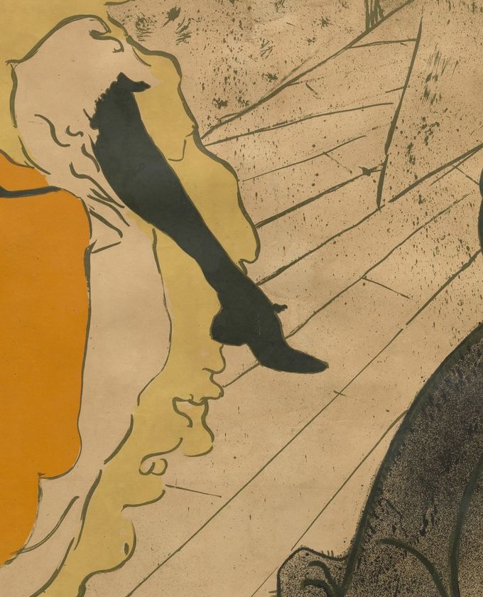
The lifted leg and skirt
The raised leg and flounced skirt give the dancer an angular silhouette.
The double bass and hand
The enlarged instrument and hand create a frame within the poster.
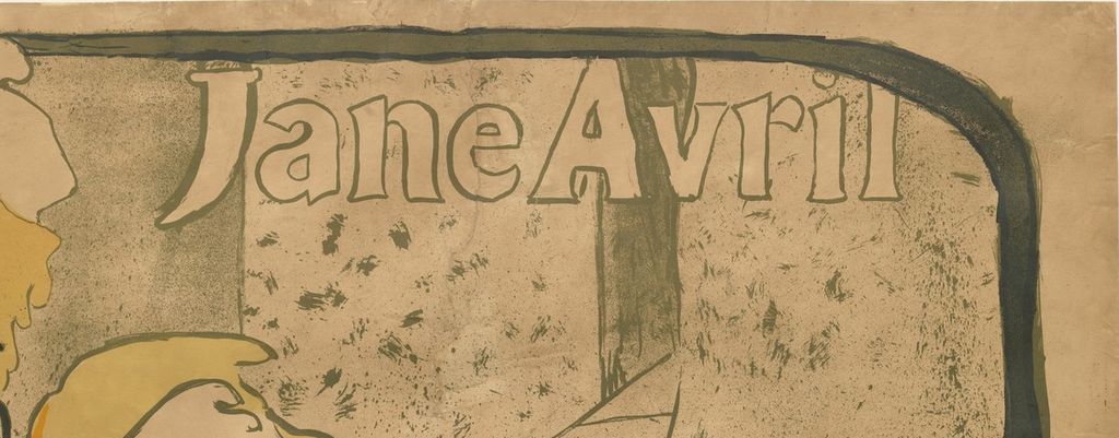
The printed name
The large name binds the dancing figure to an advertisement.
How a still figure suggests a dance
Avril is placed towards the left, with her head high and the sweep of her skirt reaching almost to the bottom. Her raised leg crosses the open middle at an angle, while the lower boot points down near the left edge. The figure therefore occupies several directions at once. Head and torso remain relatively upright; fabric expands sideways; the stockings divide into contrasting diagonals. A single pose contains the potential for further movement.
The costume is essential to that effect. The orange skirt presents a broad, comparatively unbroken area. Beside it, the pale petticoat repeatedly changes direction, curling around the raised leg before falling towards the hem. Lautrec does not describe every fold with light and shade. A handful of loops makes the ruffles look mobile. The dark stocking supplies a sharp, continuous shape against them, giving the eye a clear route through the complexity.
Her gloved arm is partly absorbed into the dark forms and fabric around her waist. This makes the outline harder to assemble at first than a straightforward anatomical study would be. We recognise the dance through costume and silhouette before disentangling every limb. The poster's economy depends on that order of recognition: orange skirt, pale frill, high black leg, then the smaller adjustments that give the figure its particular balance.
The face is quieter. Small eyes, a slender nose and red lips occupy a relatively quiet patch surrounded by yellow hair and the elaborate hat. The Art Institute reads the expression as sadness or exhaustion. That is an interpretation of the depicted features, not evidence of Avril's feelings at a particular performance. Visually, the restraint matters because it prevents the face from duplicating the skirt's animation. The body performs a spectacular gesture while the face supplies very little narrative explanation. [3]
Look, too, at the space beyond her toe. Much of it is left comparatively open, interrupted by the lines of the floor. The kick needs that interval: it makes the extension legible and separates the dancer from the large bass. If every part of the middle were crowded with spectators or scenery, the silhouette would lose its force. The empty area acts as room for the gesture, allowing the printed pose to suggest a larger sequence of motion.
The tilted floorboards reinforce it. Their long diagonals travel sharply towards the back, while the boundaries of the stage refuse the calm balance of a central viewpoint. The floor gives the pose a direction but offers little stable ground on which our own imagined feet could rest. Avril remains poised within an environment that appears to tip upwards. Movement is produced partly by the figure and partly by the unstable geometry around her.
Lettering that belongs to the picture
The large outline letters of Jane Avril run across the upper field, close to the border but inside it. Their pale interiors keep the inscription from becoming another heavy black mass. The first letter drops towards the dancer's hat; the tall forms later in the name approach the vertical shape behind them. The words occupy the same designed space as the stage and costume. They do more than label a picture from outside it.
The MoMA impression reproduced here does not carry a large Jardin de Paris venue line. Its prominent inscription is the performer's name. That absence is worth noticing, because the commission and publisher identify the entertainment context even where the main lettering concentrates entirely on the star. A poster can promote an appearance through the recognisability of a performer, while individual impressions preserve different amounts of the advertising information associated with the design. MoMA's record identifies this sheet's publisher as Jardin de Paris. [2]
Small inscriptions at the foot of the image introduce a different scale of reading. The Art Institute's record transcribes the Chaix printing line and the notice directing buyers to Kleinmann at 8, rue de la Victoire. The same information is visible in small lettering on the featured impression. These words reward the close attention that the large name does not require. They connect the dancer's conspicuous presence with the firms and commercial addresses through which the sheet was produced and circulated. [3]
Building the printed performance
The apparent speed of the gesture conceals a sequence of decisions. The Phillips Collection suggests that a publicity photograph by Paul Sescau may have contributed to the pose, which Lautrec reworked in an oil sketch. It also identifies changes to the expression and to the dance posture in the poster. The photographic connection remains a possibility. The final composition developed through selection and revision. [12]
Evidence from trial proofs makes that development tangible. In 2017 the Phillips exhibited an early proof without lettering or colour, another with the stage floorboards, and a finished five-colour version. The proofs show the floor and colour developing as parts of the design. [12]
The 2005 exhibition checklist identifies olive-green, yellow, orange, red and black in the poster. [15] Across the finished sheet, orange works as a concentrated attraction. The skirt's broad colour field differs sharply from the more dispersed marks in the backdrop and foreground. Pale yellow around the petticoat softens the transition between that orange expanse and the dark stocking. The small red mouth is easily missed at first, but becomes an accent within the face when we look more closely. Colour gives the image both a distant impact and smaller points of attention.
The speckled passages matter just as much. They prevent the large background and dark foreground from looking like uniform blank fillings. Fine spots coexist with rougher, more open marks, while the firm contour of the leg remains exceptionally clear. Colta Ives discusses the importance of fluid ink-brush outlines in Lautrec's early lithographs, distinguishing their character from the greater use of crayon in later work. Her account helps explain why line can remain expressive even when it serves the practical task of enclosing a colour area. [10]
For a lithograph, those marks had to work through a printing process. Phillip Dennis Cate describes a collaboration in which Lautrec prepared images on stones, normally one per colour, and corrected or approved proofs before a printer pulled the edition. A fluid mark on the finished paper therefore need not have been made directly on that paper by the artist. Repetition was built into the means of production. The line could retain the appearance of a quick gesture while being printed for successive viewers. [16]
Cate also distinguishes several nineteenth-century methods of combining printing colours. His discussion cautions against imagining that every orange, green or purple in Lautrec's work resulted from overlapping three primary inks. In this poster, the documented five-colour separation gives the colour fields their own identities. The design depends on how the orange skirt, olive outlines and black accents meet, as well as on any effects of transparency. Its success is a coordination of drawing, palette and skilled printing. [15] [16]
Avril on stage, in the audience and in the printshop
Moving to Divan Japonais changes Avril's role. There she sits in the foreground in a large black hat and dress, watching an entertainment whose singer is partly outside the frame. MoMA identifies the companions and performer as Édouard Dujardin and Yvette Guilbert. The conspicuous woman is now a spectator, and Guilbert's long gloves carry recognition across the intervening orchestra. The two advertisements use different arrangements of fame: the Jardin de Paris poster names and displays Avril's own act; Divan Japonais makes her recognisable presence part of another venue's attraction. [17]
The instruments reveal the difference particularly clearly. In Divan Japonais, several necks and the conductor's arms intervene between audience and stage. In Jane Avril, one enormous bass concentrates that interruption into a continuous frame. The Phillips connects the latter motif with Degas's The Orchestra at the Opera. Castleman similarly places Lautrec's theatrical framing in relation to Degas. These comparisons explain a way of organising spectatorship: music-making occupies the space through which the stage is seen. They do not make the poster a record of a particular observer's exact seat. [12] [14]
In At the Moulin Rouge, the Art Institute includes Avril among the people seated at the central table. The red-haired woman seen from behind belongs to a group whose glances and postures disperse attention around the room. The comparison brings out the selectivity of the poster. A person situated among companions in the painting becomes a name and a commanding silhouette in the advertisement. Neither presentation exhausts her identity; each gives her a different function within its composition. [8]
A third role appears on the cover for L'Estampe originale, also made in 1893. Avril examines a proof while the master printer Père Cotelle works at the press. Wolfgang Wittrock's catalogue entry identifies the workshop as that of Ancourt. Here Lautrec represents her as someone looking at a printed image. The relationship is especially suggestive beside the Jardin de Paris poster: the woman whose act is made into an object of public attention can herself appear as an attentive viewer. The cover does not prove her participation in every decision about this poster, but it enlarges the range of roles through which Lautrec presented her. [18]
From advertisement to collected impression
Jane Avril entered the print market quickly. Cate records its appearance, alongside Divan Japonais, in Edmond Sagot's June–July 1893 sale catalogue. That documented listing gives a more precise account of contemporary reception than a general claim that the poster instantly conquered Paris. It shows a dealer treating a new advertisement as something a customer could acquire and keep. The design had an audience beyond the people considering an evening's entertainment. [16]
The difference between design and impression is particularly useful here. MoMA lists an edition of twenty for object 456.1954. That number belongs to the museum's account of its particular object; it cannot be used as the total number of advertising posters distributed. Ives's checklist describes the Met's 1893 poster with its edition size unknown. Holding those records together preserves the distinction between a recorded edition and an undocumented overall printing history. [2] [10]
Collection histories also belong to individual sheets. The Art Institute's impression was given by Carter H. Harrison in 1949; MoMA's came through A. Conger Goodyear. The orange costume and bass frame identify a shared design, while margins, inscriptions, paper and provenance identify physical objects. That is why a reproduction can show the familiar poster without conveying every fact that a museum records about its own impression. [3] [2]
Looking at the poster as a print preserves something of its original double demand. At a glance, the name and kick must register. At closer range, the hand, musical notation, uneven speckling and shifting border continue to reward attention. The image can work quickly without being exhausted quickly. Its lasting interest lies in the coordination of those scales: the professional advertisement gives a passing viewer a vivid figure, then gives a patient viewer a whole constructed relationship between performance, music and looking.
Toulouse-Lautrec artworks directory
Browse 84 identified works and publications in this researched selection. Dates and titles follow the individual records; this is not a complete catalogue of the surviving oeuvre. Print impressions remain attached to their designs. Some listed works do not have a dedicated article. The Drawings guide also contains nine illustrated studies consolidated from former articles.
Frequently Asked Questions
It promoted her 1893 appearance at the Jardin de Paris. The Met records that Avril commissioned the advertisement. [1]
The 1893 design has the orange skirt, high kick and bass frame. The 1899 poster is a separate composition, associated with Avril's snake-decorated dress. The Art Institute's 2005 exhibition checklist lists them separately as catalogue 175 and 178. [15]
Discussion
Look again at the images and ideas explored in Jane Avril: Toulouse-Lautrec's 1893 Jardin de Paris Poster. These editorial prompts invite your observations.
Reader Insights
Where does the bass stop being an instrument and start becoming a frame? Trace its outline and consider how that transformation changes the apparent distance between you and the dancer. [14]
Compare Avril's raised leg with the stillness of her face. Which carries the greater force in your first encounter, and does that balance change when you look again? The Art Institute's reading of the expression offers one interpretation to test against the visible features. [3]
Join the Conversation
Share a detail, comparison or question about Jane Avril: Toulouse-Lautrec's 1893 Jardin de Paris Poster below.
References
- Metropolitan Museum of Art, Jane Avril, 1893, accession 32.88.15. Commission, composition and this impression's object record. View source.
- Museum of Modern Art, Jane Avril, 1893, object 456.1954. Featured impression, publisher, printer, edition and credit. View source.
- Art Institute of Chicago, Jane Avril, 1893, accession 1949.1004. Collection record and retained institutional API entry: description, inscriptions and provenance. View source.
- Autoportrait, 1880 (in French). View source.
- ALBERTINA: Der Schimmel Gazelle,GE123DL. View source. (in German).
- Franka Blok, Portrait of Vincent van Gogh, 2024. View source.
- Art Institute of Chicago: Moulin Rouge, La Goulue. View source.
- Art Institute of Chicago, At the Moulin Rouge, 1892–95, accession 1928.610. Identification of Avril among the table group. View source.
- Au Salon de la rue des Moulins (in French). View source.
- Colta Ives, Toulouse-Lautrec in The Metropolitan Museum of Art, 1996, pp. 40–41, ink-brush line and printshop practice; p. 62, Jane Avril poster checklist entry. View source.
- Maurice Joyant (in French). View source.
- Phillips Collection, “Performers of the Belle Époque: Jane Avril,” 29 March 2017. Commission, possible photograph and oil sketch, Degas comparison, trial proofs and five-colour separation. View source.
- Fanny Girard and Musée Toulouse-Lautrec, Toulouse-Lautrec et l'art de l'affiche, press dossier, 2025, pp. 5–6, entertainment advertising and poster collecting (in French). View source.
- Riva Castleman, “Introduction,” in Henri de Toulouse-Lautrec: Images of the 1890s, Museum of Modern Art, 1985, p. 13, theatrical framing and the Jane Avril poster. View source.
- Art Institute of Chicago and National Gallery of Art, Toulouse-Lautrec and Montmartre, 2005 exhibition checklist, catalogue 175, 1893 poster, and 178, 1899 snake-dress poster. Object identification and media only. View source.
- Phillip Dennis Cate, “The Popularization of Lautrec,” in Henri de Toulouse-Lautrec: Images of the 1890s, Museum of Modern Art, 1985, pp. 77–83, especially pp. 81–82, colour printing, proofs, printer collaboration and Sagot's 1893 listing. View source.
- Museum of Modern Art, Divan Japonais, 1893, object 97.1949. Collection entry and published commentary identifying Avril, Dujardin and Guilbert. View source.
- Wolfgang Wittrock, “Catalogue of the Exhibition,” in Henri de Toulouse-Lautrec: Images of the 1890s, Museum of Modern Art, 1985, p. 102, entries 12–15, Avril, Cotelle and the L'Estampe originale cover; p. 226, entries 252–254, separate painting and poster records. View source.
- Splash image, Jane Avril, 1893. Colour lithograph. Museum of Modern Art, New York, 456.1954, gift of A. Conger Goodyear. The double bass and musician’s hand frame the dancer. Museum of Modern Art,456.1954. Image source. Public domain. Resized only; native appearance preserved.


 Henri de Toulouse-Lautrec.jpg)