


 by Tom Gurney
Tom Gurney BSc (Hons) is an art history expert with over 20 years experience
Published on June 19, 2020 / Updated on November 3, 2026
Email: tomgurney1@gmail.com / Phone: +44 7429 011000
L’Artisan moderne by Henri de Toulouse-Lautrec: Introduction
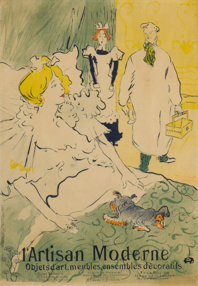
A craftsman arrives in a bedroom carrying a small toolbox. The woman in bed turns towards him, a maid pauses behind her and a little dog sprawls across the coverlet. Henri de Toulouse-Lautrec's L’Artisan moderne makes an advertisement look like a comic interruption of private life. Its subject is domestic, but its purpose is public: the words along the bottom turn the encounter into a recommendation for decorative objects and furnishings.
Princeton University Art Museum dates its colour lithographic poster to 1894 and identifies Bourgerie & Cie as printer. Other catalogues use 1896, including the Museum of Modern Art's 1985 checklist. The differing dates should remain attached to their sources rather than being silently treated as agreement. The composition itself is unmistakable: pale figures, a patterned bedspread, a toolbox and a large business name below a bedroom scene. [1] [2]
At a Glance
- ArtistHenri de Toulouse-Lautrec.
- TitleL’Artisan moderne, or The Modern Craftsman.
- Date1894 in Princeton's record; 1896 in other cited catalogues.
- Mediumcolour lithographic poster.
- PrinterBourgerie & Cie, Paris.
- ExamplePrinceton University Art Museum, x1953-122. [1]
This work across Henri de Toulouse-Lautrec’s career
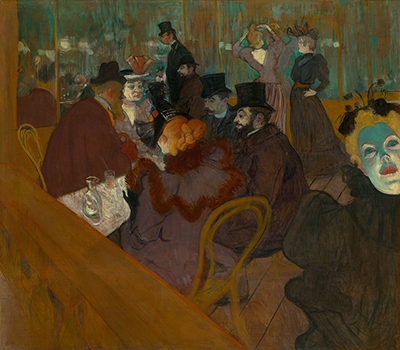
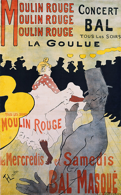
At the Moulin Rouge
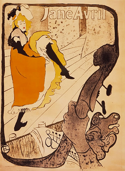
1892–1895 [7]Jane Avril
1893 [8]L’Artisan moderne (current article)
1894 (Princeton); 1896 (other catalogues) [1] [2]Contents
- An arrival with an unexpected purpose
- A designer, a publisher and a model
- Large colour areas and restless patterns
- Lettering anchors the bedroom scene
- Impressions, colour and the question of date
- A different kind of Lautrec advertisement
An arrival with an unexpected purpose
The visitor's long pale smock gives him the appearance of someone attending a patient. His toolbox changes that first impression. Instead of a medical bag, we see a compact container associated with practical work. The discrepancy is the beginning of the joke: the scene invites us to recognise a familiar kind of visit and then reconsider what service is being offered. The woman sits within a richly decorative interior that could itself supply work for an artisan.
Lautrec distributes the reactions across three people. The visitor presents an almost continuous pale shape, with a relatively small head above the smock. The woman turns towards that shape from the lower left, while the maid's upright figure intervenes near the centre. Their differing positions let us read the encounter without a speech balloon or explanatory dialogue. The gap between their faces carries much of the action. Even the dog participates in the visual comedy by occupying the bed with conspicuous informality.
The picture's lightness depends on leaving the episode unresolved. We are not told exactly what has happened before the visitor enters or what the woman expects him to do. Clothing, equipment and poses are sufficient to set the situation in motion. The poster can therefore be grasped quickly while still offering details that reward a second look, an effective combination for an image that must compete for public attention.
A designer, a publisher and a model
Phillips's catalogue explains that the advertisement was made for publisher and designer André Marty and his range of useful and decorative objects. It identifies the figure of the visiting artisan as Lautrec's friend Henri Nocq, a jeweller and medallist. These are different roles: the man used as a model should not automatically be understood as the proprietor of the advertised enterprise. The same account attributes the design of the lettering to Niederkorn. [12]
That division of work is useful when looking closely at the poster. The image does not function as a straightforward portrait advertisement in which an owner stands beside examples of merchandise. Instead, a recognisable person plays a part within an invented encounter. The products are suggested through the surrounding interior and the printed description of the business. The distinction leaves room for a visual story that would be unnecessary in a plain illustrated catalogue.
The worker's clothes also complicate the word moderne. Their pale, simplified shape is easy to recognise across the poster, but the interior is full of ornamental incident. The artisan stands between practical labour and fashionable decoration. The advertisement draws on that tension: useful things can also be designed things, and a commercial service can be presented through wit as well as through a list of capabilities.
Large colour areas and restless patterns
The colour arrangement makes the visitor legible before individual details are clear. His pale body stands against a yellow wall and the darker figure of the maid. At the left, the woman's yellow hair separates her head from the pillows and bedclothes. Below, the green coverlet spreads into a broad platform for the scene. These colours organise the surface without requiring the carefully graduated shadows of an illusionistic interior.
Within those larger areas, line supplies a different kind of energy. The bedding is full of curves; the maid's clothing has abrupt, dark edges; and the wallpaper carries a repeating ornamental rhythm. Compare the visitor's relatively quiet smock with the restless surface across the bed. The figure remains readable partly because the area around it is more active. Simplicity is a relation between neighbouring passages, rather than a quality applied uniformly to the whole design.
The figures' contours vary in weight. A strong outline can hold an arm or shoulder against a pale background, while slighter marks are enough for a hand or a facial feature. This selectivity makes the drawing feel conversational. We encounter a few expressive accents before we attend to the surrounding decoration. The poster's lithographic medium preserves the importance of drawn marks while allowing those marks and colour areas to recur in printed impressions.
Watch: Toulouse-Lautrec
Choose an artist introduction, a film about graphic design or a closer look at At the Moulin Rouge.
Lettering anchors the bedroom scene
The large business name occupies the lower part of the design, directly beneath the dog and patterned coverlet. It does more than identify the advertiser after the image has caught our eye. Its dark letterforms provide a firm horizontal base under the loose curves above. The words belong to the composition's balance, giving the bedroom scene something visually stable to rest on.
The smaller line of commercial information changes the pace of reading. A viewer may register the reclining woman and the visitor almost immediately, then read the business name and come closer for the additional details. Princeton records the printer's inscription along the left edge and the business information and addresses in the lower margin. These are distinct forms of lettering, aimed at different kinds of information. The printer's name documents production; the prominent business text performs the advertisement's practical work. [1]
Cropping a reproduction can weaken this relationship. If the lower lettering disappears, the picture begins to look like an independent illustration of a bedroom encounter. With the wording intact, the visitor, room and decorative goods remain part of a commercial proposition. The scene does not merely accompany the advertisement: its comic ambiguity gives the advertiser a memorable public voice.
Impressions, colour and the question of date
A poster design and an individual impression are related but distinct objects. Princeton's colour example is x1953-122; its separately catalogued blue impression is x1946-364. Those records should not be merged into a single description of one physical sheet. Different colour treatments alter the balance between outline and large areas of tone, even when viewers can recognise the same underlying arrangement. [1] [13]
The Phillips impression introduces another specific detail. Its catalogue describes a state with the word qui? added in red at the upper right. That information belongs to the impression and state identified in that sale; it is not permission to describe every reproduction as identical. In the image shown here, the larger story is carried by the figures and tools whether or not a small printed addition can be read at this scale. [12]
The dating difference deserves the same care. Princeton's 1894 record and the 1896 catalogue entries are evidence of a disagreement in cataloguing, not by themselves proof of a two-year working process. Without a document establishing such a sequence, it would be misleading to turn the different dates into a narrative of conception and revision. Keeping the alternatives explicit lets us discuss the image confidently while acknowledging the limit of the consulted evidence.
A different kind of Lautrec advertisement
Compared with Jane Avril, where an entertainer's body becomes a striking public sign, L’Artisan moderne asks us to follow an encounter among several characters. The visitor's equipment, the woman's turn and the maid's pause create a scene that has to be read across the page. The commercial identity comes from that small drama and its relation to the lettering below.
Look again at the toolbox. It is a modest object beside the much larger bed, but it changes the meaning of the entire visit. Without it, the man's role would be far less clear; with it, the image makes practical work the subject of a sophisticated joke. Lautrec's achievement is to keep both readings available. The advertisement is easy to recognise, yet its shifting signals make it more engaging than a simple demonstration of goods for sale.
Toulouse-Lautrec artworks directory
Browse 84 identified works and publications in this researched selection. Dates and titles follow the individual records; this is not a complete catalogue of the surviving oeuvre. Print impressions remain attached to their designs. Some listed works do not have a dedicated article. The Drawings guide also contains nine illustrated studies consolidated from former articles.
Discussion
Look again at the images and ideas explored in L’Artisan moderne by Henri de Toulouse-Lautrec. These editorial prompts invite your observations.
Reader Insights
How does the toolbox change your first impression of the visitor?
Where do the largest colour areas help separate the figures from the decoration?
How does the business lettering change the way you read the bedroom scene?
Join the Conversation
Share a detail, comparison or question about L’Artisan moderne by Henri de Toulouse-Lautrec below.
References
- Princeton University Art Museum, L’Artisan moderne (The Modern Craftsman), x1953-122: 1894, colour lithographic poster, printer, inscriptions and catalogue references. View source.
- Museum of Modern Art, Henri de Toulouse-Lautrec: Images of the 1890s, 1985, physical p. 253, catalogue entry 292: dated 1896. Selected checklist entry consulted, not the entire catalogue. View source.
- Autoportrait, 1880 (in French). View source.
- ALBERTINA: Der Schimmel Gazelle,GE123DL. View source.
- Franka Blok, Portrait of Vincent van Gogh, 2024. View source.
- Art Institute of Chicago: Moulin Rouge, La Goulue. View source.
- Art Institute of Chicago: At the Moulin Rouge. View source.
- Jane Avril, 1893. View source.
- Au Salon de la rue des Moulins (in French). View source.
- Colta Ives, Toulouse-Lautrec in The Metropolitan Museum of Art, 1996. View source.
- Maurice Joyant (in French). View source.
- Phillips, L’Artisan Moderne, 2015, lot 115: 1896 impression, state description and catalogue account of André Marty, Henri Nocq and Niederkorn, citing Nora Desloge's 1988 Baldwin collection catalogue. That book was not directly consulted. View source.
- Princeton University Art Museum, L’Artisan moderne, x1946-364: separately catalogued blue impression. View source.
 Henri de Toulouse-Lautrec.jpg)