



 by Tom Gurney
Tom Gurney BSc (Hons) is an art history expert with over 20 years experience
Published on June 19, 2020 / Updated on November 3, 2026
Email: tomgurney1@gmail.com / Phone: +44 7429 011000
The Jockey by Henri de Toulouse-Lautrec: Introduction
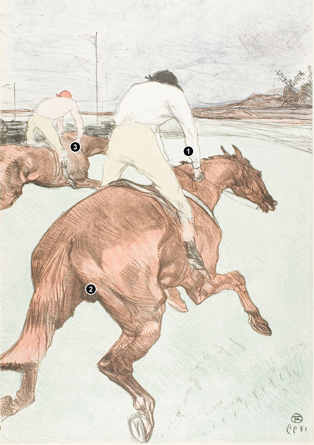
The nearest horse seems almost too large for the sheet. Its hindquarters swell towards us, its tail sweeps out of the left edge, and its head reaches away to the right. Above that twisting brown body, a jockey in a pale shirt and yellow breeches leans forward. A second horse and rider repeat the movement further ahead. Toulouse-Lautrec's The Jockey makes speed a relationship between bodies, distances and the edges of the picture.
This colour lithograph dates from 1899. The Art Institute of Chicago identifies its impression as Wittrock 308, the second of two states, on ivory laid paper. Its racing subject brings a longstanding interest in horses into the artist's mature graphic practice. [1]
At a Glance
- ArtistHenri de Toulouse-Lautrec
- TitleThe Jockey, or Le Jockey
- Date1899
- Medium of Chicago impressionColour lithograph on ivory laid paper
- Dimensions of Chicago impression51.8 × 36.3 cm
- CollectionArt Institute of Chicago, Mr. and Mrs. Carter H. Harrison Collection
- Accession number1931.46
- Catalogue identityWittrock 308, state II/II; Delteil 279
These measurements, paper description and collection details belong to Chicago's individual impression. [1]
This work across Henri de Toulouse-Lautrec’s career
Contents
- A racing image intended for a larger series
- Looking from behind changes the race
- Legs, tail and the pressure of the edges
- An open track and a distant windmill
- How the proofs reveal the colour decisions
- From Gazelle's stable to the racecourse
- Annotated details
A racing image intended for a larger series
The Jockey was conceived within a publishing project. The Parisian publisher Pierrefort commissioned a series of equestrian lithographs entitled Les Courses. Rachel Sloan's Courtauld catalogue entry identifies this as its first plate. The project connects Lautrec's racing subject with the same practical world of publishers and printed editions that supported other parts of his graphic work. It was an image made to circulate, with surviving impressions preserving different stages of its development. [11]
Colta Ives describes The Jockey as the only print published from the projected racing series. That distinction leaves room for other designs and proofs without turning them into a completed published suite. The surviving colour image is complete in its own right, even though the larger undertaking remained unfinished. Its concentrated view also works independently: we do not need preceding or following scenes to understand the surge of the two horses. [9]
The title needs a precise image beside it. Wolfgang Wittrock's 1985 exhibition catalogue separates The Jockey, W.308, from The Paddock, W.310, and Jockey Led to the Post, W.311. The last shows a mounted jockey with a man leading the horse, a fundamentally different action from the galloping pair seen here. A shared date and equestrian subject cannot make these prints interchangeable. [12]
The distinction is visually immediate in the catalogue's illustrations. The led horse presents its head towards the left and is accompanied by an upright human figure in the foreground. The Jockey turns both mounted figures away, opening a large interval of track ahead of them. One composition gathers attention around the management of a horse before racing; the other makes us follow bodies already in motion. The catalogue numbers preserve this difference when translations of the titles vary. [12]
Looking from behind changes the race
The nearest horse is seen obliquely from the rear. Its broad rump dominates the lower half, while the torso narrows towards the shoulders and head. Foreshortening compresses a body extending away from the viewer into the flat sheet. Lautrec does not offer the evenly readable outline of a horse in profile. He makes the large near end and smaller far end pull against each other.
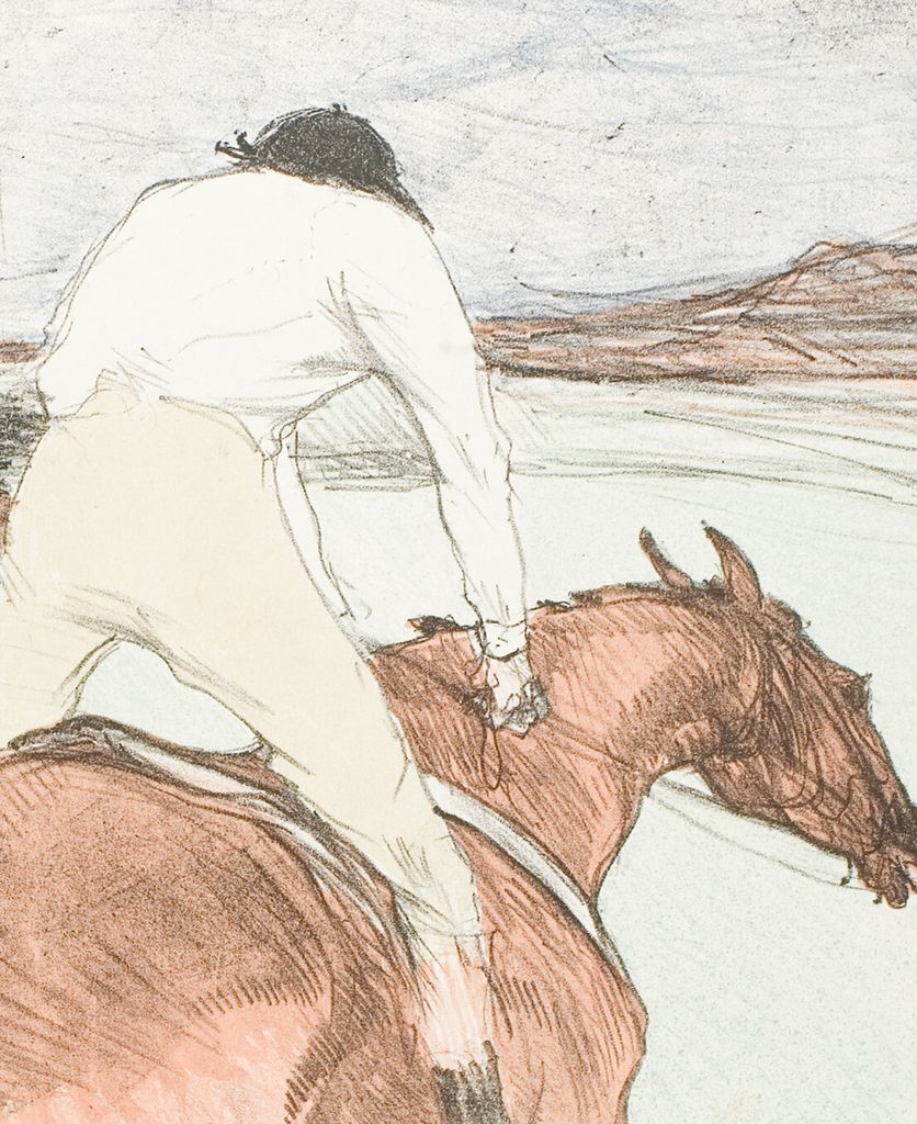
The rider reinforces that recession. His back forms a pale rounded shape high in the centre, but his head is small and bent forward. We see the cap rather than a face. His right arm descends towards the horse's neck, while a long booted leg cuts diagonally down its side. The posture connects upper and lower parts of the picture. Rider and horse appear to share a direction before we have worked out every limb.
The yellow breeches are particularly effective at this junction. Their broad shape spans the animal, bringing a relatively simple area of colour into contact with the much busier brown body. Below, the dark boot provides a firmer interruption. Above, the shirt contains only a few lines describing creases and the bend of the arm. The human figure is legible through this distribution of large colour areas and small directional marks.
We cannot exchange a look with either jockey. Both are occupied by the course ahead, and our position is behind their action. The viewpoint draws us close without identifying where the artist stood. Looking down across the nearest horse gives us information that would be difficult to take in from an ordinary distant spectator's view. The composition offers a heightened proximity, with the animal's body almost filling our field of attention.
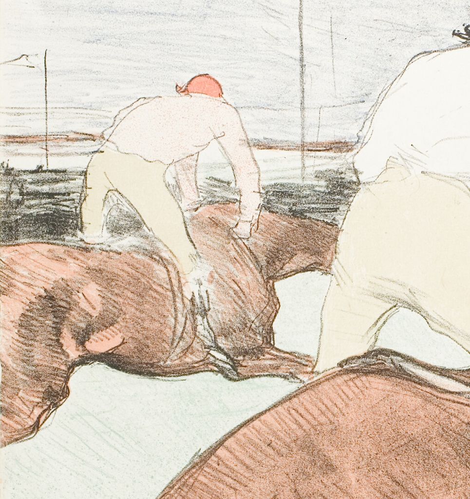
The second pair supplies the necessary measure of distance. Its rider is smaller, its horse partly cut by the left edge, and its colours echo those of the foreground group. In the National Gallery of Art's published colour impression, a reddish cap and pale pink shirt distinguish the further jockey from the nearer figure's dark cap and light shirt. These modest differences keep repetition from becoming duplication. [13]
Read together, the pairs create a rhythm of bent backs and extended necks. The smaller group carries the eye outward; the enormous nearer horse draws it back. The race consequently has depth as well as direction. The farther rider is not merely an accessory identifying the sport. That repeated posture helps us experience the interval through which the foreground horse is moving.
Annotated Details from The Jockey
The numbered points identify visible features discussed in this article. Return from each detail to the whole composition. Henri de Toulouse-Lautrec, The Jockey, 1899. Colour lithograph on ivory laid paper, 51.8 × 36.3 cm. Art Institute of Chicago, 1931.46, Mr. and Mrs. Carter H. Harrison Collection. Art Institute of Chicago, Mr. and Mrs. Carter H. Harrison Collection. Image source. CC0 / Public domain. Resized only; native appearance preserved.
Details from THE JOCKEY
Compare the cropped details with the complete images above. Notice how their colours, shapes and positions contribute to the larger compositions.
The foreground rider
The rider is seen from behind above the foreshortened horse.
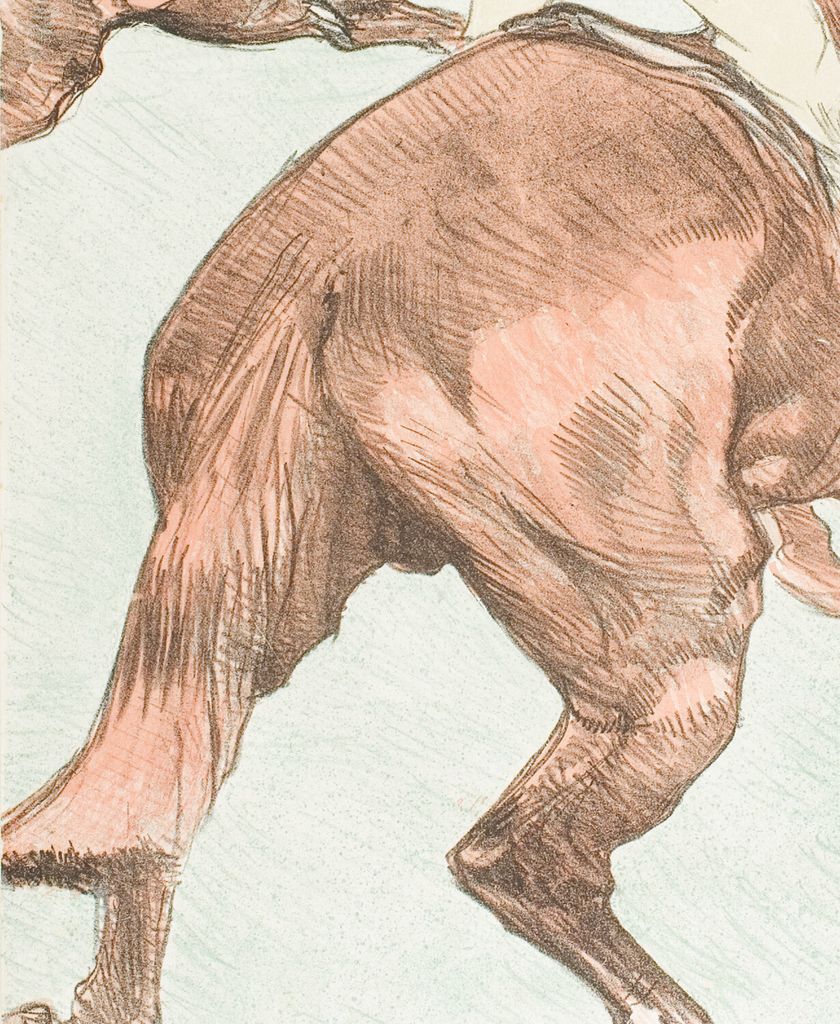
The horse’s rump and tail
The close view of the horse makes its body a large compositional mass.
The smaller racing pair
The second rider establishes distance and the direction of the race.
Legs, tail and the pressure of the edges
The horse's body combines a powerful continuous mass with abrupt changes of direction. Its back and rump form a broad descending curve. The legs beneath it bend, overlap and separate into much thinner shapes. At the right, an extended foreleg ends in a dark hoof; lower down, another hoof presents a more open oval. These small changes prevent the lower silhouette from becoming a single sweeping diagonal.
The gaps matter as much as the limbs. Pale track appears between the bent legs and beneath the belly, allowing the separate parts to remain readable. The spaces feel briefly occupied and then released. Nothing provides the reassuring baseline of four feet planted along a horizontal strip of ground. The suspended effect belongs to the arrangement of the whole animal, rather than to one isolated sign of movement.
The tail carries a different rhythm. Long dark strands follow its downward and leftward sweep, joining the broad rump to the abruptly cropped edge. It leads out of the rectangle while the horse's head points into the open area at the right. These opposed directions stretch the composition. The horse advances, yet its near end seems to have arrived from a space continuing beyond the sheet.
Cropping the hind leg at the left and pressing the lower hoof towards the bottom edge intensify that impression. We see a close fragment of a larger event. At the same time, the much smaller distant windmill and slender flagpoles keep the scene from becoming a purely decorative arrangement of animal shapes. There is a course beyond this body, and the horses are crossing it.
Follow the marks inside the brown coat. Dense strokes collect beneath the tail, along the underside and around joints. On the broad rump, hatching changes angle and surrounds lighter areas. This variety helps the body turn, making a large coloured shape feel rounded without smoothing its surface. The marks remain conspicuous enough to lend the animal a restless visual energy of its own.
Watch: Toulouse-Lautrec
Choose an artist introduction, a film about graphic design or a closer look at At the Moulin Rouge.
An open track and a distant windmill
The racing surface is remarkably spare. A pale greenish field surrounds the horses, interrupted by small diagonal groups of marks near the lower right. Longer lines move into the distance along the course. Their contrast with the dense foreground hatching is essential: if every part of the track were equally busy, the horse would lose some of its force. Open space gives the body room to move.
The horizon remains high, with a narrow band of land stretching behind the riders. At the right, a small windmill breaks its outline. Both Ives and the Courtauld catalogue identify the setting as Longchamp in the Bois de Boulogne, using the windmill as a landmark. The place can therefore be named without treating the lightly drawn landscape as a detailed topographical survey. [11] [9]
The upright flagpoles are a quiet counterweight to the horses. Their narrow verticals rise through the sky while the bodies travel diagonally across the foreground. The flags and mill also establish how far attention can travel within the sheet. The huge rump and minute structure occupy opposite ends of its scale, turning a restricted upright format into an unexpectedly expansive view.
That upright format is part of the surprise. Racing might suggest a long horizontal panorama, but Lautrec stacks near horse, bent rider and distant sky. Forward movement has to cross a deep field rather than simply run from one side to the other. The open track to the right makes the turn of the horse's head particularly consequential: its small profile supplies a destination for the energy accumulated in the enormous body behind it.
How the proofs reveal the colour decisions
The print's apparent immediacy survived several material possibilities. Wittrock catalogued a first-state trial proof combining lithography with oil paint and watercolour, a monochrome first-state edition impression, and a second-state colour trial. The illustrated painted trial is strikingly different from the more restrained printed colour: blue fills much of the sky and track, and broad green strokes move around the horses. These are changes made on a particular trial sheet, rather than evidence that every impression received hand colouring. [12]
In that painted trial, blue also enters the jockey's breeches. In the colour trial reproduced beside it, the breeches become a much quieter yellow-green and the surroundings recede into pale tones. The brown horse consequently takes greater command of the rectangle. Comparing the two reveals a real design question: how strongly should the environment compete with the moving animal? The sheets preserve different answers without requiring us to invent the artist's spoken explanation. [12]
The National Gallery identifies its colour trial as W.308, state II/II, trial proof iii, accession 1952.8.450. Its separate published colour impression is 1952.8.449. In the trial, the warm patch across the nearest horse's rump looks more strongly orange-red; the published example is more subdued. Digital reproductions cannot establish the exact original ink hues, but the institutional identities allow the two physical objects to be compared responsibly. [13] [14]
A monochrome impression in the Metropolitan Museum offers another useful test. The same massive hindquarters, light shirt and bent legs are already forceful before colour intervenes. Areas that become brown in the colour print contain a varied network of hatching, while the rider's clothing remains comparatively open. The monochrome sheet demonstrates how much of the composition's weight and movement resides in the drawn structure. The Met records it as a lithograph on China paper, acquired through the Harris Brisbane Dick Fund in 1928. [15]
Sloan's Courtauld account draws attention to lithographic tones resembling graphite, chalk and charcoal, and credits Henri Stern's studio with printing the two states. Such textures belong to a printed image even when they retain the appearance of hand drawing. [11] The fuller account of Lautrec's prints explains the terminology of impressions and states; here the surviving trials show why those distinctions change what we see.
From Gazelle's stable to the racecourse
An early painting makes the continuity of Lautrec's interest concrete. The ALBERTINA's White Horse Gazelle, inventory GE123DL, is an upright oil on canvas of 1881. Its collection record identifies a horse from his mother's family's stud and places the painting at Le Bosc. This is the near-frontal white horse leaning over a stable door, distinct from the separate profile version in Albi. [3]
The contrast with The Jockey is more instructive than a simple opposition between youth and maturity. Gazelle's head descends towards a solid horizontal door, and the enclosing darkness makes the pale shoulders substantial. The racing print reverses the encounter: hindquarters face us, the head extends away, and pale ground opens around the body. In each work, a large near mass determines our position, while smaller changes in the head or limbs make the animal active.
The difference is also material. Gazelle's cool shadows and warm lights are built in visible paint strokes; the racing horse's brown colour works with printed hatching. Neither animal is described uniformly. Looking between White Horse Gazelle and this late lithograph reveals sustained attention to how a horse occupies space, with very different arrangements of enclosure, distance and movement.
Toulouse-Lautrec artworks directory
Browse 84 identified works and publications in this researched selection. Dates and titles follow the individual records; this is not a complete catalogue of the surviving oeuvre. Print impressions remain attached to their designs. Some listed works do not have a dedicated article. The Drawings guide also contains nine illustrated studies consolidated from former articles.
Frequently Asked Questions
No. The Jockey is W.308 and shows the galloping pair. The separate W.311 composition shows a horse with its mounted jockey being led by a man. [12]
Discussion
Look again at the images and ideas explored in The Jockey by Henri de Toulouse-Lautrec. These editorial prompts invite your observations.
Reader Insights
How does the smaller horse and rider change your sense of the distance travelled by the enormous foreground animal?
In the painted trial and colour lithograph reproduced in Wittrock's catalogue, how does the change from blue breeches and vigorous green surroundings to a quieter palette alter the horse's prominence? [12]
Join the Conversation
Share a detail, comparison or question about The Jockey by Henri de Toulouse-Lautrec below.
References
- Art Institute of Chicago, The Jockey, 1899, accession 1931.46, complete retained institutional API record: colour lithograph on ivory laid paper, 51.8 × 36.3 cm, Wittrock 308 II/II and collection credit. View source.
- Autoportrait, 1880 (in French). View source.
- ALBERTINA, Der Schimmel “Gazelle”, 1881, inventory GE123DL, Batliner Collection: object record and embedded Koella/Billeter catalogue entry, 2005, p. 34, no. 210. (In German, with an English object summary.) View source.
- Franka Blok, Portrait of Vincent van Gogh, 2024. View source.
- Art Institute of Chicago: Moulin Rouge, La Goulue. View source.
- Art Institute of Chicago: At the Moulin Rouge. View source.
- Jane Avril, 1893. View source.
- Au Salon de la rue des Moulins (in French). View source.
- Colta Ives, Toulouse-Lautrec in The Metropolitan Museum of Art, 1996, p. 56 and checklist p. 71, fig. 67: Longchamp, Pierrefort and the single published racing design; the monochrome Met impression. View source.
- Maurice Joyant (in French). View source.
- Rachel Sloan, “The Jockey,” cat. 79, in Karen Serres, ed., The Courtauld Collection: A Vision for Impressionism, 2019, p. 310: Les Courses, Pierrefort, Longchamp, lithographic textures and Stern's studio. The individual entry was consulted. View source.
- Wolfgang Wittrock, “Catalogue of the Exhibition,” in Henri de Toulouse-Lautrec: Images of the 1890s, Museum of Modern Art, 1985, pp. 216–219, entries 232–236 and illustrations: W.308 trial and edition distinctions, W.310 and the separate W.311 design. View source.
- National Gallery of Art, The Jockey (Le Jockey), 1899, accession 1952.8.449, Rosenwald Collection: published colour impression, W.308 II/II, and institutional image. View source.
- National Gallery of Art, The Jockey (Le Jockey), 1899, accession 1952.8.450, Rosenwald Collection: colour trial proof iii, W.308 II/II, and institutional image. View source.
- Metropolitan Museum of Art, The Jockey, 1899, accession 28.81.2, current collection API record and image: monochrome lithograph on China paper, Harris Brisbane Dick Fund, 1928. View source.
- Splash image, Henri de Toulouse-Lautrec, The Jockey, 1899. Colour lithograph on ivory laid paper, 51.8 × 36.3 cm. Art Institute of Chicago, 1931.46, Mr. and Mrs. Carter H. Harrison Collection. Art Institute of Chicago, Mr. and Mrs. Carter H. Harrison Collection. Image source. CC0 / Public domain. Resized only; native appearance preserved.


 Henri de Toulouse-Lautrec.jpg)