



 by Tom Gurney
Tom Gurney BSc (Hons) is an art history expert with over 20 years experience
Published on June 19, 2020 / Updated on November 3, 2026
Email: tomgurney1@gmail.com / Phone: +44 7429 011000
The Chap-Book: Irish and American Bar: Introduction
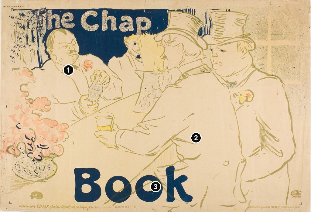
A broad back fills the foreground, two top hats rise almost to the upper edge, and a bartender works beyond a sharply slanting counter. The people are drawn with surprisingly few lines. What holds the scene together is the enormous blue name divided between its top and bottom: The Chap Book. Toulouse-Lautrec's advertisement turns a close view of a Paris bar into a memorable image for an American magazine. The Art Institute of Chicago dates its colour lithograph to 1895. [1]
The two names in the longer title describe different things. The Irish and American Bar on the rue Royale is the pictured establishment; The Chap-Book is the publication being promoted. The Bibliothèque nationale de France explicitly identifies that distinction in its catalogue of the poster. Keeping it in mind changes the scene: these customers are helping advertise something outside the room they occupy. [2]
At a Glance
- ArtistHenri de Toulouse-Lautrec.
- Date1895 in Chicago's record and Wittrock's exhibition catalogue; some related museum sheets receive a broader 1895–96 date. [1] [3] [4]
- Medium of the Chicago exampleColour lithograph on tan wove paper. [1]
- Measurements of that impressionImage 40.1 × 60.1 cm; sheet 41.4 × 60.1 cm. [1]
- Subject and purposeA Paris bar scene used to promote the American magazine The Chap-Book. [2]
- Chicago collectionMr. and Mrs. Carter H. Harrison Collection, accession 1931.48; catalogued as Wittrock P18 and Delteil 362. [1]
This work across Henri de Toulouse-Lautrec’s career
Contents
- A Paris bar advertises a Chicago magazine
- Two hats and a broad back
- The counter gives the room its shape
- Blue words and pale coats
- Reading the small print and the date
- A drawn appearance made for repetition
- Another way to bring the spectator forward
- Annotated details
A Paris bar advertises a Chicago magazine
The magazine already had a distinctive material identity. A February 1895 book notice in The Homoeopathic Physician describes The Chap-Book as a twice-monthly publication issued by Stone & Kimball from the Caxton Building in Chicago. It cost five cents a number or a dollar for an annual subscription. The reviewer particularly noticed its small format, old-fashioned type, unsized paper and rough edges. This was a publication whose physical appearance formed part of its appeal, well before a reader reached any individual article. [14]
Lautrec's poster offers a markedly different first encounter. The large English words occupy a recognisably social interior, with the customers' bodies and the bartender's hands supplying the activity. The connection is associative: an image of people gathered at a Paris counter lends its visual interest to a publication name. The BnF describes the poster as intended for the American review and identifies La Plume, at 31 rue Bonaparte in Paris, as its distributor. The advertised magazine and the French enterprise circulating the image therefore belong to separate parts of the arrangement. [2]
Phillip Dennis Cate places the poster within La Plume's wider support for contemporary graphic art. Founded by Léon Deschamps, the review promoted posters through publications and its Salon des Cent exhibitions. Cate records its publication of Lautrec's Chap Book poster in 1895 and draws attention to the La Plume credit printed in the margin. Citing the artist's correspondence, he also reports a payment of two hundred francs to Lautrec from La Plume for the design. That payment gives the French publisher an active role beyond merely appearing in small type. [15]
These connections make the advertisement transatlantic without turning it into a view of American life. Its publication name points towards Chicago, its subject towards the rue Royale, and its printed distribution address towards the Left Bank. The different destinations meet on one small horizontal sheet. The bar's own name makes that meeting especially apt, but the words at the top and bottom establish which business the conspicuous image is promoting.
Two hats and a broad back
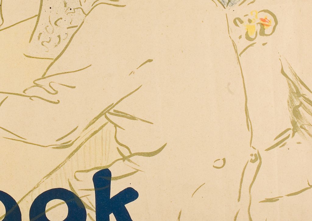
The nearest customer is seen mainly from behind. His shoulders spread across the centre, his right side descends towards the bottom edge, and the contour of his extended arm carries us left towards a small glass. The expansiveness of his coat is striking because so little happens inside it. A handful of curved strokes suggests folds near the elbow, waist and shoulder. Large intervals of light surface allow the body to become the dominant form without becoming the darkest one.
His head is more particular. Beneath the top hat, short curved marks distinguish hair, ear, cheek and moustache. The hat brim points towards the other customer's face, while the back of the collar establishes a firm change of direction below. The viewer receives a sequence of precise local clues rather than a continuously shaded volume. We can recognise a turned body even where its clothing remains almost empty.
The second top hat repeats the first at the upper right. Its crown is marked by quick horizontal strokes, and its brim curves into the surrounding light ground. Below it, the face turns left, bringing a second profile into the space above the nearer shoulder. His coat extends down the right edge and partly disappears behind the foreground figure. The overlap establishes proximity more immediately than a fully described chair or floor would.
Wolfgang Wittrock's 1985 catalogue identifies the man seated at the right as Tom, the Rothschilds' coachman, and the bartender as Ralph, from San Francisco. Carnavalet's current description repeats the coachman and bartender identifications. These are documented catalogue identifications, rather than conclusions that can be drawn from hats or facial features. Wittrock also associates the establishment with English horseracing enthusiasts, trainers and grooms; that account of its clientele does not identify every individual represented here. [3] [4]
The two foreground figures nevertheless work as a pair before their names become relevant. Their tall hats repeat; their shoulders meet; their faces turn towards the same side of the sheet. A flower on the right-hand coat answers the pink accents nearer the bartender. Repetition connects them, while the difference between a broad back and a more exposed face prevents them from merging into one undifferentiated group.
Annotated Details from The Chap-Book: Irish and American Bar
The numbered points identify visible features discussed in this article. Return from each detail to the whole composition. Henri de Toulouse-Lautrec, Irish and American Bar, Rue Royale—The Chap Book,1895. Colour lithograph on tan wove paper. Art Institute of Chicago,1931.48; sheet41.4 × 60.1 cm. Image source. Public domain. Resized only; native appearance preserved.
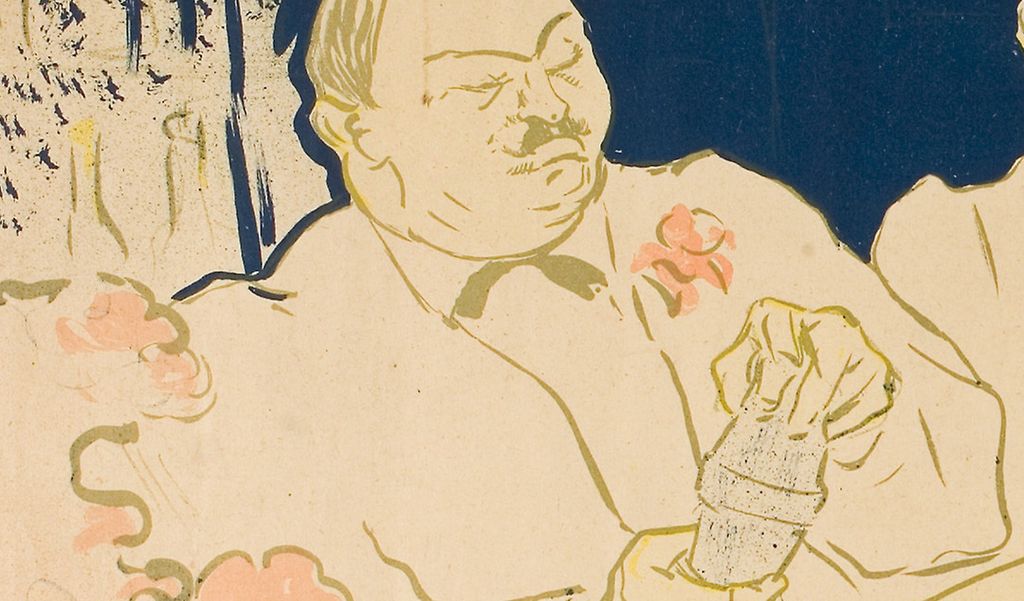
Details from THE CHAP-BOOK: IRISH AND AMERICAN BAR
Compare the cropped details with the complete images above. Notice how their colours, shapes and positions contribute to the larger compositions.
The foreground back
The large back interrupts the room and brings the observer close.
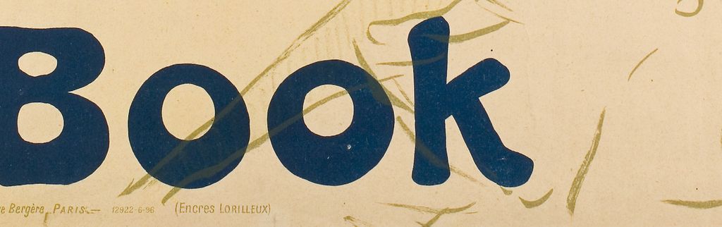
The blue Book lettering
The large blue word Book turns the bar scene into an advertisement for the magazine.
The counter gives the room its shape
The bartender faces us from the opposite side of the counter. His broad torso occupies the left half, while his hands gather around a small vessel near the centre. One hand grips below and the other bends over its top. Compared with the customers' expansive coats, this compressed cluster of fingers is unusually busy. The change of density makes the activity of his hands the clearest focal point within the bar scene.
A fourth person appears between him and the foreground hat. Only part of the head and upper body remains visible, with a dark bow tie just below the face. Carnavalet describes a waiter alongside the bartender. [4] The fragment gives the space behind the counter another occupant without requiring room for a second full figure. It also stops the gap between hat and bartender from becoming an inert opening.
The counter itself rises diagonally across the sheet. Its nearer edge begins low, beneath the large word Book, and travels towards the clustered heads. Another line runs from the bartender's side towards the foreground arm. These oblique directions turn a shallow rectangle into a place where bodies can stand on opposite sides of something. The furniture supplies the spatial framework while receiving much less attention than the people and lettering.
Several smaller objects test that framework. The foreground customer's glass sits above his outstretched hand; another vessel rises close to his face. At the left, flowers in a rounded container occupy the near edge, large enough to compete with a head. Their scale brings that corner forward. Beyond them, the bartender's smaller hands and the partially concealed attendant establish a receding sequence. Depth emerges through overlap and relative size as much as through the counter's lines.
We look past a shoulder and around a floral arrangement, with little open floor or surrounding architecture to establish a comfortable distance. The room is accessible in fragments. The bartender is clearly visible across the counter, but the nearer customer occupies much of the route towards him. Looking around people becomes an essential part of the image's construction.
Watch: Toulouse-Lautrec
Choose an artist introduction, a film about graphic design or a closer look at At the Moulin Rouge.
Blue words and pale coats
The most substantial dark area is not a person. Deep blue surrounds the upper words, spreading behind the bartender's head and into the interval above the attendant. The pale letters appear within it as a patterned interruption. At the lower edge, Book reverses the arrangement: the letters themselves are blue against the light surface. The same colour performs opposite tasks at the two ends of the composition.
That exchange holds the horizontal scene together. The upper blue mass presses down around the heads; the lower word anchors the counter and foreground body. Between them, the light coats can expand without allowing the whole design to lose definition. The advertisement's commercial message supplies much of its visual weight. Covering the words would alter the balance of the people as radically as removing a figure.
The edges of the title also participate in the scene. The first hat rises beside the end of Chap, interrupting the blue field's continuation to the right. At the bottom, the diagonal counter remains visible through parts of the large blue letters. Text and interior overlap rather than occupy neatly separated strips. The words retain their readability while sharing the same crowded space as the customers.
Other colours operate on a smaller scale. Olive-toned lines describe faces, clothing and furniture; yellow touches brighten the glass, hair and flowers; pink gathers most noticeably in the near-left bouquet and the bartender's lapel. These accents are dispersed enough to connect distant areas without challenging the blue. Looking across them reveals an economical arrangement: expansive light bodies, one dominant dark colour, and concentrated patches of warmer detail.
Chicago's medium description identifies tan wove paper. That light support is essential to the appearance of its impression: great stretches of coat and counter remain close in tone to the surrounding sheet. [1] The eye supplies much of their volume from a few boundaries. The large bodies appear substantial because their contours are carefully selected, even while their interiors remain open.
Reading the small print and the date
The lower margin contains a second level of information. At the left, the printing credit names Imprimerie Chaix, the Ateliers Chéret and 20 rue Bergère in Paris, followed by an ink manufacturer's name, Lorilleux. At the right, Affiches Artistiques de La Plume gives the rue Bonaparte distribution address. Carnavalet transcribes these lines for its impression, AFF3071; the credits are also visible on Chicago's reproduction. The bottom edge connects the image to the businesses that produced and circulated the sheet. [4]
Two small emblems extend that record of authorship and manufacture. The elephant-shaped monogram near the lower left belongs to Lautrec; the compact circular mark at the lower right belongs to Chaix. The BnF distinguishes the two in its catalogue. Their unobtrusive scale is part of their usefulness: they identify contributors without competing with the much larger magazine name. [2]
The printing line also contains the sequence “12922-6-96.” Carnavalet transcribes it and dates its sheet between 1895 and 1896. Chicago dates accession 1931.48 to 1895, as does Wittrock's catalogue heading for the design. The records therefore preserve a distinction worth retaining: 1895 is the principal design date, while the broader date and the Chaix imprint belong to the history of particular surviving sheets. The “6-96” is visible evidence, but by itself it does not establish a complete printing chronology or justify redating every impression to 1896. [4] [1] [3]
The measurements require similar attention. Wittrock lists two exhibition examples at 41.2 × 61.8 cm, distinguishing P18/A and P18/B as first and second states. Chicago records a sheet of 41.4 × 60.1 cm and supplies the broader catalogue designation P18. The differing measurements describe separate objects carrying the same design, rather than contradictory accounts of one sheet. [3] [1]
A drawn appearance made for repetition
The print contains several different kinds of mark. Fine contours carry noses and fingers; broader strokes turn around the hats; minute dots fill the upper lettering and soften parts of the background. The distinction is especially clear near the left flowers, where light pink shapes meet a granular surrounding field. The apparent informality rests on the coordination of these different densities.
The BnF's description identifies colour lithography using crayon, brush and spatter, with a transferred screen. That vocabulary helps separate the image's visible texture from the physical paper beneath it. A grainy passage may belong to the printed construction rather than to an immediately applied drawing. It also explains why the dotted and continuous passages can coexist so precisely within one repeatable image. [2]
Colta Ives's discussion of the printshop offers a useful companion. She identifies Père Cotelle pulling proofs at Ancourt's press in Lautrec's L'Estampe originale cover and stresses the discipline he brought to examining printed results. Cate similarly separates the artist's drawing and approval of proofs from the printer's production of an edition. These accounts illuminate the work behind such seemingly easy contours; they do not replace the Chaix credit on this particular sheet. [12] [15]
Another way to bring the spectator forward
The Divan Japonais advertisement makes a revealing comparison. There, Jane Avril's black dress supplies the great solid foreground shape, while the singer and orchestra occupy fragments beyond her. Ives discusses its decorative silhouette, compressed space and sharply cropped musical elements. The spectator commands an image advertising a performance venue. [12]
In The Chap-Book, the nearest body is similarly enlarged, but it is mostly light and turned away. Blue lettering takes over the emphatic dark role held by Avril's dress. The commercial purpose also changes: the scene promotes a magazine whose contents are not shown. In each case, looking past a conspicuous person creates visual interest. Here, however, the publication name becomes an indispensable part of the room's apparent structure.
That comparison brings the foreground back into focus. The broad coat initially seems to conceal too much, yet its restraint gives the fingers, glass, profiles and flowers room to register. The bar is made readable through selective revelation. Lautrec's graphic practice repeatedly joins advertising to close observation; this design gives the very large back and the very large words equally demanding jobs.
Toulouse-Lautrec artworks directory
Browse 84 identified works and publications in this researched selection. Dates and titles follow the individual records; this is not a complete catalogue of the surviving oeuvre. Print impressions remain attached to their designs. Some listed works do not have a dedicated article. The Drawings guide also contains nine illustrated studies consolidated from former articles.
Frequently Asked Questions
It promotes an American magazine. The Irish and American Bar on the rue Royale in Paris is the pictured setting, rather than the advertised publication's title or address. [2]
The familiar lettered image is a colour lithographic poster. Chicago's example is printed on tan wove paper and is catalogued as accession 1931.48. [1]
Discussion
Look again at the images and ideas explored in The Chap-Book: Irish and American Bar. These editorial prompts invite your observations.
Reader Insights
How does the reversal from pale upper letters on blue to blue lower letters on a light ground hold the bar scene together?
Compare the foreground customer with Avril in Divan Japonais. What changes when the largest figure becomes a pale back rather than a black silhouette? [12]
Join the Conversation
Share a detail, comparison or question about The Chap-Book: Irish and American Bar below.
References
- Art Institute of Chicago, Irish and American Bar, Rue Royale—The Chap Book, 1895, accession 1931.48, complete institutional API record, title, date, medium, image and sheet measurements, catalogue numbers, collection credit and reproduction. View source 1. View source 2.
- Bibliothèque nationale de France, The Chap Book, notice FRBNF42173655, lettered impression, publication/distribution and printer credits, technical description, monograms and identification of the magazine and Paris bar (in French). View source.
- Wolfgang Wittrock, “Catalogue of the Exhibition,” in Riva Castleman and Wolfgang Wittrock, eds., Henri de Toulouse-Lautrec: Images of the 1890s, Museum of Modern Art, 1985, p. 242, cats. 278–279, states, measurements, venue clientele and attributed identifications of the coachman and bartender. View source.
- Musée Carnavalet–Histoire de Paris, Paris Musées, The Chap/ Book, AFF3071, 1895–96 dating, Chaix and La Plume imprint transcription, ink-maker credit and iconographic identifications (text in French). View source. (in French).
- Autoportrait, 1880 (in French). View source.
- ALBERTINA: Der Schimmel Gazelle,GE123DL. View source. (in German).
- Franka Blok, Portrait of Vincent van Gogh, 2024. View source.
- Art Institute of Chicago: Moulin Rouge, La Goulue. View source.
- Art Institute of Chicago: At the Moulin Rouge. View source.
- Jane Avril, 1893. View source.
- Au Salon de la rue des Moulins (in French). View source.
- Colta Ives, Toulouse-Lautrec in The Metropolitan Museum of Art, 1996, p. 38 on Divan Japonais and its compressed composition; p. 41 on Cotelle, proofs and the printshop. View source.
- Maurice Joyant (in French). View source.
- “The Chap-Book,” book notice, The Homoeopathic Physician, vol. 15, no. 2, February 1895, p. 102, publisher, Chicago address, frequency, price and material description; original page image examined in the National Library of Medicine's digitised copy. View source.
- Phillip Dennis Cate, “The Popularization of Lautrec,” in Henri de Toulouse-Lautrec: Images of the 1890s, Museum of Modern Art, 1985, p. 82 on proofing and printing; pp. 85–86 on La Plume and the poster; p. 92, note 25, the two-hundred-franc payment, citing Goldschmidt and Schimmel, letter 196. Correspondence consulted through Cate, rather than the original letter volume. View source.
- Splash image, Henri de Toulouse-Lautrec, Irish and American Bar, Rue Royale—The Chap Book,1895. Colour lithograph on tan wove paper. Art Institute of Chicago,1931.48; sheet41.4 × 60.1 cm. Image source. Public domain. Resized only; native appearance preserved.


 Henri de Toulouse-Lautrec.jpg)