



 by Tom Gurney
Tom Gurney BSc (Hons) is an art history expert with over 20 years experience
Published on June 19, 2020 / Updated on November 3, 2026
Email: tomgurney1@gmail.com / Phone: +44 7429 011000
Babylone d’Allemagne: Toulouse-Lautrec’s Military Satire: Introduction
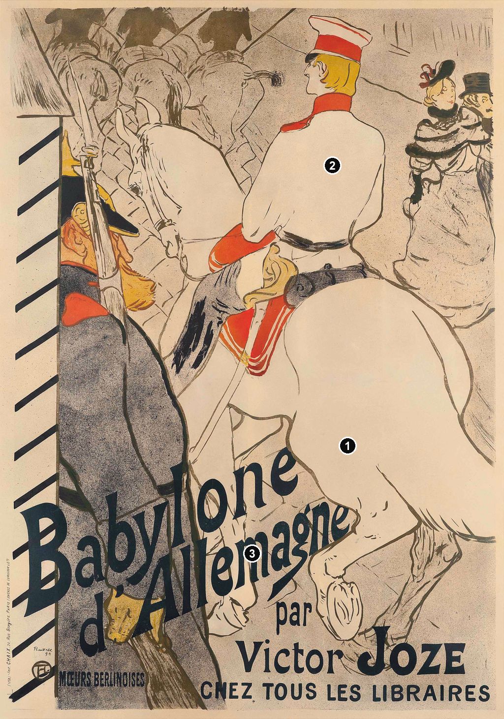
A white horse takes up most of the view, its rider turning away as a sentry presents arms. Toulouse-Lautrec gives this military ceremony an awkward intimacy: the horse’s enormous hindquarters crowd the soldier, and the title climbs across them both. Created in 1894 to advertise Victor Joze’s Babylone d’Allemagne, this colour lithographic poster makes an arresting promise of the book’s satirical Berlin. Its humour depends on the collision between ceremonial dignity and an unceremonious viewpoint. [1] [2]
At a Glance
- ArtistHenri de Toulouse-Lautrec
- TitleBabylone d’Allemagne, translated as German Babylon
- Date1894
- ObjectColour lithographic poster advertising Victor Joze’s book
- Catalogue identityWittrock P12; the lettered poster is P12/B, Delteil 351, second state. [2]
- Printer and publisherMoMA credits Chaix, Paris, as printer and Victor Joze, Paris, as publisher of its poster. [1]
- Example in a public collectionMuseum of Modern Art, New York, 590.1940, gift of Abby Aldrich Rockefeller. Its sheet measures 118.3 × 84.3 cm. [1]
This work across Henri de Toulouse-Lautrec’s career
Contents
- A Parade Seen from Behind
- What Joze’s “German Babylon” Promised
- Lettering That Takes Over the Street
- The Poster, Its Earlier State and the Book Cover
- A Literary Advertisement Among Lautrec’s Posters
- Annotated details
A Parade Seen from Behind
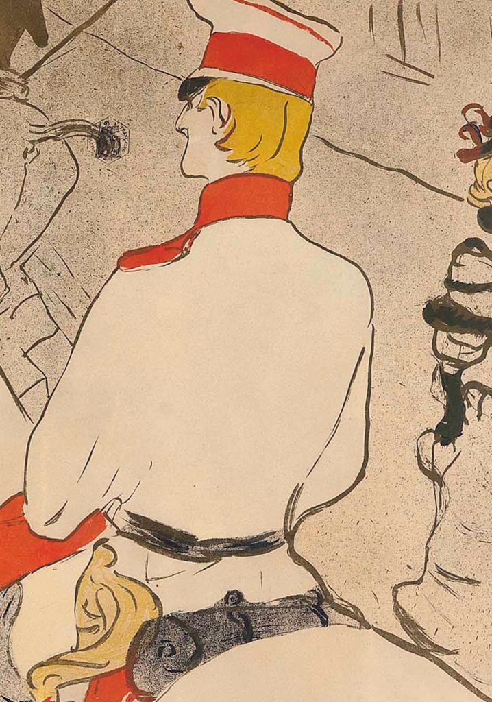
The poster’s commanding figure is mounted, pale-uniformed and conspicuously upright. A red band circles his cap, red marks his collar and cuff, and yellow defines his hair. He looks left, towards the procession ahead. Yet we meet him largely through his back: the smooth sweep of his tunic leads directly into the broad, rounded body of his horse. Lautrec denies us the frontal encounter that might turn this figure into a heroic military portrait. We see the uniform’s arrangement and the body’s posture before we can form much acquaintance with the face. These are visual effects of the composition, rather than evidence for the rider’s identity. [2]
At the left, a sentry stands beside a striped guard box, his rifle rising almost vertically. His dark, granular coat makes a weighty foreground shape. His face, yellow moustache and red collar introduce colour into this block, but his lower body is soon overtaken by the title. Above him, horse heads, riders, reins and upright weapons form a dense tangle towards the upper edge. Lautrec gives enough information for us to read a mounted military group while cropping away the open space in which an orderly parade might usually unfold. The viewer is pressed close to the passing animals. [2]
The scale changes abruptly at the right. A woman with a decorated hat and conspicuous wrap appears beside a man wearing a top hat. Her face turns towards the mounted officer, while her companion is partly cut off by the border. The few lines defining them are quite different from the sentry’s heavy mass. They occupy the small remaining pocket of street, spectators whose presence makes the procession a social spectacle as well as a military one. There is no need to assign them names, occupations or a particular relationship for their glances and contrasting dress to do their work. [2]
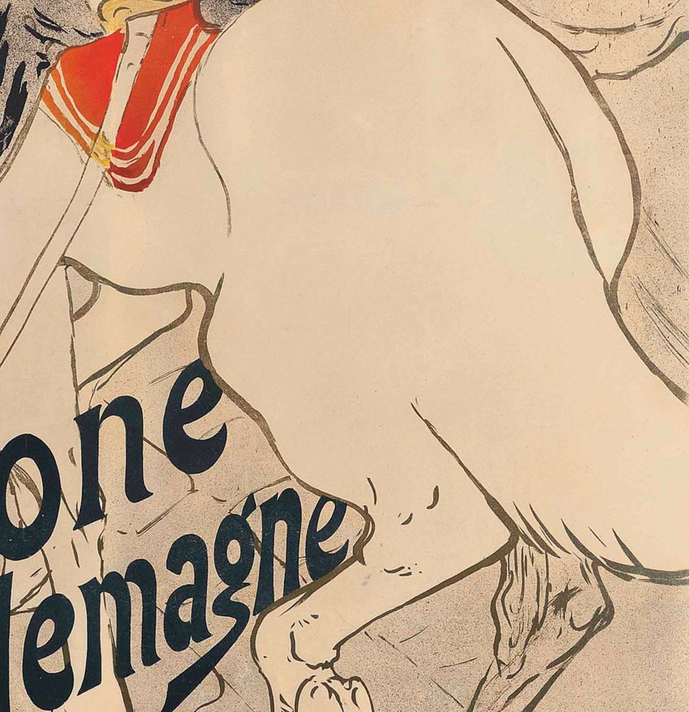
The largest horse is especially disconcerting. Its flank is an expanse of pale paper enclosed by sparse contours; the bent rear leg and visible underside of a hoof introduce movement at the bottom. Red saddle fittings and fine hanging lines interrupt this great light shape without filling it. Against the erect rider and the straight rifle, the animal’s rounded body and lifted foot produce an ungainly counter-rhythm. Military precision rests on something bodily, mobile and difficult to contain. That is one way of reading the image’s comedy, grounded in the forms Lautrec places together. [2]
What Joze’s “German Babylon” Promised
The book’s opening sharpens this mismatch between dignity and ridicule. Its title page places Babylone d’Allemagne within Joze’s La Ménagerie sociale, or “The Social Menagerie,” and credits a cover by Toulouse-Lautrec. Published in Paris by P. Antony et Cie in 1894, the volume also contains Types de Berlin, illustrations credited to Bac and Lubin de Beauvais. The poster’s smaller phrase Mœurs berlinoises means Berlin manners or customs: a promise of social observation that the book immediately makes contentious. [12]
Joze opens his preface by anticipating displeasure across the Rhine. He mocks German claims to virtue, linking the supposed wish to purify the world with armaments, the emperor and the weapons manufacturer Krupp. On the next page he insists that his book is an impartial social study rather than chauvinistic provocation. Read beside the surrounding passages, that claim is revealing. His comparisons repeatedly favour an idealised Paris and describe Germans through hostile national stereotypes. His portrayal of women is particularly reductive, treating them as products of male tastes and using sexual behaviour to rank one nation against another. These are Joze’s polemical judgments, not reliable descriptions of German people. [12]
The opening of the narrative brings military status and private pleasure together. Set on 1 November 1891, it introduces the young Count Hubert de Rau celebrating promotion to second lieutenant with fellow officers at a restaurant on Unter den Linden. He admires his sword and epaulettes; even his adolescent moustache seems to adopt a military bearing. The men drink champagne and congratulate one another. Joze’s narrator makes their self-importance comic before the evening’s search for entertainment has properly begun. The precise date belongs to the fiction’s setting; it does not turn this dinner into a documented historical event. [12]
When the officers leave the restaurant, their uniforms become an obstacle. The narrator explains that they cannot enter certain public entertainments in military dress, and the group chooses a different destination. The opening therefore establishes a tension between visible respectability and private appetite. Lautrec’s poster does not illustrate the restaurant scene. Instead, it presents the public face of that military world: impeccable bearing, a salute, a mounted procession and civilian attention. The contrast between the book’s opening and the poster helps explain how an apparently decorous street scene could advertise a provocative text. It condenses an atmosphere rather than supplying a literal synopsis. [12] [2]
The title’s “Babylon” encourages the reader to approach Berlin as a place of moral excess. Joze’s preface supplies the intended direction of that accusation, while the horse and rider give it a public, recognisable form. But the picture remains less explicit than the prose. No act of sexual misconduct is shown. Its insinuation comes through disproportion, proximity, the officer’s cultivated appearance and the spectators’ attention. Keeping that distinction matters: the poster participates in the book’s advertising and satire without making every assertion in its preface visible. [12] [2]
Watch: Toulouse-Lautrec
Choose an artist introduction, a film about graphic design or a closer look at At the Moulin Rouge.
Annotated Details from Babylone d’Allemagne: Toulouse-Lautrec’s Military Satire
The numbered points identify visible features discussed in this article. Return from each detail to the whole composition. Babylone d’Allemagne, 1894, lettered poster composition; reproduction via Christie’s and Wikimedia Commons. A different impression from MoMA’s sheet. Henri de Toulouse-Lautrec, reproduction via Christie’s and Wikimedia Commons. Image source. Public domain. Resized only; native appearance preserved.
Details from BABYLONE D’ALLEMAGNE: TOULOUSE-LAUTREC’S MILITARY SATIRE
Compare the cropped details with the complete images above. Notice how their colours, shapes and positions contribute to the larger compositions.
The exaggerated horse
The horse’s large rear dominates the compressed street scene.
The upright officer
The rigid officer contrasts with the horse’s broad rounded form.
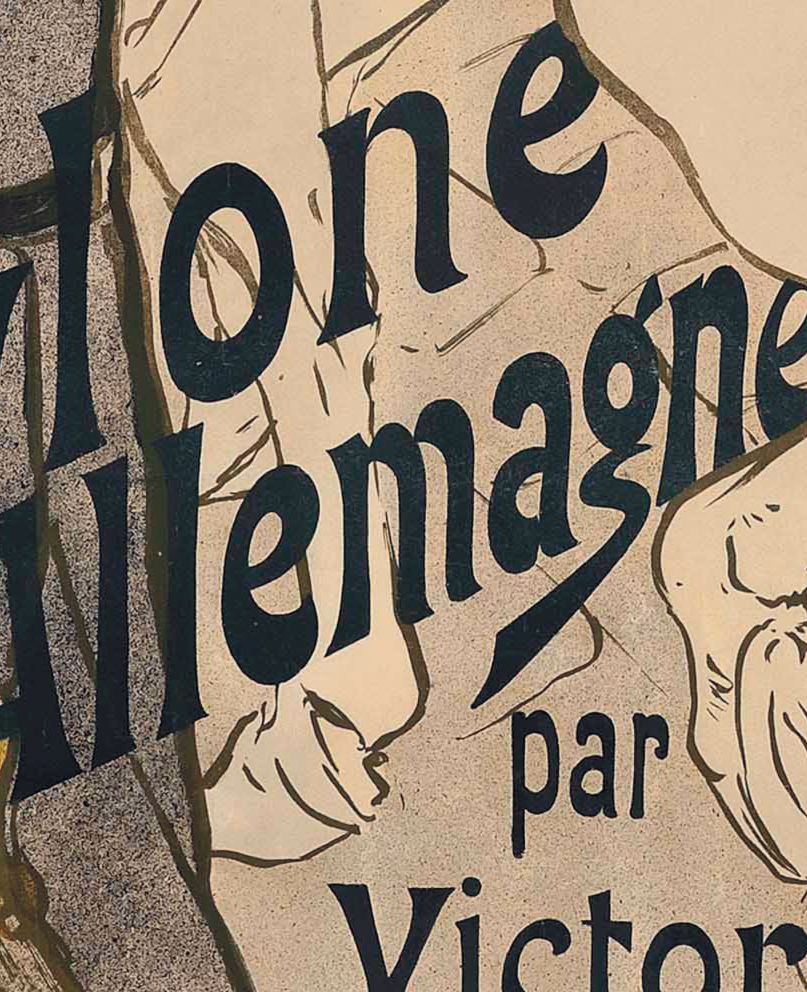
The diagonal title
Large black lettering cuts across the lower part of the advertisement.
Lettering That Takes Over the Street
The words are central to the fully lettered poster’s effect. Babylone rises diagonally from the lower left, with d’Allemagne climbing beneath it. The large dark letters cross the sentry’s coat and extend over the pale horse. They occupy the foreground almost like another physical obstruction, competing with the guard box’s repeated diagonal stripes. Rather than sitting in a quiet caption panel, the title appropriates the street scene. The officer continues his parade while the advertisement addresses the viewer over his horse’s back legs. [2]
The title’s direction also changes how the eye moves. The rifle and sentry establish a vertical at the left; the horse and mounted group carry attention upwards and into the distance. The rising words cut across those movements, returning us to the lower half. Beneath them, the small par introduces the author, whose surname receives conspicuous weight in Victor Joze. Finally, the horizontal Chez tous les libraires—“at all booksellers”—anchors the bottom. A complex arrangement of bodies and glances ends in a plain purchasing instruction. The visual joke and the commercial message reinforce one another. [2]
Colour makes the hierarchy equally clear. Much of the scene consists of fine outlines and open paper. Red and yellow accents pick out the officer and sentry; the foreground coat supplies a dark, textured counterweight. The title can consequently cross the picture without becoming lost in dense modelling. The contrast between the coat’s speckled surface and the almost empty horse flank is particularly useful: it separates adjoining bodies through texture and tone while allowing the title to bind them together. This is close-looking evidence of the printed result, not a reconstruction of the order in which its inks were applied. [2]
The Poster, Its Earlier State and the Book Cover
Surviving sheets of this design differ in state and format. Wolfgang Wittrock’s catalogue in MoMA’s 1985 exhibition publication lists a proof of Babylone d’Allemagne separately from the coloured poster in the museum’s collection. The latter is Wittrock P12/B and Delteil 351, second state. Its reproduced arrangement matches the lettered composition discussed here. The distinction matters because lettering is so active in the design: an impression without it presents a materially different balance of image and empty space. [2]
Colta Ives’s 1996 Metropolitan Museum catalogue identifies the Met’s example as a four-colour lithograph before letters, Wittrock P12.A and Adriani 58.I. The current Met record likewise calls it a print before letters on machine wove paper, accession 32.88.16. Those descriptions belong to that example; they should not be transferred wholesale to MoMA’s lettered sheet. The same caution applies to measurements. A design can survive in sheets with different margins, trimming or recorded dimensions, so a single measurement cannot describe every impression. [10] [13]
The book cover adds a further distinction. The University of Ottawa copy of the 1894 volume preserves the horse-and-sentry motif on its cover, but with red lettering and a different distribution of the words. The publisher’s name appears below. Opening the volume reveals the title page’s separate credit to Lautrec for the cover. This is a related use of the composition in a small book format, not the large advertising poster itself. The contrast is easy to see: the poster’s expansive dark title and broad instruction to booksellers belong to a public announcement, whereas the cover identifies the volume already in the reader’s hands. [12]
Phillip Dennis Cate places Joze’s books within a wider experiment in illustrated publishing. In Prints Abound: Paris in the 1890s, he connects the series with Seurat, Bonnard and Lautrec, arguing that their designs brought an adventurous visual language to the roman de mœurs, the novel of social manners. His illustration of the Babylone cover makes the distinction between book and poster especially clear. Joze’s publications offered artists more than one setting for an image: the intimate object handled and read, and the large advertisement intended to secure attention before reading began. [14]
A Literary Advertisement Among Lautrec’s Posters
The work also changes our sense of what a Lautrec poster can advertise. In Reine de Joie, his earlier advertisement for Joze, the author’s name is attached to another provocative novel. Babylone d’Allemagne continues that publishing relationship but exchanges the restaurant encounter of the earlier design for mounted soldiers and spectators. Cate’s account distinguishes Bonnard’s cover for Reine de Joie from Lautrec’s poster, while crediting Lautrec with both cover and poster for Babylone. Collaboration with the same writer did not impose a single pictorial formula or a single division of artistic labour. [14]
The scale of the poster also belongs to its purpose. In his 1985 essay, Cate includes Babylone d’Allemagne among Lautrec’s designs fitting the large double colombier poster format. He explains that posters circulated through collectors and dealers as well as through display, and that examples before lettering could command particular attention. That history helps explain a literary advertisement’s survival as a museum object. It does not establish the original use or ownership history of every individual sheet, nor does it supply a confirmed print run for this design. [15]
The printed object joins several kinds of work: Joze’s authorship and promotion, Lautrec’s image, and the printer’s production. MoMA’s present record credits Chaix with printing and Joze with publishing its example. Cate’s discussion of lithographic practice distinguishes an artist’s preparation and approval of proofs from a printer’s production of the edition. Here that distinction keeps the precision of the finished poster in view. Its apparently quick contours, granular darks, broad pale forms and intrusive words belong to a coordinated printed surface. Readers interested in those broader relationships can explore Lautrec’s prints; this particular poster makes them tangible through one horse, one salute and a title that refuses to stay beneath the picture. [1] [15]
Toulouse-Lautrec artworks directory
Browse 84 identified works and publications in this researched selection. Dates and titles follow the individual records; this is not a complete catalogue of the surviving oeuvre. Print impressions remain attached to their designs. Some listed works do not have a dedicated article. The Drawings guide also contains nine illustrated studies consolidated from former articles.
Frequently Asked Questions
It means “German Babylon.” Joze’s 1894 book uses Berlin as the setting for a hostile satire of German manners; its preface explains the national comparison behind the title. [12]
Discussion
Look again at the images and ideas explored in Babylone d’Allemagne: Toulouse-Lautrec’s Military Satire. These editorial prompts invite your observations.
Reader Insights
Look first at the bodies, then at the words. Which establishes the mood more strongly: the officer’s rigid posture, or the horse’s exaggerated scale?
How does the rising title change the street scene when you follow it across the sentry and horse?
Join the Conversation
Share a detail, comparison or question about Babylone d’Allemagne: Toulouse-Lautrec’s Military Satire below.
References
- Museum of Modern Art, German Babylon (Babylone d’Allemagne), 1894, object 590.1940. Current object record: medium, publisher, printer, dimensions and credit. View source.
- Wolfgang Wittrock, catalogue entries 262–263, in Riva Castleman and Wolfgang Wittrock, Henri de Toulouse-Lautrec: Images of the 1890s (MoMA, 1985), printed p. 232; lettered poster reproduced on p. 234. View source.
- Autoportrait, 1880 (in French). View source.
- ALBERTINA: Der Schimmel Gazelle,GE123DL. View source. (in German).
- Franka Blok, Portrait of Vincent van Gogh, 2024. View source.
- Art Institute of Chicago: Moulin Rouge, La Goulue. View source.
- Art Institute of Chicago: At the Moulin Rouge. View source.
- Jane Avril, 1893. View source.
- Au Salon de la rue des Moulins (in French). View source.
- Colta Ives, Toulouse-Lautrec in The Metropolitan Museum of Art (1996), checklist p. 65: Babylone d’Allemagne, 32.88.16, before letters. View source.
- Maurice Joyant (in French). View source.
- Victor Joze, Babylone d’Allemagne (Paris: P. Antony et Cie, 1894), University of Ottawa copy digitised by Internet Archive. Cover and title page; preface pp. 7–11; opening narrative pp. 15–17. (In French.) View source.
- Metropolitan Museum of Art, Babylone D’Allemagne, 1894, object 32.88.16. Current record for the impression before letters. View source.
- Phillip Dennis Cate, “Prints Abound: Paris in the 1890s,” in Prints Abound: Paris in the 1890s (National Gallery of Art, 2000), pp. 39–41, especially p. 40 and fig. 21. View source.
- Phillip Dennis Cate, “The Popularization of Lautrec,” in Henri de Toulouse-Lautrec: Images of the 1890s (MoMA, 1985), pp. 81–82 on colour and artist/printer roles; p. 89 on poster format and collecting. View source.
- Splash image, Babylone d’Allemagne, 1894, lettered poster composition; reproduction via Christie’s and Wikimedia Commons. A different impression from MoMA’s sheet. Henri de Toulouse-Lautrec, reproduction via Christie’s and Wikimedia Commons. Image source. Public domain. Resized only; native appearance preserved.


 Henri de Toulouse-Lautrec.jpg)