



 by Tom Gurney
Tom Gurney BSc (Hons) is an art history expert with over 20 years experience
Published on June 19, 2020 / Updated on November 3, 2026
Email: tomgurney1@gmail.com / Phone: +44 7429 011000
The Englishman at the Moulin Rouge: Introduction
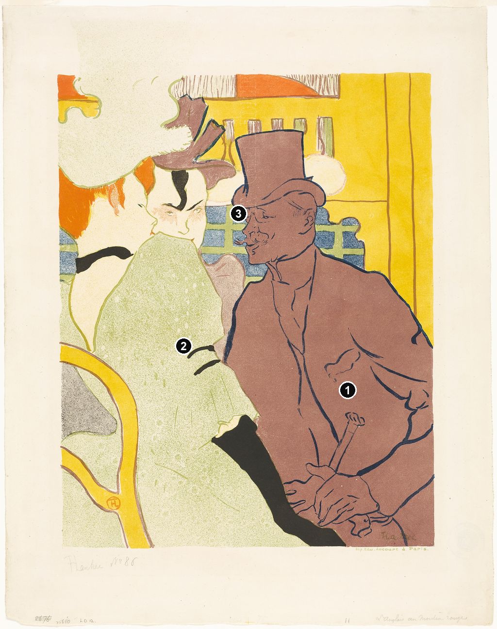
A towering hat, a curling moustache and an enormous pale sleeve bring three people almost uncomfortably close. In Henri de Toulouse-Lautrec's The Englishman at the Moulin Rouge, the familiar dance hall becomes a tightly framed encounter. The 1892 colour lithograph gives its principal male figure a nearly continuous purple body, set against the textured green of the woman beside him and the emphatic yellow behind them. [1]
The Englishman is William Tom Warrener, a painter and friend of Lautrec's. A separate painting at the Metropolitan Museum of Art supplied the composition for the print. Looking between the two reveals much more than a change of materials: Lautrec altered the relative force of faces, clothing and surroundings, turning a painted encounter into a striking arrangement of printed colour. [2]
At a Glance
- ArtistHenri de Toulouse-Lautrec
- Date1892
- Principal work discussedColour lithograph; Chicago's impression is on ivory laid paper. [1]
- Chicago collectionArt Institute of Chicago, 1931.67, Gift of the Print and Drawing Club. [1]
- Chicago measurementsImage: 52.7 × 37.3 cm; sheet: 61.8 × 48.7 cm. [1]
- Printed paletteSix colours; the dominant purple was a premixed ink. [3]
- Published edition100, as recorded in Colta Ives's catalogue. [4]
- Preparatory paintingMet 67.187.108, 1892, currently catalogued as oil on cardboard, 85.7 × 66 cm. [2]
This work across Henri de Toulouse-Lautrec’s career
Contents
- A Painter Inside the Picture
- The Sleeve That Holds the Composition Together
- What Changed Between Painting and Print?
- Why the Purple Matters
- The Proofs Reveal a Redesign
- How Much of the Encounter Can We Know?
- A Printed Sheet in a Museum Collection
- Annotated details
A Painter Inside the Picture
Warrener's identity gives the title a particular meaning. He was a fellow artist working in Paris. Wolfgang Wittrock's 1985 catalogue identifies him as William Tom Warrener, born in 1861 and from an influential Lincoln family. It records his move to Paris in the mid-1880s to study at the Académie Julian, his exhibitions at the Salon and Royal Academy, and his meeting with Lautrec after moving to Montmartre in the early 1890s. [13]
That background changes the balance between familiarity and caricature. The moustache, hat and bent posture are memorable signs, but they belong to an identified fellow painter. His inclusion makes this an image of a social circle as well as of a celebrated establishment. The title singles him out by nationality while the picture embeds him among people, furniture and lights. The wider Montmartre setting helps explain how artists and entertainment venues came into contact; here that network has been compressed into three adjoining heads.
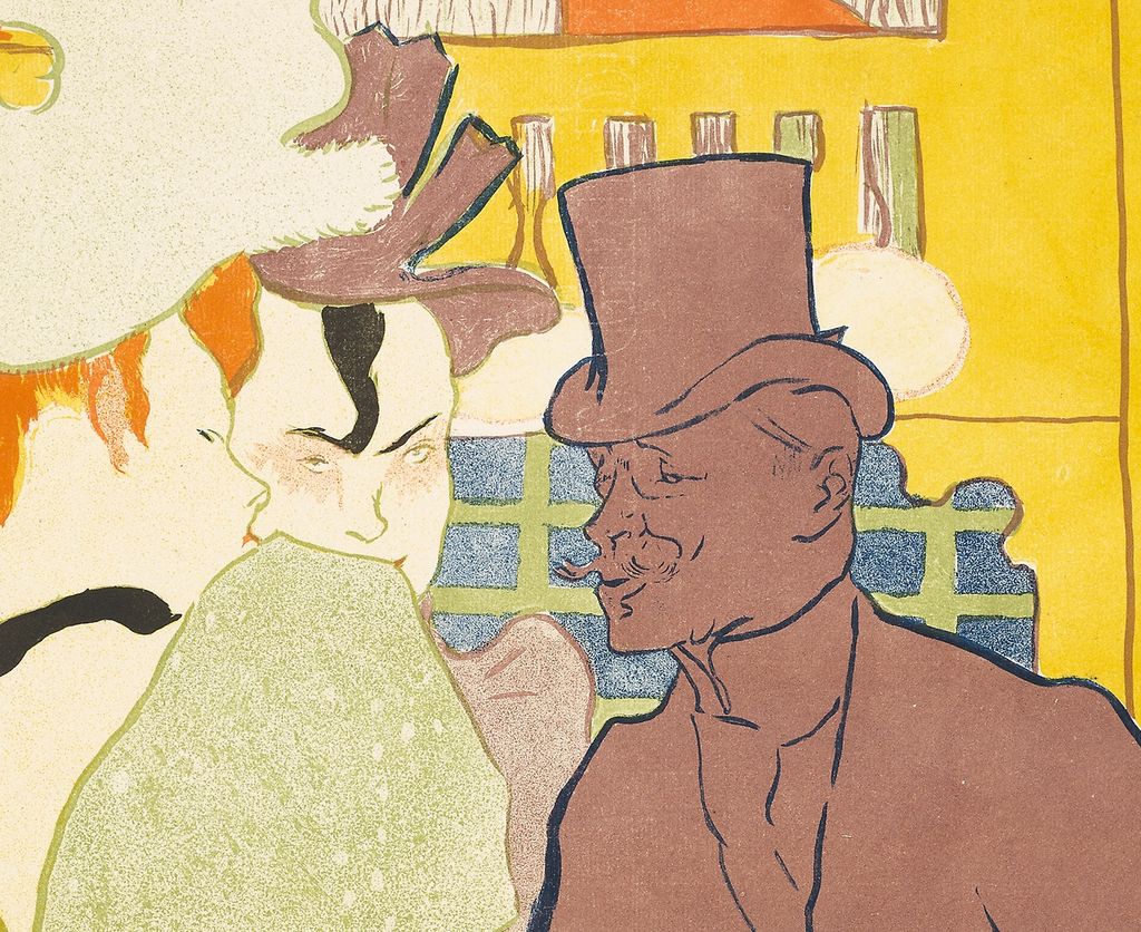
Warrener occupies the right side, turning left towards the women. The nearer woman gives us her back and a narrow profile; the woman between them faces more nearly outwards. These three orientations keep the group from settling into a conventional row of portraits. One figure addresses the group, another partly conceals it, and the central face remains visible through a narrow opening. We enter the image from close quarters, with no intervening dance floor to establish a comfortable viewing distance.
The Sleeve That Holds the Composition Together
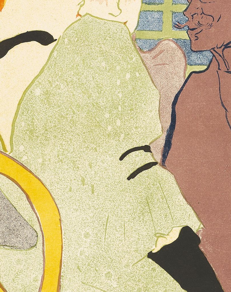
The foreground woman's sleeve is the print's great interruption. Its swelling outline occupies much of the middle of the image, coming close to the central woman's mouth and separating her face from Warrener's torso. The puffed upper portion contracts into a ruffled cuff; two black bands mark the arm before a long black glove descends towards the bottom edge. Following those changes takes the eye through the full height of the figure without requiring a complete view of her body.
Her pale green garment has a granular surface, unlike the comparatively continuous purple assigned to Warrener. Their boundaries meet across the centre. The result is more than a contrast between light and dark: one body seems dispersed into small printed marks, while the other holds together as a broad coloured mass. Even before the faces are examined, that unequal distribution of texture makes the relationship visually active.
The hat above the nearer woman's red hair is so large that it extends beyond the top and left edges. A chair back enters at the lower left, its yellow curve repeating the warm colour elsewhere. Those cropped forms make the scene seem to continue around us. Yet the woman's black neck ribbon and glove are exceptionally definite. They punctuate an otherwise pale figure, giving small dark accents unusual power within the design.
The central woman's dark forelock supplies another concentrated black shape. Her face is small compared with the hat and sleeve around it, but the eyes and brows remain forceful. The print does not distribute detail in proportion to size. A few finely articulated features can compete with expanses of almost uninterrupted colour. Warrener's own moustache and fingers work similarly: they preserve distinctive information within a figure whose larger internal divisions have been greatly reduced.
Behind the heads, a blue-and-green lattice creates a regular pattern against these irregular human contours. Pale circular lights hover above it, while upright divisions extend through the yellow field at the right. The furnishings provide enough structure to imply an interior, but they never open into an extensive room. Our attention remains caught between the three people and the nearby surfaces.
Riva Castleman connects the raised shoulder and back view in this print with established poses in Japanese courtesan imagery. Her comparison concerns pictorial form: the turned body, the dominant garment and the selective presentation of a face. It is useful within Lautrec's Japonisme, without establishing a specific borrowed print or identifying the occupation of either woman represented here. [14]
Annotated Details from The Englishman at the Moulin Rouge
The numbered points identify visible features discussed in this article. Return from each detail to the whole composition. Henri de Toulouse-Lautrec, The Englishman at the Moulin Rouge, 1892. Colour lithograph on ivory laid paper. Art Institute of Chicago, 1931.67; image52.7 ×37.3cm, sheet61.8 ×48.7cm. Image source. Public domain. Resized only; native appearance preserved.
Details from THE ENGLISHMAN AT THE MOULIN ROUGE
Compare the cropped details with the complete images above. Notice how their colours, shapes and positions contribute to the larger compositions.
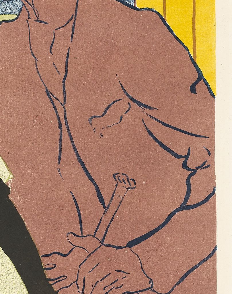
The Englishman’s coat
A broad, separately printed colour shape organises the Englishman’s coat.
The pale sleeve
The light sleeve contrasts with the surrounding strong flat colours.
The close faces
Closely grouped heads make the scene an encounter across a small space.
What Changed Between Painting and Print?
The Met's painting gives Warrener a bright white shirtfront beneath his face and a dark, vigorously brushed coat around it. Separate strokes run down the clothing and across the crown of the hat. His cheek, ear and moustache receive different colours and degrees of emphasis. The nearer woman's sleeve is likewise built from pale strokes over the warm brown ground, while the background remains full of loose vertical and horizontal marks. The three people occupy the same tight arrangement, but the surface is much more changeable. [2]
In the lithograph, the white shirtfront loses its force as an independent shape. Purple extends through face, neckwear and coat, with lines distinguishing parts that paint had differentiated through colour and stroke. Warrener becomes a much more unified presence. The face remains readable because the brow, nose, moustache and jaw have been retained so selectively. A large part of the descriptive burden has moved from varied paint to the precise placement of contours.
The nearer woman's transformation is equally substantial. The sleeve's broken creamy strokes become a greenish field whose texture is more consistent across the shape. Her large hat is simplified, the chair becomes a more emphatic curve, and the background yellow is much more assertive. These changes alter the relative importance of body and room. The print's furnishings seem less atmospheric and more like coloured structures pressing against the people.
Colta Ives describes the passage from painting to lithograph as a conversion from painterly realism to decorative abstraction. The pair supports that reading in concrete ways: internal modelling diminishes, neighbouring fields become more distinct, and a small number of surviving lines carry more information. The familiar composition is being reconsidered for another medium. [4]
The painting's material description has also changed in museum publications. Ives labelled it oil and gouache on cardboard in 1996; the Met's current record says oil on cardboard. These are descriptions of the same preparatory object, 67.187.108. The lithograph is a separate work on paper, with its own catalogue identity and dimensions. [4] [2]
Watch: Toulouse-Lautrec
Choose an artist introduction, a film about graphic design or a closer look at At the Moulin Rouge.
Why the Purple Matters
Phillip Dennis Cate identifies six printing colours in the Englishman: olive-green, purple, blue, red, yellow and black. He makes a specific point about the dominant purple. It was mixed before printing and applied from a stone carrying that ink, rather than produced by superimposing a red impression and a blue one. The distinction is fundamental to understanding the colour as a chosen component of this design. [3]
Cate contrasts this approach with the yellow, red, blue and black system used for Lautrec's 1891 Moulin Rouge: La Goulue poster. In that earlier work, overlaps supplied further hues. The Englishman, like La Goulue and Her Sister of 1892, shows Lautrec moving towards the juxtaposition of separately prepared colours. This was a practical change in how a printed image was organised, rather than merely a preference for a different-looking palette. [3]
Look back at Warrener's body with that distinction in mind. Its force comes from the amount of space assigned to one colour and the way it meets the pale sleeve and bright background. The hue does not have to describe how his actual coat looked under a particular lamp. It can coordinate hat, head, torso and hands within the rectangle. The change from the painted shirtfront to the printed purple is particularly revealing: losing a strong light accent makes the whole figure more continuous.
Colour printing also required collaboration. Cate describes Lautrec drawing the image on stones, normally one per printing colour, and then correcting or approving proofs pulled by a printer. Once approved, the edition could be printed. The artist's apparent freedom of line therefore depended on a sequence of preparations and judgements. The broader history of his prints and posters includes many such partnerships; the Englishman preserves unusually useful evidence of the decisions within one design. [3]
The Proofs Reveal a Redesign
Wittrock's catalogue separates the first-state lithograph, a watercoloured example, second-state trial proofs and the published print. Its reproductions make the difference striking. In the watercoloured proof, drawn contours establish the three figures across a relatively open field. One trial isolates much of the nearer woman's pale, textured form while Warrener disappears. Another gives his large purple silhouette an almost independent life, without most of the internal detail that animates him in the final print. [13]
The Bibliothèque nationale de France's French catalogue explains what happened to the initial drawing stone. It served as a guide for the separate colour stones, but much of its image was subsequently removed. The first-state record identifies the female faces and parts of the nearer woman's hat and dress among the elements that survived. The original drawn structure did not simply remain intact beneath added colour. [15]
For the second state's first trial, the BnF records that the right-hand composition, including the Englishman, had been erased from that stone, along with the chair's outline. Spattered texture had been introduced on the nearer woman's dress and hat, and the lattice had been drawn with a brush. The proof lets a seemingly incomplete image document a specific reallocation of work among the printing surfaces. [16]
The aubergine trial gives a different part of that process. The BnF identifies a redrawn Englishman, elements of the central woman, and contours of the surrounding furniture on this stone. A subsequent trial combined five of the six stones used for the finished version, leaving the nearer woman's hat and dress without their eventual printed contribution. The catalogue records several distinct operations behind what can initially look like a simple contrast between a purple man and a green woman. [17] [18]
This evidence makes the relation between line and colour unusually tangible. A contour could move to another stone; a silhouette could become a separately printed mass; texture could be introduced where a lighter, more open shape had previously stood. The final image is economical in its appearance, but the proofs show that this economy was constructed. They reward looking across stages, just as the painting rewards looking across media.
There were also differences among finished impressions. The BnF's edition record describes some in which light turquoise was printed from the aubergine stone before the Englishman's silhouette was printed over it in aubergine, producing a violet tone. It therefore records six or seven colours for the edition's variants. That qualification belongs beside Cate's six-colour account, rather than being turned into a rule that every surviving sheet has exactly the same ink sequence. [19]
How Much of the Encounter Can We Know?
The physical closeness invites a story. Warrener bends towards the women, whose mouths are partly concealed by the intervening sleeve. Ives interprets the encounter as flirtation and draws attention to the reddish ear in the painting as a sign of embarrassment. The Met's present interpretation similarly proposes a risqué conversation. These are readings of pictorial cues; neither provides a transcript of what was said. [4] [2]
The print changes those cues. Purple absorbs the distinctions that make the painted ear conspicuous, while the sleeve grows more prominent as an obstruction. The people remain close, but the image's strongest contrast is now between the differently coloured bodies. Whatever narrative a viewer finds persuasive has to account for that transformation. A small painted accent and a large printed field do not communicate in quite the same way.
What remains most secure is the organisation of attention. The central woman looks across the narrow interval beside the sleeve; Warrener turns into the group; the foreground woman's face is available only in profile. The arrangement gives each figure a different degree of visibility. We are close enough to notice eyes and fingers, yet do not share every part of the represented exchange.
Castleman's formal comparison with Japanese prints helps explain the turned shoulder's effectiveness, but a compositional resemblance cannot supply a sitter's biography. Equally, the Moulin Rouge setting alone cannot establish either woman's occupation or private relationships. The print sustains interest through what it shows selectively: an identified artist amid two women, a conspicuous garment between faces, and bodies pressed into a small space. [14]
A Printed Sheet in a Museum Collection
The Englishman entered a collecting culture as well as a world of entertainment. Ives records an edition of one hundred, and the BnF credits the Paris printing firm Edward Ancourt. Cate reports Jean Adhémar's account that it was printed by Ancourt for Boussod. These records place the design within a network of workshops and art dealers; its setting at the Moulin Rouge does not by itself make it an advertisement commissioned by the venue. [4] [19] [3]
Chicago's impression, accession 1931.67, was given by the Print and Drawing Club. The museum identifies it as Wittrock 2, second state of two, and Delteil 12. Its image measures 52.7 × 37.3 centimetres within a larger sheet of ivory laid paper. Those dimensions describe this individual impression. Ives's Met checklist records other examples on sheets of different sizes, illustrating why a print's title does not guarantee identical paper or margins. [1] [4]
In the 2005 exhibition checklist for Toulouse-Lautrec and Montmartre, the Met painting and Chicago lithograph appear as consecutive entries, numbers 141 and 142. Their juxtaposition made the relationship between the objects explicit. The painting's older oil-and-gouache description remained in use there, while the print received its own six-colour description, accession and separate image and sheet measurements. [20]
Seen together, these objects make a particularly clear case for following Lautrec through drawing, painting and print. The composition remains recognisable while its means of holding our attention change. A white shirtfront can vanish into purple, a loosely painted sleeve can become a dominant textured shape, and a crowded room can contract into a few coloured structures. Returning to the lithograph after the studies, one sees how much invention is contained in its apparent directness.
Toulouse-Lautrec artworks directory
Browse 84 identified works and publications in this researched selection. Dates and titles follow the individual records; this is not a complete catalogue of the surviving oeuvre. Print impressions remain attached to their designs. Some listed works do not have a dedicated article. The Drawings guide also contains nine illustrated studies consolidated from former articles.
Frequently Asked Questions
He is William Tom Warrener, an English painter who studied in Paris and became a friend of Lautrec's. Wittrock's catalogue identifies him and outlines his training and exhibition activity. [13]
Discussion
Look again at the images and ideas explored in The Englishman at the Moulin Rouge. These editorial prompts invite your observations.
Reader Insights
Join the Conversation
Share a detail, comparison or question about The Englishman at the Moulin Rouge below.
References
- Art Institute of Chicago, The Englishman at the Moulin Rouge, 1892, accession 1931.67, complete retained institutional API record: medium, image and sheet measurements, second-state designation, catalogue numbers and gift credit. View source 1. View source 2.
- Metropolitan Museum of Art, The Englishman (William Tom Warrener, 1861–1934) at the Moulin Rouge, 1892, accession 67.187.108, current object information, preparatory relationship, image and curatorial interpretation. View source.
- Phillip Dennis Cate, “The Popularization of Lautrec,” in Henri de Toulouse-Lautrec: Images of the 1890s, Museum of Modern Art, 1985, pp. 79–83; especially pp. 81–82 on colour systems, premixed purple and proofing, and p. 83 on Ancourt and Boussod. View source.
- Colta Ives, Toulouse-Lautrec in The Metropolitan Museum of Art, Metropolitan Museum of Art, 1996, pp. 32–33, painting-to-print comparison, historical medium label and interpretation; p. 62, print checklist, edition and distinct Met impressions. View source.
- Autoportrait, 1880 (in French). View source.
- ALBERTINA: Der Schimmel Gazelle,GE123DL. View source. (in German).
- Franka Blok, Portrait of Vincent van Gogh, 2024. View source.
- Art Institute of Chicago: Moulin Rouge, La Goulue. View source.
- Art Institute of Chicago: At the Moulin Rouge. View source.
- Jane Avril, 1893. View source.
- Au Salon de la rue des Moulins (in French). View source.
- Maurice Joyant (in French). View source.
- Wolfgang Wittrock, “Catalogue of the Exhibition,” in Henri de Toulouse-Lautrec: Images of the 1890s, Museum of Modern Art, 1985, pp. 94–95, classification and conventions; pp. 98–101, entries 4–11 and illustrations: painting, trial proofs, published print and Warrener biography. Selected entries consulted, rather than the complete catalogue raisonné. View source.
- Riva Castleman, “Introduction,” in Henri de Toulouse-Lautrec: Images of the 1890s, Museum of Modern Art, 1985, pp. 11–13, Japanese print comparisons, dominant forms and the turned-shoulder pose in the Englishman. View source.
- Bibliothèque nationale de France, L'Anglais au Moulin Rouge, first state, drawing-stone proof, FRBNF40273292, material description and notes on the drawing stone's use and surviving elements (in French). View source.
- Bibliothèque nationale de France, L'Anglais au Moulin Rouge, second state, trial proof I, FRBNF47012944, olive-green trial and alterations to the original drawing stone (in French). View source.
- Bibliothèque nationale de France, L'Anglais au Moulin Rouge, second state, trial proof II, FRBNF47012942, aubergine stone, brush and spatter, redrawn figures and furniture (in French). View source.
- Bibliothèque nationale de France, L'Anglais au Moulin Rouge, second state, trial proof III, FRBNF47012943, five-stone trial and reserved areas of the nearer woman's costume (in French). View source.
- Bibliothèque nationale de France, L'Anglais au Moulin Rouge, 1892 edition, second state, FRBNF40281115, Ancourt imprint, edition of one hundred and six- or seven-colour variants (in French). View source.
- Art Institute of Chicago, Toulouse-Lautrec and Montmartre, exhibition checklist, 2005, cats. 141–142: Met preparatory painting 67.187.108 and Chicago lithograph 1931.67, separate materials and measurements. Checklist consulted, rather than the full exhibition-catalogue essays. View source.
- Splash image, Henri de Toulouse-Lautrec, The Englishman at the Moulin Rouge, 1892. Colour lithograph on ivory laid paper. Art Institute of Chicago, 1931.67; image52.7 ×37.3cm, sheet61.8 ×48.7cm. Image source. Public domain. Resized only; native appearance preserved.


 Henri de Toulouse-Lautrec.jpg)