


 by Tom Gurney
Tom Gurney BSc (Hons) is an art history expert with over 20 years experience
Published on June 19, 2020 / Updated on November 3, 2026
Email: tomgurney1@gmail.com / Phone: +44 7429 011000
Philibert the Pony by Henri de Toulouse-Lautrec: Introduction
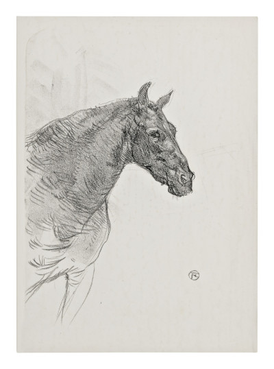
A pony's head turns towards the right, its long mane sweeping down the left side of the image. Short, dense marks describe the face, while broader, looser curves carry the neck towards the lower edge. Henri de Toulouse-Lautrec's Philibert the Pony makes an animal's head sufficient for an entire composition. The absent body is less important than the changing texture and direction of the lines we can see.
The Museum of Modern Art identifies the work as a lithograph of 1898, with an edition of fifty. Its impression, object 159.1946, was given by Abby Aldrich Rockefeller. The museum records the publisher as probably Lautrec himself and leaves the printer unidentified. Those qualifications are part of the record, rather than gaps to fill with an assumed workshop. [1]
At a Glance
- ArtistHenri de Toulouse-Lautrec.
- French titleLe poney Philibert.
- Date1898.
- Mediumlithograph.
- Edition50, according to MoMA.
- Publisherprobably Henri de Toulouse-Lautrec, Paris.
- Printerunidentified.
- MoMA impression159.1946, gift of Abby Aldrich Rockefeller. [1]
This work across Henri de Toulouse-Lautrec’s career
Contents
- A head seen from the side
- The mane changes the rhythm
- Texture without a painted coat
- The surrounding paper gives the animal room
- A named pony, with limits to the story
A head seen from the side
The head occupies the upper middle of the printed image and projects towards the right. The muzzle reaches into a relatively open area, while the neck enters from the left and continues downwards. This arrangement gives the pony a clear direction without enclosing it in a fully described stable or field.
The ears provide two pointed accents above the forehead. They interrupt the longer, curving line of the mane and help distinguish the head from the surrounding pale paper. Their upright forms are small, but they matter because the rest of the composition contains few similarly sharp projections.
The eye sits within a dense passage of marks. It is visible without becoming an isolated dark symbol pasted onto the face. Nearby strokes describe the forehead, cheek and the changing surface around it. We understand the eye as one feature within a closely observed head rather than as the sole carrier of expression.
The muzzle introduces another concentration of detail. Short strokes gather around the nose and mouth, making the end of the head feel more compact than the open neck below. The change of density gives the viewer a route through the animal: from ear and forehead towards the eye, then down to the muzzle.
The mane changes the rhythm
Along the left side, the mane is described through repeated curved marks. Some are close and dark; others extend more freely into the pale area below. Their changing length makes the hair feel different from the shorter marks used across the face.
The upper mane follows the neck's slope. Lower down, the lines loosen and sweep away, suggesting the fall and movement of hair without requiring every strand to be separately completed. That variation gives the neck an expansive quality beside the more tightly contained head.
The mane is also a structural device. It carries the composition down the left side and prevents the head from appearing to float alone near the top. Its long descent gives the image a vertical axis, while the face points horizontally towards the right. The meeting of those directions holds the arrangement together.
The contrast is worth looking at slowly. The head is bounded, with a recognisable muzzle and ears. The neck opens towards the lower edge through fewer and longer lines. The print lets one part feel compact and another part feel extended, using changes in mark-making rather than a heavy surrounding frame.
Watch: Toulouse-Lautrec
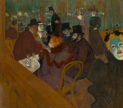
Choose an artist introduction, a film about graphic design or a closer look at At the Moulin Rouge.
Texture without a painted coat
The face contains a complicated network of short strokes and darker accents. These suggest changes in the coat and the planes of the head without relying on a continuous area of shading. Pale intervals remain visible among the marks, giving the surface a broken, responsive texture.
Across the broad neck, the description becomes less crowded. Longer lines can indicate the curve of the body while leaving much of the interior light. The shift keeps the animal from being treated as one evenly patterned surface. Different parts require different kinds of attention.
This is particularly effective around the transition from cheek to neck. A more concentrated head meets a broader, lighter area, allowing the face to project. The viewer does not need a strongly painted shadow to understand that change. Density, direction and the edges of marks do much of the work.
The result can look remarkably immediate in reproduction. Yet the work is a lithograph, not simply a unique pencil drawing. MoMA's material identification restores a fact that appearance alone cannot settle. Freely drawn-looking lines and a printed edition can belong to the same object. [1]
The surrounding paper gives the animal room
The right half of the sheet is comparatively open. That area gives the muzzle space to project and makes the pony's direction unmistakable. If the background were crowded with stable fixtures or other animals, the head would have to compete with more descriptive information.
A few faint surrounding marks suggest a wider environment without establishing a detailed location. They remain much less emphatic than the animal. We can recognise that the head is not set within a dense ornamental border while avoiding an invented account of a particular stable, owner or sitting.
The small monogram near the lower right supplies a separate compact accent. It is distant from the head and lighter in visual weight than the animal's central passages. Its placement makes the open field noticeable as part of the composition, rather than as paper that happens to remain after the subject has been drawn.
The sheet and the printed composition also have different boundaries. MoMA gives separate measurements for each: the composition is 37.5 × 26.5 centimetres, while the sheet is 55.8 × 35.8 centimetres. These measurements describe its particular impression and should not be confused with the size at which a cropped reproduction appears online. [1]
A named pony, with limits to the story
The title gives the pony the name Philibert. That is enough to make the work more particular than a generic equestrian study, but it does not supply a documented breed, owner or personality. The pose alone cannot establish that the animal was patient, stubborn or responding to a command.
What the print offers directly is a set of visible choices: the side-facing head, upright ears, dense facial marks and long mane. Those features provide a substantial encounter with the animal without depending on an anecdote. The viewer can attend to the pony as a body observed through line.
For comparison, The Little Pony of Calmese includes a complete animal, a small dog and a lightly indicated enclosure. Its arrangement asks us to compare scale and setting. Philibert concentrates attention instead on the differences between head, coat and flowing hair. The similar animal subject does not make the two prints interchangeable.
MoMA's gift credit and edition information give this impression a documented collecting and production context. They do not identify the printer or remove the museum's qualification about the publisher. Keeping those limits clear leaves the visual achievement undiminished: a head and mane occupy a broad pale sheet through a carefully varied vocabulary of marks. [1]
Toulouse-Lautrec artworks directory
Browse 84 identified works and publications in this researched selection. Dates and titles follow the individual records; this is not a complete catalogue of the surviving oeuvre. Print impressions remain attached to their designs. Some listed works do not have a dedicated article. The Drawings guide also contains nine illustrated studies consolidated from former articles.
Discussion
Look again at the images and ideas explored in Philibert the Pony by Henri de Toulouse-Lautrec. These editorial prompts invite your observations.
Reader Insights
How do the short face marks differ from the mane’s longer lines?
What does the open space in front of the muzzle contribute?
How does the absent body affect your attention to the head?
Join the Conversation
Share a detail, comparison or question about Philibert the Pony by Henri de Toulouse-Lautrec below.
References
- Museum of Modern Art, Philibert the Pony (Le poney Philibert), 159.1946: 1898, lithograph, edition, qualified publisher attribution, unidentified printer, composition and sheet measurements, and Rockefeller gift. Visual analysis is based on the reproduced print. View source.
- Autoportrait, 1880 (in French). View source.
- ALBERTINA: Der Schimmel Gazelle,GE123DL. View source.
- Franka Blok, Portrait of Vincent van Gogh, 2024. View source.
- Art Institute of Chicago: Moulin Rouge, La Goulue. View source.
- Art Institute of Chicago: At the Moulin Rouge. View source.
- Jane Avril, 1893. View source.
- Au Salon de la rue des Moulins (in French). View source.
- Colta Ives, Toulouse-Lautrec in The Metropolitan Museum of Art, 1996. View source.
- Maurice Joyant (in French). View source.
 Henri de Toulouse-Lautrec.jpg)