 by
Tom Gurney
Tom Gurney BSc (Hons) is an art history expert with over 20 years experience
Email:
tomgurney1@gmail.com
/ Phone:
+44 7429 011000
Henri Matisse, Amphitrite, 1947: Introduction
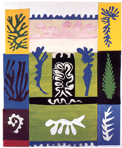
Henri Matisse's Amphitrite brings a small underwater world into an upright arrangement of colored paper. Long fronds rise at the sides. A rippling dark-blue line crosses the top, pale pink curves gather below it, and a white branching form holds the center against black. Near the bottom, a broad green rectangle carries a pale cut shape that could suggest a fish or a plant. The picture does not settle each shape into one label. Its marine signs work through color, repetition and changing outlines.[1]
The correct title is Amphitrite, although this page retains its established /anfitrite/ address. The Museum of Modern Art's 2014 exhibition checklist and catalogue identify the work as a 1947 composition in gouache-painted paper, cut and pasted, measuring 85.5 × 70 centimeters. They listed it in a private collection at that time. That historical label should not be read as a current ownership statement. The work is a separate cut-paper collage, not an illustration from Matisse's book Jazz as the older page claimed.[1][2]
At a Glance
- Artist Henri Matisse
- Work Amphitrite
- Date 1947
- Explore Cut paper and drawing
This work across Henri Matisse’s career
Dance (1910)
1910The Red Studio
1911The Piano Lesson
1916The Snail
1953Contents
- What can you see in the colored blocks?
- Why is it called Amphitrite?
- How was this paper world made?
- Where did it sit in Matisse's studio work?
- How should you return to the image?
What can you see in the colored blocks?
Begin with the structure rather than looking for the goddess named in the title. Two tall yellow blocks cap the upper corners, while the middle opens into pale paper. Below, columns of deep blue, near-black and green form a darker central zone. A red-purple strip at lower left and a blue strip at lower right anchor the bottom. These rectangles make the composition feel built from adjacent panels. Organic paper silhouettes then interrupt their straight edges, so the image continually moves between a colored grid and an imagined living world.
The side forms give the strongest suggestion of undersea growth. In the upper-left yellow area, a dark branching cut-out spreads upward and outward like coral or seaweed. A related form descends on the upper-right yellow area. Lower down, the dark-on-blue form at left, green-on-black form at right and white-on-blue form at the lower right all keep a branching rhythm. They are similar enough to make a family of shapes, yet their scale, color and direction differ. The repetition lets the eye recognize a marine vocabulary without requiring Matisse to draw one identifiable species.
Across the upper middle, a dark-blue scalloped band makes a wavering boundary. It might recall the surface of water, but it can also be read simply as a cut-paper rhythm between pale spaces. Under it, broad pink curves hover across a cream field. Their loops are much softer than the spiky side forms. They might suggest clouds, a body, floating plants or reflected light; the surviving image does not compel one answer. The uncertain reading matters because the collage invites us to shift between a picture of things and an arrangement of shapes.
At the center, two blue vertical forms flank a white branching one over black. The white form is especially active: its pale outline seems to turn inward and outward as it rises, while the blue forms stand more upright. A white wavy line below it runs across a narrow black strip. The effect is of growth or movement held temporarily within a rigid frame. No painted shading makes the forms recede. Matisse creates depth through overlap, color contrast and the eye's tendency to place a pale shape forward against darkness.
The broad green lower rectangle changes the pace. Its central white form extends horizontally, unlike the side fronds that grow vertically. It can look like a fish with a tail, a plant laid sideways or another freely cut sign. Holding those possibilities open is more faithful to the picture than confidently naming an exact creature. The blue sawtooth pattern along the bottom echoes the scalloped blue near the top, making the composition feel bounded by motion. A viewer can move down through the collage and then be carried back upward by repeated wavy and branching contours.
Why is it called Amphitrite?
Amphitrite is the sea goddess in Greek mythology and the wife of Poseidon. The Getty's iconography record confirms that association. Matisse's title makes a marine reading reasonable, but it does not prove that a particular blue or pink cut-out is the goddess, or that the collage illustrates a named episode from myth. There is no clear trident, chariot or single human figure organizing the whole scene. The title works more like an invitation into a sea realm than a caption that labels each shape.[3]
That openness differentiates the work from a conventional depiction of a classical figure. In many artworks Amphitrite appears as a woman accompanied by Poseidon or marine animals. Here colored rectangles and organic signs dominate. A viewer can think of the goddess as a presence implied by the underwater setting rather than a portrait hidden in one contour. This is an interpretation, not a claim that Matisse documented a precise symbolic program. His cuts give the theme room to remain suggestive.
The sea had been a recurring source for Matisse long before this collage. Saint Louis Art Museum's Matisse and the Sea research connects his late cut-outs with seaweed-like forms, lagoon memories and marine imagery. That context helps explain why fronds and water-like bands were available to him as a visual language in 1947. It should not be used to assign this particular arrangement to one actual lagoon or to say that every colored block represents a mapped location. Amphitrite turns remembered marine forms into a deliberately constructed paper field.[4]
Watch: Matisse’s art and working methods
Choose a museum film or a close reading to continue exploring Matisse’s work.
Matisse: The Cut Outs
Tate introduces its exhibition devoted to Matisse’s cut-paper work.
Watch on YouTubeHow was this paper world made?
The MoMA record identifies gouache on cut and pasted paper, not oil paint. Gouache is an opaque water-based paint. MoMA's technical account explains the wider method: assistants prepared sheets of paper and painted them with gouache; Matisse chose colored sheets and cut shapes from them. Pieces could be pinned while an arrangement was tested, then mounted for stability. That account describes a studio practice, not a documented step-by-step order for every part of Amphitrite.[1][5]
The method joins color and outline. In a conventional drawing, a line may come first and color be filled inside it. Here a cut edge determines the colored shape and the neighboring space at the same time. The dark coral-like form on yellow is not a dark drawing over a yellow area; it is a separate shape whose perimeter does the descriptive work. The white figure in the black central strip has force because white remains bright against black and because its branching edge keeps turning. Each material decision changes the surrounding empty space as well.
Straight rectangles and free silhouettes appear to compete, but they also depend on one another. The blocks give each cut-out a colored ground. A frond becomes dark against yellow, pale against blue or green against black. Conversely, a branch or fish-like form makes its rectangular field feel less like an abstract tile and more like an area containing motion. The viewer alternates between seeing a patchwork of paper and entering an underwater scene. That movement is the particular achievement of this compact cut-out.
Where did it sit in Matisse's studio work?
MoMA places Amphitrite among the cut-outs associated with Matisse's Villa le Rêve studio in Vence. Its 2014 digital exploration groups the work with other 1947 pieces, including Panel with Mask, Composition, Black and Red and Two Masks (The Tomato). Those works share a method and period, but they are not sections of Amphitrite and need their own titles and object records. The studio grouping helps locate this collage in an active experiment with colored backgrounds and free-cut motifs.[6]
An auction catalogue for the neighboring Composition with Red Cross discusses a studio photograph from about 1947 in which Amphitrite appears beside it. This is useful evidence that the works could be viewed together on Matisse's walls before their separate later lives. The catalogue describes changes to the red-cross composition between studio display and its 1949 exhibition; those changes should not automatically be assigned to Amphitrite. What transfers securely is the setting: multiple cut-paper works could occupy a working wall while Matisse tested color and placement.[7]
Compare Composition, Black and Red, another 1947 work listed in MoMA's Vence group. Its smaller, strongly contrasting fields show how Matisse could work within a compact collage rather than a room-wide mural. Amphitrite uses more distinct color blocks and a stronger array of branching shapes to make the surface feel populated. The comparison is about a shared cut-paper practice and a difference in arrangement, not a claim that one was a study for the other.[6]
The 1947 date also helps separate this independent composition from Jazz. Matisse did make cut-paper designs for the book, whose colored images were printed as pochoir plates in 1947. A shared year and technique do not make every 1947 cut-out a Jazz plate. The MoMA checklist lists Amphitrite by itself, with its own dimensions and private lender; its Jazz items are separately identified as book maquettes or printed plates. Reading the old page's “illustration” claim into the object would blur two kinds of work that the museum distinguishes.[1][2]
How should you return to the image?
Start at the two yellow corners and trace the dark fronds inward. Cross the blue wave at the top, then let the softer pink curves slow the eye. The central black-and-white strip is the sharpest contrast; after it, the pale horizontal form on green changes direction. On a second look, notice how the blue and white shapes can belong to several possible sea creatures or plants. The work's title supplies a setting, while its paper edges keep that setting mobile.
The broad color relationships and visible contours can be read in reproduction, but the joins and pinholes of a cut-paper collage demand much closer inspection. The 2014 MoMA exhibition listed the original in a private collection; that dated record does not establish its present location. For the technique beyond this one collage, the cut-outs guide connects Amphitrite to the broader practice while keeping its own 1947 identity clear.[1][5]
Explore 113 Matisse artworks
This directory covers the 113 individual works explored in these articles, rather than a complete catalogue of Matisse’s output. Cut-paper designs and prints appear under Drawing in the medium filter; each row names its form. Dates retain the qualifications explained in the linked articles.
Discussion
Look again at the images and ideas explored in Henri Matisse, Amphitrite, 1947. These editorial prompts invite your observations.
Reader Insights
What can you see in the colored blocks?
Which comparison discussed in the article helps you see the work differently?
How do the materials and historical setting affect your reading?
Join the Conversation
Share a detail, comparison or question about Henri Matisse, Amphitrite, 1947 below.
References
- Museum of Modern Art , Henri Matisse: The Cut-Outs (2014), exhibition checklist, Amphitrite entry, PDF p. 15. View source .
- Museum of Modern Art , Henri Matisse: The Cut-Outs (2014), catalogue preview, catalogue no. 55 and illustration. View source .
- J. Paul Getty Trust , Cultural Objects Names Authority, “Amphitrite”, mythological identity. View source .
- Saint Louis Art Museum , Matisse and the Sea , gallery research, marine vocabulary and late cut-outs. View source .
- Museum of Modern Art , “The Cut-Outs,” materials and techniques, gouache preparation, cutting, pinning and mounting. View source .
- Museum of Modern Art , Vence studio exploration, 1947 cut-out group and object labels. View source .
- Christie's , catalogue note for Henri Matisse, Composition à la croix rouge , description of the Vence studio photograph including Amphitrite . View source .
 Henri Matisse.jpg)