

 by
Tom Gurney
Tom Gurney BSc (Hons) is an art history expert with over 20 years experience
Email:
tomgurney1@gmail.com
/ Phone:
+44 7429 011000
Henri Matisse, The Snail , 1953: Introduction
An orange border encloses a field of white paper. Within it, large pieces of purple, green, red, yellow, blue, pink and black seem to turn around one another. None has been shaped into a realistic mollusk. Yet Henri Matisse called this nearly square, nearly three-metre work The Snail , or L'Escargot . Made in 1953 , it asks us to follow a shell's suggestion through color, spacing and movement rather than locate a neatly drawn animal. The work belongs to Tate; its recorded medium is gouache on paper, cut and pasted on paper mounted on canvas , and its dimensions are 286.4 × 287 centimetres . [1] [2]
That size changes the experience of its simple-looking forms. A block that appears small in a book or on a screen would occupy a substantial area of wall in front of a viewer. The white intervals are substantial too. They make room for the colored pieces to turn, pause and meet. This is a work made with painted paper, not an enlarged sketch or a design that only became art when it was printed. Its irregular edges, gaps and joins are part of the original composition.
At a Glance
- Artist Henri Matisse
- Work The Snail
- Date 1953
- Explore Cut paper and drawing
This work across Henri Matisse’s career
Contents
- What are we looking at?
- How was The Snail made?
- Why does the white paper matter?
- What do the colors do?
- Is the snail a picture or an abstraction?
- Where does the work belong in Matisse's final years?
- Annotated details
What are we looking at?
The clearest outer shape is the orange frame. It runs around the perimeter, making the white interior look like a space deliberately held open. Colored pieces cluster within that field. Toward the center, black acts as a weight among brighter hues; elsewhere, green, red and purple-pink forms press in from different directions. A blue piece sits low in the arrangement. The shapes are roughly rectangular in places, but their outlines refuse the precision of a ruler. Some edges look sheared, some torn, some slightly angled.
The title invites the eye to travel around this center. MoMA describes the colored sheets as a concentric composition that echoes a snail's shell. It is a helpful description of the whole, though no single drawn spiral joins every piece. The sense of turning arises through placement: an outer color gives way to another, a gap changes the direction of looking, and the dark middle suggests a point around which the larger forms gather. This shell reading need not turn each rectangle into a body part. The work remains visibly an arrangement of paper. [3]
Look first at the orange around the edge and then inward. The white field interrupts any easy slide toward the middle. Its openings vary in width, and the colors seem to move at different speeds because of those intervals. A dark form makes one part of the center dense; a bright patch makes another appear to leap forward. The eye can trace a circuit, but it can also begin somewhere else and find a different sequence. The title offers a way of seeing, not a diagram with one required route.
Matisse's own account, reported by Tate, connects the work to an observed animal. He said he began by drawing a snail from nature, arrived at a mental image purified of its shell and then took up scissors. This account supports a path from observation to simplification. It does not establish that the finished work copies one preparatory drawing or that a large series of snail studies preceded it. The change from observed creature to cut shapes is the subject's transformation, not the disappearance of the subject altogether. [1]
That transformation explains why viewers may first see an abstract pattern and then begin to sense a spiral. Neither response is a mistake. The name The Snail does real work: it encourages us to connect separate pieces into a circling structure. At the same time, the colors and edges are strong enough to remain interesting when we stop trying to identify the animal. Matisse allows recognition and abstraction to take turns.
How was The Snail made?
Gouache is opaque, water-based paint. For the late cut-outs, sheets of paper were painted with it and then cut into shapes. The process brought painting, drawing and physical arrangement together. Color entered the work before the paper was cut, while the cut edge established the contour of each form. A description such as “paper collage” is accurate only if it preserves both parts: the painterly surface of the sheets and the decision about where each shaped piece would go. [4]
The material line on Tate's work distinguishes several layers. There is gouache on paper ; that paper was cut and pasted on paper ; the support was then mounted on canvas . This is the finished object's recorded construction. It is not a conventional oil painting whose colored forms were brushed directly onto one canvas. Nor is it merely a photograph of a temporary arrangement on a studio wall. A reproduction flattens these stages into one image, while the original retains the physical fact of separate, worked sheets. [1] [2]
Matisse developed such compositions by placing painted shapes on the wall, looking, adjusting and sometimes moving them again. Museum accounts of the late cut-outs describe assistants preparing colored sheets and helping pin pieces under his direction. The wall was a working surface where relationships could be tested at a scale close to the intended work. Pinning was provisional; pasting made a particular arrangement lasting. For The Snail , the institutional descriptions support this general working method but do not provide a piece-by-piece log of each move. The final composition is evidence of choices, not a record of every rejected trial. [3] [4]
The Centre Pompidou describes paper in The Snail as torn by hand, alongside the cut-paper medium recorded by Tate. That matters when reading the surface. A torn edge does not behave exactly like a clean scissor line. It can look softer, rougher or more open. The range of edges keeps the broad colored blocks from behaving like mechanically perfect tiles. Each piece has its own contour, and the small irregularities affect how closely one seems to touch another across the white ground. [4]
The work's apparent immediacy can conceal its labor. Painted sheets had to be prepared; large pieces had to be handled, positioned and assessed at room scale; the relation between colored blocks and open paper had to hold together across more than eight square metres. Matisse's scissors could make a decisive curve or angle, but decisiveness is not the same as a single unplanned gesture. The resulting picture looks light and mobile because a substantial material process has been compressed into a clear set of relations.
Annotated Details from The Snail
The numbered points identify visible features discussed in this article. Return from each detail to the whole composition. The Snail — Henri Matisse
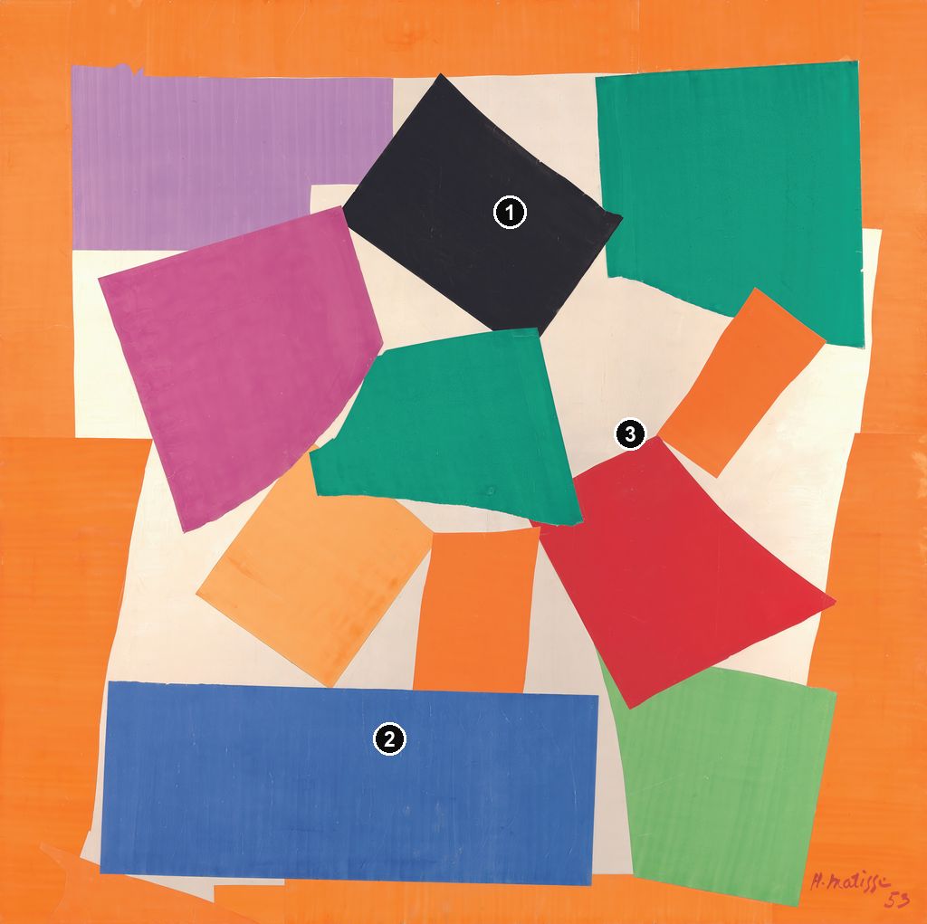
Details from THE SNAIL
Compare the cropped details with the complete images above. Notice how their colours, shapes and positions contribute to the larger compositions.
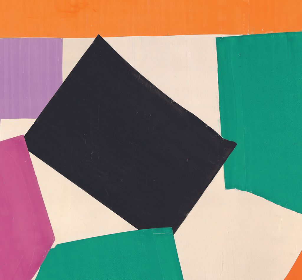
An angled dark form
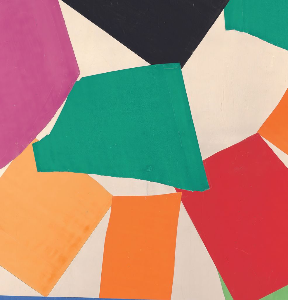
The near-black piece tilts above the centre. Its angle helps turn the surrounding blocks instead of locking them into a regular grid.
A broad blue base
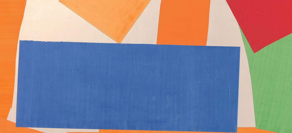
A wide blue rectangle anchors the lower area. Its long edge differs from the more sharply tilted pieces above it.
The white turning spaces
White openings wind among the coloured pieces. The eye follows these gaps as well as the blocks, making a turning movement without a literal shell outline.
Why does the white paper matter?
The white is more than a neutral background. It surrounds, separates and sometimes seems to pass between the colored forms. Against it, a green piece has a clean presence even when its edge is uneven. A red area can feel close to a purple or black one without actually touching it. These gaps create rhythm: close meetings of color followed by stretches of quieter space. Removing the white or filling it with another strong hue would alter the apparent movement of the whole.
The orange perimeter gives that open white field a boundary. It is easy to imagine the colored forms expanding endlessly beyond the picture, but the border makes them feel gathered within a definite space. The border also creates a relation between outside and inside. Orange appears as a broad enclosing color rather than merely another small participant in the center. Its warmth affects how the blue and green areas register, while the white keeps those contrasts from collapsing into one solid mass.
At first the broad white passages may resemble empty spaces left after the “real” shapes were added. Yet their contours have been made by the placement of everything around them. A notch of white between two pieces can pull the eye inward; a wider stretch can hold it back. The negative spaces do as much compositional work as the colored papers. This is especially evident where a dark form and a vivid one would compete too strongly if no white intervened.
Looking from a distance, the whole appears legible as a set of large colored events. Moving closer, the junctions, angled edges and changing widths of white become easier to notice. The composition therefore rewards two ways of looking. From across a room it offers a strong, turning figure; at close range it shows how a sequence of physical decisions sustains that figure. A small digital image can suggest the color plan but cannot reproduce this shift in bodily scale.
Watch: Matisse’s art and working methods
Choose a museum film or a close reading to continue exploring Matisse’s work.
Matisse: The Cut Outs
Tate introduces its exhibition devoted to Matisse’s cut-paper work.
Watch on YouTubeWhat do the colors do?
Tate singles out red and green , orange and blue , and yellow and mauve as complementary pairs in the work. These oppositions help explain the liveliness of the surface. Warm and cool pieces can intensify one another even when separated by white. Yet the composition does not read as three isolated demonstrations of a color rule. Black adds weight, pink and purple complicate the warm-cool split, and differing areas of each hue keep the picture from becoming a color chart. [1]
The red and greens are especially active because they occur among the central shapes rather than only at the boundary. Their relation changes as the eye moves. A green may answer red across a gap, while another green draws attention toward a neighboring purple or black. Instead of assigning one fixed opponent to each piece, it is more useful to notice how several colors compete for the next glance. The composition stays animated because its relations cannot be exhausted in a single comparison.
Orange has a different job. As the broad outer band, it frames the work before we make out its turning interior. Blue, placed low, feels concentrated by comparison. The two hues offer one of Tate's named pairs, but their roles are unequal: one encloses, the other sits within the field. That inequality gives the colors a sense of direction and scale. They are not interchangeable swatches. Where orange seems to announce the picture, the small blue presence helps arrest the gaze inside it.
Yellow and mauve or purple-pink contribute another tension. A light, bright area can appear to push outward while a cooler, darker piece pulls back toward the center. These are effects of visual relation, not evidence that Matisse assigned symbolic meanings to individual colors. The title names an animal and a movement, not a code in which red must mean one emotion and blue another. The work gains force through precise placement without needing such a translation.
Black is just as necessary as the saturated colors. Near the middle it interrupts the easy cheerfulness a viewer might expect from the bright paper. It gives the composition a point of density, one that can make the surrounding hues appear lighter and more mobile. In a small reproduction this may look like a simple dark patch; in the full work it is a large shape with a material edge. Its weight helps the loose spiral hold together.
Is the snail a picture or an abstraction?
The answer depends partly on how one approaches it. There is no continuous outline of a shell, no carefully painted body or antennae, and no natural setting. If the title were hidden, a viewer might speak first of colored blocks, a turning structure and a strong border. Once the title is known, the turn becomes easier to associate with the spiral of a shell. The image does not require us to choose between those descriptions. It lets an observed motif survive as a relation among shapes.
MoMA's description of The Snail as one of the most abstract cut-outs is persuasive because the animal is present in the organization rather than in an easily separable silhouette. Compare a work such as Blue Nude II , where cut paper still describes a recognizable seated body. In The Snail , the reference has been reduced further. The comparison is about different degrees of legibility within one medium, not a claim that Matisse stopped caring about things seen in the world. [3]
The word “abstract” also should not make the making seem effortless or accidental. The forms have edges chosen by cutting and tearing, colors selected from painted sheets, and positions tested against one another. The spiral is loose because Matisse did not turn it into a graphic symbol with a single continuous line. A viewer can feel the turn across a field of interruptions. In this sense the breaks between pieces are part of the shell idea: the eye has to do some of the joining.
It is tempting to identify one shape as the animal's head, another as its body, and the dark center as a literal shell opening. Such a map quickly becomes unstable. The composition provides no clear anatomical boundary for these claims, and museum descriptions emphasize a shell-like concentric arrangement rather than a keyed diagram. The stronger reading respects the work's deliberate uncertainty. It takes the title seriously while allowing paper, color and space to remain visible as paper, color and space.
Where does the work belong in Matisse's final years?
Matisse made The Snail at the Hôtel Régina in Nice in 1953, during the last phase of his career. Large cut-outs were central to that phase, but they did not arise from a simple inability to paint. Their very medium depends on painted gouache, and Matisse had explored cut and arranged paper in earlier projects. In the 1950s the method became capable of work at architectural scale. The Snail shows what that method could do when an observed subject was pared down to colored relations across a near-square expanse. [1] [4]
The Centre Pompidou groups The Snail with other large 1953 projects, including Memory of Oceania , La Gerbe and Acanthes . These titles point to different subjects and arrangements; they should not be treated as versions of one design. What they share is the ambition to organize separate painted-paper forms over a substantial area. In Memory of Oceania , for example, MoMA records cut-and-pasted gouache paper with charcoal on a paper-and-canvas support. That work's imagery and additional drawn marks make it distinct from Tate's snail, even though both explore how fragments can create a whole. [4] [5]
The Swimming Pool offers another useful comparison from 1952 . It extended along the walls of Matisse's dining room and used marine forms across a long, site-specific band. The Snail gathers movement into a nearly square field instead. One composition asks the eye to travel along a room; the other makes it turn within a bordered area. The same painted-paper method could support both a work fitted around an interior and an independent, mounted composition. [6]
Earlier cut-paper projects also matter, but their physical outcomes must be kept separate. The designs for Jazz led to a printed book made through pochoir, a stencil process. Tate's The Snail is an original assemblage of gouache-painted paper on a mounted support, not a plate from that book or a later poster design. The common ground lies in Matisse's exploration of cut contours and color. The difference lies in what the viewer actually confronts: a singular, monumental arrangement rather than a printed sequence. [3]
Cut-outs were publicly presented during Matisse's lifetime: the Centre Pompidou records a dedicated exhibition in spring 1953 . Tate and MoMA later included The Snail in their 2014 exhibition accounts of the medium, while Tate had acquired the work in 1962 . Those facts give the work a documented institutional history. They do not support the claim that cut-outs were ignored until long after the artist died in 1954 . Nor does their later fame explain away the choices visible in this particular object. [4] [1] [2] [3]
Return finally to the white near the center. Follow it outward between the darker and brighter papers, then around the colored blocks toward the orange edge. The route will not be perfectly smooth; it will stop and restart at a gap or angled corner. That intermittent movement is one of the work's pleasures. Matisse could suggest a snail without illustrating one, because the viewer completes the turn through the relations he set in place. See the cut-outs guide for the medium, Memory of Oceania for another large 1953 composition, and The Swimming Pool for a work arranged around a room.
Explore 113 Matisse artworks
This directory covers the 113 individual works explored in these articles, rather than a complete catalogue of Matisse’s output. Cut-paper designs and prints appear under Drawing in the medium filter; each row names its form. Dates retain the qualifications explained in the linked articles.
Discussion
Look again at the images and ideas explored in Henri Matisse, The Snail , 1953. These editorial prompts invite your observations.
Reader Insights
What are we looking at?
Which comparison discussed in the article helps you see the work differently?
How do the materials and historical setting affect your reading?
Join the Conversation
Share a detail, comparison or question about Henri Matisse, The Snail , 1953 below.
References
- Tate , The Snail artwork description, date, place, medium, dimensions, artist's snail account and color relationships. View source .
- Museum of Modern Art , The Snail audio entry, Tate ownership, full medium and dimensions, and 1962 purchase credit. View source .
- Museum of Modern Art , Henri Matisse: The Cut-Outs press release, late cut-out process and the concentric shell reading. View source .
- Centre Pompidou , Matisse 1941–1954 press kit, process, wall arrangement and 1953 large-work context. View source .
- Museum of Modern Art , Memory of Oceania , distinct 1952–53 cut-out, medium and support. View source .
- Museum of Modern Art , The Swimming Pool , distinct site-specific 1952 cut-out. View source .


 Henri Matisse.jpg)