 by
Tom Gurney
Tom Gurney BSc (Hons) is an art history expert with over 20 years experience
Email:
tomgurney1@gmail.com
/ Phone:
+44 7429 011000
Henri Matisse, The Red Room (Harmony in Red) , 1908: Introduction
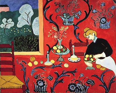
Red seems to fill a room, a table and much of the canvas at once. Blue curling lines spread across that red, while fruit, vessels and a woman at work remain visible within it. At the left, a window opens onto a green garden. Henri Matisse's The Red Room , also widely called Harmony in Red or The Dessert: Harmony in Red , is a painting that makes an ordinary domestic setting feel almost wall-sized. The State Hermitage Museum in Saint Petersburg owns the oil on canvas , dates it 1908 , and records its dimensions as 180.5 × 221 centimetres and inventory as ГЭ-9660 . It was conceived as a decorative panel for collector Sergei Shchukin's dining room in Moscow. [1]
The red does not erase the room. A table edge, chair, figure and window still let us orient ourselves, while the pattern moves over boundaries that would normally separate furniture from wall. This is the central tension of the picture. Matisse gives us enough information to recognize an interior and a garden, then refuses to keep every surface visually apart. The scale matters: from across a room, the red can dominate as a broad field; closer in, the many small objects and turns of blue line begin to insist on their own identities.
At a Glance
- Artist Henri Matisse
- Work The Red Room (Harmony in Red)
- Date 1908
- Explore Painting
This work across Henri Matisse’s career
Dance (1910)
1910The Red Studio
1911The Piano Lesson
1916The Snail
1953Contents
- Which painting is this?
- What happens across the table?
- How can a wall and table share one red?
- Why does the blue ornament matter?
- What does the window open onto?
- What is the woman doing?
- Was the painting always red?
- Why did Shchukin want a decorative panel?
- How does it differ from The Dinner Table?
- How does it differ from The Red Studio?
Which painting is this?
The Hermitage's current Russian title is Krasnaia komnata , or The Red Room . Other museum publications call the same Hermitage canvas Harmony in Red and sometimes use the French La Desserte or the English The Dessert: Harmony in Red . The different titles can shift emphasis—from a colored room to a composition of related hues to a table being set—but they do not identify separate works here. The museum number ГЭ-9660 , size and Shchukin history anchor this one physical painting. [1] [2]
The English word “dessert” in a familiar alternate title should not send a viewer hunting for a documented sweet course. The picture shows a table with fruit and vessels, a woman nearby and a decorated interior. Its French title and the Hermitage's room title direct attention to the arrangement rather than a menu. Tracking the titles is useful because it prevents a second, quieter confusion: interpreting a catalogue label as evidence for exactly what meal was served in the painted room.
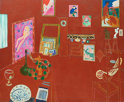
Nor is it Matisse's The Red Studio . That later 1911 canvas belongs to the Museum of Modern Art in New York and shows the artist's working room at Issy-les-Moulineaux with many artworks inside it. The Hermitage painting shows a dining interior and a garden opening, and it was intended for Shchukin's dining room. Both use a large red field, but they transform different spaces and have different histories. A search for “Matisse red room” can bring up either, making title, date and owner especially useful. [3] [1]
The Hermitage records that Matisse made the painting in a Paris studio overlooking a monastery garden . This gives a plausible setting for the view beyond the window, although the painted opening should not be treated as a literal photograph of that garden. The artist selected and organized what the picture needed. The museum describes the canvas as a decorative panel , the term Matisse used for its intended role. Its width exceeds two metres, so it was built to occupy an architectural setting, not merely to reproduce a small tabletop scene. [1]
What happens across the table?
The table reaches toward us from the middle of the picture. Its cloth is red, with scrolling blue ornament that loops among bowls, fruit and vessels. Yellow and green pieces of fruit stand out as discrete forms against the warm ground. A glass or bottle and a vase punctuate the center and left; stems and flowers rise upward. These smaller objects help our eyes locate the tabletop even as the cloth's red nearly matches the wall behind it.
At lower left a chair is partly cut off by the picture's edge. Its back and seat supply a recognizable piece of furniture and a measure of scale. Another chair appears farther back near the window. Together with the table edge, they remind us that a person could move through this interior. Yet neither chair forces the space into a single, camera-like system of perspective. They are clear enough to be furniture and spare enough to coexist with the red pattern around them.
The fruit is not painted as an isolated still life against a neutral ground. It belongs to a room where tablecloth, wall, figure and garden are all present. Follow a yellow round form across the table and it may echo another circle in a flower or leaf. Follow a blue scroll and it can lead past one bowl toward the woman. Matisse uses repeated contours to make the tabletop active as part of the whole painting. The objects are identifiable, but they also serve the movement of color and line across the canvas.
The cloth's edge is important precisely because it is not always obvious. A line or change of direction tells us where the table turns downward, but the red continues. The same blue ornamental language appears above, on what we read as wall. The eye has to decide where a horizontal plane ends and a vertical one begins. MoMA's retrospective account emphasizes this continuity: a pattern that first looks like tablecloth climbs into the wall area and surrounds the woman. The room has not disappeared; its divisions have been made less absolute. [2]
There are small intervals of white, yellow and green on the table that prevent the red from becoming monotonous. The pale dish at the right and brighter fruit beside it draw attention toward the woman. A vase closer to the center sends flowers upward, visually connecting the table to the broader field above. These accents do not weaken the red's authority. They make the large color area readable at a human scale, giving the viewer points from which to begin exploring it.
Annotated Details from The Red Room (Harmony in Red)
The numbered points identify visible features discussed in this article. Return from each detail to the whole composition. The Red Room (Harmony in Red) — Henri Matisse
.jpg)
Details from THE RED ROOM (HARMONY IN RED)
Compare the cropped details with the complete images above. Notice how their colours, shapes and positions contribute to the larger compositions.
Window and garden
The cool garden is bounded by the opening at left. Its pale trees and green ground offer a different space from the red interior.
 Detail 01 window-and-garden.jpg)
The blue pattern crosses surfaces
Blue curling forms continue over the red table and wall. Their repetition makes the boundary between the two harder to isolate.
 Detail 02 the-blue-pattern-crosses-surfaces.jpg)
Fruit, vessels and the figure
Small rounded objects and the figure punctuate the red. Their compact contours remain readable within the larger field of pattern.
 Detail 03 fruit-vessels-and-the-figure.jpg)
How can a wall and table share one red?
Ordinarily an interior painting might use changes in light, shadow or local color to distinguish wall from tablecloth. Matisse instead lets a strong red-crimson field occupy both. The Hermitage describes a lavish red cloth whose energetic blue design descends from the wall onto the table, making the two a unity. This is a museum interpretation of a visible effect: the space seems to contract toward the picture plane even while the furniture remains recognizable. The red behaves almost like a stage on which the remaining forms appear. [1]
It would be too simple to say that the work is completely flat. The tabletop has an edge and a direction; fruit rests on it; chairs have backs and seats; the woman's arm reaches toward objects; the window opens away from the room. All these cues produce depth. They simply do not combine into a consistent illusion of a box-shaped chamber. Matisse keeps depth available where it helps one read an action or object and relaxes it where a continuous color field can do more compositional work.
This selective depth makes the red feel expansive. Because wall and cloth are close in hue, the picture can be read first as one broad area before individual surfaces separate. Blue lines help the separation happen and undo it again: a curl may seem to belong to fabric in one place and to a wall design in another. The viewer is continually switching between “what is this?” and “where does this color lead?” That switching is a concrete part of looking at the painting, not a theory imposed on it afterward.
The near-monochrome area also alters the role of every other color. Yellow fruit looks brighter against red; green outside the window feels sharply distinct; blue ornament seems to vibrate. The woman wears dark clothing that gives her a solid presence amid the scarlet. White details catch the eye because there are not many of them. Matisse did not paint every surface with the same intensity, and those differences create a hierarchy within a composition that can initially appear all-over.
“Harmony” in the title should therefore not be confused with quiet uniformity. The picture brings unlike things into relation: a warm field and cool pattern, a near surface and a distant garden, flat decoration and modeled objects, a working figure and a setting that almost absorbs her. Their coexistence is what the title helps us notice. The work is calm in its overall organization while full of small visual conflicts that hold attention.
Why does the blue ornament matter?
The vine-like blue lines do not merely fill gaps in the red. They give the eye a route across the entire canvas. Some curves rise around the central vase; others spread beneath the objects on the table; still others climb the wall toward the top. The pattern can look botanical without becoming a diagram of one plant. It links areas that architecture would separate, and it lets the painting keep moving even where no figure or still-life object occupies the field.
The blue is not the same everywhere. Darker outlines and lighter strokes vary the pressure of the scrolls. Near the top, broad loops occupy a relatively open red field; lower down, the pattern threads between fruit, dishes and table edges. This change in density keeps the ornament from reading as a mechanically repeated wallpaper. The same kind of line can do different work depending on whether it surrounds an object, touches a boundary or opens into an empty red passage.
MoMA's 1992 account describes a remarkable ambiguity: similar linear marks can stand for cloth design, wall design, flower forms and even nature beyond the window. That is not a claim that all those things are literally identical. It is a claim about the picture's vocabulary. Matisse can make a blue curve respond to another curve across a change of subject. One part of the canvas becomes legible through its relation to another, even as the viewer still recognizes table, wall, vase and garden. [2]
The pattern also affects time spent with the work. From a distance, red may seem to absorb the room. At closer range, the scrolls require slower tracking; a line turns, branches and returns. That movement can carry the eye past the woman's arm, across a still-life group and toward the left window. The painting does not supply one central point where everything resolves. Its ornament distributes attention, making the whole surface active without giving every place equal visual weight.
Calling the painting “decorative” need not mean it has no subject. The room, food, vessel, seated or bending figure and garden are all concrete. Decoration is the means through which they are joined. The Hermitage's account treats the design as energetic and growing, while also noting the straight lines and gentler contours that quiet it. Those two kinds of movement—vigorous curls and stable edges—help explain why the red room can feel both animated and ordered. [1]
What does the window open onto?
At the left, the red stops at a rectangular opening. Green foliage, pale flowering trees and a lighter sky create an outdoor view. This is the strongest change of place in the painting. After the eye has followed the blue ornament over red wall and table, it can move through the opening into a different color world. The window supplies distance without requiring the interior itself to become deeply modeled. Its frame establishes a clear boundary even though the vine-like shapes inside and outside echo one another.
The view has its own layers. Darker green sits low, paler tree forms rise above it, and a light passage lies farther back. These distinctions make the garden feel more distant than the table. Yet its flowering shapes are also simplified enough to join the patterning elsewhere. The tree branches can be read as part of nature beyond the window and as another family of curving marks on the canvas. Matisse lets the window separate two spaces while the painting's lines keep them related.
The Hermitage explains that the window gives the eye a way into depth within the large red field. That is an important qualification to the usual description of this painting as “flat.” A picture can assert its surface and still contain openings that imply elsewhere. The garden is not merely a small green patch added for contrast; it changes how we understand the red as an interior. Without it, the wall and table might be harder to distinguish from a single patterned textile. With it, the red becomes a room whose boundary we can see across. [1]
The placement of the window also balances the figure on the right. One side opens outward; the other contains a person bending toward work at the table. The eye can move from garden to vase and then toward her without abandoning the blue and red network that holds the image together. This side-to-side relation gives the wide canvas a clear large-scale organization. It is not symmetric in the strict sense—the window and woman have different shapes and activities—but each prevents the other side from feeling empty.
We need not insist on an exact botanical account of the trees. At this scale in a small reproduction, pale blossoms and branching forms are visible, but species would be a guess. The important facts for reading the painting are their contrast with the room, their vertical movement and the sense of air behind them. The outdoor view does not turn the work into a landscape painting. It makes the interior more complex by allowing one different world to appear within it.
Watch: Matisse’s art and working methods
Choose a museum film or a close reading to continue exploring Matisse’s work.
MoMA Conservators discover Matisse's process for "The Red Studio" | CONSERVATION STORIES
Conservators examine the making of The Red Studio.
Watch on YouTubeWhat is the woman doing?
At the right, a woman bends toward the table. Her dark upper clothing and pale face contrast with the red behind her; a light cloth below gives her figure another clear boundary. Her hands are near a dish or bowl with fruit. The action is domestic and specific enough to see, but the painting does not identify her by name, occupation or relationship to the artist. Calling her a servant because she is near a table would import a social identity the owner record does not establish. The visual fact is a person engaged with the still-life setting.
Her pose breaks the long horizontal of the table. The head tilts downward; the shoulder and arm angle toward the dish. These diagonals bring movement into a room whose broad red surface might otherwise feel fixed. The viewer can follow her gaze to the object she handles and then along the spread of fruit. She is not a portrait confronting us. Her absorbed action keeps our attention within the space of the painting rather than returning it from the canvas as a look.
The Hermitage describes the figure as capable of moving within the red space despite the force of its flat pattern. That observation helps correct another simple reading: Matisse did not just place a cut-out silhouette on a red background. Her dark dress, pale face, arms and proximity to the dishes make her part of a working interior. Yet she has not been rendered with enough personal detail to take command as an individual portrait. Her role is compositional as well as narrative. [1]
The woman also makes the picture's scale comprehensible. Fruit, chair and vase can be read in relation to a human body. This gives the large canvas a household subject even while the panel was meant to work as decoration in a collector's room. The viewer is at once outside, facing a broad painted surface, and imaginatively inside, beside someone arranging a table. That double position is why the work can feel intimate and monumental at the same time.
There is no need to infer an emotion from her downward gaze. She may seem calm or concentrated, but the painting does not give us her thoughts. It shows a task, a pose and a set of visual relations. Much of the interest lies in how the blue pattern approaches her body, how her dark mass holds against the red, and how the pale dish and fruit bring her hands into the still life. Those are things a viewer can test by looking, without inventing a biography for her.
Was the painting always red?
No. An older Museum of Modern Art catalogue describes a sequence in which Matisse first developed the composition in green, then repainted it blue, and finally made it red. That account says the blue version appeared at the 1908 Salon d'Automne and places the red repaint in 1909 . The current Hermitage object record, however, dates The Red Room 1908 , and MoMA's later retrospective brochure also calls the red work a 1908 painting. These are differing institutional chronologies for stages of the same canvas. This page uses the present owner's date in its heading and does not pretend the exact year of the last change is settled by the sources consulted here. [4] [1] [2]
The color history is more than a curiosity about what lay beneath the red. Each dominant hue would change the relation among table, wall, garden and objects. The older MoMA account argues that the blue version already reduced conventional modeling and perspective, while the red made table and wall join even more forcefully. Whether one adopts that catalogue's final date or the Hermitage's current date, the documented revisions show Matisse testing the canvas as a large color arrangement, not simply coating an otherwise finished dining scene for emphasis. [4]
It would be misleading to say that the present red is merely a correction of a mistake. A revision can be an artistic discovery. The green and blue stages suggest alternative answers to the same problem of unifying a room. Red puts warm pressure on the entire field and makes the cool blue vine pattern stand out. A viewer of the finished work cannot simply recover an earlier version by imagining its red switched off. The final relation among hue, line, figure and window was built through rethinking the whole composition.
The blue-to-red story is sometimes told as if Shchukin asked for one color and Matisse defied him. The institutional evidence used here establishes the work's intended dining-room role and the color sequence, but it does not require a dramatic patron-artist conflict to explain the change. The picture itself supplies the better evidence for why red matters: wall and table connect, the garden becomes more distinct, and small yellow and white objects come forward. Motives beyond what records establish should remain proposals, not facts.
Its large surface made these changes consequential. Repainting a broad field of color affects the scale at which every object is seen. A vase that might have been one colored form among others in a blue arrangement becomes a bright interruption on red. The woman likewise stands more firmly against the warm background. The revision history therefore belongs to close looking: it helps a reader understand why this particular color organization, and not only the underlying drawing, defines the work.
Why did Shchukin want a decorative panel?
The Hermitage states that the painting was intended for the dining room of Sergei Shchukin's Moscow house . Shchukin was a major collector of Matisse's work, and the canvas's size suits a room where a viewer could encounter it at some distance. The dining subject also speaks directly to that setting. A table is being prepared inside the picture while the real room around the panel was meant for dining. The relationship is more precise than a general label such as “large still life.” [1]
A decorative panel is not necessarily a painting without depth or a mere furnishing. Here the intended setting encouraged Matisse to think about a broad surface, continuous color and the viewer's movement across it. The panel could act across a wall, drawing the eye over its full width; at the same time, window, chairs and table give the viewer a room to enter imaginatively. The work can therefore serve a real interior while picturing another one. The relationship between those two rooms is part of its ambition.
The Hermitage traces the painting from Shchukin's collection through the Museum of Modern Western Art to the Hermitage, which received it in 1948 . That sequence anchors the physical object. It also separates this canvas from later red paintings whose patronage differed. A reader encountering the canvas today sees a museum work, but its size and composition were decided with a collector's dining room in mind. The history affects how its scale should be understood. [1]
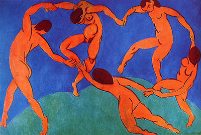
MoMA's 1992 retrospective places Harmony in Red alongside the later Dance and Music projects commissioned by Shchukin for a stairway. These works are not interchangeable decorations. The dining-room panel uses still life, figure, window and repeating ornament; the later stairway panels organize large simplified bodies and movement. Yet the common patron helps show that Matisse was treating painting in relation to architecture across several years, testing how an image might occupy a wall and meet a viewer in motion. [2]
It is also important not to retroactively make The Red Room a commission for Shchukin's dance-and-music staircase. That was a separate architectural setting and a later project. The Hermitage explicitly gives the dining room for this red panel. The distinction keeps the history concrete: a painter and patron could collaborate on more than one part of a house without making all of the resulting canvases one ensemble.
How does it differ from The Dinner Table?
MoMA compares the Hermitage canvas with Matisse's earlier The Dinner Table , painted in 1896–97 . Both show a domestic interior, a table carrying objects and a woman occupied with an action rather than looking out at us. That continuity is worth seeing. Matisse did not need to change every subject to change painting radically. He could return to familiar household materials and ask them to perform very different compositional work. [2]
In The Dinner Table , the viewer can locate more conventional distinctions among tabletop, room, objects and figure. Color and brushwork are already active, but they do not bind wall and table into one dominant field as Harmony in Red does. The difference gives the 1908 picture a specific historical force: a dining motif has become an experiment in how much the viewer can recognize when spatial boundaries are loosened. To say simply that Matisse “became more abstract” would miss the precise change in this shared subject.
The figures also ask for different kinds of attention. In both pictures, a woman is engaged in a domestic task, yet the later panel makes her one dark, angled presence within a large network of red and blue. She does not carry the whole story. Table setting, fruit and her movement remain visible, but pattern has become a participant equal to the people and things. The comparison is therefore about the distribution of importance across a canvas as much as about style labels.
The 1896–97 work belongs to Matisse's early public career; the red panel belongs to the years after his Fauvist experiments, when large decorative compositions became central. Those categories are useful background, but the two pictures do the explanatory work themselves. One can compare how a table edge separates planes in the earlier painting and how a similar edge struggles to separate them in the later one. The change can be seen without assuming the domestic subject was ever merely a pretext. [2]
For readers who want that earlier point of comparison, The Dinner Table has its own page. The two works should be read as separate paintings made more than a decade apart, not as a single image revised from dark to red. The revision history of Harmony in Red concerns green and blue stages of this later canvas, not the 1890s painting.
How does it differ from The Red Studio?
Matisse returned to an all-embracing red in The Red Studio , made in 1911 . The Museum of Modern Art owns that painting; it shows his Issy workroom with paintings and sculptures represented inside. At first sight, both works can seem like red rooms whose walls dissolve. The objects reveal their different purposes. In the Hermitage canvas, food, tableware and a figure remain central, and blue plant-like pattern extends across red table and wall. In MoMA's studio canvas, artworks retain their own identities while much furniture is defined by thin edges within a broad red field. [3] [1]
The windows differ too. The Red Room opens toward a lush green garden that interrupts the red expanse and offers depth. The Red Studio organizes a working interior around the artworks it contains. One painting was meant for Shchukin's dining room; the other records a studio through a highly selective, red-painted construction and has its own later ownership path. Similar hue does not make them variants of one scene.
There is a technical difference in what we can responsibly claim from sources. MoMA has studied the 1911 studio canvas closely, including how red changed an earlier painted version of that room. Those findings belong to The Red Studio . The older MoMA catalogue's green/blue/red sequence concerns Harmony in Red . It would be tempting to collapse these two revision stories into one dramatic account of Matisse suddenly discovering red, but each applies to a separate object and different years. The museums' records are the guardrails for comparison. [5] [4]
The pair shows that red was a question Matisse kept asking, not one fixed formula. In the dining interior, ornament travels over red and unites a room designed for food and human action. In the studio, the red field lets the artist's own works stand out against an unusually spare rendering of his surroundings. The viewer can move between the two canvases and notice what stays recognizable because Matisse chose to preserve it. Red is powerful in both, but its relationship to objects changes.
What should a viewer follow first?
Begin with the window at left. Its greens and pale trees give a strong sense of outside, so the red around it becomes unmistakably an interior. Move down to the chair and across the table edge, looking for the point where cloth and wall become difficult to separate. Follow one blue scroll upward until it leaves the tabletop and passes behind the central vase. This route makes the painting's main spatial experiment visible without requiring an abstract theory of modernism.
Next find the fruit and pale dish near the woman's hands. Their smaller colors slow the eye after the long movement of the blue lines. The woman brings the objects into a human action; the object group brings her back into the table's design. Notice how her dark clothing remains clear against red and how her head tilts into the room. She is neither lost in pattern nor independent of it.
Finally step back and let the canvas become a broad red field again. The two modes of seeing—one decorative surface and a room full of distinguishable things—do not need to resolve into a single answer. Their alternation is the work's force. The canvas was made for a dining room, passed through Shchukin's collection and is now a Hermitage painting with its own number and contested revision chronology. Its visual achievement is immediate, however: table, wall, garden and person remain available to the eye even as red and blue pull them into one large arrangement. See the paintings guide for the wider practice, and compare the separate The Red Studio for another answer to what a red interior can be.
Explore 113 Matisse artworks
This directory covers the 113 individual works explored in these articles, rather than a complete catalogue of Matisse’s output. Cut-paper designs and prints appear under Drawing in the medium filter; each row names its form. Dates retain the qualifications explained in the linked articles.
Discussion
Look again at the images and ideas explored in Henri Matisse, The Red Room (Harmony in Red) , 1908. These editorial prompts invite your observations.
Reader Insights
Which painting is this?
Which comparison discussed in the article helps you see the work differently?
How do the materials and historical setting affect your reading?
Join the Conversation
Share a detail, comparison or question about Henri Matisse, The Red Room (Harmony in Red) , 1908 below.
References
- State Hermitage Museum , The Red Room , current owner title, date, medium, size, inventory, Shchukin dining-room purpose and 1948 transfer. View source .
- Museum of Modern Art , Henri Matisse: A Retrospective brochure (1992), Harmony in Red interpretation, The Dinner Table comparison and Shchukin context. View source .
- Museum of Modern Art , The Red Studio , distinct 1911 Issy studio painting and owner record. View source .
- Museum of Modern Art , The Wild Beasts: Fauvism and Its Affinities catalogue, older green/blue/red sequence and alternative final red dating. View source .
- Museum of Modern Art , Matisse: The Red Studio exhibition section texts, technical account of that separate 1911 canvas's red revision. View source .
 Henri Matisse.jpg)