 by
Tom Gurney
Tom Gurney BSc (Hons) is an art history expert with over 20 years experience
Email:
tomgurney1@gmail.com
/ Phone:
+44 7429 011000
Henri Matisse prints: line, tone and the illustrated page: Introduction
Henri Matisse made prints for more than half a century. They were a substantial part of his work, not merely smaller copies of his paintings. The Museum of Modern Art counts more than 800 original works in intaglio, lithography, woodcut, linocut and monotype from 1900 until his death in 1954. These include quick-looking portraits, carefully worked images of figures and interiors, and prints made for illustrated books. The paper, ink and means of transferring an image matter as much as the subject. A visitor who knows Matisse through paintings and late cut-outs can find a different sense of his decisions in a drypoint line, a lithograph's broad tone or the coloured stencils of Jazz.[1]
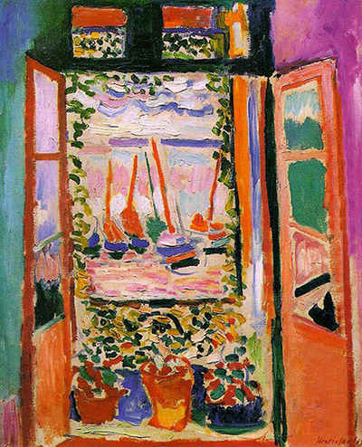
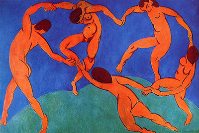
“Matisse print” can mean two very different things. An original print is a work produced through a printmaking process as part of the artist's practice, often in an edition. A modern poster or giclée reproducing The Open Window, Dance or another painting is a reproduction of Matisse's art. Its printed paper does not make the pictured oil canvas an original lithograph or etching. This guide follows Matisse's work with print processes themselves and uses individual museum records to keep those categories clear. The paintings directory follows the painted objects from which many modern reproductions are made.
At a Glance
- Artist Henri Matisse
- Lived 1869–1954
- In focus Prints
Contents
- What counts as an original print?
- When did Matisse make prints?
- How did prints relate to Matisse's drawing and painting?
- Why use drypoint and lithography differently?
- What makes Poésies an illustrated book?
- Are the prints in Jazz cut-outs?
- How should a viewer look at a Matisse print?
What counts as an original print?
A print begins with a surface or system prepared to transfer an image to another support, usually paper. In an etching, ink settles into lines worked into a metal plate. A drypoint line is scratched directly into a plate and can give a softer edge because of the displaced metal around the cut. In a lithograph, the image is drawn or painted on a prepared flat surface; its tonal range can differ greatly from an etched line. In a woodcut or linocut, a cut surface prints by relief. A monotype is printed from an image made on a surface and normally yields a single impression rather than a repeatable edition. In pochoir, colour is applied through stencils. These processes do not produce one uniform “Matisse look.” They offer different relations between a hand's mark and its transfer to paper.[1][2]
It also helps to distinguish an image, a plate mark and a sheet. The Metropolitan Museum of Art's Large Irène Vignier of 1914 is an etching on chine collé: its plate measures 17.8 × 12.7 cm, while the sheet is 37.5 × 28.1 cm. The generous paper around the printed portrait is part of the object a viewer sees. A catalogue giving plate and sheet sizes is not contradicting itself, and a cropped web image may not show the full sheet. Its museum object number, 29.89.35, identifies a particular impression in a collection, while the title and date identify the print work.[3]
An edition can contain multiple impressions of an original print, each made through the authorized process. That is not the same as an unlimited later reproduction of a painting. Nor does “original” mean every impression was pulled by Matisse's own hands. Printmaking often joins artist, printer, publisher and material process. The exact medium and edition should be checked in a collection record rather than guessed from a photograph, signature or seller's description. MoMA, for example, records the 1929 Odalisque on Checkered Background as a drypoint with chine collé, edition 25. Its small 15.5 × 12.4 cm plate and larger sheet are facts about that original print, not about any poster that might reproduce it today.[4]
Explore prints
 Henri Matisse.jpg)
When did Matisse make prints?
MoMA's survey identifies several especially active periods: around 1906, 1914 and throughout the 1920s. The pace could change dramatically. In 1929 alone, MoMA says, Matisse made more than 100 etchings and drypoints. A total exceeding 800 across a long career should not be imagined as an even annual output. It was a series of returns to printmaking, each with different circumstances and interests.[1]
One return is unusually well documented by the Art Institute of Chicago. After a six-year hiatus, Matisse resumed printmaking in the autumn of 1913. Through early 1917, the Art Institute counts 8 lithographs, 66 drypoints and etchings, and at least 69 monotypes. It notes that the monotypes belong to this period alone in his printmaking career. The subjects were close to his daily world: people he knew, figures and events of the studio. These numbers belong to the Institute's defined 1913–17 phase. They should not be confused with MoMA's greater-than-800 career total or treated as a catalogue of everything he ever printed.[2]
The 1920s brought a different concentration. MoMA describes many portraits, figures and odalisques, with small etchings and drypoints that can look as fluid as a sketchbook page. Its Odalisque on Checkered Background fixes one example in 1929 rather than asking readers to imagine the whole decade through a generic painting of an odalisque. The actual drypoint is a compact work with its own matrix, paper and edition. The title may sound like a painting title, but the museum's medium field makes its status clear.[1][4]
The later illustrated books extend the story into the 1930s and 1940s. The National Gallery of Art records Matisse's Poésies with Stéphane Mallarmé's texts as a 1932 unbound volume containing 27 etchings on Arches paper. MoMA's Jazz, prepared through the 1940s and published in 1947, is an illustrated book with twenty colour pochoirs. The two books are separate undertakings using different techniques. They show that prints could be planned for reading and turning pages, not simply for hanging one framed image at a time.[5][1]
How did prints relate to Matisse's drawing and painting?
MoMA's account calls Matisse's printmaking a personal extension of his drawing. An etching or drypoint can preserve the movement of a line even though the final image passes through a plate and press. Its intimate scale lets the viewer attend to an eye, shoulder, hand or contour without the surrounding colour architecture of a large painting. A print is not simply a preliminary sketch; the mark has been considered in relation to transfer, paper and often multiple impressions. But printmaking could give Matisse a way to pursue graphic questions near his other work.[1]
The Art Institute offers a stronger, period-specific connection. When Matisse moved to his quai Saint-Michel studio, he purchased a hand etching press. The Institute argues that prints made there were linked to his demanding painting experiments of 1913–17. Some, especially monotypes, helped him try a possible change in a composition or record the end of a painted state before further alteration. This does not mean that every surviving monotype can be identified as a direct study for a named canvas. It means the print process itself sometimes entered a cycle of looking, testing and repainting.[2]
Monotype is particularly suited to that explanation because it is not built around repeating a stable edition. A unique transfer can capture one arrangement, then allow the artist to move on. The Art Institute's scholarly catalogue discusses a group of goldfish monotypes from 1914–15 alongside Matisse's goldfish paintings. The topic returns across media, but their object types remain distinct: a monotype on paper is not an oil-on-canvas state, and a painting photographed during revision is not automatically a print. The drawings directory and this prints page offer complementary paths into Matisse's line and revision, while individual collection records decide the medium of each work.[6][2]
The 1914 Large Irène Vignier shows another side of the same period. It is a named sitter and a small etched plate on a larger sheet. It belongs to the Art Institute's broad account of printmaking around people near the studio, without needing to be assigned to a specific painting. The museum record offers what an artwork page requires: title, date, medium, plate and sheet dimensions, and collection number. Those modest facts make a richer comparison than a blanket statement that Matisse “worked in black and white” at this time; the medium is specific, and the physical white of the sheet matters to how the line appears.[3][2]
Watch: Matisse’s art and working methods
Choose a museum film or a close reading to continue exploring Matisse’s work.
Matisse: The Cut Outs
Tate introduces its exhibition devoted to Matisse’s cut-paper work.
Watch on YouTubeWhy use drypoint and lithography differently?
MoMA contrasts the small scale and fluent line of many Matisse etchings and drypoints with the larger format and tonal reach of his lithographs. A line cut or incised in a plate can be spare and decisive. Lithography permits a more continuous range of light and dark, and MoMA notes that Matisse used it to build a sense of volume and depth. These are tendencies in his output, not fixed rules saying every drypoint is slight or every lithograph is grand. An object record remains the check for a particular sheet.[1]
The effect can be understood by imagining different decisions for the same subject. A portrait made from a handful of dark curves asks the viewer to complete the sitter mentally; blank paper becomes an active area. A tonal lithograph can keep that drawn quality while making the shoulder, clothing or surrounding space heavier. Both can be highly worked despite their apparent simplicity. The prints therefore challenge a common habit of ranking a medium by size or colour. A tiny etching can contain the whole force of a meeting between Matisse's line and a sitter's features, while a larger lithograph can bring another kind of bodily presence.
The Art Institute's 1913–17 numbers also show how much he varied his processes while returning to related subjects. Sixty-six intaglio works, eight lithographs and at least sixty-nine monotypes represent different ways of making and transferring an image, not just three marketing names for paper pictures. Seeing the medium labels in a collection alongside the works is essential. Without them, a black mark in a digital thumbnail could be mistaken for ink drawing, drypoint, etching or lithography, though each resulted from a different procedure.[2]
What makes Poésies an illustrated book?
The National Gallery of Art's record for Poésies identifies Mallarmé as author and Matisse as artist. Its object is an unbound volume with 27 etchings, made in 1932. That description joins text, images, paper and book format. The images are not merely a set of unrelated prints later gathered under a convenient cover; they belong to a publishing project shaped around poetry. The record also allows a reader to distinguish the NGA's volume from another institution's impression or a loose reproduction of one of its plates.[5]
Book illustration changes the pace of looking. A single framed portrait can be studied for as long as one chooses, with its sheet and margin visible at once. A book gives sequence: the viewer reads, turns pages and sees one image after another. Matisse's line participates in that rhythm. MoMA says he collaborated on thirty-eight illustrated-book projects during his career, placing Poésies within a broader activity. The number should not be turned into thirty-eight identical kinds of “print.” Each project has its own medium, publication date and relation of word to image.[1][5]
The NGA entry is useful precisely because its medium is so definite: etchings on Arches paper. There is no reason to call the volume a lithograph because another Matisse book used lithography, or to call every illustrated page a cut-out because his late books are associated with coloured paper. “Illustrated book” describes a format; “etching” names a process used for the images in this particular volume. Keeping both levels in view gives a more accurate account than the vague label “Matisse prints.”[5]
Are the prints in Jazz cut-outs?
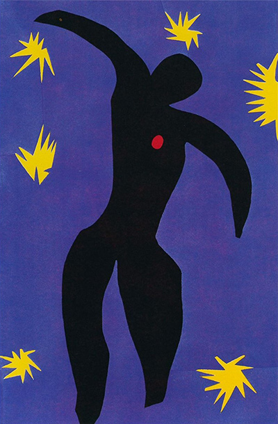
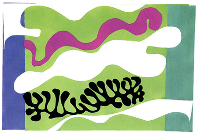
The printed plates of Jazz are pochoirs, made with stencils after Matisse's original cut-paper designs. MoMA's object record calls the published 1947 book an illustrated book with twenty pochoirs and identifies its publisher as Tériade. A MoMA exhibition account explains the translation: Matisse cut and arranged shapes from coloured paper for the designs, while the book's colour images were produced by hand-cut stencils using colours related to those of the original painted papers. The result is closely tied to the cut-out method but is a printed edition, not the same physical paper shapes pinned and arranged in the studio.[1][7]
That distinction matters when following individual images. Icarus is known through the Jazz book, while other articles follow works associated with the cut-paper designs or related plate identities. Their museum records decide whether a given object is a maquette, a pochoir impression or a later reproduction. A colour image printed in a copy of Jazz belongs to Matisse's publishing project, but it does not prove that the particular sheet is the unique cut-paper original. The cut-outs directory follows the late scissors-and-gouache practice; this page follows the moment when some of those designs moved into printed pages.[1][7]
The comparison with Poésies makes the change legible. One book presents etched line beside poetry; the other turns coloured cut-paper designs into stencil-printed images and gives them Matisse's handwritten text. Both are illustrated books, yet the visual experience differs. Jazz is not merely a late colour upgrade of an earlier black-line technique, and Poésies is not just an incomplete version of a cut-out book. Each project uses a print process suited to its own relation of image, text and page.[5][1]
How should a viewer look at a Matisse print?
Start with the museum's medium line. Is the object an etching, drypoint, lithograph, woodcut, monotype, stencil print or a book containing prints? Then look at its plate or image size, its sheet size, the edition if recorded, and whether the page belongs to a larger sequence. Those details answer practical questions about what was made and how it was meant to be seen. They also keep a cropped digital photograph from substituting for the whole physical sheet.
Next, follow what the process contributes. In a small etched portrait, notice how little line is needed to give a face weight and direction, and how the paper around it affects that impression. In a drypoint, pay attention to the density and softness of its dark lines. In a lithograph, look for the range of tone available around contours. In a monotype, consider what a single transfer can preserve at a moment of experimentation. In a pochoir, ask how sharp stencil edges and repeated colour make an original cut-paper design available in a book. Those questions do not require an imagined biography for the sitter or a guessed emotional code for every black line.
The National Gallery of Art's 1990 exhibition of Matisse prints and drawings placed etchings, lithographs and Jazz stencil sheets side by side across the years 1906–1948. That museum grouping underlines the variety of the print record. The individual works tell the story more precisely: the Met's 1914 Irène Vignier, MoMA's 1929 drypoint odalisque, the NGA's 1932 etched Poésies volume and MoMA's 1947 pochoir Jazz occupy distinct phases and formats. None needs to stand in for all the others.[8][3][4][5][1]
For a wider path through Matisse's media, the artist overview and sculptures directory sit alongside the drawings, paintings and cut-outs already linked here. A career with many media does not make them interchangeable. The print record is distinctive because it joins the directness of drawing to decisions about matrix, transfer, paper, impression and edition. Matisse used those decisions for private-looking portraits, experiments near paintings and ambitious illustrated books; a later reproduction on paper can show the image, but the original print carries the history of how that image was made.
Explore 113 Matisse artworks
This directory covers the 113 individual works explored in these articles, rather than a complete catalogue of Matisse’s output. Cut-paper designs and prints appear under Drawing in the medium filter; each row names its form. Dates retain the qualifications explained in the linked articles.
Frequently Asked Questions
Yes. MoMA records more than 800 intaglios, lithographs, woodcuts, linocuts and monotypes made across his career, alongside illustrated-book projects such as Poésies and Jazz . [1]
No. It is a later reproduction of a painting. An original print has its own printmaking process and object record. A poster of Dance does not turn the Hermitage oil canvas into a lithograph.
A monotype normally gives a unique impression from one prepared image. A plate or other reusable printing surface can produce multiple authorized impressions in an edition. The Art Institute identifies at least 69 monotypes in Matisse's 1913–17 printmaking phase. [2]
Discussion
Look again at the images and ideas explored in Henri Matisse prints: line, tone and the illustrated page. These editorial prompts invite your observations.
Reader Insights
What counts as an original print?
Which comparison discussed in the article helps you see the work differently?
How do the materials and historical setting affect your reading?
Join the Conversation
Share a detail, comparison or question about Henri Matisse prints: line, tone and the illustrated page below.
References
- The Museum of Modern Art , Jazz object record and Sarah Suzuki's printmaking essay excerpt. View source .
- Art Institute of Chicago , “Printmaking, 1913–1917”. View source .
- The Metropolitan Museum of Art , Large Irène Vignier , 1914, 29.89.35. View source .
- The Museum of Modern Art , Odalisque on Checkered Background , 1929, 102.1951. View source .
- National Gallery of Art , Matisse and Mallarmé, Poésies , 1932, 2014.112.16. View source .
- Art Institute of Chicago , online scholarly catalogue, Still Life with Goldfish III and V , 1914–15. View source .
- The Museum of Modern Art , Jazz exhibition release, 1983. View source .
- National Gallery of Art , Matisse prints and drawings exhibition, 1990. View source .
 Henri Matisse.jpg)