 by
Tom Gurney
Tom Gurney BSc (Hons) is an art history expert with over 20 years experience
Email:
tomgurney1@gmail.com
/ Phone:
+44 7429 011000
Henri Matisse, Composition Green Background, 1947: Introduction
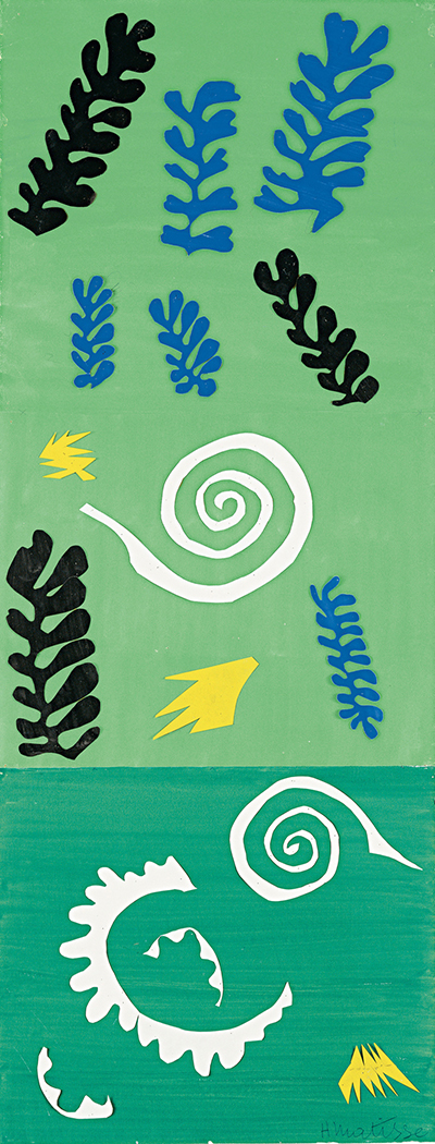
Henri Matisse's Composition Green Background is unusually tall and narrow. Fronds of black and blue paper drift across a pale green field; yellow bursts and a broad white spiral interrupt them. A darker green band at the bottom holds another white spiral and a broken, curling shape. The work can suggest seaweed and snails in water, but it is also a precise arrangement of flat color and cut edges. Its height makes the eye travel downward through two different green spaces rather than settle on one central motif. [1] [2]
The Menil Collection in Houston identifies the work as Composition Green Background (Composition fond vert) , made in 1947 while Matisse lived in Vence . Its materials are gouache, cut papers and pencil on paper. The Menil records its dimensions as 104.1 × 39.2 centimetres and its accession number as CA 5204 . MoMA's 2014 exhibition checklist gives the same height but a width of 40.3 centimetres ; the reason for this published difference is not established. The current owner's measurement is used here. [1] [3]
At a Glance
- Artist Henri Matisse
- Work Composition Green Background
- Date 1947
- Explore Cut paper and drawing
This work across Henri Matisse’s career
Dance (1910)
1910The Red Studio
1911The Piano Lesson
1916The Snail
1953Contents
- How does the green field organize the cut shapes?
- Is this an underwater scene?
- What does the cut-out method add?
- How did a studio arrangement enter public view?
- How does it relate to Matisse's other cut-outs?
How does the green field organize the cut shapes?
The upper part is light green. Near its top, a black frond leans inward from the left while a larger blue one spreads down the right. Another blue shape sits between them. Smaller fronds follow lower down, then a black form angles across the right side. They vary in size and direction, moving the eye as if the space had currents. Each remains a separate piece of paper with a clear edge. The green has no horizon or vanishing point; it lets the cut forms appear to float.
Two yellow shapes sharpen that movement. One small burst appears left of center, above the main white spiral. A larger one points upward near the transition to the darker band. Their jagged edges contrast with the lobed fronds and the spiral's continuous curve. The white spiral has a broad outer sweep and a tighter center; its green interior is the background seen through an open path. Read as a mark, it seems drawn in one motion. Read as cut paper, it has thickness and a boundary that had to be placed among the other pieces.
The lower band's green is deeper and bluer. A second white spiral turns near its top, while another white cut form curves below it. A yellow accent sits at the lower right. The upper fronds largely give way to white curls here, shifting pace as well as tone. This division makes “green background” more complex than the title suggests: the same white kind of shape behaves differently on two greens.
Is this an underwater scene?
The Saint Louis Art Museum , which exhibited the Menil work in its 2024 Matisse and the Sea exhibition, describes the blue, black and yellow shapes as seaweed and the white spirals as snail forms. It interprets their setting as suggestive of marine life in French Polynesian lagoons. That is a useful way to approach the image, especially because the forms appear suspended rather than rooted in a landscape. It is an interpretation of cut shapes, however, not a claim that every piece depicts an identifiable species or that Matisse copied a particular view. [2]
The Menil relates this work to Matisse's memory of his 1930 trip to Tahiti . By 1947, he was working from a long-held experience rather than making a travel sketch on site. The green areas can call to mind shallow water, and the repeated forms can suggest plants or small creatures carried through it. But the image does not depend on a literal lagoon map. Its cut pieces can be compared as colors, directions and intervals even by a viewer who sees no marine subject at first. [1]
Watch: Matisse’s art and working methods
Choose a museum film or a close reading to continue exploring Matisse’s work.
Matisse: The Cut Outs
Tate introduces its exhibition devoted to Matisse’s cut-paper work.
Watch on YouTubeWhat does the cut-out method add?
The Menil explains that Matisse's studio assistants colored paper with gouache before he cut shapes from it. At Vence, he worked with cut-outs pinned on the walls of his studio residence and rearranged them with his assistants. That practice gave him a way to try positions before an arrangement was fixed. The record does not tell us the exact order in which he placed these particular black, blue, yellow and white pieces, and the finished sheet should not be treated as a snapshot of one documented trial. [1]
What the sheet does show is how much the contour of each piece contributes. The blue and black fronds have repeated lobes, but they do not become mechanically identical. The yellow pieces cut sharply across the calmer greens. The white spirals draw the eye through their open centers as well as along their outer edges. Gouache gives the papers strong matte color; cutting makes their silhouettes immediate. Pencil is listed among the materials, though the small reproduction does not support assigning a particular visible line to it. [1]
How did a studio arrangement enter public view?
The Menil's account of the studio gives the tall sheet a useful setting. Matisse pinned cut shapes to walls at Vence and worked with assistants to rearrange them. This composition's vertical sequence can be read as placements down a narrow field: dark and blue fronds occupy the upper stretch, and white spirals carry the eye into the darker lower band. The owner does not document that this exact arrangement changed in a particular order, so the studio account explains the flexibility of the method rather than supplying a reconstruction of its making. [1]
Its appearance in the 1953 cut-out exhibition shows that this small, narrow work was presented as art in its own right while Matisse was alive. That exhibition history matters alongside the Tahiti reference. The composition is a memory transformed through cut colour, yet it also belongs to a public account of cut-outs as finished works. The marine interpretation and the visual pattern need not be separated: the fronds suggest sea plants because their contours, spacing and colours make a convincing world on the green paper. [1] [2]
How does it relate to Matisse's other cut-outs?
The Menil states that Composition Green Background appeared in Matisse's 1953 first cut-out exhibition , when it was already in the de Menils' private collection. It later appeared in MoMA's 2014 cut-outs exhibition and Saint Louis's 2024 sea-themed exhibition. Those settings bring out different things: the cut-paper process in one, the marine associations in another. The object remains the same tall composition whose two green zones guide the eye from fronds to spirals. [1] [3] [2]
Compare the contemporary Composition, Black and Red : it also divides its ground, but its horizontal format focuses attention on a green positive-and-negative pair. Here the vertical length and repeated marine-like forms create a slower descent. The two works need not be an intended pair to clarify different choices Matisse made with cut paper. Return to the white spiral halfway down this sheet, then follow the second spiral into the darker green below. For more context, explore the cut-outs directory and Matisse's biography .
Explore 113 Matisse artworks
This directory covers the 113 individual works explored in these articles, rather than a complete catalogue of Matisse’s output. Cut-paper designs and prints appear under Drawing in the medium filter; each row names its form. Dates retain the qualifications explained in the linked articles.
Discussion
Look again at the images and ideas explored in Henri Matisse, Composition Green Background, 1947. These editorial prompts invite your observations.
Reader Insights
How does the green field organize the cut shapes?
Which comparison discussed in the article helps you see the work differently?
How do the materials and historical setting affect your reading?
Join the Conversation
Share a detail, comparison or question about Henri Matisse, Composition Green Background, 1947 below.
References
- Menil Collection , Composition Green Background (Composition fond vert) , owner record, Vence and Tahiti context, 1953 exhibition history. View source .
- Saint Louis Art Museum , Matisse and the Sea exhibition interpretation (2024), marine reading and loan identification. View source .
- Museum of Modern Art , Henri Matisse: The Cut-Outs checklist (2014), object listing and variant width measurement. View source .
 Henri Matisse.jpg)