


 by
Tom Gurney
Tom Gurney BSc (Hons) is an art history expert with over 20 years experience
Email:
tomgurney1@gmail.com
/ Phone:
+44 7429 011000
Henri Matisse, Cover Design for Matisse: His Art and His Public , 1951: Introduction
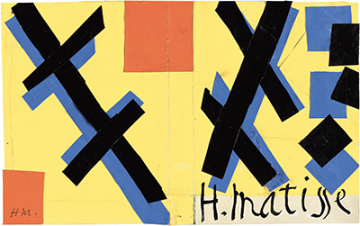
Henri Matisse made this small paper design for the cover of a large book about his work. Its yellow field carries crossing black bands, blue offsets, two orange-red accents and his name in sweeping script. The object is often called a cover maquette : a working design for a publication, made with cut and pasted painted paper rather than a finished printed jacket. The Museum of Modern Art (MoMA), which owns it, now titles it Cover design for Matisse: His Art and His Public . The book was written by Alfred H. Barr Jr. , not by Matisse; the artist supplied the cover design. [1] [2]
At a Glance
- Artist Henri Matisse
- Work Cover Design for Matisse: His Art and His Public
- Date 1951
- Explore Cut paper and drawing
This work across Henri Matisse’s career
Dance (1910)
1910The Red Studio
1911The Piano Lesson
1916The Snail
1953Contents
- What are we looking at?
- Why was Matisse designing a book cover in 1951?
- How does the written name work as a visual element?
- Where is the maquette now?
What are we looking at?
The design is a broad horizontal rectangle, 27.0 × 42.9 centimetres . Yellow provides a continuous ground across it. On the left, dark oblique strips meet in a compact knot, with blue showing beside some of their edges. On the right, black and blue pieces form another crossing arrangement and more open angular shapes. Orange-red appears sparingly near the upper middle and in a small square toward the lower left. These are not illustrations of particular paintings or recognizable people. They work as a set of contrasts: dark against light, slanting against upright, clustered against open. [1]
The two sides have a relation without being mirror images. The left group is tighter and lower; the right group spreads outward. A line down the middle makes the design look divided, yet yellow continues across it. It is tempting to read that division as the intended fold of a book jacket. The visible maquette permits us to notice a join or fold; it does not by itself establish precisely how a printed cover was folded, cropped or reproduced. What matters visually is that Matisse made a composition able to hold together across a wide surface while letting either side carry its own shapes.
The words are part of that composition. A small “H.M.” appears in the orange-red square at lower left, while “H. Matisse” crosses the lower centre and right in black script. The larger name is not set apart in a tidy box beneath an image. It curves through the same yellow field occupied by the cut paper, answering the angular strips with a looser kind of line. MoMA specifies ink on paper as well as painted paper in the medium. The contrast between the written curve and the cut edges gives the cover its force: a reader encounters a name and an abstract design in one glance. [1]
Watch: Matisse’s art and working methods
Choose a museum film or a close reading to continue exploring Matisse’s work.
Matisse: The Cut Outs
Tate introduces its exhibition devoted to Matisse’s cut-paper work.
Watch on YouTubeWhy was Matisse designing a book cover in 1951?
MoMA published Barr's Matisse: His Art and His Public in 1951 after years of preparation. Its nearly six hundred pages offered a substantial account of Matisse's career; MoMA notes that it contained the first art-historical discussion of The Red Studio , painted about forty years earlier. The museum also mounted a survey exhibition of Matisse's work. The publication and exhibition therefore presented his career to readers and visitors at the same moment. Matisse's cover made the book's public face part of that presentation, while Barr remained its author. [1]
There was a second, smaller publication. MoMA records a distinct Matisse design for the cover of the accompanying Henri Matisse exhibition catalogue. That maquette measures 27.0 × 40.0 centimetres and has its own museum number, 419.1953 . The design discussed here belongs to the Barr monograph and measures 27.0 × 42.9 centimetres , museum number 418.1953 . The two objects show that Matisse worked on both publications, but one should not describe the catalogue maquette as the cover of Barr's book or transfer its dimensions to this work. [1] [3]
The choice of cut paper was not a merely convenient way to lay out a title. In the later years of his career, Matisse made painted-paper cut-outs as major works and as designs for other settings. Here, small pieces and bold empty areas are enough to announce his visual language at the scale of a book. The blue offsets make the black bands seem to shift or cast colored echoes, while the limited red notes keep the large yellow expanse active. It would go beyond the evidence to treat each shape as a coded symbol for a phase of his art. The design communicates through placement and color before it communicates any story. [2] [4]
How does the written name work as a visual element?
MoMA's medium line includes ink as well as painted paper, matching the difference visible between the sweeping signature and the cut strips. The name crosses the yellow field rather than sitting in a separate caption area. Its curves interrupt the angles of the black and blue pieces, making handwriting part of the cover's rhythm. This is especially apt for a book devoted to an artist: the reader sees Matisse's name as both information and a made mark. The small “H.M.” at lower left sets up a second, compact version of that identity within the image. [1]
The companion design for the exhibition catalogue helps define this object's purpose. Both maquettes were made for MoMA publications, but the Barr volume was a substantial monograph and the other design belonged to a shorter exhibition catalogue. The two have close dimensions yet separate inventories. A viewer comparing them can ask how Matisse varied the face of each publication without treating one surviving collage as a draft for the other. The book cover discussed here is a specific commission with its own final use. [1] [3]
Where is the maquette now?
MoMA lists the design in its Drawings and Prints collection as 418.1953 , with the credit “Transferred from The Museum of Modern Art Publications Department.” Its 2014 cut-outs checklist gives the transfer year as 1953 . That institutional path fits an object first made for the museum's own publishing project. A separate MoMA exhibition slide gives a conflicting acquisition credit, so the current object record and the full checklist are the more reliable basis for this page's ownership statement. [1] [2] [5]
Seen as an object in its own right, the maquette has a different job from the monograph it introduced. Barr's book used words and reproductions to survey the artist's career. Matisse's design compressed an encounter with that career into yellow space, cut color and a written name. Its modest dimensions also matter: the same decisions about balance that animate his larger cut-outs remain legible at the scale of a cover. This is a design for a reader to hold and recognize, as well as a surviving record of how Matisse could adapt his art to print.
For the wider late-career context, see Matisse's cut-outs and the biography . The Red Studio was among the earlier paintings brought into Barr's 1951 account; it is a separate artwork, not an image reproduced in this maquette's abstract shapes.
Explore 113 Matisse artworks
This directory covers the 113 individual works explored in these articles, rather than a complete catalogue of Matisse’s output. Cut-paper designs and prints appear under Drawing in the medium filter; each row names its form. Dates retain the qualifications explained in the linked articles.
Discussion
Look again at the images and ideas explored in Henri Matisse, Cover Design for Matisse: His Art and His Public , 1951. These editorial prompts invite your observations.
Reader Insights
What are we looking at?
Which comparison discussed in the article helps you see the work differently?
How do the materials and historical setting affect your reading?
Join the Conversation
Share a detail, comparison or question about Henri Matisse, Cover Design for Matisse: His Art and His Public , 1951 below.
References
- Museum of Modern Art , Cover design for Matisse: His Art and His Public , 418.1953, owner record, medium, dimensions, credit and 2022 gallery label on Barr's publication. View source .
- Museum of Modern Art , Henri Matisse: The Cut-Outs artwork checklist (2014), cover-maquette entry naming Barr and 1953 transfer. View source .
- Museum of Modern Art , Cover design for exhibition catalogue Henri Matisse , 419.1953, separate companion design and dimensions. View source .
- Museum of Modern Art , The Cut-Outs process account, general context for Matisse's painted-paper method. View source .
- Museum of Modern Art , 2014 selected-works slide for the book maquette, historical listing with a credit inconsistent with the current owner record and full checklist. View source .


 Henri Matisse.jpg)
