 by
Tom Gurney
Tom Gurney BSc (Hons) is an art history expert with over 20 years experience
Email:
tomgurney1@gmail.com
/ Phone:
+44 7429 011000
Henri Matisse, Pale Blue Window : A Cut-Paper Design for Vence: Introduction
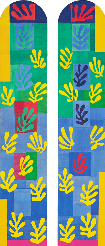
Henri Matisse's Pale Blue Window ( Vitrail bleu pâle ) rises in two rounded arches filled with blue, green, yellow and red. It looks like stained glass at first glance, but the pictured work is a full-size cut-paper maquette , or design study, for the windows of the Chapel of the Rosary at Vence . The Centre Pompidou dates this second version November 1948–January 1949 and identifies it as gouache-painted paper cut and pasted on kraft paper mounted on canvas . Its two-part panel measures 509.8 × 252.3 cm , inventory AM 1982-109 (1) . The paper work and the chapel's eventually installed glass should be kept separate. [1] [2]
Two vertical white gaps keep the arches distinct, while repeated yellow forms carry the eye across them. The title's “pale blue” describes an atmosphere within a design that has several blues; it does not mean every part of the surface is a light blue wash. Rectangular pieces form a shifting ground, and plant-like cut shapes move over it. The image proposes what coloured light might do in a chapel, although paper itself cannot transmit light as glass would.
At a Glance
- Artist Henri Matisse
- Work Pale Blue Window
- Date November 1948–January 1949
- Explore Cut paper and drawing
This work across Henri Matisse’s career
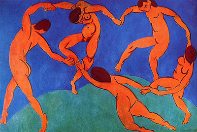
Dance (1910)
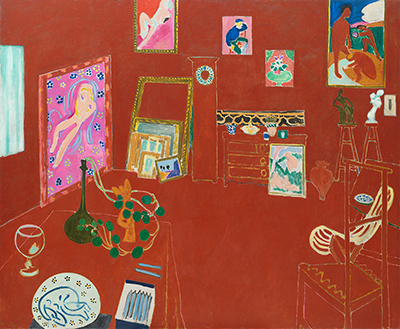
1910The Red Studio
1911The Piano Lesson
1916Henri Matisse, Pale Blue Window : A Cut-Paper Design for Vence (current article)
November 1948–January 1949The Snail
1953Contents
- How do the two arches work together?
- Why was it a maquette, rather than the final window?
- What did the second version make possible?
- What does this reveal about Matisse's cut-outs?
How do the two arches work together?
Each arch has a dark blue crown and a smaller red form near its top. Below these, green blocks and blue blocks descend through the long panels. Their edges are largely straight, setting up a measured architectural framework. Against it, leaf-like silhouettes open into forked lobes, some blue or purple, many a vivid yellow. A yellow form can seem to float over green in one area and blue in another. Repetition makes the two tall panels feel related without making them mirror images.
The background is not a single sheet of colour. Seams between rectangular pieces remain visible, especially in the lower blue sections. At several points, red or green patches interrupt the prevailing blue. The yellow shapes are spaced irregularly: some gather near the top, others descend toward the base. Their changing intervals slow the eye and counter the long, straight drop of the window frames. At this scale, a viewer's movement along the work becomes part of the design's rhythm.
The cut motifs suggest leaves or underwater growth, but the work does not illustrate a landscape beyond a window. Its shapes are designed for an architectural opening and for colour relationships. Centre Pompidou curator Isabelle Monod-Fontaine relates this version to Matisse's memories of Tahiti and to the lagoon imagery in his Jazz period. That is a curatorial connection about visual sources, not a claim that a particular Tahitian plant appears here. [1]
Watch: Matisse’s art and working methods
Choose a museum film or a close reading to continue exploring Matisse’s work.
Matisse: The Cut Outs
Tate introduces its exhibition devoted to Matisse’s cut-paper work.
Watch on YouTubeWhy was it a maquette, rather than the final window?
The chapel project changed as Matisse tested it. Monod-Fontaine describes three successive designs : an initial half-scale plan made in 1948, this second, full-size cut-paper version, and a third design from spring 1949 that led toward the realised windows. The Centre Pompidou holds Pale Blue Window as part of a group of studies for the second state. Its preservation lets viewers see a rich stage of invention that the final glazing did not reproduce unchanged. [1]
The practical demands of glass mattered. A February 1949 discussion drew attention to the structural bars needed to support the chapel windows. According to the curator's reading of contemporary notes and correspondence, Matisse reworked the design rather than simply transfer these coloured paper shapes into glass. The final scheme reduced the palette to lemon yellow, ultramarine blue and bottle green . Red, conspicuous near the tops and in patches of this maquette, was dropped. A reader comparing reproductions should therefore not assume that the red-and-blue paper arrangement can still be seen in the chapel itself. [1]
The scale of the paper study shows how seriously Matisse treated the transition from a cut-out to a built interior. Small pieces could be moved and judged at the size of the proposed window. The material was temporary in purpose, yet the assembled object remains an artwork with its own balance of colour and shape. The Centre Pompidou records its gift from Mme Jean Matisse and Gérard Matisse in 1982 ; MoMA's 2014 Cut-Outs exhibition also identified it as the second maquette for the chapel's apse window . [1] [2]
What did the second version make possible?
At more than five metres high, the paper maquette let Matisse judge relationships at roughly the scale of the intended architectural opening. The rectangular pieces establish a structural cadence, while branching yellow forms cross them at shifting intervals. A small sketch could show the idea, but this large sheet makes the weight of each blue block and the reach of each yellow cut-out part of the viewer's bodily experience. Its two arches also require a choice about whether to read each panel separately or the repeated motifs across both. The Centre Pompidou's identification of this as the second full-size stage matters because these decisions were tested before the final glass scheme. [1]
The later omission of red is especially instructive. In this maquette, red punctuates the crowns and several lower areas. In the realized scheme, the palette narrowed to yellow, blue and green, according to the owner's account. Comparing the stages shows revision through colour as well as through construction. The bars required for glass were a practical constraint, but Matisse's response altered the visual rhythm of the whole window. The surviving paper work records an option fully explored and then changed, rather than an inaccurate picture of the chapel as visitors finally saw it. [1]
What does this reveal about Matisse's cut-outs?
The coloured areas serve at once as shape and as a proposal for light. Matisse had already used painted paper in book and wall projects. Here, the cut edges could test a window's colour pattern before any glass was made. Monod-Fontaine connects that process with the artist's broader wish to make the chapel's coloured windows work with the black drawings on its opposite walls. The finished experience would depend on sunlight, wall surfaces and the viewer's position, elements a flat photograph of the maquette can only suggest. [1]
Compare Nuit de Noël , another cut-paper design related to stained glass, to see how differently Matisse could arrange radiant colour in a vertical frame. The cut-outs directory places Pale Blue Window among the other large late projects. For this work, the most revealing detail is the space between the two arches: it keeps each panel distinct while the repeated yellow forms make the eye join them. The result is a window design built out of rhythm before it became a problem of glass and light.
Explore 113 Matisse artworks
This directory covers the 113 individual works explored in these articles, rather than a complete catalogue of Matisse’s output. Cut-paper designs and prints appear under Drawing in the medium filter; each row names its form. Dates retain the qualifications explained in the linked articles.
Discussion
Look again at the images and ideas explored in Henri Matisse, Pale Blue Window : A Cut-Paper Design for Vence. These editorial prompts invite your observations.
Reader Insights
How do the two arches work together?
Which comparison discussed in the article helps you see the work differently?
How do the materials and historical setting affect your reading?
Join the Conversation
Share a detail, comparison or question about Henri Matisse, Pale Blue Window : A Cut-Paper Design for Vence below.
References
- Centre Pompidou , Vitrail bleu pâle , AM 1982-109 (1), owner record for second full-size maquette, dimensions, materials, gift and Isabelle Monod-Fontaine's account of three designs and final colour changes. View source .
- Museum of Modern Art , Pale Blue Window in the 2014 Cut-Outs exhibition, identification as second maquette for the apse window, date, medium and Centre Pompidou collection. View source .
 Henri Matisse.jpg)