 by
Tom Gurney
Tom Gurney BSc (Hons) is an art history expert with over 20 years experience
Email:
tomgurney1@gmail.com
/ Phone:
+44 7429 011000
The Sorrows of the King by Henri Matisse: music and melancholy in cut paper: Introduction
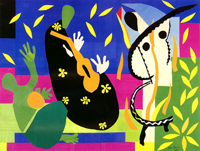
Henri Matisse's The Sorrows of the King fills a broad field with a seated dark form, raised pale hands, an orange instrument, a green figure and a tall white form outlined in black. Small yellow shapes move through the deep blue above them and gather across the picture. It can look like a performance, a memory of one, or a room whose occupants have become coloured signs. Its title names sorrow, but the image refuses to make sorrow a single facial expression. Music, movement and the stillness of a seated figure have to be read together. [1] [2]
The original French title is La Tristesse du roi . Centre Pompidou, which holds the work, also records the earlier title Le Roi triste (“The Sad King”). Matisse made it in Nice in 1952 from sheets of paper painted with gouache, cut into shapes and mounted on canvas. At 292 × 386 centimetres, it is almost four metres wide. The museum classifies it as a collage within its graphic-art collection. Calling it a “painting” can convey its pictorial ambition, but it should not conceal its actual material: this is a large original cut-paper work, not oil on canvas or a printed page from Jazz . [1]
The change from The Sad King to The Sorrows of the King is small but revealing for a reader. One title seems to describe a person; the other names a state that can spread through an entire scene. The owner record establishes that both titles have been attached to the same object, but it does not explain why the wording changed. The shift can guide looking without becoming a theory about Matisse's intention. It encourages attention to the dancer, instrument and drifting yellow forms as parts of the king's world, rather than accessories around an isolated portrait. [1]
At a Glance
- Artist Henri Matisse
- Work The Sorrows of the King
- Date 1952
- Explore Painting
This work across Henri Matisse’s career
Dance (1910)
1910The Red Studio
1911The Piano Lesson
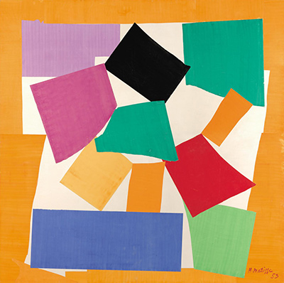
1916The Snail
1953Contents
- What is happening in the picture?
- Who is the king?
- Does the title refer to the Bible or to Rembrandt?
- How did Matisse make a scene at this scale?
- Where does it sit in Matisse's work?
What is happening in the picture?
A first look may settle on the largest dark shape near the centre. Its rounded upper contour suggests a head and its broad lower section the weight of a seated body. Two white hand shapes hover above and beside a long orange form, which can be read as a stringed instrument. Black and green shapes overlap at its sides. To the left, a green body-like form rises with an open hand; an orange disc sits near it. On the right, a tall pale form, edged by an irregular black curve, seems to lift an arm. The figures are recognisable enough to invite a scene, but no face, garment or furnishing is described in the detail expected from an ordinary narrative painting. [1] [2]
It helps to look at the ground before deciding who is who. A dark horizontal area caps the image. Under it, brilliant blue runs behind the upper forms; pink and red cross the middle; greens and yellow establish a lower region. The coloured zones do not simply mark a back wall and a floor. They pass behind and around the figures as long bands and abrupt blocks. The seated shape's black has a different visual weight from the blue above and from the green shapes beside it. Against that weight, white hands and the tall white form become particularly conspicuous. Matisse builds a sense of gathering without supplying a measured room. [1]
Yellow cut forms are scattered from left to right. Some are leaf-like, others are small pointed pieces or flower-like clusters. They can be followed across the blue as though something were circulating above the people. The Centre Pompidou teaching text compares them to petals and to the gaiety of musical notes. That metaphor fits the way they carry the eye, though it does not make them a literal notation or settle which instrument is being played. The repeated yellow also ties separate areas together: a shape above the seated figure answers one near the pale form, and the green and yellow cluster at the far right keeps the movement from stopping at the edge. [2] [1]
The composition has two tempos. The dark seated figure seems anchored and inward; the pale hands, raised arms and loose yellow pieces move outward and upward. The orange instrument cuts diagonally through the black, so attention shifts from the apparent player's body to the action of playing. It is possible to experience the picture first as exuberant colour and then as something more reflective. The title draws attention to the second mood, while the work's bright forms keep it from becoming an illustration of grief. That tension is a viewer's observation, not proof of a precise emotion assigned by Matisse to each colour. [1] [2]
Who is the king?
Centre Pompidou's educational account reads the dark seated shape as a late self-portrait of Matisse. In that account the green figure evokes an odalisque and the form at right a dancer; the yellow pieces resemble petals or music. This is a powerful way of seeing an ageing artist surrounded by subjects that had sustained his work. It also fits the contrast between a body at rest and the animated scene around it. The museum presents this as interpretation, however, not as a labelled diagram left by Matisse. The work gives the viewer enough to explore that idea without requiring every piece to play a fixed biographical role. [2]
The owner's longer collection essay preserves a reported description by Matisse of a sad king, a charming dancer and a person playing a guitar-like instrument, with gold-coloured shapes emerging from the music and circling the upper composition. Paraphrased this way, his description establishes the broad dramatic ingredients more firmly than an exact identification of each coloured silhouette. The instrument is only “guitar-like” in that account; the paper shape does not need to be forced into a modern guitar's anatomy. Likewise, the yellow pieces can suggest sound spreading across the field while still remaining cut pieces of painted paper. [1]
Earlier writing shows how open the image remains. In its 1961 exhibition catalogue, MoMA discussed the royal figure in green tones and described the large black-and-white shape on the right as an archaic harp. Centre Pompidou's teaching account, by contrast, places the self-portrait in the dark seated form and treats the right-hand shape as a dancer. The two readings are not interchangeable, and neither should be silently turned into a complete cast list. Their disagreement makes a useful point: the work depends on forms that can carry figure, instrument and ornament at once. One can see a performance without pretending that every contour has a single undisputed name. [3] [2]
Watch: Matisse’s art and working methods
Choose a museum film or a close reading to continue exploring Matisse’s work.
Matisse: “For Me It’s Always New”
The Museum of Fine Arts, Boston considers Matisse’s creative practice.
Watch on YouTubeDoes the title refer to the Bible or to Rembrandt?
The title and the music have encouraged a biblical reading. Centre Pompidou's teaching text relates the work to Rembrandt's David Playing the Harp before Saul , in which music is associated with a troubled king. It also invokes Rembrandt's late self-portraits. MoMA's 1961 catalogue cautiously proposed David, rather than David's son Solomon, as the relevant royal musician. These sources offer historical comparisons and curatorial interpretations. They do not prove that the cut-out reproduces a specific Rembrandt composition or that a particular coloured shape is unquestionably David or Saul. [2] [3]
This distinction matters because Matisse's scene does not behave like a direct illustration. The ground is banded and vivid rather than an architectural setting. A white palm can be read immediately as a hand, while the body to which it belongs is less certain. Small yellow shapes are visually central even though they do not stand for a conventional person or object. The narrative of a king consoled by music can guide attention to the group, but the composition is also about what cutting, placing and repeating colours can make visible. A biblical source is a way into the work, not a key that closes it. [1] [2]
The same museum teaching text associates the image with Baudelaire's poem La Vie antérieure , which Matisse had previously illustrated, and with themes of old age and music's power to soothe. Centre Pompidou's other public account phrases both the biblical and poetic connections as possibilities. That cautious wording is apt. The title's sadness and the yellow forms' buoyancy can be held together without claiming that the collage is a scene from the poem. The poem broadens the interpretive frame to memory and former life; the visual evidence still has to lead the reading of the particular cut-out. [2] [4]
How did Matisse make a scene at this scale?
Matisse's assistants painted large sheets of paper with gouache. He cut shapes from this prepared material, and, for larger compositions, directed assistants as they pinned and moved pieces on the studio wall. Permanent mounting came after an arrangement had been worked out. MoMA's account of the method is about the cut-outs generally; it should not be mistaken for a day-by-day record of The Sorrows of the King . Centre Pompidou's object record supplies the final support here: the cut gouache papers are mounted on canvas. The canvas is a support for the paper composition, not evidence that Matisse painted the scene directly in oil. [5] [1]
The medium joins colour and drawing in a distinctive way. A scissor-cut edge is a line, but it belongs to a piece already filled with colour. Matisse could make the dark seated form heavy through its broad area and still sharpen a hand through a small white cut-out. The pieces are flat; their placement gives them roles in a scene. At nearly four metres across, this is more than an enlarged page illustration. Its bands, groups and scattered small forms must work over the distance of a wall, so the viewer can first apprehend the whole and then move closer to recover the parts. [1] [5]
The transition from pinned arrangement to mounted object also changes what the viewer meets. MoMA notes that pieces on a studio wall could stand slightly away from it, move under an assistant's hand and be repositioned; permanent mounting made large cut-outs safer to store, frame and transport, while reducing that temporary relief. Its account concerns the method across Matisse's work and does not document a specific mounting intervention on this collage. It does clarify why the fixed work in a museum is both a physical assembly and the outcome of a more flexible studio process. The canvas named by Centre Pompidou belongs to that final, stable state. [5] [1]
The many little yellow shapes are a good example. They can be seen as individual leaves or petals at close range, but from farther back they form a visual route across the dark blue. Their repetition links the crowded centre to the edges without drawing a continuous line. Larger cut pieces do the opposite job: the blue, pink and green bands divide the field and keep the small yellow fragments from becoming a loose swarm. The balance between scattered and consolidated forms is what lets a complex composition remain legible. The scene gains energy from pieces that appear free to move, even though their final positions are fixed. [1]
Matisse had used cut paper in earlier design projects, and the 1947 book Jazz brought cut-out imagery to readers through printed pochoir plates based on his original maquettes. Centre Pompidou's collection essay describes how cut paper developed from a working method into an autonomous means of expression. The Sorrows of the King belongs to that later development. A reproduction can convey its design, but the original's materials and scale matter: the colour was painted onto paper, the contours were cut, and the parts were assembled into a single mural-sized object. The distinction also helps explain why an image in a small book and this nearly four-metre composition ask to be viewed differently. [1]
Where does it sit in Matisse's work?
Centre Pompidou places The Sorrows of the King among the great figured decorations of early 1952, alongside The Parakeet and the Mermaid . Both use cut paper at large scale, yet they organise figure and setting differently. In The Sorrows of the King , a seated mass, a musician's gesture and the possible dancer give the colour a story-like centre. In The Parakeet and the Mermaid , a dispersed field of leaves surrounds comparatively small figures. Looking between them shows that monumental cut paper did not demand one format: it could gather around an event or spread into an environment. [1]
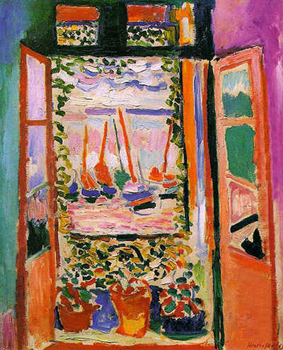
The owner's essay also compares the rhythmic golden forms with the floral pattern in Matisse's 1911 Interior with Eggplants . That earlier oil painting is a useful comparison because neither work lets a decorative motif sit passively behind the main subject. Pattern helps join the figures and the field. The materials and narrative emphasis differ sharply, but the comparison prevents the late work from seeming like an abrupt invention without earlier questions behind it. The biography follows those questions across decades; the cut-outs guide explains how they changed once painted paper became the main material. [1] [3]
There is a public history as well as a private mood. Centre Pompidou's collection essay records the work's presentation at the 1952 Salon de Mai and the enthusiasm of a contemporary review. Its current object metadata gives the state's acquisition year as 1954. The composition was therefore made, exhibited and discussed in 1952, and the owner records the later state acquisition. Its immediate reception undercuts the idea that the late cut-outs were only private experiments or minor substitutes for paintings. [1]
The title and the work's colour can pull a reader in different directions. “Sorrows” invites a search for a gloomy face, yet the image presents yellow movement, raised arms and saturated blue, green and pink around a great dark shape. The contrast does not cancel the title. It makes the picture's emotional register less predictable: music may console without erasing age or stillness, and lively colour can be part of a reflective composition. The most rewarding reading holds onto both the visible construction and the interpretive uncertainty. Follow the white hands toward the orange form, then follow the yellow pieces away from it. The work's possible story is carried by those cut-paper relations. [1] [2]
Explore 113 Matisse artworks
This directory covers the 113 individual works explored in these articles, rather than a complete catalogue of Matisse’s output. Cut-paper designs and prints appear under Drawing in the medium filter; each row names its form. Dates retain the qualifications explained in the linked articles.
Frequently Asked Questions
It is a collage made from gouache-painted paper that Matisse cut and mounted on canvas. It has the scale and pictorial ambition of a major painting, but its forms were made and assembled as cut paper. Centre Pompidou dates the original to 1952 and records it under inventory number AM 3279 P. [1]
Centre Pompidou's teaching interpretation reads the dark seated form as an ageing Matisse and calls the work a late self-portrait. That is an important institutional reading, but the collage does not label the figure. A 1961 MoMA catalogue described the royal figure and the right-hand form differently, so the identification is best presented with its source rather than as an undisputed object fact. [2] [3]
They are cut pieces of painted paper that recur across the composition. Centre Pompidou likens them to petals and to musical notes, while its longer essay relays Matisse's image of golden forms spreading from the instrument. They can be looked at both as suggestive signs and as a repeated colour that holds the large field together. [2] [1]
It belongs to the Centre Pompidou / Musée national d'art moderne collection in France. The owner's record lists an acquisition by the French state in 1954. Gallery display can change, so the collection record is the useful source for current viewing information. [1]
Compare Zulma for another large cut-paper figure arranged with room-like cues. In The Sorrows of the King , figure, music and scattered yellow forms compete more openly for the whole field; Zulma holds a single standing body closer to the centre of an interior. The comparison shows how the same late medium could make two very different kinds of presence. [1]
Discussion
Look again at the images and ideas explored in The Sorrows of the King by Henri Matisse: music and melancholy in cut paper. These editorial prompts invite your observations.
Reader Insights
What is happening in the picture?
Which comparison discussed in the article helps you see the work differently?
How do the materials and historical setting affect your reading?
Join the Conversation
Share a detail, comparison or question about The Sorrows of the King by Henri Matisse: music and melancholy in cut paper below.
References
- Centre Pompidou , “La Tristesse du roi,” collection record and analysis, including Anne Coron's essay from Collection art graphique (2008). View source .
- Centre Pompidou , “La Tristesse du roi,” teaching dossier. View source .
- Museum of Modern Art , The Last Works of Henri Matisse: Large Cut Gouaches , exhibition catalogue, 1961, pp. 9–11. View source .
- Centre Pompidou , “Fayoum – Matisse – Peindre sur et avec n'importe quoi,” event text. View source .
- Museum of Modern Art , “Henri Matisse: The Cut-Outs,” process overview, 2014. View source .
 Henri Matisse.jpg)