


 Buy Art Prints Now
from Amazon
* As an Amazon Associate, and partner with Google Adsense and Ezoic, I earn from qualifying purchases.
 by Tom Gurney
Tom Gurney BSc (Hons) is an art history expert with over 20 years experience
Page Created on June 19, 2020 / Page Updated on November 1, 2026
Email: tomgurney1@gmail.com / Phone: +44 7429 011000
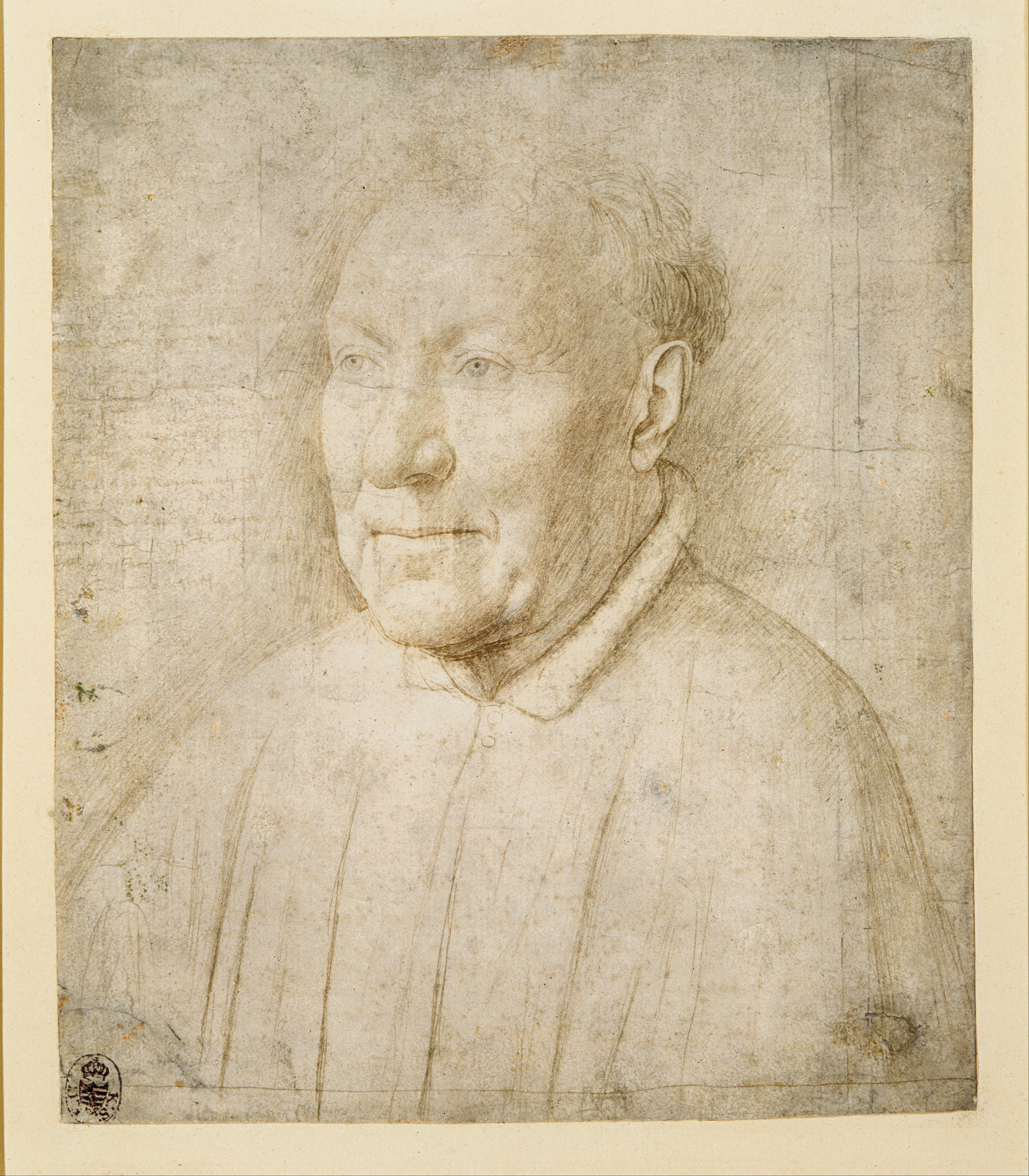
Jan van Eyck’s Dresden portrait study, traditionally called Cardinal Albergati
An older man’s face emerges from a network of fine lines, while handwritten notes preserve the colours those lines cannot show. Jan van Eyck’s Dresden Portrait of an Older Man is a study for a surviving painting in Vienna. The sitter is traditionally called Cardinal Niccolò Albergati, but that identification remains uncertain. The connection between the two portraits is much more secure than the name.[1][2]
The sheet belongs to the Kupferstich-Kabinett, Staatliche Kunstsammlungen Dresden, inventory C 775. The Morgan Library’s exhibition with Dresden described it as silverpoint and goldpoint on white prepared paper, about 1435–40, and as Jan’s only universally accepted autograph drawing. London’s National Gallery uses the approximate date 1438 for its forthcoming portrait exhibition. These are scholarly datings of an unsigned working sheet, rather than a year inscribed by the artist.[1][3]
At a Glance
Looking at the whole sheet
The drawing is roughly 21 × 18 centimetres, slightly larger than many reproductions suggest. Its head occupies the upper central area, with the torso extending towards the lower edge. The notes crowd the open space at the viewer’s left. Looking at the complete sheet reveals that Jan was organising a practical record, not simply producing a detached head study. The handwriting, clothing, shadows and boundaries around the face belong to the same surviving object.
Start with the hair. Short, separately articulated strokes follow the skull around the ear and thin out above the forehead. Below them, the pale brow occupies a broad, relatively open area. Small creases gather near the eyes, and the projecting nose interrupts the face’s smooth turn. Jan varies the pressure and density of his marks so that these surfaces appear to differ in texture as well as illumination.
The cheek nearer the visible ear is worked more insistently than the illuminated forehead. Lines describe the hollow beside the nose, the mouth’s corners and the roundness of the chin. Stronger shading under the jaw helps lift the head from its collar. The face appears substantial despite the extremely narrow tonal range. Its volume results from relationships between adjacent passages, rather than a heavy outline surrounding a flat interior.
Now look outside the head. Diagonal hatching extends into the surrounding space, especially behind the ear and beside the face. These shaded areas increase the contrast with lighter skin. They are active parts of the modelling, even though they describe no particular wall or room. The drawing makes an illusion of three-dimensional form partly by working on the space immediately around it.
The clothes receive a lighter, more summary treatment. A collar turns around the neck, a small fastening appears below, and long lines indicate the garment’s structure. The imbalance in attention is informative: the face required sustained observation, while much of the costume could be recorded more economically. The sheet preserves a hierarchy of interests rather than an equal degree of finish everywhere.
How metalpoint makes a portrait
Metalpoint depends on a prepared surface. A metal tip drawn across a suitably abrasive ground leaves minute particles behind. British Museum curator An Van Camp explains that Netherlandish artists generally favoured pale preparations, which made the delicate marks clear. The result can be exceptionally precise, but corrections are difficult, and pressing too hard risks damaging the ground. This is a method suited to careful, accumulated decisions.[4]
The term silverpoint is consequently useful but incomplete for the Dresden sheet. Its modern material description includes goldpoint too. Gold here does not mean that the artist applied a glittering gold highlight resembling a manuscript’s gold leaf. It refers to metal used in a drawing tool, leaving a fine trace on the ground. The visible portrait remains largely monochrome, although the artist changed tools while making it.[1][5]
Van Camp also explains that the appearance of metalpoint changes with time and environment. Silver marks can darken and acquire different hues; gold is more stable. The current brownish or grey appearance of a line is therefore not an uncomplicated record of what Jan saw immediately after drawing it. Nor can the metal in every individual stroke be identified reliably by inspecting a colour photograph.[4]
The surrounding hatching offers a useful place to test what a reproduction reveals. Long, sloping strokes behind the ear differ from the small marks within the cheek and from the almost horizontal emphasis at the lips. Their direction helps define the head’s turn. The finer lines around the eyes remain comparatively delicate. These differences are visible; the chemical composition of each passage requires the additional evidence of analysis.
What the scientific examination found
Research by Ina Reiche and colleagues used synchrotron-induced X-ray fluorescence to investigate metalpoint drawings without taking destructive samples. Their 2004 publication compared the Dresden portrait with a drawing by Dürer. In the van Eyck sheet, the analysis distinguished at least three metalpoint materials: two varieties of silver marks and another associated with gold, including marks in the inscriptions and reinforced passages. This replaces the picture of an artist using one uniform silver tool throughout.[5]
Martin Radtke, Uwe Reinholz and Heinrich Riesemeier’s 2009 account, published in the French journal ArchéoSciences, sets out a proposed sequence. A relatively pure silver point established the face, hair and clothing. A different silver point containing copper supplied hatching beside the head. A gold point strengthened the eyes and other details and was used for writing. The authors present this as a reconstruction from the material evidence, not an eyewitness description of Jan’s actions.[6]
They also suggest practical reasons for the choice of gold: its mechanical properties could make writing easier, and its marks behave differently from silver. That remains an explanation for the observed distribution, rather than proof of the artist’s private intention. Importantly, their method identifies composition; it does not independently date the sheet or identify the sitter. A more detailed account of tools cannot turn a proposed cardinal into a documented one.[6]
Return to the eyes and compare them with the neighbouring forehead. Small dark accents make the eyes legible without surrounding each one with an equally emphatic boundary. The pale area above them remains spacious and open. Below, the shaded throat anchors the face to the garment. The investigation helps explain why this economical-looking image can contain several distinct kinds of mark-making, even where a photograph gives an impression of one continuous brown line.
Colour instructions beside a monochrome face
The annotations concentrate on the sitter’s physical appearance. They concern eyes, hair, lips, beard and complexion, recording differences too small or too chromatic for the drawn lines alone to convey. The words act as another means of observation. They do not name the man, give his age or record the terms of a commission. Their usefulness lies in preserving distinctions that a painter might need after direct access to the sitter had ended.
Belgian scholar Leo van Puyvelde’s 1955 language study reproduces W. H. J. Weale’s earlier, fragmentary transcription, including a purplish wart, pale purplish lips and greyish beard stubble. Its gaps matter: an incomplete reading should not be silently converted into an exact modern transcript.[7]
Watch: Jan van Eyck in context
Choose a Smarthistory close reading of the Arnolfini Portrait or the closed and opened Ghent Altarpiece.
Jan van Eyck, The Arnolfini Portrait
Look closely at the room, mirror and gestures in the London double portrait.
Watch on YouTubeThe phrase “die lippen zeer witachtich”, followed by “purper”, is particularly revealing: the lips are not merely labelled red. The description combines a pale value with a purple hue. References to brownish yellow and bluish white around the eyes similarly distinguish adjoining colours within a tiny feature. These instructions concern relationships between hues rather than broad areas to fill.[7]
Compare the activity of reading these words with looking at the face. The drawing allows the eye to grasp structure immediately: the nose projects, the cheek turns, the mouth closes. The writing must be followed in sequence and interpreted. It gives a different kind of specificity. Together, word and image preserve more information than either could conveniently hold alone.
The costume shows what those facial observations leave for another stage. Two long openings descend through the mantle, and its collar and fastening have been indicated, but they do not compete with the head’s detailed surface. In the painting, the broad red garment and pale lining become a major part of the presentation. This contrast makes the sheet’s selective purpose particularly clear: a close record of the man did not require every part of the future picture to be settled at once.
What the language can tell us
Van Puyvelde identified much of the vocabulary as Middle Dutch and related certain spellings to Limburg usage. His argument was deliberately more cautious than a claim to have located Jan’s birthplace: the language could support a Limburg connection without proving that the painter was born in Maaseik. That restraint is useful when this small sheet is used as evidence for a much larger biography.[7]
The 1955 article also illustrates why older scholarship must be read alongside later research. It called the writing silverpoint, whereas the subsequent scientific investigations distinguished gold-containing marks in the inscriptions. Its linguistic observations and its material assumption have different evidential histories. We can learn from its transcription without treating its description of the drawing tools as the last word.[5][7]
From the study to the Vienna portrait
The related painting, now in the Kunsthistorisches Museum, Vienna, is catalogued as Cardinal Niccolò Albergati (?), around 1435. The museum proposes that Jan made the drawing during the Arras peace congress that year and painted the portrait soon afterwards. Its question mark is important. The historical occasion follows from the proposed identity; the sheet itself does not state that it was drawn at Arras.[2]
The visual relationship is unusually close. The same broad forehead, rounded nose, small mouth and distinctive configuration of cheek and chin recur. Yet the painting gives this face a different presence. Colour differentiates hair, skin and lips; the dark background isolates the sitter; and the garment becomes a substantial coloured mass. The finished work transforms a record of observation into an independent object intended to be seen without its preparatory notes.
That transformation should be examined feature by feature. Compare the forehead’s curve, the width of the cheek, the relationship of the ear to the eye and the lower edge of the chin. Some contours correspond closely, but that does not mean that every part of the painting was enlarged from the sheet with equal rigidity. The drawing was useful precisely because it preserved a likeness from which Jan could make further choices.
The current dimensions of the two objects cannot alone provide an exact enlargement factor. Paper edges, painted support and the area occupied by a head are different measurements. Vienna’s catalogue also records changes to the panel, including added strips and an eighteenth-century oval format subsequently made up again. Those alterations belong to the painting’s later physical history. They warn against treating its present outer rectangle as an untouched fifteenth-century working grid.[2]
Enlarging the likeness
The close relationship between the portraits has attracted theories about copying aids. Did Jan transfer selected measurements, enlarge the image geometrically, work by eye, or combine approaches? The question concerns how one two-dimensional likeness became another. It is distinct from whether the first drawing was made in front of the sitter and from the accuracy with which Jan observed colour.
Dresden curator Thomas Ketelsen and the technical researchers also investigated evidence for mechanical enlargement. A 2004 conference abstract, summarised on co-author David Stork’s publications page, associates small pinprick holes with a measuring instrument such as proportional dividers. That offers a physical reason to consider mechanical methods. It does not establish that every line was transferred by one device, or that an optical projection has been demonstrated.[8]
Marco Duarte and David Stork later tested the stronger claim that the similarity between the works requires an optical projector. Their 2010 Leonardo article reports experiments with professional artists making mechanically aided enlargements. The resulting contour fidelity equalled or exceeded that of the van Eyck pair. Their result shows that skilled artists using mechanical methods could achieve the observed closeness; it does not recover Jan’s exact sequence of operations six centuries later.[9]
The useful outcome is a more concrete question about particular marks and measurements. An impressive match is evidence that the likeness was preserved carefully. It does not, by itself, select a unique transfer method. Conversely, changes between study and painting need not break their relationship: selective measurement and free decisions can coexist within the production of a portrait.
The cardinal’s name and the drawing’s recognition
The sheet’s recognition as Jan’s work and the naming of its sitter happened at different times. The published introduction to Ketelsen and colleagues’ 2005 study records Johann David Passavant’s recognition in 1841 of the Dresden drawing’s relationship to the Vienna painting. It identifies Max Rooses’s proposal in 1902 as the source of the Albergati identification. These are episodes in the modern study of the objects, not evidence that either date marks their arrival in a collection.[10]
The proposed sitter was a Carthusian monk and papal diplomat, making the Burgundian court and peace negotiations an attractive context. The Morgan nevertheless argues that the man’s secular dress and hair are difficult to reconcile with Albergati and suggests an unidentified scholar instead. That alternative is a category, not a newly discovered name. Calling the man a scholar should remain qualified too.[1]
Current institutional titles preserve this uncertainty in different ways. Vienna retains the traditional name with a question mark; the National Gallery’s 2026 exhibition announcement calls the painting Portrait of an Elderly Man (A Scholar?). The drawing’s broad 1435–40 date and London’s approximately 1438 should similarly be understood as assessments. They do not combine to yield a documented sitting in a particular city and year.[2][3]
It is tempting to make the portrait’s physical intimacy stand in for biography. Jan studied the man closely enough to notice tiny distinctions of colour, yet we cannot securely name him. This gap is part of the sheet’s historical value. It preserves evidence of an encounter and of artistic decisions while leaving the relationship between painter, sitter and patron largely unknown.
Original, facsimile and survival
A later reproduction in Ghent provides a useful reminder that the same image can occur on very different objects. MSK Gent owns a 1900 facsimile, published by Die Insel in Das Mappenwerk der Insel, inventory 2011-CQ-16. It is catalogued on paper and cardboard at 355 × 278 millimetres. That is a reproduction after the Dresden drawing; its measurements and date must not be attached to Jan’s original sheet.[11]
The facsimile also belongs to the image’s later life as something reproduced, collected and studied. A printed imitation can transmit the arrangement of the head and writing to readers far from Dresden. It cannot transmit the complete physical evidence of the original ground, pressure, metal deposits and tiny surface interventions. The scientific work depends on precisely those differences that an excellent reproduction may leave difficult to judge.
Van Camp places the Dresden portrait within a surviving body of metalpoint drawings dominated by workshop copies. A preparatory study linked to a surviving painting is exceptional in that context. Scarcity should not be confused with an absence of drawing in the fifteenth century: working material could have many uses without enjoying the preservation given to a finished panel.[4]
The sheet’s special place among Jan van Eyck’s drawings rests on this unusually strong connection between observation and a completed work. Its value is not exhausted by calling it his sole accepted drawing. Here we can inspect a face made through different tools, read selected colour instructions and compare the resulting likeness with the Vienna portrait. The maker is unusually secure; the means of working are increasingly legible; the sitter remains uncertain.
Related reading


Discussion
What do you notice in Jan van Eyck’s Dresden portrait study, traditionally called Cardinal Albergati? Share a close observation or a source that adds useful context.
Join the Conversation
Keep observations specific and evidence clear.
References
- The Morgan Library & Museum, “Jan van Eyck: Portrait of an Older Man,” Van Eyck to Mondrian, exhibition text, caption and curator’s audio transcript. View Source
- Kunsthistorisches Museum, “Cardinal Niccolò Albergati (?)”, GG 975; collection description, dimensions, support history and provenance. View Source
- National Gallery, “Van Eyck: The Portraits,” 2026 exhibition announcement; drawing dated about 1438 and painting titled Portrait of an Elderly Man (A Scholar?). View Source
- An Van Camp, “Metalpoint Drawings from the Low Countries,” CODART eZine 6, June 2015. View Source
- Ina Reiche et al., “Spatially Resolved Synchrotron-Induced X-ray Fluorescence Analyses of Metal Point Drawings and Their Mysterious Inscriptions,” Spectrochimica Acta Part B 59 (2004), 1657–62; abstract. View Source
- Martin Radtke, Uwe Reinholz and Heinrich Riesemeier, “Synchrotron Radiation Induced X-Ray Fluorescence for the Characterization of Ancient Gold Objects,” ArchéoSciences 33 (2009), 39–44, especially 40–41; relevant full text consulted in the author’s public deposit. View Source
- Leo van Puyvelde, “De taal van Jan van Eyck,” Verslagen en mededelingen van de Koninklijke Vlaamse Academie voor Taal- en Letterkunde (1955), 213–23, especially 217–20; digitised by DBNL. View Source
- Thomas Ketelsen, Olaf Simon, Ina Reiche, Silke Merchel and David Stork, “Evidence for Mechanical (Not Optical) Copying and Enlarging in Jan van Eyck’s Portrait of Niccolò Albergati,” Optical Society of America, 2004; co-author’s published summary. View Source
- Marco F. Duarte and David G. Stork, “Image Contour Fidelity Analysis of Mechanically Aided Enlargements of Jan van Eyck’s Albergati Portrait,” Leonardo 43, no. 1 (2010), 43–50; published abstract and indexed introduction/conclusion. View Source
- Thomas Ketelsen, Ina Reiche, Olaf Simon and Silke Merchel, “New Information on Jan van Eyck’s Portrait Drawing in Dresden,” The Burlington Magazine 147, no. 1224 (2005), 170–75; publisher’s public introduction. View Source
- MSK Gent, Portrait of Cardinal Niccolò Albergati, facsimile after Jan van Eyck, Die Insel, 1900, inventory 2011-CQ-16. View Source
 Jan van Eyck.jpg)
 Jan van Eyck.jpg)


