

 by Tom Gurney
Tom Gurney BSc (Hons) is an art history expert with over 20 years experience
Published on June 19, 2020 / Updated on September 28, 2026
Email: tomgurney1@gmail.com / Phone: +44 7429 011000
About the painting
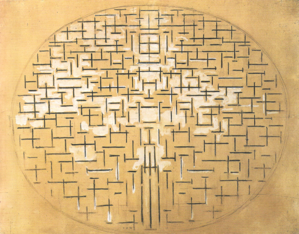
At first glance, Piet Mondrian's Composition 10 in Black and White looks like a loose constellation of small black crosses. Look longer and the marks begin to move in two directions: horizontal strokes stretch across the middle, while short verticals cluster beneath them. Together they form an irregular oval of activity on a pale ground. The Kröller-Müller Museum identifies the painting as a 1915 oil on canvas, 85.8 × 108.4 cm, and notes that it is sometimes called Pier and Ocean. It is the museum's object KM 104.241 and B79 in RKD's Mondrian catalogue.[1][2]
The painting grows out of Mondrian's drawings of the sea and breakwaters at Domburg and Scheveningen in 1914. By 1915 he had reduced that observed subject to black horizontal and vertical strokes on white. The museum calls this his first painting made exclusively in black and white. It also explains the sea-and-pier reading: longer central horizontals suggest waves, and vertical marks low in the composition suggest a breakwater. What matters here is how a particular coastal motif becomes a rhythm of opposing directions, rather than a descriptive view of a beach.[2]
At a glance
- ArtistPiet Mondrian (Piet Mondriaan, 1872–1944)
- TitleComposition 10 in Black and White; Dutch: Compositie 10 in zwart wit
- Other namePier and Ocean (used by the Kröller-Müller Museum)
- Date1915
- MediumOil on canvas
- Dimensions85.8 × 108.4 cm (height × width)
- CollectionKröller-Müller Museum, Otterlo, object KM 104.241
- Catalogue raisonnéB79; RKD also gives historic inventory reference 532-15[1][2]
Composition 10 in Mondrian's path from sea to grid
Contents
- What does Composition 10 show?
- Why is it also called Pier and Ocean?
- How did Mondrian turn a seascape into abstraction?
- Where does it fit in Mondrian's development?
- Who bought the painting and where is it now?
What does Composition 10 show?
No horizon line divides this painting into a conventional sea and sky. There is no painted pier with a deck, railing or perspective recession. Instead, small black strokes collect in a broad oval-like field. The field is not enclosed by a drawn oval; its shape emerges because the marks thin out toward the edges. This makes the white area around them seem to press inward, while the marks near the middle remain active and connected.
Most of the lines run horizontally or vertically. Some meet to make crosses or T shapes; many stop before they touch. Their lengths and gaps vary. The effect is unlike graph paper or a mechanical grid, where each square would have the same size. A viewer can follow one short horizontal and then jump to another above or below it, finding a pulse without a single route through the image. The apparently sparse white ground is part of that pulse: it sets the intervals between black marks.
The lower middle is a useful place to begin looking. Several uprights descend beneath the long horizontal passages around the centre. In the museum's interpretation, those verticals retain something of a breakwater, while the longer middle horizontals recall rolling waves. The reading is convincing as an account of the painting's source, but the strokes need not be decoded one by one into physical objects. Their relationships carry the picture even when the pier is no longer obvious.[2]
The overall arrangement has a loose balance. It spreads widely across the canvas, then narrows at the top and bottom. Lines at the periphery appear to break away or fade into the white. This edge matters: the painting does not ask the viewer to inspect a bounded diagram. Its network seems capable of continuing beyond the positions where Mondrian stopped marking the surface. That is a visual reading, not a claim that the artist intended an infinite grid.
Why is it also called Pier and Ocean?
The Kröller-Müller Museum supplies Pier and Ocean as an alternative name and relates the painting to Mondrian's 1914 drawings in the seaside towns of Domburg and Scheveningen. He studied the sea and the breakwaters there. A pier or breakwater projects into the water; seen from the shore, it sets a strong vertical direction against the horizontal movement of waves and horizon. Those opposed directions offered Mondrian a way to simplify the landscape while keeping a trace of its structure.[2]
It is useful to keep the exact titles apart. RKD lists B78, Pier and ocean 5, as a separate 1915 work at the Museum of Modern Art in New York. The painting on this page is B79, Compositie 10 in zwart wit, at the Kröller-Müller Museum. They belong to the same period of experiment, but they are not two catalogue names for one object. The alternative Pier and Ocean describes B79's subject and history; it does not erase its established Composition 10 title.[1]
Mondrian Route, a project developed with Kunstmuseum Den Haag and RKD, places the painting in his Laren and Blaricum years. It says he developed earlier sea sketches into charcoal works including Ocean 5 and Pier and ocean 5 while working in Blaricum. It describes Composition 10 as the next step, where the sea-and-pier motif becomes a black-and-white network. This sequence helps explain the painting without assuming that a single preparatory drawing maps directly to every stroke on this canvas.[3]
The title can also mislead. “Composition” announces an arrangement of formal elements, and “10” belongs to the historical name recorded by both RKD and the museum. The sources consulted here do not establish that this is the tenth work in a complete ten-painting series. The number should be used to identify the object, not turned into an unsupported chronology.
Watch: Piet Mondrian
See his studio, the move toward geometric abstraction and the rhythms of his New York paintings.
Piet Mondrian: Abstract Painting as We Know It
Curator Michael White explores the paintings and Mondrian’s studio as an abstract space.
Watch on YouTubeHow did Mondrian turn a seascape into abstraction?
The 1914 coastal drawings are a starting point, according to the museum. In the 1915 painting, water and breakwater no longer have continuous outlines or local colours. Small black lines take their place. The viewer can still imagine waves passing the end of a pier, but the picture does not depend on recognising them immediately. This is a shift from describing a place to arranging relationships that came from that place.[2]
Horizontal and vertical are simple opposites, yet Mondrian makes them varied. A horizontal may be longer than its neighbour; an upright may interrupt it or sit in a separate white gap. Some intersections feel firm, others nearly accidental. Repetition gives coherence, while uneven spacing prevents the design from becoming static. The museum calls the result an exploration of harmony and rhythm, and connects that exploration to the opposition between the two line directions.[2]
The oval-like perimeter is another important difference from Mondrian's familiar later rectangles. Rather than extending black bars from one canvas edge to another, he gathers many short marks in a swelling central zone. That form gives the abstraction a sense of concentration and release. It also preserves something of the sea motif's open, shifting character. The painting belongs to a stage of experiment, not a finished version of the later primary-colour grid.
Black and white narrow the means Mondrian uses. With no red, blue or yellow fields to distribute, relationships of direction, interval and density become more apparent. White is not merely an empty background: it separates the marks, holds them together visually and keeps the network readable. The museum identifies this as Mondrian's first painting using only black and white; the claim is specific to his paintings and should not be stretched into “his first abstract work.”[2]
This transformation also explains why the work can be read both ways. A viewer who knows the coastal source may see pier and waves. A viewer who does not can still encounter a varied arrangement of perpendicular strokes. Mondrian has not hidden a realistic scene inside a puzzle. He has made an image in which observed nature and formal order remain connected without being identical.
Where does it fit in Mondrian's development?
RKD places B79 between Pier and ocean 5 (B78) and a 1916 composition (B80) in its 1914–19 catalogue sequence. That sequence makes the painting's position clear: it follows the coastal studies and precedes later experiments in line and colour. It does not mean each work was finished in the exact numerical order of the catalogue, but it prevents the common mistake of treating Composition 10 as one of the 1920s or 1930s rectangular colour paintings.[1]
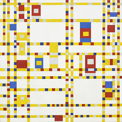
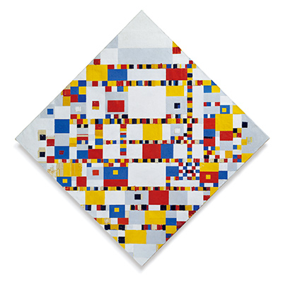
In later Mondrian compositions, heavy straight bars, large white areas and blocks of primary colour often reach the edge of the canvas. Here the marks are short, repeated and gathered in a loose oval. The rhythm is restless and comparatively fine grained. Seeing these differences is more useful than treating the work as merely an unfinished version of a future style. It has its own visual logic and belongs to a moment when Mondrian was testing how much of a landscape could be retained through reduction.
The Laren and Blaricum setting also matters. Mondrian Route says he worked in Otto van Rees's studio in Blaricum during 1915, developed the sea material there and exhibited Composition 10 at Amsterdam's Stedelijk Museum in October that year. The route also notes that Theo van Doesburg responded to the work in the period before their later association with De Stijl. These details show the painting being seen and discussed in its own time, before the later image of Mondrian's art became dominated by large red, yellow and blue rectangles.[3]
Nothing in the work requires one fixed “meaning” for every short line. The museum's language of rhythm and harmony is tied to what a viewer can see: two perpendicular directions and their varied repetition. Its reference to sea and breakwater supplies the historical motif. Keeping those levels distinct lets the painting be understood as both an object with a documented source and an arrangement open to close looking.[2]
Who bought the painting and where is it now?
The Kröller-Müller Museum holds Composition 10 in Black and White in Otterlo as KM 104.241. Its online record gives the medium and exact size as well as the 1915 date. RKD's catalogue also places B79 in the museum, but prints an older inventory reference, 532-15. These different numbers refer to the same identified painting, rather than two separate versions of Composition 10.[2][1]
Mondrian Route says the art adviser H.P. Bremmer bought the painting for Helene Kröller-Müller in 1915. A scholarly publisher's notes on Mondrian's correspondence trace a second, interpretive title: Bremmer called the work Kerststemming, or “Christmas Mood,” and Mondrian agreed with that reading. The notes cite his letter to Bremmer of 5 January 1916 and explain that the title later entered the collection descriptions. This is an intriguing episode in the painting's early reception, but Kerststemming is a historical interpretive title, not the primary title used by the museum's present object record.[3][4]
Mondrian Route reports that the work attracted attention when exhibited at the Stedelijk Museum that October. Taken with the acquisition, this puts the painting in a public and collecting context in 1915. The available sources do not give every later movement or display date, so the secure present-day statement is that it belongs to the Kröller-Müller Museum. Anyone planning a visit should consult the museum's current display information rather than assume the painting is always on view.[3][2]
Mondrian artworks directory
Frequently asked questions
When was Composition 10 in Black and White painted?
Is Composition 10 the same as Pier and Ocean?
Which museum owns the painting?
It belongs to the Kröller-Müller Museum in Otterlo, the Netherlands, under object number KM 104.241.[2]
What is its size and medium?
It is oil on canvas, measuring 85.8 × 108.4 cm (height × width), according to the museum.[2]
Why are there no red, yellow or blue rectangles?
This is a 1915 painting built from short black vertical and horizontal strokes on white. The museum identifies it as Mondrian's first painting made only in black and white; the familiar primary-colour rectangles belong to later developments.[2]
Discussion
Where do the short black marks first suggest waves to you?
Reader Insights
Follow the longer horizontals from the centre toward the oval edge. Where does your eye stop?
Which small vertical group changes the rhythm after a second look?
How does this painting differ from the separately catalogued Pier and ocean 5?
Join the Conversation
Share what you notice in this painting below.
References
- RKD – Netherlands Institute for Art History, Mondrian catalogue raisonné, Holland 1914–19, entries B78–B80. View source.
- Kröller-Müller Museum, Compositie 10 in zwart wit / Composition 10 in Black and White, object KM 104.241, facts and interpretive text. View source.
- Mondrian Route, Otto van Rees's studio, Laren/Blaricum chronology and exhibition account, project developed with Kunstmuseum Den Haag and RKD. View source.
- Querido / Singel Uitgeverijen, scholarly notes to Mondriaan, on Bremmer's Kerststemming interpretation and Mondrian's correspondence. View source.
- Lead image credit. Piet Mondrian, Composition 10 in Black and White (Compositie 10 in zwart wit), 1915, oil on canvas, RKD B79; Kröller-Müller Museum KM 104.241.
 The Red Tree Piet Mondrian.jpg)