



 by Tom Gurney
Tom Gurney BSc (Hons) is an art history expert with over 20 years experience
Published on June 19, 2020 / Updated on November 3, 2026
Email: tomgurney1@gmail.com / Phone: +44 7429 011000
Reine de Joie by Henri de Toulouse-Lautrec: Introduction
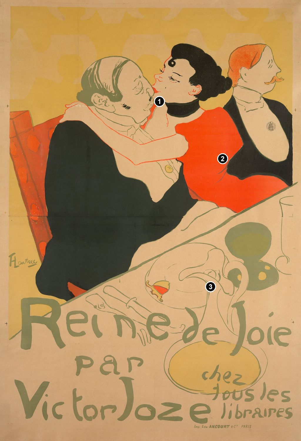
A kiss takes place above a table that seems to slide towards us. Black coats, a red dress and a pale expanse of cloth make the encounter readable almost immediately; below them, enormous irregular letters announce a book. Toulouse-Lautrec's Reine de Joie of 1892 turns a fictional dinner into a public advertisement. Its striking design also carries an antisemitic caricature, making the relationship between artistic invention and the attitudes it circulated essential to understanding the image. [1] [2]
At a Glance
- ArtistHenri de Toulouse-Lautrec.
- Date and purpose1892; advertisement for Victor Joze's novel Reine de joie. [1]
- MediumColour lithograph; the Metropolitan Museum's full poster is printed in four colours on machine-wove paper. [3]
- PrinterEdward Ancourt, Paris. [2]
- Chicago impressionArt Institute of Chicago, Charles Deering Collection, 1927.6114; image 136.2 × 93 cm, visible assembled sheets 143.8 × 99 cm. These are measurements of that museum's object. [1]
- SubjectA courtesan embraces a fictional wealthy banker at dinner; the representation deploys the period's antisemitic stereotyping. [2]
This work across Henri de Toulouse-Lautrec’s career
Contents
- A novel becomes a single encounter
- Three figures, three directions
- The table is also a writing surface
- Colour, printing and the full-sized poster
- Caricature and the criticism it encouraged
- An advertisement already collected as art
- Annotated details
A novel becomes a single encounter
The title means “Queen of Joy.” In Colta Ives's Metropolitan Museum catalogue, the fuller book title is translated as Queen of Joy, Customs of the Demimonde. The advertisement names the author and directs potential buyers to booksellers. Its subject belongs to the promotion of a novel, rather than to the announcement of a dancer's engagement or a café-concert programme. The social scene is the attraction through which the book is offered. [3]
Ruth E. Iskin's detailed study of the poster and its reception identifies the novel's central character as Alice Lamy, a Parisian courtesan. The banker, Baron de Rozenfeld, is a fictional character and an allusion to Alphonse de Rothschild; Iskin stresses that he is not the novel's principal figure. Her account locates the depicted dinner in a private room at the Café Anglais, where the banker entertains Alice and three male guests. The poster selects three prominent figures from that larger gathering. These narrative details come from Iskin's reading of Joze, rather than from identities discoverable through the faces alone. [12]
According to Iskin, Alice has just discovered a document giving her a townhouse, part of an arrangement involving financial support and gifts. The kiss responds to that discovery. This context changes how the embrace reads: the novel connects it with an economic transaction. Lautrec does not illustrate the entire bargain or set out its terms in words. He compresses the episode into the contact between two profiles, a conspicuous arm and the contrast between their bodies. [12]
The dinner's setting is only lightly specified. No fully described wall, doorway or architectural view establishes the room. Instead, pale silhouettes of distant heads and shoulders alternate with the yellow background. They suggest company while remaining much less substantial than the people nearest us. The poster gives priority to an incident that can be grasped quickly, leaving the novel to provide the sequence of events around it.
Three figures, three directions
The banker fills the left half with a swelling dark coat. His pale shirtfront cuts an irregular opening beneath his head, and a small circular ornament hangs within it. Thin lines run over the crown of his head, while darker hair remains at the side and back. His body appears compressed into the chair. The elaborate chair back supplies a warm vertical strip beside the coat, helping to make the broad dark form distinct from its setting.
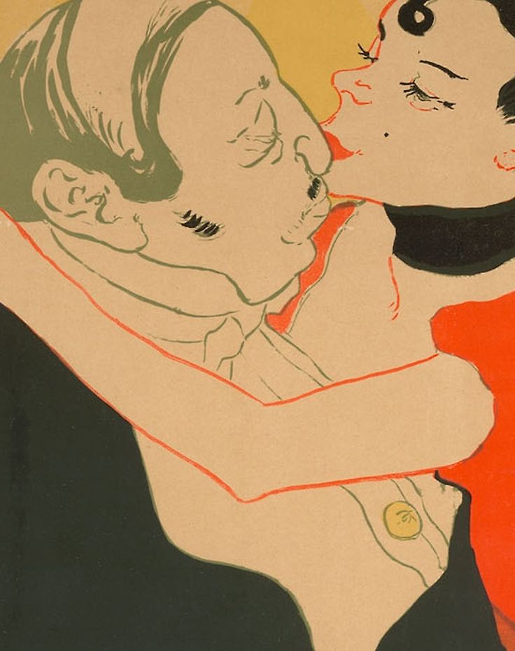
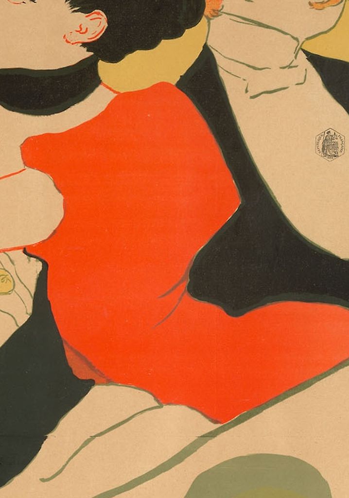
Alice approaches from the right. Her red sleeve and bodice establish a large warm shape, while her bare arm crosses the banker almost horizontally. The arm supplies an insistent boundary around his upper body: a pale band against the coat and a thin red contour against the pale shirt. Above it, her dark coiffure, curled lock and black neckband concentrate the strongest dark accents around her face. Her lips meet the projecting profile of his nose. Small features carry the incident inside much larger shapes.
Their contact does not produce a symmetrical pair. His rounded figure sinks towards the lower left; her upper body rises and leans across him. Her face is more elevated, and the line of the arm pulls the two bodies into an enclosing shape. One can trace that enclosure without assigning either figure a private thought. The visual arrangement makes the embrace forceful even before the book's transaction is explained.
The third figure turns towards the right edge. His reddish hair and extended moustache produce another sharply legible profile. A pale bow tie and expansive shirtfront interrupt the dark jacket, echoing the banker's formal dress while giving the upright body a different structure. His head points away from the kiss, so the group never becomes a closed conversation in which everyone attends to the same event.
Iskin identifies him as the novel's young English Lord of Bath. She reads the contrast between his upright appearance and the banker's compressed posture as part of the picture's hierarchy: the younger guest is set apart from the embrace. That is an interpretation of the represented characters and their social coding. It does not identify a real person who sat for the figure, or demonstrate that his averted face records moral disapproval. [12]
The differences between them are consequently more than convenient variations in pose. The caricature makes particular physical features carry a judgement about the banker, while the other man is given a contrasting bearing. Looking closely reveals how the apparent fluency of the group depends on this unequal treatment. It is possible to admire the economy of the silhouettes while recognising that their social implications are unequal too.
Annotated Details from Reine de Joie
The numbered points identify visible features discussed in this article. Return from each detail to the whole composition. Henri de Toulouse-Lautrec, Reine de Joie,1892. Colour lithograph on tan wove paper. Art Institute of Chicago,Charles Deering Collection,1927.6114; image136.2 × 93 cm,assembled sheets at sight143.8 × 99 cm. Image source. Public domain. Resized only; native appearance preserved.
Details from REINE DE JOIE
Compare the cropped details with the complete images above. Notice how their colours, shapes and positions contribute to the larger compositions.
The kiss
The meeting faces concentrate the action within the crowded upper group.
The red dress
A broad red shape holds the central figure against surrounding black coats.
The diagonal table
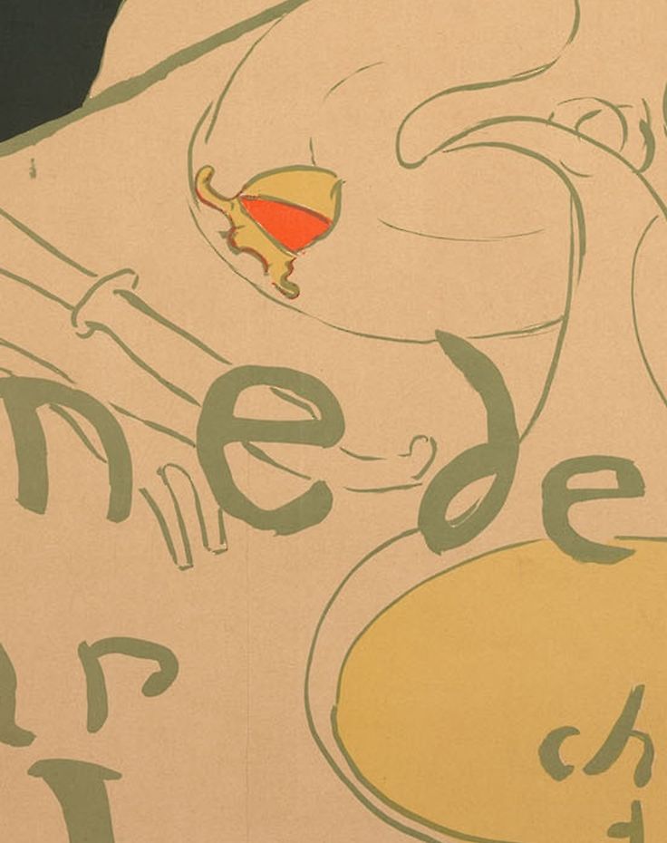
Dishes, glassware and food lead the eye across the tilted table.
The table is also a writing surface
The tabletop cuts diagonally across the poster, rising towards the right beneath Alice's sleeve. It places us close to the meal while withholding a naturalistic view into its depth. A plate appears as an oval; cutlery lies beside it; a small glass contains a concentrated warm patch. To the right, a broad drinking vessel becomes a much darker green shape, while a taller glass is indicated with very little drawing. Objects that would be comparable in a literal table setting receive radically different amounts of visual weight.
The large jug is especially active. Its bulbous lower part reaches into the area occupied by the words; the curving neck, lip and handle make a tangle of thin outlines higher up. Those curves continue the movement of the letters without becoming letters themselves. The foreground is therefore neither empty space reserved for a caption nor a densely modelled still life. Tableware, cloth and writing share the same pale field.
Read the words in sequence and the eye moves down through that field: Reine de Joie, par, Victor Joze, and chez tous les libraires—“at all booksellers.” Princeton's record transcribes the lettering and the much smaller printer's imprint naming Ancourt. The uneven letterforms belong to the printed design, as does Lautrec's signature at the left. Their hand-drawn appearance is part of a reproducible lithograph. [2]
The title stretches across the width, but its individual letters refuse a rigid baseline. The oversized initial and rising strokes compete with the plate and jug; gaps open and close as the writing passes across the table. Lower down, the author's name expands again, while the booksellers' notice occupies the right-hand corner. These changes of size create a reading order without requiring a rectangular block of typeset copy.
The effect differs from the lettering on Ambassadeurs: Aristide Bruant, another poster offered for sale in 1892. There, the name can occupy an enormous dark cloak. Here, the pale table provides room for the announcement. In both, an object within the picture carries words, but Reine de Joie lets domestic utensils and a commercial message become unusually entangled. Cate's contemporary-market evidence places the two designs together; the visible comparison shows how differently Lautrec made room for their text. [13]
Watch: Toulouse-Lautrec
Choose an artist introduction, a film about graphic design or a closer look at At the Moulin Rouge.
Colour, printing and the full-sized poster
Large colour areas bind the arrangement together. The dark coats and coiffure establish weight above the table, the dress interrupts them with red, and yellow holds the distant heads within a continuous background. Interior modelling is selective. The banker's face has a few lines around the eye and cheek; the red sleeve is articulated by small creases. Neither needs a continuous passage from light to shadow to remain legible.
Ives lists the full poster as a lithograph printed in four colours and records the Met's sheet at 150 × 99.5 cm. The current museum record agrees. Those dimensions restore a scale easily lost on a screen: this is a large advertisement whose head, arm and lettering had room to register across a wall. Four printing colours do not mean four visible hues, nor do they establish a recipe in which every secondary colour was obtained from overlapping primaries. [3] [14] [13]
Writing about Lautrec's prints and posters, Phillip Dennis Cate distinguishes the artist's preparation and correction of images from the printer's production of impressions. He also relates the flat colours of Reine de Joie to Lautrec's earlier experiments with journal illustration and stencil colour. That is a useful comparison of visual resources across processes. It does not turn this lithographic poster into a stencil-coloured journal page. [13]
The broad flat areas also make the finer drawing more consequential. A narrow contour can distinguish the pale arm from the shirt without filling either with shading. The table's edge can separate the red sleeve from the foreground in a single sustained direction. Economy here involves deciding where a boundary must be clear and where a few dispersed marks will suffice. The apparent simplicity belongs to the coordination of those unequal passages.
Caricature and the criticism it encouraged
The banker's representation requires more than a description of comic exaggeration. The Art Institute explicitly connects Joze's fictional banker with antisemitic stereotypes, and Princeton identifies the negative stereotype in both the book and the poster. This racialised construction is part of the image's historical content. The character's physique, facial features and purchase of sexual attention were used to associate Jewish identity with degrading behaviour. They are features of a prejudiced representation, not evidence about Jewish people. [1] [2]
Iskin shows why contemporary praise cannot be separated automatically from that content. Reviewing the poster in the 1890s, Frantz Jourdain, Ernest Maindron and Octave Uzanne elaborated the banker's degradation while praising Lautrec's powers of observation. In her analysis, these descriptions positioned artist, critic and reader above the person being caricatured. Critical approval could therefore reinforce the stereotype rather than merely celebrate an innovative arrangement of line and colour. [12]
Iskin also distinguishes Félix Fénéon from those critics. His 1893 comments praised the audacity of Lautrec's simplified forms and flat colour; his description of the dinner directed its attack at an ageing capitalist. Iskin argues that he did not dwell on Jewish identity as the other reviewers did. Her comparison therefore reveals differences within the contemporary response, rather than treating every admirer as voicing an identical position. [12]
A different response appears in Thadée Natanson's February 1893 review in La Revue blanche. Iskin's article reproduces its French text and supplies translations. Natanson praised the posters' colour and drawing, but repeatedly used language of disturbance. Iskin reads his response through his position as a Jewish critic, a banker's son and a supporter of the artistic avant-garde. She argues that his attention to form, and avoidance of the banker's identity, register an ambivalence absent from the more degrading descriptions. This is her historically grounded reading of his words, rather than a directly recorded confession of what he felt. [12]
The distinction matters when looking at the image today. Neither formal admiration nor a general claim that Lautrec understood marginalised people settles what this particular poster does. Its concentrated design gave an existing fictional stereotype a forceful public form. The faces and bodies need to be examined together with the critical language they prompted. Otherwise, the same dehumanising judgements can slip back into an apparently neutral description of the scene.
An advertisement already collected as art
The poster's commercial life extended beyond selling Joze's book. Cate records Reine de Joie and Moulin Rouge being exhibited with progressive proofs in Antwerp in spring 1892. He also identifies Reine de Joie in Edmond Sagot's July catalogue, offered for four francs, alongside the three-franc Ambassadeurs poster. These were contemporary opportunities to study and acquire the designs as prints. They do not establish the ownership history of any particular museum impression. [13]
Bonnard contributed another image to the same publishing project: the book jacket. The National Gallery of Art holds an 1892 colour-lithograph proof of his cover, while Matthias Arnold's MoMA catalogue essay distinguishes Bonnard's jacket from Lautrec's poster. The publication thus involved separate artists and separate graphic objects. Recognising the famous dinner scene does not make it the sole illustrated form through which a reader encountered the novel. [15] [16]
A further distinction concerns the small version of Lautrec's own design. The Met holds a colour lithograph described as “reduced from poster,” accession 49.55.164, with a sheet measuring 15.9 × 14 cm. Its reproduction retains the main figures and lettering at a markedly smaller scale. It is a separate object from the museum's 150-centimetre poster, accession 32.88.13. The smaller sheet's measurements and collection credit belong to the reduction. [17] [14]
Museum records also preserve distinct full-sized impressions. The Art Institute's example belongs to the Charles Deering Collection; MoMA's was given by Mr. and Mrs. Richard Rodgers and is numbered 73.1961. Wittrock's 1985 exhibition catalogue lists the Rodgers impression beside another example, under the full poster's catalogue identity. Their preservation allows the advertisement to be revisited beyond the moment of the novel's sale. The large title remains indispensable: it keeps the picture's original invitation to buy a book visible within its later life as collected art. [1] [18] [19]
Toulouse-Lautrec artworks directory
Browse 84 identified works and publications in this researched selection. Dates and titles follow the individual records; this is not a complete catalogue of the surviving oeuvre. Print impressions remain attached to their designs. Some listed works do not have a dedicated article. The Drawings guide also contains nine illustrated studies consolidated from former articles.
Frequently Asked Questions
The finished advertisement is a colour lithograph. The Met's full poster is documented as printed in four colours on machine-wove paper. [14]
Iskin identifies the represented characters as the courtesan Alice Lamy, fictional banker Baron de Rozenfeld and English Lord of Bath. These are characters from Joze's novel; their identification does not establish the real models who may have posed. [12]
Discussion
Look again at the images and ideas explored in Reine de Joie by Henri de Toulouse-Lautrec. These editorial prompts invite your observations.
Reader Insights
How do the jug, plate and irregular lettering share the foreground? Follow their contours and consider which shapes first lead you towards the book's title.
Compare the two men's postures, then consider Iskin's account of the contemporary reviews. Where does a description of visible difference become a judgement about the people represented? [12]
Join the Conversation
Share a detail, comparison or question about Reine de Joie by Henri de Toulouse-Lautrec below.
References
- Art Institute of Chicago, Reine de Joie, 1892, accession 1927.6114, complete institutional API record, object facts, Charles Deering Collection credit and interpretation of antisemitic stereotyping. View source 1. View source 2.
- Princeton University Art Museum, Reine de Joie (Queen of Joy), 1892, x1964-23, interpretation, printer credit, inscription transcription and full-poster image. View source.
- Colta Ives, Toulouse-Lautrec in The Metropolitan Museum of Art, 1996, p. 62, full-poster checklist entry, accession 32.88.13: translated book title, four-colour medium, paper and dimensions. View source.
- Autoportrait, 1880 (in French). View source.
- ALBERTINA: Der Schimmel Gazelle,GE123DL. View source. (in German).
- Franka Blok, Portrait of Vincent van Gogh, 2024. View source.
- Art Institute of Chicago: Moulin Rouge, La Goulue. View source.
- Art Institute of Chicago: At the Moulin Rouge. View source.
- Jane Avril, 1893. View source.
- Au Salon de la rue des Moulins (in French). View source.
- Maurice Joyant (in French). View source.
- Ruth E. Iskin, “Identity and Interpretation: Receptions of Toulouse-Lautrec's Reine de joie Poster in the 1890s”, Nineteenth-Century Art Worldwide 8, no. 1, Spring 2009, pp. 57–72; especially p. 58, novel and characters; pp. 59–61, critical reception; pp. 64–68, Natanson; notes 6 and 58, evidential caution and the transcribed French review. Article in English; contemporary French passages translated and, in note 58, reproduced in French. View source.
- Phillip Dennis Cate, “The Popularization of Lautrec,” in Henri de Toulouse-Lautrec: Images of the 1890s, Museum of Modern Art, 1985, pp. 79–82: Reine de Joie and journal colour, production roles, Antwerp exhibition and Sagot's July 1892 catalogue. View source.
- Metropolitan Museum of Art, Reine De Joie, 1892, accession 32.88.13, full poster, printer, four-colour medium, sheet dimensions and Harris Brisbane Dick Fund credit. View source.
- National Gallery of Art, Pierre Bonnard, Cover for Victor Joze's “Reine de joie, moeurs du demi-monde”, 1892, accession 2000.180.36, colour-lithograph proof, Virginia and Ira Jackson Collection. View source.
- Matthias Arnold, “Toulouse-Lautrec and the Art of His Century,” in Henri de Toulouse-Lautrec: Images of the 1890s, Museum of Modern Art, 1985, pp. 64–65, Bonnard's book jacket and Lautrec's poster for the same novel. View source.
- Metropolitan Museum of Art, Reine de Joie, 1892, accession 49.55.164, colour lithograph reduced from the poster, sheet dimensions and Alfred Stieglitz Collection credit. View source.
- Museum of Modern Art, Queen of Joy (Reine de Joie), 1892, object 73.1961, publisher, printer and gift of Mr. and Mrs. Richard Rodgers. View source.
- Wolfgang Wittrock, “Catalogue of the Exhibition,” in Henri de Toulouse-Lautrec: Images of the 1890s, Museum of Modern Art, 1985, p. 226, cats. 249–250, full poster, Wittrock P3/Delteil 342, and Rodgers impression. View source.
- Splash image, Henri de Toulouse-Lautrec, Reine de Joie,1892. Colour lithograph on tan wove paper. Art Institute of Chicago,Charles Deering Collection,1927.6114; image136.2 × 93 cm,assembled sheets at sight143.8 × 99 cm. Image source. Public domain. Resized only; native appearance preserved.


 Henri de Toulouse-Lautrec.jpg)