


 by Tom Gurney
Tom Gurney BSc (Hons) is an art history expert with over 20 years experience
Published on June 19, 2020 / Updated on September 27, 2026
Email: tomgurney1@gmail.com / Phone: +44 7429 011000
Before the Lightning: Klee builds the moment before a flash
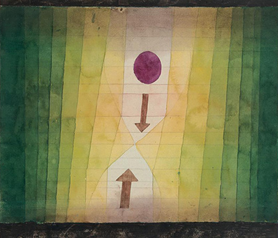
Paul Klee's vor dem Blitz was made in 1923 and recorded by the artist as 1923, 150. The title has long appeared on this site as Before the Blitz, but “Blitz” here means a flash of lightning. The Fondation Beyeler's English exhibition material calls the picture Before the Lightning. Klee made it seventeen years before the London Blitz of 1940–41, and its arrows and lightening colour fields point to a natural event, not to a retrospective image of that war. This page keeps the established address while using the more accurate English title in its text.[1][2]
The Beyeler describes the work as watercolour and pencil on paper, with additional strips at the top and bottom painted in gouache, watercolour and pen, mounted on cardboard. It measures 28 × 31.5 cm and is inventory 61.4 in the collection at Riehen. Klee signed near the upper centre-left; at the lower left he wrote “1923 150”, and at the lower right he wrote vor dem Blitz. These inscriptions make the identification unusually secure and show that the original title belongs to the object, not only to a later catalogue.[1]
Two arrows and a brightening field
Bands of green rise on either side of a pale yellow centre. The strips become lighter as they approach the middle, giving the small image a sense of accumulated energy. A downward-pointing arrow enters from above, while an upward-pointing one rises from below. Their tips nearly meet at the narrowest part of an hourglass-like bright space. Above the upper arrow floats a red-violet disc. The composition does not show a jagged bolt crossing a sky. It suspends the viewer immediately before the event named in the title.[1][3]
The effect depends on opposed movements. The arrows converge, but neither completes the collision. The green and yellow bars seem to progress inwards, while the dark edges hold the field in place. The red-violet circle is visually prominent because it has no counterpart of equal weight at the bottom. Its position can suggest a gathering charge or a point of focus. That is a reading of the arrangement, not an identified electrical diagram supplied by Klee.[1][3]
The top and bottom strips deserve attention. They are part of the museum's medium description, not merely the modern frame around a reproduced image. In the small local picture they appear as dark horizontal margins; the object record specifies their added materials. They close the vertical movement of the arrows and make the central field seem more concentrated. A reproduction that crops or confuses those strips with framing loses a feature of Klee's made object.[1]
Colour as a process
The museum press kit for the 2012–13 Cosmos of Colour: Itten–Klee exhibition singles out Vor dem Blitz as a watercolour in which arrows and colour gradations imply movement. Its broader discussion places Klee's tonal experiments within his Bauhaus years, when he explored graded steps from light to dark. This exhibition account supports describing the colour as a process unfolding across the sheet. It does not establish the old page's assertion that each band represents a musical note or that Klee set out to create a chromatic “symphony” in this particular picture.[3]
Christoph Wagner's close study of vor dem Blitz gives the formal argument greater precision. He sees the two contrary arrows moving into a gradually lightened zone and the red circle as a charged centre. In his account, the picture does not freeze a lightning bolt at its climax; it makes viewers experience the build-up to the flash through the succession of coloured bands. Wagner reads the image as a constructed natural process, not a straightforward view of weather. That distinction explains why the title says “before”: Klee gives us forces in preparation rather than the spectacle itself.[4]
Wagner also notices the artist's signature near the upper edge, beside a smaller reddish circle. He proposes that the signature and the little circle enter into a visual relation with the larger disc below, opening a second possible meaning: the flash of artistic invention. This is a scholar's interpretation of how Klee placed his name within the picture. The owner record confirms the signature's location, but it does not state that Klee intended a self-portrait or a literal diagram of inspiration. The visual comparison is valuable precisely because it returns us to the sheet's details without treating the metaphor as settled fact.[1][4]
Wagner discusses Klee amid Bauhaus debates about how art might convey processes in nature that new photography could arrest in an instant. He compares Klee's constructive image with the interest Kandinsky and László Moholy-Nagy took in photographs and diagrams of lightning and electrical discharge during the 1920s. This intellectual setting is a later historical analysis, not proof that Klee copied a particular photograph for this sheet. The picture's means remain its own: pencil, watercolour, painted margins and a deliberate sequence of tones.[4]
The Bauhaus year
Klee taught at the Bauhaus when he made this watercolour. That context is relevant to the work's economy of arrows, bands and measured colour changes, especially because the Itten–Klee exhibition relates those features to his teaching and experiments with tonal sequences. It does not turn the picture into a teaching chart. The lower inscription gives it a place among Klee's finished works of 1923, and the museum records its exhibitions as an artwork, beginning while he was alive.[1][3]
The contrast with the old article is instructive. It offered general claims about Cubism, Expressionism and musicality, but little evidence about this sheet. Klee certainly worked with music elsewhere, and the Bauhaus supplied a fertile setting for colour theory. The specific visual work of vor dem Blitz is sharper: arrows keep the eye travelling, strips of colour brighten toward a central gap, and a red disc complicates the geometry. Those features warrant analysis without using broad style labels as a substitute for looking.[1][3][4]
Even the English title affects that looking. Before the Blitz is a possible literal-sounding rendering if “blitz” is understood as a flash, but English readers are likely to hear the wartime bombing campaign. The owner uses Before the Lightning in its 2017–18 Klee press material and another museum press kit calls it Before Lightning strikes. Both point to the storm sense of the German word. The work's 1923 date and its documented visual structure support that choice; they do not require renaming its long-standing web address.[1][2][3]
A well-travelled watercolour
The Beyeler provenance begins with Klee, then Lily Klee after his death in 1940. The Klee-Gesellschaft held the work from 1946. Its record identifies a probable connection to Werner Allenbach around 1950, and probable ownership by him from 1953. “Probable” is part of the museum's wording and should remain attached to those stages. The Beyeler collection acquired the work in 1961; it has belonged to the Foundation since 1993.[1]
The work appeared publicly during Klee's lifetime. The owner lists his second comprehensive exhibition at Hans Goltz's Galerie Neue Kunst in Munich in May–June 1925, then a Kunsthaus Zürich exhibition in 1926 and one at the Neues Museum in Wiesbaden later that year. Much later it travelled to Sydney, Strasbourg, Paris, Bern, Berlin, Moscow, Stockholm, Munich, Rotterdam and Barcelona, among other venues. These records show changing settings in which it has been seen, from a living artist's presentation to exhibitions about colour, nature and the Bauhaus. They do not establish that it is continuously on display in Riehen.[1]
The Fondation Beyeler cites the printed Paul Klee. Catalogue raisonné, volume 4, as no. 3244, illustrated on page 111. That citation was checked in the museum's bibliography, not by direct consultation of the printed book. The number 3244 is its place in the multi-volume catalogue; Klee's own 1923, 150 remains the number inscribed on the sheet.[1]
The image has also entered music's later reception, though not in the manner imagined by the old article. A 2019 programme from the Kölner Philharmonie describes how the Greek-French composer Georges Aperghis had Vor dem Blitz in mind while working on Contrechamps in 2005–06. The programme's writer, Stefan Fricke, expressly treats any direct mapping from picture to sounds as uncertain. This is evidence of a later composer's engagement with Klee's watercolour, not evidence that Klee encoded notes in it in 1923.[5]
Before the Lightning leaves the flash unseen. Klee concentrates on the brightening gap, the opposed arrows and the charged interval in which something is about to happen. The exact materials, inscriptions and exhibition history secure the object; the colour sequence gives it its sense of imminent motion. The distinction between a natural lightning flash and the later English wartime meaning of “Blitz” lets the picture's own date and visual logic come forward.[1][2][4]
Related artworks
Explore eight other Klee works from the researched artwork cluster.
Sinbad the Sailor
1923
Actor's Mask
1924
Red Balloon
1922
Senecio
1922
Twittering Machine
1922
Ancient Harmony
1925
Crystal Gradation
1921
Fish Magic
1925
References
- Fondation Beyeler, vor dem Blitz collection record, German: object identity, inscriptions, full material description, dimensions, provenance, exhibitions and printed catalogue bibliography, View source.
- Fondation Beyeler, Paul Klee press kit, 2017–18, English, illustrated work list: renders the title as Before the Lightning and confirms the collection and measurements; its caption shortens the full support description, View source.
- Kunstmuseum Bern and Martin-Gropius-Bau, Cosmos of Colour: Itten–Klee press kit, English, pp. 15–16: treats Vor dem Blitz as a watercolour whose colour gradations and arrows imply movement, in the context of Klee's Bauhaus colour studies, View source.
- Christoph Wagner, “Ein Garten für Orpheus: Zur Transformation der Landschaft bei Paul Klee im Jahre 1926”, German, especially pp. 39–40: close account of the opposing arrows, brightened field, red circles, signature and represented natural process. The work is 1923 even though the article's larger subject is 1926, View source.
- Stefan Fricke, Kölner Philharmonie concert programme, German, 1 May 2019: discusses the image in relation to Georges Aperghis's Contrechamps and cautions against a direct visual-to-musical translation, View source.