by Tom Gurney
Tom Gurney BSc (Hons) is an art history expert with over 20 years experience
Published on June 19, 2020 / Updated on September 28, 2026
Email: tomgurney1@gmail.com / Phone: +44 7429 011000
About the painting
One red rectangle occupies the upper-left corner of Piet Mondrian's Composition B (No.II) with Red. The rest of the tall canvas is largely white, divided by a few black vertical and horizontal lines. The red is striking because it is alone, but the white areas and black crossings do just as much work in holding the arrangement together. Tate dates the oil painting to 1935 and records the original as 80.3 × 63.3 × 2.4 cm. RKD catalogues this Tate painting as B254, with collection number T07560.[1][2]
The full title matters. RKD also records a different Composition B, B106, made in 1920 and held by the Wilhelm-Hack-Museum in Germany. The page here shows the 1935 Tate work, which Tate calls Composition B (No.II) with Red. Their dates, collections and images separate the two. A search for “Mondrian Composition B” can bring up either object, so the catalogue number and the red upper-left plane are useful checks.[2][3]
At a glance
- ArtistPiet Mondrian (Piet Mondriaan, 1872–1944)
- Tate titleComposition B (No.II) with Red
- RKD titleComposition B, B254
- Date1935
- MediumOil paint on canvas
- Dimensions80.3 × 63.3 × 2.4 cm (height × width × depth), Tate's original-work credit
- CollectionTate, T07560
- Acquisition supportArt Fund records support in 1999[1][2][4]
The 1935 Tate painting in Mondrian's abstract years
Contents
- What does the painting show?
- Why use only one red area?
- Is this the 1920 Composition B?
- How did it enter Tate's collection?
What does the painting show?
The most obvious colour is the red plane at the top left. It reaches toward the canvas's upper and left edges, while a dark vertical line holds its right side and a dark horizontal defines its lower edge. Below it, broad white areas dominate. These whites are not one empty background: the lines make them separate spaces of different widths and heights. Some look almost square, while others are long or narrow.
Two prominent verticals pass down much of the image, and two horizontal divisions run across it. At their intersections, black becomes a strong element rather than a neutral outline. The lines do not create a repeated set of equal cells. The leftmost white strip, the central areas and the large right-hand spaces are differently proportioned. A short dark line near the left edge strengthens the lower horizontal without making the whole canvas symmetrical.
There is also considerable white beyond the main intersections. It lets the red remain intense without needing another coloured block to answer it directly. Tate's own description says the restricted palette brings black and white to the fore. It reads the slight asymmetry as a way of making the grid dynamic. Those are Tate's interpretive terms; a viewer can test them by watching how the eye alternates between the red corner, the black crossings and the quiet white spaces.[1]
The painting looks simple from a distance, yet each boundary matters. Moving the lower horizontal even slightly would change the scale of the white spaces above and below it. The vertical at the right of the red block also divides the upper region in a way the lower region does not repeat. The composition's tension comes from these unequal intervals. No documented measurement system is needed to see the effect, and the sources used here do not justify assigning a precise mathematical formula to it.
Why use only one red area?
The red block has a special role because it is the only strong colour. It makes the upper-left corner visually heavy, while black crossings and broad white fields distribute attention elsewhere. Tate describes the painting as using a single red area to emphasize the importance of black and white. This is a helpful way to look at it: the red draws the first glance, but the lines and spaces determine how long the viewer keeps looking.[1]
This limited palette belongs to Mondrian's established abstract practice by 1935. Yet the choice here is more specific than a general rule about his work. Many Mondrian paintings contain yellow and blue as well as red; this canvas does not. The absence of those colours makes the red corner, black structure and white planes especially clear. It should be described as this painting's arrangement, not as proof that Mondrian had permanently stopped using other colours.
The contrast also changes across the canvas. Near the red block, black is a firm boundary against intense colour. Lower down, the same black lines cut through white and take on a more independent presence. The viewer can follow a vertical from the top to the lower edge, then return along a horizontal. That movement gives the painting a rhythm without depicting motion or a recognisable object.
Watch: Piet Mondrian
See his studio, the move toward geometric abstraction and the rhythms of his New York paintings.
Piet Mondrian: Abstract Painting as We Know It
Curator Michael White explores the paintings and Mondrian’s studio as an abstract space.
Watch on YouTubeIs this the 1920 Composition B?
No. RKD's B106 is a 1920 Composition B in the Wilhelm-Hack-Museum, Ludwigshafen. RKD's B254 is the 1935 Tate painting shown here. The Tate title adds “(No.II) with Red,” and the Tate collection number is T07560. The repeated letter B is a naming coincidence across different periods, not evidence that one canvas changed ownership from Germany to London.[3][2]
The distinction helps when reading Mondrian's career. The 1920 painting belongs to his early postwar experiments with primary-colour fields. The 1935 Tate work has a more spare arrangement: one red plane, large white spaces and a small number of long black divisions. Comparing the two may be useful, but their dates and object records must not be merged. A page about the Tate picture needs the 1935 date even if a catalogue or search result for a different Composition B says 1920.
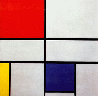
RKD places the Tate work beside other mid-1930s compositions, including a separate Composition A, B253. That is another potential title trap: Rome's 1919–20 Composition A is B105, while the 1935 Composition A in this section is B253. Mondrian reused simple lettered and numbered names, so collection and catalogue identifiers are central to accurate identification.[2][3]
How did it enter Tate's collection?
The Art Fund records that it supported the acquisition in 1999. Its page lists a £150,000 grant toward a total cost of £1,551,707. These are historical acquisition figures, not a present valuation. Tate's own accessible artwork description supplies the medium, date and original dimensions, while RKD supplies the B254 catalogue identity and Tate number T07560.[4][1][2]
The Art Fund page also prints 118.2 × 101 cm, which differs substantially from Tate's 80.3 × 63.3 × 2.4 cm credit for the original. The sources available here do not explain the discrepancy. This page follows Tate's object credit for the painting's size and reports the conflict rather than silently combining the two sets of numbers. The Tate measurement also fits the portrait shape of the reproduced work.[4][1]
Tate owns the painting, but a collection page does not guarantee where or whether it is displayed today. Art Fund's venue tag likewise should not be treated as a current gallery listing. Visitors should consult Tate's live display information before making a special trip to see this canvas.
Mondrian artworks directory
Frequently asked questions
When was Composition B (No.II) with Red painted?
Which museum owns it?
It belongs to Tate, collection number T07560.[2]
Is it the same as Mondrian's 1920 Composition B?
What is its medium and size?
Why is only one rectangle red?
Tate interprets the single red plane as a way to bring the black lines and white spaces into stronger focus. The red also gives the upper-left corner visual weight.[1]
Discussion
Does the red corner or the black crossing first hold your attention?
Reader Insights
Follow the black verticals from the red area toward the lower edge. Where does your eye stop?
Which white area seems most active after a second look?
How does this 1935 Tate B254 differ from the separate 1920 B106 Composition B?
Join the Conversation
Share what you notice in this painting below.
References
- Tate, Composition B (No.II) with Red, Tate Shop original-work credit and interpretation. View source.
- RKD – Netherlands Institute for Art History, Mondrian catalogue raisonné, Paris 1935–37, B254 and adjacent works. View source.
- RKD – Netherlands Institute for Art History, Mondrian catalogue raisonné, Paris 1920–21, B106 Composition B. View source.
- Art Fund, Composition B (no II) with Red, acquisition support record and conflicting dimensions. View source.
- Lead image credit. Piet Mondrian, Composition B (No.II) with Red, 1935, oil on canvas, RKD B254; Tate T07560.
 The Red Tree Piet Mondrian.jpg)