by Tom Gurney
Tom Gurney BSc (Hons) is an art history expert with over 20 years experience
Published on June 19, 2020 / Updated on September 28, 2026
Email: tomgurney1@gmail.com / Phone: +44 7429 011000
About the painting
Piet Mondrian's Composition in Colour A sets rose-red, deep-blue and ochre rectangles across a white field. Short black marks touch some of the colours, stand apart from others, and prevent the arrangement from settling into a regular grid. The Kröller-Müller Museum dates this oil painting to 1917, gives its size as 50.3 × 45.3 cm, and identifies it as KM 106.145. RKD catalogues the same canvas as B84. The picture on this page matches the museum image, including the cluster of larger coloured shapes around the centre and the small signature at the lower left.[1][2][3]
At a glance
Composition in Colour A in Mondrian's changing abstract language
Composition A (Rome)
1919–20Contents
- What is in Composition in Colour A?
- Why are the colours muted?
- How does it relate to De Stijl in 1917?
- How is it different from Composition in Colour B?
- How did the painting reach the museum?
What is in Composition in Colour A?
The composition has no depicted person, landscape or still-life object. Instead, coloured rectangles of unequal widths float against white. Some rose forms are close to square; several blue forms are wider or taller; the ochre forms vary from small blocks to a long upright near the right side. The colours are not spread in an even pattern. The most conspicuous rose area sits near the middle, while blue and ochre recur around it in loose groups. Their edges are mostly sharp, yet they do not make one continuous lattice.
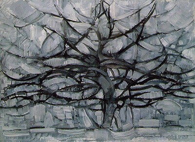
 The Red Tree Piet Mondrian.jpg)
Black appears as short vertical and horizontal fragments. A mark may sit next to a coloured edge, partly cover it, or stand alone on the white. Near the central rose area, one upright black stroke seems to float inside the colour, while another runs beneath it. Elsewhere, blue and ochre fields are touched by small black tabs. These marks are too short and scattered to serve as the enclosing grid familiar from Mondrian's later paintings. They create stops and accents as the eye moves among the colour patches.
The white has a role of its own. It separates most of the shapes while also allowing several clusters to feel connected. Wide white intervals near the outer edges differ from the tight gaps around the centre. Because no rectangular frame encloses every coloured area, the canvas can suggest motion or depth: one shape may appear in front of another. The museum describes the white as a living part of the painting rather than a neutral blank and notes the apparent floating of the coloured fields. That is the museum's interpretation of the visual effect, not a claim that the canvas depicts literal objects in space.[1]
The signature matters too. RKD records “PM '17” at the lower left and a title inscription on the reverse, “Compositie in kleur A | P. Mondriaan.” The front inscription confirms the date given by both institutions; the reverse helps secure the lettered title. The small reproduction allows the lower-left mark to be seen, although the catalogue record is the stronger source for reading it precisely.[2]
Why are the colours muted?
The museum calls the palette muted versions of the primary colours: dark rose red, deep blue and dark ochre. That description is more exact for this work than saying simply “red, yellow and blue.” The ochre can look orange-brown in a reproduction, and the rose areas are less saturated than a brilliant primary red. Together they give the painting a warmer, more varied surface than many of Mondrian's later abstractions.[1]
The different sizes and positions of the patches prevent any one hue from taking over. Blue appears in several strong blocks, including one to the left of centre and another toward the lower right. Rose recurs near the upper right, centre and lower left. Ochre is distributed both high and low. A viewer can follow one colour across the canvas, then see the same field differently when looking at its black fragment or white surroundings. The result is rhythm without a repeating tile pattern.
There is no need to assign fixed meanings to the individual colours. The museum's explanation is about the balance of lines, fields and white space, not a symbolic key in which each rose, blue or ochre block stands for a named idea. Close looking yields a more secure account of how this particular painting works.
Watch: Piet Mondrian
See his studio, the move toward geometric abstraction and the rhythms of his New York paintings.
Piet Mondrian: Abstract Painting as We Know It
Curator Michael White explores the paintings and Mondrian’s studio as an abstract space.
Watch on YouTubeHow does it relate to De Stijl in 1917?
The year 1917 places the painting at the beginning of De Stijl. The Kröller-Müller Museum names Mondrian, Bart van der Leck and Theo van Doesburg among the artists establishing the movement that year and describes their aim of making a new art for a better world. In its account, Composition in Colour A is a step toward the “pure neo-plasticism” associated with Mondrian, while still allowing overlapping shapes, apparent depth and a lively distribution of small elements.[1]
The distinction from his later work is visible without treating this canvas as an unfinished version of a better painting. Mondrian already limits himself to rectangular areas and straight black marks. Yet the coloured fields sit free of a continuous grid, and their rose, blue and ochre tones are more varied than the later familiar primary palette. The museum says that, in the years that followed, he reduced suggestions of movement and depth and used red, yellow and blue. This 1917 work shows a specific point in that development, with its own deliberate balance.[1]
The canvas was shown in the Hollandsche Kunstenaarskring exhibition at the Stedelijk Museum in Amsterdam in May 1917, according to RKD. Its recorded exhibition under the title Compositie in kleur A places the work in public circulation in the same year it was painted. Later exhibition titles sometimes translated or shortened its name; the object number B84 and museum number KM 106.145 keep those references tied to this same canvas.[2]
How is it different from Composition in Colour B?
The Kröller-Müller Museum also owns Composition in Colour B, another 1917 oil painting. It is KM 101.144, 50.5 × 45 cm; RKD gives it the separate number B85. The letters are part of two individual titles, not alternative names for a single picture.[3][4]
In A, the rose central area, repeated blue and ochre rectangles, and scattered short black marks form the arrangement shown here. B distributes its coloured planes and black accents differently. Both belong to Mondrian's experiments with colour on white in 1917, but a shared year and museum do not make their dimensions, imagery or record numbers interchangeable. That same caution applies to RKD's nearby Composition in Line, B82.83, which is a distinct work. A comparison is useful precisely because Mondrian was testing several arrangements of a restricted vocabulary rather than filling in the same template.[2][3][4]
How did the painting reach the museum?
RKD records Hendricus Petrus Bremmer with the painting in 1917, followed by Helene Kröller-Müller from 1917 to 1928. It then lists the Kröller-Müller foundation from 1928 to 1937 and the museum from 1937. The museum's public identifier is KM 106.145; RKD's provenance also preserves an earlier collection number, 534-17. These numbers serve different cataloguing contexts rather than referring to separate paintings.[2][1]
The work's exhibition history extends beyond the Netherlands. RKD lists it in the Museum of Modern Art's 1936 Cubism and Abstract Art exhibition and its travelling presentations, and in the 1982 De Stijl: 1917–1931, Visions of Utopia exhibition. It also records a 2017 exhibition on Mondrian and Bart van der Leck in The Hague. Those entries document the painting's later reception; they should not be confused with changes of ownership.[2]
The Kröller-Müller collection page currently marks Composition in Colour A as on display. Gallery placement can change, so a visitor should consult the museum's current record before travelling specifically to see it.[1]
Mondrian artworks directory
Frequently asked questions
When was Composition in Colour A painted?
What material and size is the original?
Where is the painting held?
The Kröller-Müller Museum in Otterlo, Netherlands, holds it as KM 106.145. The museum currently labels it on display.[1]
Is this Composition in Colour B?
What colours did Mondrian use?
The museum describes dark rose red, deep blue and dark ochre, set among short black marks and active white spaces.[1]
Discussion
Which rose, blue or ochre group first holds your attention?
Reader Insights
Follow the short black dashes around the central rose area. Where does your eye stop?
Which white gap best separates the coloured shapes?
How does this floating arrangement differ from the later grid in Composition A?
Join the Conversation
Share what you notice in this painting below.
References
- Kröller-Müller Museum, Compositie in kleur A / Composition in Colour A, collection record KM 106.145, with object facts, interpretation and current display label. View source.
- RKD – Netherlands Institute for Art History, Compositie in kleur A, image/object record 271489, with inscriptions, provenance and exhibitions. View source.
- RKD, Mondrian catalogue raisonné, Holland 1914–19, entries B84 and B85. View source.
- Kröller-Müller Museum, Composition in Colour B, collection record KM 101.144. View source.
- Lead image credit. Piet Mondrian, Composition in Colour A, 1917, oil on canvas, 50.3 × 45.3 cm, RKD B84; Kröller-Müller Museum, KM 106.145.