


 by Tom Gurney
Tom Gurney BSc (Hons) is an art history expert with over 20 years experience
Published on June 19, 2020 / Updated on September 27, 2026
Email: tomgurney1@gmail.com / Phone: +44 7429 011000
A poem made visible
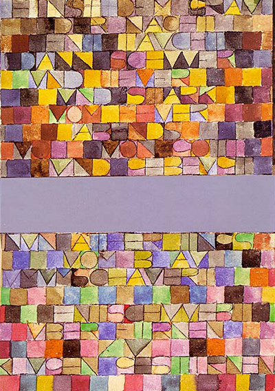
At first glance Paul Klee's Einst dem Grau der Nacht enttaucht ..., or Once Emerged from the Gray of Night, looks like an unusually bright field of small shapes divided by a broad grey-silver band. Stay with it and the shapes become letters. Look still longer and the letters begin to yield words. The picture makes reading and seeing compete for the same attention. A verse about emergence from grey night is present twice in the full object: once in ordinary handwriting on its mount, again in coloured, harder-to-follow forms below.[1][2][3]
The work is recorded as 1918,17 and belongs to Zentrum Paul Klee, Bern. A Berlin museum checklist and a Bern university page made with the owner's permission agree on watercolour, pen and pencil on paper mounted on cardboard, 22.6 × 15.8 cm. These are the strongest accessible object captions used here. Earlier publications give different sizes and a period collection credit, which makes the changing documentation part of the work's story rather than a detail to smooth away.[1][2][4]
Contents
- What is the whole object?
- Why do the dimensions and collection names vary?
- How do the two versions of the poem work?
- What was Klee doing with poetry during the war?
- What does the silver-grey band do?
- Is this writing, painting, or both?
- What can we compare without confusing the works?
- Look again
What is the whole object?
Klee's German title begins with an ellipsis. It is the opening of a verse, not a description invented by a modern print seller. 1918,17 is the artist's year and sequence number; the Berlin checklist also provides the continuous catalogue number 1864. The museum list places the work among pictures made with writing. It does not label the painted words as printed type, nor does it identify a named poem by another author. The Bern institute reproduces the picture with the ZPK Bildarchiv credit and repeats the title, materials, year, number and size.[1][2]
The full composition includes more than the brightly coloured grid shown in many online crops. A carefully written version of the verse stands near the top of the cardboard mount. Beneath it is the watercoloured arrangement in two sections. A broad horizontal silver-grey strip separates those sections. In each painted part, a grid of coloured units carries dark letter forms. To see only the coloured area is to miss the relationship between two ways of writing the same text. The small splash on this local page is itself cropped to the coloured field. It helps show broad colour and letter shapes, but it cannot show the complete mounted object or settle how its parts were attached.[2][3][5]
The authoritative current public captions used here describe the support as paper on cardboard and list watercolour, pen and pencil. That medium account matters: colour washes, linear letter marks and mounting are all involved. It does not by itself explain every stage of cutting and joining. Art historian Katja Schenker examined the original for her 1998 study and argued that the coloured part was cut and recombined around the silver strip. Her figure caption explicitly describes this construction. The owner’s current conservation record would be needed to confirm the full sequence of physical interventions; the publicly accessible Berlin caption alone is shorter.[1][2][3]
Why do the dimensions and collection names vary?
The Berlin checklist and the Bern institute give 22.6 × 15.8 cm. A German essay published in 2010 has a figure caption of 25 × 15.5 cm. MoMA's 1964 Lettering by Modern Artists catalogue records 9 7/8 × 5 7/8 inches, roughly 25.1 × 14.9 cm. These figures may measure different parts of a mounted, assembled sheet, or may reflect errors in older captions. None of the cited publications specifies those components clearly enough to decide. Reporting a single blended figure would conceal the disagreement rather than resolve it.[1][2][4][6]
MoMA's 1964 credit refers to the Klee-Stiftung/Kunstmuseum Basel in the wording of that historic catalogue. The Berlin checklist of 2008 lists Zentrum Paul Klee, Bern, and the Bern institute's present page also credits that museum and its picture archive. These are documentary moments, not a continuous provenance chain. Without the intervening inventory and transfer history, we should not invent a sale or move between named owners. A public visitor's first collection reference today is the Bern credit; the earlier MoMA line is useful evidence of how the object was catalogued at the time.[1][2][4]
How do the two versions of the poem work?
At the top, handwriting behaves much like writing on a page: lines can be followed in sequence. Below, the coloured letters ask for slower recognition. A vertical stroke might complete a letter, bound a colour cell, or do both. Adjacent coloured planes can pull the eye away from the next word. Some dark marks become readable only after the viewer has scanned the whole cluster. The verbal text is still there, but Klee makes the labour of assembling it visible. This is more specific than saying that letters “lose their function”: they keep their function while becoming shapes and boundaries as well.[3][5][6]
Schenker's examination explains how the effect was made. Beneath the colour she saw a lightly drawn grid; Klee filled its regular units with washes, while a second, less regular set of pencil lines supplied the letter forms. She observed darker pen lines over the paint. Her sequence makes the writing part of the picture's construction rather than a caption added to completed colour. Yet the visual order can run the other way: colour registers first, the fine letters later. The grid also makes some signs ambiguous. In a square cell, an L can resemble an empty boundary, while I and T, or E and F, can share much of the same geometry.[3]
The beginning tells of emergence from the grey of night. Later words bring fire, blue and stars into the movement. Those verbal colour cues matter because the painted version is chromatic. A reader moves through words in time; a viewer sees much of the coloured field at once. The object allows both experiences without making them identical. The silver-grey bar in the middle can pause reading, separate the painted zones and hold them in one physical composition.[3][5][6]
The colouring sometimes helps, but it never becomes a simple letter-by-letter code. Schenker notes grey around the opening word for grey and blues around the later word for blue. Elsewhere, similar letters take different colours, and washes even cross the drawn cell boundaries. In her reading, warm colours gather near the first stanza's references to weight and fire, while cooler, lighter areas open beneath the silver strip. Between lower lines there are cells with no letters at all. A row of colour without text creates a visual pause just before the word for floating away; the final colour row likewise lets the writing appear suspended. These are Schenker's close observations and interpretation, not a fixed decoding key that every reproduction will show equally well.[3]
The exact wording deserves care. Schenker transcribes the mounted text in her 1998 study and describes two stanzas beginning “Einst” and “Nun”: once and now. Her transcription is more useful than a 1974 Portuguese essay's German text, which has apparent spelling variants and omits a line found in both Schenker and a later German account. The online scan's searchable text also has recognition errors, so its letters should not be treated as a diplomatic edition of the original. This page uses short phrases and paraphrase rather than printing a supposedly definitive whole poem. Direct examination or an owner transcript would still help settle every letter and line break.[3][6][8]
Who wrote the verse is another separate question. A Zentrum Paul Klee video synopsis says its origin is unknown and that Klee himself is the probable author. Aichele also calls it very likely his and cites an October 1917 letter to Lily Klee in which he considered a collection that might include his own poems. Schenker gives stronger evidence: she cites Felix Klee's published statement that his father wrote the verse, and observes that the signature sits in the pale mount area beneath the painted image, visually signing both picture and poem. She takes those points as decisive. Felix's testimony deserves weight, but the signature alone cannot date or authenticate a surviving draft of the text. Until that evidence is checked against the current ZPK record, probable Klee authorship remains the clearest shared formulation.[3][5][9]
What was Klee doing with poetry during the war?
The ZPK synopsis dates the watercolour to early 1918 and connects Klee's reading of poetry to the monotony of his wartime service. Aichele describes a preceding group of 1916 word pictures using Chinese poems in German translation. The 1918 picture belongs in that wider exploration of how a text can become an image. Yet the existence of Chinese texts in the earlier group does not make this particular poem a Chinese translation. MoMA's 1964 catalogue describes the 1918 picture as one of the script pictures “inspired by Chinese poems”; its sentence is useful evidence of a historic interpretation, but its wording does not establish the text's exact author or source. The later ZPK and Aichele accounts are more careful on that point.[4][5][9]
The dates also constrain psychological readings. The poem moves through darkness, burden, fire, blue and stars, and those terms may feel suited to a wartime life. The year 1918 and Klee's service are real context. They do not prove that each colour is a coded military event or that the verse is a diary entry. A reader may consider what hope or transformation meant in wartime, but should not replace the poem's openness with a single biographical diagnosis.[5][9]
The inherited article said the text was found neither in Chinese poems nor in the Psalms. A complete search of those literatures was not documented there; the source of the negative claim is unclear. It also described “many art lessons” behind this image without identifying a relevant classroom record. Here the stronger statement is narrower: Klee had used translated Chinese poetry in earlier script pictures, while the origin of the 1918 verse remains uncertain and his own authorship is judged likely by scholars and the ZPK synopsis.[4][5][9]
What does the silver-grey band do?
The central strip looks like an interruption. Schenker's direct examination gives it a physical role as well. She identifies paper painted silver, not ready-made metallic foil, and says that it was adhered to the common support before the two painted sections, leaving it beneath them. She specifically challenges an older catalogue's wording “silver paper,” which can suggest a prefabricated foil pasted on top. The visible effect of silver is clear from reproductions; the precise build sequence rests on her specialist examination and still warrants a current conservation check.[3]
Schenker also compares the edges of the two coloured parts and argues that at least two rows, probably three, are absent from the centre after cutting. On her reconstruction, inserting the band changed the pictorial space rather than merely covering an intact grid. She sees it as an internal frame that divides and joins the colour fields. This is an attributed art-historical reconstruction, not an artist's surviving assembly diagram. Her complete 1998 argument is available in the ETH Library viewer's page-by-page text, even though its PDF download currently presents a verification step.[3]
The strip can be read alongside the first line's grey without reducing it to an illustration of one word. Schenker sees a grey, white and light-bearing element from which the coloured fields seem to emerge. The Portuguese essay likewise treats the transition from a grey band to coloured words as part of the image's transformation. These are interpretive accounts, and each gives a different emphasis: one is grounded in the physical layering, the other in the reader's movement from ordinary text to coloured script. Both explain why omitting the band from a crop or treating it as blank space would seriously change the work.[3][8]
Schenker also treats the poem as more than a description of night turning to day. Its grammar leaves the thing that emerges unnamed; there is no explicit subject to settle whether we are following a sun, a person, the painter, the viewer or the colours themselves. She proposes several of these readings and connects the first stanza's “Einst” to the second's “Nun” as a shift in perspective. The silver strip interrupts a linear passage through the words, while its reflective surface attracts the eye to the image as a whole. That is why the title can help decode the letters without exhausting the painting: after reading the poem, one can return to the physical colour and silver with a different understanding.[3]
Is this writing, painting, or both?
German literary scholar Christoph Kleinschmidt reads the boundary of letter and colour patch as a meeting of two materials. The letters are not laid over a finished abstract picture like a caption. Their strokes contribute to its shapes; the shapes, in turn, complicate the letters. He suggests the poem may even seem to describe its own emergence from grey, but presents that as a reading, not as a documented statement by Klee. This helps explain why a quick glance sees pattern while slower attention discovers words.[6]
The earlier Portuguese study, published in 1974, makes a related argument from a different angle. It contrasts the ordinary linear written version above with the spatially transformed version below, saying that reading becomes slow and selective. Its author sees a movement from the grey of the verbal opening toward the brightness of the stars as both verbal and visual. The article's wider associations with ancient writing and Klee's later travel are speculative for this specific object. Its detailed account of two modes of writing on one support remains valuable, particularly because online reproductions so often remove the cursive upper part.[8]
MoMA's 1964 exhibition placed the work in a history of artists using letters. Its booklet used details of the two painted sections on its front and back covers. The museum's own caption says lines and colours make words merge into a pictorial whole and that difficult reading affects the viewer's response. That contemporary exhibition framing is evidence of the picture's twentieth-century reception. It is also an example of selective reproduction: cover details can powerfully show the colour-letter texture while hiding the mounted poem and the work's total construction.[4]
These studies need not be flattened into a choice between “poem” and “mosaic.” There is an actual verbal text, and there is an actual physical assembly of paper, paint and line. A description of this work has to retain both. The first person or subject of the verse is not specified in the opening; Kleinschmidt's proposal that the poem itself emerges from grey is suggestive precisely because the picture makes words seem to arise through coloured form. Another reader may find a human, spiritual or cosmic movement. The image invites those readings without placing a label on its subject.[3][6][8]
What can we compare without confusing the works?
The 1916 script pictures offer a chronological comparison, especially the separately catalogued Hoch und stralend steht der Mond ..., 1916,20. The Berlin checklist explicitly calls that earlier sheet cut and recombined, with watercolour and pen on paper. That technical phrase belongs to its own entry. Schenker supplies the separate evidence for cutting and reassembly in the 1918 picture. Aichele's comparison shows a shift from using translated Chinese poems toward a verse likely Klee's own, while keeping the wider problem of making words visible.[1][3][9]
The Angelus Novus page provides another reminder that a title and an image can acquire later literary readings quite distinct from the maker's documented process. Here the poem is physically written into the object, so the relationship is more immediate. The materials and techniques guide explains why supports, mounting and front/back evidence matter for Klee. Neither route should be used to fill missing technical details in this one: the silver-painted strip and letter grid require their own object evidence.[1][3]
Look again
Begin with the local splash as a study of the colour field. Where does a dark stroke look like a letter rather than an abstract line? Which adjoining cell helps you recognise it? Stop at the silver-grey band and notice how strongly it divides the upper and lower painted parts. Then remember what this crop cannot show: the cursive verse above, the edges of the mounted object and the exact physical overlap of its papers.[2][3][7]
Einst dem Grau der Nacht enttaucht ... makes an act of reading into an act of seeing. The Bern credit, 1918 number, materials and present published size anchor the object; specialist scholarship helps explain the doubled poem, cut construction and painted silver divider. The exact transcription, the strength of the authorship evidence, competing historic dimensions and a suitable image master remain live research questions. Keeping those limits visible allows the work's most distinctive achievement to come through: the same words exist as legible handwriting and as a moving field of coloured forms, with no need to make one cancel the other.[1][2][3][5][9]
Related artworks
Explore eight other Klee works, beginning with works close in date to this one.
Flower Myth
1918
Angelus Novus
1920
Crystal Gradation
1921
Hammamet with Mosque
1914
Red Balloon
1922
Senecio
1922
Discussion
The 1918 picture presents a poem as both handwriting and coloured form.
Its cropped local image and several historic captions leave useful questions open.
Reader Insights
Where does a dark stroke become a letter for you?
How does the silver-grey divider change your reading pace?
What can the cropped image tell us, and what needs the whole object?
Join the Conversation
Share the detail and source behind your reading.
References
- Staatliche Museen zu Berlin, Paul Klee 2008 exhibition checklist (German/English), entry 1864, Einst dem Grau der Nacht enttaucht ..., 1918,17, watercolour, pen and pencil on paper on cardboard, 22.6 × 15.8 cm, Zentrum Paul Klee, Bern. Its separate entry for 1916,20 documents another cut/recombined script picture, View source.
- University of Bern, Istituto di italiano giuridico, institutional artwork credit (Italian/German), image used with Zentrum Paul Klee permission; repeats original title, 1918,17, medium, dimensions and owner/Bildarchiv credit. This permission does not authorise reuse by this site, View source.
- Katja Schenker, “Titel – Bild – Gedicht: Paul Klee, Einst dem Grau der Nacht enttaucht ..., 1918.17”, Georges-Bloch-Jahrbuch 5 (1998), 137–155 (German), DOI 10.5169/seals-720094. The complete 19-page article was read through ETH Library's page-by-page OCR text, with claims checked in their surrounding passages. OCR has occasional errors; no article image is republished, View source.
- The Museum of Modern Art, Lettering by Modern Artists (1964), PDF pp. 4–5 (English), historic caption, measurements, collection credit and its interpretation of Klee's script picture, View source.
- Zentrum Paul Klee, 2015 video synopsis of Einst dem Grau der Nacht enttaucht ... (German), early-1918 date, reading-poetry context, unknown text origin and probable Klee authorship. Synopsis read; full video not yet examined, View source.
- Christoph Kleinschmidt, “Intermaterialität im Expressionismus”, literaturkritik.de (2010) (German), object-specific reading of letter/colour boundaries, poem's unnamed subject and a 25 × 15.5 cm figure caption that conflicts with the current Bern caption, View source.
- Wikimedia Commons, file for Einst dem Grau der Nacht enttaucht ..., a 2548 × 3824 px scan of a printed book reproduction marked public domain on Commons. Its reproduction provenance and halftone quality remain unsuitable for a new annotation master without further verification, View source.
- “Escrita: kLee. Klee. kleE. klEe / figura”, Trans/Form/Ação 1 (1974) (Portuguese), section 14 on the two text presentations and reading process. Its German poem transcription has variants and an omitted line; not used as a definitive transcript, View source.
- Kathryn Porter Aichele, Paul Klee, Poet/Painter (2006), searchable pp. 44–46 (English), on 1916 translated Chinese-poem pictures, 1917 letter to Lily, and probable Klee authorship of the 1918 verse. Consult the printed book/notes for a complete edition and full translation, View source.
.jpg)