


 by Tom Gurney
Tom Gurney BSc (Hons) is an art history expert with over 20 years experience
Published on November 6, 2026 / Updated on November 6, 2026
Email: tomgurney1@gmail.com / Phone: +44 7429 011000
The Thames gave James McNeill Whistler a subject that never held still. Tides shifted the level and width of the water; smoke, fog, rain and dusk changed the visibility of each bank; barges, sailing vessels and steam traffic reorganised the surface; bridges, embankments and factories altered the skyline. From the crowded wharves that he etched soon after settling in London to the spare nocturnes of the 1870s and 1880s, Whistler returned to the river because repetition revealed difference.[1][4]
His Thames was neither untouched nature nor merely an excuse for blue paint. It was a commercial artery and an engineered urban environment. Coal was unloaded on the Chelsea foreshore, ships crowded the Pool of London, and industrial buildings lined Battersea Reach. The construction of the Chelsea Embankment changed the shore from which Whistler had worked, while new bridges entered views that also contained the old timber span at Battersea and the tower of Chelsea Old Church.[6][7][8]
The nocturnes transformed this material world without erasing it. Whistler reduced structures to silhouettes, traffic to intervals and distant activity to points of light. A title such as Nocturne: Blue and Gold—Old Battersea Bridge still identifies a bridge, a church, boats and a reach of the Thames, even as colour and spacing take priority over architectural detail. His achievement lies in making sparse evidence sustain both a place and an atmosphere.[1][10]
At a Glance
- River sequencePool of London to Chelsea and Battersea Reach
- London arrival1859
- Chelsea homeLindsey Row from 1863
- Working riverWharves, barges, factories, bridges and tidal edges
- Chelsea EmbankmentBuilt 1871–74
- First London moonlightBlue and Silver—Chelsea, 1871
- Nocturne termSuggested by Frederick Richards Leyland in 1871
- Key landmarkChelsea Old Church
- Old bridgeTimber Battersea Bridge, distinct from later crossings
- MethodRepeated looking, memory, revision and tonal reduction
Contents
- From the Pool of London to Chelsea
- The River Before the Embankment
- Descriptive Thames Paintings and the Turn Towards Atmosphere
- The First London Moonlight
- How Moonlights Became Nocturnes
- Serial Looking Along Battersea Reach
- Old Battersea Bridge and the Problem of Distance
- Working Traffic, Leisure and the Night River
- Winter, Ice and the Altered Embankment
- Materials, Grounds and Different Kinds of Atmosphere
From the Pool of London to Chelsea
Whistler came to London in 1859 and initially lodged in the wharf district below Tower Bridge. The Pool of London was the furthest reach navigable by large ships and a dense zone of warehouses, yards, quays and vessels. Its traffic offered a different visual world from the Parisian studios and French coastal towns he already knew. The Thames entered his work first as an occupied working environment.[4][17]
The etchings later gathered into the Thames Set record that encounter with unusual directness. Black Lion Wharf fixes timber structures, patched walls, boats and figures into a small copper plate. The Metropolitan Museum of Art's impression is a fourth state printed in black ink on very fine cream Japanese paper. Distinct spatial zones—broadly treated near forms and sharply described distant warehouses—make the eye jump through the image instead of travelling smoothly into depth.[4][5]
That construction has been compared with photography and Japanese prints. Cropping, abrupt intervals and a high or oblique viewpoint could disrupt European conventions, while focus might shift unexpectedly from foreground to distance. Yet the wharf is not a Western fantasy of Japan. Its buildings, cargo activity and river craft belong to London's economy. Formal experiment intensifies attention to the site rather than replacing it.[4][5]
When Whistler moved to Lindsey Row, Chelsea, in 1863, his relationship to the river changed. From the north bank he looked across Battersea Reach towards factories, wharves and open stretches of water. The quieter reach permitted wider tonal fields, but it was not outside industry. Barges continued to carry materials, chimneys punctuated the opposite bank and the tide exposed mud, piles and working edges.[1][13]
The movement upstream created a productive contrast in his Thames work. Dockland etchings often press architecture and labour close to the viewer. Chelsea paintings can set the opposite shore at a distance, allowing air and water to occupy more of the support. The difference is geographical and pictorial, not a simple progression from realism to dream. Whistler continued to observe modern structures while changing the amount of description they received.
The River Before the Embankment
The Chelsea waterfront Whistler first knew did not resemble the continuous riverside road and wall visible today. A Historic England photograph taken before construction of the Embankment shows the backs of houses descending towards the foreshore. Lighters unload coal, and a paddle steamer lies at a floating pier. Commercial use and domestic fabric meet directly at the tidal edge.[7]
This environment helps correct the idea that Whistler's Chelsea was a wholly secluded artistic quarter. Lindsey Row offered a privileged view, but the view contained deliveries, smoke, boats and labour. Old Battersea Bridge linked uneven banks through timber piers whose massive verticals changed with tide and viewpoint. Chelsea Old Church offered a persistent landmark among less stable structures.[1][7][10]
Whistler used the riverfront before, during and after extensive rebuilding. The Metropolitan Board of Works constructed the Chelsea Embankment between 1871 and 1874 as part of Joseph Bazalgette's sewer and flood-defence scheme. Houses and streets were demolished or cut back, a new wall regulated the north bank, and a road and planted walk replaced much of the irregular foreshore. Historic photographs from 1873 show works progressing with old and new landmarks visible together.[8]
Albert Bridge was built during the same period and opened in 1873. It must not be confused with the timber Battersea Bridge downstream or Chelsea Bridge, which had opened in 1858. For Whistler, these were not interchangeable decorative spans. Their profiles, positions and lighting produced different structures within the field, while construction itself changed access and lines of sight.[6][8][10]
The river in his art is consequently archival without being documentary in a narrow sense. A painting may omit engineering detail but preserve a relation between bridge, church, shore and water that no longer exists. An etching can record a doomed bank while reorganising it through cropping and drypoint. Reading the works historically requires comparison with maps, photographs and catalogue evidence, not forcing the present city back into every silhouette.
Tide added another kind of rebuilding several times a day. At low water, mud, piles, steps and the lower structures of wharves became visible; at high water, the river rose towards walls and landing places. A moored vessel changed its relation to the bank without moving along it. Whistler could use these shifts to open a foreground, compress a horizontal band or reveal the working supports beneath an apparently picturesque bridge.
The foreshore was also a legal and economic space. Loading, mooring and passage followed practical routes that a painter could observe but selectively rearrange. Coal lighters in the Historic England image make this use concrete. When later nocturnes turn a boat into a dark oblong, that minimal form still inherits weight, cargo and navigation from the river Whistler knew.[7]
The north and south banks did not change at the same rate. The Embankment imposed a coordinated wall and road on Chelsea while factories and yards across Battersea maintained another rhythm of redevelopment. Looking across the reach therefore joined a newly regulated foreground to an industrial distance. The tonal unity of a painting could hold together urban conditions that were administratively and socially unequal.
Descriptive Thames Paintings and the Turn Towards Atmosphere
Whistler's early Thames paintings retain substantial physical description. Boats have rigging and crews; ice has weight; warehouses and factories occupy the far bank. The Thames in Ice of 1860 and the works around Battersea Reach show him learning how weather and water could reorganise a working landscape. Their muted colour does not make them nocturnes before the category existed.[1][13]
In paintings of the early and middle 1860s, broad skies and river bands coexist with textured handling and observable traffic. The scene may be quiet, but it is not empty. Barges sit low in the water, smoke merges industry with atmosphere, and the opposite shore provides a broken horizontal. Whistler's later economy grew from sustained engagement with these elements rather than a sudden decision to abandon subject.[1]
Weather offered transition. Ice simplified the river into large tonal masses and slowed or redirected movement. Mist reduced contrast. Dusk dissolved small distinctions before large structures disappeared. Whistler could therefore observe reduction occurring in the world while still deciding how far to carry it in paint. Atmospheric conditions were resources, not automatic authors of the composition.
This point matters because smoke, fog and pollution are often collapsed into one explanation for the nocturnes. Coal smoke affected London air; water vapour and weather produced mist; evening reduced available light; industrial and domestic lamps created local accents. Each condition altered visibility differently. A particular object should not be diagnosed from colour alone, and a blue harmony is not a scientific report on air quality.
The First London Moonlight
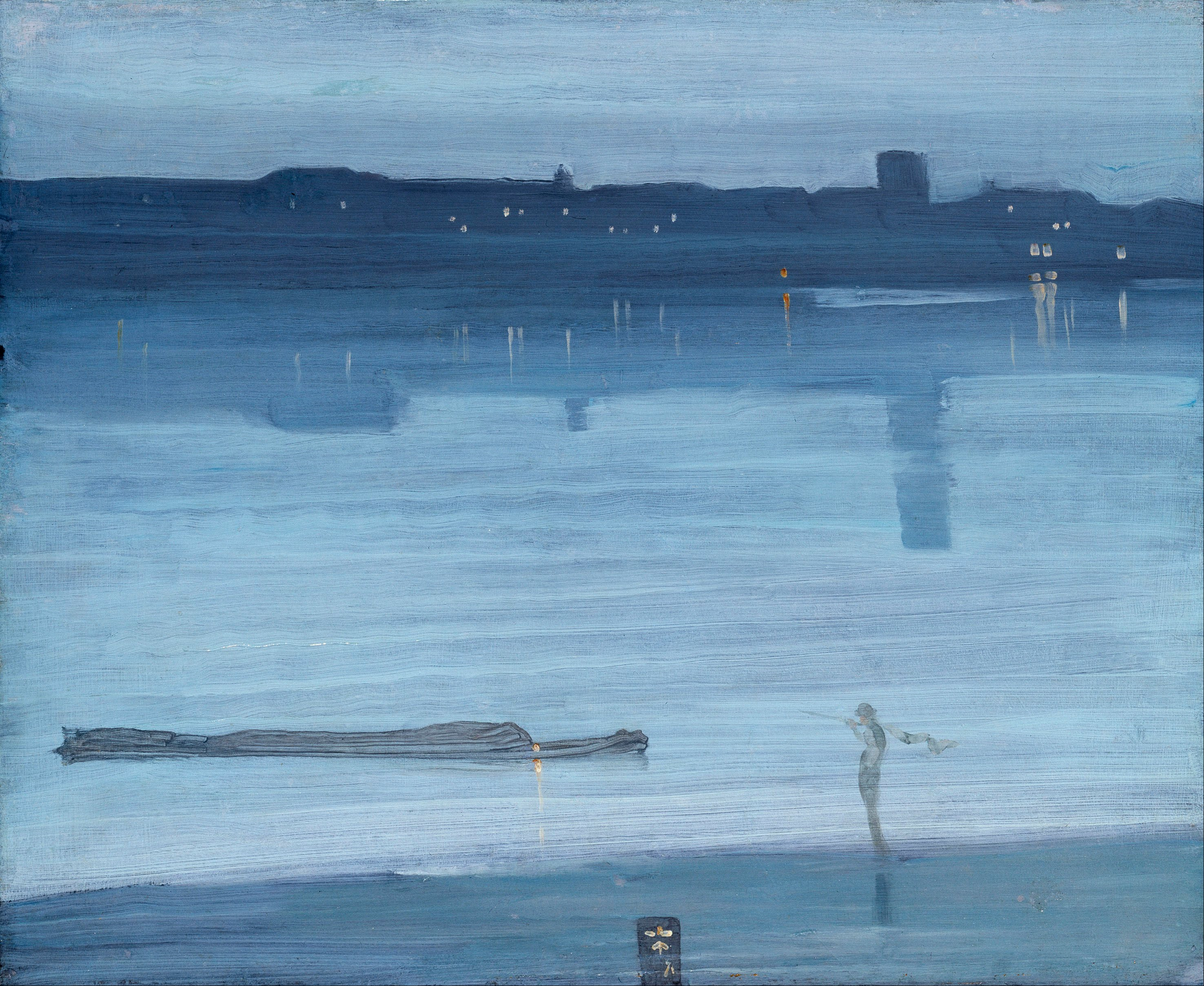
Nocturne: Blue and Silver—Chelsea occupies a pivotal place in the sequence. The University of Glasgow catalogue and Tate identify it as a 1871 oil painting on wood, approximately 50.2 by 60.8 centimetres, signed with Whistler's butterfly and the date. It was first exhibited at the Dudley Gallery under the wording Harmony in Blue-Green—Moonlight.[9]
Anna Matilda Whistler described an afternoon trip on the Thames and her son's urgent work on a sunset and moonlight after returning to the studio. Her letter is valuable contemporary testimony, but it does not establish a universal production method. It concerns a particular occasion remembered by a participant. The surviving panel, its layers and later history remain separate evidence.[3][9]
The painting looks across the river through a low range of values. A barge and small figure occupy the foreground, while the distant bank and church tower emerge as restrained differences rather than detailed forms. Whistler did not remove recognisable anchors. He made their visibility conditional, close to the way forms appear in diminished evening light.[1][9]
Its early reception was not uniformly hostile. Reviews of the Dudley Gallery recognised the relation between colour and music and understood that the work addressed mood rather than exhaustive description. Such praise belongs to that exhibition and those critics; it should not be used to claim that London immediately accepted all nocturnes. The title itself was still evolving.[1][9]
How Moonlights Became Nocturnes
Whistler initially referred to several evening paintings as moonlights. Frederick Richards Leyland, his patron and an amateur musician, suggested “nocturne” in 1871. Whistler adopted the term because it joined night subject to musical association and encouraged viewers to attend to line, form and colour. Leyland's contribution was real, though Whistler developed the pictorial category and public argument.[1][3][14]
The new name did not create an exact genre. Some nocturnes show the Thames, others Southampton Water, Valparaiso or Venice. They appear in oil on panel and canvas, lithographic media and works on paper. Evening, tonal economy and suspended incident recur, but support, scale, handling and place differ. The word defines a family of problems rather than a recipe.[1][11][14]
Nor did “nocturne” arrive all at once on every label. Blue and Silver—Chelsea was exhibited as a moonlight in 1871, and works shown later acquired revised colour phrases, numbers or locations. Preferred modern titles reconcile photographs, inscriptions, catalogues and correspondence. The thematic history must preserve those changes rather than making the current label an original studio fact.[1][2][3]
The term nevertheless changed expectations. A “view of Battersea” invites topographical checking; a “nocturne” proposes interval, atmosphere and relation. Whistler often retained a geographical subtitle, ensuring that the work occupied both categories. The most productive reading asks what remains specific after description has been reduced.
Serial Looking Along Battersea Reach
Whistler did not paint one definitive Thames nocturne. He returned to the reach in different seasons, tides, formats and states of visibility. A vertical canvas could make a bridge pier dominate; a horizontal panel could spread mist across water; a small work could depend on two or three lights. Repetition tested how much alteration a known site could absorb while remaining perceptible.[1]
Serial looking is different from mechanical repetition. Whistler changed viewpoint, distance and orientation. Old Battersea Bridge might be approached as a massive near obstruction, a broken horizontal or an opening towards Chelsea. Factory roofs could form a dense band in one work and dissolve almost completely in another. Boats might articulate scale or become isolated dark notes.[1][10]
This continuing return also complicates the notion of instant capture. Whistler observed repeatedly and could make sketches from memory, revise in the studio, scrape surfaces and return to works after exhibition. Memory allowed him to retain a relation without carrying every local fact. It did not free him from looking; it depended upon familiarity with the site.[1][3]
Series gave viewers another way to understand modernity. The river was never the same, yet its bridges and church tower provided continuity. Industrial light, weather and construction produced variation within that frame. Whistler's titles—blue and silver, grey and gold, black and gold—make changing tonal structure the organising record of those encounters.
Time operates at several scales in the series. A lamp appears within seconds; twilight changes over minutes; tide moves through hours; ice and foliage mark seasons; bridges and embankments alter over years. Whistler's recurrence to the same reach lets these durations meet. A single picture does not narrate them, but comparison reveals that an apparently timeless atmosphere belongs to an exact historical window.
Colour titles make this temporality easy to overlook because they sound self-contained. “Blue and silver” may appear to describe an autonomous chord, yet the balance could arise from remaining daylight, reflected sky, smoke or the material colour of a bank. “Black and gold” can join darkness to artificial light or fireworks. The terms identify pictorial relations while the represented conditions explain why those relations were available.
Format creates another series within the series. A vertical support can turn a near bridge pier into a descending barrier and emphasise the depth beyond it. A horizontal panel aligns with the reach and encourages lateral scanning. Small works make sparse accents intimate; larger canvases can ask the body to experience a field from several paces away. These are decisions about viewing as much as about scenery.
Whistler also regrouped works in exhibitions, where one nocturne could modify the next. Repeated colour terms and coordinated frames encouraged comparison rather than isolated anecdote. A blue panel beside a grey canvas made differences of temperature, scale and support perceptible. The series was produced by looking at the Thames, but it was completed publicly through hanging and sequence.[1][3]
Old Battersea Bridge and the Problem of Distance
Nocturne: Blue and Gold—Old Battersea Bridge is among Whistler's most radical uses of a familiar structure. The University of Glasgow catalogue identifies it as YMSM 140, painted between 1872 and 1875 and now at Tate. In its vertical format, a timber pier drops from the top edge, a barge crosses below and Chelsea Old Church appears through the bridge towards the distance.[1][10]
The old bridge is not accurately inventoried plank by plank. Its scale and darkness establish the picture's dominant interval, while the distant church, lights and water stabilise location. Japanese bridge prints provide an important formal comparison for the cropping and high, asymmetrical structure. The comparison does not make the Thames Japanese or prove dependence on one sheet; Whistler's direct knowledge of the bridge remains fundamental.[4][10]
During the 1878 Ruskin trial, questions about the painting pressed Whistler to identify the bridge and defend its representational accuracy. He argued that the intended effect became legible at a suitable viewing distance. The exchange is useful evidence for how he wanted sparse marks perceived, but it was also testimony under adversarial pressure. Distance cannot be turned into a rule that prevents close examination of surface or historical error.[10][15]
At a distance, tonal masses connect and small interruptions become lights, boats or skyline. Close up, viewers encounter the actions that produced them: fluid paint, abrasion, exposed preparation and distinct touches. Both distances belong to the work. Whistler's defence rightly challenges the demand that every mark function as isolated detail, while conservation evidence shows why the marks themselves matter.
Bridges, Churches and Orientation
Correct geography is essential because Whistler's reduction makes landmarks carry disproportionate weight. Chelsea Old Church, then commonly called All Saints, appears as a tower that can orient a view across or along the river. Old Battersea Bridge occupied a different position and form from the later bridge that replaced it. Chelsea Bridge and Albert Bridge belong to separate crossings and dates.[6][8][10]
The 1871 etching Chelsea Bridge and Church looks towards Chelsea Old Church and the newly emerging Albert Bridge context. The Met's impression combines etching and drypoint and is the fifth of seven recorded states in the Glasgow system. It was the latest plate included when the Thames Set was published in 1871, about a decade after its earliest dockland images.[4][6]
That plate makes the set itself a bridge between phases. Its riverbank was about to be changed by Embankment construction, and its spatial organisation draws on Japanese print comparison while retaining specific boats and architecture. The work cannot be treated as just another blue nocturne because it is a printed daytime or light-filled record made through line, state revision and impression.[4][6]
Uncertain sites must remain uncertain. One painting catalogued simply as Nocturne, YMSM 172, has been associated with the Thames, Valparaiso and Venice. A distant bridge-like form is insufficient to settle location. The responsible thematic account uses secure landmarks when available and does not recruit every ambiguous water scene into the Chelsea sequence.[1]
Working Traffic, Leisure and the Night River
The Thames joined work and recreation. Barges, lighters and ferries served the city's economy. Cremorne Gardens on the Chelsea bank offered music, dancing, promenades and fireworks. A river nocturne containing industrial silhouettes and one centred on a firework display therefore arise from related geography but different social events.[1][15]
Whistler's reduced figures do not mean that labour ceased. A man steering a lighter beneath Old Battersea Bridge may occupy few marks, yet his position explains the boat's movement and the scale of the arch. Mooring lights and distant traffic establish a river in use. Reduction changes visibility and emphasis; it does not make the scene unpeopled in fact.[1][10]
At Cremorne, spectatorship itself becomes part of modern urban life. Nocturne in Black and Gold: The Falling Rocket condenses a fireworks display into sparks, smoke, darkness and scattered figures. The Detroit Institute of Arts identifies the 1875 work as oil on panel. Its later legal fame should not cause all Thames nocturnes to be read as trial exhibits, nor should fireworks be confused with industrial flame.[15]
Whistler's distance from the opposite bank could aestheticise difficult conditions. Factories become silhouettes; labourers become small accents. That visual transformation deserves scrutiny, but it is not equivalent to ignorance. Earlier prints show his close engagement with wharves and workers. The later nocturnes ask what happens when the same modern environment is experienced through darkness, weather and remove.
Winter, Ice and the Altered Embankment
The Thames remained a subject after Whistler's 1879 bankruptcy. Nocturne: Grey and Silver—Chelsea Embankment, Winter is dated 1879 and now belongs to the Freer Gallery of Art. The catalogue connects it with ice moving along the river and contemporary reports of severe winter conditions. Its title names the new embankment rather than the earlier irregular bank.[12]
The painting's chronology joins environment to economic pressure. Whistler wrote of finishing a picture for sale while trying to meet debts. That fact establishes circumstances, not motive for every pictorial decision. The winter effect could be observed and aesthetically compelling while the completed canvas also functioned urgently in the market.[3][12]
Ice changes the nocturne's movement. Instead of smooth reflective water, broken pale forms pass along a darkened reach. The embankment and buildings give urban location, while close grey values suppress detail. This later work demonstrates that the category was not confined to moonlight or the early 1870s.
Comparing it with pre-Embankment photographs clarifies how much the site had changed. The north shore was now regulated, defended and traversable in a new way. Whistler's repeated Thames subject therefore contains infrastructure history within tonal variation, even when the painting offers no engineering narrative.
Materials, Grounds and Different Kinds of Atmosphere
Nocturnes can look materially alike in reproduction, but examination shows important differences. Blue and Silver—Chelsea is on wood; Old Battersea Bridge is on canvas; The Falling Rocket is on panel. Works on paper and lithotints use other processes. Support affects texture, absorption, scale and the survival of thin layers.[9][10][15][16]
The Art Institute of Chicago's Nocturne: Blue and Gold—Southampton Water provides a detailed technical comparator. A cross-section shows a dark-grey ground, blue paint and varnish, while microscopy records areas where abrasion exposes preparation and canvas. These findings belong to that 1872 painting, which depicts Southampton Water rather than the Thames. They demonstrate possible methods, not a universal Chelsea formula.[11][16]
Fluid paint can connect a broad field, while rubbing and scraping reduce contrast or remove unsuccessful passages. Small, thicker accents may establish moon, lamp or boat. Later varnish, cleaning and increased paint transparency can change the balance between dark preparation and surface colour. Atmosphere seen today includes ageing and treatment as well as Whistler's actions.[16]
The technical variety reinforces the logic of serial looking. Whistler did not simply pour one blue mixture over different views. He adjusted ground, support, consistency, abrasion and accent to the particular object. WHIS010 explains those comparative methods in depth; each later artwork page must retain its own examination history.
Scale and framing modify these material effects. A small panel can be surrounded by a comparatively broad gold frame, turning a dim interior image into a concentrated field. Painted or gilded edges mediate between close blues and the wall beyond. Whistler's insistence on designed frames was therefore relevant to nocturnes whose internal contrasts might be overwhelmed by a heavy conventional border.[1]
Surface gloss matters in exhibition light. A varnished passage can reflect the room and obscure close values, while a matt abraded area may appear lighter from one angle and darker from another. Historic galleries, daylight and modern controlled lighting do not produce identical experiences. Current digital reproductions remove that changing reflection and should not be used to make exact claims about depth of colour.
Condition is especially important where only a few differences carry form. If a small light is lost or retouched too strongly, the implied distance can collapse. If thin blue paint becomes more transparent, a grey or brown preparation can dominate the harmony. Conservation records belong to individual object pages because the thematic resemblance of nocturnes does not give them a shared ageing history.[16]
The Nocturnes and Japanese Print Comparison
Japanese ukiyo-e offered Whistler models for asymmetry, cropping, compressed depth, large intervals and the placement of bridges or boats. Hiroshige's bridge views are especially relevant to the way a near structure can cut across a composition while small distant forms remain active. The relation is strongest when a specific formal problem is compared, not when every mist or silhouette is labelled Japanese.[4][6][10]
Other sources remain present. Photography could encourage abrupt cropping and discontinuous focus. Realist practice directed attention towards contemporary wharves and workers. Direct observation supplied the geometry and traffic of the Thames. European night painting and print traditions also mattered. Whistler combined resources rather than replacing Western vision with a borrowed template.[4][5][17]
Technique must remain distinct as well. Japanese colour woodblock prints were designed, cut and printed through relief blocks. Whistler's oil nocturnes were painted and abraded; his etchings were bitten into copper; his lithotints depended on planographic printing. Similar spatial effects do not make these material operations equivalent.
The comparison becomes historically richer when makers and objects remain visible. “Japanese influence” is too vague unless it identifies what Whistler could have seen and what relation appears in a particular work. It should also acknowledge that London collectors and markets mediated access. WHIS008 owns that cultural history; the Thames page uses it to sharpen, not monopolise, the account of space.
Memory, Observation and the Myth of Instantaneity
Accounts of Whistler seeing an effect, returning to the studio and painting rapidly have shaped the nocturne legend. Anna Whistler's 1871 letter supplies unusually close testimony for one moonlight. Thomas Way later described memory sketches made after a Chelsea scene. Such sources show that observation could be stored and reorganised, but they do not prove that every nocturne was completed from memory in one sitting.[1][3][9]
Whistler's familiarity with the river made compression possible. He knew where a tower stood, how a bridge opened and how barges moved with the tide. Memory could retain these relations while discarding incidental detail. Studio work could then test whether the marks held at distance. Revision, drying and abrasion remained available after the initial act.[1][16]
Instantaneity is also a critical effect. Long strokes and sparse lights allow a viewer to grasp the whole quickly, creating the impression of a scene caught at once. That perceptual unity may have required repeated adjustment. Visible economy should not be used as a stopwatch.
The distinction helps reconcile Whistler's modernity with craft. He responded to fleeting urban conditions, but his art is not merely spontaneous notation. It is an edited structure built from observation, recollection and material judgement. The river changes quickly; the painting determines which changes endure.
Critical Conflict and Later Reception
Whistler's nocturnes divided critics because they challenged familiar measures of finish, labour and accurate representation. Some early viewers praised their chromatic subtlety; others saw vagueness or insufficient work. John Ruskin's attack on The Falling Rocket and the 1878 libel case made one hostile judgement emblematic, but it did not represent every response.[1][9][15]
The trial brought price and execution time into public argument. Whistler defended the value of accumulated knowledge and the intended effect of paintings seen at an appropriate distance. He won the action but received one farthing in damages. WHIS015 owns the legal sequence; for the river works, the important point is that sparse description had become a contested claim about artistic authority.[15]
Later Tonalist painters and photographers found the nocturne a useful category for low contrast, atmosphere and urban night. Symbolist and modernist histories valued Whistler's suggestion, restricted palette and relative independence from narrative. These afterlives are significant but diverse. They do not make every later misty image a direct descendant, and they do not turn Whistler into a non-objective painter.[14][17]
His Thames works retain bridges, churches, boats, taverns, fireworks and engineered shores. Their modernity lies partly in how much those subjects can be reduced while remaining active. The images shifted critical attention towards relation and perception without abandoning the nineteenth-century city that supplied them.
Exhibition practice amplified the debate. Crowded annual displays trained viewers to read subject and finish rapidly, whereas Whistler's later one-person installations controlled spacing, wall colour and sequence. A nocturne encountered amid many unrelated pictures could appear slight; a group presented as variations invited slower adjustment of the eye. Reception therefore responded not only to paint and title but to the conditions under which difference became visible.[1][3]
The market also shaped which works travelled and which comparisons audiences could make. Patrons such as Leyland bought selected paintings; dealers assembled later displays; American collectors eventually formed concentrated holdings. Sales dispersed the series across institutions, so the familiar “Thames nocturnes” are now reconstructed through catalogues, loans and reproductions rather than viewed as a stable set designed once by Whistler.
That dispersal creates a modern interpretive hazard. Present museum groupings may bring together works that Whistler never saw side by side, while online searches align images at equal size despite major differences of support and dimensions. Catalogue identity and exhibition chronology are the safeguards against turning a productive family resemblance into a fictitious original series.
How to Look at a Thames Nocturne
Begin with orientation. Identify the support, date and secure site before reading a familiar title as literal fact. Locate bridge, church, bank and direction of view where catalogue evidence permits. If the site remains disputed, preserve the dispute. A present-day map may help, but rebuilt bridges and the Embankment require historical correction.[1][2][8]
Then look at the picture from more than one distance. From across a room, ask how the largest tonal masses connect and which accents establish depth. Close up, distinguish exposed ground, thin paint, abrasion and later coating where visible. Neither view is complete on its own.[10][16]
Attend to traffic and labour even when reduced. A single boat may organise the scale of a bridge; a line of lamps may indicate an active bank; a chimney may merge with fog without losing industrial meaning. Ask what has been omitted and what minimal evidence remains.
Finally, compare carefully. Another nocturne may share colour words but depict a different river or use another support. A Japanese print may clarify cropping without explaining pollution, tide or local infrastructure. Historic photographs may establish what stood on the bank without dictating Whistler's purpose. The strongest reading lets object, place and pictorial relation correct one another.
Sound can be considered without pretending that the paintings encode music. A working Thames carried engines, whistles, voices, water against piles and the intermittent detonation of fireworks. Whistler's visual quiet is therefore selected rather than necessarily literal. The musical title describes organisation and mood; it does not prove that the represented river was silent. That gap between urban noise and pictorial stillness is one measure of transformation.
Social distance deserves the same attention. A viewer inside a Chelsea house, on a bridge or along the new Embankment occupied a different position from a worker aboard a lighter or unloading coal. Whistler's viewpoints often belong to mobility and access not shared equally across the river. Aesthetic pleasure and industrial use occur in the same scene, although the nocturne may distribute their visibility unevenly.
Look also for what resists the harmony. A sharp orange lamp in a blue field, a black pier interrupting mist or a roughly abraded patch can prevent softness from becoming uniform. These points are structurally important because the surrounding palette is close. Whistler's tonalism is not the absence of contrast but its concentration into selected places.
Finally, consider the frame of historical knowledge. A silhouette that once registered as a current factory may now appear generically picturesque; an old bridge that London viewers recognised instantly may require identification. Scholarship restores these references without turning the picture into an illustrated gazetteer. The goal is to recover the tension between specific modern infrastructure and the reduced visual language through which Whistler made it newly strange.
A Modern River Seen Repeatedly
Whistler's Thames sequence gains force when its atmosphere is returned to history. The broad fields of blue, grey or black came from looking at a river crowded by trade, modified by engineering and experienced through unstable light. The old bank, new Embankment, bridges, factories, lighters, church tower and leisure grounds supplied a changing structure. Reduction made their relations newly visible.
The movement from dockland etchings to Chelsea nocturnes was not a flight from reality. It was a shift in distance, medium and criterion. Close description of wharf architecture gave way, in many works, to tonal fields in which a few marks carry location. Japanese prints, photography, Realist observation and Whistler's musical theory all contributed, but none alone explains the sustained return.
The river is the continuity. Whistler watched it from different homes and banks, before and after major construction, in ice, dusk, mist and artificial light. Each work selects one arrangement from a system already in motion. Seen together, the nocturnes are not variations on emptiness. They are records of how little a painter needs to make a modern city, its work and its weather remain present.
Their restraint is consequently dense with decisions. The choice of bank sets social and visual distance; tide determines what the shore reveals; bridge and church establish orientation; format directs the eye; ground and abrasion organise the surface; title and frame govern the first public encounter. No single factor makes a nocturne. The works gather these conditions until a few intervals can carry the complexity of the river from which they came.
Frequently Asked Questions
Fog and mist reduced visibility, but dusk, smoke, moonlight, artificial lighting, tide and artistic selection also mattered. Whistler chose viewpoints, supports and marks. Atmosphere was observed material, not a complete explanation of composition.
Discussion
What remains historically specific when Whistler reduces the Thames to a few intervals?
Test atmosphere against geography, labour, tide, construction and the evidence of the individual object.
Reader Insights
Which bridge, church, bank or reach fixes the view?
How do tide, weather, light or rebuilding alter it?
Which minimal marks still carry work and movement?
Join the Conversation
Share a precise Thames observation or question.
References
- Margaret F. MacDonald and Grischka Petri, The Paintings of James McNeill Whistler: A Catalogue Raisonné, University of Glasgow, including YMSM 36, 46, 53, 103, 117, 119, 120, 140, 145, 164, 170, 174, 205, 235 and 309: https://www.whistlerpaintings.gla.ac.uk/catalogue/
- University of Glasgow, “The Project,” The Paintings of James McNeill Whistler: https://www.whistlerpaintings.gla.ac.uk/project/
- Margaret F. MacDonald, Patricia de Montfort, Nigel Thorp and Georgia Toutziari, eds., The Correspondence of James McNeill Whistler, 1855–1903, University of Glasgow: https://www.whistler.arts.gla.ac.uk/correspondence/
- Allison Rudnick, “James McNeill Whistler (1834–1903) as Etcher,” Metropolitan Museum of Art, 2015: https://www.metmuseum.org/essays/james-mcneill-whistler-18341903-as-etcher
- Metropolitan Museum of Art, Black Lion Wharf, 1859, 17.3.35: https://www.metmuseum.org/art/collection/search/372506
- Metropolitan Museum of Art, Chelsea Bridge and Church, 1871, 17.3.65: https://www.metmuseum.org/art/collection/search/372547
- Historic England Archive, “Chelsea Embankment, London,” BB94/15622: https://historicengland.org.uk/education/schools-resources/educational-images/chelsea-embankment-london-bb94-15622
- Historic England Archive, “General view looking west showing the construction of Chelsea Embankment,” OP04626, and “The Great Stink—A Victorian Solution to the Problem of London's Waste”: https://historicengland.org.uk/images-books/photos/item/OP04626 ; https://historicengland.org.uk/images-books/archive/collections/photographs/the-great-stink/
- University of Glasgow and Tate, Nocturne: Blue and Silver—Chelsea, 1871, YMSM 103 / T01571: https://www.whistlerpaintings.gla.ac.uk/catalogue/display/?mid=y103
- University of Glasgow and Tate, Nocturne: Blue and Gold—Old Battersea Bridge, 1872–75, YMSM 140 / T01959: https://www.whistlerpaintings.gla.ac.uk/catalogue/display/?mid=y140
- Art Institute of Chicago, Nocturne: Blue and Gold—Southampton Water, 1872, 1900.52, curatorial entry and technical summary: https://publications.artic.edu/whistlerart/reader/paintingsanddrawings/section/84
- University of Glasgow and Freer Gallery of Art, Nocturne: Grey and Silver—Chelsea Embankment, Winter, 1879, YMSM 205 / F1902.143a-b: https://www.whistlerpaintings.gla.ac.uk/catalogue/display/?mid=y205
- National Gallery of Art, American Paintings of the Nineteenth Century, Part II, systematic catalogue: https://www.nga.gov/content/dam/ngaweb/research/publications/pdfs/american-paintings-of-the-nineteenth-century-part-II.pdf
- Victoria and Albert Museum, “The wonderful world of Whistler,” updated 17 April 2024: https://www.vam.ac.uk/articles/the-wonderful-world-of-whistler
- University of Glasgow, edited court transcript for Whistler v. Ruskin, 25 November 1878, and Detroit Institute of Arts, Nocturne in Black and Gold, the Falling Rocket, 46.309: https://whistler.arts.gla.ac.uk/correspondence/people/display/?initial=W&nameid=Whistler_Gwa&rs=103&sr=0 ; https://dia.org/collection/nocturne-black-and-gold-falling-rocket/64931
- Kimberley Muir, “Ground and Atmosphere: Observations on Whistler's Painting Supports,” Whistler Paintings and Drawings at the Art Institute of Chicago: https://publications.artic.edu/whistlerart/reader/paintingsanddrawings/section/24
- H. Barbara Weinberg, “James McNeill Whistler (1834–1903),” Metropolitan Museum of Art, 2010: https://www.metmuseum.org/essays/james-mcneill-whistler-1834-1903


