


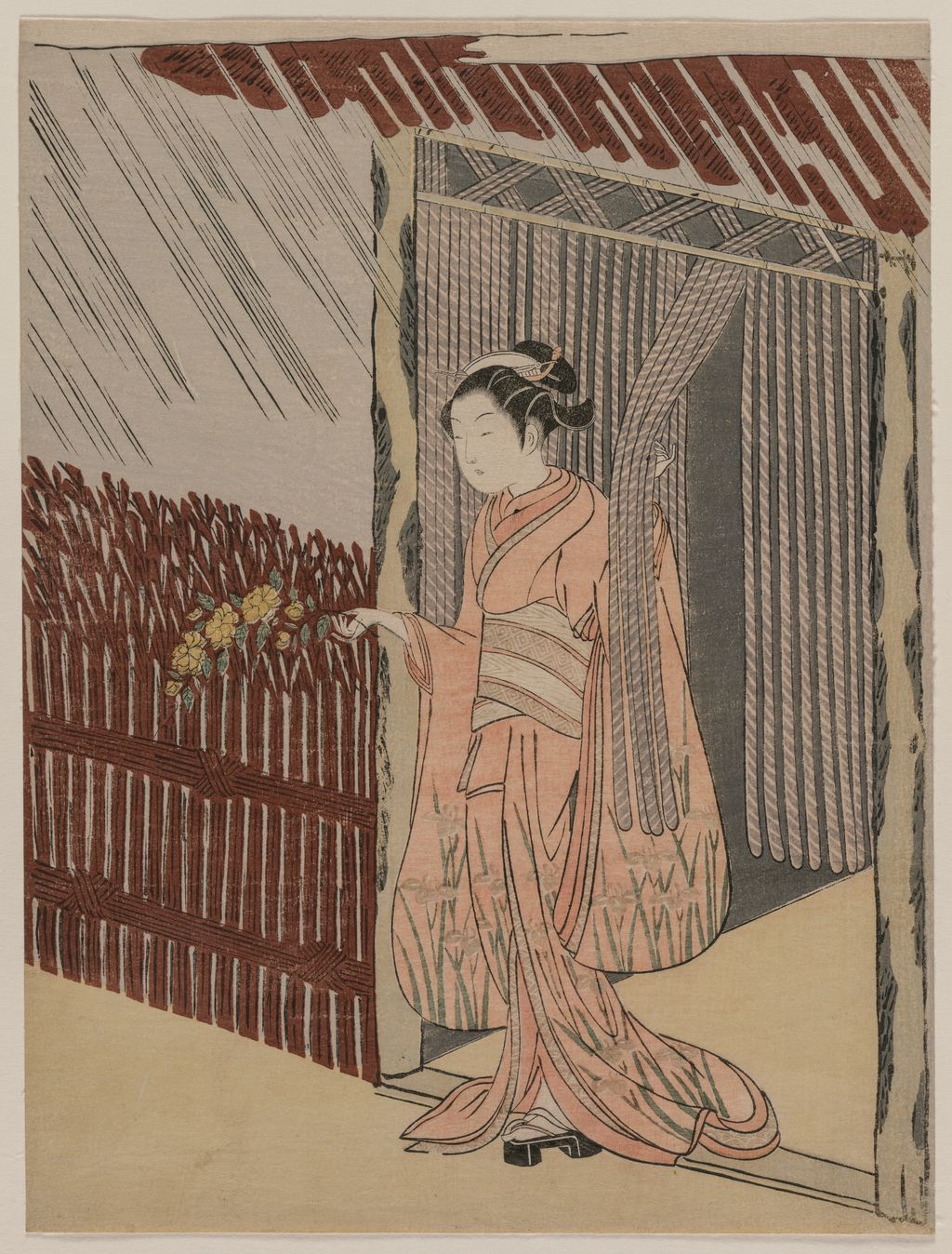
Suzuki Harunobu, A Girl Dressing in Pink, 1766. Cleveland Museum of Art, 1930.175. Museum object record.
 by Tom Gurney
Tom Gurney BSc (Hons) is an art history expert with over 20 years experience
Published on September 25, 2026 / Updated on September 25, 2026
Email: tomgurney1@gmail.com / Phone: +44 7429 011000
Suzuki Harunobu and the art of a small picture
Suzuki Harunobu (c.1724/25–1770) made prints that ask a viewer to look twice. A young woman may be attending to an ordinary task, but her pose invokes a figure from an old tale. A poem may lend a domestic scene the mood of a place far away. A pattern on a robe may conceal a calendar. Harunobu's most admired work belongs to a remarkably concentrated period in the 1760s, when privately exchanged picture calendars helped bring fully multicolour woodblock prints into wider use. His achievement lies in the meeting of drawing, literary play, colour and the labour of the people who cut and printed the blocks. [1] [2] [3]
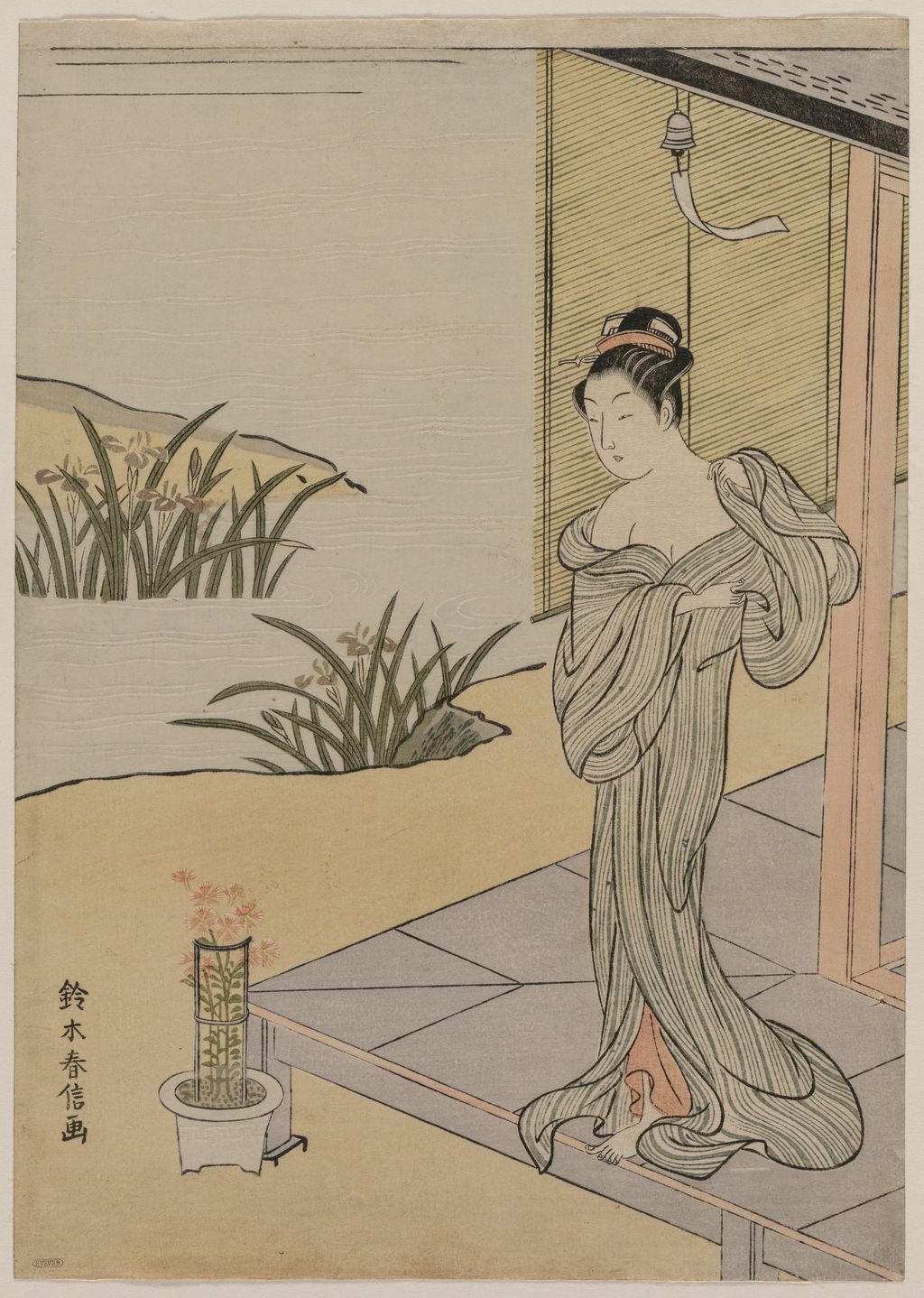
The figures often inhabit a sheet roughly the size of a book page. Cleveland's 1766 A Girl Dressing in Pink, for example, measures 28 by 21 centimetres. The museum title describes her pink clothing; it does not establish that she is putting it on. In the actual impression, one hand raises a hanging screen while the other reaches towards flowers by a fence. The screen's vertical lines, broad pink robe and spare ground organise a small moment of movement. Harunobu's later reputation can make every sheet a milestone in the history of colour; this one also rewards attention to a hand, a threshold and a flower. [4]
Contents
- Suzuki Harunobu and the art of a small picture
- Look closely at the screen and flowers
- Before the brocade print
- A calendar hidden in an image
- From a private exchange to a printed world
- Allusion: making an old story live in the present
- Colour, paper and a quiet change of attention
- Women, named sitters and the limits of a label
- What an individual impression can and cannot tell us
- How to look at Harunobu now
- Books on Japanese Art
Look closely at the screen and flowers
Choose a number to enlarge a detail from the high-resolution museum image. Find its position in the whole print and compare the explanation below.
Explained details
The hand at the hanging screen
One hand lifts the hanging screen. Its repeated vertical lines frame the figure; they do not show that she is changing clothes.
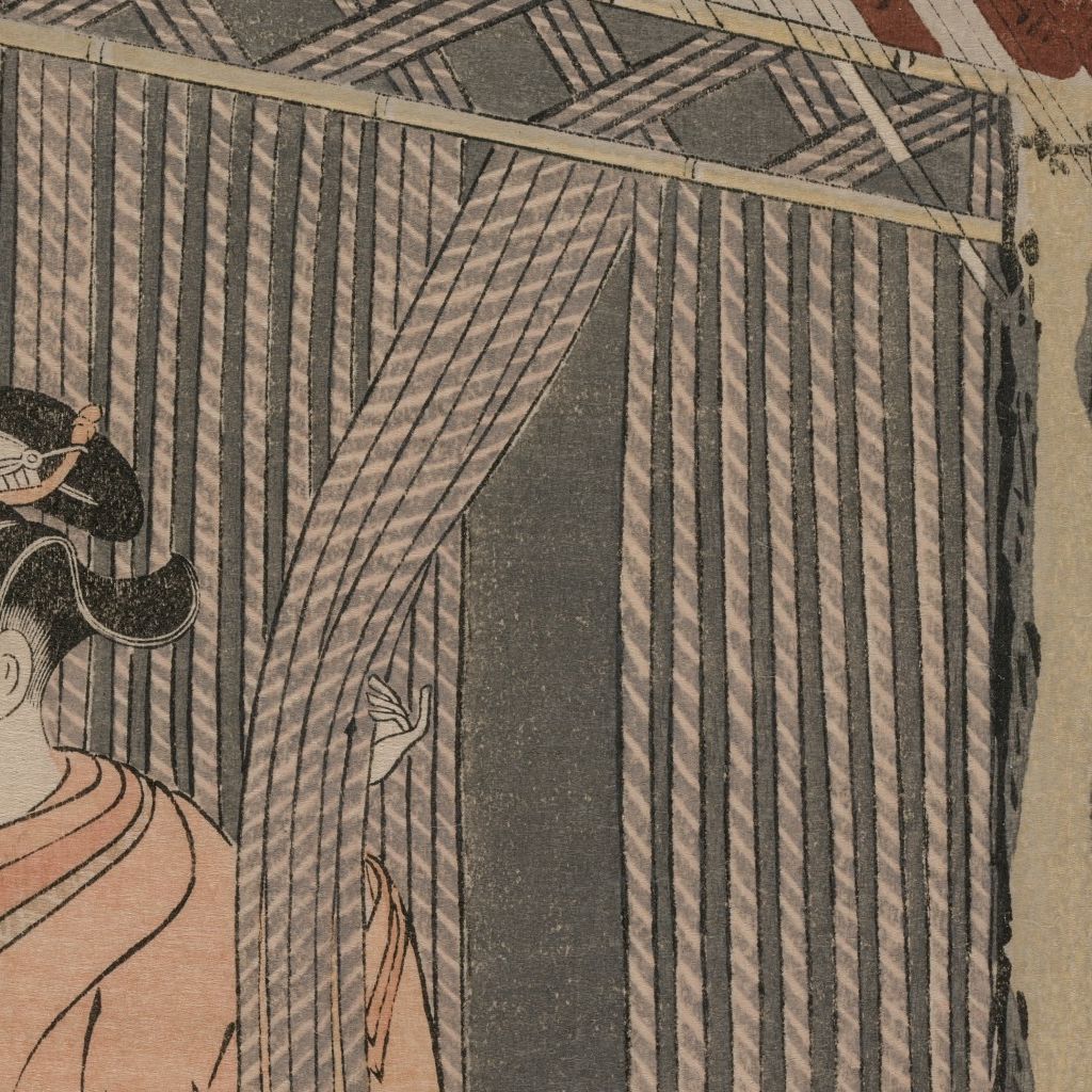
Cleveland Museum of Art Object record 1930.175. Editorial crop and resize disclosed.
The hand by the flowers
Her other hand reaches toward the flowers at the fence. Return to the complete sheet to connect the hand, flowers and pink sleeve.
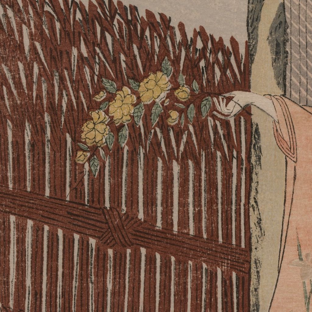
Cleveland Museum of Art Object record 1930.175. Editorial crop and resize disclosed.
Harunobu is frequently introduced as the inventor of nishiki-e, or “brocade pictures.” The label points to the transformation of colour printing around 1765, but the image on the page needs a fuller explanation. A designer's composition was translated into carved blocks; differently inked surfaces and carefully aligned impressions brought its colours together on paper. Patrons supplied the impetus for luxurious private calendars, and later publishers could bring colour designs to a broader audience. Japanese and British museum accounts place Harunobu at the centre of that transition, while the surviving sheets also preserve evidence of commissioners, carvers and other contributors. To say that he transformed the medium is well supported. To imagine one painter alone producing a printed sheet is not. [1] [2] [3] [5]
At a glance
- Lifec. 1724/25–1770
- Main periodJapanese prints of the 1760s
- FormatsBenizuri-e, picture calendars and nishiki-e
- Look forPrint states, mitate and poetry
Before the brocade print
Harunobu did not begin with the densely coloured prints that now define his name. Tokyo National Museum places earlier red-and-green prints, or benizuri-e, beside his later work. In the Met's Shimizu Temple, the older technique supports an image based on an episode of the poet Ono no Komachi. The sheet is narrow, about 31 by 14 centimetres, and the Met dates it to around 1765. Its catalogue warns that the yellow visible today may have been added after the original colour faded. That single qualification matters: the present palette of a surviving impression is evidence to examine, not a perfect record of what a buyer saw when the sheet was first printed. [3] [6]
Komachi had been admired for poetry and beauty for centuries. Harunobu's print does not need to put a ninth-century court poet in ancient costume to connect with her story. A contemporary-looking scene, a title cartouche and a poem can carry the association. Tokyo National Museum names Fūryū Yatsushi Nana Komachi among the strands of Harunobu's early practice. The word yatsushi signals a remaking of an inherited subject in fashionable, familiar form. The pleasure lies in recognising both sides of the transformation. A reader new to Japanese prints can begin with the visible scene, then return to it after learning why Komachi's name matters. [3] [6]
This bridge between old and new is visible in a later Met print, The Cloth-Fulling Jewel River. It shows two women working cloth in a room as autumn signs gather around them. Two little pictures on the wall are rendered as older, limited-colour benizuri-e within a new multicolour print. Harunobu thus offers a way to compare the techniques without leaving the subject of the sheet. The Met also notes a mistake in the verse's inscription: it credits Lady Sagami, but the museum attributes the poem to Minamoto Toshiyori. The discrepancy is a reminder that a printed inscription has its own history and may not settle a literary attribution. [7]
A calendar hidden in an image
The e-goyomi, or picture calendar, was more than a decorative image with a year printed beneath it. In the Met's Visit to a Shrine at the Hour of the Ox, numbers for the long and short months of 1765 lie in the pale pattern of a woman's kimono. The museum describes them as embossed rather than coloured, which makes them difficult to see. Once the pattern has been found, the scene changes. The viewer has solved a visual puzzle while looking at a woman engaged in a mysterious night visit. The calendar information is part of the picture's material surface, not a separate caption. [8]
The shrine subject has its own tension. The woman carries implements associated with a curse traditionally performed in the ox hour, around two in the morning, but the Met notes that she lacks some expected accessories. It reads her quiet manner as closer to dreaming than to a violent ritual. The same sheet bears a commissioner's seal and names the block cutter Sekine Kaei alongside Harunobu. Those marks give unusually concrete evidence of a particular collaborative project. They make a better account of the colour-print breakthrough than a tale in which an isolated genius simply has a new idea one day. [8]
The design also shows why print states matter. The British Museum owns a later printing of Ushi no toki mairi and explicitly says that its first printing included the long-month numbers in the robe. A later image of the same subject need not still display the calendar clue in the same way. The Met and British Museum records refer to different physical impressions, and each should be captioned as such. The difference opens a larger question: what changed when a once-private calendar design reached another audience? The available records establish the changed printing; they do not tell us everything about the buyers. [8] [9]
From a private exchange to a printed world
British Museum and Japanese museum accounts connect Harunobu with picture-calendar exchange gatherings in 1765 and 1766. These events made demanding images attractive to patrons who could enjoy a hidden month sequence, a witty allusion and a finely printed object at once. The process helped make multicolour registration and richer combinations of pigment economically and socially useful. This account is specific enough to explain change without suggesting that printers had never combined colours before. Earlier benizuri-e already did so with a more restricted palette. The decisive question is what the calendar circle encouraged designers and printers to achieve together. [1] [2] [3]
Chiba City Museum's Night Rain at the Double-Shelf Stand complicates a neat private-versus-public story. The museum identifies its example as a second printing of a design first made as a privately circulated surimono. The first printing carried the name of a commissioner, Kyosen, whom Chiba identifies as the hatamoto Ōkubo Jinshirō Tadanobu. Yet this design from Zashiki hakkei, or Eight Views of the Parlour, is not itself a calendar. It translates the old “night rain” landscape motif into an interior where the sound of a tea kettle can stand in for falling rain. One patron's involvement connects the print to a culture of private exchange, while the subject and its later printing show how far those inventive images could move. [10]
Chiba's account is unusually detailed about what changed between the two printings. It says the private first edition bore Kyosen's signature and seals, whereas a publisher removed those identifiers and made the design available for sale as an Azuma nishiki-e. The museum also identifies a literary link: Taiya Teiryū's 1735 poems had shifted the prestigious Eight Views of Xiaoxiang from landscape into domestic spaces. The “rain” of this view is the water sounding inside a tea kettle; a dozing mother, a mischievous child and an older girl make the indoor scene lively. An English title that merely says Night Rain might leave readers looking for weather outside the window. The changed printing, named commissioner, sale and poetic source together tell a more interesting story of how a private joke became a commercial print. [10]
There is also an important limit to the evidence. Chiba's surviving sheet is the second printing, and its explanatory text draws on information about the first. We may describe the changed seals because the museum does. We should not draw a diagram of their exact former positions from a second-printing photograph or assert that every surviving version had identical colours. A future page devoted to Zashiki hakkei would need to identify first-printing and published examples of the same design and explain whether the whole eight-sheet group shared the same route into circulation. The artist home uses the one well-documented case to make the larger process understandable. [10]
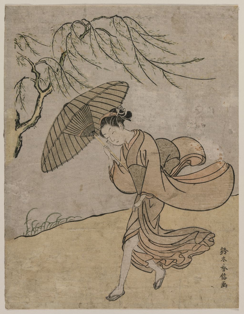
The contrast with the Cleveland Woman Running Past a Willow Tree in a Breeze helps keep the account visual. Here a body and hanging branches make the breeze readable without hiding a date or requiring knowledge of an old poem. Cleveland dates the print to 1766 or 1767. It is a reminder that not every Harunobu scene is an encrypted classical text. A descriptive title can tell us what the museum identifies, while the image's sense of motion can be enjoyed before we learn anything about patrons. By placing this print near the calendar discussion, the page can show two different kinds of sophistication in a closely related period. [11]
Allusion: making an old story live in the present
Mitate is often translated as “parody,” but the English word can suggest ridicule that is absent from many prints. It can be an imaginative seeing-as: a contemporary person, action or place calls an older subject to mind. Chiba City Museum's Parody of Meng Zong invokes one of the Chinese paragons of filial piety, whose story concerns a mother longing for bamboo shoots in winter. The British Museum's print based on the Hundred Poets similarly moves an old poem into a scene with fashionable figures. Such sheets invite recognition and reinterpretation rather than a simple one-to-one illustration. [12] [13]
Chiba's Meng Zong record combines this remaking with a second print-state puzzle. Its first version was a picture calendar for 1765, with the long months hidden in bamboo leaves. The museum says those marks were removed for the later printing it holds. In the inherited Chinese story, a dutiful son prays for winter bamboo shoots to feed his ill mother. Harunobu turns him into a young woman in a fashionable long-sleeved kimono, barefoot in the snow as she searches for shoots. Viewers could recognise the old moral story while enjoying the conspicuous difference in gender, dress and time. A modern reproduction of Chiba's later sheet would show the mitate, yet it would be misleading to mark the removed month numbers as visible on it. A single exact object thus connects allusion, calendar fashion and reprinting without collapsing those three histories. [12]
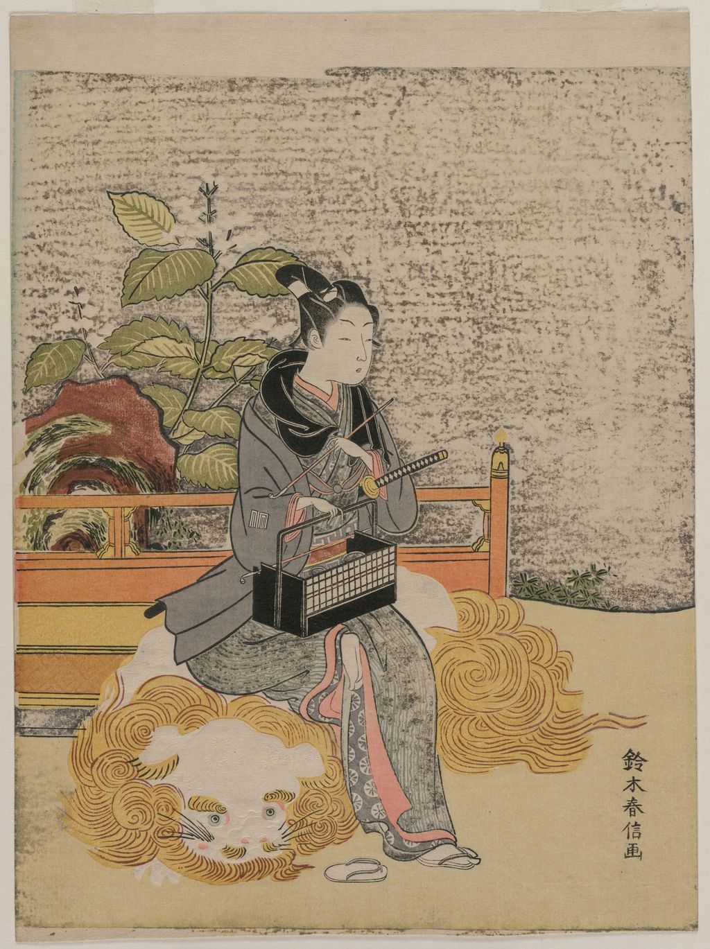
Cleveland's Youth as a Stand-in Monju offers a cleared image for the same kind of question. Its Japanese title, 見立文殊菩薩, names the comparison with Monju, the bodhisattva of wisdom. The viewer should be shown the young figure and asked what in the contemporary scene activates that exalted identity. It is too blunt to say the print merely “depicts Monju” if the point is a fashionable stand-in. Nor should every visible prop be assigned a religious meaning that the museum record does not support. The title establishes the allusion; the image lets the reader consider how Harunobu stages it. [14]
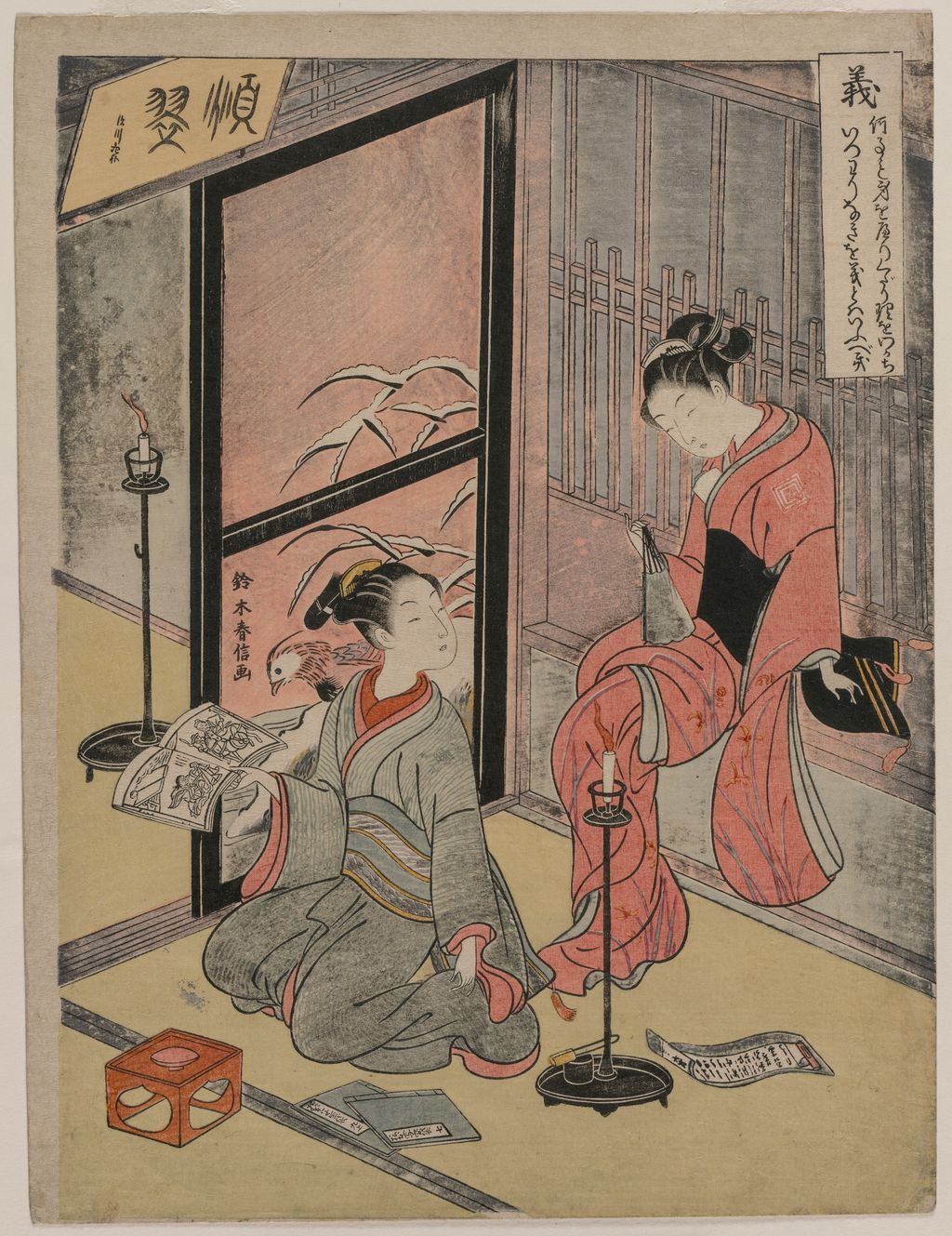
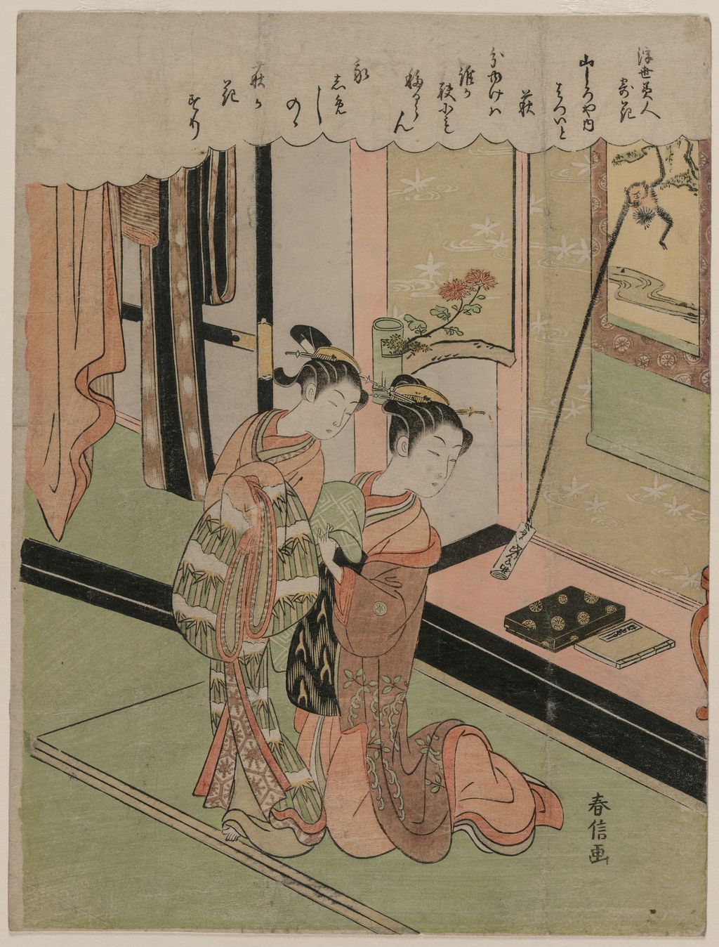
Cleveland's Righteousness, from The Five Virtues gives another way to read a title before reading the scene. The Japanese title, 五常の内 義, places this print within a sequence about the five constant virtues and specifies gi, righteousness. The image does not become a dictionary entry for an abstract noun; it offers a human setting in which a named quality may be contemplated. It matters that the museum catalogues this as a series print from 1767. A useful gallery would put it beside the Monju sheet, since both call on learning beyond the immediately visible moment, while preserving the distinction between a Buddhist allusion and a moral series. [15]
Poetry and place could add still another layer. In the Met's The Tama River at Ide, dated probably 1766, a woman and two young attendants wade through water while a verse by Fujiwara Toshinari links the scene to a famous river in Yamashiro Province. The people look of their own day; the name and poem bring a history of travel and literary memory into their crossing. Harunobu could thus bring old waka into a present-feeling picture without claiming to be illustrating a poet's actual journey. The print's exact location and verse belong to the Met record, so it is a research comparison until a production image is cleared. [16]
Ide is one of the “Jewel Rivers” whose names had accumulated associations in verse. The Met explains that a celebrated place name could do the work of a much longer description: readers might recall a season or another poem as soon as they encountered it. The figures in Harunobu's crossing are present-tense figures for his audience, yet they enter a landscape already occupied by earlier writing. This is why a place name in a title is not just a geographic label. It can be the hinge that joins a printed scene to remembered literature. The object's date is “probably 1766,” so its exact place within the calendar exchange years remains an inference rather than a documented commission. [16]
The Met's Cloth-Fulling Jewel River pushes the same idea into an interior. It names the Tamagawa in Settsu, yet much of what we see is a dim room, a candle, cloth and a view through a bamboo window. The season comes through the beating of cloth and the persimmon tree outside, while the name brings a distant river into the experience of domestic work. Its two tiny prints on the wall introduce another timescale: an older colour method depicted by a new one. Seen together with the Ide crossing, it shows that a named place did not demand a literal outdoor panorama. Harunobu could turn a literary river into the subject of what people were doing at home. [7] [16]
Captions need to keep those layers available without claiming too much. A place-based title should give the museum's province or named river; a series title should be retained when the object belongs to one; a poem's author needs the catalogue's correction when an inscription disagrees. For the Settsu sheet, that means identifying the inscribed credit to Lady Sagami and the Met's reassignment to Minamoto Toshiyori as two different statements. For the Ide sheet, it means distinguishing a poem by Toshinari from the contemporary-looking women who cross the water. The page's inline references can take an interested reader back to those records while the image caption remains short enough to be read alongside the print. [7] [16]
Colour, paper and a quiet change of attention
The visible effect of colour is not simply “more realistic.” In Cleveland's Young Woman Looking at a Pot of Pinks, dated around 1767, the museum records colour printing with embossing. The woman's attention to a small pot asks the viewer to slow down too. Embossed passages depend on the paper's relief and angle of light; a flat digital photograph may show them weakly. The page should first let the whole print breathe, then use an enlargement only if a close inspection of the retained original shows the raised impression well enough to explain it. The relevant lesson is that printing could organise touch and light as well as hue. [17]
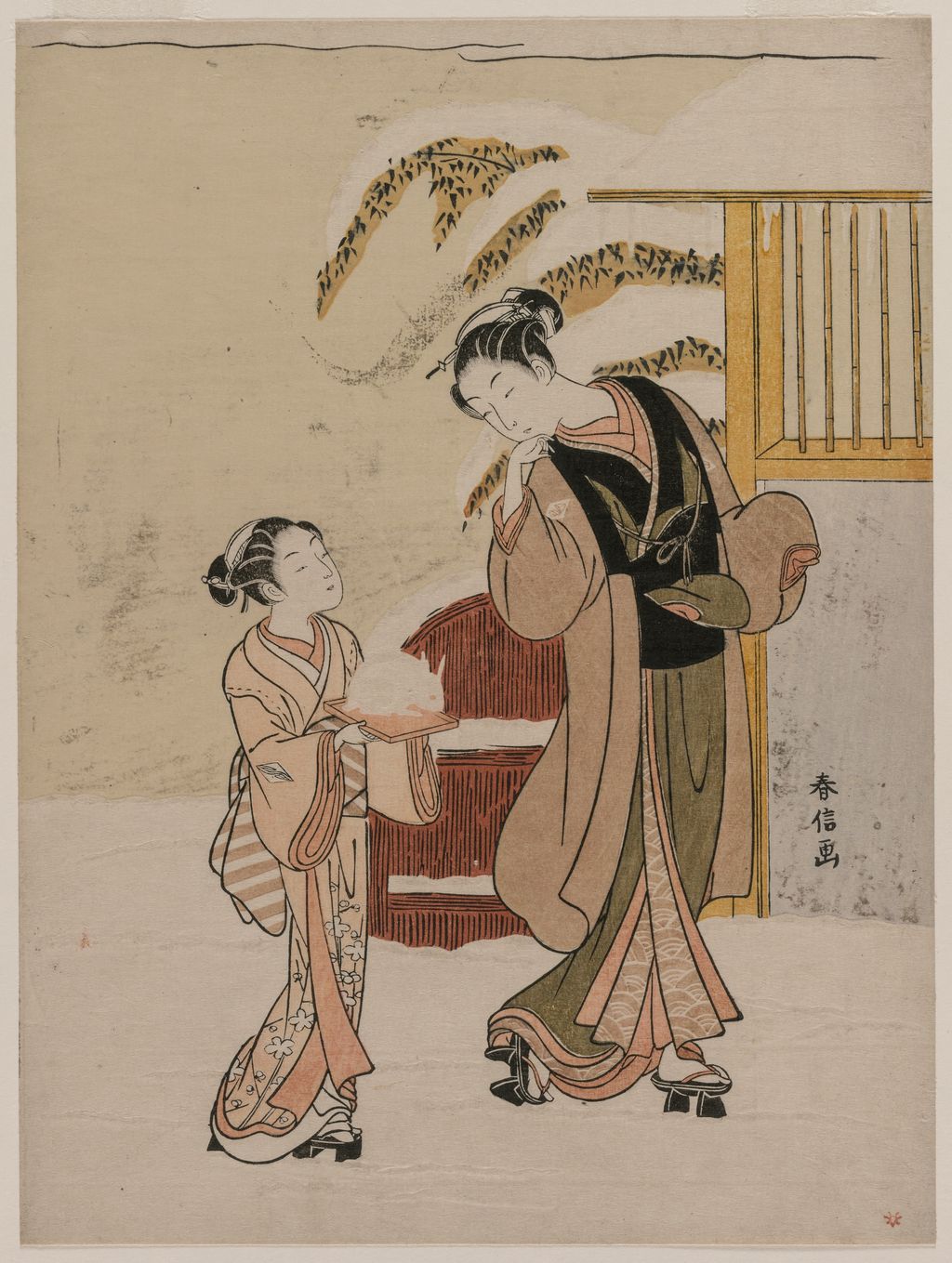
The same caution applies to Young Woman Admiring a Snow Rabbit. Cleveland dates it to the late 1760s and describes ink, colour and embossing on paper. The snow rabbit is an object within an attentive domestic scene; pale areas can be as important to its effect as the coloured robe. It would be easy to make the rabbit large in an isolated crop and lose the person who looks at it. The complete composition shows how her act of looking gives the small subject significance. Here the annotation, if useful, should let the reader move between the rabbit and the full print rather than substituting a detail for the whole. [18]
Harunobu also used weather and time of day to complicate familiar figures. The Met's Twilight Snow on Mount Matsuchi draws on the inherited “eight views” pattern, while its printed poem likens snow-laden trees to blossom in evening light. The pictured bridge crosses San'ya Canal near the Sumida River. This is not a landscape survey of the mountain; the poem and view give a familiar Edo place the feeling of a classical theme. Cleveland's willow print makes weather visible through movement, while this Met print lets the words alter how snow is seen. Both kinds of effect deserve room in an artist introduction even if only the former currently has a cleared production photograph. [19] [11]
Another kind of night scene appears in the British Museum's Lovers Hunting for Insects, dated about 1767–68. One person holds a lantern as the other searches among flowering bush clover. The museum remarks that the dark sky required repeated printing to achieve its deep black. That observation ties the print's atmosphere to labour at the press: night was built through successive impressions, while the lantern and small gestures keep the figures legible. An image of a dark field on a web page cannot by itself show how many passes produced it. The museum's technical note gives readers a way to connect what they see with how it was made. The print remains a research comparison here because its photograph has not been cleared for this site. [28]
The difference in format matters as much as the difference in colour. The narrow Shimizu Temple sheet is catalogued as a hosoban. Cleveland's A Girl Dressing in Pink and the calendar sheets occupy the more compact, book-page-like chūban proportions often associated with Harunobu. The Met also preserves a much taller and thinner hashira-e, or pillar print, Beauty under an Umbrella in the Snow, dated around 1770. A single vertical figure standing in quiet weather suits that long frame; it would look quite different forced into the crop of a medium-sized sheet. These are examples of different formats, not a progression from “primitive” to “advanced.” Measurements on the object records should guide the page's image treatment so readers can recognise that a print's shape was part of its design. [6] [4] [29]
Women, named sitters and the limits of a label
The British Museum calls Harunobu a leading designer of prints of beautiful women in the 1760s. That category is useful but broad. A woman at a hanging screen, a woman looking at a pot of flowers, and a courtesan identified by name do not have identical social positions or reader meanings. The supplied title of Cleveland's Hatsuito of the Yamashiroya Likened to Bush Clover gives both Hatsuito and the Yamashiroya, and the Japanese series title makes the flower comparison explicit. We can begin with those facts, then look at how a plant analogy shapes the way the named woman is presented. We should not assume that the depiction is a portrait likeness in the modern sense or that every woman in the gallery worked in the same setting. [1] [20]
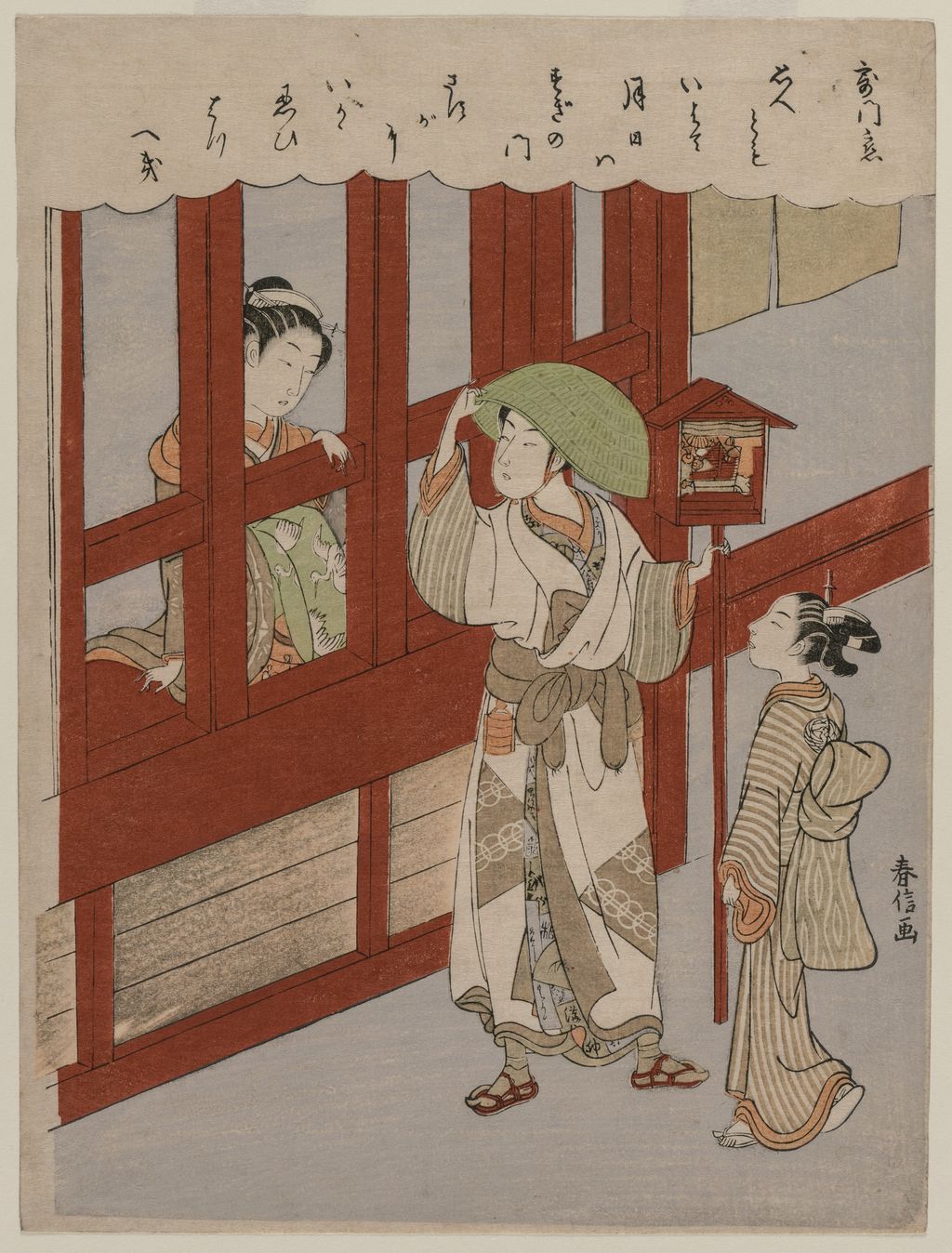
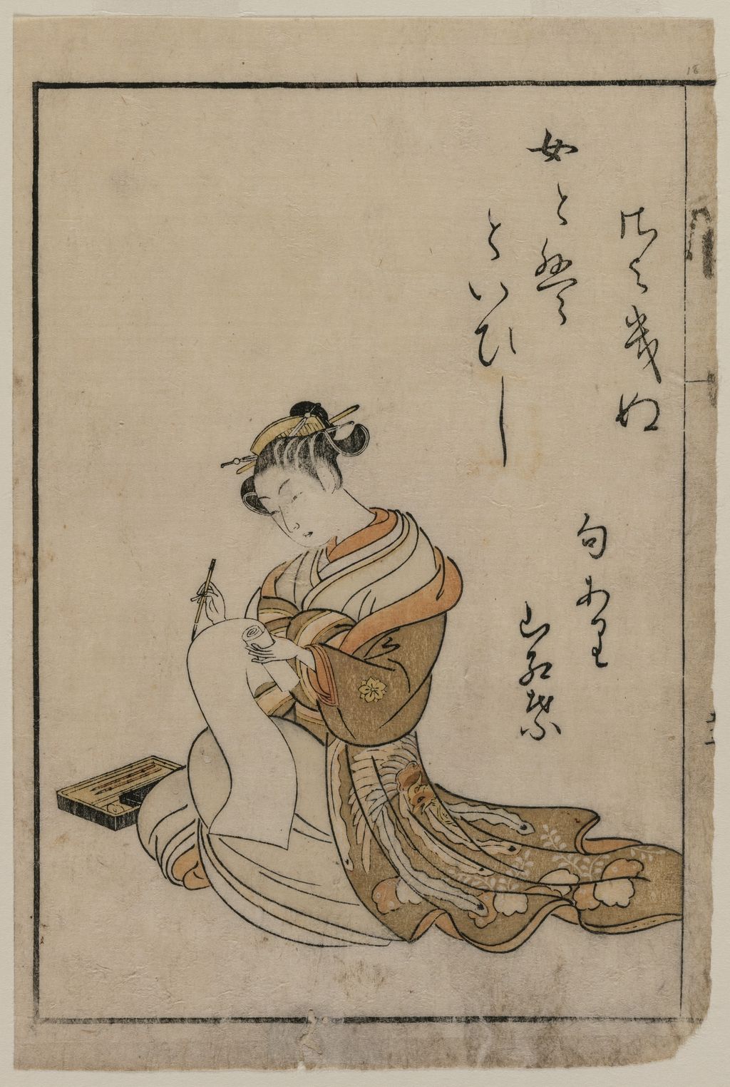
Cleveland's Love at the Brothel Gate and The Courtesan Writing from a Book bring another caution. Their object records date them to the late 1760s and 1770 respectively. The words “brothel” and “courtesan” come from the holding museum's titles, not from a general rule that an elegant kimono always identifies a woman's work. Reading the book or gate as an object in the composition can reveal the setting; a caption can supply the museum's established title without turning that setting into spectacle. This is particularly important on a page that introduces a wide audience to Harunobu. [21] [22]
Not all the work of seeing is supplied by a title. A Met print called Two Ladies places two courtesans on either side of a mirror, so that reflected and direct views make a relation between them. Its catalogue reads the exposed nape, the mirror and the poem as parts of one intimate address. The museum gives a broad date, 1764–72, which should not be tightened to a single year to fit a simple story of Harunobu's late manner. Like the existing cleared Met The Watchers and the Watched, it can prompt a reader to ask who looks, who is seen and how the picture controls their access. These are comparisons in looking, not proof that the same models or print states were used. [23] [24]
What an individual impression can and cannot tell us
Colour woodblock prints survive in more than one impression, and the example in a museum may be later than the design it records. The ox-hour calendar is an unusually clear case: British Museum catalogue text identifies its impression as a later edition and says the first printing had month marks in the robe. Chiba's Night Rain similarly distinguishes a second printing from a private first printing. These facts do not make the later copies unimportant. They tell us to stop treating “Harunobu's print” as a single image outside time. A changed inscription, a different state or a later reprinting can alter what a viewer can learn from the sheet. [9] [10]
Attribution is another distinct question. A museum's search results for “Harunobu” can include works after him. Cleveland, for example, catalogues The Heron Maiden Standing Beneath a Willow Tree as a Meiji-era print after Harunobu; another Harunobu-associated holding, Passing the Bamboo Grove, is dated by the museum to the Meiji period even without an “after” qualifier in its artist field. They may matter for a study of his later influence, but they cannot illustrate his own 1760s production as lifetime impressions. Exact accession numbers and dates are indispensable when comparing the early prints with later versions. [25] [26]
Chiba City Museum estimates that Harunobu made about a thousand designs. That is a museum estimate of designs, not a count of original impressions still available to view. Many designs could be printed more than once and held in multiple institutions. A figure on an artwork page should therefore identify the specific sheet illustrated, while a statement about the artist's total output should be labelled as an estimate. The distinction allows the richness of his production to be understood without treating every duplicate record as a new invention. [27]
How to look at Harunobu now
Start with the complete sheet. Notice where figures sit relative to the blank paper, a branch, a doorframe or a title cartouche. Then read the museum's exact title and date. Ask whether it names a person, a series, a place or a literary analogy. In A Girl Dressing in Pink, a gesture is enough to hold attention; in Youth as a Stand-in Monju, a Japanese title invites a second reading; in the ox-hour print, the calendar marks depend on the exact impression being studied. Harunobu's range becomes clearer when those different experiences of looking are kept in view. [4] [14] [8]
Next, look for the encounter between the everyday and the inherited. A flower pot, rabbit or book belongs to a small act of attention. The Five Virtues, Monju, Komachi and the Jewel Rivers draw on learned worlds that Harunobu and his patrons knew. Sometimes an image explains itself without a key; sometimes a poem or title changes it completely. The most rewarding account of Harunobu holds both experiences together. The pictures can be enjoyed first and researched further without implying that every viewer in Edo had the same knowledge or that one correct reading exhausts the design. [15] [17] [18] [6]
Finally, remember the sheet as an object made by several hands. Embossing may nearly vanish in a flat photograph; an old colour may be altered; a later printing may omit a calendar clue. Every impression has a history. Those limits of reproduction are not obstacles to looking. They point to the questions that make prints compelling: how was the image made, which impression are we seeing, and what was a contemporary viewer being invited to discover? Harunobu's best work continues to reward those questions at the scale of a single small sheet. [17] [6] [9]
Frequently Asked Questions
He was an Edo-period Japanese designer of woodblock prints, active chiefly in the 1760s and associated with the flowering of multicolour nishiki-e. His precise birth year is uncertain: major museum records give 1724 or 1725; he died in 1770. [1] [3]
He played a central part in its emergence around 1765, especially through picture calendars, but designing, commissioning, cutting and printing involved different people. Earlier two-colour benizuri-e already existed. The new prints developed through collaboration and more complex production. [2] [3] [8]
It is a picture calendar. In some Harunobu examples, information about the long and short months of a particular year is hidden in the image itself. The Met's ox-hour shrine print records such marks for 1765; the British Museum catalogues its sheet of that design as a later printing. [8] [9]
It is a visual reimagining that asks a viewer to see a contemporary scene in relation to an older subject, figure or poem. Cleveland's Youth as a Stand-in Monju and Chiba's Parody of Meng Zong offer different examples. The relation may be playful without being a joke at the subject's expense. [12] [14]
Discussion
Compare individual Harunobu impressions and the clues in titles, materials and print states.
Reader Insights
What can the first ox-hour impression tell us that a later printing cannot?
How does the title change the way you read the stand-in Monju?
How do the hand, hanging screen and flowers relate in A Girl Dressing in Pink?
Join the Conversation
Share a documented example or reliable source below, keeping observation separate from inference.
References
- British Museum, Suzuki Harunobu artist biography. Birth-year alternative, training uncertainty, calendar gatherings,
chūbanand women subjects. - Ōta Memorial Museum, 2015 exhibition on
nishiki-e. Japanese institutional account of the 1765 turn and printing technique. - Tokyo National Museum, Harunobu exhibition/object list. Japanese source for 1725?, earlier
benizuri-e, literary remakings, calendar exchanges and later colour prints. - Cleveland Museum of Art, A Girl Dressing in Pink, 1930.175.
- Metropolitan Museum of Art, Visit to a Shrine at the Hour of the Ox, JP2438. Commissioner, artist and carver inscriptions are named in the object account.
- Metropolitan Museum of Art, Shimizu Temple, JP699. Earlier colour method; possible later yellow addition.
- Metropolitan Museum of Art, The Cloth-Fulling Jewel River, JP3021. Embedded older prints and poem-attribution warning.
- Metropolitan Museum of Art, Visit to a Shrine at the Hour of the Ox, JP2438. Calendar marks and exact 1765 impression.
- British Museum, later Ushi no toki mairi impression, 1925,0406,0.12.
- Chiba City Museum of Art, Night Rain at the Double-Shelf Stand, 2933004. First/second printing and Kyosen details.
- Cleveland Museum of Art, Woman Running Past a Willow Tree in a Breeze, 1942.148.
- Chiba City Museum of Art, Parody of Meng Zong.
- British Museum, Hundred Poets
mitateprint, 1937,0710,0.46. - Cleveland Museum of Art, Youth as a Stand-in Monju, 1930.177.
- Cleveland Museum of Art, Righteousness, from The Five Virtues, 1985.307.
- Metropolitan Museum of Art, The Tama River at Ide, JP2443.
- Cleveland Museum of Art, Young Woman Looking at a Pot of Pinks, 1985.304.
- Cleveland Museum of Art, Young Woman Admiring a Snow Rabbit, 1985.306.
- Metropolitan Museum of Art, Twilight Snow on Mount Matsuchi, JP3406.
- Cleveland Museum of Art, Hatsuito of the Yamashiroya Likened to Bush Clover, 1916.1157.
- Cleveland Museum of Art, Love at the Brothel Gate, 1921.349.
- Cleveland Museum of Art, The Courtesan Writing from a Book, 1921.1281.
- Metropolitan Museum of Art, Two Ladies, JP1640.
- Metropolitan Museum of Art, The Watchers and the Watched, JP876.
- Cleveland Museum of Art, The Heron Maiden Standing Beneath a Willow Tree, 1985.310. Meiji-period work after Harunobu.
- Cleveland Museum of Art, Passing the Bamboo Grove, 1930.176. This holding is dated by the museum to the Meiji period.
- Chiba City Museum of Art, 2002 Harunobu exhibition. The around-1,000-design estimate is the museum's.
- British Museum, Lovers Hunting for Insects, 1945,1101,0.8. Its object commentary describes the repeatedly printed night sky.
- Metropolitan Museum of Art, Beauty under an Umbrella in the Snow, JP1376. A pillar print, circa 1770.