


 by Tom Gurney
Tom Gurney BSc (Hons) is an art history expert with over 20 years experience
Published on November 6, 2026 / Updated on November 6, 2026
Email: tomgurney1@gmail.com / Phone: +44 7429 011000
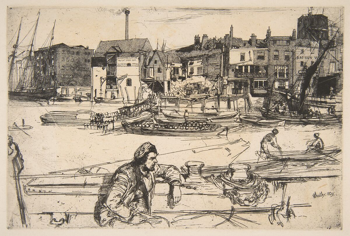
James McNeill Whistler's Black Lion Wharf is a horizontal etching built from extremes of density and interruption. Warehouses, wooden galleries, ships, chimneys, signs and rigging crowd the upper bank. A wide passage of river opens beneath them. In the immediate foreground, a bearded man sits amid the cropped fittings of a barge, close enough for the buttons of his jacket and the weight of his resting arm to register. The print offers no single panoramic sweep: the eye jumps between a human body, open water and a compressed commercial shore.[1][5]
Whistler etched the copper in 1859, exhibited an impression in 1860 and included the plate in the published Thames Set eleven years later. During that interval he altered the plate, printed it on many kinds of paper, sold early proofs and saw the image enter museums and collections. The current catalogue records 104 impressions and four states before cancellation. Any account must therefore separate the design common to the plate from changes belonging to a state and qualities belonging to one sheet.[4][6][8][9]
At a Glance
- Plate cataloguesGlasgow 54 / K.42 / M.41 / T.35 / W.40
- Date1859
- MediumEtching on copper with minor drypoint
- Plate size153 × 229 mm
- Featured impressionMet 17.3.35 / K0420311, state 4/4
- Ink and paperBlack ink on extremely fine cream Japan paper
- Sheet size18 × 24.7 cm (Met)
- States and impressionsFour states before cancellation; 104 known impressions
- PublicationThames Set no. 1, Ellis & Green, 1871
- DisplayMet: not on view on 26 August 2026; verify current status
Contents
- Plate, state and impression
- The featured Met impression
- Current location and an open image
- A worker close to the viewer
- Chains, bollards and the cropped barge
- Open water as an active interval
- Boats across the middle distance
- A waterfront made of differences
- The wharves speak through signs
- Why the title has a missing letter
Plate, state and impression
Three related objects sit behind the familiar title. First is the copper plate: the metal surface Whistler drew through an acid-resistant ground and later modified and cancelled. Second is a state, meaning a materially distinct stage of that plate. Third is an impression, one pull printed from a particular state with its own ink, paper, wiping, tone, margins, marks and history. Two impressions can carry substantially the same etched lines yet look and feel different because their supports and printing differ.[6][7][8]
The plate is K.42 in Edward Kennedy's catalogue and record 54 in the present University of Glasgow project; concordances also list M.41, T.35 and W.40. Glasgow gives the general plate size as 153 by 229 millimetres. The surviving copper at the Freer Gallery measures 15.4 by 22.9 centimetres. Whistler signed and dated the image `Whistler. 1859.` at lower right, so the date is carried by the printing matrix itself rather than inferred only from later memory.[4][7][12]
The featured Met impression
The sheet used for close reading here is Metropolitan Museum of Art 17.3.35. It was printed in black on extremely fine cream Japan paper from the fourth state of four in the current Glasgow impression record. The Met gives a plate measurement of 15 by 22.1 centimetres and a sheet of 18 by 24.7 centimetres. The specialist entry differs slightly—15.1 by 22.1 for the plate mark and 18.5 by 24.4 for the paper—so the holder's current measurements govern this summary while the variance remains documented.[1][10]
This is not a neutral stand-in for every Black Lion Wharf. Its support has no recorded watermark and has not been trimmed to the plate mark. The specialist record notes very light tone, rich black ink and scattered foul-biting flecks, especially along the bottom and in the corners. Whistler did not sign the paper separately. An oval Metropolitan Museum stamp, applied on the reverse, shows through at the lower-left edge of the printed area. Those details identify this sheet, not the copper in general.[1][10]
The measurements also restore the work's physical scale. The etched field is little more than the width of an adult handspan, although it contains a man, several boats and an extended industrial bank. Details that appear expansive on a digital screen were compressed into a plate only about twenty-two centimetres wide. Close viewing is therefore not an optional scholarly exercise: the signs, faces, rigging and alterations were made to be encountered within a small object whose density rewards changes of viewing distance.[1][10]
The untrimmed paper leaves a border around that compact field. It preserves the distinction between the rectangular plate mark and the larger sheet, while the museum stamp showing through near the lower left introduces a later institutional trace outside Whistler's etched description. A crop that removed the margin would make the waterfront easier to reproduce as a self-contained picture, but it would suppress evidence about this particular impression's support and collecting history. The Met photograph lets both levels remain visible: the image carried by the copper and the sheet that has survived as accession 17.3.35.[1][10]
Current location and an open image
On 26 August 2026 the Met listed 17.3.35 as not on view. That field is mutable and should be checked again before planning a visit. The credit line is Harris Brisbane Dick Fund, 1917, and the object belongs to the Department of Drawings and Prints. Its recorded provenance connects Frederick Keppel & Co. and Harris Brisbane Dick to the museum's acquisition.[1][10]
The Met supplies an exact 3,684-by-2,566-pixel primary photograph under its Open Access programme. Both the collection record and structured API mark the work Public Domain; current policy permits commercial as well as non-commercial reuse without a permission fee. The file includes the paper margins and visible collection stamp, making it better evidence than a cropped plate-only reproduction and suitable for use with an appropriate Met credit.[1][2][3]
A worker close to the viewer
The foreground man is large enough to disrupt any detached survey of the river. His cap sits towards the back of his head, exposing a bearded profile turned to the right. One arm stretches along the vessel's side; the other hand rests lower. Lines describing jacket seams, folds and buttons gather around his torso, while the lower edge removes part of his body. He is both a person observed at close range and a compositional mass that holds the bottom of the print.[1][5]
His name is unknown. Frederick Wedmore later called him a `long-shore man`, and the Glasgow catalogue judges an association with shipping or waterfront work probable. Neither statement is an employment record. The clothes, boat and setting make labour a reasonable context, but the sitter should not be turned into a named dock worker or a representative social type whose biography the plate supposedly reveals.[5]
Chains, bollards and the cropped barge
The boat around the seated man is emphatically partial. A chain loops around a substantial fitting near the centre; ropes, timber, hooks and a cut-off carved or worn form press towards the right edge. At the far left, another upright element is severed by the boundary. The vessel does not sit politely within the rectangle. It appears to continue behind and beyond the spectator's field.[1][5]
This cropping changes the relation between foreground and shore. The lower boat cannot be grasped as a complete object, so its diagonals push the eye outward and upward. The foreground contains meticulous passages, yet it also includes bare paper and fast, angular lines. Proximity is therefore not equated with uniform focus. Whistler can bring a man close while allowing surrounding equipment to break apart.[1][5]
Open water as an active interval
Between the near vessel and the opposite bank lies a broad, lightly worked zone. Small boats and figures cross it, but no continuous carpet of hatching describes the river's surface. The relative emptiness lets the white or cream paper act as water. It also prevents the crowded warehouses from fusing with the seated figure below.[1][5]
Calling this band unfinished would mistake economy for absence. The water establishes distance and pacing. A tiny standing or rowing figure can carry because the surrounding paper is quiet; hulls become discrete horizontal marks; the middle barge loaded with barrels reads clearly against the interval. The image depends as much upon withheld line as upon the remarkable accumulation above.[5]
Boats across the middle distance
A landing stage enters from the left bank, with vessels beside and in front of it. The central loaded barge establishes a long horizontal below the warehouses. Skiffs move at different angles, and a narrow boat at the lower right holds two more figures. Their scale supplies a measure between the dominant foreground man and the remote people on balconies.[1][5]
At the extremes, larger sailing craft frame the commercial strip. Masts rise beside Hoare's Wharf at left, while a barge with furled sail and the bow of a larger ship occupy the right. Rigging passes across signs, roofs and sky. These lines do not simply describe nautical equipment; they stitch the plate's spatial bands together and sometimes interfere with the words that name the wharves.[5]
A waterfront made of differences
The upper bank is not one continuous architectural façade. A many-storeyed masonry warehouse at left gives way to steep roofs, plank walls, projecting rooms, stairs, balconies and patched riverside structures. Chimneys rise at irregular intervals, and a weather vane tops the dark building near the right edge. Goods lie in front of buildings; people occupy galleries; cranes, poles and rigging complicate the boundary between land and river.[1][5]
Whistler differentiates materials through the direction and pressure of lines. Roof tiles receive repeated strokes; brick walls acquire denser hatch; timber siding runs in another rhythm; dark apertures interrupt lighter fronts. Some sections are almost diagrammatically legible, while adjacent structures dissolve into crossings. The result is specific without pretending that every visible surface is equally known.[5]
The wharves speak through signs
Lettering is part of the view's architecture. `HOARES WHARF` sits at the left, `DOWNES` appears farther along, and a large board advertises old shipping clippers for daily hire, naming Glasgow, Inverness, Grangemouth and Peterhead in irregular or incomplete forms. Another façade carries `ST. ANDREWS`. At the far right, the sign from which the print takes its name is partly interrupted and appears with letters missing.[5][10]
These signs do more than label scenery. They identify businesses, destinations and a working network of ships and goods. Their rectangular blocks also impose local order on sagging roofs, dark windows and crossing rigging. Emma Chambers's analysis, summarised by the Glasgow catalogue, treats lettering as a way of fixing function amid an otherwise unruly mesh of lines. The words are therefore documentary and formal at once.[5]
Why the title has a missing letter
Historical titles respond to the damaged or obscured-looking sign. The Royal Academy listed `Thames – Black Lion Wharf` in 1860. Whistler wrote the full Black Lion Wharf in 1863. Ellis & Green hyphenated it for the 1871 set, and Ralph Thomas later used Blac Lion Wharf, explaining the missing `k` through what the print seemed to show. The current specialist catalogue accepts Whistler's full 1863 spelling as definitive.[5]
The title is thus neither a recent expansion nor a literal transcription of every surviving gap on one impression. The wharf was an identifiable place, and the artist used its complete name. Rigging, shallow biting, wear and the original sign's condition can all affect how letters read. The catalogue wisely declines to decide whether every spelling irregularity began with Whistler or with commercial sign painters.[5]
Locating the north-bank site
The warehouses stood along Wapping's north-bank waterfront, within the sequence of wharves east of St Katharine Docks. The 1859 postal directory helps connect names to addresses: St Andrew's Wharf stood at 316 Wapping High Street and Hoare's Wharf at number 354. The specialist reconstruction also connects the clipper notice with Old Dundee Wharf and situates Black Lion among Downes, Carron and neighbouring commercial sites.[5]
This does not mean the plate is a cadastral survey. Names shift, some buildings overlap visually, and much of the waterfront has disappeared. The value of directory evidence is to establish that the etched words belonged to a real economic geography. It anchors the image without forcing every mast, staircase and roof into a one-to-one modern map.[5]
Was the view reversed deliberately?
Etching normally reverses a drawing when the inked copper is printed. Katharine Lochnan argued that Whistler compensated here by reversing the scene on the plate so the impression would restore the correct east–west relation. Comparing the wharves with a nineteenth-century map led her to propose a viewpoint across the river near Horselydown New Stairs on the south bank.[5]
The claim is important but should remain attributed. Glasgow's catalogue reports Lochnan's conclusion that this would be unique among Whistler's etchings and uses `probably` for the viewpoint. That is stronger than a guess based on resemblance, yet it is still a scholarly reconstruction. The article can explain its evidence without turning Horselydown New Stairs into an inscribed fact.[5]
Three horizontal zones
The composition can be divided into three long bands. The foreground boat and man form a dense lower zone; the river opens through the middle; the opposite bank becomes a tightly patterned upper strip. The horizon is high enough that architecture dominates the upper half, while the paper's open middle prevents the design from becoming a wall of detail.[1][5]
Depth and flatness remain in tension. Overlapping boats, differences of scale and the foreground figure establish recession, yet the far-bank buildings also read as an extended band parallel to the sheet. Diagonal oars, rigging and vessel edges connect those parallel levels. The eye does not glide through conventional perspective so much as move by jumps, crossings and changes of line density.[5]
Photography as a comparison
The Met relates the contrast between sharply articulated distant warehouses and broader near forms to photography. The analogy is useful because nineteenth-century cameras could produce uneven fields of focus and abrupt cropping unlike a conventionally staged panorama. Here the nearest equipment is cut off and partially loose while many remote signs and windows remain unexpectedly legible.[1]
No source used for this article identifies a photograph that Whistler copied. `Photographic` therefore describes a possible visual logic, not a material source hidden behind the etching. The plate was observed, drawn, bitten and revised. A comparison can clarify why distance and focus do not behave conventionally without replacing the evidence of work at a specific river site.[1][5]
Japanese prints as another comparison
The Met also relates cropped forms and distinct spatial zones to Japanese woodblock prints, which Whistler had begun collecting in Paris. That comparison addresses the way the design can appear both spatial and flat: a large near figure, open interval and patterned distance coexist without being blended into a single atmospheric field.[1]
Again, the evidence does not isolate one Japanese print as a copied model. The Wapping signs, named wharves, workers and shipping remain materially local. Japanese graphic practice may have enlarged Whistler's compositional options, while photography offered another way to understand focus and cropping. Neither framework needs to cancel the other, and neither should turn the river into a merely decorative pretext.[1][5]
The image behind Whistler's mother
Whistler later placed a framed impression of Black Lion Wharf on the wall behind Anna Matilda Whistler in Arrangement in Grey and Black: Portrait of the Painter's Mother. Its dense horizontal view is small within the oil painting but conspicuous against the plain wall. The inclusion suggests that Whistler regarded the etching as fit to represent his work within his own domestic and pictorial environment.[1][5]
This is a quotation across media, not a preparatory relationship. The river etching was complete and exhibited years before the portrait. By painting it into the room, Whistler connected his printmaking, his household and the constructed setting of the later canvas. The appearance also helped Black Lion Wharf acquire an afterlife beyond separate portfolios and print-room mounts.[5]
The first state: complete but singular
Glasgow calls the composition complete in state 1. The right-hand furled sail remains white, an entrance at the far right lacks shading, and faint contours of a third barge survive beyond two vessels at the left. Only one impression is currently known. It was printed in very dark brown ink on dark ivory, medium-weight wove paper.[6][8][9]
Its uniqueness complicates the everyday language of `first state`. The market-history record says Whistler treated this pull as a working proof and later called what the modern catalogue numbers state 2 his first state. An artist's nineteenth-century inscription and a modern catalogue can therefore use different numbering systems without either referring to a different plate.[8][9]
State 2: additions, removal and an old `first state`
In state 2, Whistler shaded the sail and warehouse entrance, removed the faint third barge while leaving traces, and deepened selected shadows near a chimney and the St Andrew's sign. A slightly curved vertical scratch descended near the bollard beside the seated man. The printing record identifies roughly two dozen impressions on varied Asian and Western papers.[6][8]
The British Museum bought one from Whistler in 1863. Its current Glasgow impression record numbers it state 2/4, yet Whistler sold it as a `1st state`. Printed in black on ivory Japan paper, it carries light overall tone, plate dirt and detailed traces around the altered barges. The sheet makes the historical numbering issue tangible rather than theoretical.[9][11]
States 3 and 4: cleaning the copper
State 3 is an intermediate cleanup. Whistler partly removed a conspicuous triangular black patch at lower left and reduced the curved scratch near the bollard. Spots from unintended acid action—foul biting—remain in the water and elsewhere, while faint drypoint clouds at upper left disappeared or wore away. These are targeted changes to the matrix, not a redrawing of the entire waterfront.[6]
State 4 removes the triangular mark and stops out a spot below the bollard. Foul biting in the water varies in visibility according to how an impression was inked, and early pulls can retain burnishing traces around the masts. This was the state used for the Thames Set. More than forty impressions are recorded, including the Met sheet discussed here.[6][8][10]
Cancellation is not another ordinary edition
When regular printing ended, the copper was scored with four vertical and two corner-to-corner diagonal lines. Those strokes announce that the matrix had been cancelled. Later pulls bearing them are documents of the plate's termination rather than ordinary state-4 impressions. A handful survive on wove and laid papers.[6][8]
The cancelled copper itself entered Charles Lang Freer's collection after purchase from Frederick Keppel & Co. in 1896 and reached the Freer Gallery with his collection in 1920. It bears a rectangular Hughes & Kimber manufacturer stamp from Red Lion Square/Fleet Street. The plate survives as a worked and deliberately disabled tool, physically distinct from every sheet pulled from it.[7][12]
Etching, drypoint and foul biting
Glasgow describes the composition as fundamentally etched, with drypoint confined largely to the sky and a few minor additions. In etching, acid bites exposed copper where a needle has opened the protective ground. Drypoint instead raises a burr by cutting the metal directly. Because burr wears under pressure, faint drypoint clouds can weaken across impressions even when etched lines remain comparatively stable.[6][8]
Foul biting is unintended acid action that produces spots or patches. It is not identical to plate tone, which comes from ink deliberately or incidentally left on the surface during wiping. Nor does one speck prove a new state: the catalogue combines recurring plate evidence with changes in inking and condition. The Met impression's corner flecks belong to its specific printed appearance within a state whose water marks can vary.[6][8][10]
Paper changes the encounter
The impression corpus ranges across Asian and Western supports: fibrous Japan, laid Japan, wove sheets, older laid papers and watermark-bearing stocks. The unique first-state pull is dark ivory wove; the British Museum's early sheet is ivory Japan; the main 1871 edition often used ivory laid paper carrying De Erven de Blauw watermarks. Other final-state pulls depart from that pattern.[8][11]
Paper is not an attribute of the copper. Its colour changes the apparent warmth of unprinted water; its fibres alter how fine lines sit; thickness and surface affect handling and light. This is why the Met's extremely fine cream Japan sheet should be named precisely. It exemplifies one material choice among many rather than defining the only authentic appearance of Black Lion Wharf.[1][8][10]
Early stock, proofs and circulation
One cream laid impression had been sold by Francis Seymour Haden before January 1861, and Whistler labelled another state-2 pull `Early proof`. A notebook entry from about 1862 includes `Black Lion 8` among counts for several etchings. The number may represent prints made or sheets then in stock; the record does not let it be converted confidently into a total edition figure.[8]
Distribution widened quickly. The South Kensington Museum acquired a state-2 impression among a group of Whistler etchings in 1861; the British Museum followed in 1863. Individual sheets also passed to Samuel Putnam Avery, George A. Lucas, William Cleverly Alexander and continental collectors. These transfers began well before the formal 1871 set publication.[8][9][11]
From Royal Academy debut to Thames Set
The earliest documented exhibition was the Royal Academy in 1860, where Thames – Black Lion Wharf appeared as catalogue number 902. An Athenaeum critic greeted Whistler's etching group as admirable work by a name new to the reviewer. In 1861 the Thames plates were shown together at Edmund Thomas's London print shop, followed by international exhibitions in London and Paris in 1862.[5][9]
Ellis & Green issued Black Lion Wharf as the opening plate of the Thames Set in 1871. The delayed publication did not mean the image had been unknown for eleven years; it had already been exhibited, sold and collected. Publication instead consolidated selected river etchings into a named commercial group and brought renewed critical attention to their contrasts and crowded waterfront material.[4][9]
Reception and reproduction
The 1871 Athenaeum review admired the plate's force, contrasting structure and abundance of cranes, galleries, windows, ships, steps and smoke-darkened industry. Later writers shifted emphasis. Wedmore made the houses the centre of interest, while Lochnan and Chambers analysed zones, focus, signs and the tension between depth and surface. Reception has therefore moved between picturesque subject, technical achievement and spatial argument.[5][9]
The image also circulated through reproduction. A large wood engraving after it appeared in the Daily Chronicle in 1895, and the specialist catalogue records a photographic reproduction with an added small schooner in the margin. Such versions extended recognition while differing materially from impressions printed from Whistler's copper. They should not enter the 104-impression count.[9]
The Met sheet's path into a public collection
The Met's provenance tab names Frederick Keppel & Co., Harris Brisbane Dick and the Dick estate, while the specialist entry says the museum bought from Dick's collection using the fund that bears his name in 1917. The exact sheet is now both a historical impression and an institutional object, carrying the oval stamp that became visible from the reverse.[1][10]
Its public-domain photograph makes that object history unusually accessible. A viewer can inspect the margins, plate tone and foul-biting flecks rather than seeing only a cleanly cropped composition. That fuller presentation supports a central lesson of the plate: Black Lion Wharf is not just an image capable of endless identical reproduction. It is a copper history embodied differently in particular papers and collections.[1][2][3][10]
Why Black Lion Wharf stands apart
The plate deserves attention beyond its membership in the Thames Set because its horizontal design makes labour, lettering and river space mutually dependent. The seated worker is not an interchangeable foreground type, the wharf signs are not generic decoration, and the boats do not merely fill a gap between banks. Each element changes how the others can be read.[1][5]
Comparison with neighbouring Thames plates sharpens that distinction. The Lime-Burner looks through a vertical work yard, while Rotherhithe places two smokers beneath towering rigging. Black Lion Wharf instead stretches a low commercial frontage behind a broad field of water and gives the nearest labourer unusual scale. Its identity remains specific even within a shared river sequence.[4][5][9]
How to look at Black Lion Wharf
Start with the seated man, but do not stop at him. Follow the barge's chain and cropped fittings into the open river, then let the boats carry the eye towards the lettered bank. Read the signs as commerce and as shape. Notice how masts interrupt words, how open water makes tiny figures legible, and how the building strip alternates between meticulous hatch and unstable crossings.[1][5]
Then look at the sheet rather than only the scene. Find the plate signature, lower-left stamp, pale margin and scattered unwanted bites. Compare those features with the catalogue's state changes and paper history. The print becomes most intelligible when site, human labour, compositional experiment and material variation are held together. None alone exhausts the reason this small copper image remained important to Whistler and to generations of collectors.[5][6][8][10]
Discussion
How does Whistler make a worker, open river and crowded commercial shore operate as one etched structure?
Follow the seated man, chains, cropped barge, open water, boats, warehouses, signs and rigging while distinguishing the copper plate, its changing states and the material qualities of one Met impression.
Reader Insights
How do foreground, water and shore balance density and openness?
Which marks belong to the image, the state or this particular sheet?
How do signs and lettering turn the waterfront into a named working place?
Join the Conversation
Share a close observation.
References
- Metropolitan Museum of Art, “Black Lion Wharf,” accession 17.3.35, live object record, including object data, interpretation, markings, provenance, current display and Public Domain notice, checked 26 August 2026, https://www.metmuseum.org/art/collection/search/372506.
- Metropolitan Museum of Art Collection API, object 372506, including structured object fields and primary Open Access image DP813302, checked 26 August 2026, https://collectionapi.metmuseum.org/public/collection/v1/objects/372506.
- Metropolitan Museum of Art, “Open Access,” current policy for public-domain collection images, https://www.metmuseum.org/about-the-met/policies-and-documents/open-access.
- University of Glasgow, Whistler Etchings Project, Black Lion Wharf, K.42 / record 54, “Date,” https://www.etchings.arts.gla.ac.uk/catalogue/plate/display/index.php?catno=K042&xml=dat.
- University of Glasgow, Whistler Etchings Project, K.42, “Subject,” including title, description, site and critical discussion, https://www.etchings.arts.gla.ac.uk/catalogue/plate/display/index.php?catno=K042&xml=sub.
- University of Glasgow, Whistler Etchings Project, K.42, “States,” https://www.etchings.arts.gla.ac.uk/catalogue/plate/display/index.php?catno=K042&xml=sta.
- University of Glasgow, Whistler Etchings Project, K.42, “Plate,” surviving copper and manufacturer stamp, https://www.etchings.arts.gla.ac.uk/catalogue/plate/display/index.php?catno=K042&xml=pla.
- University of Glasgow, Whistler Etchings Project, K.42, “Printing,” technique, papers, ink and impression distribution, https://www.etchings.arts.gla.ac.uk/catalogue/plate/display/index.php?catno=K042&xml=pri.
- University of Glasgow, Whistler Etchings Project, K.42, “History,” publication, exhibitions, reception, sales and collectors, https://www.etchings.arts.gla.ac.uk/catalogue/plate/display/index.php?catno=K042&xml=mar.
- University of Glasgow, Whistler Etchings Project, impression K0420311, Metropolitan Museum of Art 17.3.35, https://www.etchings.arts.gla.ac.uk/catalogue/etchings/etching/?filename=K0420311.
- University of Glasgow, Whistler Etchings Project, impression K0420209, British Museum 1863-10-17-170, https://www.etchings.arts.gla.ac.uk/catalogue/etchings/etching/?filename=K0420209.
- Smithsonian National Museum of Asian Art, “Etching plate: Black Lion Wharf,” Freer Gallery F1896.5, official archived collection record, https://asia-archive.si.edu/object/F1896.5.


