


 by Tom Gurney
Tom Gurney BSc (Hons) is an art history expert with over 20 years experience
Published on November 6, 2026 / Updated on November 6, 2026
Email: tomgurney1@gmail.com / Phone: +44 7429 011000
James McNeill Whistler did not treat printmaking as a way to multiply a finished image without change. A copper plate could be drawn, bitten, scratched, tested, revised, wiped differently and printed on papers chosen for their colour and feel. One design might therefore survive through several material states and many visibly unlike impressions. That variability is central to his achievement, not an inconvenience around it. The University of Glasgow's catalogue records plates, states and known impressions separately because each answers a different question about how a print came into being.[1][2]
Whistler's most consequential published groups make that distinction especially clear. The Thames plates were largely made around 1859–61 but gathered for publication as a set in 1871. The first Venice group followed a Fine Art Society commission and appeared in 1880; a second, larger selection was exhibited before being issued in 1886. The elapsed time mattered. Plates continued to be altered, printing became an increasingly visible part of authorship, and publishers helped frame separate sheets as coherent commercial and artistic objects.[4][5][10][14]
This guide follows the work from copper to paper, then through the Thames and Venice Sets. It distinguishes the fixed marks on a plate from the decisions made during printing. It also keeps individual sheets in view. Black Lion Wharf, The Lime-Burner, Rotherhithe, Nocturne, The Doorway, The Venetian Mast and Upright Venice are not interchangeable examples of a style; their state, ink, support and printing histories differ.[7][8][9][11][12][13][15]
At a Glance
- PlateWorked copper matrix
- StateA materially altered stage of the plate
- ImpressionOne sheet printed from a plate state
- EtchingAcid bites exposed lines through a resistant ground
- DrypointNeedle scratches copper and raises fragile burr
- Plate toneSurface ink deliberately retained during wiping
- Thames SetSixteen plates published in 1871
- First Venice SetTwelve plates published in 1880
- Second Venice SetTwenty-six plates published in 1886
- AuthenticationPlate, state, ink, paper, provenance and catalogue evidence
Contents
- What is an original Whistler print?
- From copper plate to printed sheet
- Etching, drypoint and the character of a line
- States, proofs and revision
- Wiping, plate tone and artistic printing
- Paper, margins, tabs and the butterfly
- Before the Thames: training and the French Set
- The Thames plates and the 1871 Set
- Three Thames plates: site, state and impression
- The First Venice Set
What is an original Whistler print?
An original print is not necessarily a unique image, and it is not a photographic or digital copy of a painting. In Whistler's intaglio work, the image was conceived through marks made on or into a metal plate. Ink was then transferred from that plate to paper under pressure. Every sheet produced in this way is an impression. Several impressions may come from the same state of the plate, while a physical alteration to the copper creates a different state.[1][2]
The word “original” describes this relationship between conception, worked matrix and printed sheet. It does not mean that Whistler personally performed every manual operation, that every impression looks identical, or that every sheet was printed immediately after the plate was drawn. Publishers and professional printers participated at various moments. Assistants helped with portions of the Second Venice Set. Authorship therefore includes design and decisions about the plate and printing, but responsible description also credits documented labour.[14][18]
Six terms prevent most confusion. The *plate is the worked piece of metal. A state is a stage in that plate's development after one or more material alterations. A proof is an impression used to assess progress, though the word acquired wider collecting uses. An impression is a single printed sheet. An edition is a planned number of impressions. A set* is a selected group of plates published together. A plate may have more states than an edition has groups, and the number of surviving impressions is not the stated edition size.[1][2][4]
These distinctions change how one reads a museum label. “Fourth state of seven” identifies the plate's material stage, not the fourth sheet printed and not one of seven surviving examples. “From the Second Venice Set” identifies a publication grouping, not necessarily the date when the copper was first worked. A catalogue total of known impressions reports what researchers have located; it cannot be converted into a reliable original print run without further evidence.[1][15]
From copper plate to printed sheet
Etching and drypoint are intaglio processes: the printable marks lie below the plate's surface. The printer covers the plate with ink, works that ink into recessed lines, and wipes the upper surface according to the intended effect. Damp paper laid over the copper is passed through a press under substantial pressure. The paper is pushed into the incisions and lifts out the ink. The edge of the plate commonly embosses a plate mark around the image.[2][3]
The print reverses what was drawn on the plate. A building placed on the left of the copper appears on the right of the impression. Whistler could accommodate that reversal or exploit it; it is nevertheless important when comparing a printed view with topography. It also helps explain why a counterproof—made by transferring a fresh impression to another damp sheet—could be useful. Its image corresponds to the direction of the plate and could assist correction.[2]
Copper was Whistler's normal intaglio matrix. Its surface could receive a fine etched line, a drypoint scratch or both, then withstand repeated inking and pressure. Yet the plate was not inert. Acid might bite unevenly, unwanted pits could appear, and repeated printing could wear delicate burr. A plate could be reduced, polished, reworked or finally cancelled. Each event belongs to the physical biography of the matrix.[1][2][3]
Printing introduced another sequence of choices: ink colour and consistency, how fully the plate was charged, how cleanly it was wiped, whether a film remained in selected areas, the moisture and thickness of the sheet, press pressure and drying. A catalogue that records only the incised design would miss much of what viewers actually encounter. Whistler made the meeting of plate, ink and paper unusually conspicuous, especially in his Venetian work.[1][6][16]
Etching, drypoint and the character of a line
For an etching, a copper plate is coated with an acid-resistant ground. A pointed tool traces the design through that film and uncovers narrow paths of metal, but does not need to incise them deeply. Acid then bites those open paths while the coated surface remains largely protected. After the ground is removed, the resulting channels hold ink. Length of biting, the ground's behaviour and repeated work can alter the line's strength and texture.[2][3]
Drypoint bypasses acid. A needle scratches the copper directly, displacing metal and raising a ridge called burr. Ink caught by the cut and burr can print as a soft, dark, slightly blurred line. That richness is vulnerable: pressure and wiping gradually flatten or strip the ridge. Early and later impressions from one unchanged state can therefore differ as burr wears, although paper, ink and wiping may also contribute to the difference. No universal number of “good” drypoint impressions can be imposed on every plate.[2][3][11]
Whistler used pure etching, pure drypoint and combinations. Drypoint was not just a velvety finishing flourish. He could add it in later states to correct anatomy, reinforce a contour, shift a shadow or rebuild an area after previous work had been reduced. The contrast between a more even bitten line and a richer drypoint passage gave him a flexible vocabulary. Because both processes may occupy one plate, a responsible object description should reproduce the catalogue's medium rather than decide from appearance alone.[1][3]
He also tested less regular effects. Open bite allowed acid to attack an area rather than a neatly drawn line. Foul biting—the accidental or tolerated pitting produced where the ground failed—could be removed or retained when useful. A roulette, a small toothed wheel, created patterned marks and appears in such works as The Doorway. He experimented with mezzotint, but it did not become a principal method. These techniques complicate the myth of an artist relying only on spontaneous needle line.[2][3][12]
States, proofs and revision
A new state exists when the plate itself has materially changed. Added drypoint, removed shading, altered figures, a new signature or cancellation marks may all establish another state. A different ink or a more atmospheric wipe does not. This is why two impressions can look startlingly different yet belong to the same state, while two similar-looking sheets may sit on opposite sides of a small but decisive plate alteration.[1][2]
Proofs made revision observable. Whistler could print a plate, inspect how lines transferred, then return to the copper. The proof was not simply an imperfect rehearsal for a predetermined final image. It formed part of an iterative method in which the print revealed what the plate was doing. Surviving sequences can show large revisions, tiny corrections, abandoned solutions and moments when wear altered the result.[1][11][12]
State numbering is a scholarly reconstruction from material evidence. It is extremely useful, but it should not be turned into a ladder of quality. A first state is not automatically the most expressive; a late state is not necessarily the artist's final aesthetic verdict. Some early proofs carry vigorous burr, some later printings achieve a different balance through wiping, and a cancelled state may document legal or commercial closure rather than a desired visual culmination.[1][2][9]
Nor does a state total reveal the number of sheets. Glasgow catalogues nine states and 59 known impressions for Nocturne, twenty states and 66 known impressions for The Doorway, twelve states and 57 known impressions for The Venetian Mast, and six states and 118 known impressions for Rotherhithe. These totals describe the current research record across institutions and collections. They are neither edition statements nor guarantees that every historical impression has survived or been found.[9][11][12][13]
Wiping, plate tone and artistic printing
After ink fills the incisions, the plate's upper surface can be wiped almost clean. It can also retain a thin film called plate tone. Whistler used that film selectively, taking ink away from lights and leaving it in areas that suggest haze, dusk, water or interior shadow. The residual ink is printed at the same pressing as the line, but it was not permanently bitten into the plate. A second impression could therefore redistribute light and atmosphere without requiring a new state.[2][6]
This practice made printing a form of interpretation. In some Venetian impressions, surface ink approaches the variability associated with monotype, but the underlying etched or drypoint matrix remains active. Calling such sheets “monotypes” without qualification obscures their repeatable lines. Calling the surface ink mere dirt is equally misleading. The productive category is artistic printing: a repeatable plate design completed differently in individual pulls.[6][11][16]
Wiping could be broad or highly selective. Cloth, hand, pressure and the direction of removal affected the film. A pale opening might be cleared around a doorway while richer tone gathered in surrounding architecture; water could be streaked or softly modulated. Ink trapped by drypoint burr responded differently from a film sitting on polished copper. Thus line, burr and tone must be read together, even though they arise from different material structures.[2][11][12]
The variability prompted disagreement. Viewers trained to value clean, consistent impressions could see heavily worked surface ink as an intrusion upon etching. Whistler instead made the printed sheet—not the untouched plate—the site of completion. That claim aligned with his broader insistence on arrangement, tone and carefully staged display. It also created scarcity within an edition, because collectors might distinguish not only states but especially successful individual printings.[6][16][17]
Paper, margins, tabs and the butterfly
Paper is not a neutral carrier. Whistler sought Japan papers and selected older Western sheets for warmth, fibre, surface and responsiveness. Cream or ivory supports softened the contrast of black or brown ink; thin Japan paper could register delicate lines and surface effects differently from a heavier laid sheet. The Met's Black Lion Wharf is printed in black ink on extremely fine cream Japan paper, while its first-state The Lime-Burner uses ivory wove paper. Those descriptions belong to the cited sheets, not every impression of either plate.[7][8]
Laid paper shows a regular pattern from the papermaking mould; wove paper has a more uniform structure. Watermarks can help identify a sheet or group, but interpreting them requires physical inspection and comparative expertise. Paper colour may also have changed through age, light or treatment. Online photography cannot securely determine fibre, thickness, watermark, original tone or condition.[1][2]
Whistler often trimmed later impressions close to the plate mark while leaving a small tab below. He might sign the tab in graphite with his butterfly. This was intentional presentation, not evidence that every close-trimmed sheet has been damaged. Conversely, trimming by itself does not authenticate a print, and an absent tab does not prove that a sheet is wrong. Date, plate state, ink, support, signature, provenance and catalogue concordance must agree.[2][6]
The butterfly developed from his initials into a compact emblem. It could appear within a plate and on an impression, and its drawn character changed over time. As signature and brand, it helped connect the sheet to Whistler's controlled public persona. Yet it is not a substitute for material study. Graphite inscriptions can be copied, plate signatures recur across impressions, and later annotations may belong to dealers or collectors.[1][2][18]
Margins also carry evidence. A full sheet may preserve a watermark, deckle edge, dealer note or collector's mark; a trimmed sheet may preserve Whistler's chosen tab format. Neither format is universally superior. The appropriate question is whether the paper and presentation make sense for that plate, state, printing period and ownership history. Condition judgments should come from examination, not from a generic rule that more paper always means a better impression.
Before the Thames: training and the French Set
Whistler learned from a mid-century revival of etching, from looking closely at old-master prints and from family connections to the etcher and surgeon Francis Seymour Haden. The medium suited rapid drawing, but its apparent immediacy depended on technical control. The 1858 French Set joined street and domestic subjects made during travel in France and the Rhineland and announced an artist thinking in printable line rather than translating a completed painting.[4][6]
The early group matters as a precedent for publishing related plates together. A cover designed by Whistler and a named selection turned separate sheets into a marketable artistic statement. The set format did not erase differences among impressions, nor did it mean that every etching made on the journey entered the published group. That distinction between a broad body of work and a selected issue would become even more important with the Thames and Venice plates.[4]
Early prices also show printmaking's changing position in Whistler's career. Glasgow's exhibition research notes a modest price for the French Set compared with the sums later asked for Thames and Venice impressions. Such figures are historical evidence about presentation and demand, not a guide to present value. They also remind us that reputation was built through dealers, exhibitions, collectors and critical argument as well as through work at the plate.[4][17]
The Thames plates and the 1871 Set
Whistler worked along the commercial Thames in 1859 and continued related plates into the early 1860s. Warehouses, wharves, lime works, tavern balconies, masts and rigging supplied both close structures and layered distances. The subjects were active sites of trade and labour. Exact line could describe timber, brick and rope while open water or sky received less marking. These were selective views from particular positions, not an exhaustive social survey of the port.[5][6]
The plates' making and their publication must be separated. Frederick Standridge Ellis of Ellis & Green issued A Series of Sixteen Etchings of Scenes on the Thames and Other Subjects in 1871. The familiar short title “Thames Set” refers to that sixteen-plate publication. It does not mean all Whistler's London river etchings were created together in 1871 or that every river subject entered the set.[4][5]
The interval gave the works an unusual temporal structure. Scenes grounded in the late-1850s and early-1860s port circulated as a formal group after further urban change and after Whistler's own practice had shifted. Publication brought consistency through title, selection and packaging, while impressions retained variation in paper, ink, state and wear. A buyer acquired a coordinated series, but not sixteen mechanically standardized images.[1][5]
The set also unsettles a simple march from description to abstraction. Close observation and compositional selection operate together. Dense networks of masts or warehouse fronts can flatten into patterns, yet named businesses, workers and river traffic remain historically specific. Whistler's later concern with tonal arrangement did not retrospectively empty the Thames plates of work and place. Their aesthetic order mediates industrial material; it does not cancel it.[6][7][8][9]
Three Thames plates: site, state and impression
Black Lion Wharf was etched in 1859. The Met's impression, object 17.3.35, is catalogued as the fourth and final state, printed in black ink on extremely fine cream Japan paper. The view compresses signs, timber, windows and projecting structures into a narrow vertical field, with people embedded in the working frontage. Its paper and state identify this sheet; another impression may carry a different support or printing character.[7]
The Lime-Burner, also 1859, combines etching and drypoint. The Met's 17.3.39 is a first-state impression in warm black ink on ivory wove paper. The long passage leads toward East London Wharf, and William Jones, associated with the premises, appears within a site where lime was prepared for building uses including mortar and plaster. The title points to a worker and process, not just picturesque decay.[8]
The contrast is instructive. “Fourth state” in the first label and “first state” in the second do not establish a competition between late finish and early freshness. Their plate histories are independent. Likewise, fine Japan paper does not make Black Lion Wharf categorically more authentic than The Lime-Burner on wove paper. Each combination must be assessed within its own catalogue record.[7][8]
Rotherhithe, dated 1860, combines etching and drypoint on a larger vertical plate. Glasgow records six states and 118 known impressions. The foreground was drawn from the south-bank Rotherhithe side while the view looks toward Wapping, helping explain why “Rotherhithe” and “Wapping” both appeared historically as titles. The ambiguity concerns viewpoint and naming, not two different designs.[9]
The Met owns an impression from the sixth state, printed in black on thick ivory laid paper, taken from the cancelled plate. Cancellation marks make visible a later stage when normal edition printing had been closed. The sheet remains an impression from Whistler's copper, but its crossed or defaced matrix condition is essential to its identity. It should not be described as though it showed the unaltered published image.[9]
These examples also resist anonymous “old London” nostalgia. Proprietors, workers, tavern users and port traffic occupy real economic spaces. Whistler chose viewpoints, suppressed some information and organized what remained. To acknowledge mediation is not to deny documentary value; it is to ask exactly what an impression records, what it omits, and how plate and publication transformed a site into an art object.[5][6]
The First Venice Set
The Fine Art Society commissioned twelve Venetian etchings in 1879. Whistler stayed far longer than first expected and produced many more plates than the commission required. Twelve were exhibited and published in 1880 as Venice, a Series of Twelve Etchings, with an intended edition of 100. The published choice did not simply equal every plate shown during development: The Bridge, Santa Marta gave way to The Little Mast, and the displaced plate later entered the Second Set.[4][10]
Venice intensified questions already present in the Thames work. Whistler drew directly on small copper plates, so printing reversed his on-site observations. Narrow canals, distant lagoon views, doorways and modest workshops displaced the expectation that a Venetian series must centre only on grand monuments. Yet the plates are not transparent records of a hidden “real Venice.” Selection, line, empty paper and later printing constructed their own version of urban experience.[6][10]
The intended edition of 100 refers to the publication plan, not to 100 identical sheets now traceable for every plate. Whistler's revisions divided plates into states, drypoint wore, and individual wiping produced different atmospheres. Printing extended over time. The set's title and Fine Art Society presentation created unity, while material practice kept reopening difference.[2][4][10]
This tension helps explain why the Venice etchings became so important to Whistler's claim for printmaking. A publisher could offer a bounded series, but the artist could insist on the singular qualities of a particular pull. The sheet became at once part of an edition and an individually judged arrangement of line, tone, paper and margin.[6][16]
Nocturne, The Doorway and The Venetian Mast
Whistler's etched Nocturne dates from 1879–80 and belongs to the First Venice Set. Glasgow identifies nine states and 59 known impressions. The plate began in etching; drypoint entered, changed and in places was rejected as Whistler reconsidered the design. Burr could print richly and then diminish through wear. The state sequence therefore registers both decisions on copper and the consequences of repeated printing.[11]
Surface ink made the individual pulls still more variable. Rather than wipe the plate uniformly clean, Whistler could build a dim field around the sparse etched structure, clear passages and modulate water or sky. Critics might regard that intervention as disguising weak line or compromising repeatability. From Whistler's position, the act of printing supplied the tone through which the nocturnal image became complete.[6][11][16]
The Doorway provides a different model of revision. Glasgow catalogues twenty states and 66 known impressions, with etching, drypoint and roulette all present. Figures and the dark interior changed substantially. The plate was not a quick outline subsequently decorated by ink; it was a prolonged site of correction, rebalancing and technical experiment. Its unusually numerous states should not be confused with a twenty-sheet edition.[3][12]
The patterned roulette work also warns against describing every granular or shaded area as plate tone. Some texture is fixed in the matrix and repeats; some lies in the surface film and varies with wiping. Comparing impressions of the same state helps separate the two. High-resolution images can suggest differences, but confirmation depends on the object and catalogue record.[2][12]
The Venetian Mast, another First Set plate, has twelve states and 57 known impressions in the Glasgow catalogue. The Art Institute of Chicago's 1934.536 anchors one documented sheet within that history. Mast, boats, architecture and open space were adjusted over a long period of proofing and printing. Again, the catalogued state total describes changes to one copper, while the impression total reflects surviving sheets currently traced.[13]
Together the three plates defeat a single formula for “the Venice style.” Nocturne makes surface ink and sparse structure especially visible; The Doorway exposes extended figure and interior revision; The Venetian Mast sustains a long sequence around open spatial relations. All depend on intaglio, but the balance among bitten line, scratched mark, paper and printing is object-specific.[11][12][13]
The Second Venice Set and collaborative printing
Whistler displayed Venetian etchings at the Fine Art Society in 1883 in an environment presented as an arrangement of white and yellow. That exhibition was not the final published Second Set. Dowdeswell and Thibaudeau issued A Set of Twenty-six Etchings in 1886. Four plates were later non-Venetian subjects, so publication formed a retrospective artistic group rather than a sealed diary of the 1879–80 stay.[14][17]
The edition was planned at thirty, markedly smaller than the First Set's intended 100. Restricted number, deliberate presentation and differences among impressions supported an increasingly connoisseurial market. The sheets were not scarce simply because copper made repetition impossible. Scarcity was structured through edition policy, laborious printing, plate change, paper choice and the value placed on especially successful pulls.[4][14]
Printing was collaborative. The Glasgow set history records initial impressions by Émile Frédéric Salmon before Whistler chose to assume much of the work. It also identifies assistance from Nathaniel Sparks, Mortimer Menpes and Walter Sickert. Lists and receipts demonstrate production and delivery, although they do not justify assigning every operation on every sheet to a named hand. The precise conclusion is therefore limited: Whistler directed and performed substantial printing, while documented assistants contributed and should not disappear behind a solitary-genius narrative.[14]
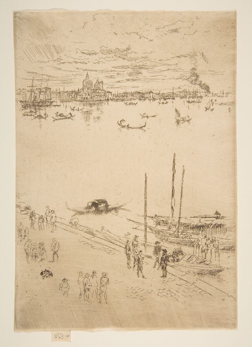
Upright Venice shows why a set label needs impression data. The Met's 17.3.106 is printed in dark brown ink on ivory laid paper and catalogued as the fourth state of seven. It belongs to the Second Venice Set, but those facts do not describe all its impressions. A different state, paper or wipe would alter both appearance and historical position.[15]
After completion, plates were cancelled. Cancellation materially limited ordinary further pulls and testified that an edition had closed. It did not erase earlier impressions, and it could generate documentary sheets from the defaced matrix. Buyers and cataloguers must therefore distinguish lifetime impressions from later pulls and unaltered states from cancelled ones, using plate history and provenance rather than signature alone.[2][14]
Publishers, exhibitions and the value of difference
Whistler's etched work reached viewers through a network: the Fine Art Society, Ellis & Green, Dowdeswell and Thibaudeau, printers, assistants, critics, dealers and collectors. Publishers selected and packaged plates; exhibitions arranged walls, frames and colour; catalogues named groups; reviews argued over finish and surface ink. These activities did not sit outside the artwork's meaning. They taught audiences how to compare impressions and what kinds of difference to value.[4][5][14][17]
Set packaging gave separate plates a shared tempo. The Thames group appeared as sixteen related scenes; the First Venice Set answered a twelve-plate commission; the Second expanded to twenty-six in a deliberately restricted issue. Titles, covers or albums and exhibition design supplied coherence. Within that structure, paper, ink, state and wiping allowed individual sheets to retain distinct identities.[4][10][14]
Whistler was an interested participant in the critical story. His letters and public statements defended artistic control, sometimes attacked critics or dealers, and helped cultivate scarcity. They are evidence of strategy and self-fashioning, not neutral technical reports. Catalogue and conservation evidence must test claims about who printed what, when an edition ended and how a particular sheet relates to the plate.[1][18]
Historic price evidence charts this changing status. Research associated with Glasgow's print exhibition notes the French Set at two guineas, higher sums for later Thames material, and individual Venice impressions reaching substantially larger asking prices. The pattern shows Whistler and his dealers differentiating prints by reputation and quality. It cannot be translated directly into modern market value, which depends on state, impression, condition, provenance and current demand.[4]
Critical resistance to plate tone also had a market dimension. If a print ought to be a consistent translation of engraved lines, variable wiping could seem irregular. If each pull were an artistic performance, variation became evidence of attention and rarity. Whistler pressed the latter interpretation, turning technical contingency into aesthetic and commercial distinction. Modern scholarship can recognize that achievement while still recovering the labour and institutions that enabled it.[6][14][16][17]
The language of “finish” was at stake. In an academic hierarchy, a highly elaborated image could appear more complete than a sheet built from sparse lines and open paper. Whistler proposed a different completion: sufficient relations among marks, intervals and tones. An apparently slight plate might demand exact control because an extra contour or a clumsy film of ink would disturb the balance. That argument did not make every irregular pull successful, but it shifted judgment away from quantity of labour visible in the design and toward the coherence of a particular impression.[6][17]
Later cataloguing made those debates materially testable. By collating impressions across collections, scholars could identify states, compare signatures, trace papers and distinguish etched changes from printing variation. The resulting catalogue raisonné is not merely a list of titles. It reconstructs sequences from many dispersed sheets and records uncertainty where evidence remains incomplete. Its totals can change when another impression is identified, which is why “known impressions” should always be understood as a research status rather than a fixed historical edition.[1]
Collecting history can also skew what now seems characteristic. Exceptionally tonal or vividly burred impressions attract reproduction and exhibition, while paler, worn, cancelled or awkward pulls may remain less familiar. Those less celebrated sheets still reveal how the plate travelled through use. A full history needs both connoisseurial peaks and production evidence: failed experiments, working proofs, routine deliveries and the cancelled copper's final pulls.[1][9][11][14]
The same caution applies to national and stylistic labels. Whistler was American-born, trained partly in Paris and made major print campaigns in London and Venice. Japanese papers and prints influenced presentation and spatial thinking, while European old-master etching supplied technical precedents. No single affiliation explains the material decisions. The sheets emerged from movement among studios, ports, publishers, collections and viewing traditions.[6][17]
How to look at a Whistler impression
Begin with the object label, not the image title alone. Record the plate title, making date, medium, state, set or publication, ink colour, paper description, dimensions, accession number and current holder. If any element is absent, leave it unresolved. A web image cannot supply an invisible watermark or establish whether graphite is autograph.[1][2]
Next separate repeated and variable information. Etched and drypoint lines belong to the plate state and should recur in impressions from that state, allowing for wear and printing strength. Surface tone, wiping streaks and some edge effects can change from pull to pull. Compare more than one catalogued impression when possible. A difference is evidence to investigate, not instant proof of another state.[1][11]
Look for how line behaves. An etched contour may be fine and relatively even; a drypoint passage can appear broader or velvety where burr holds ink. Roulette produces patterned texture. Plate tone may sit as a film over open areas. Reproduction size, compression and lighting can blur these distinctions, so visual interpretation should remain proportional to the available evidence.[2][3]
Then examine the support and borders. Is the sheet Japan, laid or wove paper? Does the museum record a watermark? Are margins broad, trimmed to the plate mark or formed around a deliberate tab? Is there a butterfly on the plate, a graphite signature on the sheet, a collector's stamp or later inscription? Each clue belongs to a chain; none authenticates the object in isolation.[2][6]
Finally ask what the publication grouping does. A Thames plate may have been made a decade before the 1871 set. A Venetian plate may have been drawn during the stay, shown in 1883 and published in 1886. The set supplied a public context but did not freeze the plate's whole history. Good looking therefore moves between site, copper, proofing, individual pull and later circulation.[5][10][14]
When comparing digital records, keep the accessions attached to their institutions. Two museums can own impressions with the same title yet describe different states, papers and histories. Downloaded images easily lose that context. A useful research note records the direct object URL beside the accession and transcribes only what the holder actually claims. If a later catalogue revises the state, the note should preserve the source and date of that revision instead of silently merging incompatible labels.[1][7][8][9][15]
Conclusion
Whistler's intaglio practice joins drawing, chemistry, metalwork, printing and publication. Etched lines establish one kind of structure; drypoint burr adds another; state changes record decisions on copper; wiping and paper differentiate individual pulls. The result is neither a unique drawing nor an endlessly uniform multiple. It is a family of materially related objects whose differences must be described with precision.[1][2][3]
The Thames and Venice Sets made that precision publicly consequential. A publisher could define a sequence, an exhibition could frame its tone, and an edition could limit supply. Within those boundaries, Whistler kept revising plates and treating each printing as an aesthetic event. Close study should therefore ask not only “Which image is this?” but “Which state, which impression, on what paper, printed how, and published when?”[5][10][14]
That method protects both history and visual experience. It keeps dock labour attached to actual sites, Venice attached to distinct commissions and exhibitions, and the artist's reputation attached to printers, publishers, critics and collectors. Above all, it lets the sheet be what Whistler made it: an encounter among a worked plate, responsive paper and a particular act of printing.[6][14][17]
Frequently Asked Questions
Discussion
Which difference matters most when two Whistler impressions share a title?
Keep plate state, burr, surface ink, paper and publication history separate before judging quality.
Reader Insights
Which etched or drypoint marks recur from the plate?
What changes through ink, wiping, pressure or wear?
What does the holder document about paper and margins?
Join the Conversation
Share an impression-specific observation or question.
References
- Margaret F. MacDonald, Grischka Petri, Ruth Fine, et al., James McNeill Whistler: The Etchings, a Catalogue Raisonné, University of Glasgow, https://etchings.arts.gla.ac.uk/catalogue/
- University of Glasgow, “Glossary,” James McNeill Whistler: The Etchings, https://etchings.arts.gla.ac.uk/catalogue/intro_texts/?eid=intro_glossary
- University of Glasgow, “Whistler's Etching Technique,” James McNeill Whistler: The Etchings, https://www.etchings.arts.gla.ac.uk/catalogue/intro_texts/?eid=intro_technique
- University of Glasgow, “Sets and Series” and “The Gentle Art of Making Etchings,” https://www.etchings.arts.gla.ac.uk/catalogue/sets/ and https://etchings.arts.gla.ac.uk/exhibition/
- University of Glasgow, “The Thames Set,” James McNeill Whistler: The Etchings, https://etchings.arts.gla.ac.uk/catalogue/sets_texts/?eid=thames
- Allison Rudnick, “James McNeill Whistler (1834–1903) as Etcher,” Heilbrunn Timeline of Art History, Metropolitan Museum of Art, https://www.metmuseum.org/essays/james-mcneill-whistler-18341903-as-etcher
- James McNeill Whistler, Black Lion Wharf, 1859, fourth state, 17.3.35, Metropolitan Museum of Art, https://www.metmuseum.org/art/collection/search/372506
- James McNeill Whistler, The Lime-Burner, 1859, first state, 17.3.39, Metropolitan Museum of Art, https://www.metmuseum.org/art/collection/search/372510
- University of Glasgow, “Rotherhithe,” and Metropolitan Museum of Art, Rotherhithe (Wapping), 17.3.51, https://www.etchings.arts.gla.ac.uk/catalogue/plate/display/?catno=K066 and https://www.metmuseum.org/art/collection/search/372521
- University of Glasgow, “The First Venice Set,” James McNeill Whistler: The Etchings, https://etchings.arts.gla.ac.uk/catalogue/sets_texts/?eid=venice1
- University of Glasgow, “Nocturne,” James McNeill Whistler: The Etchings, https://etchings.arts.gla.ac.uk/catalogue/plate/display/?catno=K184
- University of Glasgow, “The Doorway,” James McNeill Whistler: The Etchings, https://etchings.arts.gla.ac.uk/catalogue/plate/display/?catno=K188
- University of Glasgow, “The Venetian Mast,” James McNeill Whistler: The Etchings, https://etchings.arts.gla.ac.uk/catalogue/plate/display/?catno=K195
- University of Glasgow, “The Second Venice Set,” James McNeill Whistler: The Etchings, https://etchings.arts.gla.ac.uk/catalogue/sets_texts/?eid=venice2
- James McNeill Whistler, Upright Venice, 1879–80, fourth state, 17.3.106, Metropolitan Museum of Art, https://www.metmuseum.org/art/collection/search/372583
- Art Institute of Chicago, “Songs on Stone: James McNeill Whistler and the Art of Lithography,” Museum Studies 24, no. 1, https://www.artic.edu/files/b3c9504a-9f27-46f5-bdb9-857a9d725de9/AIC_MuseumStudies_24-1_UPDF.pdf
- H. Barbara Weinberg, “James McNeill Whistler (1834–1903),” Heilbrunn Timeline of Art History, Metropolitan Museum of Art, https://www.metmuseum.org/essays/james-mcneill-whistler-1834-1903
- University of Glasgow, The Correspondence of James McNeill Whistler and Whistler biography, https://www.whistler.arts.gla.ac.uk/correspondence/ and https://www.whistler.arts.gla.ac.uk/correspondence/biog/


