


 by Tom Gurney
Tom Gurney BSc (Hons) is an art history expert with over 20 years experience
Published on November 6, 2026 / Updated on November 6, 2026
Email: tomgurney1@gmail.com / Phone: +44 7429 011000
James McNeill Whistler called some of his lithographs “Songs on Stone.” The phrase was poetic but materially exact. A lithographic image could begin as greasy crayon on a massive limestone block or as a portable drawing on prepared transfer paper. It then depended on chemical processing, careful dampening, rolling ink and presswork. Wash-like lithotint demanded still other skills. The resulting sheet was an original print, yet its production was inseparable from printers, papers and publishing systems.[1][2][3]
Lithography was not a lighter version of Whistler's etching. It is a planographic process, operating across a substantially flat surface rather than from ink held in incisions. It also opened different working situations. Transfer paper could travel to a hotel, garden, street or domestic room, then pass to a printing shop. The Way firm in London turned many such drawings into printable stones; French firms handled selected projects; James Henry Bray helped realize difficult late lithotints.[1][4][13][16]
Whistler's lithographic history stretches from two isolated designs in 1855 to sustained experimentation beginning in 1878 and an intense final decade ending in 1897. It encompasses figures, portraits, Thames atmospheres, shops, blacksmiths, gardens, French streets and periodical illustrations. Proofs in small numbers coexist with machine-printed issues of hundreds. Stones preserved after his death could produce later editions, making date, printer, paper and watermark essential to an impression's identity.[1][7][8]
At a Glance
- ProcessPlanographic printing from a flat matrix
- Direct methodDrawing directly on prepared stone
- Transfer methodDrawing on coated paper transferred to stone
- LithotintWash-like tonal lithographic process
- Sustained practice1878–97
- Principal printersThomas Way and Thomas Robert Way
- Late lithotint printerJames Henry Bray
- ColourSeparate registered stones around a keystone
- Impression evidenceState, printer, paper, watermark and issue
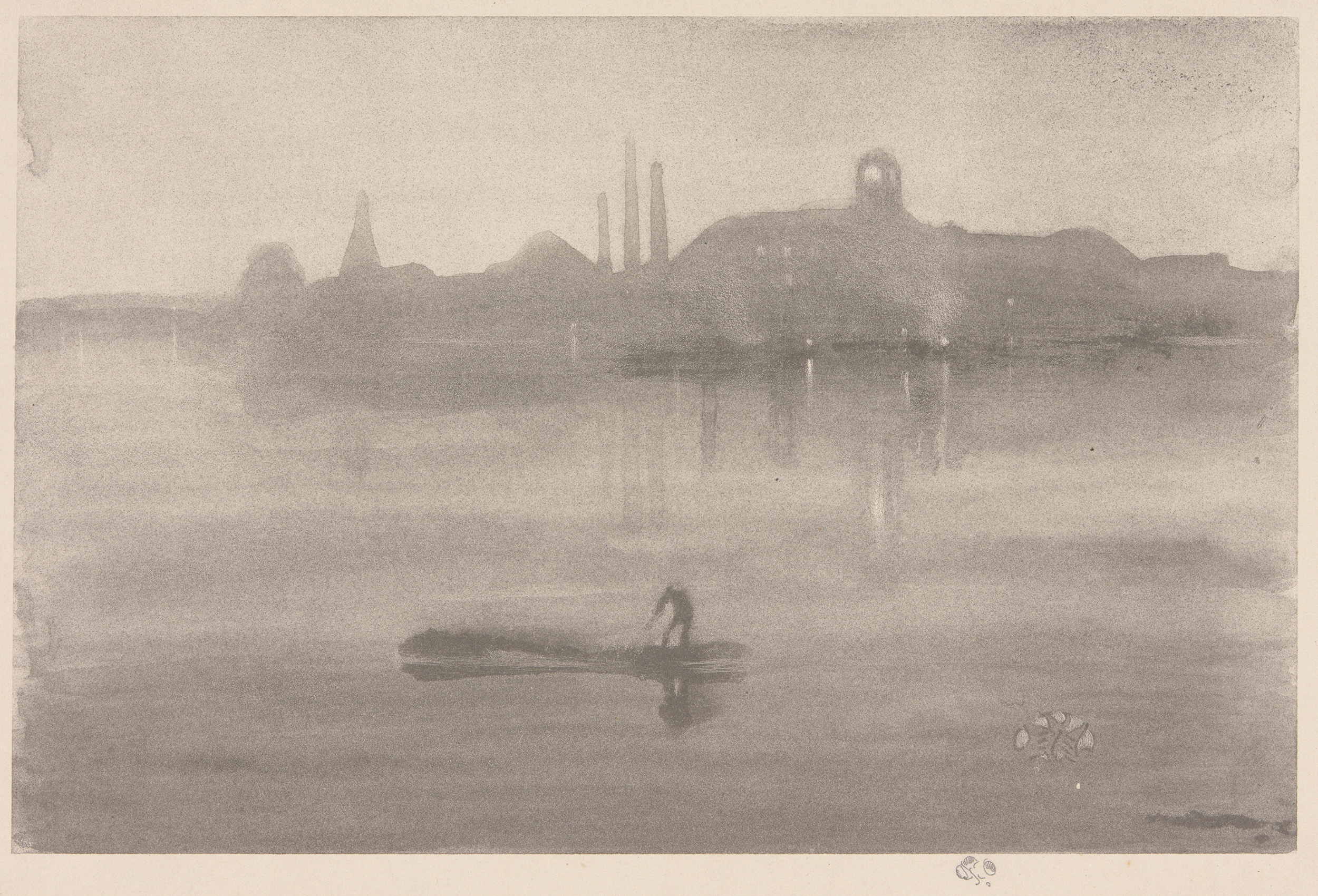
- Featured objectNocturne, 1878, catalogue 8
Contents
- How lithography makes an image
- Drawing on stone and drawing on transfer paper
- Lithotint, scraping and tonal work
- Thomas Way, T. R. Way and Wellington Street
- The 1878 beginning: Maud Franklin and the Thames
- Nocturne and the 1887 Notes portfolio
- Return to lithography and “Songs on Stone”
- Chelsea trades and periodical editions
- Colour lithography and Draped Figure, Standing
- French printers, travel and Stéphane Mallarmé
How lithography makes an image
Lithography relies on the different behaviour of greasy drawing material, water and oily printing ink on a prepared flat matrix. The artist establishes an image with lithographic crayon, liquid tusche or related materials. Processing stabilizes the relation between image and non-image areas. During printing, the surface is dampened; appropriately treated non-image areas accept water and resist oily ink, while the greasy image takes the ink rolled over it. Paper receives that ink under pressure.[1][3]
This differs fundamentally from intaglio. An etching or drypoint holds ink below a copper plate's surface, and damp paper is forced into those recesses. A lithograph ordinarily carries no equivalent intaglio plate mark because it prints from a flat plane. A black lithographic line may resemble crayon or pen, while an etched line may appear equally light, but visual similarity does not make the processes interchangeable.[1][3]
The stone is a matrix rather than a sculpted relief. Its prepared surface can preserve granular crayon marks, broad touches, fine lines and tonal fields. It can also be corrected or altered, creating states. Printing is repeatable, but it is not automatic sameness: ink, pressure, paper, stone condition and the difference between hand and machine production affect impressions.[1][3][8]
The printed orientation also needs care. A direct drawing on stone reverses when it is printed. In transfer work, the initial drawing is reversed onto the stone and reverses again in the final pull, so the impression generally retains the orientation of the transfer drawing. Corrections applied directly to the stone enter that sequence differently. Topographical interpretation should therefore identify how an image was made before comparing right and left with a site.[1][3]
Because the working surface is chemically prepared, seemingly blank areas are active parts of the design. They preserve paper light only when the matrix rejects printing ink cleanly. A pale interval around a figure or between buildings is consequently a manufactured relation among drawing, processing, dampening and presswork, not simply untouched drawing paper.[3]
Drawing on stone and drawing on transfer paper
Direct lithography puts the artist in contact with the printing matrix. The stone's grain responds to the pressure and texture of crayon. A liquid medium can create strokes or washes, and areas may be scraped or otherwise modified. Because the block is heavy, direct work usually ties the artist more closely to a workshop or a place where a prepared stone has been supplied.[2][3]
Transfer lithography separates drawing from stone. The artist works with greasy material on specially coated paper. A printer places that drawing against the stone and transfers the image under pressure, then processes and proves it. Whistler could therefore draw in Paris, Brittany, London lodgings or beside a window and send the portable sheet to a printer. Mobility enlarged his subject range and made the medium compatible with travel and domestic observation.[1][6][15]
Transfer was not an invisible courier service. Coarse, fine, transparent and stone-grained papers produced different marks. A textured sheet could make crayon appear as though it had already met a granular block. Age, creasing or deterioration might compromise a drawing before transfer. Once on stone, the image could be strengthened, scraped or supplemented; the transfer drawing and final impression are related material stages, not guaranteed facsimiles.[1][3][8]
Not every transfer drawing became a print. Whistler rejected or destroyed studies, sent alternatives, and sometimes left images that were only processed after his death. Conversely, an image could be retransferred from its original stone to supplementary stones for a large edition. “Transfer lithograph” thus names a method, not a single unbroken route followed by every object.[1][13]
Lithotint, scraping and tonal work
Lithotint allowed broad, wash-like values rather than relying chiefly on crayon line. Greasy liquid could be manipulated over a prepared ground, and scraping could reopen lights. Stumping—rubbing or applying crayon with a stump—created other soft gradations. These marks were fixed through lithographic processing and printed from a flat matrix.[2][3][9]
The resemblance to watercolour should not obscure the difference. A watercolour is pigment bound and deposited on the sheet the viewer sees. A lithotint impression transfers oily ink from a processed stone. Nor is it intaglio plate tone, which is ink deliberately left on the upper surface of an etched copper plate during wiping. Each method can suggest mist or dusk, but the material chain is distinct.[3][9]
Lithotint was difficult to stabilize and print. Tonal passages could lose freshness, fill in or shift during proofing. Scraping and reworking might restore light or revise form. The printer's understanding of preparation, moisture and ink was therefore not a secondary mechanical service. Late collaboration with James Henry Bray mattered precisely because Whistler's Thames tones made demanding technical requests of the matrix.[2][16]
Whistler moved between line and tone rather than advancing from one to the other. His early lithographic campaign of 1878 included figure studies, linear subjects and Thames lithotints. In the 1890s he often favoured light transfer drawings, then returned to the difficult tonal process for The Thames in 1896. Technique answered the image rather than a fixed chronological formula.[1][5][16]
Thomas Way, T. R. Way and Wellington Street
Thomas Way owned Thomas Way and Son at 21 Wellington Street, London, where most of Whistler's lithographs were produced. He encouraged the artist to experiment in 1878 and supplied access to materials and professional knowledge. His son Thomas Robert Way supervised the printing of most of the lithographs and later published an early catalogue raisonné, first in 1896 and in enlarged form in 1905.[1][4]
The two Ways must not be collapsed into one person. Thomas Way was the firm's owner and an active collaborator. T. R. Way was the younger printer, correspondent, cataloguer and memoirist whose detailed recollections shaped early accounts of the work. Their Wellington Street premises connected artistic drawing to a commercial lithographic business equipped for transfer, proofing and editions.[4]
Whistler's role was directive but not solitary. He made drawings, inspected proofs, requested changes, selected paper and judged impressions. The Ways prepared stones, transferred images, printed proofs and managed practical production. Correspondence exposes negotiation rather than obedient execution: parties disagreed about paper, instructions, timing, ownership and the handling of matrices.[8][18]
The relationship was especially close from 1887 until a break in 1896. T. R. Way's later memoirs preserve valuable information, but recollection is not identical to a contemporary workshop log. When Way described where or how Whistler drew an image, catalogue evidence tests the account against impressions, drawings and dated letters. Technical history becomes stronger when it credits his expertise without treating every memory as uncontested.[1][4][18]
The 1878 beginning: Maud Franklin and the Thames
Whistler had produced two isolated lithographic designs in 1855, but his sustained engagement began more than two decades later. With Thomas Way's encouragement in 1878, he tested different materials in studies of Maud Franklin. Her presence matters: she was Whistler's partner and model, not an anonymous female form supplied to a technical exercise. The studies let him compare crayon, liquid medium, prepared grounds and tonal handling.[1][5]
The campaign quickly reached the Thames. Limehouse, Nocturne, Early Morning, bridge subjects and related images translated familiar river observation into planographic terms. Lithography could retain a drawn immediacy, while lithotint offered broad atmosphere. These were not reproductions of the oil nocturnes, even when silhouettes, water and industrial landmarks overlap. They were conceived through stones and printing.[5][9]
Publication ambitions formed part of the experiment. Thomas Robert Way later recalled that Whistler considered a lithographic nocturne for Art and Art Critics in 1878, although cost may have prevented it. Early images also entered periodicals or waited years before a coordinated issue. A making date must therefore be distinguished from the date a sheet reached a larger public.[5][7]
The initial effort paused when Whistler went to Venice in 1879. That pause should not make the early lithographs mere preparation for later mastery. They established recurring problems—how to print a tonal ground, how much intervention a printer should make, how to preserve delicate marks and how to price proofs against published sheets—that remained active through the 1890s.[2][5]
Nocturne and the 1887 Notes portfolio
Nocturne was made in 1878 as a lithotint with scraping on a prepared half-tint ground. The Art Institute catalogue identifies two states, various black inks and Thomas Way as printer. T. R. Way listed 100 impressions without separating states and publication sheets, a reminder that early totals require interpretation rather than being repeated as a simple edition census.[9]
Way later said Whistler made the design from memory in one sitting at Wellington Street. The river profile would have been deeply familiar from Lindsey Row, but “from memory” remains the printer's recollection. The final lithotint reverses the direct stone image and organizes recognizable Battersea-side structures into a compressed tonal field. Its effect comes from the matrix, scraping, ink and support together.[9]
In 1887 Boussod, Valadon and Company issued 100 second-state impressions in the Notes portfolio, printed by Way. The portfolio gathered six early lithographs, although only thirty impressions of Limehouse could be included before wear led to erasure of its image. Editions of the other five therefore circulated without Limehouse as well as in the complete group.[6][7][9]
This history complicates the idea of a fixed set. The portfolio created a public sequence years after the drawings were made, and its two configurations reflected the matrix's condition. Signed proofs on larger sheets and unsigned smaller-format issues also carried different prices. Publication used reproducibility, but it simultaneously organized hierarchy and scarcity.[6][7]
The object record for Nocturne further notes mounted blue paper in an important published impression. Its blue field contributes directly to the dusk effect. That support choice cannot be generalized across the oeuvre, where Whistler later preferred warm ivory, cream and Japanese sheets. It is a specific conjunction of lithotint, coloured paper and secondary mount.[8][9]
Return to lithography and “Songs on Stone”
Whistler returned to lithography in 1887 and made it a sustained practice through the next decade. Chelsea courtyards and shopfronts, readers, draped models, dancers, family interiors, blacksmiths, French towns and Paris gardens entered the catalogue. Transfer paper made this geographical and social range practical, while the Way firm supplied continuity in London printing.[1][6]
Beatrix Whistler supported his renewed commitment after their 1888 marriage. Their domestic life supplied subjects including quiet rooms, music and family figures, but she was also an artist and designer with her own practice. The lithographs should not turn her into background atmosphere. Her independent history belongs elsewhere; here the evidence establishes encouragement and shared circumstances rather than technical authorship.[6]
“Songs on Stone” expressed Whistler's claim that small lithographs could work like intimate music: concise relations, suggestive intervals and restrained tone rather than exhaustive description. He pursued an agreement with William Heinemann in 1893 for a publication under that title. The project was not issued as a completed fixed portfolio, so the phrase should describe an aspiration and proposed enterprise, not an edition one can enumerate.[2][6]
The title also entered critical debate. Sparse lines could be praised as delicacy or mocked as incompleteness. Whistler's musical analogy directed attention away from narrative detail and toward arrangement, but production remained industrially grounded. Prepared papers, heavy stones, commercial presses and skilled labour made those apparently weightless images possible. Their subtlety did not transcend manufacture; it depended upon it.[2]
Chelsea trades and periodical editions
Whistler's Chelsea lithographs include rag shops, courtyards, fish shops and working interiors. They combine quick visual selection with named businesses and trades. The figures in The Tyresmith or the facade of Maunder's Fish Shop should not dissolve into a generic picturesque quarter. Publication in popular journals also placed these local subjects within modern print commerce.[10][11]
The Tyresmith of 1890 is a one-state transfer lithograph drawn on medium-grained paper and printed by Way. T. R. Way listed eight impressions, but an authorised machine-printed issue of about 500–1,000 appeared with The Whirlwind on 15 November 1890. The two figures repair a hoop in a wheelwright's Chelsea workshop. The small hand-proof census and the large periodical edition describe different production categories, not a contradiction.[10]
The published sheets came from supplementary stones, protecting the original matrix from the wear of a long machine run. They used smooth wove paper and tend to appear coarser, glossier and higher in contrast than hand proofs. Many surviving copies have lost their printed legend through trimming. An absent legend therefore invites material investigation; it does not by itself prove that a sheet is a rare proof.[10]
Maunder's Fish Shop, Chelsea, also 1890, was transferred with scraping and exists in two states. Its second state likewise entered The Whirlwind in an edition estimated at 500–1,000. Retransfer to supplementary stones weakened some light marks, and machine sheets differ in paper and surface from proofs. Here authorised multiplication visibly changed the drawing's character.[11]
Both matrices had afterlives. Goulding printed fifty-one posthumous impressions of The Tyresmith in 1904, while thirty-three posthumous impressions of Maunder's Fish Shop were pulled in 1903. Papers and watermarks help separate these from lifetime printing. A signature within the image repeats from the stone and cannot settle the date.[8][10][11]
Colour lithography and Draped Figure, Standing
Colour lithography usually required a key or keystone carrying the principal design and additional stones for separate colours. Each component had to align when printed in sequence. Transfer drawings on transparent paper helped Whistler place colour areas against the key. Registration marks, state changes and the order of printing belong to the image's construction.[3][12]
This is not the same as adding watercolour by hand to a finished black impression. In a colour lithograph, coloured inks are printed from prepared matrices unless the object record also documents manual additions. Slight misregistration can reveal how stones met, while a state change may alter a colour matrix, the key or both. Descriptions must follow the catalogue rather than infer process from reproduction.[1][3]
Draped Figure, Standing of 1891 is among Whistler's most ambitious colour experiments. The digital catalogue records a transfer lithograph drawn on thin transparent paper, four states and changing ink colours. The printed butterfly belongs to the keystone. Commercially made papier végétal helped place the successive colour stones accurately.[12]
The first design ended at the model's ankles. Her feet appeared with the colour stones in the second state, while later states developed relations among body, drapery and ground. Colour was therefore structural, not a decorative layer applied after a complete monochrome image. State sequence records Whistler revising the figure through several matrices.[12]
The model's possible identity remains qualified in the catalogue. The image has been linked tentatively to Carmen Rossi, but suggestion is not identification. More securely, different historical titles emphasized red or green versions, reflecting the marked colour shifts among states. Naming should preserve that uncertainty while keeping the technical facts firm.[12]
French printers, travel and Stéphane Mallarmé
Living and travelling in France expanded Whistler's transfer practice but complicated the relationship with Wellington Street. Fine-grained and transparent sheets went through the post to London; other images were handled by French printers including Lemercier and Belfond. Printer and firm need to be established plate by plate. National location alone does not prove who transferred or pulled an impression.[1][4][6]
Brittany subjects from 1893 used fine-grained transfer paper to register roofs, markets, canals and streets. Paris brought gardens, balconies, museum interiors, portraits and draped figures. The portable sheet allowed Whistler to catch a site without transporting a stone, yet processing still intervened later. The apparent travel sketch is a designed input to a collaborative print chain.[6]
The portrait Stéphane Mallarmé was created in 1892 for the poet's Vers et Prose. Whistler made and destroyed several studies on thin transparent paper, then selected two for transfer. The second portrait was rejected. Belfond printed the accepted image as the book's frontispiece for its first three editions.[13]
T. R. Way reported that this published run came from the original stone rather than supplementary matrices, which would make the survival of delicate marks notable. The catalogue appropriately treats the statement as Way's evidence and observes that proof and book impressions are not easily ranked by visible quality. Publication context, paper and provenance remain necessary.[13]
This collaboration also joins visual and literary networks. Mallarmé admired Whistler's art, and Whistler's musical language found a receptive Symbolist setting. Yet Stéphane Mallarmé remains a portrait made for a specific volume, not simply an illustration of Symbolist theory. The sitter, rejected alternatives, printer and book all belong to its history.[2][13]
Portraits, interiors and The Doctor
Transfer paper suited encounters in domestic rooms. Whistler drew readers, women sewing, mother-and-child groups, friends and family with a limited number of marks. Blank paper could carry light around a figure, while a textured support converted pressure into granular tone. Economy required decisions about what to omit, but it also depended on successful transfer of the faintest useful traces.[3][6]
The Doctor portrays Whistler's brother William McNeill Whistler. It was drawn in 1894 in the drawing room at 110 rue du Bac during a visit. The catalogue identifies a transfer lithograph on thin transparent paper. When proofs arrived from London, Whistler requested more, indicating active judgment after the drawing had left Paris.[14]
The portrait circulated through several public frameworks. It represented Whistler in the 1895 centenary exhibition of lithography in Paris and appeared at the Fine Art Society show of 1895–96. A machine edition had been printed for The Pageant, but the periodical's first issue was delayed until November 1896. Drawing, proofing, exhibition and publication therefore occupy separate dates.[14]
The Fine Art Society reportedly sold no impression during the exhibition, while twenty-four remained in Whistler's estate in 1903. Visibility did not guarantee immediate sale. Nor does later familiarity let the printed portrait stand for William's entire life as a physician. The object page and the future family article must recover the sitter beyond his role in Whistler's work.[14]
Other domestic subjects demand the same discipline. A title such as Needlework can name both an activity and a portrait of Rosalind Birnie Philip. Afternoon Tea depicts Frances Birnie Philip with her daughter Ethel Whibley. Where catalogues identify people, generic “woman” or “family scene” language discards recoverable history.[1][17]
Kensington Gardens and the late Thames lithotints
Whistler drew Kensington Gardens in January 1896 while he and Beatrix were staying at De Vere House near Kensington Road. The likely view from their lodging looked toward the wintry park. He used transfer paper with a grained-stone texture, supplied through T. R. Way after related experiments at Lyme Regis.[15]
The image was not included in either edition of the catalogue for the Fine Art Society lithograph exhibition, which ran from December 1895 into January 1896. Its chronology brushes against the show but does not place it on those walls. This is a useful control against assuming that every work made during an exhibition entered it.[7][15]
Later in 1896 Whistler returned to lithotint for The Thames, reviving a method he had not used since 1878. The return connects early river atmosphere to contemporary interest in painterly lithography without making the late print a repetition of Nocturne. Different ground, working history and printer intervention give it a separate material identity.[2][16]
The production exposed strained collaboration. Whistler wanted to continue lithotint experiments in Paris, while Thomas Way was unwilling to send instructions and materials from London. The record establishes refusal but not a single motive that can be safely invented. James Henry Bray's expertise became crucial in realizing the challenging late Thames lithotints.[16][18]
Such work makes authorship visibly distributed. Whistler selected the subject and pursued the tonal effect; a skilled printer turned vulnerable material into repeatable impressions. Credit to Bray does not diminish the artist's invention. It explains how the image exists and why comparable pulls need printer, state and paper information.[2][16]
Papers, watermarks and the life of an impression
Whistler valued warm old Western papers, Japanese papers and Japanese vellums. Fibre, thickness, translucency and surface changed the way black or coloured ink sat on a sheet. He often preferred aged character, stains or inclusions that Thomas Way judged unsuitable. Their disagreement reveals a real tension between aesthetic patina and a printer's concern for stable, workable stock.[8][18]
Paper selection could differentiate a small proof edition from a machine publication. Hand proofs might appear on varied laid or Japanese sheets, while periodical issues used regular wove stock. Mounting also mattered: the blue chine of Nocturne was laid onto a larger support, and Afternoon Tea appeared on tan laid Japanese vellum attached to a mount in Vollard's 1897 album.[8][9][17]
Watermarks provide comparative evidence. The digital catalogue collates marks across lifetime and posthumous impressions, allowing a sheet to be associated with particular paper batches and printing campaigns. A watermark is not an independent certificate. It must agree with state, printer, ink, dimensions, provenance and catalogue history, and may be fragmentary or absent in a trimmed sheet.[1][8]
Paper colour seen online is unreliable. Lighting, display glazing, scanning and ageing can turn ivory toward white or cream. Foxing and stains may be historical evidence while also constituting condition issues. Decisions about treatment, washing, mounting or removal from a volume belong to paper conservators examining the object, not to a generic preference for pristine sheets.[8]
The catalogue's paper work is particularly valuable because Whistler's matrices survived unevenly. Where the same stone supported lifetime proofs, a periodical issue and a posthumous printing, sheet structure can help separate phases that share the printed design. Material description is therefore historical argument, not decorative cataloguing.[1][8][10][11]
Publications, posthumous printing and the 1895–96 exhibition
Whistler's lithographs circulated as hand proofs, portfolio sheets, magazine inserts, book frontispieces and album contributions. The Tyresmith reached The Whirlwind; Chelsea Rags appeared with The Albemarle; Stéphane Mallarmé entered Vers et Prose; The Doctor entered The Pageant; and Afternoon Tea formed part of Ambroise Vollard's album in 1897.[7][10][13][14][17]
Large authorised editions do not turn these images into reproductions of another artwork. Contemporary advocates used “auto-lithograph” to distinguish a print made from the artist's own lithographic design from lithographs that reproduced paintings. Yet the original/published distinction still matters within an image: hand proofs and machine sheets may differ in matrix, paper, legend and printing surface.[7][10]
The Fine Art Society's A Collection of Lithographs by James McNeill Whistler in 1895–96 consolidated an extensive body before the public. Selection, framing, catalogues and sales records show active construction rather than a neutral display of everything extant. Some old trial proofs returned to view; recently printed subjects appeared alongside works held in Whistler's Paris collection; other images such as Kensington Gardens were absent from the catalogues.[7][15][18]
After Whistler's death in 1903, Frederick Goulding printed editions from many stones before they were erased or otherwise closed. These are genuine posthumous impressions from Whistler's matrices, not lifetime pulls and not modern photographic copies. Catalogues separate them by dates, printer, paper and watermarks. A seller who says only “original Whistler lithograph” has not supplied enough information.[1][8][10][11]
Whistler stopped making lithographs in 1897. One of his final publication contexts was Vollard's album, which included Afternoon Tea. The quiet double portrait and its carefully mounted Japanese support show how domestic intimacy, Parisian print publishing and luxury paper could meet. The endpoint is not exhaustion of the medium so much as the close of a concentrated decade.[2][17]
How to examine a Whistler lithograph
Begin with the catalogue number, title and date. Record whether the medium is direct lithograph, transfer lithograph, lithotint or colour lithograph, and note additions such as scraping or stumping. Identify the state, printer, ink, sheet and image dimensions, paper, watermark, publication and accession. An image alone cannot provide most of that history.[1][3]
Catalogue numbers need their systems attached. Thomas Robert Way's pioneering lists and Joseph Pennell's or Howard Mansfield's period language may appear in older records, while the Spink, Stratis and Tedeschi catalogue supplies the current Chicago sequence and concordances. A bare “Way 27” is useful only when a reader knows that it refers to The Tyresmith within Way's lithograph catalogue rather than to an etching system. Titles also changed, so number, medium and image dimensions should be reconciled together.[1][4]
Ask which matrix produced the sheet. A hand proof may come from the original stone; a long magazine run may come from supplementary stones; a posthumous impression may have been pulled by Goulding from a preserved matrix. Retransfer can weaken fine lines, while machine ink and paper can alter gloss and contrast. These differences are not adequately described as “better” and “worse.”[8][10][11]
Look for the transfer paper's character within the mark. Coarse grain, fine grain or a stone-like texture can remain visible after transfer. In colour work, identify the keystone and registration among colour matrices. In lithotint, distinguish printed tonal fields and scraped lights from stains or later discolouration on the sheet.[3][12][16]
Keep inscriptions in context. A butterfly printed from the stone repeats in each pull. A graphite signature may distinguish a signed proof, but it does not independently date the printing. Periodical legends can be trimmed away, dealers add notes and mounts can cover edges. Provenance and institutional comparison remain necessary.[1][10]
Measure the image and the whole sheet separately. A periodical legend can enlarge the printed field above a composition, while mounting can make the visible support seem larger than the thin paper actually carrying the ink. Dimensions recorded by a holding institution may use slightly different conventions, so a small discrepancy should prompt examination rather than an instant attribution claim. Mounts, bindings and old hinges can themselves document publication or collecting history.[8][10][17]
Condition alters appearance as well. Light can fade a coloured paper; foxing can interrupt pale spaces; pressure, abrasion or an old mount may flatten the sheet. Lithographic ink may retain a different gloss in machine and hand pulls, but a screen cannot reliably distinguish it from photographic glare. Comparisons are strongest when records describe the physical sheets under consistent examination.[8]
Finally, do not turn a named sitter or workplace into mere technique. Maud Franklin, Beatrix Whistler, William McNeill Whistler, Mallarmé, Rosalind Birnie Philip, Frances Birnie Philip, Ethel Whibley, shop proprietors and workers belong to social history. Material precision should recover their presence rather than replace it.[5][13][14][17]
Frequently Asked Questions
Whistler's lithographs unite portable drawing with industrial knowledge. Crayon and tusche established marks; transfer papers carried them; stones fixed printable relations; printers balanced water and ink; papers changed their tone and status. Lithotint and colour multiplied the technical demands. No single hand performed every stage, yet the collaborative chain served a sustained artistic direction.[1][2][3]
The history also overturns a simple equation between originality and rarity. A hand proof may be one of a few; an authorised journal insert may belong to a run of hundreds; a later sheet may come from the same stone after Whistler's death. Each is understood through its matrix, state, printer, issue, paper and date.[7][8][10]
From the 1878 Nocturne to the late Thames and Afternoon Tea, Whistler made planographic printing carry river atmosphere, street labour, portrait presence and domestic quiet. The lightness of a “song” rested on stone, transfer, skilled presswork and exact looking. To see that material foundation is not to dispel the poetry. It is to understand how the poetry became printable.[9][16][17]
Discussion
Which material difference most changes how a Whistler lithograph should be understood?
Keep matrix, transfer, state, printer, paper, publication and printing date attached to the individual sheet.
Reader Insights
Was the image drawn on stone, transferred, or built across colour stones?
Which printer, ink and edition shaped this impression?
What do sheet, watermark, mount and publication context establish?
Join the Conversation
Share an impression-specific observation or question.
References
- Nesta R. Spink, Harriet K. Stratis and Martha Tedeschi, eds., The Lithographs of James McNeill Whistler: The Digital Edition, Art Institute of Chicago, https://publications.artic.edu/digitalwhistler/reader/lithographs
- Douglas W. Druick, “Art from Industry: James McNeill Whistler and the Revival of Lithography,” Art Institute of Chicago, https://publications.artic.edu/whistlerart/sites/publications.artic.edu.whistlerart/files/file_assets/Whistler-theRevivalofLithography.pdf
- Art Institute of Chicago, “Whistler's Lithographic Techniques: Beauty and Business,” https://publications.artic.edu/digitalwhistler/reader/lithographs/section/567
- Art Institute of Chicago, “Whistler, Way, and Wellington Street,” https://publications.artic.edu/digitalwhistler/reader/lithographs/section/339
- Art Institute of Chicago, “1878–1879: Early Studies and Lithotints,” https://publications.artic.edu/digitalwhistler/reader/lithographs/section/20
- Art Institute of Chicago, “1887–1894: Return to Lithography,” https://publications.artic.edu/digitalwhistler/reader/lithographs/section/375
- Art Institute of Chicago, “Marketing the Lithographs,” https://publications.artic.edu/digitalwhistler/reader/lithographs/section/584
- Harriet K. Stratis, “Whistler's Papers: Their Appearance, Selection, and Use,” https://publications.artic.edu/digitalwhistler/reader/lithographs/section/570
- Art Institute of Chicago, Nocturne, catalogue 8, https://publications.artic.edu/digitalwhistler/reader/lithographs/section/363
- Art Institute of Chicago, The Tyresmith, catalogue 36, https://publications.artic.edu/digitalwhistler/reader/lithographs/section/393
- Art Institute of Chicago, Maunder's Fish Shop, Chelsea, catalogue 37, https://publications.artic.edu/digitalwhistler/reader/lithographs/section/394
- Art Institute of Chicago, Draped Figure, Standing, catalogue 46, https://publications.artic.edu/digitalwhistler/reader/lithographs/section/404
- Art Institute of Chicago, Stéphane Mallarmé, catalogue 60, https://publications.artic.edu/digitalwhistler/reader/lithographs/section/419
- Art Institute of Chicago, The Doctor, catalogue 110, https://publications.artic.edu/digitalwhistler/reader/lithographs/section/472
- Art Institute of Chicago, Kensington Gardens, catalogue 140, https://publications.artic.edu/digitalwhistler/reader/lithographs/section/504
- Art Institute of Chicago, The Thames, catalogue 161, https://publications.artic.edu/digitalwhistler/reader/lithographs/section/526
- Art Institute of Chicago, Afternoon Tea, catalogue 173, https://publications.artic.edu/digitalwhistler/reader/lithographs/section/538
- Art Institute of Chicago, Whistler–Way letters and correspondence appendices, https://publications.artic.edu/digitalwhistler/reader/lithographs/section/562 and https://publications.artic.edu/digitalwhistler/reader/lithographs/section/566


