


 by Tom Gurney
Tom Gurney BSc (Hons) is an art history expert with over 20 years experience
Published on November 6, 2026 / Updated on November 6, 2026
Email: tomgurney1@gmail.com / Phone: +44 7429 011000
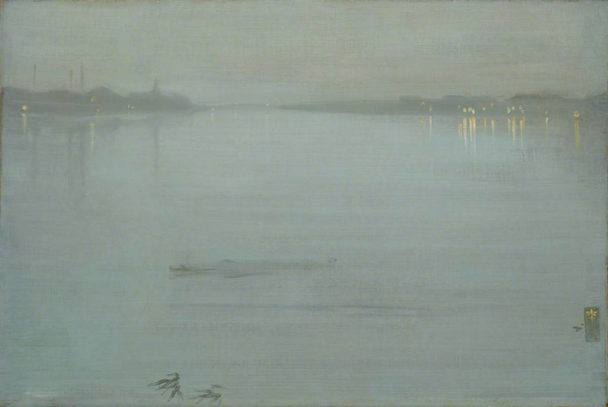
James McNeill Whistler's Nocturne: Blue and Silver—Cremorne Lights spreads the Thames across a wide, pale field. Battersea's dark factories occupy the distant left bank. On the right, small orange-yellow lights mark the pleasure grounds at Cremorne and descend in broken reflections. A low vessel rests in the middle distance, while a handful of reeds or leaves enters from the lower-left edge. Almost everything else is blue-grey water and air, joined by long horizontal strokes.[1][4][8]
This is YMSM 115 and Tate accession N03420. Tate dates the painting to 1872, records oil paint on canvas and measures the support at 50.2 by 74.3 centimetres. Its present frame measures 81 by 106.2 by 10.5 centimetres. The older catalogue header gives a width of 74.9 centimetres, but Tate's current object measurement governs. Arthur Haythorne Studd bequeathed the painting in 1919.[1][3][5]
When checked on 26 August 2026, Tate listed the work on display in its James McNeill Whistler exhibition at Tate Britain. The London presentation runs from 21 May to 27 September 2026 before the exhibition travels. Display information can change, so N03420 remains the reliable locator after those dates.[1][2]
At a Glance
- CatalogueYMSM 115
- Date1872
- SupportOil on canvas; earlier figure campaign beneath
- Dimensions50.2 × 74.3 cm
- SignatureButterfly and ‘72’ at lower right
- ViewpointProbably Battersea Bridge, looking upriver
- Preferred titleNocturne: Blue and Silver—Cremorne Lights
- FrameLost Whistler frame; later Grau-style replica
- CollectionTate, N03420
- DisplayTate Britain exhibition on 26 August 2026; verify current status
Contents
- Which Cremorne painting is this?
- A title that changed with every context
- Looking upriver from Battersea Bridge
- Factories on the left bank
- Cremorne as lights rather than spectacle
- Most of the picture is open water
- Horizontal strokes and vertical interruptions
- A nocturne painted over women in robes
- Did Albert Moore cause the change?
- An enlarged and already lined canvas
Which Cremorne painting is this?
Whistler made several pictures associated with Cremorne, and similar names conceal substantially different objects. YMSM 115 is the broad 1872 Thames view at Tate. It is not Cremorne Gardens, No. 2, YMSM 164, a later firework scene whose groups of spectators stand near the pleasure grounds. Nor is it The Fire Wheel, YMSM 169, or Detroit's The Falling Rocket, YMSM 170.[18]
The distinction matters because the Tate painting offers no foreground crowd and no large pyrotechnic wheel. Its pleasure gardens are distant lights across the water. Even the vessel in front is difficult to name with precision. Catalogue and technical records variously allow raft, lighter or barge, a useful warning against turning a few dark strokes into an illustrated story.[4][5]
The preferred title, Nocturne: Blue and Silver—Cremorne Lights, combines Whistler's tonal category with a specific urban landmark. Catalogue number YMSM 115 and accession N03420 secure the identity when historical records call the same object Chelsea, Battersea Reach, blue and gold, or silver and gold.[1][4][6]
A title that changed with every context
The earliest proposed identities are uncertain. A Nocturne in Blue and Silver shown at the Dudley Gallery in 1872 may have been this painting. Thames views exhibited by Durand-Ruel in Paris in 1873 probably included it, but no surviving itemised evidence removes all doubt. A Brighton Nocturne in blue and gold priced at £420 in 1875 has also been suggested, although at least two other paintings are credible candidates.[3][6][7]
The chain becomes firmer in the 1880s. The work was probably exhibited at the Grosvenor Gallery in 1882 as Nocturne in Blue and Silver. Whistler used essentially that form in an 1884 letter, then identified a blue-and-silver Cremorne nocturne on a list compiled around 1886–87. These records link colour and site without yet producing one permanent punctuation or subtitle.[4][6][11]
In January 1892 Whistler called it a blue-and-silver nocturne of Chelsea. The Goupil retrospective catalogue that March supplied the decisive formula: Nocturne. Blue and Silver—Cremorne Lights. Its owner, Gerald Potter, nevertheless called it a symphony in blue and gold, while a Glasgow newspaper in 1893 described a blue-and-gold nocturne of Battersea Reach. Studd used silver and gold the next year.[4][12][13][15]
These changes do not document a sequence of repainting from blue into gold. They show how Whistler, owners, dealers and critics selected words for a low-toned surface that can appear grey, blue, silver or faintly golden according to light and reproduction. The 1905 Paris memorial exhibition restored the blue-and-silver Cremorne form in French, and the 1980 catalogue raisonné standardised the preferred English title.[4][7]
Looking upriver from Battersea Bridge
The accepted site is the Thames between Battersea and Chelsea. Tate identifies the viewpoint as Battersea Bridge, looking upriver. Factories and chimneys on the left belong to the Battersea shore; lights on the opposite side mark Cremorne Gardens in Chelsea. The water opens between them and narrows towards the horizon.[1][4]
The catalogue raisonné preserves a little more uncertainty. Whistler may instead have developed the view from his home at Lindsey Row, from a small drawing such as M.0474, or from memory accumulated through repeated journeys on this reach. These possibilities concern the making of the image, not the basic geography it represents.[4][18]
Separating viewpoint from method prevents a familiar myth. The picture need not have been completed outdoors in front of one transient effect. A locatable view could be studied from bridge, window, boat or sketchbook and then reorganised in the studio. Its material surface, including a discarded figure painting and extensive support preparation, rules out an untouched transcription of one evening.[3][5]
Factories on the left bank
At upper left, low industrial buildings form an uneven silhouette. Three narrow chimneys rise through the haze, with further structures dissolving towards the centre. Their darkness is thin rather than solid; pale blue crosses their edges, and the canvas texture remains visible. Whistler gives Battersea enough shape to establish an active shore without itemising each premises.[4][5][8]
The factories are not accidental blemishes on a supposedly natural river. They occupy one side of the composition and supply a dark counterweight to Cremorne's lights. Smoke, buildings and water share the same restrained colour range, yet their material difference survives. Tonal unity does not require the industrial bank to stop being industrial.[1][4]
This balance distinguishes the nocturne from both topographical inventory and pastoral escape. The left shore is economically productive; the right advertises metropolitan leisure. Whistler does not supply a moral verdict on either. He makes their distant forms and illumination participate in one field while allowing the divided uses of the river to remain visible.[4][8]
Cremorne as lights rather than spectacle
Cremorne Gardens lay beside the Thames near the western end of the King's Road. In the painting, the grounds are known through concentrated lamps rather than architecture or crowds. Several pale yellow strokes cluster above the right bank. Longer reflections descend below them, some nearly vertical and others interrupted by blue drawn back across their length.[1][4][5]
The lack of visible revellers is meaningful. Viewers know that the lights belong to a commercial pleasure garden, but the canvas withholds its performances, music and bodies. The public resort becomes a remote luminous fact. To invent dancers, boats arriving for an event, or a specific night of entertainment would confuse historical knowledge of the site with objects actually resolved in the paint.[4][8]
Industry and recreation consequently meet without becoming a simple opposition between darkness and light. Battersea also has lamps, and Cremorne's bank retains a low dark mass. The brightest strokes do not erase the river separating the two shores. Their reflections emphasise the distance across water as much as they advertise a destination.[5][8]
Most of the picture is open water
The horizon sits high, leaving an unusually large expanse beneath it. Sky and river are close in hue, yet the upper field is quieter while the lower one carries more pronounced lateral movement. A distant strip of bank divides them without forming a hard boundary. Because the scene is broad and low, small changes in stroke direction become major spatial cues.[4][5]
Near the centre-left, the faint vessel interrupts that openness. Its dark top and shallow body extend laterally, then disappear into blue. Pentimenti show that Whistler reconsidered its outline. The form provides scale and proximity, but its uncertain identity—raft, lighter, barge or even driftwood in some descriptions—should remain unresolved.[4][5]
At lower left, a few dark strokes suggest reeds, leaves or vegetation near the viewer. They give the picture an immediate edge without constructing a continuous foreground bank. The cropped marks also resist a perfectly empty abstraction: the viewer occupies a place from which water, plant forms and the opposite shore are unequally near.[4][8]
Horizontal strokes and vertical interruptions
Long strokes run from left to right through the river. They produce both surface and distance, because the brush furrows act as ripples while joining wide areas of the composition. The most important interruptions are vertical: chimneys, shore lights and reflections. None dominates like the bridge pier in Whistler's Old Battersea Bridge, yet together they keep the panorama structurally alert.[5][18]
The reflection lines are especially economical. Whistler drew warm colour downward while the blue water remained wet, then passed blue back across it. The resulting lights appear to break on moving water rather than hang as unmodified stripes. Their sequence can be read visually because vertical warmth and horizontal blue remain partially separate.[5]
This organisation also explains why reproduction can flatten the work. If the tonal field is made uniformly pale or dark, distinctions among brush furrows, shoreline and vessel disappear. Tate's current image preserves the cool surface, visible weave and sparse warm notes sufficiently to verify the object, but looking at the painting still offers information about gloss, texture and scale that a screen cannot fix.[1][8]
Historical photography forms part of that problem. A mid-twentieth-century photograph made the submerged woman more apparent than she normally looks, and Tate recreated the effect in 1993 with panchromatic film. The result did not expose a stable second picture simply waiting to be seen; it showed that film sensitivity can privilege dark material beneath a thin upper layer. Modern colour images answer a different need, presenting the nocturne's current visible balance. Neither type is a neutral substitute for the object, and differences between them should not be mistaken for undocumented repainting.[5][8]
A nocturne painted over women in robes
The blue river is not the first image on the canvas. Examination and X-radiography reveal an earlier decorative figure composition related to Whistler's Six Projects of about 1868–70. On the left, a woman in a Japanese-inspired robe bends or kneels while trailing a fan and looking right. A second, less distinct woman nearer the centre probably kneels facing left.[3][5][17]
An older Tate summary spoke of four or more robed figures. Later object-specific study does not support that count. It identifies two women with different degrees of confidence and only a few further strokes on the right. The revised technical account should govern, because imaging can clarify as well as complicate what an earlier visual description proposed.[1][5]
The figure picture was not simply covered intact. Whistler rubbed much of it down, probably removing additional paint at lower right. Remnants nevertheless remain beneath the nocturne, and the off-white priming continues to affect the cool upper image. What looks like an expansive void is therefore the visible end of a canvas already occupied and materially altered.[5]
Did Albert Moore cause the change?
Whistler's abandoned figure project has been connected with his anxiety about similarities between his work and that of Albert Joseph Moore. Letters from September 1870 document the concern, and W. E. Nesfield reassured Whistler that the resemblance was superficial. The exchange supplies a genuine artistic context for the end of the Six Projects campaign.[3][9]
It does not prove that Whistler erased this particular canvas because of Moore. The catalogue presents that causal link as a possibility. Other reasons—dissatisfaction, changing demand, a desire to reuse a support or a new compositional ambition—cannot be excluded. The secure conclusion is narrower: an earlier robed-figure composition was converted into the 1872 nocturne.[3][5]
That conversion should not be reduced to a symbolic leap from decoration to modern landscape. The two phases share Whistler's interest in restrained pattern, controlled intervals and surfaces that resist narrative detail. Reusing the canvas changed subject and spatial organisation, while retaining a prepared material object on which prior decisions continued to matter.[3][5][18]
An enlarged and already lined canvas
Before the figure painting was made, Whistler changed the support itself. Roughly two centimetres of canvas that had turned around the right stretcher edge were brought into the picture plane. A narrow strip of wood was added to support the enlargement, and the canvas was glue-paste lined to another fabric.[5][17]
The brown imprimatura of the first composition extends across this incorporated strip, confirming that enlargement and lining preceded the robed women as well as the nocturne. The butterfly later occupied much of the same narrow area. A practical alteration at the edge thus became an active part of the finished design rather than a neutral repair hidden outside the image.[5]
Lining made the original weave more conspicuous. Whistler did not attempt to eliminate it before painting the river. Near-parallel strokes cross a support whose grid remains visible, so the nocturne's texture comes from both brush and fabric. The surface is not an optically smooth glaze floating above an invisible ground.[5][8]
Priming and the brown remains of the first picture
The canvas originally received an off-white priming applied only to the intended picture plane. It gave the first surface a reasonably even texture. Whistler then laid a thin brown imprimatura for the figure composition. After that image was rubbed down, brown speckles remained in low points while the lighter priming still contributed to the colour above.[5]
No wholly new imprimatura was added for the river scene. This is important because a general account of Whistler's `sauce` can imply that each nocturne began from the same purpose-made ground. YMSM 115 instead preserves a layered sequence particular to one reused and modified support.[5][17]
The visual effect depends on those survivals. Pale blue over vestigial brown can look cooler and more atmospheric than an opaque blue layer of equal colour. The earlier preparation also appears between strokes and through thin passages. Technical history therefore belongs to what viewers see, even when they cannot identify the submerged women unaided.[5]
Establishing the shore before the blue field
After rubbing down the figures, Whistler sketched the principal river elements. A thin dark mixture, probably including black and raw umber, established the shoreline, buildings and vessel. This local underpainting provided positions and values without coating the entire canvas with a second dark field.[5]
Pale blue then crossed those darker forms. Where it lay thinly over their edges, the turbid mixture softened them rather than hiding them. Factories could remain legible without crisp contour, and the vessel could emerge as a near silhouette while retaining an atmosphere between viewer and object.[5][17]
Chimneys were not all added as positive black lines. Whistler sometimes removed wet blue with a sharp edge or scraped through it with the handle of his brush. A vertical structure could thus be made by subtraction. The process helps explain the slight, broken quality of forms that nevertheless occupy exact positions on the horizon.[5]
What Whistler's `sauce` contains here
The main paint is a very pale blue composed largely of lead white. Synthetic ultramarine and Prussian blue supply cool colour; madder and another red lake modify it. This is an object-specific mixture, not a universal recipe for every nocturne. Different Whistler paintings require separate technical evidence.[5][17]
He thinned most of the mixture heavily with turpentine. A stiff, flat hog-bristle brush about two centimetres wide carried it across the canvas. Its bristles left broad channels that remain visible in sky and water. The even loading and extended movements indicate control rather than an accidental flood of dilute paint.[5]
Whistler moved chiefly from left to right, adjusting the stroke path around buildings and other established forms. The upper nocturne layer shows relatively little overall rubbing compared with some of his canvases, although microscopic abrasion exists. Its apparent ease comes from sustained, sparing application after a more disruptive earlier campaign.[5]
Why the dilute paint did not simply run
Turpentine-thinned oil colour ordinarily risks drying matte and forming drips. Examination points to a medium modifier involving a natural resin, probably of a mastic type. It increased transparency and refractive quality while helping the mobile paint retain a more suitable surface and resist uncontrolled flow.[5][17]
Ultraviolet behaviour, response to heat and high refractive index favour the resin explanation over an addition made only from drying oil. The modifier also helps account for the way earlier layers remain visible through the nocturne without the upper film appearing merely chalky.[5]
It may have enabled Whistler to work at an easel, step back and judge the entire arrangement. That remains a technical possibility rather than a witnessed fact for this canvas. The composition could also have spent time flat. Material analysis can identify likely ingredients and functions more securely than it can reconstruct every studio posture.[5]
Lights placed once
The warm shore lights differ physically from the blue field. They contain lead white and cadmium yellow with added vermilion, and appear thicker, as though applied from a more concentrated mixture. A round brush produced narrow strokes that stand above the turpentine-rich layer.[5][17]
Technical study finds little reworking in these accents. Whistler placed them and largely left them alone. Their assurance is made more conspicuous by the openness around them: a short warm mark can identify a lamp, while the matching downward stroke creates its unstable reflection without describing a bank or building in detail.[5]
Rapidity here can be located precisely. It belongs to individual actions—the placement of a light, a reflection or the butterfly—not to a claim that the whole object was finished in minutes. The reused image, lining, underpainting and wet-on-wet sequence demonstrate a more extended material history.[5]
The butterfly on the added strip
At lower right, Whistler's butterfly occupies the incorporated edge. It was painted after the blue layer had dried, using a narrow brush and slightly diluted tube paint. The mark is constructed from a compact succession of crossing horizontal and vertical strokes rather than from a slowly modelled insect.[5][8]
The signature's position is unusually revealing. What had once been a stretcher turn became part of the picture; what might have remained an awkward strip received the artist's identifying emblem. The butterfly turns the support alteration into a deliberate margin and balances the dark vegetation at the opposite lower corner.[5]
A varnish stroke protects the monogram, but that coating may not be original. It should not be used as proof that Whistler isolated or emphasised the signature in exactly its current glossy state. As elsewhere in the painting, present appearance combines his work with later care.[5]
Whistler's first frame is lost
The frame that originally surrounded the nocturne in 1873 had a painted fish-scale pattern. It may have resembled the surviving decorated surround of Nocturne: Blue and Silver—Chelsea, but the actual object has disappeared. Whistler's letter to George A. Lucas that January insists that frames continued a painting's harmony and that his butterfly could mark both picture and surround.[5][10][18]
In 1892 Whistler proposed that Potter's works receive frames associated with Frederick Henry Grau. Potter resisted the expense, and the intermediate history is incomplete. It is possible that an early frame survived that episode or that more than one replacement followed; the documents do not establish a simple, unbroken sequence.[5][12][14]
The present pine frame is a gold-leaf, oil-gilded replica of a Grau-style design. It was made after Whistler's death in 1903 and modified around 1919, perhaps in Studd's ownership. Tate's 2010 gallery caption says Whistler decorated the frame with gold fish scales, but object-specific frame research shows that statement belongs to the lost original, not the surviving surround.[1][5]
Cleaning without Potter's permission
During preparation for Whistler's 1892 Goupil exhibition, the painting was probably sent to Stephen Richards for cleaning and varnishing. D. C. Thomson admitted that work had been undertaken without Potter's prior consent. Potter objected strongly to the principle while also acknowledging that the pictures looked substantially improved.[5][14]
Consent and visual result must remain separate. Potter's approval of the appearance did not retroactively authorise the intervention, and the correspondence does not provide a complete laboratory account of materials removed or added. It documents an episode in which dealer, artist, restorer and owner had different claims over the object's presentation.[14]
The treatment also occurred long after Whistler's support extension and glue-paste lining. Those earlier operations should not be attributed to Richards or Goupil. The painting had already been structurally altered before either the figure subject or nocturne was created.[5]
The 1993 Tate treatment
Later conservators strengthened the edges with strip lining and retouched the incorporated right side, although surviving documentation does not fix the dates. The work may belong to the period before Tate established a formal conservation department in 1955. Any wartime dating remains an inference rather than a recorded event.[5]
By 1993, non-original varnish had become extremely yellow and uneven. Broad horizontal application marks, roughly twelve to fifteen centimetres wide, disturbed the subtle field. Stephen Hackney removed the coatings and old retouchings at Tate, then applied a non-yellowing synthetic-resin varnish.[5][17]
YMSM's technical record, updated in 2020, reports no further treatment after that campaign. The current blue and warm lights are therefore viewed through a modern coating rather than the strongly discoloured varnish visible before 1993. Conservation changed access to the surface without returning the painting to an imaginary untouched state.[5]
Divided criticism in 1872
If YMSM 115 was one of Whistler's two Dudley Gallery moonlights in 1872, The Times review captures an early split response. The critic admired rare truth and beauty in delicate grey, gold, blue and silver, and recognised music as a useful analogue. The same notice then characterised Whistler's art as being constructed from his limitations.[6][16]
Because the catalogue identification is only possible, the review cannot be attached sentence by sentence to this object. It is still evidence for how the first blue-and-silver nocturnes were encountered. Their reduced form could be praised as disciplined tonal perception and attacked as avoidance of conventional subject within one assessment.[6][16]
Whistler's 1873 letter to Lucas shows that he understood exhibition as argument. The Paris group of Thames views was intended to register his colour and pattern ideas among painters, not merely to offer pleasant night scenes for sale. YMSM 115 probably participated in that assertion, although the exact Durand-Ruel checklist remains unresolved.[6][10]
The Grosvenor audience in 1882
The 1882 Grosvenor showing is much more likely to have included this painting. One illustrated response turned its lights and reflections into musical notation, treating the nocturne as a sequence of notes and bars. Other periodicals called Whistler's exhibits jokes or described the canvas as inscrutable, sometimes with praise folded into irony.[6][16]
The Athenaeum offered a strikingly attentive alternative. It read the effect as mist before dawn rather than conventional night, noticed orange light on the shore and described the drifting raft as the solid form that stabilised the field. Even if its time-of-day interpretation differs from Whistler's title, the review demonstrates that contemporary viewers could locate atmosphere, colour and object with precision.[6][16]
Reception was therefore not a unanimous history of ridicule followed by modern understanding. Some viewers dismissed the painting; others described its internal relations with care. The disagreement concerned whether a lightly stated river effect constituted sufficient painting, not whether any subject could be seen at all.[6]
Gerald Potter and an uncertain first price
Gerald Potter bought the nocturne directly from Whistler, but neither the date nor amount is secure. Decades later Whistler offered several conflicting memories: thirty or forty pounds, perhaps fifty, and in one abandoned formulation eighty or one hundred. His shifting figures were part of an angry argument about later profits, not dependable accounting.[6][15]
The painting's whereabouts during Whistler's bankruptcy in 1879 are also uncertain. It may have been deposited with H. Graves & Co. as security for a loan, but the evidence does not establish that as fact. By 1882 it was available for exhibition, and Alan Cole recorded seeing `Cremorne Symphonies` in Whistler's studio that June.[6]
Potter's ownership did not prevent Whistler from treating the work as part of his public programme. He attempted to borrow it for Paris and possibly Brussels in the 1880s. Those plans failed, making the probable Grosvenor display and secure Goupil retrospective especially important moments in its nineteenth-century exhibition history.[6][11]
The Goupil retrospective
The painting appeared as catalogue number 34 in Nocturnes, Marines & Chevalet Pieces, which opened at Goupil in March 1892. Whistler used the entry not only to title the object but to curate its criticism, reproducing selected remarks from the Ruskin trial and later writing. The catalogue converted hostile language into material for his own retrospective argument.[6][13]
He remained acutely involved in reproduction. When photographs were proposed for a Goupil album, he considered this nocturne too dark and murky in the available print. That objection is more than vanity: a low-toned painting depends on distinctions that contemporary photography could compress, changing lights, vessel and bank into undifferentiated grey.[6]
Whistler tried to send the painting onwards to Munich, with Potter's consent, but arrangements again failed. The work's public movement was repeatedly negotiated through loans, cleaning, framing and photographic suitability. Its exhibition history was not a passive list of venues; it involved material and reputational decisions at each stage.[6][12][14]
Glasgow, Goupil and Studd
Potter later placed a group of paintings with D. C. Thomson of Goupil. They travelled to Glasgow in 1893, where this canvas appeared under the misleading blue-and-gold Battersea Reach description. The first sales effort failed, provoking Whistler's complaint that distinguished works were being hawked around Britain.[6][15]
Arthur Haythorne Studd acquired the painting by 1894. Goupil had asked £650, but Studd told Whistler that the final payment was lower without disclosing the exact amount. This evidence corrects any claim that £650 was the completed sale price. Whistler welcomed higher valuations while resenting the gains made by earlier patrons.[6][15]
A later story says Charles Lang Freer offered £250,000 for three Studd paintings—this nocturne, Symphony in White, No. 2 and The Fire Wheel—and was refused. The account was published after the Second World War, not documented as a contemporaneous offer, so it belongs to the painting's collecting legend rather than a verified transaction ledger.[6][18]
From private possession to Tate
Studd bequeathed the nocturne to the National Gallery in 1919. It later transferred to Tate; the catalogue raisonné gives 1949. The bequest brought a painting long controlled by private owners into a public national collection and preserved its association with two other important Studd Whistlers.[1][6]
The current accession, N03420, now anchors an object whose title, measurement, framing and visibility have all changed in the record. Tate's 50.2-by-74.3-centimetre measurement supersedes the catalogue header's slightly wider figure, while technical study distinguishes the lost Whistler frame from the later replica. Public ownership has not made the history static; it has enabled further correction.[1][5]
The 2026 exhibition adds another dated stage rather than a permanent endpoint. The painting is presently encountered alongside a broader range of Whistler's work, but its own layered support, divided river and contested history remain specific. After the London display closes, the accession and catalogue number will continue to identify it even as location changes.[1][2]
Why this nocturne matters
YMSM 115 joins apparent simplicity to exceptional material complexity. Its visible language is sparse: banks, chimneys, lights, reflections, vessel and reeds. Underneath lie a decorative figure project, rubbed paint, an enlarged edge, early lining and an earlier brown preparation. The broad blue calm is something Whistler constructed out of an already eventful object.[3][5]
Its urban subject is equally layered. Battersea industry and Cremorne leisure occupy opposite shores, neither described in full and neither removed. The river converts their buildings and lamps into intervals of darkness and colour without erasing their social functions. Tonal harmony is a way of organising modern London, not an escape from it.[4][8]
Finally, the painting exposes how Whistler's reputation was made. Early critics divided over its economy; the 1882 audience turned it into both joke and musical analogy; Goupil reframed hostile language; Potter disputed unauthorised treatment; Whistler contested resale profits; and Studd's bequest changed its public status. Surface, title, frame and market all participate in what the work became.[6][13][15]
Frequently Asked Questions
No evidence supports that claim. The topography may draw on direct observation, sketches and memory, but the canvas was enlarged, lined, used for a figure subject, rubbed down, locally underpainted and then developed through wet and dry stages. Some individual accents were rapid; the whole object was not materially simple.[4][5]
No. Cremorne Gardens, No. 2 is YMSM 164, a separate later painting. YMSM 115 is the panoramic blue-and-silver Thames nocturne at Tate; its pleasure gardens appear only as distant lights.[18]
Discussion
How does Whistler turn an industrial and recreational river into a field of light without erasing its modern geography?
Compare Battersea's thin dark factories at left with the warm Cremorne lamps at right, then follow the horizontal blue strokes across their vertical reflections and the faint central vessel.
Reader Insights
How do the small lamps make Cremorne feel both present and remote?
Where do the canvas weave, dilute blue layer and submerged figure campaign affect what you see?
How do horizontal water strokes interrupt the vertical lights and chimneys?
Join the Conversation
Share a close observation or an object-history question.
References
- Tate, “Nocturne: Blue and Silver—Cremorne Lights,” N03420, live artwork page and public API page 46207, accessed 26 August 2026, https://www.tate.org.uk/art/artworks/whistler-nocturne-blue-and-silver-cremorne-lights-n03420.
- Tate, “James McNeill Whistler,” Tate Britain exhibition and tour records, accessed 26 August 2026, https://www.tate.org.uk/whats-on/tate-britain/whistler.
- Margaret F. MacDonald and Grischka Petri, “Nocturne: Blue and Silver—Cremorne Lights, YMSM 115: Date,” The Paintings of James McNeill Whistler: A Catalogue Raisonné, updated 22 November 2020, https://www.whistlerpaintings.gla.ac.uk/catalogue/display/?mid=y115&xml=dat.
- MacDonald and Petri, “YMSM 115: Subject and Titles,” The Paintings of James McNeill Whistler, https://www.whistlerpaintings.gla.ac.uk/catalogue/display/?mid=y115&xml=sub.
- MacDonald and Petri, “YMSM 115: Technical Description, Conservation and Frame,” The Paintings of James McNeill Whistler, https://www.whistlerpaintings.gla.ac.uk/catalogue/display/?mid=y115&xml=tec.
- MacDonald and Petri, “YMSM 115: History, Provenance and Exhibitions,” The Paintings of James McNeill Whistler, https://www.whistlerpaintings.gla.ac.uk/catalogue/display/?mid=y115&xml=his.
- MacDonald and Petri, “YMSM 115: Bibliography,” The Paintings of James McNeill Whistler, https://www.whistlerpaintings.gla.ac.uk/catalogue/display/?mid=y115&xml=bib.
- Tate and University of Glasgow, official images and image records for N03420/YMSM 115, checked 26 August 2026, https://media.tate.org.uk/art/images/work/N/N03/N03420_10.jpg and https://www.whistlerpaintings.gla.ac.uk/catalogue/display/?mid=y115&xml=img.
- James McNeill Whistler to Albert Joseph Moore, [12/19 September 1870], GUW 04166, and W. E. Nesfield to Whistler, 19 September 1870, GUW 04263, The Correspondence of James McNeill Whistler, https://www.whistler.arts.gla.ac.uk/correspondence.
- Whistler to George A. Lucas, [18 January 1873], GUW 09182, The Correspondence of James McNeill Whistler, https://www.whistler.arts.gla.ac.uk/correspondence/people/display/?cid=9182.
- Whistler to Charles William Deschamps, [11 January 1884], GUW 07909, and Whistler list [1886/87], GUW 06795, The Correspondence of James McNeill Whistler, https://www.whistler.arts.gla.ac.uk/correspondence.
- Whistler to David Croal Thomson, [4 January 1892], GUW 08214, and J. C. Potter to Whistler, 1 May 1892, GUW 05008, The Correspondence of James McNeill Whistler, https://www.whistler.arts.gla.ac.uk/correspondence.
- James McNeill Whistler and Goupil Gallery, Nocturnes, Marines & Chevalet Pieces, London, 1892, catalogue 34, transcribed and controlled in YMSM 115.
- David Croal Thomson to Whistler, 2 April 1892, GUW 05713, and J. C. Potter to Whistler, 4 April 1892, GUW 05006, The Correspondence of James McNeill Whistler, https://www.whistler.arts.gla.ac.uk/correspondence.
- Whistler, Thomson and Studd market correspondence, including GUW 08254, 08287, 08276, 02674, 08275, 05610 and 08285, The Correspondence of James McNeill Whistler, controlled in YMSM 115.
- The Times, 11 November 1872; Society, May 1882; Modern Society, 20 May 1882; Daily Telegraph, 1 May 1882; and Athenaeum, 6 May 1882, transcribed and attributed in YMSM 115.
- Stephen Hackney, “Colour and Tone in Whistler's ‘Nocturnes’ and ‘Harmonies’ 1871–72,” The Burlington Magazine 136 (1994), 695–99; Stephen Hackney, Rica Jones and Joyce H. Townsend, eds, Paint and Purpose: A Study of Technique in British Art (Tate, 1999), 86–89; and Townsend's 2017 technical report, synthesised in YMSM 115.
- MacDonald and Petri, YMSM 052, 083–086, 103, 113, 118, 119, 164, 169 and 170, and Margaret F. MacDonald's drawing catalogue M.0474, comparative records in the University of Glasgow Whistler catalogues.


