


 by Tom Gurney
Tom Gurney BSc (Hons) is an art history expert with over 20 years experience. Updated September 24, 2026.
Introduction
Contents
- Introduction
- Ten views, several kinds of object
- Explore ten exact museum views
- Two iris pairs, one literary place
- A river that binds unequal panels
- Rough Waves: motion on a two-panel screen
- Hotei and the economy of ink
- Flower designs and the limits of attribution
- Lacquer: the bridge leaves the picture plane
- Autumn grasses on the Fuyuki Kosode
- Kōrin and Kenzan: a ceramic made by two brothers
- Red and white plum trees around a dark stream
- Rinpa before and after Kōrin
- How to follow the work
- Reader insights and discussion
- Books on Kōrin and Rinpa
Ogata Kōrin (尾形光琳, 1658–1716) is often introduced through blue irises on gold. That image is a powerful start, but it can hide the range of his work. In one pair of screens the plants appear without the bridge that explains their literary setting; in another, angular planks cut across the gold. A two-panel screen turns water into dark, clawing waves. An ink hanging scroll treats the Buddhist figure Hotei with disarming economy. Designs move onto a writing box and into the decoration of ceramics made with his younger brother Kenzan. These are different objects, with different makers and histories, not interchangeable photographs of a single “Rinpa style.” The Nezu Museum's Irises [2], Metropolitan Museum's Irises at Yatsuhashi [3] and Met Rough Waves [5] supply three exact starting points.
This home page follows design across surfaces. It begins with a pair of verified Met screen views and opens out to preparatory drawings, ink painting, printed design leaves, lacquer and Kenzan ceramics. It also distinguishes Kōrin's own lifetime from the later construction of a lineage called Rinpa. The Kyoto National Museum [1] describes Rinpa as a loose connection among artists separated by generations, including Hon'ami Kōetsu, Tawaraya Sōtatsu, Kōrin and Kenzan, and Sakai Hōitsu. That account is more useful than imagining a school in which every member learned from the previous one in the same workshop.
The separate biography follows the textile household, patrons, work with Kenzan, Edo years and later reception. A focused iris guide compares the Nezu and Met pairs object by object. A plum-screen guide studies the National Treasure at MOA Museum. On this page, those routes are introduced through the material and viewing questions that connect them. Where a museum photograph cannot be reused, a precise linked object record is more truthful than a superficially similar substitute.
At a glance
- Who was Kōrin?A Kyoto artist born in 1658 and deceased in 1716, raised in the Ogata family's high-end Kariganeya textile business. Kyoto National Museum [1].
- Are the famous iris screens one pair?No. The Nezu Museum's National Treasure Irises is a six-panel pair without a bridge; the Met's later Irises at Yatsuhashi is another six-panel pair with an eight-plank bridge, accession 53.7.1, .2. Nezu [2]; Met [3].
- What else did he make?Ink and colour screens, hanging scrolls, designs for lacquer, and painted decoration on ceramics made with his brother. Surviving album leaves catalogued under his name are prints whose production dates are not fixed by their Met records. Met objects [5]; Kyoto museum ceramic pair [10].
- What does Rinpa mean here?A later name for related approaches across several generations, not an uninterrupted studio. Hōitsu's 1815 publications helped organise Kōrin's legacy retrospectively. Kyoto National Museum [1].
- Can every image be reproduced?The Met files illustrated below are individually marked Public Domain and its API confirms Open Access. The Nezu and MOA website photographs have different terms and are linked as research records only. Met [3]; Nezu [12]; MOA [13].
Ten views, several kinds of object
Explore ten exact museum views
These ten views represent eight accessioned objects. Filter by format and use each card to inspect its exact record.
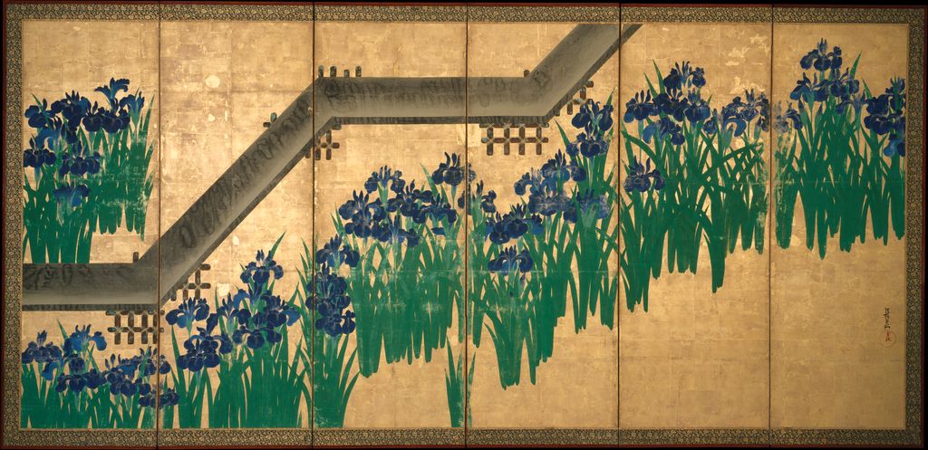
Irises at Yatsuhashi — screen view 1
One screen of the Met pair, with a bridge; not the Nezu National Treasure.
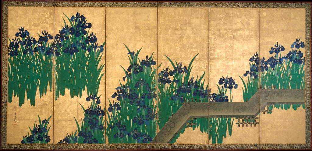
Irises at Yatsuhashi — screen view 2
The other complete screen view of the same Met pair.
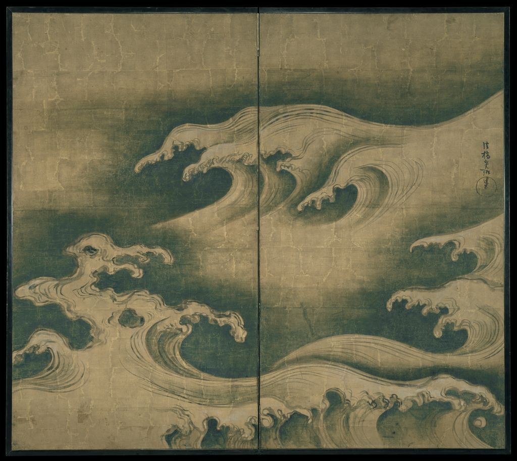
Rough Waves
A distinct two-panel screen, with ink, colour and gold leaf on paper.
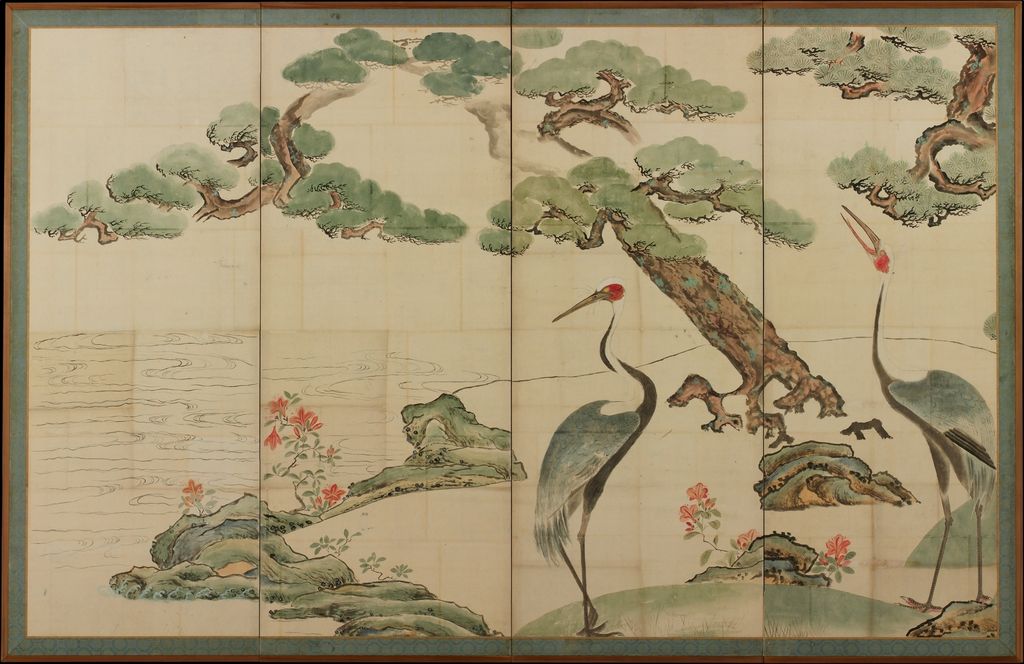
Cranes, Pines, and Bamboo — four-panel view
Four-panel view of preparatory drawings, not an original finished screen pair.
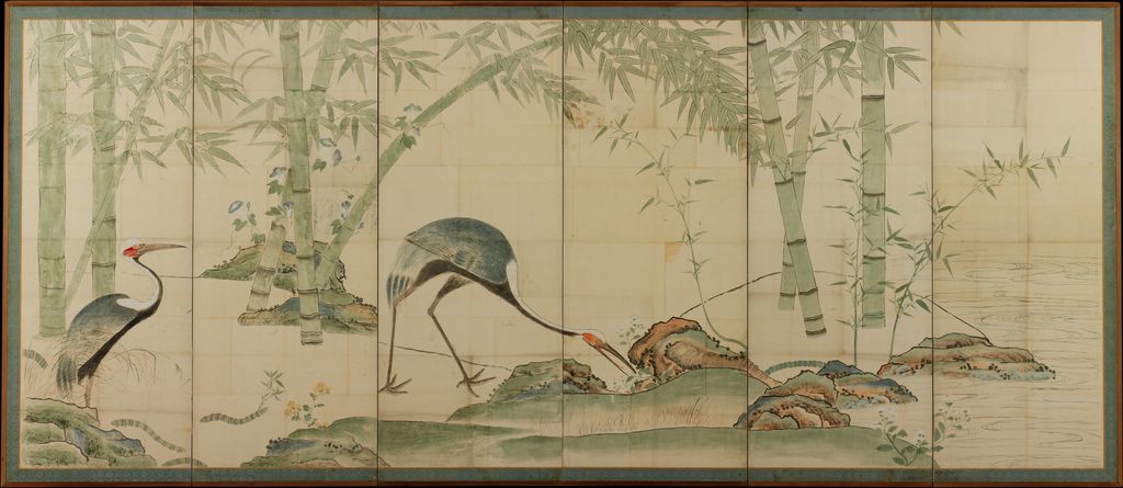
Cranes, Pines, and Bamboo — six-panel view
Six-panel view of the same preparatory work, not a second artwork.
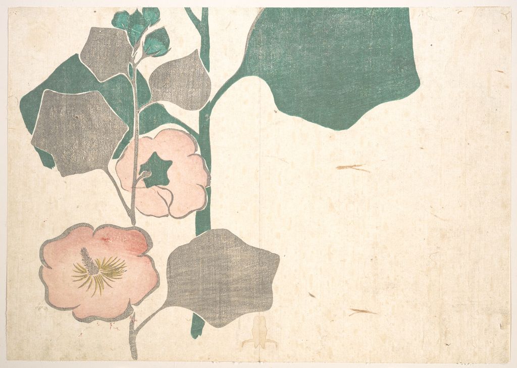
Design of Flowers
Printed leaf catalogued under Kōrin; no narrow printing date given.
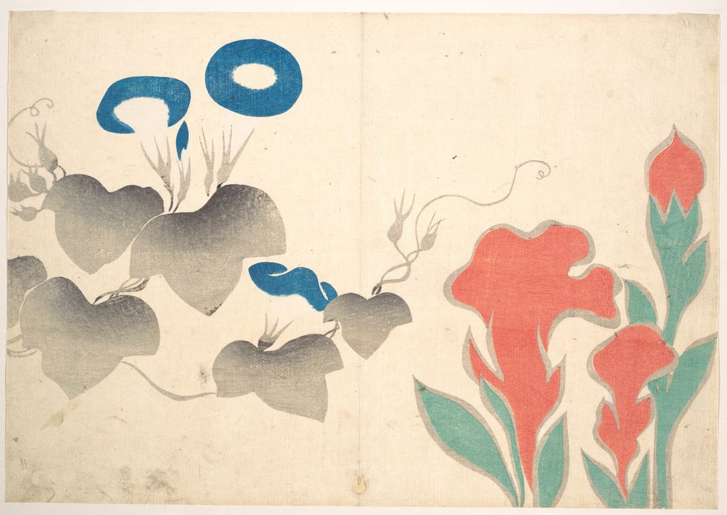
Design of Morning-glory and Other Flowers
A separate printed leaf; do not infer who carved or pulled this impression.
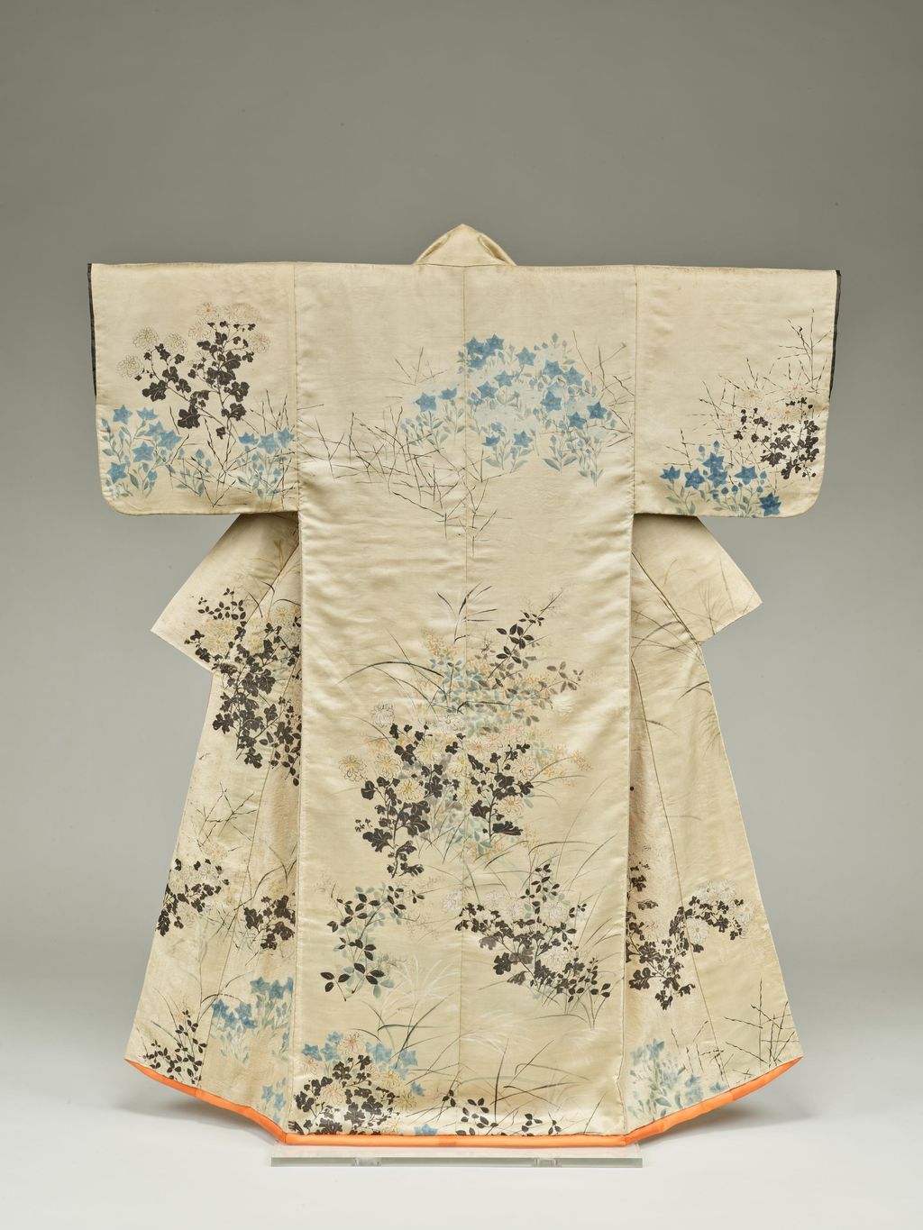
Kimono (Kosode) with Autumn Grasses
Fuyuki Kosode, freehand autumn grasses on silk; the Fuyuki family commission is a documented tradition.
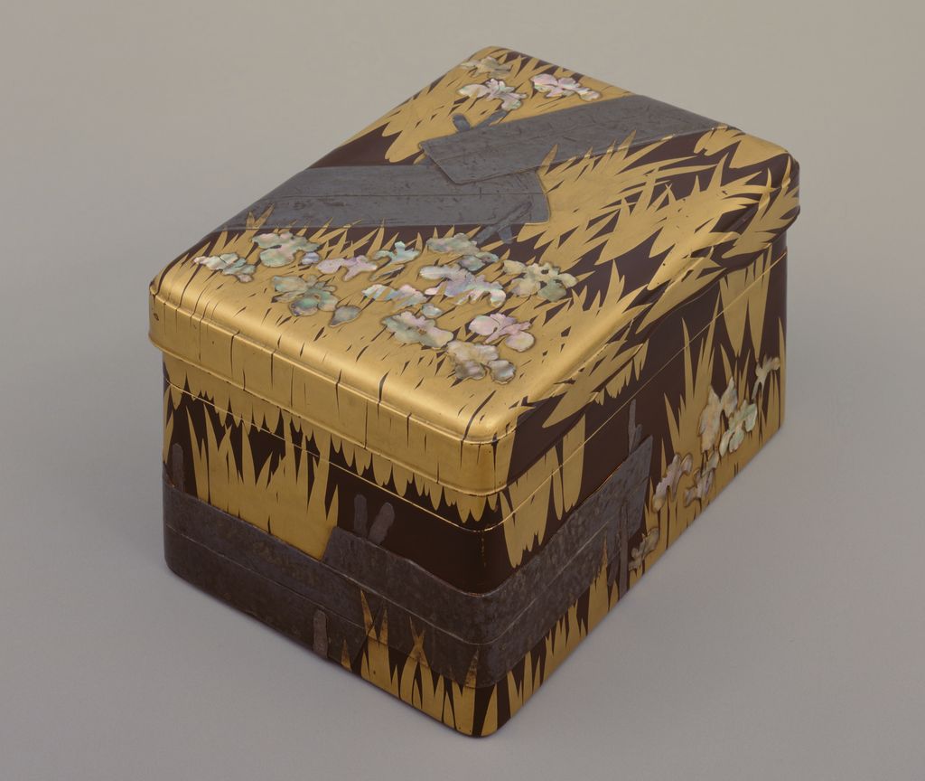
Writing Box with the Yatsuhashi Bridge
Lacquer, lead and mother-of-pearl carry the bridge across the box.
The illustrated gallery contains ten views from eight accessioned objects. Six Met objects supply two photographs of the single Yatsuhashi screen pair; one of Rough Waves; two views of Cranes, Pines, and Bamboo; one of Hotei; and two separately accessioned flower-design album leaves. ColBase supplies a Tokyo National Museum view of the Fuyuki Kosode [16], I-721, and one of the Yatsuhashi writing box [17], H-86. A screen view is not a new artwork. Each card states what is pictured and links its exact museum record. The album leaves are catalogued as woodblock prints; because the records give only the broad Edo period, the gallery does not claim that Kōrin carved the blocks, printed these impressions, or supervised a lifetime edition. The Met's two flower records [7] provide the necessary medium labels.
The range resists a simple contrast between decorative gold and modest ink. The irises turn blue and green plants into a rhythm over metal leaf; Rough Waves makes a dark sea surge across a much smaller, two-panel format. The crane drawings use islands, trees, bamboo and stream as devices for joining unequal expanses. Hotei has neither a gold field nor a large folding surface. Its ink marks work at a human scale, in a hanging scroll that a viewer would encounter differently from a screen surrounding a room. Looking at the object type before naming a “style” gives the images their physical relationships back. Met Rough Waves [5]; Met Hotei [6].
The images have also been processed consistently for the site: retained museum originals, derivatives at up to 1024 pixels wide, JPEG quality 80 and 144 dpi, plus image URLs and checksums in the local ledgers. ColBase permits commercial use with a source link and requires disclosure that a supplied file was edited; both Tokyo cards state that their files were resized for web display. ColBase's official reuse guidance [18] explains these conditions. The technical record makes it possible to re-caption a view without losing its exact source. It does not change the museum's accession or turn a detail photograph into a complete object.
Two iris pairs, one literary place
The Nezu Museum's Irises (燕子花図) [2] is a National Treasure, a pair of six-panel screens, each 151.2 by 358.8 centimetres. Irises in mineral blues and greens stand against a gold-leaf ground. The museum explicitly says that some motifs were repeated using stencils; close comparison should therefore attend to repetition and difference, rather than praising every plant as a separate act of spontaneous naturalism. The screens refer to chapter nine of The Tales of Ise, in which travellers reach Yatsuhashi and a poem makes the syllables of kakitsubata, iris, an acrostic. The bridge is not painted in this Nezu pair. The absence matters: plants alone can summon a well-known place and story for a viewer who recognises the allusion.
The Met's Irises at Yatsuhashi (Eight Bridges) [3] is another pair of six-panel folding screens, dated after 1709 and catalogued as 53.7.1 and 53.7.2. Here the planks sweep diagonally among iris groups on the two screens. The bridge makes the location visible, but its geometry also interrupts the vertical stems. Kōrin can let the eye travel along a dark angular path and then stop among clusters of upright leaves and petals. The Met connects both the view and its literary reference to the Ise story; its page includes John T. Carpenter's English translation, while acknowledging that translation cannot fully reproduce the original acrostic. We link that museum text rather than inventing a supposedly literal equivalence between the Japanese wordplay and English lines.
The two Met production images show complete six-panel views of this latter object. They do not depict the Nezu screens, even though both pairs have irises, gold and a literary subject. Nor does a gallery of two screen photographs capture the changing angle at which a folded pair is seen in a room. The dedicated iris article will compare exact dimensions, institutions, formats and the role of the bridge. It will identify the image rights for each source separately. A side-by-side comparison that labelled the Met files “Nezu Irises” would teach the wrong history precisely where readers most need a careful distinction.
A river that binds unequal panels
The Met's Cranes, Pines, and Bamboo [4], accession 1975.268.62, .63, is an especially revealing survival because the museum calls it preparatory drawings remounted as a pair of folding screens. One screen has four panels and the other six. Their image dimensions are approximately 167 by 257.2 and 167 by 384.2 centimetres. These are not a finished matched six-panel pair like either iris object. The drawings once belonged to the Konishi family, descendants of Kōrin, before their later remounting. That history should remain visible in any caption, or the current screen format might be mistaken for the exact form in which the drawings left Kōrin's workshop.
The Met points to unfinished passages: a smudged tree-trunk area, faint green on right-screen branches and the written notation “very pale green” on the left screen. Those marks let a visitor see design thinking rather than only a polished effect. The stream runs toward the front of the composition and both divides and links the two lands. Cranes, pines and bamboo suggest longevity; smaller floral details hint at seasonal shifts. A picture can thus work simultaneously as auspicious imagery and as a plan for distributing masses, voids and movement. The two photographs on this page show the four-panel and six-panel views separately, following their visible folds and the museum's dimensions.
There is a practical lesson in the river. To call it “negative space” alone would miss the water actually represented by drawn ripples. To call it a realistic landscape would miss how strongly it is shaped to connect two unlike panels. The viewer's eye follows the break between land masses, then the stream, then cranes that step across the scene. The gallery lets these two images sit beside the irises because both solve a related problem: how to make a repeated natural subject work across hinged surfaces. The answer is different in each case. Kōrin's forms are recognisable, yet they have been organised to suit the object's fold, width and pace.
Rough Waves: motion on a two-panel screen
The Met dates Rough Waves (波濤図屏風) [5] about 1704–9 and records it as a two-panel folding screen, ink, colour and gold leaf on paper, accession 26.117. Kōrin's “Dōsū” seal provides a chronological clue, since the Met says he adopted that name in 1704; research cited on the object page suggests a possible execution during his residence in Edo. These are reasoned dating anchors, not a dated commission document. The canvas of paper is roughly 146.5 by 165.4 centimetres in image area, unlike the broad six-panel Yatsuhashi pair. Its smaller span intensifies the sensation that several waves are competing for space.
The dark, swelling water rises under pale, curling crests. White openings within some wave-tips make the shapes look almost grasping, and line groups follow their bends. The Met's description notes the use of two brushes held together for some outlines and compares the foam to talons. It also proposes Sesson Shūkei's earlier wave paintings as a possible inspiration. “Possible” is important: a visual resemblance and a curatorial suggestion do not prove that Kōrin stood before a particular Sesson painting while making this screen. The site image allows viewers to follow the wave contours; the museum record explains which technical and historical inferences can currently be made.
Placed next to the irises, Rough Waves broadens the meaning of design. The irises rely on measured spacing, strong colour and either an absent or visible literary bridge. The sea screen relies on repeated curves, dark ink and a shallow space that can feel unstable. Both make movement across a folded object central. Kōrin did not simply apply one decorative pattern to every subject; he adapted the physical screen and its tonal resources to the problem each subject posed. A rich artist home needs this work as well as the familiar floral screens.
Hotei and the economy of ink
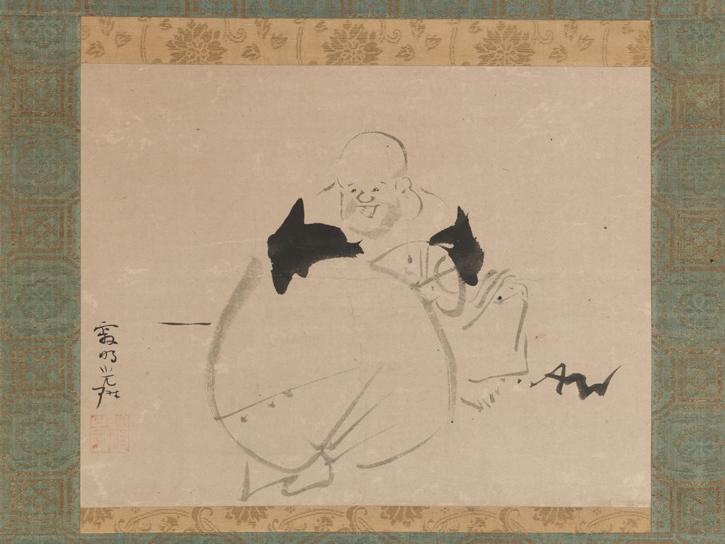
The Met's Hotei [6], accession 2015.300.89, is an ink-on-paper hanging scroll dated after 1704. Its subject is the cheerful monk called Budai in China, associated in Japan both with Zen stories and with the Seven Gods of Good Fortune. The museum describes Kōrin's playful treatment of revered and legendary figures. This is a useful corrective to presenting him only as a floral designer. A lightly rendered figure can address religious and popular culture while keeping the mark-making unmistakably a painter's question.
The scroll's image measures only 28.5 by 36.8 centimetres according to the museum, though the mounting is larger. It does not demand the same scanning movement as a six-panel pair. The image can be approached at close range, with attention to how a few dark shapes set a body in motion and leave the paper active. It is risky to read the expression as a direct statement of Kōrin's own mood, or to read “Zen” as a universal explanation for spare brushwork. The museum's subject identification, physical measurements and date give a better base. Comparing Hotei with Rough Waves shows that economy of colour can still produce very different pictorial energies.
The artist's range also changes how a museum list should be read. A search for only his best-known irises might make his art look more uniform than it was. Conversely, an ink figure cannot be used to claim he abandoned gold screens at a particular moment. The broad dating “after 1704” overlaps the period in which Rough Waves may have been made and precedes the later Met iris pair. The objects demonstrate coexistence of formats, not a neat march from ink to colour or from simple to ornate. A biography can describe changing circumstances without forcing every surviving image into a developmental ladder.
Flower designs and the limits of attribution
Two Met album leaves extend the gallery's range while demanding a different caption. Design of Flowers, JP1828 [7], and Design of Morning-glory and Other Flowers, JP1829 [8], are catalogued under Ogata Kōrin as woodblock prints in ink and colour on paper. Their pages give the Edo period but no narrow object date. They are separate accessioned leaves with similar small horizontal formats. Their flower groups can be read as designs intended to make plant form legible and repeatable on a flat sheet, although the catalogue alone does not establish how the original album was issued or how these specific impressions were produced.
Those limits are important for a painter whose designs later circulated widely. The printed sheets can show what the Met currently attributes to Kōrin, and their leaf format can be compared with large screens. They cannot by themselves prove that Kōrin personally cut the woodblocks, pulled the Met impressions, or approved a publication in his lifetime. The page therefore records exactly what the museum records say and stops there. A convincing site feature should help a reader distinguish a design, an impression and the artist's own hand, rather than converting an attribution label into an unsupported workshop story.
The visual comparison remains rewarding. A plant that can spread across a folding screen becomes a compact horizontal motif on an album page. Branch direction, clusters and open paper still determine where the eye travels. The scale and use differ: an album leaf may be held or turned, while a screen structures an interior. Calling both “decorative” without mentioning their physical experiences is too blunt. Kōrin's legacy lay partly in adaptable design, but adaptation requires attention to the surface and the maker or process that carried it.
Lacquer: the bridge leaves the picture plane
The Tokyo National Museum's National Treasure Writing Box with the Eight-Plank Bridge [9] is accession H-86, an eighteenth-century lacquer object attributed to Kōrin. Its recorded materials include maki-e lacquer, lead and mother-of-pearl. The Kyoto National Museum's Rinpa exhibition [1] explains that the bridge and irises alone allude to the Tales of Ise episode and highlights the unusual form, lead plate and shell inlay. These are material choices with edges, reflectivity and weight; they cannot be reduced to a painted motif pasted onto a box.
The design makes an especially good comparison with the Met Yatsuhashi screens. On a screen, bridge planks cut across folded paper. On a box, the design must negotiate a lid, sides and corners and a viewer who moves around or opens the object. The Tokyo museum's longer explanation says the bridge continues across the lid and four exterior sides. It also describes execution by skilled craftspeople working from Kōrin's design. Authorship should therefore be described as design leadership and workshop making, not a claim that he personally laid every fragment of shell or shaped every piece of lead. The gallery's exact-object photograph comes from ColBase H-86 [17], with the source and resizing disclosed below it.
The writing box helps explain why the study of Kōrin is larger than painting. He worked in a city where luxurious textiles, lacquerware and ceramics served patrons who lived with crafted things. The Kyoto National Museum's Kariganeya account [1] connects his household to the high-end clothing trade. It does not prove that every gold screen was designed as a textile pattern, yet it places repeated motifs and fine materials in a credible social world. Screens and boxes differ in function, but both make a viewer notice how design inhabits a surface rather than simply displaying an isolated motif.
Autumn grasses on the Fuyuki Kosode
The Tokyo National Museum's Kimono (Kosode) with Autumn Grasses, I-721 [15], called the Fuyuki Kosode, provides a surviving textile counterpart. Its white twill-weave silk carries freehand autumn plants, including chrysanthemums, bush clover, bellflowers and grasses, in restrained ink and colour. A ColBase photograph of the exact object [16] is used in the gallery with a source and resizing credit. The garment's open shape in the photograph shows how the design extends across sleeves and body, but this museum display is not the same as seeing it worn. Lines would move and fold with the cloth. The record calls it hand-painted by Kōrin; it does not turn the garment into a print or a fabric woven with a repeated pattern.
The museum says Kōrin travelled from Kyoto to Edo in 1704 and first stayed with the Fuyuki family, timber merchants in Fukagawa. Tradition holds that he painted the kosode for the household's wife. The Tokyo National Museum's research and conservation report [20] describes associated documents and dates the garment broadly to the Hōei era, 1704–11. The patron story is reported as a tradition, not converted into a signed commission. In a biography it will illuminate the network that housed him in Edo; on the home page it demonstrates what happens when his plant designs meet a wearable, flexible surface.
Kōrin and Kenzan: a ceramic made by two brothers
The Kyoto National Museum's pair of square dishes with Hanshan and Shide [10], inventory G甲802, provides an unusually precise collaboration. The museum says Kōrin painted the two figures and his younger brother Ogata Kenzan added poetic inscriptions to the dishes. The ceramic bodies are shaped, coated with a white slip and marked with iron pigment and red. The museum dates comparable collaborations to the period from 1709 to 1716. This is not evidence that Kōrin was the sole potter or that Kenzan merely supplied an empty support; the record assigns different contributions to each.
The work also recalls Hotei without being the same kind of object. Hanshan and Shide are figures in a ceramic pair designed to be seen with Kenzan's writing; Hotei is a hanging scroll. Material and collaborator change the viewing situation. A visitor can ask how a brisk line behaves on white slip compared with paper, or how a poem shares a bounded square field with a figure. The Kyoto object photograph is useful on the museum record, but the catalogue links an image-application process and does not provide an open licence here. The artist home links the object and describes it rather than copying the file into the article.
Kenzan is often named beside Kōrin in a single breath. Keeping their roles explicit respects the collaboration and offers a clearer view of the household's cross-media culture. The relevant unit is a specific pair of dishes with two artists' named contributions, not an abstract claim that two brothers were jointly responsible for every “Kōrin ware” object. Museum evidence can support a rich narrative precisely because it narrows what can be said with confidence.
Red and white plum trees around a dark stream
Kōrin's Red and White Plum Blossoms (紅白梅図屏風) [11] at MOA Museum is another National Treasure screen pair and one of the essential works for this cluster. Its two trees frame a central stream. At the level of composition, the work makes the eye move between contrasting trunks and across a dark watercourse, asking how asymmetry can bind a pair. It can be read beside the river in the crane drawings and the restless sea of Rough Waves, but each is a different object with distinct medium, custody and research history.
The dedicated plum article will handle the screen's materials and scientific examinations in depth. Older statements about how its gold ground or stream were made have been challenged by later study; the exact wording and methods need to be tied to MOA and technical research, not repeated as art-history folklore. MOA's image FAQ [13] restricts reuse of its website and catalogue images beyond private use. No Met plum image is substituted for the MOA masterpiece on this page. A linked museum object record keeps the discussion anchored while a separate rights-cleared production source is sought.
The omission of an onsite photograph is a real editorial limit, but it need not reduce the subject to a token mention. The Met, Nezu, Kyoto, Tokyo and MOA records together make it possible to discuss water, plants, material and format with exact object identities. A viewer can follow the MOA link for the image. The deeper page can place findings in chronological order, state what instruments or samples were actually used, and separate reported observation from interpretation. That approach will do more for the screen than a borrowed low-resolution photograph with an inaccurate caption.
Rinpa before and after Kōrin
The Kyoto National Museum [1] connects Kōrin to earlier Hon'ami Kōetsu and Tawaraya Sōtatsu while describing the category as loose. Kōrin knew and admired earlier art; the Nezu Museum says he studied Sōtatsu. That is not the same as direct instruction from a man of a much earlier generation. The exhibition's grouping of Sōtatsu, Kōrin and Sakai Hōitsu versions of Wind and Thunder Gods is a useful way to see how a subject changed over time. Each version has its own maker, institution and date; the motif's travel should not erase those differences.
The same exhibition explains that Hōitsu published Kōrin hyakuzu and Ogataryū ryakuinpu in 1815, the centenary of Kōrin's death. These publications gathered Kōrin's works and seals and helped define an “Ogata school” in retrospect. They are evidence of reception and canon-making, not a transparent inventory produced by Kōrin himself. The word Rinpa emerged from a later view of related artists, and its explanatory power depends on saying which relation is meant: shared subject, borrowed motif, historical admiration, family collaboration or later editorial organisation.
That distinction helps explain why Kōrin deserves both an artist home and focused object pages. The home can show a design vocabulary moving through folded paper, lacquer and ceramic surfaces; the iris article can compare two separate pairs; the plum article can give scientific material questions their own space; the biography can examine when and for whom the artist worked. None of those jobs is met by a list of masterpieces alone. The exact museum records and the Met's Open Access images make a visually generous start without weakening the object boundaries on which the scholarship rests.
How to follow the work
Start with the two Met Yatsuhashi photographs and trace where the bridge meets the iris clumps. Then open the Nezu record [2] and notice how plants can evoke Yatsuhashi without a visible crossing. Look at the four- and six-panel views of the crane drawings [4] and ask why water joins their unequal widths. Return to Rough Waves [5], where water becomes the entire subject. These are ways to compare compositional problems without collapsing the works into one formula.
Next move from large surfaces to intimate things: the Hotei scroll [6], writing box [9], Kyoto ceramic pair [10] and printed flower leaves. Ask what changes when a viewer walks along a screen, opens a lacquer box, handles a dish or turns an album page. A photographic website necessarily flattens those actions. The purpose of exact medium, dimensions and accession links is to keep the original object's encounter imaginable even on a small screen.
Finally, let a source qualify the conclusion. An institution's date may be an estimate; an attributed printed leaf may have a later production history; preparatory drawings may have been remounted; an image use policy may differ from the object's public-domain status. None of these limits makes the artwork less interesting. They make the story of its survival and interpretation sharper. Kōrin's art rewards that patient looking: his subjects recur, but their arrangements, materials and settings keep changing.
Reader insights and discussion
Choose an exact Kōrin object and share how its fold, material or open space shapes your view.
Reader Insights
How does the literary place change when the bridge is visible in one pair but absent in the other?
What does water do in the crane drawings compared with Rough Waves?
How does a bridge change when it moves from a screen to a lacquer box?
Join the Conversation
Include the museum accession that prompted your observation.
References
- Kyoto National Museum, Rinpa: The Aesthetics of the Capital, exhibition account. Japanese institutional overview of Kariganeya, Rinpa relationships, writing box and Hōitsu's 1815 publications.
- Nezu Museum, National Treasure Irises, collection 10301. Exact screen dimensions, materials, stencil discussion and Tales of Ise connection.
- Met, Irises at Yatsuhashi (Eight Bridges), 53.7.1, .2. Separate screen pair, after 1709, poem translation and Open Access files.
- Met, Cranes, Pines, and Bamboo, 1975.268.62, .63. Preparatory drawings, later remounting and unequal screen dimensions.
- Met, Rough Waves, 26.117. Two-panel screen, date reasoning and technique.
- Met, Hotei, 2015.300.89. Ink scroll and subject identification.
- Met, Design of Flowers, JP1828. Album-leaf print and catalogue attribution.
- Met, Design of Morning-glory and Other Flowers, JP1829. Separate album-leaf print.
- Tokyo National Museum, National Treasure Writing Box with the Eight-Plank Bridge, H-86. Lacquer materials and collection identity.
- Kyoto National Museum, square dishes with Hanshan and Shide, G甲802. Named contributions of Kōrin and Kenzan and material description.
- MOA Museum, National Treasure Red and White Plum Blossoms. Exact object and research lead.
- Nezu Museum, website terms. Image-use status.
- MOA Museum, image-use FAQ. Image-use status.
- Metropolitan Museum of Art, Designing Nature: The Rinpa Aesthetic in Japanese Art. John T. Carpenter, 2012; bibliographic recommendation. The book's full text was not consulted for claims in this manuscript.
- Tokyo National Museum, Fuyuki Kosode, I-721. Exact garment, material and Edo connection.
- ColBase, Fuyuki Kosode, I-721. Exact production photograph and credit.
- ColBase, Yatsuhashi writing box, H-86. Exact production photograph and credit.
- National Center for the Promotion of Cultural Properties, ColBase image-use FAQ. Commercial reuse, source citation and edit disclosure.
- Tokyo National Museum, conservation report on the Fuyuki Kosode. Hōei-era evidence and conservation account.
- Tokyo National Museum's research and conservation report
