


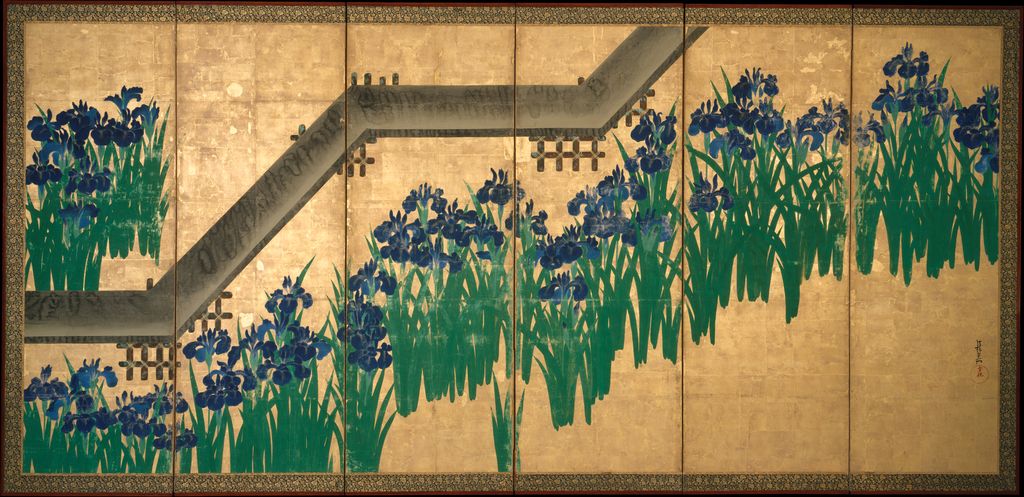
One screen from the Met’s Irises at Yatsuhashi, after 1709, 53.7.1, .2. This is not the Nezu Museum’s National Treasure. Met object image.
 by Tom Gurney
Tom Gurney BSc (Hons) is an art history expert with over 20 years experience. Updated September 24, 2026.
Introduction
Two sets of blue irises stand against gold. One pair leaves the bridge out. In the other, a dark, angled bridge crosses the flowers and seems to change the speed of the whole design. Both are by Ogata Kōrin, both draw on the same place in The Tales of Ise, and both consist of two six-panel folding screens. They are different works, held by different museums, made at different points in the artist's career. The Nezu Museum's National Treasure Irises [1] is its collection number 10301. The Metropolitan Museum's Irises at Yatsuhashi (Eight Bridges) [2] is 53.7.1 and 53.7.2, dated after 1709. Confusing the pairs changes the argument one can make about Kōrin's development as well as the ownership and rights of the image in front of the reader.
This page invites a close comparison. It first establishes what each holding institution actually records. It then follows the poem and place behind the irises, asks what an omitted or painted bridge does to a folding screen, and tests how the design moved into lacquer. The images of the Met pair come from that museum's Open Access object record; the Nezu pair is deliberately represented by a linked, text-led object card because a research image on the museum's site is not an automatic licence for republication. The Kōrin biography supplies the textile-household, Kyoto and Edo chronology; the artist home places the iris screens beside other media.
Contents
- Introduction
- Keep the two screen pairs distinct
- A poem, a place and an absent traveller
- The Nezu National Treasure: a bridge withheld
- The Met pair: a bridge enters the screen
- What changes when the pairs are compared?
- The Yatsuhashi writing box: a design on a thing one opens
- Looking closely at the rights-cleared screens
- Look inside the Met pair
- From Kōrin to later Rinpa
- How to use this comparison
Two pairs at a glance
- Holding and exact recordNezu Museum: Irises / 燕子花図屏風: Nezu Museum 10301 [1]; National Treasure
Met: Irises at Yatsuhashi / 八橋図屏風: Met 53.7.1, .2 [2] - ObjectNezu Museum: Irises / 燕子花図屏風: Pair of six-panel folding screens
Met: Irises at Yatsuhashi / 八橋図屏風: Pair of six-panel folding screens - Recorded dateNezu Museum: Irises / 燕子花図屏風: Edo period, eighteenth century; Nezu interprets it as a peak in Kōrin's mid-forties
Met: Irises at Yatsuhashi / 八橋図屏風: After 1709 in the Met catalogue - Size of each painted imageNezu Museum: Irises / 燕子花図屏風: 151.2 × 358.8 cm
Met: Irises at Yatsuhashi / 八橋図屏風: 163.7 × 352.4 cm - BridgeNezu Museum: Irises / 燕子花図屏風: Absent from the painting
Met: Irises at Yatsuhashi / 八橋図屏風: Angular bridge painted across the composition - Colour and groundNezu Museum: Irises / 燕子花図屏風: Nezu identifies azurite blue and malachite green against gold
Met: Irises at Yatsuhashi / 八橋図屏風: Met records ink and colour on gold leaf on paper; its exact pigments require its own technical evidence - Production-image status for this pageNezu Museum: Irises / 燕子花図屏風: Research record linked; Nezu photograph not copied
Met: Irises at Yatsuhashi / 八橋図屏風: Public-domain Open Access images of both screens, with accession and source link
Keep the two screen pairs distinct
Open the Nezu record for its own photographs. The displayed screen images belong to a different Met pair.
Nezu: bridge absent
National Treasure Irises, Nezu Museum 10301. Pair of six-panel screens, each 151.2 × 358.8 cm. The bridge is absent from the flowers and gold. Its photographs are not reproduced here; inspect both on the holding museum’s record.
Met: bridge present
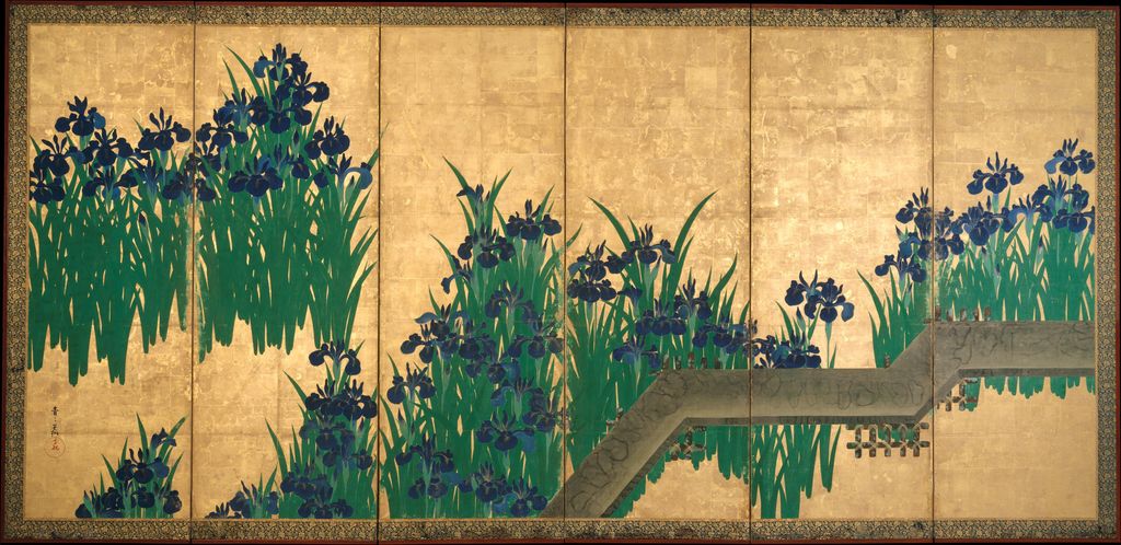
Irises at Yatsuhashi, Met 53.7.1, .2, after 1709. Pair of six-panel screens; each painted image 163.7 × 352.4 cm. Both images below belong to this pair.
A poem, a place and an absent traveller
The literary starting point is episode 9 of The Tales of Ise, often called the eastward journey. At Yatsuhashi in old Mikawa Province, a traveller and his companions stop where water divides into channels crossed by a sequence of bridges. Irises prompt a poem about a journey and the longing attached to familiar clothing and people left behind. The beginning sounds of its five lines form ka-ki-tsu-ba-ta, the Japanese name of the flower. The Met's object essay [2] sets out that connection, including a translation by John T. Carpenter; the Nezu object account [1] also points to the episode. The artist has not painted the travelling poet, the companions or written lines of verse onto the screens. Instead, flowers—and, in the later pair, the bridge—ask a viewer familiar with the text to supply the story.
The geographic name is a clue, not a photographic address. “Eight Bridges” gives the episode its famous setting, but an eighteenth-century folding screen does not document the exact construction of a tenth-century crossing. A bridge repeated in gold-screen painting can stand for the literary Yatsuhashi without being a survey of Mikawa. Equally, the first pair's omission of planks does not make it a generic flower study detached from Ise. Nezu explains the connection even though no bridge appears. Its gallery account of Kōrin and Kenzan [5] expressly notes that the earlier Irises may be understood as taking the step of removing the bridge from an already recognisable Yatsuhashi motif.
This is a form of visual shorthand, but shorthand need not be simple. For a viewer without the poem, there are magnificent flowers. For a viewer who knows the wordplay, even a screen without a bridge may imply the place, its river and the absent traveller. The difference between what is shown and what is recalled is therefore part of the pleasure of looking. That reading is an inference from the paintings and the museum's stated literary source; it is not a surviving declaration by Kōrin that he wanted every viewer to react in the same way.
The Nezu National Treasure: a bridge withheld
The Nezu pair, 10301 [1], carries clusters of irises across a completely gold ground. The museum records each screen at 151.2 centimetres high and 358.8 centimetres across and describes shades of blue azurite and green malachite. Those measurements belong to the Nezu screens, not to the Met pair. The gold field provides no painted riverbank or horizon to explain exactly where the plants grow. The eye has to move among upright leaves, rounder petals, intervals and folds. A title or a remembered poem supplies Yatsuhashi; the painted object itself keeps the bridge out of view.
Nezu's own close description resists a common shortcut: the work is not simply an early graphic pattern. It observes the contrast and balance between the left and right screens, rhythmic placement of flower clusters, some repeated use of a stencil, and full, swelling petals produced through pigment handling. A repeated outline can impose rhythm while local decisions of brush and colour keep flowers from becoming identical signs. The museum's 2018 gallery note [5] calls the pair a first artistic summit of Kōrin's mid-forties, combining designed structure with vigorous material paint. Its English exhibition account [6] likewise places it early in a painting career that began relatively late.
It is tempting to call the screens “modern” because of the isolated motif and unbroken ground. That can help a present-day reader notice their economy, but it can also erase their literary and material setting. The costly blue, green and gold, the six-fold format, and the relation to a courtly poem all mattered before graphic design became a modern occupation. Nezu's colour exhibition [7] identifies azurite and malachite in its pair and situates this palette within a longer East Asian blue-green-and-gold tradition. The flower is neither just a botanical specimen nor merely a free-floating decorative emblem. Its visual force depends on the mixture of cultivated reference, costly material and the bodies of the screens.
The painted fold is crucial. A pair of screens can close, turn at different angles and change the reflections from gold leaf as a viewer moves. A reproduction on a single flat page preserves relative positions but cannot recover every change in light and spacing. The right and left halves do not work like interchangeable posters: their groupings and intervals form a carefully staged relation. Nezu's catalogue description notes the planned contrast between the two sides. A digital study should therefore identify each screen and offer the pair together rather than treat one isolated iris cluster as the entire National Treasure. Because this site does not have permission to republish the Nezu photograph, the exact museum record [1] is the place to inspect both official images.
The question of a patron is equally delicate. Nezu suggests that lavish, high-quality pigments point toward a wealthy customer, which is a reasoned inference from materials. Its collection record does not turn that inference into a named contract. Nothing in the blue paint identifies who paid, where the screens first stood or on which day Kōrin completed them. The institutional date, eighteenth century, and the curator's mid-forties interpretation should be kept in their proper evidential places. The later Met date should not be copied backwards onto the Nezu work just because both depict irises.
The Met pair: a bridge enters the screen
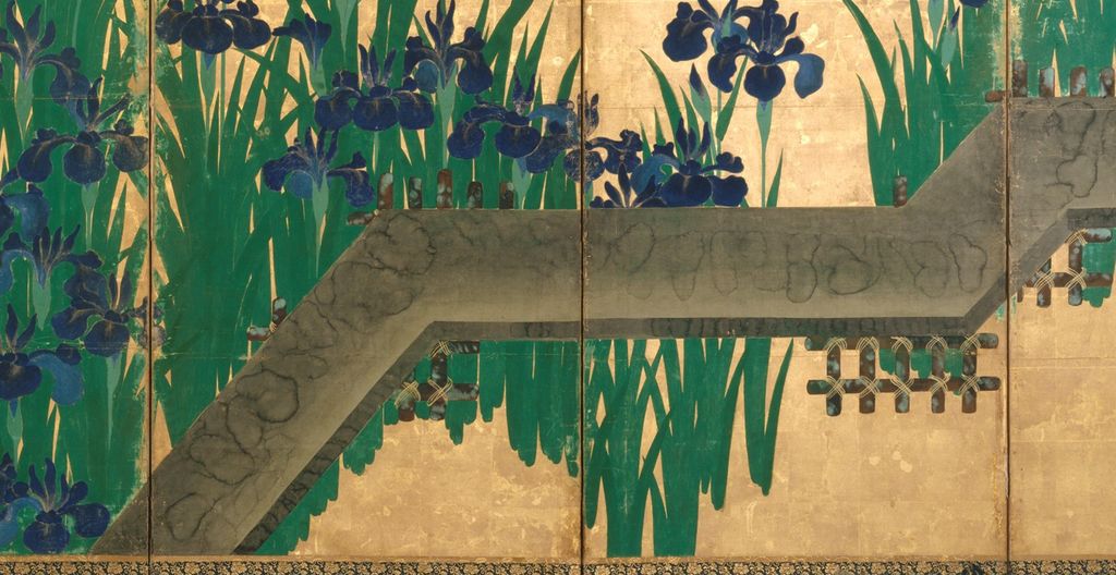
The Metropolitan Museum dates 53.7.1, .2 [2] after 1709 and catalogues a pair of six-panel folding screens, ink and colour on gold leaf on paper. Each painted image is 163.7 centimetres high and 352.4 centimetres wide. The museum purchased the pair in 1953 with the Louisa Eldridge McBurney Gift. It is the Met's Irises at Yatsuhashi, also known by the Japanese title Yatsuhashi zu byōbu. Both accession numbers belong to this one pair: one number for each screen. The screen photographs used here have been traced to that exact object, not to the earlier Nezu National Treasure.
Against the same broad family of gold and irises, planks now cross the surface diagonally. The Met says the angular bridge sweeps across both screens and makes the literary reference explicit. Its older exhibition description [8] points out that the work reduces narrative particulars while organising the flowers and bridge into an asymmetrical, cohesive design. One can follow a step-by-step looking path: a mass of leaves arrests the eye; a dark bridge segment cuts it; another segment carries the gaze across a fold; a new cluster resumes the upright rhythm. The visual claim here is modest: the bridge introduces changes of direction and texture that are absent from the Nezu photograph. It does not prove what Kōrin privately thought about his earlier pair.
Nezu's 2012 exhibition comparing the works [3] says Kōrin painted the same subject in the same six-panel-pair format more than a decade apart. That event reunited the two pairs for exhibition after a long separation; its published checklist [4] gives separate entries for the Nezu and Met works. The exhibition is unusually useful for chronology because a holding museum compares the exact objects rather than generic reproductions. Yet “more than a decade” is an institutional estimate of their separation, not a dated diary entry for each painted panel. This page therefore retains Nezu's broader eighteenth-century label and the Met's after-1709 label alongside the comparison.
The bridge is sometimes described as lightning-like. Nezu's 2012 account uses that image for the diagonal arrangement and notes tarashikomi on the painted bridge, the wet-on-wet technique associated with varied pools and edges of colour. It suggests Kōrin sought a new composition through geometry and differing surface effects. That museum interpretation can guide looking without making a remote web JPEG a substitute for technical examination. We can mark where a bridge segment meets foliage in a rights-cleared Met image and ask what happens to the rhythm. We should not diagnose a pigment or reconstruct a sequence of brushstrokes from compression artefacts in a 1,024-pixel derivative.
The same caution applies to blue. The Met's published conservation bibliography [9] lists a 2014 study by Marco Leona and colleagues on Kōrin's technical choices and a 2016 Leona–Jennifer Perry study called “Beneath the Blue.” Their existence is worth recording, and the conservation question is directly relevant. The full studies have not been consulted for this manuscript, so the page makes no specific claim about layers or chemical constituents from them. Nezu's azurite-and-malachite statement applies to Nezu 10301. The Met's basic catalogue wording—ink and colour on gold leaf—applies to Met 53.7.1, .2. Keeping the two material records separate is a useful discipline for any future annotation.
What changes when the pairs are compared?
The comparison is strongest when made across several precise questions. First is the bridge: absent in Nezu 10301, present across the Met pair. Second is timing: Nezu associates its work with an early artistic peak and dates the object broadly to the eighteenth century; the Met says after 1709. Third is scale: both are imposing six-fold pairs but their recorded painted dimensions differ. Fourth is display: the fold makes clusters and plank angles shift with a viewer's position. Fifth is evidence: one museum identifies exact blue and green mineral pigments for its screens, while a separate technical literature exists for the other. A comparison table or selector should preserve these differences even when a simplified verbal title says “Kōrin's Irises.”
The relation between flower and story also changes. The Nezu pair appears to ask the informed viewer to supply more of Yatsuhashi from memory; the Met pair presents planks as a visible prompt. That is an interpretation of viewing, not a known order of Kōrin's thoughts. We cannot infer that he “corrected” the first version by adding an object that had been missing. The Nezu 2012 text [3] instead stresses Kōrin's exploration of a familiar subject across time and surface. Both versions work on their own terms. Their shared motif makes formal comparison possible; their different objects and dates make the comparison historically meaningful.
There is no need to force a winner. The Nezu pair's open gold may make the flower groups seem to float. The Met bridge introduces a firm path and dark intervals. Blue and green answer the gold differently where the bridge cuts through them. The Nezu record's mention of stencil repetition and the Met's bridge technique may suggest different ways to discuss making, but they are not symmetrical laboratory reports. The most honest interactive feature presents “bridge absent” and “bridge present” as object labels, gives each holding and accession, and allows a reader to toggle a short list of observable differences. The Nezu card links out to its official images; the Met card can display two cleared screen photographs locally.
The Yatsuhashi writing box: a design on a thing one opens
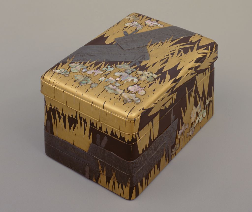
Tokyo National Museum's Writing Box with the Eight-Plank Bridge [10], H-86, carries the motif into a different kind of object. The museum lists it as a National Treasure by Kōrin, eighteenth century. Its materials include lacquered wood, maki-e, lead and mother-of-pearl. The Kyoto National Museum's Rinpa exhibition [12] describes the unusual form of the box, the bold use of lead and cut shell, and a design that alludes to the Ise episode through irises and planks. The ColBase object photograph [11] gives this page a rights-cleared view of the actual Tokyo object. It is credited to ColBase, linked and disclosed as resized for web display.
A writing box cannot be read like a flat screen. A person approaches the lid, sees the bridge run onto the sides, opens the upper tier and encounters writing implements. The same literary cue—irises plus bridge—turns around corners and enters the handling of an object associated with writing. That gives a concrete connection to a poem without proving that the box was commissioned for a particular reading of The Tales of Ise. Tokyo National Museum's gallery note [13] describes the box as a project bringing together different makers under Kōrin's direction. That account is a useful correction to the notion that every technical part of a lacquer object came from one painter's hand.
The writing box also helps explain why “Rinpa” cannot be reduced to the look of gold screens. Across the screens and lacquer, the subject has a vocabulary: blue floral clusters, long green leaves, a zigzag path, precious reflective surfaces and an allusion carried by a small set of signs. Those ingredients change with the object. On a screen, viewing distance and folds matter. On a box, edge, lid, shell and the act of opening matter. This page should show the box as a related National Treasure in its own card, not slip its photograph into the Met screen pair or imply that it reproduces the Nezu painting.
Looking closely at the rights-cleared screens
Look inside the Met pair
Choose a numbered point, read its explanation below, then select the detail image to enlarge it. Crops come from retained Met originals.
12345Bridge enters the flowers
A plank breaks the upright rhythm of leaves, then a flower group resumes it beyond a fold.
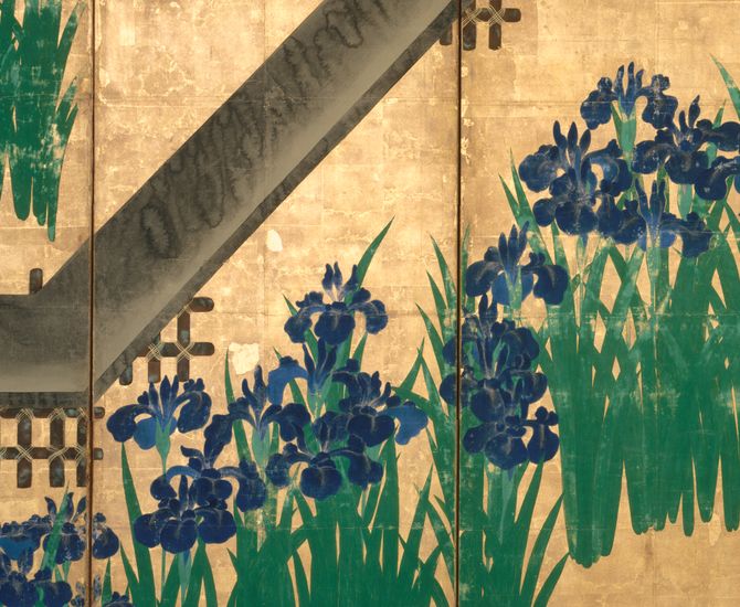
Angle across a fold
The plank changes direction around a screen fold; the dark bridge is not a flat line across a poster.
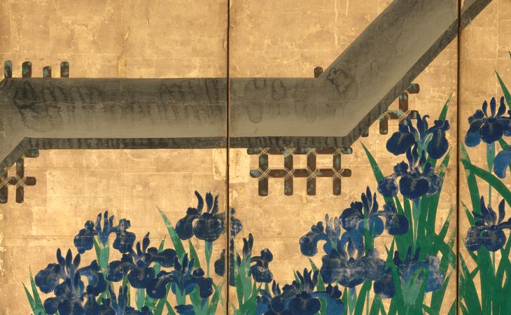
A dense flower group
Several blue blossoms sit above sharply rising green leaves; this concentration balances distant open gold.
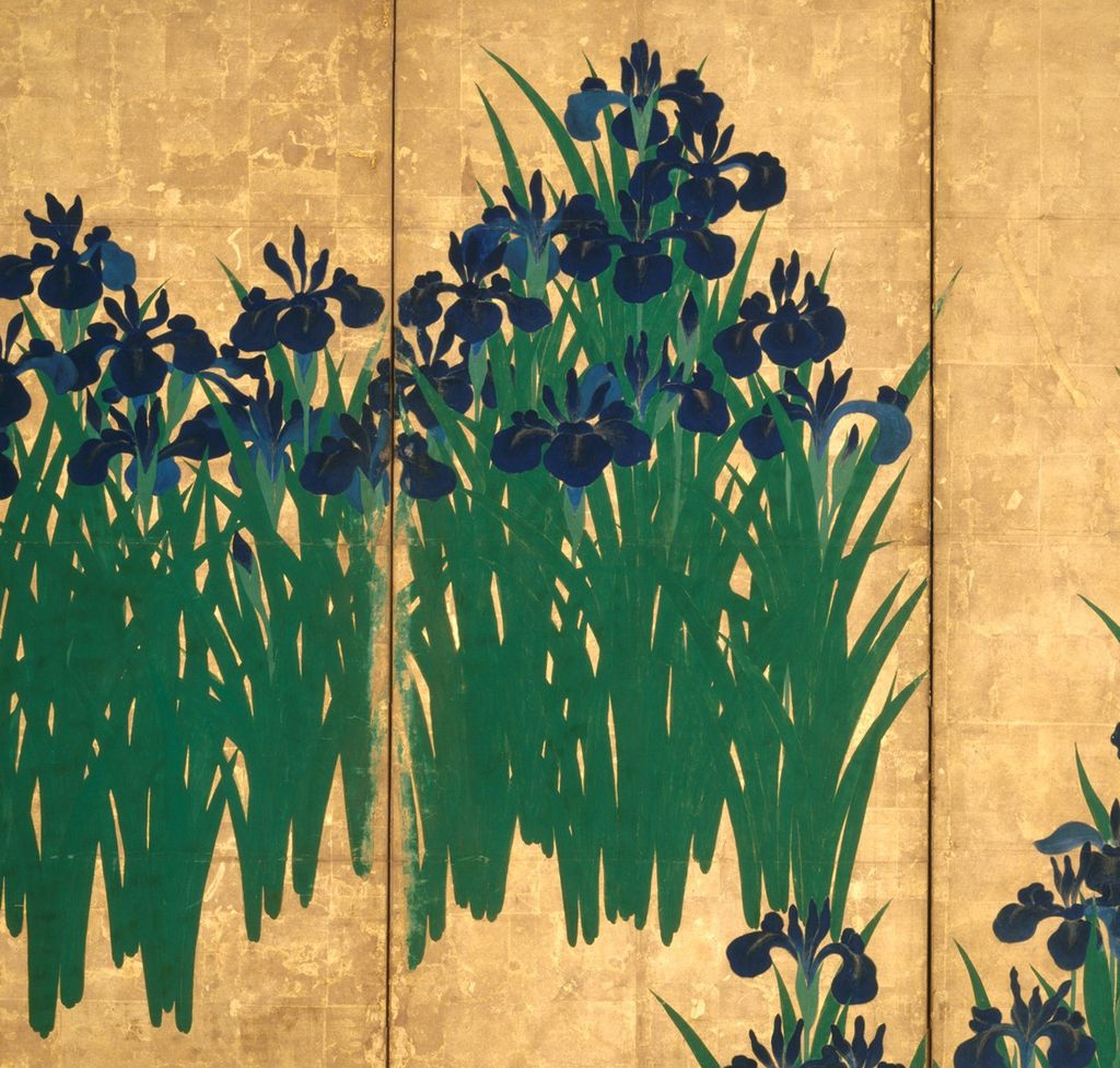
Bridge and leaves
The low bridge crosses a mass of leaves; ornamental pattern and a suggested route meet.
Gold as an interval
Gold between separate clumps is an active spacing device, not a photographed river or empty wall.
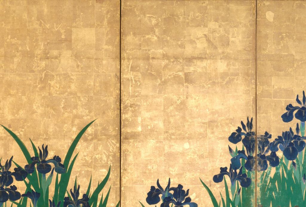
All annotated views and crops belong to Met 53.7.1, .2, a different object from Nezu 10301. Met object record.
The annotated view in this page is based on a retained high-resolution source for the Met pair. Its numbered points identify visible structure: where the bridge enters a cluster, where a fold interrupts its angle, where flower groups vary their density, and where gold remains an active interval rather than empty background. Each detail crop is derived from the original museum file and opens at a larger size. The annotations are editorial observations; the object record remains the authority for artist, title, date, dimensions, medium and accession. The work is not labelled Nezu's National Treasure anywhere in that module.
An image has limits as evidence. The two source files used for the cleared overview are of different pixel dimensions and may reflect distinct photographic processing. A brighter blue in one screen photograph need not mean that Kōrin mixed it differently from its companion. A seam, crease or dark patch may belong to paper, paint, later mounting, conservation or light. The annotated points focus on large-scale composition visible in both the image and catalogue; they do not attribute a visible mark to a particular workshop action without an examined technical source. The site retains the original files and prepares 1,024-pixel-wide JPEG derivatives at quality 80 and 144 dpi for ordinary web display.
For the bridge-free pair, the most reliable viewing path remains the Nezu Museum's two official photographs [1]. The linked card makes the limitation plain rather than presenting a substituted Met image. A reader can take the comparison questions back to that exact institutional record. This also models a way to use Japanese museum scholarship fully while respecting its image terms. Scholarship and production rights are two separate records, and both deserve care.
From Kōrin to later Rinpa
Before following the later followers, it helps to place the two pairs in Kōrin's own working life without making them illustrate a simplistic before-and-after story. The Nezu Museum's age-of-Kōrin exhibition [6] calls the bridge-free screens a first peak for a painter who began professionally in his thirties. His luxury-textile upbringing helps explain why repeatable motifs and fine materials were familiar, but no surviving Nezu record says he took a particular stencil directly from a Kariganeya garment. In 1704 he travelled from Kyoto to Edo, and the Met dates its bridge-bearing pair after his return around 1709. The Kōrin biography treats that journey through Tokyo National Museum's Fuyuki Kosode and other exact objects. Its chronology makes it reasonable to ask whether an older artist revisited a favourite motif after working in a different city. It does not license an unsupported story that travel alone caused the bridge to appear.
Kyoto's art world also complicates the label of solitary invention. The Kyoto National Museum's Rinpa exhibition [12] places the Ogata brothers in a city of makers, clients and luxurious surfaces, with visual and literary practices crossing painting, calligraphy, ceramics and lacquer. A screen pair large enough to shape a room required paper, gold, frame and mounting as well as the named painter's design. The Tokyo National Museum's account of H-86 [13] is even more explicit that a master-led lacquer project drew together specialists. It would be wrong to flatten that coordinated labour into an anonymous “workshop style,” just as it would be wrong to claim to identify every unnamed hand. The screen and the box are signed or attributed under Kōrin's name; their materials also invite questions about making beyond the brush.
There is a useful distinction between motif, composition and object. The motif is irises at Yatsuhashi, a subject a viewer could recognise from Ise. The composition is the particular allocation of those irises, gold and, where present, the bridge across folds. The object is a pair of constructed screens that can be stored, opened and viewed in changing light, or a lidded box that can be handled. If we say only that Kōrin “repeated the iris motif,” we lose what is different about the Met pair. If we say only that he “added a bridge,” we lose the changes in intervals and the way a dark form now guides the eye. If we say only that the box shares the pattern, we miss how the path crosses lid and side. The two museums' exact records make all three levels available for comparison.
One can test these levels with a practical looking exercise. On the Met overview [2], begin at the dense green group nearest a plank. Follow the diagonal until the screen fold interrupts the contour, then find the next upright leaf group. The bridge can make the gap between plants feel like space to be crossed. Now inspect the Nezu pair [1] on its own website. With no painted crossing, the eye can move by the alternation of blue blossom, green leaf and gold interval. This does not establish one mandatory route for every spectator: folding screens invite bodily movement. It gives the reader a concrete way to notice that Kōrin could vary the same literary place by changing a few large relationships.
Published scholarship can take that test further. The Met's conservation bibliography [9] identifies the 2014 chapter “Designing Nature: Ogata Kōrin's Technical Choices in Irises at Yatsuhashi” by Leona, Londero, Perry, Fukunaga, Bailey and Hale, and the 2016 “Beneath the Blue” article by Leona and Perry. A reader with access to those full publications could investigate what microscopic examination, imaging and pigment analysis reveal about this Met object. This page records the precise leads but does not borrow their conclusions from their titles. The question is especially important because a whole-screen JPEG cannot show the same evidence as an examined paint surface. Similarly, the Nezu Museum's catalogue wording about its own pigments remains the authority for that different pair. The need for two separate technical conversations is a consequence of there being two physical objects, not a pedantic obstacle to enjoying them.
The place called Yatsuhashi has a history beyond the paintings as well. The Tales of Ise gives it emotional force through a journey away from the capital, a pause at water and the poem's play on the flower's name. The Kyoto exhibition describes this Mikawa episode as one of Kōrin's favoured themes and notes its appearance in the writing box. The screens do not need a painted traveller to keep the journey present, because the poem's setting would already have been familiar to educated viewers. At the same time, a modern international reader may first see only an exquisite flower. Explaining the literary reference opens another layer rather than declaring that the visual beauty was merely a puzzle to be solved. Kōrin's restraint in both pairs—no cast of actors, no explanatory caption in the painted field—leaves room for both experiences.
The iris subject did not end with Kōrin's two screen pairs. The Nezu Museum's later exhibition on Kōrin followers [14] displays an iris pair by Watanabe Shikō and describes how its all-gold setting and single floral motif connect to Kōrin while more explicit flower structure marks the later painter's choices. The comparison shows reception through another object, not an identical copy. The Met's Rinpa account [15] places Sakai Hōitsu's Kōrin hyakuzu in 1815, with later sequel volumes in 1826, long after Kōrin's death in 1716. Such publications helped later artists and readers form a lineage around Kōrin's designs. Calling the original screen pair “Rinpa” is useful today; it should not be mistaken for proof that a formal, continuously run “Rinpa school” commissioned them in the early eighteenth century.
The history of the two pairs after Kōrin is part of their meaning too. The Nezu National Treasure now belongs to a Tokyo collection with a detailed Japanese record and repeated exhibitions; the Met pair entered a New York collection in 1953. Nezu's 2012 comparison exhibition [3] brought the pair of pairs together for viewers and published a checklist that makes their separate identities unusually clear. Today a reader may meet them on two websites, in different languages, with different photographic rights. The task of a bilingual art page is to reconnect their questions while keeping each physical object, owner, catalogue number and permission statement intact.
How to use this comparison
Start with Nezu's collection record for Irises [1] and inspect its two official screen images. Notice the flower groups and the lack of a bridge. Return to this page and select the Met's two Irises at Yatsuhashi screens [2]. Watch how the angular planks alter the route your eye takes through the irises. Then look at the Tokyo National Museum writing box [10] and ask what changes when the path moves over a lid and sides. The answer is not a single slogan about Kōrin's “style.” It is a more exact account of how one literary place could be made present through omission, painted structure and a handled object.
The objects establish what can be known; looking supplies questions. We know the separate holdings, formats, material descriptions, recorded dimensions and stated dates. We can see a bridge absent, a bridge painted and a bridge carried around lacquer. We can infer that each makes a familiar Ise place present in a different way. We cannot name the Nezu screens' original purchaser from the pigments alone, recover every intended response of a first audience, or claim results from technical articles we have not read. Those distinctions make the two pairs more interesting, because they allow the specific choices preserved in each work to come into view.
Reader insights and discussion
Choose an exact Kōrin object and share how its fold, material or open space shapes your view.
Reader Insights
How does the literary place change when the bridge is visible in one pair but absent in the other?
What does water do in the crane drawings compared with Rough Waves?
How does a bridge change when it moves from a screen to a lacquer box?
Join the Conversation
Include the museum accession that prompted your observation.
References
- Nezu Museum, National Treasure Irises, collection 10301. Exact holding, dimensions, material description, stanza source, stencil observation and object identity.
- Metropolitan Museum of Art, Irises at Yatsuhashi, 53.7.1, .2. Exact later pair, date, medium, dimensions, literary episode and Open Access images.
- Nezu Museum, KORIN exhibition of the two iris pairs, 2012. Direct institutional comparison, chronology and tarashikomi observation.
- Nezu Museum, bilingual 2012 exhibition checklist. Separate object entries for Nezu and Met pairs.
- Nezu Museum, gallery discussion of Kōrin and Kenzan. Earlier Nezu pair, bridge omission and early career interpretation.
- Nezu Museum, Irises Screens: The Age of Kōrin. English museum interpretation of the earlier pair.
- Nezu Museum, Irises: The Allure of Color. Nezu's azurite, malachite and gold account; the scheduled 2020 exhibition was cancelled, but the published institutional explanation is cited for its object description.
- Metropolitan Museum of Art, 2003 Yatsuhashi exhibition description. Earlier curatorial reading of literary allusion and composition.
- Metropolitan Museum of Art, East Asian painting conservation bibliography. Bibliographic records for 2014 and 2016 technical studies; full findings are not claimed.
- Tokyo National Museum, Yatsuhashi writing box H-86. Exact National Treasure, lacquer object and material.
- ColBase, writing box H-86. Exact production-image source, with local resizing disclosed.
- Kyoto National Museum, 2015 Rinpa exhibition. Yatsuhashi motif across screens and lacquer; Kyoto luxury-making context.
- Tokyo National Museum, lacquer-gallery note. Collaborative making of the box under Kōrin's direction.
- Nezu Museum, 2025 exhibition on Kōrin followers. Watanabe Shikō's later iris screens as a distinct reception object.
- Metropolitan Museum of Art, Rinpa experience of nature. Hōitsu's later Kōrin hyakuzu publication chronology.
- Metropolitan Museum of Art, Designing Nature, John T. Carpenter, 2012. Verified catalogue for the book-recommendation module; not cited as if read in full.
- ColBase official reuse FAQ. Reuse, credit and disclosure for altered ColBase files.
