 by Tom Gurney
Tom Gurney BSc (Hons) is an art history expert with over 20 years experience
Published on June 19, 2020 / Updated on October 27, 2026
Email: tomgurney1@gmail.com / Phone: +44 7429 011000
Summit of the Sierras: Introduction
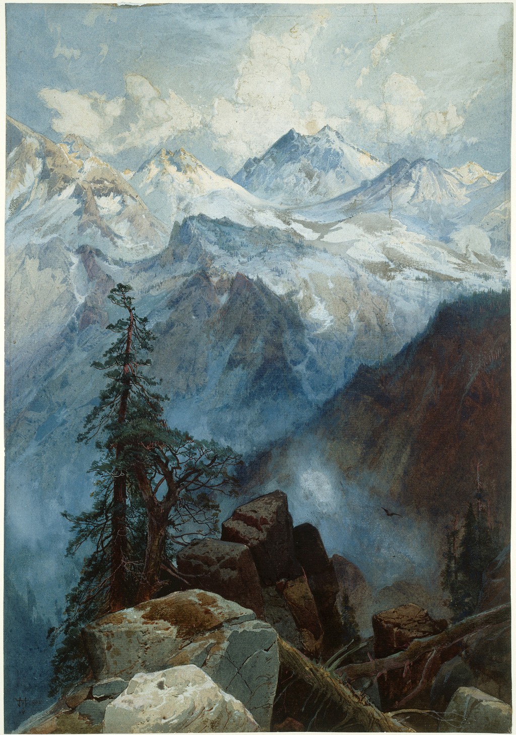
Thomas Moran's Summit of the Sierras at the Art Institute of Chicago is a work on paper, made in gouache over graphite. The museum dates it 1872/75. Its upright composition brings a dark foreground tree into relation with a far brighter mountain landscape, where snow, cloud and distance are closely intertwined. [1]
The picture's title also appears in records of Prang chromolithographs. Those prints helped a mountain image reach viewers beyond the original sheet. Keeping the paper work and printed versions distinct makes it possible to appreciate both Moran's arrangement and the history of its reproduction.
At a Glance
- ArtistThomas Moran
- TitleSummit of the Sierras
- Date1872/75, as catalogued by the Art Institute of Chicago
- MediumGouache over graphite on cream laid paper
- Dimensions36 × 25 cm
- CollectionArt Institute of Chicago
- Object number1965.852
- CreditGift of Mrs. Byron Harvey
- Related printSummit of the Sierra Nevada, 1875, Amon Carter Museum
- Portfolio contextPrang's western portfolio, issued 1876
Where this work sits in Moran’s career
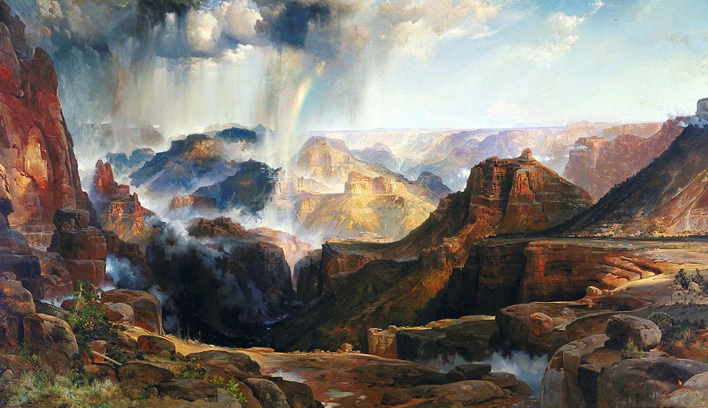
The Chasm of the Colorado
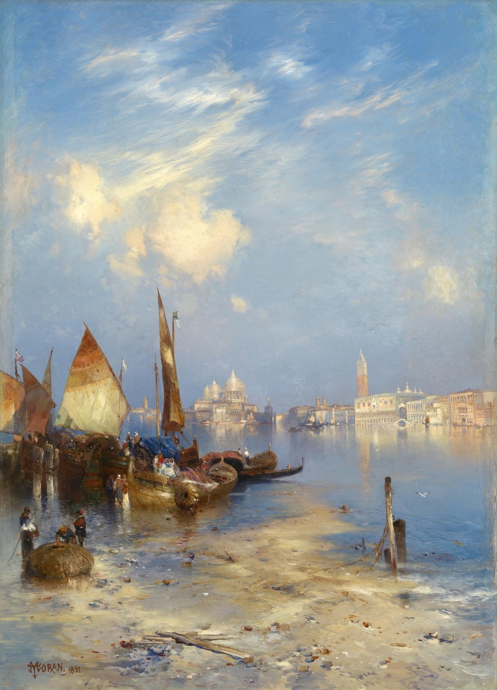
1873–1874; completed in 1874A View of Venice
1891Point Lobos, Monterey, California
1912, signed and datedSummit of the Sierras
1872/75, as catalogued by the Art Institute of ChicagoContents
- The Art Institute's paper work
- A tree as a measure of distance
- Pale rocks and the foreground threshold
- Snow, cloud and the light beyond
- What the date 1872/75 tells us
- The chromolithographs
- Prang's portfolio and a railway audience
- Mountain pictures and changing formats
The Art Institute's paper work
The museum's authoritative object record specifies cream laid paper as the support, with gouache over graphite. This identifies a small, upright paper work rather than an oil painting on canvas. The sheet measures 36 × 25 cm and entered the collection as the gift of Mrs. Byron Harvey. [1]
Gouache and graphite are different parts of the recorded construction. The medium description allows for drawing beneath the painted image, but does not provide a complete account of every stage in its making. It is unnecessary to invent a particular sequence of washes or a pigment recipe to recognise the finished arrangement.
The composition has a striking division between near and far. Dark trees and rough ground occupy the lower and left-hand areas. Snowy peaks and luminous atmosphere open beyond them. The foreground supplies a place from which the eye can enter the picture, while the brighter distance offers its principal destination.
The mountain does not fill the whole sheet from edge to edge. Its appearance depends on intervals of haze and sky, and on darker forms around it. That relationship is essential to the sense of elevation. The peaks seem remote because the picture provides a nearer world against which to measure them.
Annotated Details from Summit of the Sierras
Compare these details with the full composition. The numbered overview and crops come from the same original image.
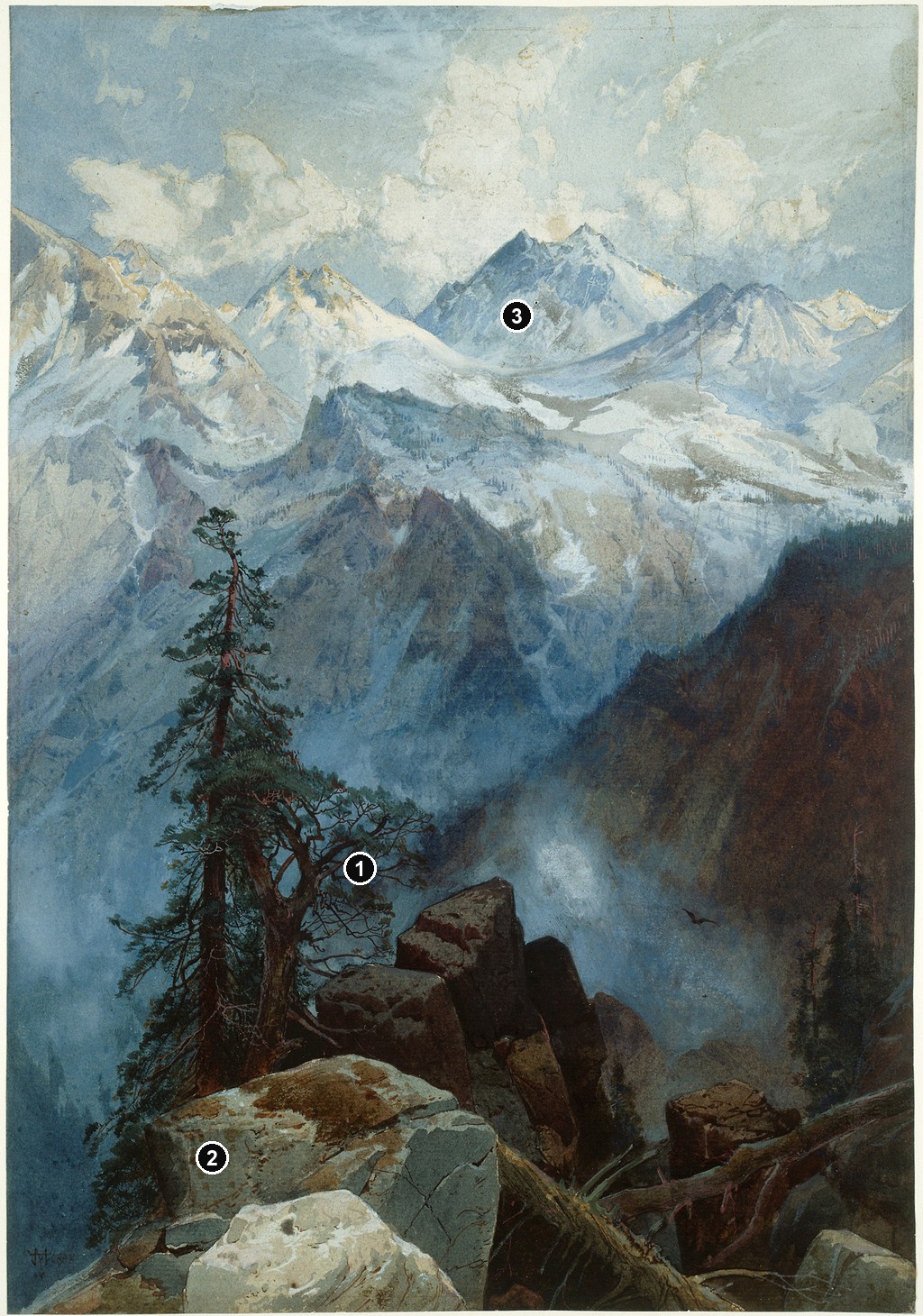
Details from SUMMIT OF THE SIERRAS
Open a detail to see it more closely.
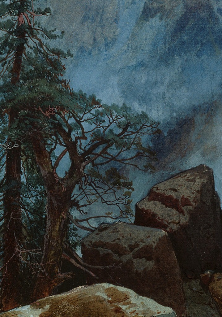
A tree as a measure of distance
A tall conifer rises on the left. Its silhouette is irregular, with branches extending by different amounts rather than forming a perfectly symmetrical triangle. Some branches stand sharply against the light; others meet darker passages and become less distinct. The tree gains character through those uneven changes in visibility.
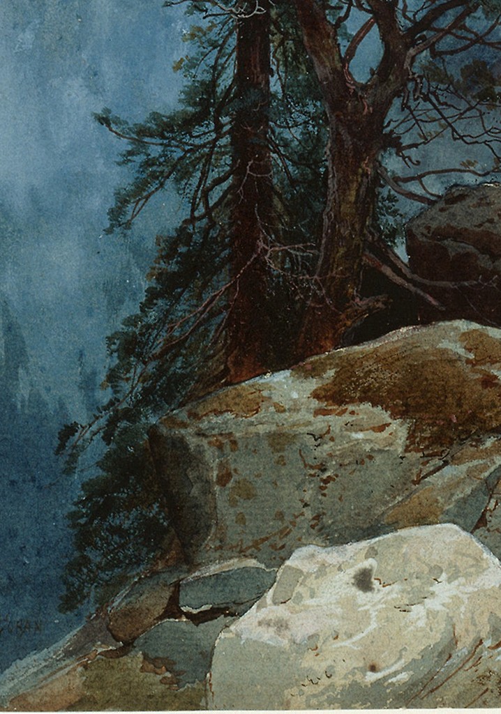
Pale rocks and the foreground threshold
Light-coloured rocks occupy the lower part of the image. Their broken edges and changes of plane give the foreground a rough texture. Pale surfaces catch the light, while darker gaps separate them. They form a passage into the picture without becoming a smooth, inviting path.
Snow, cloud and the light beyond
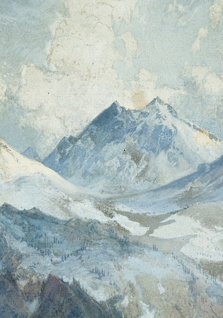
The far peaks have jagged profiles, but their internal surfaces are less consistently defined than the tree and foreground rocks. Cool blue passages lie beside pale snow and light atmosphere. At several points, mountain and cloud approach one another in colour. Their boundaries require attention rather than announcing themselves with equal force everywhere.
A tree as a measure of distance
A tall conifer rises on the left. Its silhouette is irregular, with branches extending by different amounts rather than forming a perfectly symmetrical triangle. Some branches stand sharply against the light; others meet darker passages and become less distinct. The tree gains character through those uneven changes in visibility.
Its trunk carries attention upwards from the lower ground. That upward movement prepares the eye for the peaks beyond, but also contrasts with them. The tree is dark, comparatively close and structurally legible. The mountains are pale and separated from us by atmosphere. Their relationship makes the distance more convincing than either form would alone.
The highest branches also interrupt the mountain view. They prevent the distant landscape from becoming a simple picture inside a clear window. We look past something substantial. That partial obstruction places the spectator within the nearer terrain, making the view feel discovered from a particular position.
On the right, a darker wooded slope answers the tree's weight without repeating its silhouette exactly. It provides a lower boundary to the brighter space. Between these darker areas, the distance has room to expand. The composition is framed through unequal forms, which keeps its balance from feeling mechanically arranged.
Pale rocks and the foreground threshold
Light-coloured rocks occupy the lower part of the image. Their broken edges and changes of plane give the foreground a rough texture. Pale surfaces catch the light, while darker gaps separate them. They form a passage into the picture without becoming a smooth, inviting path.
Fallen branches introduce narrower lines across that rocky area. These lines differ from the broad surfaces of stone and from the upright movement of the standing tree. They create another scale of detail. Close to the spectator, the landscape has small interruptions and irregularities before it opens into much larger forms.
The shift from rocks to depth is not equally clear everywhere. Some edges remain emphatic; other passages merge into darker ground or haze. Moran selects where the foreground should hold attention and where the eye should be allowed to continue. A fully uniform description would make every part compete at the same level.
The foreground therefore acts as a threshold. It gives enough physical detail to suggest a place underfoot, then allows the eye to move beyond it. We experience the mountain as something seen from rough terrain. The arrangement retains an awareness of the viewer's position while directing attention towards an expansive distance.
Snow, cloud and the light beyond
The far peaks have jagged profiles, but their internal surfaces are less consistently defined than the tree and foreground rocks. Cool blue passages lie beside pale snow and light atmosphere. At several points, mountain and cloud approach one another in colour. Their boundaries require attention rather than announcing themselves with equal force everywhere.
This changing clarity makes the distance feel active. Some peaks appear through the light more firmly than others. The spectator follows a crest, loses part of it, then finds another sharper edge. The mountains seem extensive because the picture allows their forms to continue beyond what can be immediately separated.
The brightest passages do not belong solely to the highest summit. Light spreads through the upper atmosphere and across the snowy forms. That distribution joins sky and land. It also prevents the picture from becoming merely a dark frame around one isolated white point.
A small flying bird is visible towards the right of the middle distance. Its dark mark occupies a much lighter passage and introduces a brief sense of movement. It is not necessary to identify a species for the shape to matter. Against the vast landscape, its smallness makes the surrounding interval feel larger.
What the date 1872/75 tells us
The Art Institute retains the date 1872/75. That notation should accompany this specific paper work. It should not be silently reduced to the single year 1875 because a related print bears that date, or turned into a detailed story of continuous painting over several years without additional evidence. [1]
An artwork's date and a print's date answer different questions. One concerns the original work's catalogued identity; the other concerns a separately manufactured object. A publication may follow a design while giving it another format, title variant or physical support. The shared subject connects the objects without making their records interchangeable.
The same care applies to the title. “Sierras” and “Sierra Nevada” appear in the related museum records. Those variations help trace the mountain subject's circulation. They do not identify a securely documented summit or exact viewing station by themselves. The image can be appreciated as a structured mountain view without assigning every peak a name.
Watch: Thomas Moran
Choose a film to explore the artist’s work, its interpretation and its wider setting.
The painting that inspired a National Park
A close discussion of Moran’s landscape and its relationship to the idea of Yellowstone.
Watch on YouTubeThe chromolithographs
The Amon Carter Museum records Summit of the Sierra Nevada, dated 1875, as a chromolithograph. Its accession is 1971.59.5. The museum also records a verso inscription using the title Summit of the Sierras, Nevada. These are particulars of the print, not alternative medium descriptions for the Art Institute sheet. [2]
The Stark Museum holds a further chromolithograph on paper, Summit of the Sierras, Nevada, dated 1875. Its record names L. Prang & Co. as lithographer and publisher. Together, the museum records demonstrate the subject's existence as a printed image and identify surviving impressions with their own collection histories. [3]
Chromolithography made colour part of the reproduced image. The finished print was a manufactured object, with work by the publisher and its lithographic specialists as well as Moran's design behind it. Calling it simply a watercolour would erase that distinction. Calling the original sheet a print would lose its different material character.
These records support a comparison of object types, dates and titles. A detailed claim about changes in particular colours would require direct examination of the relevant impressions. The important starting point is that the original paper work and a chromolithograph can carry a closely connected subject while remaining different physical objects.
Prang's portfolio and a railway audience
The National Gallery's catalogue places the design within Prang's western publishing project. The portfolio was issued in 1876 and comprised fifteen chromolithographs from specially prepared watercolours. Individual print dates of 1875 and the portfolio's 1876 issue date therefore describe different parts of the publication history. [4]
The accompanying historical text, transcribed in the catalogue, compares the Sierra Nevada with the European Alps and describes the view as familiar to travellers on the Central Pacific Railroad. It also discusses forests, snow, mist and lakes. This shows the kinds of associations offered to the print's original audience.
The railway reference makes the scenery part of a changing experience of travel. Readers could relate a reproduced mountain view to landscapes encountered along a route. It does not, by itself, establish that Moran painted the Art Institute sheet from a train or at one precisely identifiable railway stop.
The nineteenth-century geological explanations in that text belong to their historical setting. Their value here is in showing how the publication interpreted its mountain subject. The picture supplies a different kind of encounter: visible relationships of tree, rock, light and atmosphere that can still be examined without adopting every period scientific claim.
Mountain pictures and changing formats
Tower Falls, Yellowstone provides a useful comparison in paper. Its upright rock study brings a warm tower close to the spectator, with water below. Summit of the Sierras gives much greater visual importance to a pale mountain distance beyond nearer vegetation. A similar format supports a different distribution of attention.
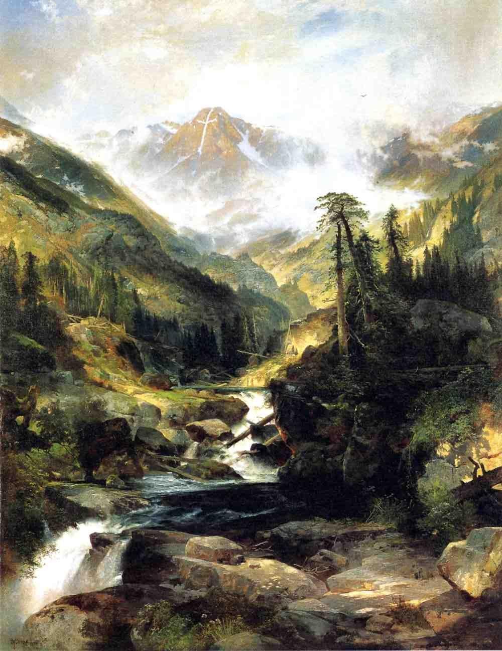
Moran's Mountain of the Holy Cross offers another balance between near and far. Its celebrated mountain feature carries a more specific name and symbolic association. The Sierra sheet asks us to follow a broader interaction among peaks, haze and the tree in front of them. Its effect develops through several forms working together.
The picture also belongs to the wider story of Moran's watercolours and prints. A work could have the intimacy of a small sheet while supporting a much wider published life. Looking closely at this original keeps both experiences in view: the near tree and rocks anchor our position, while the snowy distance invites attention beyond them.
Artworks directory
Selected documented works and distinct versions. This directory is not a comprehensive catalogue raisonné. Dates and media retain the distinctions explained in the articles and museum records.
| Name | Date | Medium |
|---|---|---|
| An Arizona Sunset near the Grand Canyon | Date not securely established | Oil painting |
| Autumn Afternoon, the Wissahickon by Thomas Moran | 1864 | Oil on canvas |
| Cascade Falls, Yosemite | Commonly catalogued as 1905 | Catalogued as oil on canvas |
| The Chasm of the Colorado | 1873–1874; completed in 1874 | Oil on canvas, currently mounted on aluminium |
| Children of the Mountain | 1866 in the current museum title; 1867 in the 1997 National Gallery catalogue | Oil on canvas |
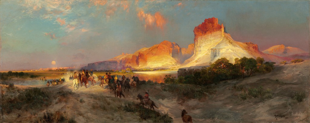
| Cliffs of Green River | 1874 | Oil on canvas |
| Cliffs of the Upper Colorado River, Wyoming Territory | 1882 | Oil on canvas |
| East Hampton, Long Island , also captioned Easthampton, L.I | 1897 | Oil on canvas laid on board, according to the reproduction record |
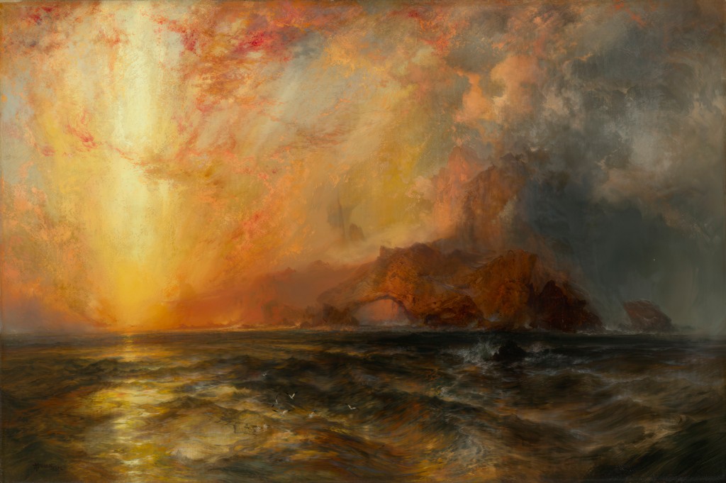
| Fiercely the red sun descending, Burned his way along the heavens | 1875–76 | Oil on canvas |
| Forest Scene | 1870 | Oil on canvas |
| Grand Canyon of the Colorado River | 1892 and 1908 | Oil on canvas |
| Green River Cliffs, Wyoming | 1881 | Oil on canvas |
| Green River, Wyoming | 1878 | Oil on panel |
| The Juniata, Evening | 1864 | Oil on canvas |
| Mosquito Trail, Rocky Mountains of Colorado | 1875 in the 1997 National Gallery exhibition catalogue | Watercolour |
| Mountain of the Holy Cross | 1875 | Oil on canvas |
| The Much Resounding Sea | 1884 | Oil on canvas |
| Point Lobos, Monterey, California | 1912, signed and dated | Oil on canvas |
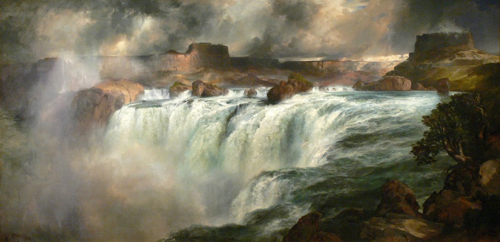
| Shoshone Falls on the Snake River | 1900 | Oil on canvas |
| Summit of the Sierras | 1872/75, as catalogued by the Art Institute of Chicago | Gouache over graphite on cream laid paper |
| The Teton Range | 1897 | Oil on canvas |
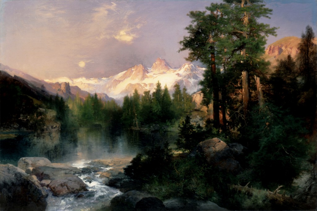
| The Three Tetons | 1895 | Oil on canvas |
| Tower Falls, Yellowstone | 1872 | Watercolour and gouache over graphite on blue laid paper |
| A View of Venice | 1891 | Oil on canvas |
| The Grand Canyon of the Yellowstone | 1872 | Oil on canvas, currently recorded as mounted on aluminium |
| Mountain of the Holy Cross, Colorado (etching) | 1888 | Etching, roulette and aquatint |
| The Resounding Sea (etching) | 1880 | Etching |
| The Much Resounding Sea (later etching) | 1886 in heading; 1888 on plate | Etching, drypoint and roulette |
| Tower Falls (Prang print) | c. 1875; portfolio issued 1876 | Chromolithograph |
| Shoshone Falls (early watercolour) | 1874 | Watercolour |
| Venice (watercolour) | 1888 | Watercolour over graphite |
Frequently Asked Questions
The Art Institute work is gouache over graphite on cream laid paper.
The Art Institute of Chicago catalogues it as 1872/75.
36 × 25 cm; 1965.852.
They are separately catalogued chromolithographs. Their dates should be distinguished from the original paper work's date and the portfolio's 1876 issue date.
The records identify the Sierra mountain subject but do not securely establish every peak or an exact viewing station.
Discussion
Follow the left tree's silhouette upwards, then trace a distant snowy ridge. Which edges stay clear, and which become difficult to separate from their surroundings?
Reader Insights
Editorial prompts for close looking and discussion.
Follow the left tree's silhouette upwards, then trace a distant snowy ridge. Which edges stay clear, and which become difficult to separate from their surroundings?
Which source or image helps you assess the interpretation?
How does this page compare with the related works linked above?
Join the Conversation
Share your reading of this page below.
References
- Art Institute of Chicago, Summit of the Sierras, authoritative object record, 1872/75, 1965.852.
- Amon Carter Museum of American Art, Summit of the Sierra Nevada, 1875, chromolithograph, 1971.59.5.
- Stark Museum of Art, Summit of the Sierras, Nevada, 1875, chromolithograph, 11.132.1.M.
- Nancy K. Anderson and contributors, Thomas Moran, 1997, selected Prang discussion, pp. 318–319, and appendix transcription, “The Summit of the Sierras”, p. 345.
- Splash image source.
Summit of the Sierras, 1872/75, gouache over graphite on cream laid paper. Art Institute of Chicago, Gift of Mrs. Byron Harvey, 1965.852. Image source. Public Domain Mark; faithful reproduction; AIC record is_public_domain true. Resized only; complete source image retained.
- Splash image source.
Summit of the Sierras, 1872/75, gouache over graphite on cream laid paper. Art Institute of Chicago, Gift of Mrs. Byron Harvey, 1965.852. Image source. Public Domain Mark; faithful reproduction; AIC record is_public_domain true. Numbered circles added to the overview; details cropped from the original reproduction. No colour adjustment or sharpening.
- Splash image source.
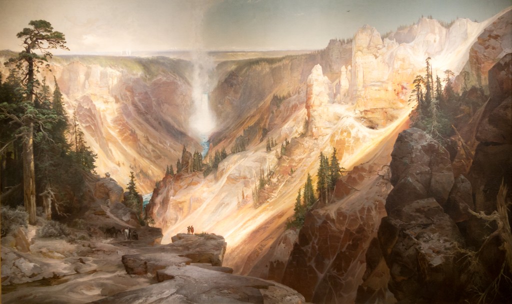
The Grand Canyon of the Yellowstone, 1872. Wuselig / Wikimedia Commons, CC BY-SA 4.0; U.S. Department of the Interior Museum painting. Image source. CC BY-SA 4.0; also marked PD-Art. Outer museum frame cropped; resized. Painted composition retained; photographic perspective unchanged. This image derivative is available under the same licence.
- Splash image source.
The Chasm of the Colorado, 1873–1874. U.S. Department of the Interior Museum; faithful reproduction via Smithsonian American Art Museum / Wikimedia Commons. Image source. Public Domain Mark; faithful two-dimensional reproduction. Resized only; complete source image retained.
- Splash image source.
Mountain of the Holy Cross, 1875. Autry Museum of the American West; faithful reproduction via Wikimedia Commons. Image source. Public Domain Mark; faithful two-dimensional reproduction. Resized only; complete source image retained.
- Splash image source.
Shoshone Falls on the Snake River, 1900. Wolfgang Sauber / Wikimedia Commons, CC BY-SA 3.0; Gilcrease Museum painting. Image source. CC BY-SA 3.0; also marked PD-Art. Resized only; complete source image retained. This image derivative is available under the same licence.
- Splash image source.
Green River Cliffs, Wyoming, 1881. National Gallery of Art, Gift of the Milligan and Thomson Families. Image source. Public domain; NGA Open Access. Resized only; complete source image retained.
- Splash image source.
A View of Venice, 1891. Smithsonian American Art Museum, Transfer from the U.S. Department of the Interior, National Park Service, 1968.120.1. Image source. Free to use; Smithsonian Open Access. Resized only; complete source image retained.
- Splash image source.
The Three Tetons, 1895. The White House Collection, Gift of C. R. Smith; faithful reproduction via Wikimedia Commons. Image source. Public Domain Mark; faithful reproduction of a two-dimensional public-domain work. Resized only; complete source image retained.