 by Tom Gurney
Tom Gurney BSc (Hons) is an art history expert with over 20 years experience
Published on June 19, 2020 / Updated on October 27, 2026
Email: tomgurney1@gmail.com / Phone: +44 7429 011000
Thomas Moran Prints: Introduction
Thomas Moran's prints belong to several kinds of artistic work. He supplied designs that professional engravers and printers reproduced, and he also worked directly in lithography and etching. A coloured western panorama, a magazine illustration and an etched seascape may all carry his name, but that name does not necessarily describe the same role in their production.
Thomas P. Bruhn's printmaking chapter in the 1997 Moran catalogue makes this distinction central. Joni L. Kinsey's publishing study adds the commercial settings in which images circulated. Together, they reveal a career involving original graphic work, reproduction, collaboration and changing audiences, rather than a small appendix to the famous oils. [1]
At a Glance
- Principal distinctionsDesigned by Moran; made as a print by Moran; reproduced, printed or published by others
- TechniquesLithography, etching and related tonal methods; wood engraving and chromolithography in reproductive projects
- Selected worksTower Falls and Sulphur Mountain, Mountain of the Holy Cross, Colorado, The Resounding Sea and the later Much Resounding Sea print
- Publishing landmarkLouis Prang's 1876 western portfolio
- Related artistMary Nimmo Moran, a separately recognised landscape etcher
- Related pagesDrawings and Watercolours
Contents
- An original print and a reproduced image
- An education connected with printmaking
- Lithography and early experiment
- A design changing on its way to publication
- Prang's printed colour
- Mountain of the Holy Cross in graphic form
- The Resounding Sea of 1880
- The later Much Resounding Sea print
- Plates, impressions and changes
- Looking beyond the main image
An original print and a reproduced image
The word print identifies an object produced through a printing process, but leaves important questions unanswered. Who conceived the image? Who worked on its printing surface? Who printed the particular sheet? Who published it? A record can name different people in those roles, and each contribution belongs to the object's history.
A wood engraving after a Moran design should therefore not automatically be described as a block he carved. His drawing could provide the composition while another specialist translated it into an engraved surface. Likewise, a chromolithograph after a watercolour is a printed colour image, not paint applied by Moran to that individual sheet.
An etching made by Moran offers another relationship with authorship. The artist's work on the plate participates directly in the graphic image. That image can still repeat a subject explored in painting. Originality in the print medium does not require the artist never to have represented the scene elsewhere.
These distinctions allow different kinds of achievement to be appreciated. A reproductive image can communicate a landscape to a large audience; an artist's own etched marks can create a particular graphic experience. Treating them accurately need not turn the two into a simple ranking of valuable and unimportant work.
An education connected with printmaking
Bruhn places Moran's early graphic interests beside his Philadelphia engraving apprenticeship and his study of prints after other artists. Turner was important within that education. Printed images made another painter's arrangements of light, distance and atmosphere available for repeated examination, even before Moran encountered the original paintings. [1]
That relationship suggests a useful way to look at Moran's own graphic work. In a monochrome image, illumination has to emerge through differences in marks and tone. A pale opening may depend on darker surroundings; a distant form may be lightly indicated while a nearer mass receives stronger definition. Colour's absence does not remove the possibility of atmosphere.
Printmaking also asks an artist to think about the relation between an image and its circulation. A design can be encountered in a book or magazine, or studied as a separate sheet. The same landscape subject takes on different settings when it enters a publication beside text or becomes an object viewed on its own.
Lithography and early experiment
Bruhn identifies lithography as Moran's principal sustained print activity in the 1860s. His study also discusses early experiments in etching and cliché-verre. In the latter, a drawn image on a transparent surface serves as a photographic negative. Its printing involves light-sensitive paper, distinguishing it from an etched metal plate. [1]
The variety matters more than treating every early experiment as a step towards one inevitable technique. Different processes offered different relations between drawing, tone and reproduction. Moran's graphic practice developed through several possibilities, some of which remained less widely circulated than his later etchings.
The lithographs also complicate the idea that his interest in dramatic nature began only with Yellowstone. Bruhn discusses Solitude and Desolation, both associated with the late 1860s, as significant examples. Their existence places ambitious graphic landscapes before the western journey that made Moran nationally prominent. [1]
A design changing on its way to publication
Kevin J. Avery's study of Colburn's Butte traces a notebook image, a watercolour, a graphite-and-ink-wash design and a wood engraving published in The Aldine. The developed arrangement introduces a rider and stronger atmospheric emphasis. Avery reconstructs a sequence of decisions rather than identifying a simple, unchanged transfer from observation to print. [2]
The case demonstrates why the intervening design deserves attention. A figure can provide scale, trees can frame the principal rock and clouds can increase the contrast around its summit. These changes affect how a magazine reader encounters the subject. They are compositional choices, not merely incidental consequences of losing colour.
The final print also belongs to the magazine's setting. It could bring a western formation before readers who would never stand in front of it. The image offered a visual encounter through a published object, while its surviving preparatory material reveals that the encounter had been deliberately organised.
Prang's printed colour
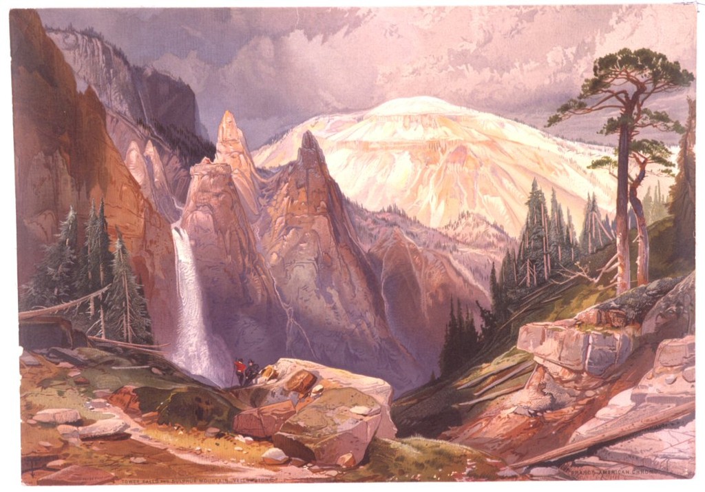
Louis Prang's 1876 portfolio contained fifteen chromolithographs after Moran's watercolours. Its full title names Yellowstone and mountain regions of Idaho, Nevada, Colorado and Utah. The publication therefore extends beyond the park, and its coloured prints should be distinguished from the painted sheets made for the project. [1]
The Library of Congress record identifies Tower Falls and Sulphur Mountain, Yellowstone as a Prang chromolithograph dated circa 1875. That date belongs to the separately catalogued print; the major portfolio's issue is 1876. Both are different from the NGA's 1872 coloured sheet Tower at Tower Falls. [3]
The printed view offers a broader setting for the waterfall than the upright NGA rock-formation image. The distinction gives a reader something more useful than a general statement that Moran represented Tower Falls repeatedly. The works organise related features differently and reach their viewers through different physical objects.
A chromolithograph can preserve an extensive range of colour relationships while remaining a reproductive work. Its achievement involves the printed translation of those relationships. Recognising the publisher and process keeps the original artist's contribution visible alongside the additional labour that made the image available to purchasers.
Mountain of the Holy Cross in graphic form
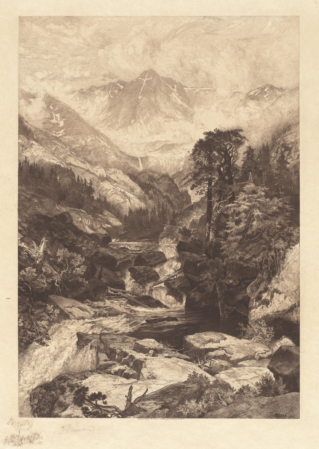
The NGA records Mountain of the Holy Cross, Colorado, dated 1888, as etching, roulette and aquatint in brown on wove paper. It is a separate print from Moran's 1875 oil. Its material label identifies several methods contributing to one impression, rather than a photograph of the earlier painting. [4]
The image leads from a rocky foreground and descending water towards the distant snow-marked mountain. A large dark tree occupies the right, while pale ridges and clouds open behind it. The cross remains visible on the mountain because lighter snow interrupts the darker face. Recognition depends on a relation of tone within the print.
The foreground has many closely spaced marks. They give rocks, vegetation and water different kinds of texture. Farther into the image, lighter passages reduce the density of information. This contrast helps create depth without requiring a separate colour for every level of distance.
The named combination of techniques should not encourage a guessed map of where each was used. The museum record establishes that they are present; the reproduction shows their combined visual effect. Its most evident achievement is the organisation of dark near forms and a much lighter mountain distance within a coherent upright field.
The comparison with the oil painting also reveals how a familiar subject can sustain a different encounter. Coloured rock and atmospheric illumination in the canvas give way to graphic marks and tonal contrasts. The snow formation can remain a clear destination while the route towards it changes in medium and texture.
The Resounding Sea of 1880
The NGA's The Resounding Sea, catalogued as 1880, is an etching in black. Its illustrated impression is accession 2008.115.3594. A low, wide field contains a stormy sky, repeated waves and a shoreline on the right. Small vessels in the distance introduce human scale without displacing the sea. [5]
Curving lines follow the rise and fall of water. Denser marks give the hollows weight, while lighter crests break into more open passages. The spectator follows several stages of movement across the image, rather than encountering one wave as an isolated outline.
The sky uses a different rhythm. Long diagonal passages suggest unsettled weather, and darker cloud gathers above the breaking water. That change in direction distinguishes the atmosphere from the sea while making both part of one disturbed scene. The print can communicate force through the relations among its marks.
The small boat occupies only a modest area. Its clearer silhouette becomes visible against the much larger surrounding movement. A far vessel tilts near the horizon, but the print's principal action remains the waves themselves. Human vulnerability is suggested through scale and position rather than through a dominant foreground hero.
Watch: Thomas Moran
Choose a film to explore the artist’s work, its interpretation and its wider setting.
The painting that inspired a National Park
A close discussion of Moran’s landscape and its relationship to the idea of Yellowstone.
Watch on YouTube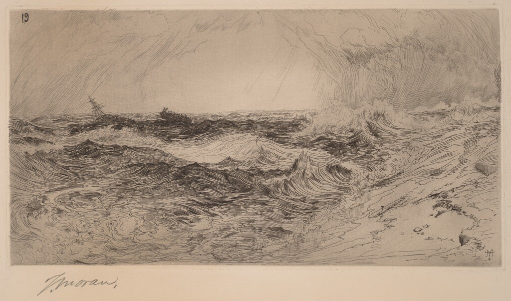
The later Much Resounding Sea print
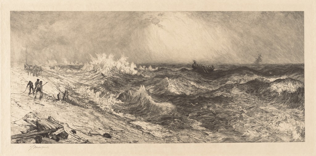
The larger Much Resounding Sea impression at the NGA is recorded as etching, drypoint and roulette on Japanese paper, accession 2002.98.166. Its heading gives 1886, while the museum records an 1888 plate inscription. Those dates should remain distinct until evidence explains their relationship; they do not justify inventing a particular printing-state history. [6]
Here the shore is on the left. People stand near a rope, and damaged-looking timber occupies the nearer beach. A boat rises among the waves farther right, with another vessel visible towards the horizon. These additions make the interaction between people and sea more explicit than in the earlier etching.
The arrangement also gives water a stronger intervening role. The viewer looks from the inhabited shore towards the boat through successive crests. Dark troughs and bright foam separate one raised passage from the next. Distance is experienced as a series of obstacles, not simply as an open stretch between land and horizon.
The figures remain small beside the waves. Their presence gives the movement possible consequences, but they do not make the sea a background decoration. The rope, boats and broken wood introduce purposeful human forms into a field whose curves and disturbances do not follow their geometry.
This print is also distinct from the 1884 oil The Much Resounding Sea. The oil uses colour and a comparatively narrow shore; the later print develops a more explicit narrative through its figures and equipment. A shared title connects the works without making their compositions or material identities the same. [7]
Plates, impressions and changes
A plate and an impression are different things. The plate supplies the surface from which an image is printed; an impression is an individual sheet made from it. Altering the plate can change subsequent images, while a collection record identifies the particular impression held by that institution.
Bruhn's discussion of Harlech Castle—Wales traces reworking with roulette between recorded states. This supplies a documented example of a print whose tonal effect changed. It should not be transferred without evidence to every other sheet, or used to resolve the later sea print's dating automatically. [1]
That care also applies to signatures and numbers. A mark visible in an image may be part of the printed plate or an inscription added to the sheet. Museum records can distinguish them. A number near the corner does not, by appearance alone, establish an edition size, printing order or state.
Looking beyond the main image
The illustrated Holy Cross impression includes more than the large rectangular mountain scene. Below it, a small animal and vegetation appear towards the left margin, with a signature farther across the sheet. Their position outside the main field distinguishes them from the forest, rocks and stream within the landscape.
These surrounding details change the way the object is encountered. The extensive mountain view is one part of a sheet that also carries marks associated with its graphic identity. Attention can move from the principal composition to a much smaller image without treating both as features situated within the same depicted place.
The sea impressions similarly include signatures below their main fields. Looking only at a tightly bounded picture would miss that surrounding information. A complete view of the sheet helps the spectator distinguish composition, margin and inscription before consulting the museum record for their particular identities.
Mary Nimmo Moran and separate authorship
Mary Nimmo Moran had her own professional recognition as a landscape etcher. The Smithsonian profile records her election to the New York Etching Club in 1879 and the London Painters-Etchers Society in 1881. Her work belongs to the family's graphic history, but should not be absorbed into Thomas's output. [8]
The NGA's record for the 1886 American Art Association catalogue of Thomas Moran sale credits both Thomas and Mary. It describes a bound volume containing eight etchings in black on wove paper. The collection entry supplies joint attribution; it does not by itself assign the individual plates or establish an equal division between the artists. [9]
The example shows why a familiar surname is insufficient for attribution. A publication can involve two named artists, and an individual print can have its own maker and publisher. Reading those distinctions preserves Mary's work as well as Thomas's, while allowing their shared professional setting to remain visible.
How to look at a Moran print
Begin with the whole image and its strongest contrast. In the Holy Cross print, the eye moves between the dark foreground and pale mountain; in the sea prints, repeated crests distribute attention sideways. Notice how marks create that route before concentrating on the identities of every minor form.
Then read the object label closely. Date, medium, accession and named roles tell you which work and which impression you are looking at. When comparing a print with a watercolour or oil, identify a changed format, a newly prominent figure or a different area of light. Resemblance becomes more informative when it is accompanied by clear object identities.
Moran's graphic work rewards this sustained attention. It could carry colour into publication, translate a landscape into etched marks or introduce a familiar subject through a changed arrangement. The print is both a means of circulation and an image whose own surface, scale and structure deserve to be seen.
Selected print impressions
These are separately documented museum or library impressions, with their own materials and dates.
Artworks directory
Selected documented works and distinct versions. This directory is not a comprehensive catalogue raisonné. Dates and media retain the distinctions explained in the articles and museum records.
| Name | Date | Medium |
|---|---|---|
| An Arizona Sunset near the Grand Canyon | Date not securely established | Oil painting |
| Autumn Afternoon, the Wissahickon by Thomas Moran | 1864 | Oil on canvas |
| Cascade Falls, Yosemite | Commonly catalogued as 1905 | Catalogued as oil on canvas |
| The Chasm of the Colorado | 1873–1874; completed in 1874 | Oil on canvas, currently mounted on aluminium |
| Children of the Mountain | 1866 in the current museum title; 1867 in the 1997 National Gallery catalogue | Oil on canvas |
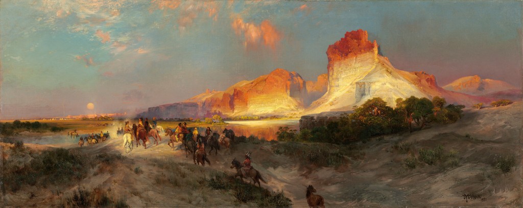
| Cliffs of Green River | 1874 | Oil on canvas |
| Cliffs of the Upper Colorado River, Wyoming Territory | 1882 | Oil on canvas |
| East Hampton, Long Island , also captioned Easthampton, L.I | 1897 | Oil on canvas laid on board, according to the reproduction record |
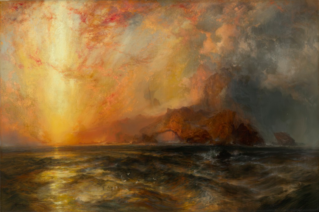
| Fiercely the red sun descending, Burned his way along the heavens | 1875–76 | Oil on canvas |
| Forest Scene | 1870 | Oil on canvas |
| Grand Canyon of the Colorado River | 1892 and 1908 | Oil on canvas |
| Green River Cliffs, Wyoming | 1881 | Oil on canvas |
| Green River, Wyoming | 1878 | Oil on panel |
| The Juniata, Evening | 1864 | Oil on canvas |
| Mosquito Trail, Rocky Mountains of Colorado | 1875 in the 1997 National Gallery exhibition catalogue | Watercolour |
| Mountain of the Holy Cross | 1875 | Oil on canvas |
| The Much Resounding Sea | 1884 | Oil on canvas |
| Point Lobos, Monterey, California | 1912, signed and dated | Oil on canvas |
| Shoshone Falls on the Snake River | 1900 | Oil on canvas |
| Summit of the Sierras | 1872/75, as catalogued by the Art Institute of Chicago | Gouache over graphite on cream laid paper |
| The Teton Range | 1897 | Oil on canvas |
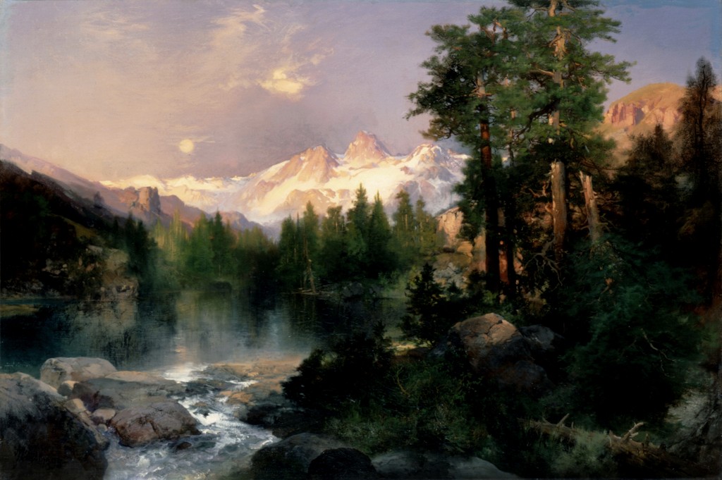
| The Three Tetons | 1895 | Oil on canvas |
| Tower Falls, Yellowstone | 1872 | Watercolour and gouache over graphite on blue laid paper |
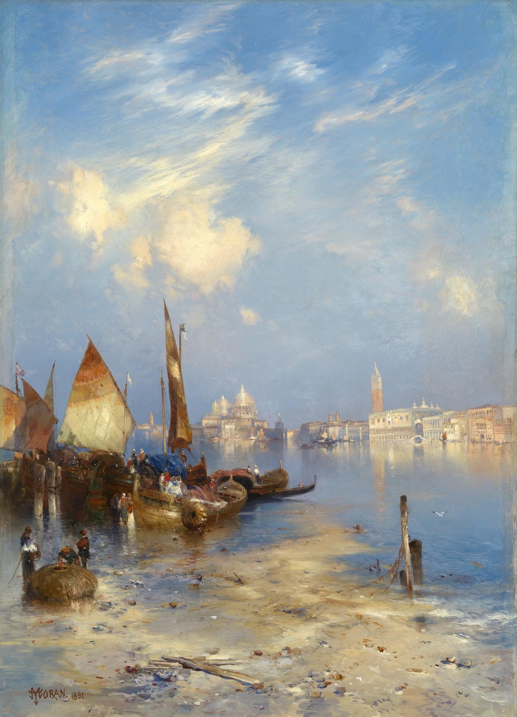
| A View of Venice | 1891 | Oil on canvas |
| The Grand Canyon of the Yellowstone | 1872 | Oil on canvas, currently recorded as mounted on aluminium |
| Mountain of the Holy Cross, Colorado (etching) | 1888 | Etching, roulette and aquatint |
| The Resounding Sea (etching) | 1880 | Etching |
| The Much Resounding Sea (later etching) | 1886 in heading; 1888 on plate | Etching, drypoint and roulette |
| Tower Falls (Prang print) | c. 1875; portfolio issued 1876 | Chromolithograph |
| Shoshone Falls (early watercolour) | 1874 | Watercolour |
| Venice (watercolour) | 1888 | Watercolour over graphite |
Frequently Asked Questions
No. He supplied designs reproduced by professional engravers and printers, as well as making original lithographs and etchings himself.
They are printed colour images after Moran's watercolours, with their own production and publication histories.
No. The earlier NGA Resounding Sea is catalogued as 1880; the larger later print contains a more explicit shore narrative and has separate records.
The museum gives 1886 as its heading date and records an 1888 plate inscription. The relationship is not resolved here by an invented state chronology.
Yes. She was independently recognised as a landscape etcher, and the NGA credits both artists in its record for the 1886 sale catalogue.
Discussion
Compare the two sea prints. How do the changed shore, figures and equipment affect your reading of the waves? Then compare the Holy Cross print with the oil: which effects depend most on colour, and which survive through tone and marks?
Reader Insights
Editorial prompts for close looking and discussion.
Compare the two sea prints. How do the changed shore, figures and equipment affect your reading of the waves?
Then compare the Holy Cross print with the oil: which effects depend most on colour, and which survive through tone and marks?
How does this page compare with the related works linked above?
Join the Conversation
Share your reading of this page below.
References
- Thomas P. Bruhn, “Printmaker of the First Rank”, and Joni L. Kinsey, “Moran and the Art of Publishing”, in Thomas Moran, 1997, selected printmaking discussion, pp. 282–297, and publishing discussion, pp. 300–304 and 318–319.
- Kevin J. Avery, Thomas Moran's Colburn's Butte, South Utah: Forgotten Landmark of a Lost Friendship, Metropolitan Museum Journal 44, 2009, selected image-development discussion.
- Library of Congress record reproduced at Wikimedia Commons, Tower Falls and Sulphur Mountain, Yellowstone, circa 1875, LC-USZC4-3246.
- National Gallery of Art, Mountain of the Holy Cross, Colorado, 1888, 2008.115.3589.
- National Gallery of Art, The Resounding Sea, 1880, 2008.115.3594.
- National Gallery of Art, The Much Resounding Sea, print record, 2002.98.166.
- National Gallery of Art, The Much Resounding Sea, 1884 oil, 1967.9.1.
- Smithsonian American Art Museum, Mary Nimmo Moran, artist profile, citing Peter Bermingham, 1975.
- National Gallery of Art, American Art Association catalogue of Thomas Moran sale, 1886, 2018.44.71.
- Splash image source.
Mountain of the Holy Cross, Colorado, 1888, etching, roulette and aquatint. National Gallery of Art, Reba and Dave Williams Collection, Gift of Reba and Dave Williams, 2008.115.3589. Image source. CC0 1.0. Resized only; complete source image retained.
- Splash image source.
Tower Falls and Sulphur Mountain, Yellowstone, chromolithograph, circa 1875. Thomas Moran / L. Prang & Co. / Library of Congress, LC-USZC4-3246. Image source. No known restrictions on publication; public-domain print. Resized only; complete source image retained.
- Splash image source.
The Resounding Sea, catalogued1880. Etching inblack. National Gallery of Art,2008.115.3594. National Gallery of Art / Reba and Dave Williams Collection, Gift of Reba and Dave Williams. Image source. Public domain; NGA Open Access, exactobjectmedia declaration. Resized only; complete source image retained.
- Splash image source.
The Much Resounding Sea, printcatalogued1886, with1888plateinscription recordedbymuseum. Etching,drypoint androulette onJapanese paper. NGA,2002.98.166. National Gallery of Art / Gift of Jacob Kainen. Image source. Public domain; NGA Open Access, exactobjectmedia declaration. Resized only; complete source image retained.
- Splash image source.
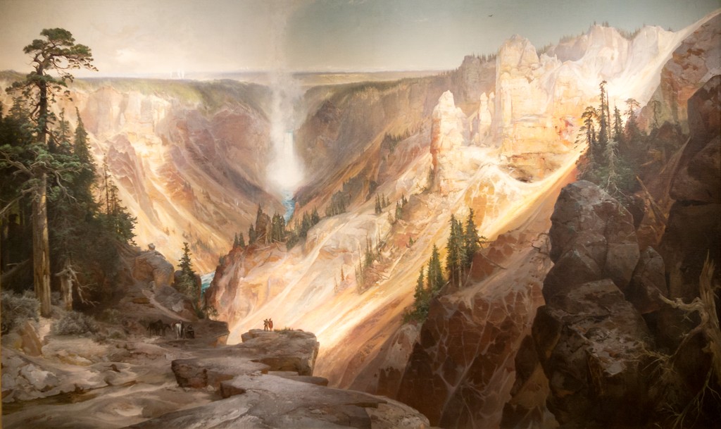
The Grand Canyon of the Yellowstone, 1872. Wuselig / Wikimedia Commons, CC BY-SA 4.0; U.S. Department of the Interior Museum painting. Image source. CC BY-SA 4.0; also marked PD-Art. Outer museum frame cropped; resized. Painted composition retained; photographic perspective unchanged. This image derivative is available under the same licence.
- Splash image source.
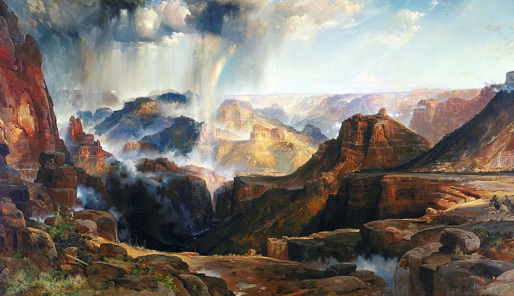
The Chasm of the Colorado, 1873–1874. U.S. Department of the Interior Museum; faithful reproduction via Smithsonian American Art Museum / Wikimedia Commons. Image source. Public Domain Mark; faithful two-dimensional reproduction. Resized only; complete source image retained.
- Splash image source.
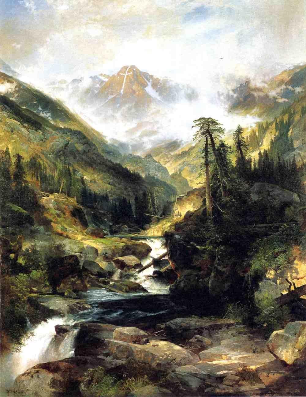
Mountain of the Holy Cross, 1875. Autry Museum of the American West; faithful reproduction via Wikimedia Commons. Image source. Public Domain Mark; faithful two-dimensional reproduction. Resized only; complete source image retained.
- Splash image source.
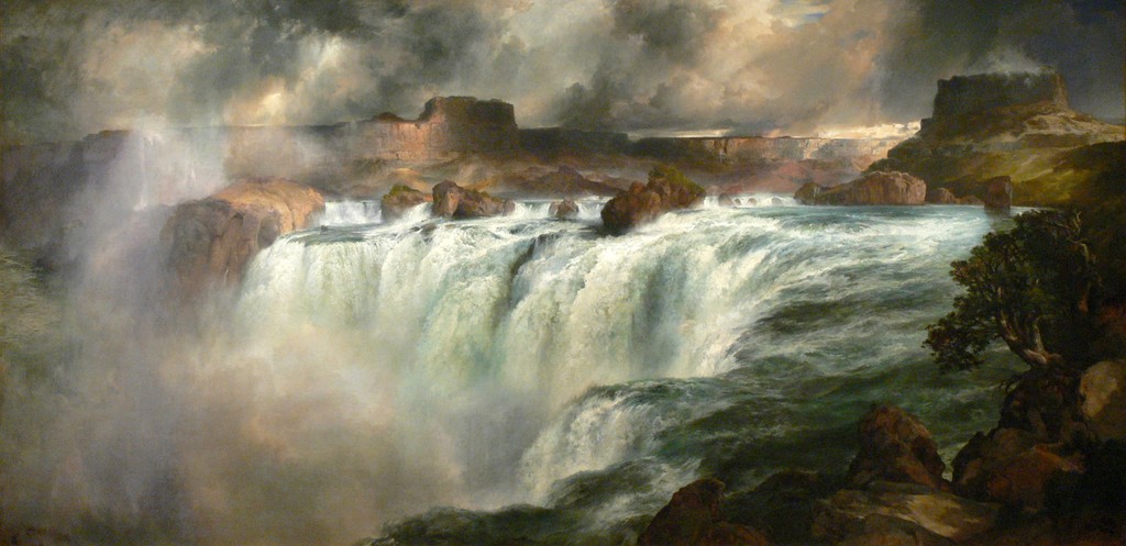
Shoshone Falls on the Snake River, 1900. Wolfgang Sauber / Wikimedia Commons, CC BY-SA 3.0; Gilcrease Museum painting. Image source. CC BY-SA 3.0; also marked PD-Art. Resized only; complete source image retained. This image derivative is available under the same licence.
- Splash image source.
Green River Cliffs, Wyoming, 1881. National Gallery of Art, Gift of the Milligan and Thomson Families. Image source. Public domain; NGA Open Access. Resized only; complete source image retained.
- Splash image source.
A View of Venice, 1891. Smithsonian American Art Museum, Transfer from the U.S. Department of the Interior, National Park Service, 1968.120.1. Image source. Free to use; Smithsonian Open Access. Resized only; complete source image retained.
- Splash image source.
The Three Tetons, 1895. The White House Collection, Gift of C. R. Smith; faithful reproduction via Wikimedia Commons. Image source. Public Domain Mark; faithful reproduction of a two-dimensional public-domain work. Resized only; complete source image retained.