 by Tom Gurney
Tom Gurney BSc (Hons) is an art history expert with over 20 years experience
Email: tomgurney1@gmail.com / Phone: +44 7429 011000
Thomas Moran Watercolours: Introduction
Thomas Moran's watercolours offer a close encounter with landscapes that his oil paintings often present on a monumental scale. A relatively small sheet can contain distant mountains, a forceful river or an extensive view of Venice. Colour, changes of emphasis and the visible relationships among forms make that space convincing without requiring a large canvas.
These works belong to several kinds of activity. The exhibition presentation for The Poetry of Place brings field sketches and studio work together, while the history of Louis Prang's 1876 portfolio shows watercolours made for a publishing project. A coloured sheet should therefore be approached as an individual object, rather than automatically classified as a quick note painted on the spot. [1] [2]
At a Glance
- RangeWestern rock formations, mountains, rivers and later city views
- MaterialsWatercolour, sometimes combined with gouache and graphite
- Selected examplesTower at Tower Falls, Yellowstone (1872), Summit of the Sierras (1872/75), View of Venice (1888)
- Publishing connectionFifteen chromolithographs in Louis Prang's 1876 western portfolio
- Related pagesDrawings, Prints and Style and technique
Contents
- A medium with several purposes
- Colour learned through looking
- Watercolour, gouache and graphite
- Tower at Tower Falls: a concentrated western view
- Summit of the Sierras: distance in an upright sheet
- Venice in watercolour and gouache
- Reading the whole sheet
- Comparing the 1888 sheet with the 1891 oil
- Prang's portfolio: originals and printed images
- Close looking across media
A medium with several purposes
A work made during travel can preserve something the artist wants to retain: the relationship between a bright cliff and shadow, a distinctive summit or an unusual quality of water. A developed composition has another task. It must organise those observations into a picture that sustains attention after the moment of encounter has passed.
The two purposes can overlap. A small sheet may contain both abbreviated passages and carefully developed ones. Its size alone does not decide whether it was a first note, a later elaboration or a work intended for another person. Dates, inscriptions, collection records and documented commissions help establish those distinctions.
The pleasure of looking closely lies partly in that uneven distribution of attention. A rock edge may be sharply defined while neighbouring atmosphere remains broad and open. A few stronger marks can hold a distant feature in place without giving it the same detail as the foreground. Moran's paper works make these differences available within a compact field.
Colour learned through looking
The Frick exhibition presentation connects Moran's education with prints and books, his brother Edward's studio and his study of Turner's paintings in England. Those experiences helped shape an approach in which an impression of landscape mattered alongside the forms represented. His paper works offer one place to examine that relationship. [1]
The comparison with Turner is most useful when it prompts attention to specific effects. Notice how light occupies an area, how a distant form partly merges with its surroundings or how reflected colour alters water. A general label of influence cannot explain every decision within an individual sheet.
Moran's subjects also supply their own demands. A steep rock pinnacle requires different emphasis from a pale architectural frontage or a succession of snow-covered peaks. The medium allows each to be considered through relations of colour and shape, but does not turn them into one identical formula.
Watercolour, gouache and graphite
Museum records preserve combinations that broad titles can obscure. Tower at Tower Falls, Yellowstone is described as watercolour and gouache over graphite on blue laid paper. Summit of the Sierras is gouache over graphite on cream laid paper. Both are works on paper, but their material descriptions are not identical. [3] [4]
Those labels help keep drawing and coloured handling connected without collapsing them into a single name. Graphite supplies a documented foundation in these examples, while the finished images depend on the combined effect of their materials. It is not necessary to identify every visible contour as an exposed pencil line to recognise drawing's place in the work.
A digital image provides another kind of evidence. It allows comparison of a pale peak with a dark foreground or a strong sail with soft reflection. It cannot by itself establish an undocumented pigment mixture or explain every stage of application. The most secure reading combines the museum's material record with careful attention to the visible arrangement.
Tower at Tower Falls: a concentrated western view
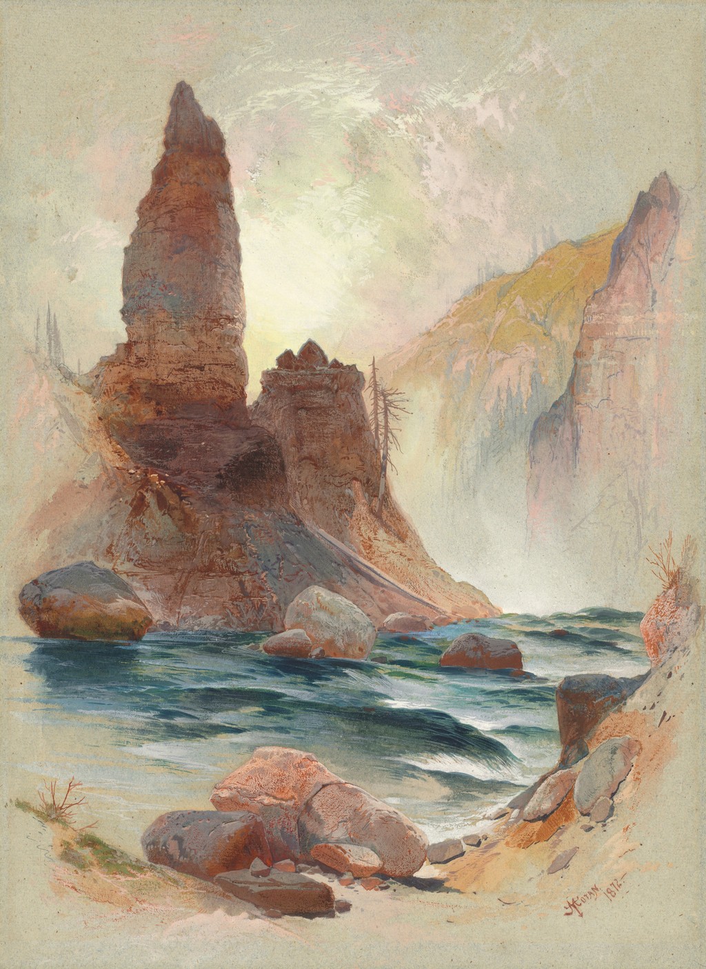
The NGA's 1872 Tower at Tower Falls, Yellowstone measures 36.2 × 26.4 cm. A tall, dark reddish formation rises on the left above moving water. A lower adjoining mass and the opposite wall help establish the setting, while pale atmosphere opens around and beyond the rock. The subject is the tower formation, not an uninterrupted view of the whole waterfall. [3]
The upright format gives the rock a commanding position. Its height is felt against the lower water and the surrounding sky, rather than through a long horizontal procession of cliffs. The spectator can grasp the principal form quickly, then examine the ledges and darker intervals that give it weight.
Water introduces a different rhythm below it. Blue-green passages, darker hollows and pale streaks lead through the lower part of the image. They prevent the rock from becoming an isolated monument on an inactive base. The scene contains both an enduring vertical mass and a moving surface that changes as it passes around smaller stones.
The distant wall is less forceful than the foreground formation. Its pale colour and softer boundaries create space without competing equally for attention. That contrast is particularly effective on a small sheet: selective clarity gives the image depth while maintaining the tower as its centre.
Summit of the Sierras: distance in an upright sheet
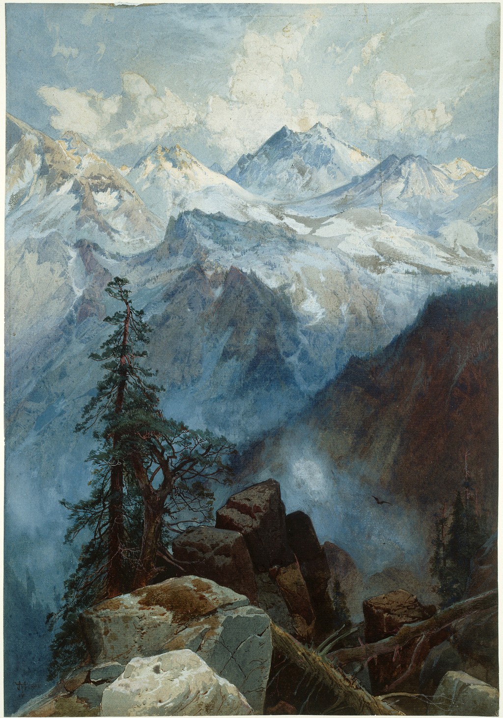
The Chicago Summit of the Sierras is dated 1872/75 and measures 36 × 25 cm. A foreground tree and angular rocks frame an opening towards successive mountains. Pale peaks and cloud fill the upper distance, while the near ground contains stronger dark passages. [4]
The sheet's effect depends on a sequence rather than one summit alone. Near rocks overlap a shadowed depth; ridges emerge beyond it; farther peaks rise against cloud. Each interval gives the next a different position in space. The spectator moves through the image by comparing these relations.
The tall tree makes that distance more tangible. Its irregular branches and dark trunk provide a close form against which the lighter mountain passages can recede. At the same time, it occupies only part of the opening. The view extends past it, giving the spectator both a foreground anchor and an invitation into deeper space.
The example shows why a developed work on paper deserves attention independently of a larger oil. Its particular format and the concentration of its near forms create their own encounter. Describing it simply as a small mountain image would miss the way the foreground directs the entire view.
Venice in watercolour and gouache
The National Gallery's View of Venice, dated 1888, offers a different subject and format. The record gives an image size of 26.35 × 40.01 cm on a larger sheet, with watercolour and gouache on laid paper. It belongs to the Corcoran Collection through James Parmelee's bequest. [5]
The horizontal view contains an extensive pale sky above architecture and boats. Domes rise towards the left, a tall tower stands farther across the view and an arcaded building occupies the middle-right. The arrangement brings several strong architectural shapes together while allowing atmosphere to soften their presence.
Colourful sails and boats gather left of centre. Their warmer and darker passages stand out from the surrounding pale water, giving the eye a nearer focus. Smaller boats on the right balance that group without repeating it exactly. The composition's activity lies in the relationship between these clusters and the larger open areas around them.
Reflections extend the boats and buildings into the foreground. Their forms are broken into shorter marks rather than reproduced as exact inverted outlines. The water therefore connects the architecture with the spectator while changing its appearance. Strong shapes above become softer, less stable passages below.
Much of the image remains comparatively light. The boats' concentrated colour seems more vivid because of the pale space around them. That distribution creates an atmosphere of breadth and quiet movement without eliminating local detail. A spectator can notice a sail or bird, then return to the wider field in which it appears.
Watch: Thomas Moran
Choose a film to explore the artist’s work, its interpretation and its wider setting.
The painting that inspired a National Park
A close discussion of Moran’s landscape and its relationship to the idea of Yellowstone.
Watch on YouTube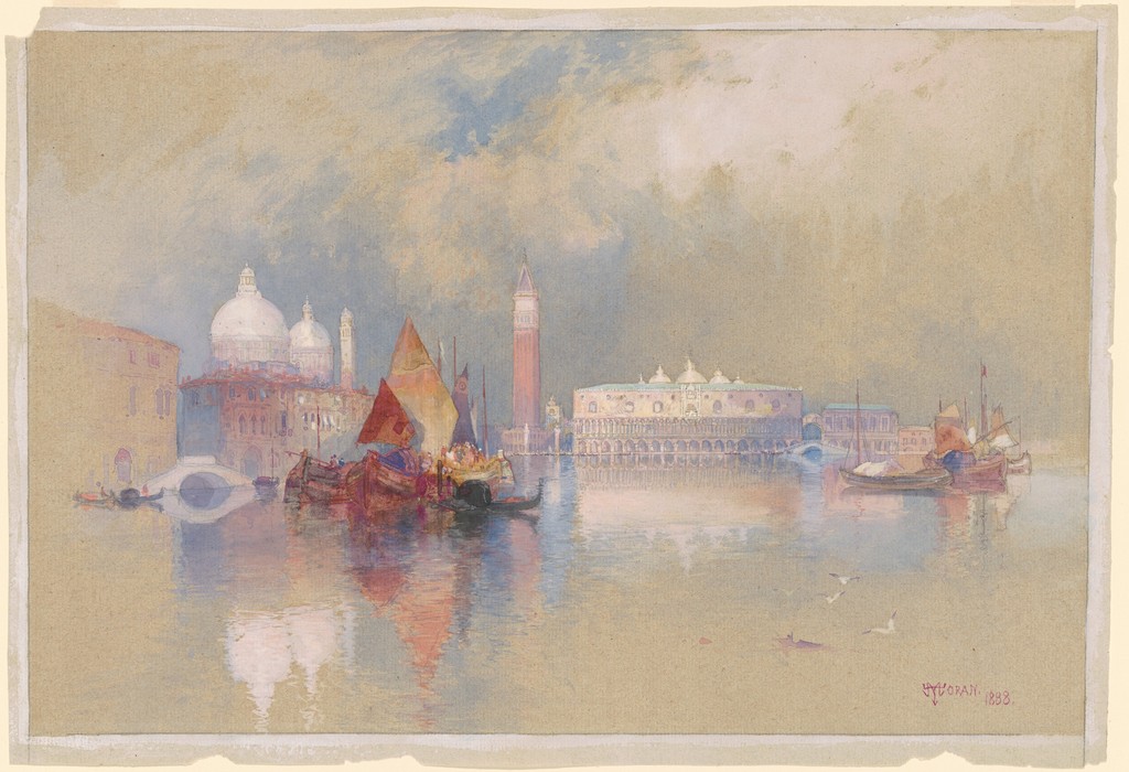
Reading the whole sheet
The Venice reproduction includes the sheet beyond the rectangular composition. Its irregular outer edges and surrounding margin make the physical extent visible alongside the pictured scene. That is useful when comparing a work on paper with an oil shown only to the edge of its painted surface.
The NGA separates image measurements from sheet measurements: 26.35 × 40.01 cm for the image, and 28.58 × 41.91 cm for the sheet. The figures describe different extents of one object, rather than competing estimates of the same boundary. Keeping that distinction clear helps a viewer understand what the reproduction includes. [5]
The margin also changes the encounter. It provides a pause around the reflected water and pale atmosphere, reminding the spectator of the compact surface on which the extensive city view has been organised. The apparent space reaches far beyond its small physical support.
Comparing the 1888 sheet with the 1891 oil
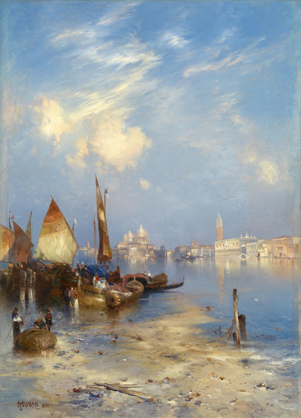
The Smithsonian's A View of Venice, dated 1891, is a separate oil painting. Its more upright composition centres attention differently, with foreground figures and boats providing a stronger close encounter. The 1888 NGA watercolour is not a reproduction of that later canvas or another label for the same object. [6]
Their formats make the contrast clear. The paper view spreads architecture, boats and reflections sideways beneath an extensive sky. The oil gives its nearer activity more height within the field. Both use the relationships among water, built forms and small human presences, but they lead the spectator through those relationships differently.
The pair is therefore more informative than a claim that Moran always painted Venice in one manner. A recurring subject offered opportunities to vary proportions, emphasis and the balance between near activity and distant atmosphere. The individual collection records keep the comparison grounded in two identifiable works.
Prang's portfolio: originals and printed images
The 1997 catalogue describes fifteen chromolithographs after Moran's watercolours in Louis Prang's 1876 portfolio, The Yellowstone National Park, and the Mountain Regions of Portions of Idaho, Nevada, Colorado, and Utah. The project involved watercolours made for reproduction, not merely a publisher gathering unrelated travel notes. [2]
That distinction gives the original sheets a place within a wider history of viewing. Their colour could reach audiences through printed versions. The portfolio's subjects also extended beyond Yellowstone, as its full title makes clear. A western scene appearing in the publication should not automatically be relocated to the park.
The printed Tower Falls and Sulphur Mountain provides a useful example. The Library of Congress record dates its chromolithograph to circa 1875; that print date is distinct from the 1876 issue of Prang's major portfolio. It should also be distinguished from the NGA's 1872 Tower at Tower Falls sheet, which concentrates on the rock formation and moving water. Related subject matter does not establish identical composition or physical identity. [7]
An original watercolour and a chromolithograph can share a colour scheme while remaining different objects. The printed image involves a reproductive process and a publication context. Recognising those differences allows the quality and reach of the print to be appreciated without presenting it as paint applied by Moran to that particular sheet.
Close looking across media
Begin a comparison by identifying the objects: date, medium, collection and format. Then notice how the foreground establishes a position, where the darkest or brightest area attracts attention and how distant forms lose or retain clarity. These questions make a small work on paper available for the same sustained scrutiny as a large oil.
A medium name does not decide the answer in advance. The Tower sheet can give rock weight, the Summit can create an extensive depth and the Venice view can distribute colour across pale water. Their shared compactness invites close looking; their differences reveal how many kinds of space Moran could organise within it.
Selected works on paper
These coloured works include graphite beneath watercolour or gouache. They are not presented as uncoloured drawings.
Artworks directory
Selected documented works and distinct versions. This directory is not a comprehensive catalogue raisonné. Dates and media retain the distinctions explained in the articles and museum records.
| Name | Date | Medium |
|---|---|---|
| An Arizona Sunset near the Grand Canyon | Date not securely established | Oil painting |
| Autumn Afternoon, the Wissahickon by Thomas Moran | 1864 | Oil on canvas |
| Cascade Falls, Yosemite | Commonly catalogued as 1905 | Catalogued as oil on canvas |
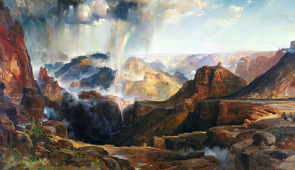
| The Chasm of the Colorado | 1873–1874; completed in 1874 | Oil on canvas, currently mounted on aluminium |
| Children of the Mountain | 1866 in the current museum title; 1867 in the 1997 National Gallery catalogue | Oil on canvas |
| Cliffs of Green River | 1874 | Oil on canvas |
| Cliffs of the Upper Colorado River, Wyoming Territory | 1882 | Oil on canvas |
| East Hampton, Long Island , also captioned Easthampton, L.I | 1897 | Oil on canvas laid on board, according to the reproduction record |
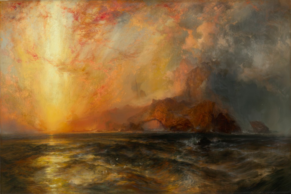
| Fiercely the red sun descending, Burned his way along the heavens | 1875–76 | Oil on canvas |
| Forest Scene | 1870 | Oil on canvas |
| Grand Canyon of the Colorado River | 1892 and 1908 | Oil on canvas |
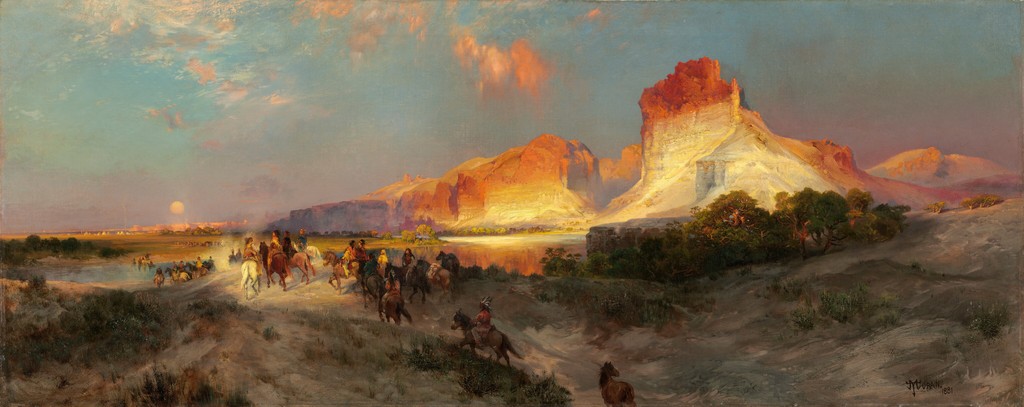
| Green River Cliffs, Wyoming | 1881 | Oil on canvas |
| Green River, Wyoming | 1878 | Oil on panel |
| The Juniata, Evening | 1864 | Oil on canvas |
| Mosquito Trail, Rocky Mountains of Colorado | 1875 in the 1997 National Gallery exhibition catalogue | Watercolour |
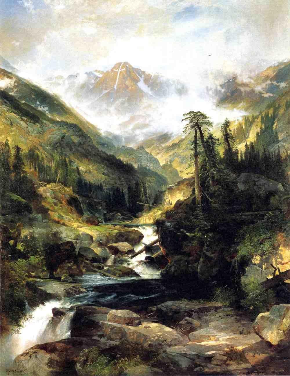
| Mountain of the Holy Cross | 1875 | Oil on canvas |
| The Much Resounding Sea | 1884 | Oil on canvas |
| Point Lobos, Monterey, California | 1912, signed and dated | Oil on canvas |
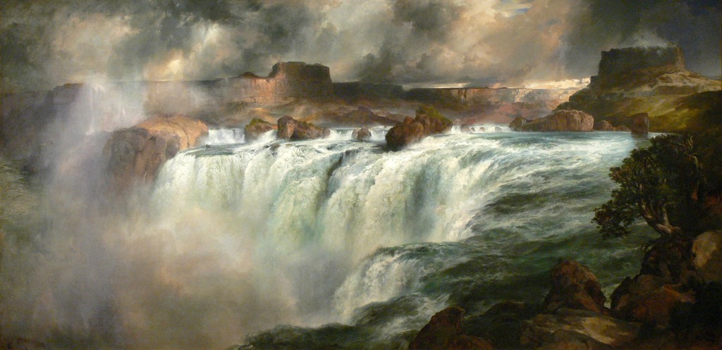
| Shoshone Falls on the Snake River | 1900 | Oil on canvas |
| Summit of the Sierras | 1872/75, as catalogued by the Art Institute of Chicago | Gouache over graphite on cream laid paper |
| The Teton Range | 1897 | Oil on canvas |
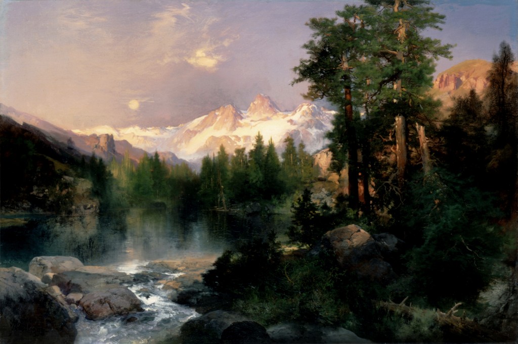
| The Three Tetons | 1895 | Oil on canvas |
| Tower Falls, Yellowstone | 1872 | Watercolour and gouache over graphite on blue laid paper |
| A View of Venice | 1891 | Oil on canvas |
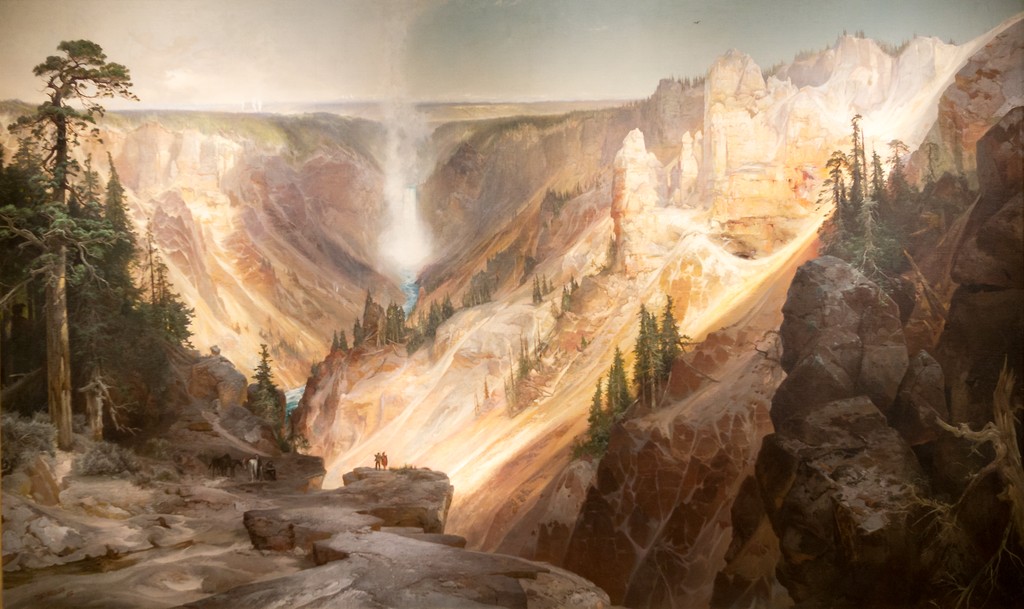
| The Grand Canyon of the Yellowstone | 1872 | Oil on canvas, currently recorded as mounted on aluminium |
| Mountain of the Holy Cross, Colorado (etching) | 1888 | Etching, roulette and aquatint |
| The Resounding Sea (etching) | 1880 | Etching |
| The Much Resounding Sea (later etching) | 1886 in heading; 1888 on plate | Etching, drypoint and roulette |
| Tower Falls (Prang print) | c. 1875; portfolio issued 1876 | Chromolithograph |
| Shoshone Falls (early watercolour) | 1874 | Watercolour |
| Venice (watercolour) | 1888 | Watercolour over graphite |
Frequently Asked Questions
No such general claim is supported. His works on paper include field-related records, developed compositions and watercolours made for publication projects.
Yes. The museum records for the Tower and Summit sheets identify graphite beneath their coloured media.
No. The NGA work is an 1888 watercolour and gouache on paper; the Smithsonian oil is dated 1891.
No. They are chromolithographs after Moran's watercolours, with their own printed-object and publication identities.
No. The title also names mountain regions of Idaho, Nevada, Colorado and Utah.
Discussion
Compare the upright Tower or Summit sheet with the horizontal Venice view. How does format change your route through the image? When looking at a related print or oil, which similarities remain and which decisions belong to the individual object?
Reader Insights
Editorial prompts for close looking and discussion.
Compare the upright Tower or Summit sheet with the horizontal Venice view. How does format change your route through the image?
When looking at a related print or oil, which similarities remain and which decisions belong to the individual object?
How does this page compare with the related works linked above?
Join the Conversation
Share your reading of this page below.
References
- The Frick Art & Historical Center, The Poetry of Place: Works on Paper by Thomas Moran from the Gilcrease Museum, 2001 exhibition presentation and Donna Gustafson essay excerpt, Resource Library.
- Thomas P. Bruhn and contributors, Thomas Moran, 1997, selected publishing discussion, pp. 318–319, and Prang appendix.
- National Gallery of Art, Tower at Tower Falls, Yellowstone, 1872, 2012.93.1.
- Art Institute of Chicago, Summit of the Sierras, object metadata, 1872/75, 1965.852.
- National Gallery of Art, View of Venice, 1888, 2014.136.184.
- Smithsonian American Art Museum, A View of Venice, 1891, oil on canvas.
- Wikimedia Commons / Library of Congress, Tower Falls and Sulphur Mountain, Yellowstone, circa 1875, chromolithograph published by L. Prang & Co., LC-USZC4-3246.
- Splash image source.
Tower at Tower Falls, Yellowstone, 1872. This is the rock-formation study, distinct from views centred on the waterfall. National Gallery of Art, Florian Carr Fund. Image source. Public domain; NGA Open Access. Resized only; complete source image retained.
- Splash image source.
Summit of the Sierras, 1872/75, gouache over graphite on cream laid paper. Art Institute of Chicago, Gift of Mrs. Byron Harvey, 1965.852. Image source. Public Domain Mark; faithful reproduction; AIC record is_public_domain true. Resized only; complete source image retained.
- Splash image source.
View of Venice, 1888. Watercolour and gouache on laid paper. National Gallery of Art, Corcoran Collection (Bequest of James Parmelee, 1941). Distinct from Moran’s 1891 Smithsonian oil. National Gallery of Art, Corcoran Collection (Bequest of James Parmelee, 1941), 2014.136.184. Image source. Public domain; NGA Open Access, exact object media declaration. Resized only; complete source image retained.
- Splash image source.
A View of Venice, 1891. Smithsonian American Art Museum, Transfer from the U.S. Department of the Interior, National Park Service, 1968.120.1. Image source. Free to use; Smithsonian Open Access. Resized only; complete source image retained.
- Splash image source.
The Grand Canyon of the Yellowstone, 1872. Wuselig / Wikimedia Commons, CC BY-SA 4.0; U.S. Department of the Interior Museum painting. Image source. CC BY-SA 4.0; also marked PD-Art. Outer museum frame cropped; resized. Painted composition retained; photographic perspective unchanged. This image derivative is available under the same licence.
- Splash image source.
The Chasm of the Colorado, 1873–1874. U.S. Department of the Interior Museum; faithful reproduction via Smithsonian American Art Museum / Wikimedia Commons. Image source. Public Domain Mark; faithful two-dimensional reproduction. Resized only; complete source image retained.
- Splash image source.
Mountain of the Holy Cross, 1875. Autry Museum of the American West; faithful reproduction via Wikimedia Commons. Image source. Public Domain Mark; faithful two-dimensional reproduction. Resized only; complete source image retained.
- Splash image source.
Shoshone Falls on the Snake River, 1900. Wolfgang Sauber / Wikimedia Commons, CC BY-SA 3.0; Gilcrease Museum painting. Image source. CC BY-SA 3.0; also marked PD-Art. Resized only; complete source image retained. This image derivative is available under the same licence.
- Splash image source.
Green River Cliffs, Wyoming, 1881. National Gallery of Art, Gift of the Milligan and Thomson Families. Image source. Public domain; NGA Open Access. Resized only; complete source image retained.
- Splash image source.
A View of Venice, 1891. Smithsonian American Art Museum, Transfer from the U.S. Department of the Interior, National Park Service, 1968.120.1. Image source. Free to use; Smithsonian Open Access. Resized only; complete source image retained.
- Splash image source.
The Three Tetons, 1895. The White House Collection, Gift of C. R. Smith; faithful reproduction via Wikimedia Commons. Image source. Public Domain Mark; faithful reproduction of a two-dimensional public-domain work. Resized only; complete source image retained.