


 by Tom Gurney
Tom Gurney BSc (Hons) is an art history expert with over 20 years experience
Published on June 19, 2020 / Updated on September 25, 2026
Email: tomgurney1@gmail.com / Phone: +44 7429 011000
The artist in a changing city
Tsukioka Yoshitoshi (1839–1892) worked through one of the most consequential changes in Japanese visual culture. Born in Edo, he began studying with Utagawa Kuniyoshi around 1850. During the next four decades, Edo became Tokyo, the shogunate gave way to an imperial government, railways and newspapers altered the experience of the city, and woodblock prints had to compete with new kinds of image. Yoshitoshi did not leave printmaking behind. He used its collaborative tools to picture war, new technology, theatre, everyday emotion and old stories in ways that belonged to his own moment. [1] [2]
Explore One Hundred Aspects of the Moon
Contents
- The artist in a changing city
- What to look for in a Yoshitoshi print
- From Kuniyoshi's studio to a public career
- A railway picture and a dating problem
- News, war and the changed uses of print
- Women, hours and the close-up
- Gods, ghosts and the moment before an event
- One hundred different moons
- Paintings and drawings beyond the prints
- Books on Japanese Art and Prints
A gallery of his work can feel as if several artists have been gathered under one name. An early print of a warrior watching a steamship sets a figure from historical storytelling beside a sign of a changed world. A triptych of a train at Takanawa makes the machinery itself the spectacle. A late print replaces engines and crowds with a fireman, moonlight and smoke. Another isolates the instant a woman opens her eyes. The striking difference between them is the point. Yoshitoshi kept finding new relationships between a printed picture, the public events around its buyers and the older stories those buyers already knew. [3] [4] [5] [6]
Yoshitoshi at a glance
- PeriodLate Edo through Meiji, 1839–1892
- TeacherUtagawa Kuniyoshi, from around 1850
- FormsSingle sheets, diptychs, triptychs, illustration and painting
- Major seriesOne Hundred Aspects of the Moon; Thirty-Two Aspects of Customs; New Forms of the Thirty-Six Ghosts
The familiar label “last great ukiyo-e artist” can be useful only with care. It conveys his place near the end of a particular nineteenth-century commercial print culture, but the medium did not stop in 1892. Artists, printers and publishers continued to make Japanese woodblock prints. The more precise question is what Yoshitoshi could still make the established medium do at a time when its subjects, customers and rivals were changing. The Fitzwilliam Museum places him between the Edo print tradition and new Meiji subjects and pictorial effects; the Ōta Memorial Museum likewise treats his historical, supernatural and beauty prints alongside the notorious violent designs. [2] [7]
What to look for in a Yoshitoshi print
Start with the time of the scene. Some pictures present recognisable contemporary places, occupations or news; others picture distant historical or literary episodes; several make the past feel immediate through gesture, cropping and colour. Then look at the format. A single upright sheet draws attention to one expression or body. A triptych lets figures, architecture and movement spread across three separate printed papers. Finally, examine the surface of the particular impression: shading, embossing, texture and the weight of black could vary with the materials and decisions of printers. A picture reproduced as a flat thumbnail loses much of that evidence. [9]
Yoshitoshi supplied designs, but a published colour print was not the product of one hand alone. A publisher chose and financed a project; a block-cutter translated lines into wood; printers registered the sheets and worked successive colours onto paper. The Fitzwilliam Museum's drawing for a Twenty-Four Hours print preserves black brushwork over red underdrawing, making revision visible before the design became a block. Another Fitzwilliam account describes dry embossing, fabric texture, rubbed gloss black and graduated colour as effects on high-quality late prints. These methods are worth noticing without assuming that every surviving impression of a given design has the same finish. [10] [9]
The sheet's evidence is also more specific than an online title. Publishers could issue designs over time; later impressions might differ in colour or surface; separated triptych sheets can obscure their original relationship. The ten images chosen for this page therefore retain their holding museum's object number, date and source file. A title common to two institutions identifies a design, while each photographed impression remains a particular object. That distinction becomes especially important for a series as widely collected as One Hundred Aspects of the Moon. [11] [12]
From Kuniyoshi's studio to a public career
The National Diet Library places Yoshitoshi's entry into Kuniyoshi's studio around 1850. Kuniyoshi was a major designer of warriors, legends and playful imagery, and those subjects gave the younger artist a working vocabulary. It would be misleading, however, to treat the relationship as a single inherited style. The Fitzwilliam Museum notes that Yoshitoshi returned to subjects familiar from Kuniyoshi while pressing them towards different psychological effects. What changed across the career was not simply the subject list but the timing of an image: a figure sometimes acts; at other times the print holds the charged interval before or after an action. [1] [2]
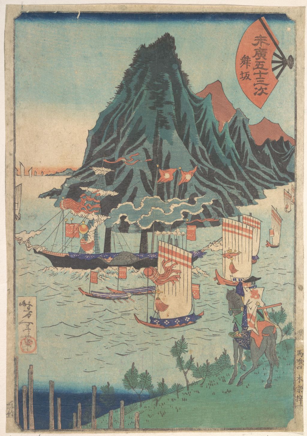
Consider the Met's circa-1865 print from Fifty-Three Stations of Suehiro. A warrior stands at the right; steam-powered vessels cross the water farther back. The artist's arrangement binds a familiar journey format to the machinery of a newly visible world. The work is a reminder that Yoshitoshi's early career was not only an apprenticeship in theatrical violence. He could make the tension between an old pictorial framework and a new object the subject of the print itself. The Met catalogues this particular sheet as accession JP3178. It should be described and reproduced as that impression, rather than as a generic illustration of every design in the series. [3]
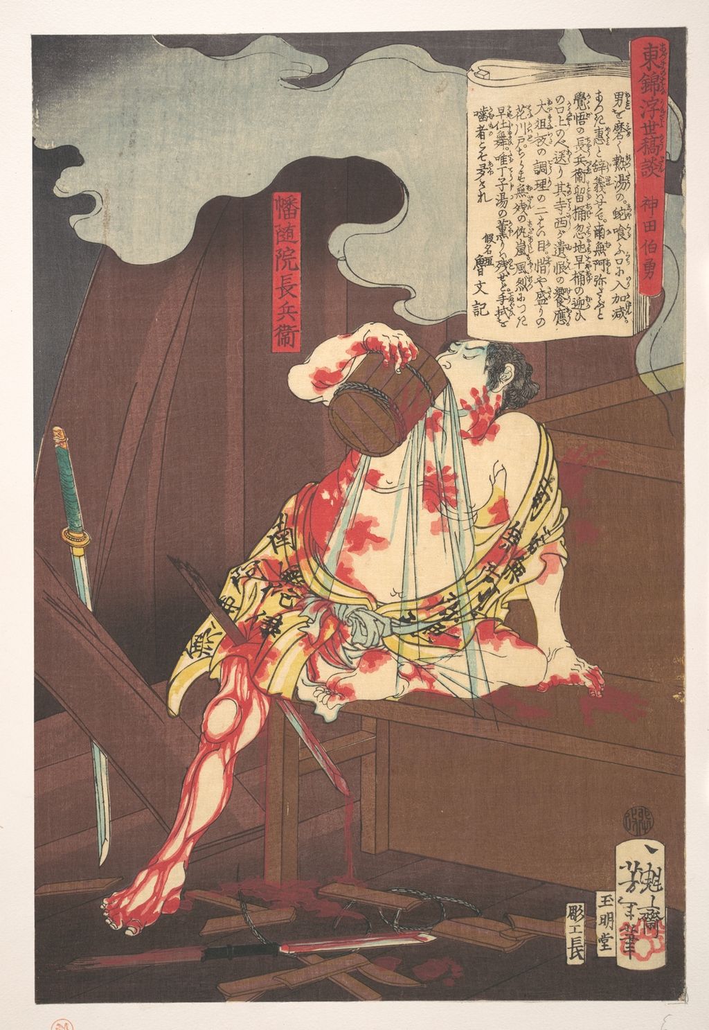
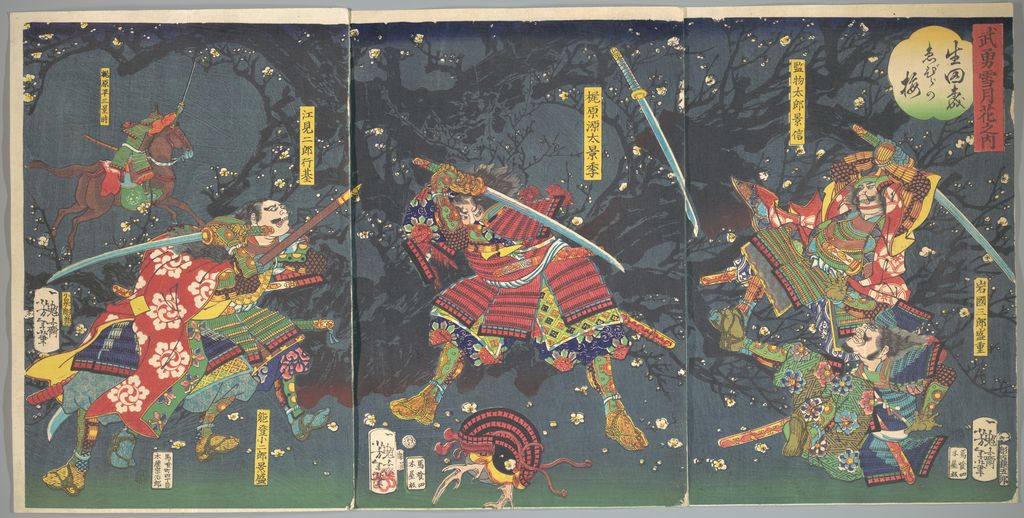
The 1860s also brought urgent historical and dramatic subjects. A Met impression of Banzuiin Chōbei is dated to the tenth month of 1867. Another three-sheet work, Plum Blossoms in the Forest of Ikuta, belongs to the same year in the Met's record. The sequence does not establish a simple evolution from “old” to “new”: stories from the past continued to circulate even as railway and newspaper imagery entered print shops. Looking at these two works beside the steamship design helps a reader resist treating Meiji modernity as a sudden replacement of Edo motifs. [13] [14]
One reason the artist's violent images dominate short accounts is that his 1866 collaboration with fellow Kuniyoshi pupil Ochiai Yoshiiku, Twenty-Eight Famous Murders with Verse (英名二十八衆句), is so hard to forget. The NDL identifies the collaboration as a turning point in Yoshitoshi's public reputation. Ōta Memorial Museum's Yoshiiku exhibition assigns 14 sheets to each artist, a division that keeps this joint project from becoming a Yoshitoshi-only achievement. The series still deserves an account of its theatrical and publishing context before anyone treats it as direct evidence of his private fascination with bloodshed. A future page could compare signed sheets and their printed texts. On this home page it marks one part of a much wider output, not a key that unlocks every later design. [1] [29]
The next year's named historical figures ask for a different kind of attention. Banzuiin Chōbei is a character with a narrative life beyond this single printed sheet; its title gives the first reader a person to recognise and a story to bring to the image. The triptych from Ikuta, by contrast, has enough room to stage a more extended scene across several papers. Reading the work means asking what happens at the joins: does a tree, body or direction of movement carry the eye from one panel to the next? Such questions come from the object's format and visible composition, not from a modern habit of sorting pictures into “violent” and “not violent”. [13] [14]
A railway picture and a dating problem
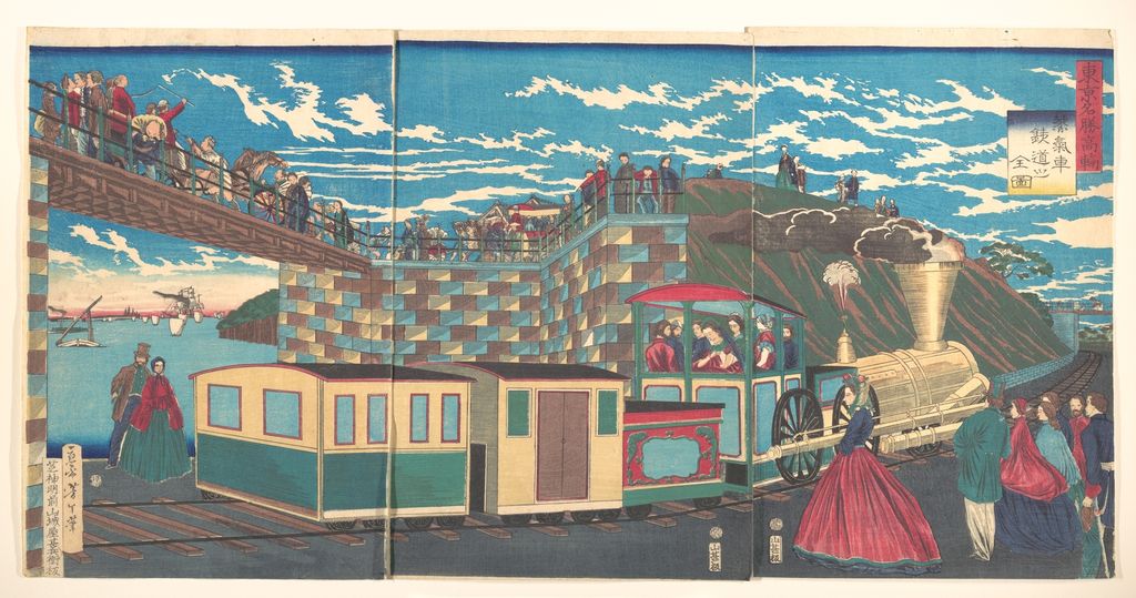
The Takanawa railway triptych is an especially good test of source discipline. The print shows a smoking locomotive beneath an elevated path and a crowd in varied dress. The Met identifies its three-sheet object, 2007.49.260a–c, under an English title translating Tokyo Famous Places: Complete View of the Steam Locomotive Railway at Takanawa and dates its object to 1872. The National Diet Library's catalogue, however, records the Japanese title 東京名勝高輪蒸気車鉄道之全図 and a 1871 publication by Yamashiroya Jinbei; Tokyo Museum Collection records another impression with September 1871 as the date. These records should sit beside one another. The Japanese catalogues establish a 1871 design/publication context, while the Met date is the date stated for the particular impression shown here. We should not silently change either record to make them agree. [4] [15] [16]
Nor should the picture be mistaken for a mechanically exact engineering drawing. Its selling point was a spectacle: a railway, people watching it, the landscape of a famous shore and the patterned spaces of the three-sheet format. A site page about the print could compare the Met and Tokyo impressions in more detail, including any difference in blocks or colour after both files are checked. On an artist home, the work shows how readily Yoshitoshi could put a new piece of infrastructure into the visual grammar of a large commercial print. That is a more useful observation than claiming that he personally witnessed the train at that location or that all details are topographically accurate. [4] [16]
The Met image makes the crowd as important as the locomotive. Some figures look down from the raised crossing; others stand near the tracks or appear inside the carriages. The train runs horizontally, pulling the eye through the joints of the triptych, while the bridge and embankment set up opposing diagonals. Several patches of bright clothing punctuate the much larger blocks of blue sky and dark track. It is possible to enjoy the sheet as a record of excitement around modern transport without pretending that the dresses, uniforms, machine parts and buildings are photographic evidence. The design is itself a construction of attention: it tells us what a publisher and print team thought would make rail travel visible and saleable on paper. [4]
News, war and the changed uses of print
The National Diet Library names illustrated work for the Yūbin Hōchi Shimbun, Eiri Jiyū Shimbun and Yamato Shimbun among Yoshitoshi's activities after the Restoration. A newspaper print asks its reader to make a different connection between image and time from a legendary warrior print. The pictured event purports to belong to public news, even though selection, staging and the limits of information still shape what the artist could show. The British Museum's Samurai guide identifies a 1877 Yoshitoshi print of the campaign in Satsuma and places such images among visual responses to the conflict. [1] [17]
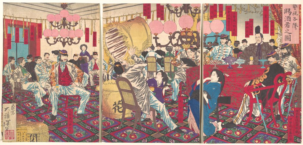
The Met's September 1877 triptych of the police superintendent's party receiving food and drink belongs to this altered market of current affairs. Its long title identifies an episode and its date ties it to the Satsuma Rebellion period, but a caption should not assert that Yoshitoshi witnessed the meeting or supply the precise identities of participants without documentary support. The wide format gives a group event the scale of a historical tableau. It invites a useful comparison with his earlier warrior subjects: both can be dramatic, but their claims to the viewer differ. One pictures inherited narrative; the other frames a contemporary conflict. [5] [17]
Yoshitoshi's subjects from the 1870s do not align neatly with a single political opinion. One print's content, publisher and market are not enough to infer the artist's private views of the new state. The more defensible claim is that he made images for readers living amid war, reform and a changing media economy. His print career supplies evidence of the work available to an artist; it does not turn each sheet into a transparent statement of his beliefs. This distinction should guide any later page about his war or newspaper imagery. [1] [17]
Format can help keep those claims in proportion. The 1877 group print is a physical event across two sheets. The people are smaller than the actors in a bust-length portrait; the room or landscape is part of the information. A close-up print can ask us to decode one face, whereas the news scene asks us to orient ourselves among roles, uniforms and actions. Those are choices about the viewer's work. They are also choices a publisher could make in response to how a public already encountered news. The site can compare newspaper illustration and standalone colour prints where actual dated examples are available, without turning the artist home into an unsupported history of journalism. [5] [1]
Women, hours and the close-up
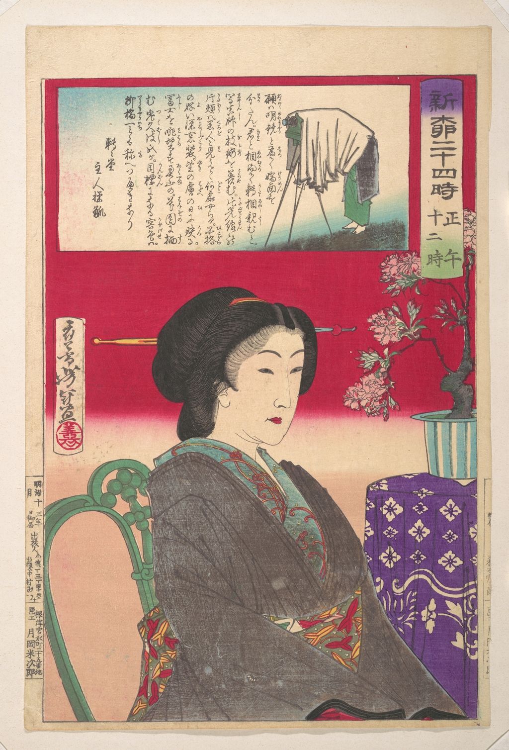
The series Twenty-Four Hours at Shinbashi and Yanagibashi changes scale again. The Met identifies an 1880 upright impression for noon. A woman and the markers of an hour occupy a single sheet rather than a battlefield-sized triptych. The Fitzwilliam Museum's surviving preparatory drawing for a different hour, one o'clock, shows how Yoshitoshi worked a red underdrawing into a more definite black design. Because that drawing concerns a different sheet, it is evidence of the artist's working process for the series, not the unique preparatory study for the Met's noon impression. [18] [10]
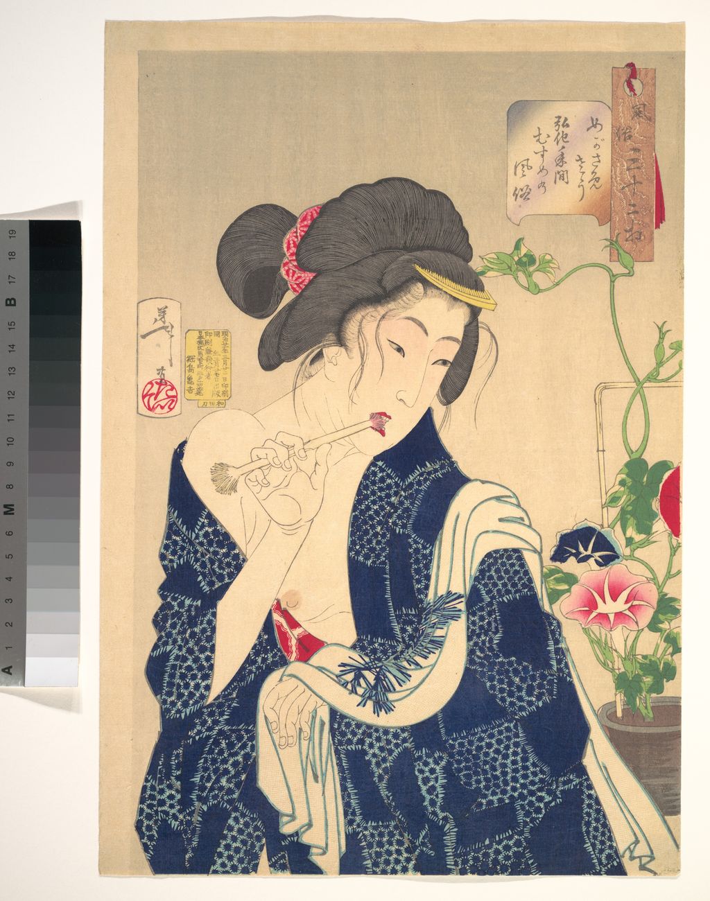
The late Thirty-Two Aspects of Customs (風俗三十二相) explores facial expression and a woman's apparent state of mind, while locating its subjects in named eras and social settings. Ōta Memorial Museum characterises the 32 designs as women of varied positions and occupations. Kanagawa Prefectural Museum gives the series a more exact publication span from November 1887 to November 1888 and notes that a list or title sheet makes 33 sheets in a complete set. A printed label such as “looking as if...” directs an interpretation, but the woman's clothes, posture and surroundings give the viewer more to read than a mood word alone. [19] [20]
The Met's 1888 Waking Up: A Girl of the Kōka Era supplies a concrete example. An open mouth and partly raised hands present the act of waking rather than a timeless idealised pose. Ōta's Japanese exhibition page identifies the corresponding design as めがさめさう. The title's antique spelling is part of the object and should remain visible in Japanese; modernising it would remove evidence of how the print addresses its viewer. On another Met sheet, Teasing the Cat, the animal becomes a partner in an intimate, playful scene. Its catalogue title should not be silently folded into Thirty-Two Aspects merely because the date is 1888: the series attribution must be checked on that particular record. [6] [21] [19]
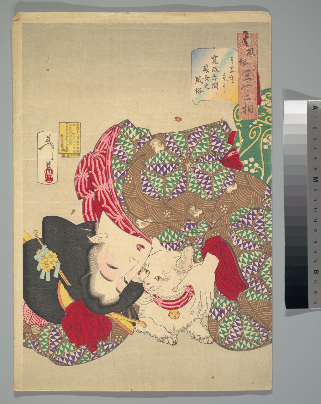
There is an important connection to the existing Utamaro cluster here. The Fitzwilliam Museum points out that sō, translated as “aspect” or “appearance”, had earlier lives in images of women by artists including Utamaro and Kunisada. Yoshitoshi did not invent a new category from nothing. The reader can compare how a face is framed, how an inscription guides judgement and how a viewer is asked to infer character. A link to Utamaro's physiognomy prints should carry that concrete comparative purpose rather than just connect two famous names. [22]
This comparison becomes richer when clothing and setting enter the discussion. Thirty-Two Aspects gives each woman an imagined historical moment, so the series is partly a gallery of changing fashions as well as a gallery of moods. A Kōka-era girl appears in one print; a Meiji-era subject appears elsewhere. The subject's era and the sheet's publication date are different things. The entire series was published in 1887–88; a woman described as belonging to an earlier era was not necessarily drawn or printed in that earlier era. A Japanese page should make this distinction especially clear because a date embedded in the original title can easily be mistaken for the date of the artwork. [6] [20]
Gods, ghosts and the moment before an event
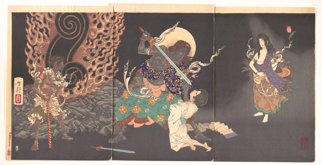
Supernatural subjects offer a third way to read Yoshitoshi's timing. The Met's 1885 triptych Fudō Myōō Threatening a Novice builds an encounter across three sheets. A viewer has to scan bodies and space to locate the threatened figure. By contrast, a late ghost print may reserve a large quiet area for expectation, letting a small sign of the uncanny change the meaning of the whole composition. These are different pictorial strategies, and neither should make “ghosts” the whole explanation for the artist's appeal. [23] [24]
The late series New Forms of the Thirty-Six Ghosts (新形三十六怪撰) gives the supernatural a flexible meaning. The Fitzwilliam Museum explains that the title's kai ranges across strange, monstrous and uncanny presences, not only the returning dead. Its series record dates publication to 1889–92 under Sasaki Toyokichi, notes pupil assistance on later designs and says three were issued after Yoshitoshi's death. This sequence calls for careful attribution on future object pages. A posthumously printed sheet should not automatically be described as a completed print seen and approved by the artist. [24]
Ōta Memorial Museum's retrospective displayed preliminary drawings for late triptychs and used them to discuss production. A reader seeing one polished print may be tempted to imagine the design arriving fully formed. Sketches show a more useful story of selection and revision. Yet the public museum images of those drawings are not licensed for use here, and our article must rely on the museum's research description unless a separately reusable file is located. [7]
One hundred different moons
One Hundred Aspects of the Moon (月百姿) is the natural centre of a Yoshitoshi cluster, but it cannot stand in for his entire career. The National Diet Library describes 100 colour prints drawing on Japanese and Chinese stories, historical episodes, myths, women, warriors, animals and supernatural beings. Ōta Memorial Museum has shown the complete group across two exhibition rotations, an instructive reminder of its size. The moon is the organising motif; it does not turn the 100 designs into one repeated scene. [11] [12]
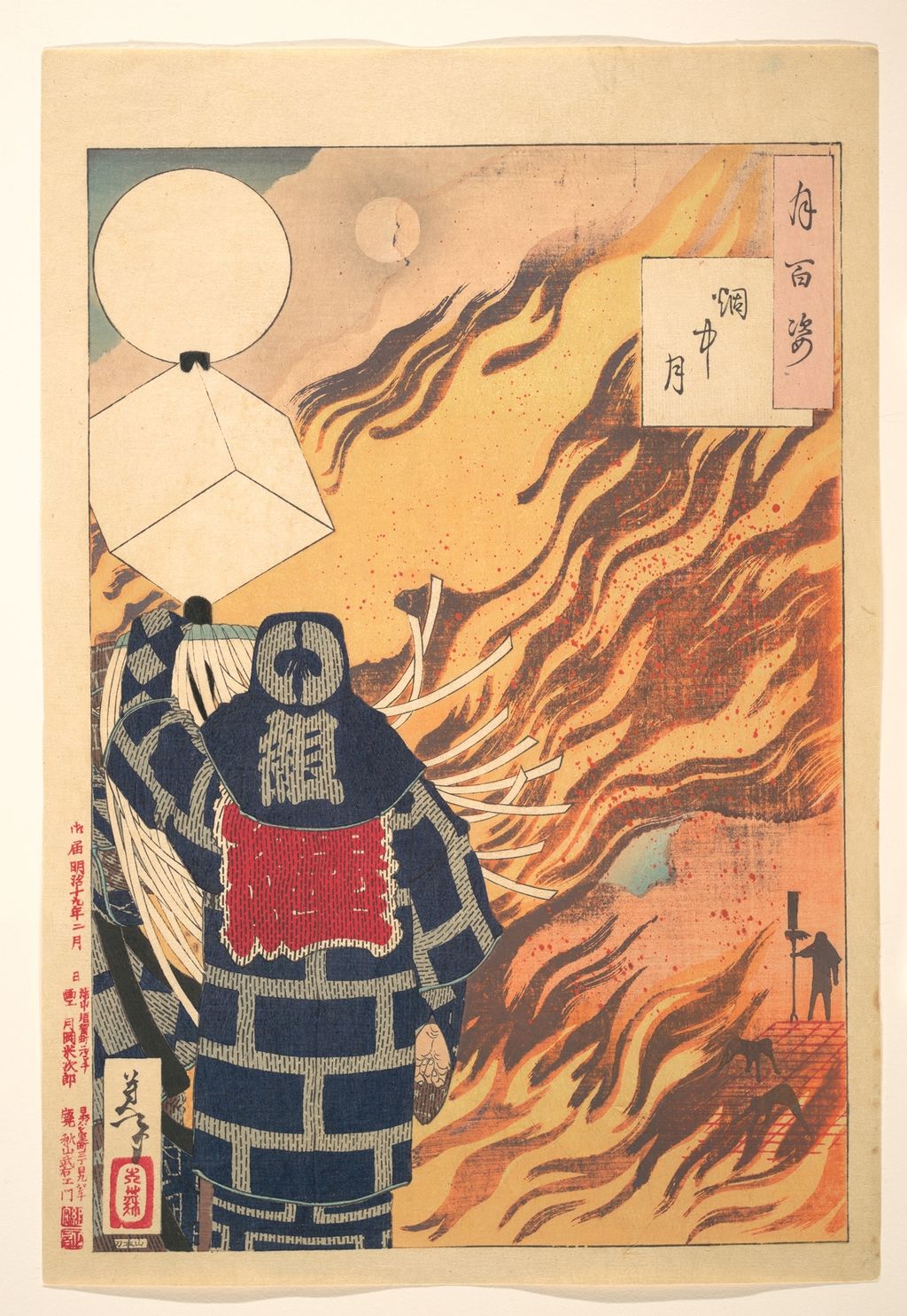
The Fitzwilliam Museum names publisher Akiyama Buemon and places the series broadly in 1885–92. Ōta's account gives 1885–91. Rather than erase that discrepancy in a header, a detailed series page can state that institutional catalogues differ on the outer publication range, then date each featured design from its particular object. The Met's Moon in the Flame is dated February 1886. The Fitzwilliam's separate impression of the same fireman design supplies unusual production detail: it names the block-cutter Yamamoto Shinji, describes borderless shading and splattered pigment, and explains how the character on the fireman's jacket identifies his role as the holder of a brigade standard. Those observations can deepen our close reading while the image caption continues to identify the Met impression actually reproduced. [25] [12] [8] [26]
In that print, the pale moon has little detail of its own. Fire, smoke and the dark geometric jacket do the visual work around it. The title does not promise a romantic night view; the scene centres on an everyday urban worker in a dangerous city. This is why a series page should group the designs by kind of story and viewing problem rather than rank them as 100 interchangeable “moon pictures”. The publisher, cutter, printer, pigments and individual sheet condition all matter to how a surviving image reads. [26] [9]
The difference between the Met and Fitzwilliam records is useful even when we display only the Met file. The Fitzwilliam identifies details of its impression and printing method, including a red-lead spatter that has darkened. The Met's colour reproduction shows the design in its own surviving condition. A close-reading module could place matched details from the two impressions side by side only after both images have suitable publication rights; otherwise the text can explain the comparison and send readers to the Fitzwilliam object record. The site should not crop the Fitzwilliam image from a noncommercial, no-derivatives page merely to make an attractive annotation. [26] [8]
It is also easy to let the title One Hundred Aspects of the Moon turn the series into a claim of completeness: one hundred moods of a single celestial body. The NDL description gives a more tangible structure. A moon can locate the time of a story, set the light falling on a figure or connect a familiar tale to a recognisable landscape. Some subjects come from Japanese history, others from Chinese narratives or performance traditions, and some belong to city life. Grouping the series by story source, visual function of the moon and date of publication would teach a reader more than a long undifferentiated thumbnail grid. [11] [25]
The publisher and completion date also shape the ending of Yoshitoshi's career. The moon series was sustained over years, not drawn in one late burst. The ghost series continued into and beyond 1892. Taken together, they show a mature artist and printmaking teams working with several long publishing commitments. A biography page can trace those commitments chronologically; a moon-series hub can map stories, dates, titles and impressions print by print. The artist home should make both routes visible without trying to become a 100-object catalogue itself. [24] [25]
Paintings and drawings beyond the prints
This distinction matters because the drawing under a print design and the published sheet answer different questions. The drawing may reveal compositional alternatives or the sequence of brush lines. The print records what the cutter and printer made reproducible and what the publisher released. Neither is a mere “version” of the other. For a future annotated module, the source should be a retained high-resolution master of the same object that appears in the article; an inset from another impression should be explicitly labelled as a comparison, not quietly substituted. [10] [9]
The format of a painting also sets limits on comparisons with prints. A festival curtain nine metres long would have been seen and handled differently from an ōban sheet purchased from a print seller. A votive plaque belongs to a religious site and an offering practice; a commercial print circulates as a reproducible commodity. Even when the same historical character appears in both media, the commission, scale and audience may alter the work's meaning. A later works overview should use the British Museum's leads to locate exact surviving paintings and their owners, then test each medium on its own terms. It should not simply add one painting to a list of woodcuts to prove “variety”. [27]
Frequently Asked Questions
No. The phrase is a retrospective judgement about his place in a changing nineteenth-century print culture. Japanese woodblock printmaking continued after his death. His work is more accurately understood by comparing its early and late subjects, publishing formats and technical choices. [2] [7]
One Hundred Aspects of the Moon is his best-known long series. Its 100 designs draw on history, literature, theatre, everyday life and the supernatural, linked by the moon. Institutions give slightly different outer publication ranges; date a particular print from the individual collection record. [11] [12] [25]
No. They are part of his work, but so are contemporary news and railway prints, women in daily life, theatrical subjects, historical heroes and paintings. The ten objects on this page intentionally span several kinds of image and date. [1] [7] [27]
An institution may date its specific impression while another records the design's publication. In this case the Met labels its object 1872, while NDL and Tokyo Museum Collection record 1871 for the design or another impression. Both dates should be given with their sources rather than merged into a false single certainty. [4] [15] [16]
Discussion
Compare identified prints from different parts of Yoshitoshi’s career, then share what you notice.
Reader Insights
What changes when two museums hold different impressions of one design?
How does the Takanawa railway move your eye across the triptych?
Which part of Moon in the Flame first attracts your eye, and why?
Join the Conversation
Share a documented example or a reliable source below, keeping observation separate from inference.
References
- National Diet Library, “Tsukioka Yoshitoshi”, Japanese biographical authority.
- Fitzwilliam Museum, “About Tsukioka Yoshitoshi”.
- The Met, *Fifty-three Stations of Suehiro: Warrior Looks at Passing Steamship*, JP3178.
- The Met, *Illustration of Steam Locomotive Tracks at Takanawa*, 2007.49.260a–c.
- The Met, *Police Superintendent's Party: A Gift of Food and Drink*, JP3387.
- The Met, *Waking Up: A Girl of the Kōka Era*, 2005.349.
- Ōta Memorial Museum, 2012 Yoshitoshi retrospective.
- The Met, *Moon in the Flame*, 2007.49.310.
- Fitzwilliam Museum, “Techniques & Special Effects”.
- Fitzwilliam Museum, *Preparatory drawing for 1pm*, PD.360-1991.
- National Diet Library Image Bank, *One Hundred Aspects of the Moon*.
- Ōta Memorial Museum, 2024 *Tsuki hyakushi* exhibition.
- The Met, *Banzuiin Chōbei*, 2007.49.308.
- The Met, *Plum Blossoms in the Forest of Ikuta*, 2005.348a–c.
- National Diet Library Search, *Tokyo Famous Places: Complete View of the Steam Locomotive Railway at Takanawa*, record 023960742.
- Tokyo Museum Collection, *Takanawa Steam Locomotive Railway*, Edo-Tokyo Museum impression, 91220332–91220334.
- British Museum, *Samurai* large-print guide, Satsuma Rebellion section.
- The Met, *Twenty-Four Hours at Shinbashi/Yanagibashi: 12 Noon*, 2007.49.316.
- Ōta Memorial Museum, “Yoshitoshi: Thirty-Two Aspects of Customs and One Hundred Aspects of the Moon”.
- Kanagawa Prefectural Museum of Cultural History, “Thirty-Two Aspects of Customs”.
- The Met, *Teasing the Cat*, JP3687b.
- Fitzwilliam Museum, “Thirty-two Aspects of Customs and Manners”.
- The Met, *Fudō Myōō Threatening a Novice*, 2005.350a–c.
- Fitzwilliam Museum, “New Forms of the Thirty-six Ghosts”.
- Fitzwilliam Museum, “One hundred aspects of the moon”.
- Fitzwilliam Museum, *Moon and Smoke*, P.22-2003, a different impression from the Met image.
- British Museum, Tsukioka Yoshitoshi artist record.
- Fitzwilliam Museum, Yoshitoshi online exhibition introduction.
- Ōta Memorial Museum, Yoshiiku exhibition. The two artists' 14/14 division of the 1866 series.